Showing posts with label dina kelberman. Show all posts

Monday, June 24, 2013

Gag Work: Desmond Reed and Dina Kelberman


Uncles and Fruits & Vegetables, by Desmond Reed. Creepy uncles are not unusual in fiction, but Reed takes it to a whole other level in Uncles. This first issue of what appears to be a multi-part saga sees Reed channeling Basil Wolverton and the highly detailed and ugly MAD school of drawing in sending up zombie fiction in general. When a man and his girlfriend go look for their dog in the dark, they find a trio of deadly uncles lurking by a dumpster. When one of the uncles sticks his tongue in her ear, she sure enough is transformed into a hairy, fat-fingered and altogether unpleasant figure of terror. This is good dumb fun that's lent a bit of weight thanks to Reed's intense hatching style and overall level of detail. The jokes about the unpleasant hairiness of the uncles works because Reed lovingly draws every last follicle in excruciating detail.

Fruits and Vegetables collects his mini small minis from the past few years. Here are my reviews of "Todd", "Aloha" and "The Island", which happen to be some of his stronger gag comics, especially the funny twists of "Todd". Another strong conceptual strip is "The Usual", which is about sentient silverware wondering who's going to be on call fr that night's meal. When fork and knife realize that they have the night off, they briefly chat and then start making out. "Too Late" features sixteen blank panels followed by a robot bemoaning his lateness and wishing for more time, only to run out of panels. "The First Day" and "A Lesson Learned" both feature anthropomorphic objects (mugs and cups in the former, shapes in the latter) trying to find ways to act superior to each other, only to get undercut at the very end. Reed's simple, functional line is designed to deliver the gag as simply as possible, and this collection is a great starting point for a very funny cartoonist.


Important Comics Vol 2, by Dina Kelberman.This one came out in 2011 and is a fairly direct sequel to her series of cut-up observations from her website. Once again, Kelberman's tiny cylindrical character and little blob character with hair (both extensions of Kelberman herself) cut up at each other's expense, bemoaning a lack of motivation and interest in the world while desperately clinging to it. Her dramatic and decorative lettering, non-intuitive and at times garish use of color, and her weird page and panel design make her comics as disconcerting as ever, keeping the reader off-balance on a continual basis. For Kelberman, process is everything. The comic isn't so much about reaching a particular destination nor even the journey itself, but rather the moments of distraction. Kelberman's all about in-between time, what happens to characters when they go off-stage and passive-agressive confrontations. It helps her cause greatly that she has a sharp wit and has really refined these strips (as much as they can be refined) to something almost resembling a formula that works time and again. These are also some of my favorite strips about what it means to be lonely, what it means to encounter frustration when trying to express oneself, and what it means to repeatedly sabotage oneself. Combining this themes with the comics equivalent of having brightly-colored flashlights dance all over the page while you're reading it adds to the sense of discord that Kelberman is clearly trying to invoke. Kelberman is really in a category by herself.


Wednesday, February 20, 2013

Checking In WIth Hic & Hoc

Let's check in with some of the recent comics published by interesting new micropublisher Hic & Hoc.

Demontears, by Bernie McGovern. The title is a play on another way of representing "DTs", or "delirium tremens", a severe form of alcohol withdrawal. The comic follows the struggles of the artist with alcohol and how to overcome its debilitating effect not only on his life, but on his imagination as a creative person. When he starts getting the shakes and finds himself drinking again, the specter of alcohol is literally a shadow that forcibly pushes his skull into walls and pushes him into blackout states. In those states, McGovern is reduced to being a brain attached to a spinal cord, floating through a devastated environment. As the story proceeds, he understands that this wasteland is what's happened to his imagination and ideas as alcohol wreaked havoc on him, and the rest of the book is an extended metaphor about recovery. It's beautiful, strange and more than a little harrowing, yet has moments of whimsy and humor, especially at the end, which ends with a crude but appropriately funny joke. McGovern's thin and even fragile line is perfect for evoking his sad world of imagination, populated with all sorts of funny-looking and slightly terrifying characters. Despite the darkness of the material, there's an almost visceral joy of drawing that pops off these pages, which is fitting for someone whose very control over his hands was weakened when the DTs came on. Simply being able to get back the sheer pleasure of having total control of making marks on paper is evident on every page of the book. The visceral quality of the imaginative sections of the book are able to get across the desperation of addiction in a more poetic and powerful manner than a naturalistic approach would have been able to, and that's what makes this comic so effective.

Jammers, by Lizz Hickey. Some comics appear to have flowed effortlessly from the pen or pencil of their creator. In the case of Hickey's bizarre, frequently hilarious and sometimes distressing comics, it seems more like her images escaped from her pen, taking refuge on the page. There's actually a genuinely frightening streak of violence and danger to be found amongst the many absurd and downright stupid images and situations portrayed in this comic. The Australian frog with a knife (Tim-Tam), the "very dumb girl" Carol and her obsession with love and the other strange characters go through adventures that remind me a bit of the sort of out-there comics one might have seen in the 80s; there's hints of early, weirder Chester Brown in here along with a general NuWave sensibility. Portions of the comic are deliberately drawn to resemble children's art, a conceit that ties it into its overall sense of being outsider art. That said, one can see the mind behind the weirdness exorcising the darker parts of its id in a very direct and deliberate manner. It's as though Hickey is working out all of her worst impulses as well as the things she hates most about herself on the page.


Looking Out, by Philippa Rice. I was happy to hear that Hic & Hoc Publisher Matt Moses was publishing a comic by Rice, who's one of the exciting young talents on the British comics scene (she's a frequent contributor to Solipsistic Pop). This comic is a mix of simple figures and cluttered backgrounds about a future world where technology is complicated but doesn't always serve to make life better, especially when it breaks down. Indeed, in the same way that texting and social media serve in some ways to isolate people, this future world reduces people to tiny units in their little living pods. It's a failure of technology that pushes two people who happen to live in the same building together in that familiar and slightly clumsy & awkward way, where both parties are clearly interested but neither is exactly sure to what extent. When the main character reveals why she's alone much of the time to her potential suitor, it comes from an angle that's convoluted and science-fiction, yet also speaks of the way that obsession can drive us. The clutter and chaos of this world helps thin the more twee aspects of this romance story (both in terms of the cute figures and the situation), giving the emotions expressed a surprising amount of weight and even a sense of bittersweet delight. 


Why Is My Easy Life So Hard?, by Dina Kelberman. I blurbed the back cover of this book, so allow me to share that quote: "Dina Kelberman's comics are all about contradictions, as she tries to balance living in her own head with that desperate, nagging need to interact with others. With her minimalist line, her avoidance of conventional narrative, her counter-intuitive use of color and her focus on the decorative aspects of lettering, Kelberman cuts a unique figure in comics as a guileless provocateur as well as a humorist with surprisingly traditionalist roots." This comic really focuses in on and ruthlessly excoriates her own narcissism that borders on solipsism as her little, hair potato-shaped stand-in theatrically ignores a crying friend ("I mean, is this really all you're bringing to the table."), tries to atone by hanging out with her boyfriend (a sort of smudgy cat), and finally mocks herself by introducing TV as a cure-all for every one of her relationships. It's a funny, weird and at times powerful visual experience, thanks to that bizarre color sense of hers.

Bowman: Earthbound, by Pat Aulisio. Aulisio seems to be trying to serialize the further adventures of 2001: A Space Odyssey's Dave Bowman with as many different micropublishers as possible. The central shtick of the series is that it's as balls-out crazy and profane as the Stanley Kubrick film is austere and cold. Indeed, this comic has more in common with the kinetic craziness of Jack Kirby's 2001 adaptation than the film, other than the use of the Bowman character. Aulisio also packs his pages with crazy amounts of eye-melting detail, drawing in scads of wavy lines and debris that leave the reader off-balance when simply looking at the page. There are times when this technique goes a bit off the rails and makes it difficult to parse his pages, but he usually finds a way to rein things in a bit and return to a more conventionally solid kind of storytelling. This chapter of the Bowman saga finds him getting bored with being an all-powerful space warrior on a planet with creatures that fear and obey his every whim, until the enigmatic Monolith returns. Bowman steps through the Monolith and winds up in a Road Warrior-type earth in the far future, which suits him just fine.I don't know how tightly plotted Aulisio has made the story so far or if he's improvising it along the way, but he makes just enough nods to the original source material to keep things coherent before he runs off on some crazy, visceral and frequently nastily funny tangent.

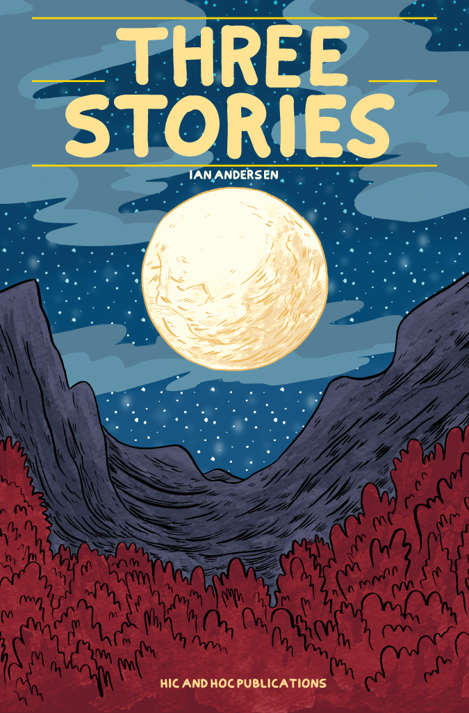
Three Stories, by Ian Andersen. Each of the titular three stories is stripped down and simply told. The first story, "Pack Rat", is a sort of visual exercise as a blank-faced character first finds a face on the ground (two dot eyes and a line for a mouth), and then proceeds to acquire more and more material goods as he walks along, until he collapses under the weight of his possessions and loses everything--including his identity. I't unclear just how much meaning Andersen is choosing to inject into this story beyond the neat visual trick of a simple character adding more and more detail and weight, until it's all gone. The second story, "Pear", concerns what seems to be the gentle eating adventures of a river turtle. He tries to dodge a loud animal that winds up eating his food, until he devises a method to get rid of it--once and for all. Andersen likes to inject a bit of cruelty into his stories at their conclusions, and the turtle's eventual "reward" for his actions is an effective surprise. In the last story, "Howl Hole", a couple of forest tree creatures follow a howling wolf to his hole, making fun of him when they can't understand him. The reveal here is a creature suffering heartbreak, with a lack of understanding denying any possible empathy. This is a comic with modest ambitions and an understated visual approach; it's quite different from the crazier, flashier and less conventional material that Moses usually publishes. That said, there's a surprising amount of emotional depth to this comic that belies its otherwise mundane trappings.

Wednesday, March 7, 2012

Give The People What They Don't Want: Important Comics Are Bad and The Regular Man

On the back of her collection of strips from the Baltimore City Paper, Dina Kelberman printed this quote from a disgruntled reader: "Please, please, please CANCEL Important Comics by Dina Kelberman. She makes the Family Circus seems creative and entertaining. What was the strip she replaced? Please, don't print her anymore. It's painstakingly pathetic, unartistic and drab." There's a degree to which Kelberman's art functions as provocation (especially in a weekly newspaper), given her minimalist line, her avoidance of conventional narrative, and her focus on the decorative aspects of lettering. That said, I don't think she ever means to deliberately provoke readers or try to do something defiantly anti-art. On the comics page, Kelberman is someone who lives exclusively in her own head, and her comics represent an attempt to communicate that experience.


This might sound like a stretch, but the strip Important Comics Are Bad reminds me of the most is Charles Schulz's Peanuts. That's because every major character in Peanuts functions as a different aspect of Schulz's personality, just as all of Kelberman's dumpy, geometric figures represent the argument she carries on constantly in her own head. At the same time, both Schulz and Kelberman are committed to writing gags. To be sure, Kelberman abandons the more conventional joke/narrative structure of a Schulz on a frequent basis. There's plenty of absurdism to be found in this book and lots of practical jokes on the readers. The best of these is the accompanying CD that contains recordings from the Important Comics podcast, wherein a friend of Kelberman's would try to interpret each week's strip in the most half-hearted manner possible. The comics themselves are about contradictions, the chief one being Kelberman's misanthropy vs her need to be with others. Every other theme of the book is a variation on that, like comically inflated egomania vs a consistent sense of worthlessness, the need to be productive vs the desire to waste time, etc.


Those themes are more pointed in direct in her fabulous collection of her epically strange quasi-monthly four-page minicomic, The Regular Man. The production values for this comic are ridiculously high considering the minimalist nature of her line, but that level of detail is important because of the counter-intuitive way she uses splotches of color. Unlike Important Comics Are Bad, Kelberman starts each issue knowing that she needs to fill up two pages worth of comics. She starts doing this in a fairly conventional manner but gets more ambitious and conceptual as the book continues, with one story interpolating her emotional experiences with a schematic drawing of furniture. Her use of color is almost expressionistic at times, adding emotional tones as well as challenging the reader to see a comics page in a different way. Beyond her techniques and ideas, I just find Kelberman's comics to be hilarious. The mopeyness inherent in navel-gazing auto-bio is duly mocked even as she indulges in same. "Listening" to her main character analogue yell is as funny as Sally Brown yelling in a Peanuts strip. Boredom and self-loathing are transformed into fodder for laughs, and her drawings are frequently surprisingly expressive, even without the addition of color. Kelberman is a unique figure in comics as a provocateur without guile as well as a humorist with surprisingly traditional roots.

Wednesday, August 10, 2011

Diary and Autobio Comics: Harbin, Kelberman, Taylor


Dharbin #1-2 Collected Edition and Diary Comics 2, by Dustin Harbin. The former minicomic is a collection of older work; the latter is Harbin's latest collection of diary comics and is published by Koyama Press. The difference between the two books is striking in a number of ways. The former book is a mixed bag in terms of content, mixing some great gags with some duds as well as several excellent autobiographical stories. The collected edition shows Harbin as a cartoonist just starting to get a handle on his talent and understanding of what is possible when he started to amp up his ambitiousness. Harbin's line is delicate to the point of wispiness and his character design is imaginative and funny. At times, he lays it on a bit too thick; his line sometimes gets fussy and overworked as unnecessary hatching and detail clogs up some strips. Harbin is at his best when he draws himself as a little kid, with a huge head and a single snaggletooth, looking like a weird cross between a Bil Keane kid and a James Kochalka character. His stories about his mother are all on point, as he reins in some of his fussiness to tell some of his clearer, more focused stories.


His SPX diaries are true treasures; while they tend to be a bit on the "inside baseball" side, Harbin's focus is really on the joys, pressures and sheer craziness of attending a con. Cartoonists are a naturally solitary lot, so the opportunity for compressing several months worth of partying and socializing in just three days is clearly intoxicating for Harbin, especially as this mini documents his slow integration into the small press community. Harbin's Diary #2 carries the common hallmarks of a diary zine, with a four panel grid constraint, quickly-drawn stories, a focus on quotidian and work details and a certain sense of repetitiveness. Harbin himself refers to diary strips as "the lowest form of comics", yet it's clear that these daily exercises have had a powerful effect on him as an artist.


Harbin's lively wit and whimsical nature inform these strips, adding life to the usual quotidian detail. Harbin is also bracingly honest, talking about the ways he battles depression while coming up with clever graphic solutions in depicting it. His strips about his girlfriend are playful and endearing without being treacly, as Harbin's m.o. of always keeping things light leavens any potential sentimentality in the happier strips, while preventing the heavier subjects from getting too morose. Harbin does occasionally go in for the quick and easy laugh a bit too often, though he does seem to be leaving behind some of the easier scatological gags that dominated his earlier work. More than anything, the sheer energy and enthusiasm Harbin has for comics is palpable in his work. He's still more of an artist that writes rather than a writer that draws, but drawing and writing dozens of pages of his own material is starting to hone his voice as a writer. His best work is clearly ahead of him, but he's already produced a lot of worthy comics.


Crocus, by Whit Taylor. Taylor introduces this comic as material she came up with after "a particularly rough and unproductive 1st winter in Boston", invoking the crocus as the first flower that blooms after winter. While there is certainly charm to be found in Taylor's voice and a certain energy in her character design, these comics definitely have the feel of an unpolished first crack at creating after a long hiatus. Taylor's line is crude but expressive, though I get the sense that she would like to be a better draftsman given the sorts of things she tries to draw. The way she overdraws and overscribbles at times is a common tell for young artists who aren't yet confident in their line. In that regard, Taylor needs to simplify her line; indeed, the pages that are talking heads are the most expressive and effective. Taylor has a knack for relating the juiciest, funniest parts of party conversations, and these are her best strips in terms of content. One story is about Taylor relating a weird comment she got after giving a blow-job; another is about Taylor and some female friends suggesting a "Princess Fantasy Wedding Party", going into great detail about cakes, clothes, cheesy party favors and bad music, only to get shot down by her male friends. Her "Shit I Won't Do Anymore" series is also pretty funny, though this was one area where I hoped for a funnier, clearer image and lettering to go with the gag. I'd be curious to see more of Taylor's work, especially since her sunny but sarcastic tone is a winning one.


The Regular Man #17-21, by Dina Kelberman. I thought I'd save a few of these for a stack so I could see the progression of ideas and images by Kelberman. While these comics are not explicitly autobiographical in terms of using her actual name and likeness, Kelberman has stated that these odd little comics emerge from her everyday life. #17 is really clever, as Kelberman draws on top of a schematic drawing of a series of shelves, drawing herself on shelves from top to bottom as though they were panels. Each of these comics finds Kelberman's tubular, tousled-haired stand-in struggling once again with engaging the world. She worries when it's a nice day and friends don't contact her. She resists going out on nice days and ignores a thirsty friend on a hot day when she creates art. Her other stand-in of sorts apologizes to a friend after she got drunk and then learns that learns that it was no big deal, but worries that if she's no longer an asshole, "then who am I?" Finally, she mockingly pats herself on the back for reading a book instead of tooling around on the internet, only to have the internet take on a fuzzy personification that hectors her.


Kelberman uses a dizzying array of styles, splashing color across panels in an almost abstract expressionist manner to alter each strip's emotional tone, drawing over other material, varying paints on the page (and sometimes using paint for scrawled lettering), or changing the very background of the comic (in one issue, we see Kelberman's sketchbook laid out on a table, her hand at the bottom of the page as she takes a photo of it). Kelberman's comics are constantly fascinating to me because decorative, narrative and formal aspects all have an equal standing on the page. There's a story she's telling through dialogue, she tells it using all sorts of crazy visual devices, and each page has a half-dozen odd decorative flourishes. That's especially true of the lettering, which often rolls into little circles and other shapes, bursts on the page in vibrant colors and also gets across Kelberman's feelings. The series will end soon and Kelberman will collect these strips into a book, which is exciting because more readers will have a chance to get their hands on this.

Wednesday, February 10, 2010

TCJ Post #28: Katie Skelly & Dina Kelberman

Over at The Comics Journal, Rob reviews NURSE NURSE #5, by Katie Skelly; and THE REGULAR MAN 1-5, by Dina Kelberman.

Sunday, November 29, 2009

Minicomics from SPX

Rob reviews a number of minicomics he got at SPX. Included are SO BUTTONS #2, by Jonathan Baylis, et al; NOAH VAN SCIVER MINI COMIC, by Noah Van Sciver; THE DAY I KILLED JESUS, by Julia Wertz; JUMBLY JUNKERY #7 & 8, by L.Nichols; BOOK COMIC, by Phil McAndrew; LIMBS OF THE MEGALITH, by Eamon Espey; OTTO ZEPLIN #1, by BT Livermore; THE REGULAR MAN, by Dina Kelberman; MY TERRIBLE TEARABLE HEART, by Sophia Wiedeman; TALES OF GOOD OL' SNOOP DOGGY DOGG, LOSERS WEEPERS and OLD MAN WINTER, by J.T. Yost; and PINSTRIPED BLOODBATH, edited by Jeff Zwirek.

SO BUTTONS #2, by Jonathan Baylis, David Beyer Jr, Tim Ogline & T.J. Kirsch. Baylis collaborated with several different artists for his autobiographical stories, and in general the visuals of this issue were stronger than his first effort. Baylis is at his best with the smallest of observations and recollections. Like many writers who don't draw, these stories are intensely text-heavy, sometimes to the point of overwhelming images. The artists who had the lightest, most cartoony touch were best suited to his work, like T.J. Kirsch on "So...She Married Me Anyway", a lovely story about him taking the wrong train on his wedding day. The material with his wife is the strongest in the book, especially when he tries to lecture her about comedy despite the fact that she's a professional stand-up comedian. On the other hand, his story about his Viet Nam vet uncle visiting the USS Intrepid had a lot stacked against it. Tim Ogline's earnest, naturalistic style demanded a light touch from a writer, but Baylis poured his heart out in talking about a tragedy that affected him. On top of that, the color in this story was distracting and took it further in a maudlin direction. If Baylis is going to continue mining these deeper memories (he had a similarly overwrought story about the Holocaust in his first issue), he'll need to figure out a way to add some restraint. Baylis' work is about memory above all else, and he is simply more effective relating his own, smaller memories (like recollections of listening to the Beatles with his mother) than trying to take on the horrific memories of a different generation. I do like his authorial voice and the easy way he jumps into his memories and finds ways to relate them as bite-sized narratives.


NOAH VAN SCIVER MINI COMIC, by Noah Van Sciver. Van Sciver is my favorite "miserablist" cartoonist at the moment, humorously relating his own struggles with alienation, depression, ambition and desire for success. The strip that summed all of that up the best was "Walk Home Drunk", a strip that began with Van Sciver being thrown out of a bar, trying to find his way home. Van Sciver's work is in the underground tradition: grotesque figures, an emphasis on the extremes of living (in this strip, puking up blood and the gag reveal that his "home" was a cardboard box), vicious exaggerations (Van Sciver's takedown of scenes and scenesters was hilarious), and a general sense of writing from the id. Van Sciver is still trying to find his voice and isn't quite there yet, but I like how many of his strips are so evocative of time and place. I would recommend his BLAMMO series, but this mini (a compendium of strips that appeared in various publications) is a nice place to start.


THE DAY I KILLED JESUS, by Julia Wertz. This is a split minicomic, backed with "The Legend of Rebob Mountain", an illustrated story that I previously reviewed. The titular story is a funny anecdote from the acerbic Wertz's childhood, where a family custom (of leaving a seat at the table empty for Jesus) was accidentally turned into an event that traumatized her. Wertz's autobio comics are an appealing blend of bitterness and shtick, especially when she looks back on her past as a born-again, prosyletizing Christian. That attitude mixes well with her effectively crude line that emphasizes over-the-top expressiveness. The anger that underlies all of her strips is contrasted by the goofiness of her figures, creating a tension in her work that gives even the silliest of her strips a certain charge. The reader is never distracted by drawings that are so funny that they are taken out of the reading experience. There's a pleasant sloppiness to her work that is partly a deliberate construction, and partly a sharp understanding of her own limitations as a draftsman. This piece was especially effective because she rarely writes longer narratives, but her sharpest work has been that which is a bit more fleshed out.


JUMBLY JUNKERY #7 & #8, by L. Nichols. This has become a consistently interesting grab-bag of stories, rendered in several different styles. Nichols mostly deals in slice-of-life anecdotes, and personal observations, but she also tried her hand at some compelling fiction in these comics as well. Issue #8's "Baxter" is about a kid obsessed with numbers, to the point where his book reports didn't discuss plot or character, but rather the average word lengths and graphs of letter frequency. The eventual reveal of this story took me by surprise, a tribute to Nichols' low-key storytelling style. "Paralyzed" is about a man who woke up, frozen, paralyzed by his own fear of death--a state that led everyone else to declare him dead. One thing I enjoy about her comics is the way her science background pops up in unusual ways, like in discussing entropy, ennui or the body as a mechanism.

Nichols' visual approach continues to evolve. In #7, she used a scratchy line that interlaced hatching and cross-hatching to create her figure and tell the story of Narcissus. Nichols also used color in her comics as a primary means of storytelling, matched up with simplistic stick figures. In other stories, she used a slightly deformed, almost Picasso-esque approach to making her figures. She also employed her standard self-caricature as a rag-doll with button eyes in interesting ways, like one story where literally tore her own stuffing out as an expression of frustration with the quality of her own work. These varied styles made her personal confessions and observations all the more interesting, a true one-person anthology. Nichols has frequently explored issues of identity and gender in her comics, with a refreshing absence of certainty one way or the other about what she believes. "Sisterhood" was a good example of that, a story about waiting for the feeling of "otherness" to disappear when she became an adult, that she'd feel connected to the idea of being a woman, but she feels as much an outsider as ever. The more quotidian observations from Nichols are of lesser interest; to an extent, her self-caricature can sometimes be a distraction in those strips. I'd love to see more fiction and color work from Nichols, and eventually some kind of long-form work. JUMBLY JUNKERY certainly has proven to be a fine training ground for her own development, with each issue showcasing work that's stronger and more daring than previous issues.


BOOK COMIC, by Phil McAndrew. This is less a standard comic than an extended shaggy-dog joke. With a single panel per page, it actually feels more inspired by minimalist animation (complete with silent "pause" panels) than anything else. It's about two people discussing books they've read, with a woman piling more and more over-the-top detail about her book. It turns out to be a fantasy-detective-conspiracy-scifi-ghost-romance-mystery story, becoming more and more unlikely with every detail she reveals. That's really the meat of the book, because the punchline (which is fairly obvious) is a head-slapper. In an effort to get the reader to flip the pages, McAndrew provides funny-looking drawings as his character, which I actually found a little distracting. While McAndrew is a great character designer and the details of the joke are amusing, there was no compelling reason for this to be a comic, per se.


LIMBS OF THE MEGALITH, by Eamon Espey. Everything Espey writes is pretty much a must-read for me, and this collection of very short stories for Bash magazine are no exception. While rendered in his usual grotesque & absurd style, these stories are more accessible and straightforward than much of the material that appeared in WORMDYE. These stories remind me of a weird, alternate version of Ben Katchor's JULIUS KNIPL stories, wherein we are introduced to someone with an unusual profession, an unusual life circumstance, or an unusual place in which they live. What's remarkable about these stories is their compactness, especially since Espey's WORMDYE narratives stretched out in ways that were frequently challenging. Here, Espey introduces us to a world where decreased life spans mean that children marry at age ten; a man whose dog shrunk down to an inch and turned into stone; a woman who lied about going on vacation and who made up weird tales about what she did; and a horseshoe collector who built a time machine. Espey is at the top of his game here, and this is one of the top minicomics of the year.


OTTO ZEPLIN Vol 1, by BT Livermore. This is a funny and well-drawn comic with a slightly weird premise: detailing the epic adventures of a baby whose exploits began right out of the womb. The title character was an actual person who died eight months after birth in the early 1900s, and Livermore, fascinated by the name, extrapolated all sorts of events for young Otto. These are all captioned, single-page gags wherein Otto is visited by the ghost of a pathetic U.S. Grant, hits it big in the stock market and blows it all on candy. What made the comic work was Livermore's crisp and clever character design, which did a nice job of conveying the dryly absurd nature of the humor.


THE REGULAR MAN #4, by Dina Kelberman. Kelberman's IMPORTANT COMICS was a delightful discovery for me this year, a book filled with ultra-minimalist, sardonic strips. This particular comic was about isolation and self-obsession, poking fun at herself while still delving into her own paranoia. Kelberman employs clashing colors in this little two-pager that further get across the sense of cacophony she relates here. Above all else, Kelberman is funny, both with her punchlines and her tiny geometric figures and the impromptu panels she strews across the page.


MY TERRIBLE TEARABLE HEART, by Sophia Wiedeman. Wiedeman excels at mythologizing heartbreak and pain, and this collection of short stories coheres nicely in depicting a set of experiences that form a sort of emotional narrative. "Exploratory Surgery" depicts a young woman carving open her chest and narrating as she went along, noting that if you reach inside, you get a prize. "Space Heart" was a hilariously nasty story about a smiley heart that started talking about how love lifts you up, "higher and higher". As the heart soared above the clouds into outer space, it exploded. Even the slightly maudlin "This Too..." which featured the young woman giving her heart to the Heart Monster, reassuring him that she'd grow another one as she curled up in the fetal position, used a striking sense of absurdity to leaven the outsized nature of the way she depicted pain. The way Wiedeman used dark dots for eyes gave her figures a much-needed sense of distance for the reader, even as the warmth of her line and the way she used grey drew a reader in. Refinement is the next stage for Wiedeman: more simplicity for her figures, greater confidence in her line and less reliance on greyscaling to achieve emotional effects.


LOSERS WEEPERS, TALES OF GOOD OL' SNOOP DOGGY DOGG, and OLD MAN WINTER, by JY Yost. Yost's greatest strength as an artist is his character design, and this serves his frequently amusing slice-of-life stories well. He also has a knack for seizing on a concept or gimmick and taking it in some unusual directions. For example, LOSERS WEEPERS was created when he found a journal written by a woman despairing of her relationship with a crazy boyfriend, an envelope with some explicitly crude writing scrawled on it, and a scrap of paper written in broken English. He pieced these together to create a story about that ex-boyfriend running into his ex-girlfriend, doing an obscene rap at an open-mic night and winding up sleeping under a bridge with fellow junkies. The tone of the piece was both tragic and comedic, which aptly describes much of the rest of his work. SNOOP was a compendium of dream comics and an autobiographical story related to the rapper. These are all amusing, with Snoop appearing as a friend, mentor and occasional supplicant. The last story, where we learn the impact that Snoop's music had on Yost as a child, put the dreams into a different context.
OLD MAN WINTER won a Xeric grant, and it's a collection that very much pushes emotion (and frequently sentiment) to the forefront. The title story exemplifies Yost veering from cartoony figures to naturalistic backgrounds (complete with dense cross-hatching), as we meet an old man whose wife has just died and is nearing the end of his own life. The story's emotional arc is pretty clear from the outset. The most interesting thing about it wasn't the titular character, but rather the way others around him reacted to someone in deep mourning who did as much as possible to hide it. The most effective story was "Logging Sanjay", a funny childhood account of playing pranks on a friend's family that unintentionally went to some darker places. "Roadtrip" was a really well-drawn story comparing the life paths of a human child and a calf that had all the subtlety of a sledgehammer. It's propaganda in the truest sense of the word, trying to provoke an emotional reaction with the way it juxtaposed its imagery. In that sense, it's quite effective, but propaganda is imagery programmed to provoke a single, particular reaction; this is what I'd consider to be the opposite of art.


PINSTRIPED BLOODBATH, edited by Jeff Zwirek. This is an attractively designed, sharply focused minicomics anthology about organized crime-related stories in Chicago, drawn by Chicagoans. Almost every story is a winner here, with some providing more of a payoff than others. The only dissonant note in the anthology was the story by Neil "Neil Jam" Fitzpatrick, whose stylized art and authorial voice were a bad fit. Nate Beaty and Bernie McGovern use mostly wordless stories to depict historical events; both make the wise decision, in telling stories about massacres, to provide a minimum of context. The details are less relevant than the emotional, visceral nature of the violent acts (especially with McGovern's story about a gangster going out in a blaze) and their aftermath (in Beaty's strip, a woman bloodies her handkerchief as a keepsake).
My favorite stories were editor Zwirek's account of the history of the Thompson submachine gun (the "Tommy gun") and Sam Sharpe's stunning story of his mother's delusion about his connection to a crime family. Zwirek's use of a fractured narrative was quite clever, as was the way he used the inventor's moral struggle with the fact that his invention was being used by criminals as a way of adding emotional & dramatic tension to what was essentially a timeline. Sharpe's story is a clever spin on the way that gangsters have not only become part of American myth, they've become part of American paranoia. His mentally ill mother concocted a story about how he was taken away by the "Sharpe crime family" as a way of explaining to herself how her mental illness (and time in an institution) was the product of a conspiracy. Using Jason-style anthropomorphic figures added just the right level of distance for this story. Zwirek has a sharp eye as an editor, and I hope he attempts something like this again.

Tuesday, September 22, 2009

High-Low At SPX and 12 Artists To Seek Out

I will be at SPX, perhaps the premier alt-comics event, this Saturday, September 26th in Bethesda, MD. I'll be part of the Critics' Roundtable at 3:30pm in the Brookside Conference Room, along with Gary Groth, Douglas Wolk, Sean T. Collins, Chris Mautner, Tucker Stone and Joe "Jog" McCulloch and moderator Bill Kartalopolous. I really enjoyed last year's panel and I'm looking forward to having a discussion with so many esteemed critics. I'll also be hosting a Debut Cartoonists panel, spotlighting new work by Hans Rickheit (THE SQUIRREL MACHINE), Eleanor Davis (THE SECRET SCIENCE ALLIANCE), Ken Dahl (MONSTERS), and the great Zak Sally (LIKE A DOG).

Here's my annual list of artists to seek out at the con. This is obviously not any sort of exhaustive list of artists that I like or will seek out on my own. Consider it a survey of new artists, significant artists making their first appearance at SPX, artists with interesting new releases, artists deserving greater exposure and folks whose work I simply admire.

1. John Porcellino. One of the greatest exemplars of minicomics as a viable format of their own, separate from potential collections. He'll have not just a collection of KING-CAT out from Drawn & Quarterly called MAP OF MY HEART, he'll also have a brand-new issue of the series. SPX is one of the first stops on his extensive book tour of the country celebrating his 20th anniversary of his career. His extremely spare line is a testament to how one can be devastatingly expressive using a minimalist style. Porcellino will also have original art for sale. This is his first appearance at the con since 1997, and a generation of cartoonists has been strongly influenced by his approach. He will have a 2pm spotlight on Saturday in the White Flint Amphitheater and will be signing at the D&Q table on Saturday from 11:30-1pm and Sunday from 1-3pm. Sally will moderate the spotlight session, and I should note that he's most certainly another artist to seek out.

2. Colleen Frakes. One of my favorite graduates from the Center For Cartoon Studies (along with Chuck Forsman, Sean Ford and the rest of the Sundays gang), Frakes' recent WOMAN KING was simultaneously lovely and disturbing. I'd also seek out her older TRAGIC RELIEF minicomics.

3. Carol Tyler. One of the greatest working cartoonists makes her SPX debut. Her YOU'LL NEVER KNOW is my top comic of the year. She'll be signing at the Fantagraphics booth on Saturday from 12-2pm and Sunday from 2-4pm. Tyler is also a delightful storyteller, so be sure to check out her spotlight on Sunday at 1pm in the White Flint Amphitheater.

4. Josh Neufeld. This long-time SPX attendee is basking in the glow of the well-earned acclaim that his AD: NEW ORLEANS AFTER THE DELUGE has received. One of the best books of the year, Neufeld will have his own spotlight panel on Sunday at 2pm. Neufeld is a perfect example of a generation of cartoonists whose career dovetailed with SPX, going from self-published minis to illustrating Harvey Pekar to his own series with small publishers to a book deal with Pantheon.

5. Ken Dahl. Also known as Gabby Schulz, Ken Dahl has an acidic sense of humor and stunning chops. He will be debuting MONSTERS, a collection of stories about herpes, at the show, and will be on the panel I mentioned above. Simply put, Dahl is one of the best cartoonists to emerge from this decade.

6 Dina Kelberman. IMPORTANT COMICS was one of the weirder and more compelling minis I read this year. Her comics have a sort of absurdist quality that I admire, and the way she uses unusual page & panel compositions with a minimalist line is unusual. She'll be part of the Aesthetics of Mini-Comics panel on Sunday at 4:30pm.

7. Ed Piskor. Piskor is unusual in that he's a young artist heavily influenced by the underground generation (as opposed to the alt-cartoonists of the 80s and 90s). He's also had an opportunity to work with legends like Jay Lynch and Harvey Pekar, but his own voice is unique. He's taken his underground sensibilities to write about another underground culture: hackers. Seek out the first two volumes of his WIZZYWIG and watch him on his Source-Based Comics panel at 1:30pm on Saturday.

8. Eleanor Davis. Davis is another artist on my short list of "best emerging talents of the decade" thanks to her compelling minicomics and short stories in MOME. Her Toon Books entry, STINKY, was one of the best comics of last year. Her new book, THE SECRET SCIENCE ALLIANCE, is aimed at older kids, which makes sense given her style of art.

9. Jon Vermilyea. Eric Reynolds discovered his minicomics at San Diego a few years ago, and his subsequent comics for MOME have been simultaneously hilarious and disturbing. Like Dahl, Vermilyea has incredible chops and a flair for the grotesque.

10. Jeff Zwirek. His BURNING BUILDING COMIX, an Ivan Brunetti-inspired work, was one of the more clever comics I read last year. I'd recommend getting every issue to fully appreciate the level of detail he puts into his gag work.

11. Will Dinski. Dinski gets my vote for best currently self-published artist. His new comic, COVERED IN CONFUSION, is typical of his recent remarkable hot streak: funny, dark, tragic and uniquely formatted. Someone needs to give him a book deal.

12. Matthew Thurber. Thurber's 1-800-MICE is one of the best comics of the decade. That about sums it up. It's an exemplar of comics that have a lot of genre elements, humor, deeper themes, dense plots, absurdist elements and unforgettable characters. Seek him out at the Picturebox booth.

Thursday, June 4, 2009

Form and Function: Minicomics from Blaise Larmee, Kenan Rubenstein & Dina Kelberman

Rob reviews three unusually formatted mini-comics. Included are IMPORTANT COMICS, by Dina L Kelberman, WIG-WAM by Blaise Larmee, and TICK, PROLOGUE and ON THE BEACH by Kenan Rubenstein.

WIG-WAM, by Blaise Larmee. Larmee is one of the more interesting artists who works primarily in abstract comics. This is a somewhat vaguely defined branch of art comics, given that sometimes it means a narrative told without the use of concrete figures, sometimes a comics story where the panel to panel transitions seem unconnected, sometimes a series of collages, and sometimes a comic with an emotional story arc rather than a concrete one. WIG-WAM is about as DIY as it gets, with the cover a folded-over sheet torn from a sketchbook and silkscreened. Larmee's main subjects of interest are children: their gestures, their interactions, and their secrets as they explore the world of their homes. The most interesting thing about this comic is Larmee's point of view as an artist with relation to the children. In the scenes where we see the children at play, walking, or in silent thought, the reader sees large, vividly colored images. In scenes where he depicts children exploring their secrets, the text and drawings become tiny and simplified; he's not really privy to these secrets. Naturally, the secrets revolve around sexuality, especially as it relates to identity. This comic is less a coherent statement than a series of loosely-related images that coalesce around a few simple ideas. What I like most about it is that it gets at the feeling of childhood mystery, a feeling that is never resolved as a child and never again accessed as an adult.


IMPORTANT COMICS, by Dina Kelberman. Kelberman works in a number of different media, with comics as the seeming repository for her most spontaneous work. IMPORTANT COMICS is a collection of her ephemeral, stick-figure minimalist comics. I'm fascinated by the way she uses color in her comics. It's rarely there to define space or push a narrative; often, it seems to interrupt narrative with random blotches or swaths of color completely sweeping over a panel. Like everything else in this collection, it serves to keep the reader off-balance. Despite the crude and simple nature of the artwork, Kelberman is clearly fascinated by the formal qualities of comics. Strips where her main two characters (a cylindrical triangle character and a bean-like character) "talk" with word balloons completely filled with color and no words get at this idea. Characters pour out of panels, panels are placed at weird angles in connection to each other, and in general form & function blur into each other.


This particularly plays out in the way Kelberman employs text: sometimes it's a scrawl, sometimes it's precise, and often it's part of the art itself. This is less immersive than taking an aspect of Chris Ware's work (his interjection of text occasionally dominating image) and running with it in an entirely different direction. The reader gets a big clue as to what Kelberman's doing when she reveals that she wishes she was synaesthetic. This comic is meant to be looked at as much as it is read, and the way word and image blurs mimics this desire to simulate the experience of different senses blurring in one's perception. While this collection was carefully constructed, with images juxtaposed with obvious intentionality, it also seems clear that the original images were entirely spontaneous.


It also helps that the book is very funny. Kelberman lampoons her own ambitions by printing an index in the back that refer to the text captions on each page from "jurassic park rehearsal" to "shaddap". Most of the strips are small observations, arguments, non-sequiturs, jokes and bits of absurdism (like a pair of shorts and socks being mean to a t-shirt). While it seems clear that part of the original effect of reading her comics is a visceral one, with tiny pages, she manages to keep that "what-is-this?" feeling up on page after page. Even as the reader settles into Kelberman's technique and style, she still manages to surprise and delight on every page.

TICK, PROLOGUE and ON THE BEACH, by Kenan Rubenstein. I've seen all sorts of hand-made trickery employed to spice up mini-comics, but it's the truly skilled artist who can turn such formal pyrotechnics into something that dovetails with the narrative. Will Dinski is one of the best I've seen in that regard, but Kenan Rubenstein's efforts here were also quite memorable. PROLOGUE and ON THE BEACH are tiny minis (about 2x3) that expand like maps. You open the first flap for the first panel, the next flap for the next two panels, the next flap for the next four panels, and the final flap for a splash page that serves as either a punchline or a capper.

PROLOGUE starts as a typical boy-meets-girl slice-of-life story, narrated by the author. It turns into something quite different, though the ending is alluded to early in the story. The final twist doesn't feel like a cop-out; instead, it turns the story on its head, using one cliche' to add depth and meaning to the cliche' we are initially presented with. ON THE BEACH is much more light-hearted, relating an anecdote about the author's experiences on a nude beach. Once again, the formal properties of the mini serve the story well, "exposing" more and more of the scene on the beach. It's an enormously clever use of the canvas, as it were, truly forcing the reader to engage the work and sparking their awareness of the comic as an object and delivery system.


TICK is formatted much like a calendar, which makes sense since page headers are months and several of the pages are gridded like a calendar. This is a story mostly told in images, with little dialogue. It's about a frustrated and clearly lonely artist who tosses aside his drawings for blueprints, creating a mechanical companion (which looks much like himself) run by a huge key that makes a ticking sound. "Tick" has a double meaning here--both the ticking of the automaton and the ticking of the clock as days pass by in frustration. There's a clever and unexpected twist in the story halfway through when the initial protagonist disappears and the automaton essentially lives his life in his place, biding his time until winter comes again. Ironically, winter proves to be a time of renewal for both characters.

It's an interesting idea for a comic and ambiguous enough to support several different interpretations. The main character is obsessed with spring and trees, perhaps because he's unable to actually experience it. The months that pass with the automaton are cleverly designed; each panel is a day on a calendar, roughly, and there's a sense of jumbled and blurred time bubbling up as a series of moments. It's a comic about loneliness, separation, reconnection and the ways in which relationships can break apart--even one's own relationship with one's muse. Rubenstein's sense of composition is bold and daring, with the calendar format both a problem to solve and the solution to the problem all at once.

Rubenstein's main weakness as an artist is his line. His figures are stiff and he tends to overrender a bit, which is not unusual for a young artist. His character design is a bit limited at this point as well. His line is just not very lively at the moment; it has the precision of an illustrator rather than the fluidity of a cartoonist. After he's able to loosen up a bit, this will allow him to really play to his strengths: his understanding of composition, striking use of light & shadow contrast and empathy for his characters. It's why I enjoyed his smaller "Oubliette" comics more than TICK; they were more spontaneous and less labored over. As Rubenstein matures, hopefully he'll be able to maintain that spontaneity for his more ambitious projects.