Showing posts with label jonathan baylis. Show all posts

Saturday, August 15, 2026

Jonathan Baylis' So Buttons #15

Jonathan Baylis has been writing comics for about a decade now, working with cartoonists to relate anecdotes from his life in the tradition of Harvey Pekar. What's changed for him over the years? Well, as evidenced by the latest issue of his anthology series So Buttons, he's starting to think like less as a writer and more as an editor. What I mean by that is that the way he sequences has become more sophisticated and his themes are more emotionally resonant. 


In So Buttons #15 (with a cover by C.M. Campbell that pays homage to a Barry Windsor-Smith cover from a Machine Man miniseries in the 80s), Baylis quickly establishes his theme as fathers and sons. Frequent collaborator Noah Van Sciver is a perfect choice for a loose and expressive story about a younger Baylis going with his father to visit his father's old neighborhood in Brooklyn. The message of the story ("be yourself") was a little pat, but the details of his affection for his father, along with how Baylis was frequently mystified by him, are what linger. The follow-up story, where TJ Kirsch draws a brief anecdote about solid advice on take-out, is a good gag strip that gives further color with regard to their relationship.


Baylis is a film and TV guy, having worked in the industry for a number of years. As such, he often drops interesting anecdotes about various encounters but also describes how and why film has had an impact. Sometimes, like in this issue, it leads to interesting stories, like how David Lynch's films and shows made him feel like a little less of an outsider but also indirectly helped him land a job. (Bhanu Pratrap's angular, distorted cartooning was a perfect match for this subject.) When Baylis stays away from played-out, tedious references like Star Wars or superhero stuff (essentially, Kevin Smith territory) and focuses instead on more personal and meaningful work, it's easier to see how and why it is so resonant for him. 


The stories about his time as an intern at October Films (as drawn by Danny Hellman, Karl Christian Krumpholz, and Nathan Gelgud) are not only interesting on their own as anecdotes, but they also reveal a lot about what's important for him aesthetically and how it bleeds into his personal life. That focus on movie segues into a beautiful story about his recently-deceased mother's love for West Side Story, drawn by Becky Hawkins. What represents a step up for Baylis as a writer is that this isn't simply a sentimental, emotional anecdote (although that is part of it); it's also an examination of the lacuna that now exists about why his mother felt a certain way about things. It's something he will never really know, as there are many mysteries that parents leave behind. The single-page drawing from Eleanor Davis about his mother-in-law is the single best page in the whole comic; it's a beautiful visual explication of not feeling one's own age. 

The only real misstep was Baylis' text explaining his themes at the end. I get why he might have done this, but it felt unnecessary. The themes and how they connected were clear to any reader willing to read closely. That aside, Baylis was right in asserting that this was his most cohesive issue of So Buttons to date. As a writer and as an editor, this is a clear sign that Baylis has hit his stride, and I'm excited to see his work continue to evolve. 


Monday, May 26, 2025

Jonathan Baylis' So Buttons #14

My review of Jonathan Baylis and his collaborators' new issue of So Buttons (#14) comes at a momentous time for the writer, as this issue was just nominated for an Eisner Award for Best Anthology. It's unusual for a self-published minicomic to be nominated for any award, so this is quite an achievement. The funny thing is that while I think it has his single best story to date, the issue as a whole is uneven. Or rather, the content of the first half is jarring compared to the content in the second half. That's understandable, given that the tonal shift occurred because Baylis' mother died while he was making the comic, and he chose to honor her with a memorable story and reprints of stories that featured her. 


The cover, by MariNaomi, is mixed photography and Shrinky-Dinks. It's an eloquent tribute to his mother, the pages of his comic scattered across the ocean. Baylis tries to frame the nature of the issue by framing it as "Life & Death," but as he points out in the afterword, the first part may as well have been called "Starfucker." Essentially, these are extended, amusing name-dropping stories. It wasn't any one story in particular that was bad, it's just that the whole theme, with this many stories, felt excessive and self-indulgent. 


The first story, drawn by Box Brown, was about his love of the Howard Stern show, and the producer, Gary Dell'Abate, in particular. This ties in with Baylis' stint working for the Topps card company, as he dropped off some Pamela Anderson trading cards. The actual anecdote where he meets Gary is exceedingly brief; this story is more a reflection of how much he liked the whole Stern experience. The whole aesthetic (Brown chose a yellow-orange palette that was vaguely nauseating) was off-putting, but then that's part of the Stern experience. 

The second story, with longtime partner T.J. Kirsch, was about how much he loved Chester Brown and how ironic it was that it was his wife, Ophira, who wound up meeting and interviewing him first. This wound up being a more interesting anecdote, as Baylis spotted him riding his bike to TCAF, and Brown slowed down, walked with him, and bought his comic! Kirsch's washed-out brownish hues were perfect for this story, and the whole point (comics is a small world, you should reach out to your heroes) is well-made. 


"So...Ballistic" is a mirror image of the previous story. Drawn by Sophia Glock, it's about Baylis' relative lack of interest toward the classic comic series Love & Rockets (amusingly, with Glock hectoring him about his lack of critical acumen). It's really just an excuse for the punchline of Baylis seeing Jaime Hernandez, asking him to look at a comic, and then being flustered when Jaime walks away with it. At two pages, it's just the right length. His collaboration with Craig Campbell about James Earl Jones was great when it focused on how Baylis was inspired by Jones overcoming his stutter (especially with Campbell putting on a cartooning clinic with multiple art stories and an impressive use of shading) and less so when it focused on Star Wars references (at this point, more than one is one too many). 


The second half of the issue kicks off with a sweet story drawn by Summer Pierre about Baylis teaching his young son about the concept of the "rally cap." Baylis has a real talent for taking a minor anecdote and turning it into either a solid punchline, a poignant moment, or a powerful memory.  Steven Arnold's cartooning for a story about a beloved former comic dealer who died had its moments (the bit where Baylis is drawn wearing his trademark cap at various ages was cute), but Baylis' text overwhelmed it in a way it doesn't usually do with his collaborators. 


"Take A Penny...Leave A Penny" is the piece Baylis wrote about the death of his mother, and it was drawn by Karl Christian Krumpholz. This was an excellent choice, because Krumpholz's dense and expressive style was a perfect match for this story. In the span of two pages, Baylis connected saving a young girl's life thanks to CPR training with seeing his mother suffering a stroke and dying in a way that felt organic and not overly mawkish. Krumpholz's use of dutch angles and thick lines for the opening segment but then decreasing his line weight for the latter part of the story was a nice way of smoothing out the narrative, and the brief flashbacks to previous stories featuring his mom was wonderfully restrained. Baylis let the moments speak for themselves. 

That's followed by reprints of those stories, which reminded the reader of the tenderness of Baylis' relationship to his mother. The final story, "So...Buttons" reveals to the reader the origin of the series' name, as it was something his mother said to him when he was sassing her about cleaning his room. The artist, Ayoko Nito, follows up on this origin story gag with a back cover joke featuring Baylis crouching on a rooftop like Batman. The back half of the issue was as good as anything as Baylis has ever written. Not just because of the subject matter, but because there was a lot less explaining of backstories and more letting things unfold on their own. 

Monday, November 6, 2023

Jonathan Baylis' So Buttons #13

There's a real throwback feel to the latest edition of writer Jonathan Baylis' So Buttons. (Poor Baylis chose a silly, throwaway title for this series, and now he's stuck with it as his brand. Cf. Julia Wertz's The Fart Party.) The amiable Baylis is a born networker with an extensive and deep curiosity about the history of comics and cartoonists. Meeting former Harvey Pekar collaborator Joe Zabel at a show led Baylis to hire him for a piece in this issue, which, in turn, led to him working with Gary Dumm and Brian Bram (last seen in American Splendor #2!) Can Alison Bechdel and Alan Moore be far behind? Other 80s indy stalwarts in this issue include Bernie Mireault and Michael T. Gilbert. 


Like Pekar, Baylis has a real sense of what stories to pair with which artists. It's fascinating to see him work with so many of Pekar's former collaborators, because as writers, Baylis and Pekar couldn't be any more different. Pekar's work, while deeply humanistic, was often cynical and even miserablist. However, he was also a keen observer of others and excelled in telling their stories. He was also the classic working-class intellectual, as his reviews of jazz records and literature in his comics revealed. Baylis doesn't truck with irony or spend much time wallowing in sadness (though there are hints of it); instead, he prefers to look at beauty, joy, and deep moments of connection with others and with art. As his story with Zabel revealed, what he does share with Pekar is a deep need to be a writer, and to have his thoughts expressed visually. Baylis' stories are almost always centered around himself, either in terms of the action or his reaction to same. I think this stems from his deep need to be a storyteller first and foremost, unlike Pekar, who was more interested in being an observer. What sets Baylis apart from other writers who collaborated with cartoonists like Pekar, Dennis Eichorn, or David Greenberger is a total sense of sincerity. Every one of these stories is important to him, and it's clear he spends a lot of time thinking about how each one will look. 


Tony Wolf was a good choice for "So...Swampy," given his affection for mainstream comics. This one-pager is more a style exercise than a story; it doesn't amount to more than "my grandma sent me some comics at camp when I was miserable and one of them was an Alan Moore Swamp Thing." On the other hand, "So...Premiered" (with art by Zabel and Dumm) is a meaty story that Baylis refers to as an "origin story." Baylis' background is interesting because while he loves comics, he went to film school at NYU. As such, he's had a number of gigs in the entertainment world, including with the Sundance Channel. That allowed him to meet Harvey Pekar at the premiere of American Splendor, where the writer gave Baylis encouragement. The story is full of funny visual flourishes that I'm guessing Baylis put in his script, like drawing Pekar as Dr. Octopus as part of an extended shtick. 


Baylis is frequently clever in his transitions from story to story. He follows this Sundance story with another one (drawn with flair by Mireault) about seeing the movie 28 Days Later at midnight and enjoying it because of the way he and the audience reacted together. It's a sharp observation of why seeing movies in a theater can be so rewarding. He follows that zombie story with one about his wife and kid drawn by Whit Taylor. Taylor is great at drawing stories about parenting, and this gag about a "zombified" Baylis walking in is set up nicely, complete with a plop-take at the end. Stories about being friends with Eli Roth as a film student and being delighted by his performance in Inglourious Basterds and a brief documentary bit with a memorable New York character fall more into the "anecdote" category as opposed to an actual story, and they feel a bit thinner as a result than some of the other stories. 


However, "So...It's A Viscous Cycle," featuring Maria & Peter Hoey, is the unquestioned highlight of the issue. Those two are extremely clever cartoonists and storytellers, and Baylis sets them up with a great premise regarding not just his vision, but the process of getting Lazik surgery because a film looked blurry. Keeping with the film theme, a piece on composer Enrique Morricone was interesting because Baylis notes that hearing his music just didn't sound right without accompanying film. Artist Rick Parker is a capable comedic cartoonist, but I thought a lot of the gags (did an image of John Cage need to be put next to an actual birdcage?) distracted from the overall content of the story. 


The other major highlight of the issue was his easy and natural collaboration with Karl Christian Krumpholz. It's a story within a story, told at a bar between Baylis and Krumpholz at SPX, about a particular, rare sort of bourbon that Baylis managed to acquire. It works as a captivating yarn and also provides some insight into their friendship, as well. Krumpholz' highly stylized character design and moody palette make this feel like a true collaboration. Speaking of which, it wouldn't be an issue of So Buttons without a team-up between Baylis and longtime collaborator TJ Kirsch. The latter's design for another Baylis strip about someone who shares his birthday (in this case, former baseball pitcher Nolan Ryan) was clever, riffing on Ryan using pickle brine to help strengthen the skin on his hands. 

Baylis has a pretty deep well of stories to turn to. This one hit a little bit more on his love of movies and life in the entertainment industry than usual. I'd be interested in seeing more stories hitting on fatherhood, relationships, and friendships. More bar stories with Krumpholz would also be fun. There are some artists he just seems to vibe with more than others, and the Hoeys and Krumpholz are definitely on that widening list. The other thing it would be interesting to see from Baylis is a longer narrative. I'm not quite sure what that story would be, but one senses that he's got a few of those laying around. Baylis' commitment to craft, design, and editorial coherency are on clear display, as his writing and editing chops have matured to the point where he's willing to take risks. Not everything worked in this issue, but even some of the misfires were at least interesting to look at. Baylis wasn't interested in playing it safe, and one hopes that this trend continues for future issues. 

Saturday, October 1, 2022

Minis: Jonathan Baylis And Friends Return For So Buttons #12

Jonathan Baylis continues his series of mostly affable and funny autobiographical stories with an all-star cast of cartoonists as his collaborators in So Buttons. Working in the tradition of Harvey Pekar, Baylis has refined his storytelling and matched his ideas to his illustrators with an intuitive editorial sense that rarely goes astray. Anyone who's met him in person knows that his upbeat and ebullient personality perfectly matches the mensch he writes about on the page. He's less concerned about narrative than he is in precisely nailing an anecdote, often to set up a particular punchline. 


Every new issue features upgraded production values; the cover stock and the paper for it are both top-notch. Baylis has been at this awhile now, and he continues to add new features even as his stories begin to shift from childhood and young adulthood to more stories about his wife and son. In one story, drawn by Lance Ward, Baylis ponders his own place in the comics world. This is a perilous question that can usually only end badly, but this story is less about worry about one's accolades and more about connecting with people in the community. As a side note, this thirst for community was a big theme at SPX this year, as the artists were giddy to be back out with their peers and fans. The story is set at an earlier SPX, where Baylis sat with the late Tom Spurgeon (one of the great writers about comics) and Carol Tyler (one of the greatest cartoonists of all time) and made them laugh. This anecdote led into Baylis learning that Tyler had many pages of unpublished art; he not only printed one in this issue, but he made prints of this to sell in order to help fund her late husband Justin Green's memorial. 


Another fun thing was seeing a comic from his young son, Lucas. While every parent obviously loves seeing their children's art, the deep love that Baylis has for the medium has clearly been communicated and shared with his son--another example of this theme of community that marks this issue. 


Like Pekar, Baylis has turned himself into a cartoon character, with his cap and facial hair being iconic elements he directs his artists to use. He plays on this in a strip about his facial hair, noting that his wife liked it on their first date, so he's kept it that way. That look is a bit like the actor Ethan Hawke, who he happens to work with later in life. Here, Baylis lets slip something that otherwise has nothing to do with the rest of the story (he was bullied in childhood), but the strip ends with a punchline about he and Hawke both wearing the same sneakers. 

Baylis has worked in television and also the Make-A-Wish foundation, and his wife is a stand-up comedian who had a show on NPR for a long time. As a result, he's met a lot of famous people, and they often provide fodder for his stories. One such story involved meeting punk legend Ian MacKaye in a green room, and he told him about being on Saturday Night Live as part of a mosh pit for the band Fear. Drawn by J.T. Yost, it's both naturalistic and slightly on the grotesque side, befitting the subject matter. Baylis pokes fun at himself for dropping names in a story drawn by frequent collaborator Noah Van Sciver, but it's genuinely interesting to see Baylis draw lines between meeting Chris Claremont, Jay Lynch, and the director Mike Dougherty. Creative circles can be pretty tight. 


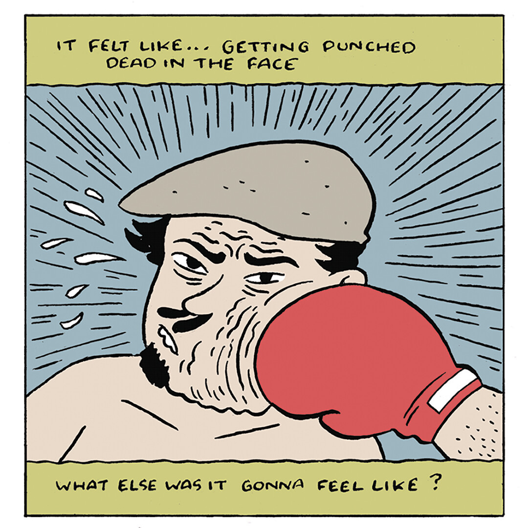
To be sure, Baylis has written about personal things before, especially with regard to his relatives. This issue feels a little different, though. In one story, he goes into greater detail about being bullied and talks about learning how to spar in a boxing gym. With Josh Pettinger giving the story just enough cartoony distance to soften the subject matter, Baylis talks about how literally learning how to take a punch in a boxing ring. In a series of increasingly-visceral panels where Baylis' face swells up with each blow received, he unleashes a torrent of grief: disease, death, job loss, and family crises over a relatively short span of time. A more naturalsitic approach would have been unbearable, but Pettinger nails this litany of blows landed, just as Baylis lays it out plainly. There's not a happy ending per se, but he ties it back into boxing by learning how to take a shot and keep moving. 

On a lighter night, strips about his son reading his comics and being absolutely delighted to see the word "shit," much to Baylis' consternation, is fun at his own expense, but he also clearly enjoys this dynamic. A strip where he helps a pregnant woman get to a hospital is given some soulful emotion when he realizes it's the place where his wife gave birth. The montage of images from the husband-wife duo of Kevin Colden and Miss Lasko-Gross is especially effective in portraying the profound gratitude he has for this place and that time. As with many of Baylis' comics, the whole tends to be greater than the sum of its parts, which is a testament to his editing and sequencing of his pieces. 

Monday, September 20, 2021

Minis: Jonathan Baylis' So Buttons #11

Jonathan Baylis's anthology memoir series So Buttons continues to truck along, as he just released his eleventh issue. As per usual, he has a strong eye for choosing the right artist collaborator for the right story. Perhaps the best in this issue was his collaboration with legendary UK cartoonist Phil Elliott, a mainstay of the burgeoning 80s British indy cartooning scene. Appropriately, Elliott illustrated the story of Baylis' time in London doing a semester abroad program. His charmingly sketchy style was perfect for this tale of Baylis meeting Bruce "Skinny Melink" Paley, a Brooklyn ex-pat who ran a comics store. Baylis followed up that anecdote with some surprising connections he later learned about as they connected to Elliott, Carol Swain, and others. 


Given Baylis' own circuitous history in comics, it's a story that makes sense. He spent years as an intern at various publishers, and this issue covers his time at Topps. It's bookended by illustrations from Fred Hembeck and Rick Parker, two veteran humor/gag cartoonists. The one by Parker is done in the classic Bazooka Joe style in a tribute to Baylis' friend Jay Lynch, who was a Topps veteran. Baylis is very much someone who has all sorts of geek fandoms in his wheelhouse, and the main story (drawn by Jeff Zapata) ties them together amusingly. Here's where the high production values Baylis uses for his comic strongly worked in his favor, because Zapata's smudged style would have looked messy in a black & white comic. However, the four-color palette was ideal for evoking that bright Topps aesthetic.


Baylis is a guy who's met a lot of interesting people through his various jobs. He talked about working as a coordinator for the Make-A-Wish foundation and coordinating a kid's lunch visit with John Cleese. Baylis is a sharp observer, and his comments on Cleese perhaps finding it necessary to be extra loquacious because he was nervous or needed to entertain were interesting. He also turns it from simply a name-dropping exercise into a human moment when he revealed a moment of real human tenderness in how Cleese wordlessly helped the child cut up his meal while continuing to entertain. A.T. Pratt and Garrett Gilchrist bookended the story with Cleese illustrations (lots of Monty Python stuff) and B.Mure drew it. Mure's use of what look like watercolors gave the story a sweetness to it.


When you need an illustrator to draw a story about whiskey, who else would you choose but November Garcia? This led off the issue, and it was an appropriate opener: very silly and funny, as Baylis recounted his quest to get his hands on a particular vintage of scotch. Garcia just went to town here with funny drawings; I'd be curious to see what the script's directions were for her in terms of some of the visual jokes. Finally, there was a one-page story about Baylis slipping into nostalgia for a Waldenbooks-turned-bank in New York drawn by his longtime collaborator T.J. Kirsch. Kirsch always hits that sweet spot between naturalism and cartooniness that fits so many of the affable Baylis' stories. Having Jim Rugg do a Basil Wolverton impersonation for the cover was also a real grabber, and it was a stroke of genius to commission Rugg to do it, given his extremely broad skill set. Baylis has grown extremely confident as a writer and long ago figured out the best way to play to each artist's strengths. I never get the sense that he's over-writing, which can be common in writer-artist collaborations. Despite the fact that these anecdotes are usually fairly breezy, the open nature of his writing makes them feel surprisingly chummy and even intimate. 

Monday, October 1, 2018

Some SPX Minis: J. Baylis, A. Stang, R. Ullman

I can never resist reading minis from old favorites right after SPX. Here are some examples...

So Buttons #9, by Jonathan Baylis, et al. Baylis writes with increasing confidence and a Harvey Pekar-like ability to pick the right artists for the right kind of stories. That's not a coincidence, as Pekar is one of his major influences. Baylis and long-time collaborator Noah Van Sciver in "So...Carl" play on the structure of the famous Pekar/R.Crumb story "The Harvey Pekar Name Story", yet the structure actually serves a purpose in discussing his father Carl and his same-named cousin. While Baylis often plays his personal anecdotes for laughs, there's often a deeply personal and even cathartic quality to many of them as well; in this case, it was going to the funeral of his uncle with his sick father and freaking out that "Carl Baylis" was dead.

Two other long-time Baylis collaborators also shine in different ways. The simplicity of T.J. Kirsch is perfect for an anecdote about Baylis' young son talking about how he loved The Flash, his mom...and that's it. Thomas Boatwright returned in a follow-up about Baylis' old ambition of being a horror movie make-up artist, with exaggerated, cartoonish figures and a bright use of color contributing to an upbeat story of meeting one of his heroes and having it go well. Summer Pierre was a perfect choice for a sweet story about Baylis talking to his son about music. A story about getting rare roast beef from the Second Avenue Deli in New York was fittingly done by one of the best in depicting the city in James Romberger. Fred Hembeck continues to illustrate Baylis' time as an intern in comics, which was littered with disastrous stories. This time around, it was at Valiant Comics, where he watched staffer after staffer get fired by despondent publisher Bob Layton. Hembeck's deep knowledge of comics was put to good use in some clever panels, like one where he referenced the famous image of an alcoholic Tony Stark from an issue of Iron Man that Layton co-wrote and inked. I'm not sure if Baylis suggested that connection or if Hembeck came up with it, but it's the sort of thing that happens all the time in Baylis' comics. Baylis has a love of comics and its history that's coupled with an eyes-wide-open understanding of the industry's foibles. Combining that with an intuitive sense of not only what kind of anecdotes from his life make for a good story, but how to tell that story economically, has made him one of my favorite recent memoirists.

The Audra Show #1, by Audra Stang. Everything about this little mini is perfectly designed, from Stang's cheery self-caricature on the cover to the intense use of reds, blues and yellows. It was clear from the beginning that Stang was a talent to watch, and it's interesting to see her stretch out and work so extensively with color. Her biggest strengths remain dialogue and character interaction, as there's a great degree of verisimilitude. This comic begins with a wink to Daniel Clowes' Ghost World in that there are two teenage girls at a diner in 1988 who harass a schlubby, mustachioed waiter named Owen. The story takes place from the point of view of the waiter, who has a crush on a waitress named Bea. When they part after hanging out after work one night, she happens to see him him jump off the dock into the ocean...and when he doesn't come up after several minutes, she gets worried. The ending is a sublime moment of magical realism that nonetheless is a smooth fit with the rest of the story and even resolves the romantic tension between the two characters.

Old-Timey Hockey Tales #3, by Robert Ullman. Ullman's sports comics get more and more confident as he wrings out every bit of story and character to be found in the oft-eccentric National Hockey League. With this third issue, he's close to putting together enough material to assemble a book (around 70 pages so far). Ullman's clear, smooth line is ideally suited for this kind of storytelling, as he varies line weights to emphasize contact and action. The comic picks and chooses between the ridiculous, the beautiful, and the horrifying, as the early NHL had a Wild West feel in terms of its on-ice violence but also featured an intensity that created a deep connection with fans.

This issue featured statistical oddities embodied by players like Ken Doraty, whose career was notable for his overtime heroics and little else. The story of the "Curse of Muldoon", which supposedly prevented the Chicago Black Hawks from finishing in first place, was hilariously revealed to be a newspaper-created hoax. Ullman uses a grey wash to create an old newsreel feel in telling the story of Larry Kwang, the first Chinese-Canadian (and minority of any kind) man to play in the NHL. It's a story that's predictably filled with racist incidents, yet Kwang found different ways to rise above them in his life. In recent years, his story has been more widely told. There's also the story of Ace Bailey, who nearly died in an on-ice fight after taking a blind cheap shot, but later forgave the man who struck him. Ullman crams a lot of stories into 26 pages, and his ability to snappily get at the heart of each story without wasting a line makes this one-man anthology a compelling read.

Monday, September 25, 2017

Minis: M.Turbitt, J.Baylis, J.Porcellino

That blissful comics avalanche feel is upon me after SPX. All I can do is sift through and start reviewing.

How To Eat Chips, by Meghan Turbitt. Turbitt continues her hilarious, over-the-top social satire by way of exploring advertising and imagery surrounding food in this mini. From the cover that's a parody of the Utz brand of potato chips to the "nutritional facts" on the back that indicates that it provides 200% of daily laughs, 100% of advice and 50% each of fashion, fine art & literature, this mini even has a single-page inset "Guide To Eating Potato Chips". What makes this mini so successful is Turbitt's genuine enthusiasm for food and snack foods in particular. The manic energy that Turbitt provides for her drawings is inherently funny in drawings of potato chips and people eating them; the dissonance between what we expect in a work of advertising and promotion and what she does on the page is amusingly diverting. The further the mini goes on, the sillier it gets, like listing the "best songs to listen to while eating Rap Snacks", positing pretzels as the enemy of chips, creating a "chips dream team" and imagining future chip flavors like oyster, pho, and lobster roll. At the same time, while the mini becomes silly, it never becomes absurd, and stays in the gravity of its central premise: a guide to something that needs no guide at all.

So Buttons #8, by Jonathan Baylis, et al. Baylis continues to get better with every issue of his collaborative autobio comic. His writing is sharper, more concise, funnier and just has a greater overall crispness and purpose. In terms of style, he's never been lacking for ideas, and the cover for this issue was just killer: a parody of the cover of American Splendor #4, as drawn by Robert Crumb. This was the one where noted record fiends Harvey Pekar & Crumb were doing an aw-shucks trade on records they really wanted, each thinking they ripped the other off. This time around, it's a drawing of Baylis and cover artist Noah Van Sciver, doing the same thing with comics. It's hilariously on point and evocative of the original while very much being in Van Sciver's mature style.

Baylis has learned to find good matches for story subjects. "So...Porky" is about his rejection of his Jewish religious roots in terms of dogma around diet and how he embraced pork. This was a light-hearted story, so a cartoony and light line like Corrine Mucha's was a solid pairing. I especially enjoyed how he went into so much detail about something called a Shanghai soup dumpling, which amusingly has a set of rituals surrounding it that one might almost call religious. Rick Parker's versatility and ability to draw horror images made him the right partner for "So...Hallow", which is a history of his love of Halloween make-up. It includes an interlude by Van Sciver where extremely gory make-up one Halloween stopped an angry motorist he'd just gotten into a fender-bender with in his tracks. Baylis always has a way of bringing these anecdotes around to more significant events, and in this case it was his initial interest in doing movie effects make-up for a living that waned when he started doing it for others, along with a general disinterest in Halloween that started after 9/11. The happy ending is that he started finding ways to dress up his dog. "So...Bejeweled" (with one of the best artists with regard to drawing animals in Rachel Dukes) is about his first dog as an adult who died not long after they got her, while "So...Close" is an amusing short with long-time collaborator T.J. Kirsch wherein he tells his wife that the feels like their life is settling down for the better...only to run out of gas. This issue is a solid, satisfying piece of storytelling.

South Beloit Journal, by John Porcellino. This mini from Uncivilized Books has an interesting origin. After finishing drawing a book about suicide, he found himself with 91 2x6" scraps of Bristol board after he trimmed the pages to size. He was inspired to do a daily, three panel journal strip that was very different from the sort of thing he does in King-Cat Comics & Stories. There's a level of precision, even in a minimalist sense, in those comics. Those comics are poetic, and the anecdotes carefully chosen. With a daily strip, John P simply unloaded what was on his mind in the fastest, rawest manner possible. The fact that he was going through an especially low, lonely period of his life and that he did this anyway is just part and parcel of Porcellino and his approach to life. Even at his most depressed, he finds a way to keep going, keep working, keep drawing, keep connecting and keep trying. The bright moments in this comic come when he's connecting with someone else, or talking to cartoonist friends of his at shows, or getting up and drawing/working when he would rather sleep all day. He's a sort of living example of the positive effects of what is known in Dialectical Behavioral Therapy (DBT) as "opposite action"--doing the opposite of what you want to do in a depressed state, in order to change mood. The journal is also proof that no matter how awful today is, tomorrow has a chance to be better. That's borne out in the back half of the journal, when he goes on an extended trip to Canada for various shows and readings, and also starts dating someone new. Porcellino is not one to overromanticize anything, so reading about him watching the hockey playoffs with his new girlfriend is a kind of shorthand for that sense of new romantic energy. Making those connections and soldiering on with his creative work doesn't make everything perfect, but in these raw, ragged and emotionally vulnerable strips, Porcellino shows that it can at least help.

Wednesday, August 26, 2015

Autobio and Collaboration: Jonathan Baylis

Jonathan Baylis has been plugging away at his autobio series, So Buttons, for a number of years. He's put together a handsome and well-organized collection, titled So Buttons: Man of Like, A Dozen Faces, that's greater than the sum of its parts. Inspired by the Harvey Pekar formula of having a stable of illustrators to collaborate with depending on the sort of story he wants to tell, Baylis has become more and more adept at pulling back on over-writing (and indeed, writing over) the art and trusting his collaborators to "show, not tell." The book is organized into sections on childhood, working in comics, his thoughts on film, his relationships and his love of animals, among others. When some of these pieces originally appeared in his minicomics series, they stuck out in a discordant manner. Recontextualized in this book, these strips are far smoother and make much more sense.

Baylis is less interested in "spilling ink" about his deepest feelings and more interested in relating anecdotes and opinions. Indeed, in one strip where he talks about a doomed relationship in the context of a trip to Los Angeles and the discovery of what appeared to be a body on the beach, his musings on how the trip cemented the notion where he and his girlfriend were drifting apart seems wedged in unnaturally. Better to provide a little less information and let the reader pick up on context clues than repeatedly try to hammer home symbolism. On the other hand, Baylis reveals a lot more of himself when he simply relates funny stories about trying to edit the work of his professional comedian wife, or plays off his OCD tendencies as a gag. When he shifts into overly-sincere mode and feels the need to explain darker emotions, his stories just don't ring as true.

Fortunately, he keeps things on a fairly light but entirely sincere basis for most of the book. My favorite stories tended to be those that focused on his reaction to works of art, be they film, comics or paintings. The "Basquiat Jam", a trio of stories drawn by Victor Kerlow and Becky Hawkins, get at the heart of how seeing Basquiat paintings in Spain affected him at a deep level, both because of the art and because of the way it connected him to his native New York City. "So...Crumby", about a friend of his who shared R.Crumb's passion for obscure records, was drawn by Crumb descendant Joseph Remnant, who actually goes a little cartoony at times in this story. Indeed, Baylis reveals much about himself in the stories he chooses to tell about others, like his father, his mother and his wife. That's true of little memory fragments from his childhood, surprising revelations and details about the ways in which he was loved and loves them.

There is an essential warmth at the heart of Baylis's comics that's best exemplified by his ongoing collaboration with cartoonist T.J. Kirsch. It's accessible and slightly cartoony. The storytelling is solid and clear. Kirsch has a way with body language that's a perfect match for Baylis' character-driven stories, creating a naturalism that a more realistic style wouldn't necessarily convey. It's pleasing to the eye without trying to be funny. When Baylis is going for a specific kind of laugh, that's where Noah Van Sciver and Rick Parker come in. Van Sciver's wobbly style is perfect for embarrassment-related humor, while Parker's skill as a caricaturist who can go over the top makes him ideal for more outlandish anecdotes. Stories about his days as a Marvel intern are fittingly drawn by fan art legend Fred Hembeck.

While Baylis and his collaborators don't always stick the landing on every strip, what makes this such a delightful read is the obvious care and thought that went into each collaboration as well as the design of the book. Outstanding cartooonist and designer Will Dinski designed the book, showing off some of the drawings of Baylis that he commissioned from the likes of Gabrielle Bell, John Porcellino, Ed Piskor, MariNaomi and Jim Steranko (!). The book looks great and reads smoothly, so much so that even some of the more disposable strips feel added value rather than wastes of time. That Baylis has chosen so wisely and so well in his choice of artists speaks well of his eye for talent that works well with his project. That said, I expect Baylis to continue to grow as a writer, developing an even stronger sense of how to write visually without overloading his comics with text.

Wednesday, May 6, 2015

Minicomics Round-Up: Baylis, Carter, Gennis


So Buttons #7, by Jonathan Baylis and various artists. Baylis continues on in the Harvey Pekar mode of shifting story content over to different artistic collaborators, with the trick being finding the right artist for the right story. He certainly nailed "So... Crumby", an account that purports to be about his degrees of separation from R.Crumb but was really about a friend who knew Crumb. Drawing in that Crumb style is Joseph Remnant, the young and super-talented artist whose underground-inspired work is very much in Crumb's tradition. The friend was "Citizen Kafka", one of those New York characters who's been everywhere and seen everything. The Crumb-style talking head panels are further accentuated by the color palette, which was very rich and dense, just like Remnant's pencils. It thrusts the reader into this particular world and does so with wit and warmth--two of Baylis' trademarks as a writer.

The second story, "So...Embarrassed", is a nice piece of design work by artist Paul Westover, who frames this story about the transition between being a normal kid and a target for bullies in the style of Star Wars cards of the era. His clean, cartoony style nicely encapsulates the little-kid setting, as do the lighter colors. This is a funny, self-deprecating story that nonetheless does little to mask how the feeling of embarrassment he felt in front of his class and teacher still stings to this day. The final story, "So...Smiley", features evocative, realistic art by David Beyer, Jr. This is just a two-pager, and it's less a story than it is a brief statement about how certain sensations bring about a simple feeling of contentment. Throw in a funny and lurid Danny Hellman cover (an ode to EC Comics) and you once again have a carefully-crafted and planned bit of autobio that's greater than the sum of its parts.


Life Was Hard, by Kirk Carter. I was charmed by these autobiographical vignettes about growing up in the harsh winters of Maine. For a comic that almost certainly looks like it was drawn using a computer, it has a restrained, simple style that retains a sense of the artist's hand. Rather than try to overrender or get flashy, Carter keeps the lines utilitarian but funny (there are a lot of funny-looking kids in this comic) and uses a very light color palette as a way to embellish and make the images pop a bit. The background colors are pastels and the clothing is a shade or two darker, and this simple formula works in strip after strip. The vignettes, memories and observations are nothing earth-shattering, but therein lies their appeal: watching TV and being confused by the Canadian channels, ordering only the first, free volumes of encyclopedias and thus retaining all sorts of facts about things starting with the letter "A", playing with siblings and "cousints" (their vernacular for "cousins"), and the ridiculous things that happened in cold weather. Carter's ambitions were modest in this comic and he certainly exceeded them with a number of amusing and memorable anecdotes.


Trepanation, by Emi Gennis. Two quick observations about Gennis's comics: they continue to look sharper and their subject matter continues to grow weirder. Her character design in particular is expressive and naturalistic at the same time, allowing for that aforementioned weirdness to really take root. Her use of hatching is a little less precise and takes the reader out of the panel a bit because it looks like an art effect rather than looking like the shading on an object; really, her control over her line is such that she hardly needs hatching. With regard to the subject matter, this is an even-handed look at the history and current practice of trepanation, a type of surgery design to drill a hole in one's head. It's an ancient practice, and some apparently swear that it can cure depression, end headaches and boost energy, though there's no particular reason why it should do so. Gennis gives every point of view ample room to state its case, though it's clear that the damning counterpoints of standard medicine are difficult to refute. The benefits of trepanation are anecdotal at best and may well be a result of the placebo effect, but each of the testimonials are interesting and compelling in their own way. What's clear is that Gennis had a great deal of fun drawing people getting holes drilled in their head and perhaps had even more fun sharing her research on the subject.


Wednesday, December 18, 2013

Shades of Autobio: Baylis, Martin, Runkle


So Buttons #6, by Jonathan Baylis and various artists. This is yet another solid issue of bite-sized anecdotes related by Baylis and rendered by an increasingly-impressive group of collaborators. Fred Hembeck continues to be an ideal artist for Baylis' stories about his time as an intern at Marvel Comics, and printing this story in full color adds to its effectiveness. Baylis has a front-line view of exactly how Marvel treated its most talented creators, and the anecdote here where he chose to give Joe Simon a couple of Golden Age comics that Simon himself did not possess instead of just getting them autographed shows how a fan treated the creators with more compassion than Marvel itself. Baylis made an interesting choice by also running the superb Josh Bayer story "Trimpe Survives", originally printed in black & white in the Rub The Blood anthology broadsheet. Printed in color and on a smaller scale, this story that interpolates a fantasy sequence with Trimpe's real struggle to get work from Marvel in the 90s is in turns profane, poignant and hilarious. It also dovetailed nicely with the first story. "So Begrudgingly" and "So This Is Where I Got It From" (drawn by Sam Spina and T.J. Kirsch, respectively), are the sort of short, gag-oriented strips that Baylis does well. Spina in particular adds exaggerated body language and flopsweat to a story about living well being the best revenge (but tweeting about it not hurting things).

The centerpiece of the issue is "So Basquiat". One of my early criticisms of Baylis' writing, especially with regard to longer, more serious pieces, is that he tended to overwrite. Too much narrative caption text and too little room for the artist to do more other than functionally describe that text was a frequent problem, though not a surprising one for a writer trying to figure out how to write a comic. As Baylis has evolved, he's come to trust his artists more and more; in turn, the artists he's working with are more adept at taking what he's written and transforming it into something visually striking. This suite of three stories works so well because it begins with Baylis' own personal experiences discovering Jean Michel Basquiat, the famous graffiti artist/painter who emerged in the 1980s. Baylis discovered his work through the biopic about his life, which tied into his own unsatisfying experience at NYU film school and that the downtown art scene was not what he had hoped. That segues into a sequence drawn by Becky Hawkins (jammed full of eye-pops) that saw a naive but enthusiastic Baylis take the money he got after being downsized by Topps to go to the Guggenheim museum in Bilbao, Spain. The cartoony nature of Hawkins' line and the soft use of color was a perfect match for the delightful weirdness of the museum's design, and Baylis let the art do the talking as much as possible while still adding in key expository points that talked more about his emotions than actual events. Victor Kerlow did the first and third segments, and his comparatively, scratchy & dirty line further communicated how much seeing the museum and Basquiat's pieces there affected him as a person, creating a sense of not necessarily relating to him but getting a sense of what they had in common. This story is a true breakthrough for Baylis, and when you tack on the cover by Jay Lynch (combining Topps' imagery with Basquiat's likeness) and a back cover portrait by Noah Van Sciver, you have his strongest issue to date.

Runx Tales #3, by Matt Runkle. Runkle is a fine general-interest storyteller who moves seamlessly from talking about a beloved drug store that closed to weird spots in San Jose to an interview with a beloved author to a series of anecdotes about a couple of ex-lovers. There's something pleasingly crude and beautifully ugly about the way he draws people: bug-eyes, stubble, skewed mouths and slouched, often amorphously drawn bodies. I think the best way to categorize him as a visual essayist, as he eloquently and colorfully spins yarns about things that interest him. His extended essay about seeing Prince on the day that fringe Christian Harold Camping claimed the world would end was jam-packed with interesting bits of trivia that went off on fascinating tangents. It was like reading a personal, emotional version of Ripley's Believe It Or Not!, stripped of its hyperbolic qualities. That was especially true when he segued into discussing the famous Winchester House. The story goes that Mary Winchester, the heir to the Winchester rifle fortune, kept on adding to the house in order to appease the ghosts of those killed by the rifles. Runkle goes deeper, discussing Winchester's roots in theosophy and spiritualism but also making note of her innovative architectural concepts.


The interview with author Jincy Willett is also tremendous, combining quotes from her novels, quotes from the interview, a variety of cleverly-composed illustrations and some solid literary criticism. The feature on the bizarre variety store SuperLongs was a bit tougher to swallow because of how esoteric its subject was and how text-heavy the feature turned out to be, but it did give Runkle a chance to draw the interesting objects one could find in there. Finally, "My Two Daddies" finds Runkle literally cutting a horizontal line in the middle of the page to create dual flip-books about two life-changing relationships when he was a "failed rent boy". It's a fascinating look at Runkle coming to terms with a stereotype, dealing with the racial implications of his relationships (he's white, but both of those sugar daddies were African-American), and how injecting money into personal and sexual relationships made things more complicated, not less so. It's a beautiful, haunting and bracingly honest account of his past and just the sort of story that makes him such a sharp writer.


Driftwood City, by Jason Martin. This is a 100-page collection of Martin's Laterborn minicomics series. Martin's comics are all about capturing small, powerful and poignant motions. Above all else, they are about trying to capture particular strong feelings. "Lily, or Save Your Pity" is about being a teen and meeting a girl with whom he had an intense phone-and-letter relationship with for a couple of months. It eventually fizzled out, but Martin really gets at that feeling of going through an experience that has an indelible impact on one's experiences and memories. It's a personality-forming experience. In the first section of the book, "Home", the stories inevitably turn to either brief, funny anecdotes or life-changing experiences or individuals. The strip about his class reciting the lyrics to "The Humpty Dance" to a teacher who inadvertently says the first line of the song is hilarious. "Who Are You" is about a teacher who inspired him to be a better human being, one more empathetic, caring and courageous. Martin himself would downplay this, as some of the strips in the book depict a breakdown of his own moral courage, but there's no question that there's a sense of being more evolved than the average high schooler.

"The College Years" gets at the heart of Martin's stories, which is the relationship between him and his friends. He had the fortune of meeting and cultivating a group of friends that had a nourishing and sustaining effect on his life, and he likewise for them. The strips here are about small moments, shared moments of beauty, funny stories, and the ways in which emotions from grief to joy are felt. It's clear that Martin is powerfully affected by what the philosopher Kant refers to as the "sublime" experience, which is a moment where one is overwhelmed by beauty. The moment can be talked about and around, but the moment itself is beyond descriptive language. Sharing these moments through the poetic language of comics, in a manner similar to John Porcellino, is one of the best ways of attempting to communicate the experience.

Martin's line is crude but functional. He's allowed himself to try to draw less and less in terms of detail and lines, which has made his actual comics look better. Some of his more labored drawings get in the way of understanding the feelings and experiences he's trying to relate, but for the most part his sense of restraint as both writer and illustrator meshes well enough to get across his meaning. That's true in some clever strips, like "The San Joaquin Route" and "Nocturnal Waltz", where his drawings and page design have qualities that affect the narrative. The third section of the book, "Drifting/Nocturnal Waltz" was my favorite because it wasn't tethered to a particular chronological era in his life, but instead allowed him to jump from anecdote to anecdote about traveling, especially traveling with others. The book concludes with Martin once again expressing his devotion to his friends, old and new, and the ways in which they obviously drive and affect his art. This is a deceptively simple and beautifully sincere book with many moments of wry humor and more moments of how wonderful and difficult it is to be alive and interact with others.

Wednesday, November 7, 2012

Autobio Minis: Shapiro, Harbin, Coovert, Baylis


Crushable: Ricky Nelson, Crushable: John Lennon, and The Hand Game, by Janice Shapiro. I read the first iteration of Shapiro's Crushable series in an online anthology, and it's a clever twist on the sort of sexual history comics that MariNaomi and David Heatley have done. It's a history of the crushes she's had on a variety of pop cultural figures from her girlhood to the present, which is an interesting method of getting at other formative events in her life over the years. Shapiro's line is scribbly and messy, leaning toward simplicity when depicting herself or her sister but more toward a scratchy realism when depicting her idols. In Ricky Nelson, six year old Janice crushes on the squeaky-clean TV and pop star, and that crush is a gateway toward discovering that her older sister's best friend loved Nelson as well. That gave her the in she needed to essentially take over that friendship, so long as Ricky Nelson was involved. Shapiro depicts this miraculous, almost utopic time when the two of them danced to Nelson's records and sat arm-in-arm when he was on TV, earning Janice the right to even get invite over to her friend's house. When Janice accidentally destroys the speaker of her parents' "hi-fi", so too is the friendship dissolved without that cultural medium. Shapiro notes that her crush was essentially transferred from Nelson to her friend, and when that ended, so too did her cultural infatuation.

John Lennon speaks to a different phenomenon. When the Beatles broke in America, Paul McCartney ("the cute Beatle") was the most beloved member of the group amongst teenage girls, and John was the least adored. Not so for Shapiro, who loved John but was forced by peer pressure to renounce that affection in favor of Paul. Shapiro muses on why she felt that connection, from sensing his leadership & intelligence, to the first sign of possessing a masochistic personality to an existential understanding of the darkness that lies at the heart of everything--but ultimately seems to chalk it up to the notion of the fact that we can't control whom we happen to fall in love with on any level. What's interesting is the shame she felt in later years for lying about it, a lie that betrayed her aesthetic sensibilities as much as anything. Speaking of masochism, The Hand Game is an interesting anecdote about playing this particular slap game with her father. The game is one where both parties hold out their hands and one person puts their hands on top of the other person's. They then try to slap one of the other person's hands as hard and fast as possible. If they miss, then it's the other person's turn. What was fascinating about this anecdote was that her father was considerably better at it than she was but refused to take it easy, leaving her hands bright red from slaps, even when she asked him if he'd take it easy. At the same time, each time he offered her a chance to end the game, she refused. Afterwards, her sister demanded to play the game with him. This was an interesting metaphor for the things we do to get attention from our parents as children, no matter how painful it might be.Shapiro reminds me a bit of Lynda Barry, both in terms of the crude but enthusiastic nature of their lines and the wistfulness with which they discuss the children in their stories.

Diary Comics #4, by Dustin Harbin. When Harbin handed me a copy of Diary Comics #4, I told him, "I thought you said you were done with diary comics." He replied, "I had something to say." Indeed he did. Rather than the simple exercise in daily comics making (and a slow, tentative reveal of Harbin's inner demons) that marked his first three entries, Harbin here tentpoles a harder look at himself and the way he interacts with the world around events that force him to interact with others, namely comic-book conventions. Harbin's self-image as he presents it in the strips in the first half of the book is earnest, slightly goofy and self-deprecatory, often setting himself up for a gag. That all changes with "Boxes", a five-part series of strips that takes up the second half of the collection.

"Boxes" is by far Harbin's densest, harshest self-examination and it's probably the best thing he's done as an artist so far. The first three sections deal with the long break in autobio strips, the vagaries of the passage of time, a brief reprise of the funny and perceptive report he did about Canada's Doug Wright Awards at the Toronto Comics & Arts Festival (TCAF), and a brief recapitulation of the sort of strip he likes to do about conventions. At the end of each part, he stops the story cold and alerts the reader that this is a diversion and isn't what he really wanted to talk about. That in itself is an interesting meta-device that clues the reader in that Harbin is avoiding something. In the fourth part, we get to spend a lot of time in Harbin's head as he prepares to go do a post-awards dinner with many of his comics idols. Harbin is self-conscious to a degree where it's no longer so much about saying something stupid or offensive, but rather doubting the very possibility of communication itself. Harbin very cleverly plays around with time, space and point of view in this strip, eventually fading into Kevin Huizenga-style pastoral scenes as a way of representing his drifting mind, popping back into dinner at various intervals. I laughed when he started talking about dinner going well despite his feeling stressed in a regular word balloon (rather than a narrative caption or thought balloon), only to have Chester Brown interrupt him by saying, "Dustin, we can hear you.".

The last part of "Boxes" focuses on a review that Tom Spurgeon gave him on Diary Comics #3, where he says "The result is a comic about a life being lived for the sake of presenting amusing comics". I'm not sure I entirely agree with that point of view, given Harbin's strips about dealing with depression and other insights into his own feelings. I do agree that Harbin is almost afraid to talk about the way he perceives the feelings of others. Harbin's reaction was to agree with the review to an interesting extreme: he says "One thing I've learned, in the process of doing these comics, is that I'm fake, very fake..fake like 'pretend to be...something' then forget that you're pretending." In Mother Night, Kurt Vonnegut famously wrote "We are what we pretend to be, so we must be careful about what we pretend to be. Even as Harbin writes that he sometimes has trouble making real connections to people because of the way he has constructed their personae in his mind, the self he projects is kind, curious, self-reflective, funny, goofy and awkward in a sort of endearing way. Sartre has said much the same thing about identity in that the masks we think we wear are who we are in a real sense, or at least part of who we are. Harbin seems not so much fake but unmoored, as the self-image he projects is built on the shifting sands of depression. That's a harsh realization he shares on the last page of the comic, where he understands that he's stuck with the arduous task of recreating his self on a moment-to-moment basis or else find a way to fix his foundation. The latter is an even more arduous task, in part because the "how" in doing so is elusive (therapy? medication?) and mysterious even before trying to do so. That realization goes beyond the kind of deflective self-deprecation of earlier strips to the essence of a problem that goes far beyond the ability of self-expression on the page to handle. Leaving the comic without a pat answer for himself or the reader is an act of courage and an eloquent, if perhaps not consciously intended, response to Spurgeon's critique. As a reader, it was the first time that Harbin's used his top-notch rendering skills to provide a counterbalance to weightier matters, and for the first time I find myself drawn to Harbin's work for something other than its sheer charm. I wasn't wrong in my last review when I mentioned that Harbin seemed ready to move on to something more substantial than his preceding Diary output; I just didn't expect that substance to come in the form of another autobio comic.


So Buttons #5, by Jonathan Baylis and various artists. Baylis continues to improve both as a writer and a self-publisher, as this comic looks attractive without being too slick. The eye-catching cover by Tom Scioli, dramatizing a pet-related anecdote, is funny because it allows Scioli to do his usual kinetic shtick ("covering" Jack Kirby) with an an otherwise quiet comic. The actual story, "So...Extracted" was drawn by Paul Westover in a full-color, slightly cartoony style that didn't take away Baylis' anxiety about his pet getting some dental work done, but it did take away some of potential melodrama from the strip. "So...Caffeinated" was simply a great yarn of an anecdote, drawn sketchily by the also-developing Thomas Boatwright. What Baylis is starting to do well is give his illustrators space to have fun with his scripts; Boatwright's exaggerated figurework and the way he uses colors helps exaggerate the humor of the piece.

Switching gears, "So...Escalated" is almost entirely in black & white and contains an excellent gag about Schindler's List. Drawn by Noah Van Sciver in his trademark scratchy, heavily cross-hatched style, Baylis balances the intense gravity of having seen the film with a friend in a theater with a joke that out of necessity lightens the mood. Finally, "So...Brisk", drawn by Lisa Rosalie Eisenberg, once again takes a fairly lightweight anecdote and gives it weight and structure with confident characterization and allowing the artist to do what she does best: pleasant, simple and expressive character work. The light purple wash balances the linework nicely, a nice complement to the story about Baylis initially ignoring what seems to be hokey advice from his mother, only to find that mom knows best (sometimes). Baylis made sure to assign stories that played to the strengths of the artists he worked with, something that Harvey Pekar did so well for so long.

Salad Days, and Simple Routines #14-15, by J.P. Coovert.If Shapiro's work is about revealing bigger truths about herself through anecdotes, Harbin's are about how hard it is to communicate in a meaningful way, and Baylis' are a way of expanding anecdotes into vignettes, then Coovert's comics have are largely about being present and expressing gratitude for those moments that inspire joy. Coovert hasn't drawn nearly as much attention as other grads of the Center for Cartoon Studies, in part because his output has been steady but simple. His work isn't boundary-pushing or revolutionary, but rather focuses in on craft, character and the electric feeling of aesthetic & personal connections. Coovert gives the reader that in small doses in Simple Routines, which mirrors Harbin's work in the way it details going to conventions, visiting friends and amusing interactions with his wife. Coovert doesn't use comics as a form of therapy or a way of venting frustrations; instead, this is a graphic document of the ways in which his life is fun and rewarding in any number of ways. There's an utter lack of pretentiousness as Coovert flits from anecdote to anecdote: he's a happy, well-adjusted guy who loves his wife, accepts his limitations and tries to patiently expand his horizons as an artist.

At the same time, there's an almost child-like glee with how he sees the world, even as the understanding creeps in that he's not a kid anymore. That feeling is explored in Salad Days, a story about spending a weekend with a childhood friend, with the idea that they'll spend the weekend eating pizza, playing video games and drinking soda. The comic is rife with asides about the compromises they're making in their everyday, responsible lives while wishing they could do exactly what they want to do, all the time. Wistfulness begins to dominate the discourse of the comic until Coovert's character decides that they should tip over a port-a-john as a nod to their days together as boys when they used to get into mischief. That leads to an inadvertent, frantic scamper away from a passing police cruiser, with Coovert realizing that he can't get in trouble for something so dumb. They manage to get away with it, literally reaching for the stars as they hide out by a river, only to find them out of reach. It's a sweet moment that brings presentness into their friendship, taking them out of pure nostalgia and creating a new, thrilling moment of connection. Sure, that moment came about through a juvenile act, but that act was a symbolic corrective for nostalgia. As always, Coovert's simple line and clear design sense made these and his journal comics quite pleasant to look at; his use of color in Salad Days is crisp and understated. I'm not precisely sure what kind of cartoonist he's going to evolve into at this point; I know he'll be illustrating some work for First Second, but I'm not quite sure what sort of writer he's going to be. It's obvious that he'll apply his finely-honed craft to whatever he does.