Wednesday, May 31, 2017

Tim Gaze's 100 Scenes

Tim Gaze's 100 Scenes is an interesting formal experiment: it's a one-hundred page, abstract graphic novel. Using a particular printing technique, each page contained a blotchy ink pattern that had some consistency thanks to the way the paper was pressed to produce it. Gaze noted that it was up to each reader to "read" each page and determine what they saw.

There is a real power to sequentiality. Simply by following up an image on one page with an image on another page, and continuing that kind of physical page-turning rhythm, there's an illusion of time passing and events changing. The result here was feeling as though I was being taken on a tour of very old images in a very old place. Some of the images were horrifying, some of them were mysterious, and some of them seemed to tell their own stories, but no matter what, there was a sense of being disconnected from them. There was a sense of being a tourist, safely detached from the old, visceral dangers that I witnessed. No matter how long I lingered on an individual image, I always had the sense that I never truly comprehended what was going on in that scene because there was another scene to attend to.

Some of those scenes felt like blood spattered on a wall, sophisticated cave drawings, networks of some kind of nervous system or sophisticated plant, mysterious & shadowy beings, strange lights, being plunged into darkness, walking in an ancient forest with just bits of light poking in above us, and glimpses of intelligences that I couldn't quite comprehend. It had a feeling of forbidden knowledge in an almost Lovecraftian sense. Yet the distance I felt from it kept the atmosphere from being one of true dread. It was like seeing an eclipse through a pinhole in a cardboard box instead of staring straight at the sun, like seeing the shadows of horror rather than the horror itself. The length of the book led to some repeat viewings of similar images, as though I was treading similar ground. Some of the things I saw looked like actual images, and others felt like tricks of the light. The length of the book was at times punishing, but it was important to stick through it in order to complete the journey as presented. All in all, it was an interesting experience to read, using simple rules regarding the form of comics to maximum effect.

Tuesday, May 30, 2017

Comics-As-Poetry #5: Andrew White, Part I

Andrew White is one of the most prolific practitioners of comics-as-poetry. I'm going to break down his work over the next month as part of my overall comics-as-poetry series. Today, we'll look at some of his collaborations.

Those Goddamn Fuckers (with Alec Berry) was published by Uncivilized Books as part of their minicomics line. Written by Berry and drawn by White, it's an especially haunting story that stays mostly faithful to a 2x3 grid until the final page. That grid is often free of borders, but its structure allow for the ghostly, fading figure effect that resembles that of memories, times and people slowly fading away. The story is about one figure in particular, a street poet and writer, the kind who is not long for this world. He's the kind of person who's broken and mentally ill and self-medicating but with something to say and people who will listen, if only for a time. The smudgy, blurred quality of the images and and frequent dropping away of line indicates that this is also a memory that won't stay around for long. It's a comic about connecting to something meaningful that is slipping away.

Fill'd/Empty'd (with Warren Craghead). The classic Warren Craghead comic is one where a relatively still scene is observed over time without regard to narrative. It's a kind of pure form of phenomenological poetry, looking at what is observed without regard to its function or its average everyday use, and through drawing it, Craghead really sees it. White experiments with this in his half of this flip book comic, taking a Craghead drawing for reference and running with it. White often uses a John Hankiewicz approach in his comics by creating a rhythm by "rhyming" images and then repeating them throughout, pairing the images with short pieces of text. White is exploring all of the meanings of the word "filled" by juxtaposing scribbled, shadowy figures against many days' worth of observation of what seems to be a pond near some rolling hills. There are oblique references to the rain cycle (airlifted) that also have a double meaning with regard to emotional states. There's a rainstorm, and the way that affects everything in the environment. Though he's working a hybrid between his own style and that of Craghead's, White's drawings always have a more anxious and urgent quality than the quietude of Craghead's, making for an interesting clash.

That clash continues with the White-written "Empty'd" part of the mini, which was drawn by Craghead. This is a different kind of phenomenological study, one in which the study of a single object with regard to its context is crucial to understanding the story. In this case, it's a stop sign in front of a vacant lot. In a fractured, frenzied manner, Craghead eventually relates the story of a car crash near the sign, a tragic event that perhaps ended someone's life. Incorporating the text as broken, jagged letters into part of the rusty, battered setting is a powerful reminder of how traumatic the event truly was and how even conjuring up memories of it is difficult and indistinct. Collaborations like this are often tricky, but both Craghead and White embraced the essential qualities of each other while working out how to create a synthesis.

Muscle Memory (with Kimball Anderson). Once again, White shows his versatility in working in a style closer to Anderson's than his own. Anderson loves playing with time and pace while blurring colors. In this comic, they mixed colors together and also co-wrote this story of a chef working over a number of years. This is a comic about a mindset, specifically a mindset needed for repeatedly performing a mundane but still somewhat skilled set of tasks. The imagery is inchoate in the early going, suggesting that a persona as a chef was still somewhat in its formative stages at the time. The rhythm of this comic is a 4x4 grid on the left-hand pages and a single, recapitulating image on the right hand side. It is crucial as a reader to stop and rest for a moment on the many empty panels in the early part of the comic, as they are meant to create a kind of reader empathy toward the slow progress made both in developing skills but also creating an identity. There's a relaxed, meditative feel to these panels as an identity is built and firmed up. The frequent use of alliteration creates an additional layer of viscerality, as even the words have weight and thickness on the page. Without conscious thought to what the chef was doing, their mind drifted out of intentionality and into the titular muscle memory. Two entirely blank pages suggest a passage of time that was so numbingly similar on a day to day basis that literally nothing stuck to the page. As the chef ages and their hands and mind aren't quite as sharp as they once where, there's no panel that goes blank. There's an intense, almost painful level of concentration on hands, head and the work itself. There's also a pain expressed with regard to the meaningfulness of this identity, a pain that fades as the work continues on. The repeating text is a kind of buzzing set of thoughts in the back of the chef's mind: never fully formed, but always repeating. White and Anderson embrace simplicity on a formal level in order to examine far deeper concepts, but the concept is irreducible from the form here. That makes it a perfectly-realized example of comics-as-poetry, one that might be used to demonstrate the form in a way that makes clear sense to a layman.

Monday, May 29, 2017

Moreton Of The Week #5: Garden & Bright Nights

Here are are in week five of my series about Simon Moreton. I'll wrap things up next week and start a new feature in its place.

Garden. Published by Lydstep Lettuce in association with the Lydstep Library, this is a zine done on conventional copy paper that follows the slow progress of a garden over time. It's nice to see Moreton's work on a big canvas, allowing his book loops and swirls room to really expand across a page. Moreton walks a delicate line between a naturalistic take and abstraction here, as certain objects (like watering cans) have a solid composition but others (like chairs and tables) are a bit more abstracted. Moreton flips between single-page images meant to slow the reader down and take in the image in full for a moment and a 2 x 3 panel grid that emphasizes the slowness and sequentiality of the garden, as observed one bit at a time. It's Moreton quietly taking in his environment and not glamorizing it--he's trying to capture an essence in terms of shape and form that emphasizes broad strokes of perception rather than exacting minutia. Moreton is also playing with light and shadow (created through the use of zip-a-tone), as he draws the garden at different times of the day. There's also the relationship between nature and the way it's hemmed in, with as much emphasis on pots and planters as the actual vegetation, as well as an acknowledgment of the background with clothes hanging on a line, flapping in the wind. There's also a record of dark clouds and rain (a favorite of Moreton's to depict), adding a degree of animation to the stillness of the prior scenes. This is a nice, simple form of meditation exercise for Moreton, drawing without narrative expectations but still with some kind of sequential base.


Bright Nights, by Simon Moreton & Jason Martin. This is a shared zine between Moreton and Martin, both looking back at past events from today's vantage point. Each of Moreton's stories is taken from a different year of his life. "Fifteen" sees him and his friends jumping out a window to hang out with some friends on a trip, watching the sun rise. There are a lot of these sorts of moments in his comics that he turns back to again and again: perfect little moments in time, frozen by beauty. There's a perfect balance of negative space and actual drawing in each panel, and Moreton's composition is simply top-notch. It's not just about abstracting a sequence down to its core, it's doing so in a way that makes it look best on a page. "Sixteen" is another perfect, simple moment of walking home in the snow from someone he obviously loved, feeling "Like I could do anything". That kind of spontaneous joy is remarkable, and Moreton knows just how to capture it by sort of capturing just the edges of the experience. "Nineteen" is a flood and flurry of racing down a road as fast as he and his friends can, until arriving at a special hang-out spot. "Thirty" is a lovely reflection of "Fifteen" in some ways, featuring a gathering where he met someone special and a subsequent trip to a mall with her and other friends, forming that awkward, exciting moment of possibilities ahead. It's Moreton at his best.

Martin's style is a simple, naturalistic style that's on the crude side but still gets the job done in terms of expressing emotion. He seemed to take his cues from Moreton in terms of what age he was in the stories he tells. "Gualala" is about him going with friends to a party on Y2K. He notes that even though he was just four years younger than most of the people at the party, that as a teenager that kind of age gap is more significant. The story is full of those unforgettable moments when a teen gets a glimpse of a life just ahead of them. That's especially true when he hears the stories of a group of older girls who give him a ride home from the party. His second story is a brief one from age 16, recalling the first time his parents felt comfortable leaving his older brother in charge of him and his younger brother for a night, and the things they did together. His third memory is that of a huge delay on a train as he was going to a Leonard Cohen concert. It's a perfect Martin story in how sanguine and measured he depicts himself in that situation, and the gratitude he feels at the end of the Cohen show. Every one of these stories has that sense of gratitude, including the final one, where he and his girlfriend crash at a friend's house with two other couples all saying goodnight to one another as they fell asleep.

I also wanted to mention the comic that he gave out at his wedding, Michelle And Jason Comics. It's a funny, lovely little inventory of small anecdotes about his future wife that delighted him, the ways in which they've influenced each other's tastes and interests, times they may have crossed each other's path in the past, the precise moment he knew he wanted to marry her, and a special moment on a carousel. It's simple and heartfelt without being sentimental or saccharine: the perfect blend of restraint and emotion that marks so much of his work.

Thursday, May 25, 2017

Moreton Of The Week, #4: Days

Days, from Avery Hill, is a collection of some of Moreton's earliest work with his Smoo series, issues four through six. As much as I enjoy Moreton in minicomic form, it was nice to look at these pages blown up and breathing a bit more. That's especially true since Moreton's earlier work depended a lot more on naturalism and detail than his current comics. I reviewed issue four here, and issue five here. I wanted to talk about the sixth issue, the supplemental material and overall what's changed with Moreton's work since his earlier days.

I had forgotten how much more naturalistic Moreton's work was in his early comics. The houses he draws had not yet been abstracted to geometric shapes, and he actually drew in things like bricks and windows. You could see him leaning toward the John Porcellino side of the fence and allowing his work to become more immersive and poetic, but he wasn't quite there yet. Still, there's plenty to see and hear: Moreton's smudged pencil technique is incredibly evocative, and his voice was still similar in the way that he processed the past and pain in particular. Issue five was the first fully realized comic he did, as it was conceptually more sophisticated, funnier and in general more daring than his past work.

The sixth issue features work that most closely resembles his current output as an artist. It opens with a classic Moreton "walk" comic, as we see the world stripped down as he passes by. One nice flourish is how he imagines he hears his Husker Do song coming out of every window, with blank word balloons emanating from them. The next story is rare in that it features some incredibly detailed drawing from Moreton in the form of water on sidewalks and the way the sun catches them to create blurry reflections. Matching that particular bit of naturalism with the slightly abstracted surroundings made the effect all the more prominent. "Houses/Homes" is a nice silent poem aided by simplification in showing how the process of moving puts one in a strange limbo state, until order (symbolized by a hot mug of tea) is finally restored and a new steady-state is established. "Routines" starts with typical Moreton solitude on a walk and ends with a swirl of lines representing a crowd surrounding his figure, head slightly bowed so as to avoid direct interaction. "Holiday" combines those lovely smudges with his stripped down figures; it was actually beautiful enough on its own visually to not need the text.

With regard to the anthology pieces, the earlier ones are very pencil-heavy. Some of them look fairly stiff, even if the actual technique is aesthetically pleasing. A strip he did for Secret Acres' Leon Avelino that's drawings inspired by a Pixies song is excellent: fluid and striped-down. A strip he did for Kus is unusually dramatic and calculated (it's about trying to get out of an office and into the woods, where the main character can paint), especially since as Moreton notes in the helpful endnotes that making a distinction between work and art can create a false dichotomy. I'm glad that Moreton had all of this material collected, because it's fascinating to watch his voice develop and see him make leaps of quality from issue to issue. He experimented with a lot of different approaches before he found one that worked for him.

Wednesday, May 24, 2017

Comics From SAW, 2016: Part 2

Let's finish up the rest of the comics I was examining from the Sequential Artists Workshop (SAW) from 2016.

Vegas Style, by Eric Taylor. This is an odd slice-of-life comic about extremes. Aaron is a high-strung waiter who lives with a slob of a roommate who won't even get off couch, much less do anything about the trash and roaches in the apartment. It's hinted early on that there are other tensions as well, but Taylor cuts to Aaron and his erratic behavior. He slips into waiter autopilot mode and helps a snickering couple, though he does make a point of asking what the woman wanted to drink instead of taking the man's word for it. That results in the woman encountering him outside a bathroom and making out with him, until he reached up and accidentally nearly pulled her earring off. There's an air of someone on the edge of a breakdown with Aaron, who returns home and nearly grinds his fingers by accident when he tries to stuff a bunch of roaches down the sink and cuts his hand on broken class. Then there's a shift to his roommate trying to calm him down and ultimately giving him a hand job.

This comic was printed on a Risograph on light green paper, and it's more an emotional mood and character piece than a traditional narrative. Taylor uses a mix of naturalism and slightly cartoony faces and then uses shadows and other effects to alter mood. Most notably, Taylor uses a light on dark approach when Aaron is trying to fantasize about a woman when his roommate is jacking him off. This is an intense scene that clearly dives into a lot of territory that was only hinted at earlier in the comic, especially as Aaron keeps saying "I hate you" to his roommate. Aaron is a character twisted in knots, hating his life and himself even as he keeps himself as tightly buttoned up as possible. The end of the comic is a (literal) release, but really it's only a reprieve--not a solution. Taylor depicts his fragility with a thin line, especially when drawing his face. The line is so fragile that it barely forms an entire figure at times. The tension is depicted by Aaron reciting his waiter litany to himself, splashing his face with water and engaging the rest of the stuff with awkward banter. There are no conclusions to be drawn here, no real resolutions. There is just the depiction of confusion, frustration and perhaps exploitation mixed with genuine affection.

Missing, by Maxine Marie. This is an odd comic in its own way, as Marie uses a 4-panel grid to tell a story about missing persons and shifting identities. The young woman at the center of the story sees a spate of missing persons fliers and wonders about this even as she hardly sees anyone on the street. She briefly ponders this oddity when she sees the photo on the missing persons flier  turn into an anthropomorphic animal. To her surprise, she turns into a fox. Things keep shifting back and forth, until buildings and streets start to appear on the signs as well. There is no resolution here; just a feeling of alienation, of paranoia, and even a touch of whimsy mixed with dread

Turtles, Frog In Love and Harmontown, by Miranda Harmon. Harmon has a beautiful, fluid line that gives her comics an inherently charming quality regardless of the subject matter. The overall cuteness of her comics is balanced by the frequently dark and personal subject matter that she chooses to explore. In Turtles, for example, a young ogre-like creature is writing to her parents a year after she chose to move underground and live with the turtles. Harmon expertly captures that feeling of being young and falling in love with a new place and wanting to be a part of it, but also is not only wistful regarding what she left behind, but is also disappointed & surprised that the move didn't change her more. It's the sort of rude awakening that one receives that a move and a fresh start doesn't solve all your problems. Frog In Love is a lovely little story about a frog wishing to be a creature that would impress a nearby swan with its own beauty. The irony is that the frog gets turned into an ugly duckling, who is picked up by the swan! Harmon uses a light touch and lets her visuals tell most of the funny story here.

Harmontown is a revealing bit of autobio about Harmon dealing with depression and loneliness through listening to writer Dan Harmon's titular podcast. It's a show that's about pain, camaraderie, shame, addiction and finding ways to persevere. The members of the show also play a round of Dungeons & Dragons, both because role-playing is a long-time passion of Harmon's but also because it represents that sense of shared experience and camaraderie. Harmon delved into her slowly growing depression, noting that the show helped when she was struggling and avoiding the work of therapy. After describing how she slowly got better through therapy and meds, she got to the meat of the book: going to Los Angeles and getting tickets to the podcast. As it turns out, the show often asked for audience participation, and when they asked "Who's in pain tonight?" she raised her hand. The resulting conversation, the kindness of the hosts and the rollicking humor that resulted in a place she knew was safe made for a remarkable account. What's interesting about Harmon's autobio is that she projects timidity but acts boldly. She is unclear about her future as a creative person yet shows a remarkable work ethic. She delves into her pain and feelings of worthlessness and comes out being able to accept who she is, even if that hurts sometimes. Harmon balances that sense of personal awkwardness with a remarkable self-perceptive quality that is well-suited to her versatile and cheery line.

Tuesday, May 23, 2017

Comics From SAW, 2016: Part 1

Last year at SPX, I picked up a number of comics from the latest group of students from the Sequential Artists Workshop (SAW), in Gainesville, Florida. This is, of course, Tom Hart's school that takes the principles of the pedagogy he's been developing for years and puts it into a different structure. After years of teaching at the School For Visual Arts (SVA), he wanted a chance to teach comics in an affordable city and at an affordable price. The school has no formal accreditation, which is really to say that those who chose to attend are doing it because they want to learn about comics first and foremost and aren't interested in getting the degree that would allow them to formally teach. Hart's faculty are excellent, the guest faculty and lecturers stack up against anyone in the country, and the students bond in the same way small programs like the Center for Cartoon Studies do. The school accepts interested students with a wide variety of experience and ability, so I thought it would be interesting to check in after my three years ago.

Ouroboros, by Roxanne Palmer. Referring to the snake eating its own tail, this mini is a meditation on anger and its positive and negative qualities. Palmer makes great use of a Risograph here, juxtaposing the blue ink of a figure with the red ink (and zip-a-tone) of a monstrous, snake-filled version of the same person. It's a brief story about trying to release anger, finding that something about this process doesn't work, and then realizing that if used right, anger can be a source of power. All along, Palmer uses that red/blue contrast as the figure takes the snake and devours it for a positive purpose. There are also story fragments including a dream of being at a huge new Confederate memorial as well as a man talking matter-of-factly about receiving calls from the Andromeda galaxy. Palmer has an effectively ragged and thin line ala CF, and it works well for her storytelling.

No Cops, by Alisha Rae. This is an intense, raw and no frills account of being jailed after protesting the nth iteration of police brutality in this country; in this case, Baton Rouge. What was interesting about her take on these sorts of protests is that in addition to being a first person account, she chose to not depict any riot police, SWAT members or prison correctional officers. Other than a fiendishly grinning cop in a helmet on the cover for contrast, Rae instead focuses on the other women who were arrested alongside her. This is a story about being pushed around the cops only up to a point, but it quickly transforms into a story of camaraderie and the sharing of an intense experience that brings people together. That it was done in the name of social justice made those bonds all the more intense. It's also a very instructive, moment-by-moment account of what it's like to be thrown to the ground, bound, arrested and then taken to jail. Rae wisely lets the events speak for themselves as much as possible. She let the dialogue she recalled fly around the page, reflecting the nature of being in a room with a lot of people, yet she nicely captured the uncertainty, fear and steely resolution of the protesters. Her line may be crude, but there's an immediacy to it that lends it a great deal of power.


Mysteries, by Sally Cantirino. Cantirino always brings an intense amount of detail to her work, This mini is a fascinating account not just of the rise of an indy-rock band and its growing cult following (and followers), it's also a meditation on time, creativity, and the power of playing & listening to music as a kind of magic. Cantirino brings a stylish kind of naturalism to the page that heavily emphasizes spotting blacks as a way of getting across the atmosphere of small club gigs and the night culture surrounding the band. Cantirino teases that connection between magic and music at the very beginning of the story ("A song as a spell.") She then plants the seed of the whacked-out ending in an interview with the lead singer of the band that's the subject of the comic (Magnets and the Sun). He talks about the vagueness of parts of his lyrics, how he doesn't quite know where some of his ideas come from and how he has a sense of wanting to be remembered that is different from fame. Cantirino then follows the narrative throughline with a group of fans waiting in line and then back to the show itself, which closes a series of time loops in an entirely satisfying way. Cantirino has a knack for magical realism that's entirely grounded in naturalism, making it all the more surprising when it does appear.

The Devil and the Deep Blue SeaAdrift and 
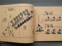
The Burden, by Miguel Yurrita. Yurrita did a number of formally interesting things in these comics. There were times where he didn't quite stick the landing in terms of being clever and coherent, but they are fascinating experiments nonetheless. One of Yurrita's interesting tricks is flipping the "camera" placement in a given panel. In The Devil and the Deep Blue Sea/Adrift, for example, is a flip book where you read only the right-hand side of a given two-page set. The first page sees a woman trying to flag down a ship, sinking below the waves and fighting a monstrous worm, only to meet her doom. Flip the book upside down and start again, and this time the narrative starts with her drowning, then fighting the worm, and then rising to the surface. It's a simple conceit, executed with precision. It would have been worked better as an accordion-style book where we couldn't see the left-hand-side pages, but once I got the gist of the book's rhythms, it all made sense.

The Burden is a looping story about consciousness that has a running conversation between either two beings or two aspects of consciousness existing simultaneously, one speaking English and the other Spanish. Starting from a pair of circles that look like eyes and/or part of a circuit board, the text circles and swirls above and around the images until they decide to create together. They take the form of cartoon characters, animals and various other forms of popular culture, which I found interesting as it suggested they had access either to a database or the collective unconscious, or both. After debating the meaning or lack of meaning of creation, destruction and mortality in general, the "higher self" and "lower self" (as they are introduced) flip languages and revert back to their original states, presumably to start the cycle again. Some of the drawing in this comic is a bit on the wobbly side, as Yurrita kind of went berserk in drawing a bunch of popular characters. It distracted from the overall narrative at times and the joke got old quickly. Still, the role of consciousness, agency and creativity as they all relate to each other made for a fascinating topic.


Monday, May 22, 2017

Comics-As-Poetry #4: Derik A Badman

Derik A. Badman has been dedicated to creating comics-as-poetry in the form of juxtaposed found imagery and found text. In the past, he's used images from old romance and western comics to create new meanings, but in these issues of his MadInkBeard comic, he goes in a different direction. In #5, he used a black background for his four panel template, blowing it up across two pages to make the small details stand out as much as possible. It's a classic abstract comics technique, creating sequentiality without narrative. In this comic, it's especially interesting because the lines of each panel are slightly different in terms of weight and solidity, creating a viewing experience that is deliberately less fluid. It also sets the reader up for Badman's next move, which is introducing text and images in the panels. There are allusions to nature and explicit mention of the moon and the possibility of its double, leading Badman to explore that imagery, including a panel that makes it appear that the viewer is in the forest.

From there, Badman explores images from washed-out photos from nature and other things, random bursts of color and verbal cues related to nature that are explored through the use of color and shape. There's an especially clever sequence where the cue is "we do not forget attachment" and the third panel has no top border as some blue shapes come pouring through. The fourth panel finds order restored with a top border present, penning in a wash of contoured blue. Badman concludes the issue riffing on the phrase "the three kinds of world", with all sorts of photos teasing this out, then uses erasure techniques in exploring the phrase "the way it manifests itself in everything", striking out one or more of the words in order to create a different context. This issue really worked well, maintaining Badman's restlessness with regard to how best to create images. His use of found images will likely always be a part of his work, but seeing him at least vary the sources made his work seem much fresher than it has been for a while. Not only that, but he played around with the words themselves in a way that was interesting, playing with their simultaneous presence and absence through the use of strike-outs.

Madinkbeard #6 is a fun issue with a clever core idea: taking bits from other artists on the envelopes and other packaging sent with minicomics and creating a narrative of sorts with that, an "unwitting collaboration", as he notes on the cover. Accompanying the images is text from Allan Haverholm that's all about reaching out to others through the mail and with personal notes, putting out information that will outlive one's immediate agency. The various shapes and colors accompanying the text are wonderful, with lots of drawings from Warren Craghead and Simon Moreton in particular. That's a great duo, given the fact that they love doodling in general, but also because of how they are able to break down images to just a few squiggles and lines. Adding the plastic quality of envelopes, tape, post-it notes, etc. gives the comic a lovely texture. Badman sequences things in such a way that images of a kind often appear together, like a series of faces drawn by different artists all seeming to stare off at different boats appearing on the horizon on the right side of the page. The end result is a comic with a sense of warmth that's unusual for Badman's output, in part because it was easy for Badman to pick up on this feeling from the actual materials that he received.

Friday, May 19, 2017

On The Occasion of Two Anniversaries: Personal Observations on Koyama Press and 2dcloud

When I wrote a piece for the Comics Journal after Dylan Williams died in 2011, I made sure to ask two publishers for their thoughts on him and his influence: Annie Koyama (Koyama Press) and Raighne Hogan (2dcloud). I thought of them because apart from Williams' close friend Austin English, Koyama and Hogan have carried on the Sparkplug Comic Book tradition more than any other publisher.

Let's consider Raighne Hogan first. I started writing about comics in 2000 (a review of Joe Sacco's Safe Area Gorazde for Savant magazine, edited at the time by Matt Fraction), but I didn't get really serious about it until early 2006, when I decided to turn my occasional column into a weekly for Sequart.com. So when Raighne sent me the first two issues of his Good Minnesotan anthology, there's a sense in which we were both starting out. Hogan kept going back, eager to improve and expand. From his earliest days, Hogan's mission was championing young and unknown talent, giving them a chance to do whatever they wanted. In the early years, the focus was often on John & Luke Holden and Nicholas Breutzman (his Yearbooks is still one of 2dcloud's best comics). Hogan made a point of finding work by interesting young queer artists as well; Anna Bonbiovanni's Out Of Hollow Water is one of the best comics of the last ten years. He published Noah Van Sciver, MariNaomi and Gina Wynbrandt. Along with one-time co-publisher Justin Skarhus (almost always a part of the operation), Hogan's choices began to become more assured, to the point where a reader could have complete trust in whatever came into their catalog. 2dcloud is now the undisputed avant-garde of American comics, and Hogan publishes books relying on fundraisers so he at least can break even and at the same time determine the audience base for his releases. That 2dcloud continues to thrive despite being so uncompromising is a testament to Hogan's determination and vision.

Addendum: I was extremely remiss in not mentioning Maggie Umber as a crucial part of the operation. As she noted in the heartbreaking article Getting Divorced In Comics, she was the co-founder of 2dcloud, co-editing and contributing to the very first Good Minnesotan anthology. She wound up handling more of the day-to-day particulars to keep 2dcloud afloat, including mundane but crucial tasks like keeping the books, as well as donating time and money that had initially been reserved for other things. Maggie is the person who made sure I got review copies. Without Maggie Umber, 2dcloud would not exist. She also notes many others who have helped behind the scenes beside Skarhus, including Blaise Larmee, Kim Jooha, Melissa Caraher, Vince Stall, Will Dinski, Saman Bemel-Benrud and Aaron King. She says that Raighne has always been the visionary of the company, but he was carried along by many others, none more important than Umber.

What to say about Annie Koyama? She's been a force of nature and a champion to Canada's illustrators and up-and-coming stars. Her relationship with Michael DeForge is one where both publisher and artist greatly profited from each other's presence and support. She too has a keen eye for talent and is a remarkably nurturing and positive presence. Annie is very much like Dylan in that respect: someone who always has time for an artist who needs someone to listen to them and get encouragement. I love that she has a stable of artists (DeForge, Patrick Kyle, Jesse Jacobs, John Martz, Jane Mai, Dustin Harbin) but also that she brings in new talent all the time, like Eisner-award nominated Daryl Seitchik. There's no end to the list of artists who want to work with her, and it's especially heartening when a veteran cartoonist in need of a publisher fits in with her, like Julia Wertz. She has long supported the work of queer cartoonists and of course the work of women, actively looking to create diversity in publication while still keeping an eye on getting people to buy them. Then there's all of the behind-the-scenes stuff that she does that's been so important to so many. Koyama's genuine warmth, keen intellect and empathy shines through in her books as well as in person, just as Hogan's innate sweetness and curiosity shines through in his. Koyama has had many helpers as well, including her sister Helen and the irreplaceable Ed Kanerva.

I've had the chance to grow as a critic in part because of the challenging and exciting work that they've published. I'm grateful that I've had the opportunity to review virtually everything in their back catalogs. I respect their integrity and am grateful for the respect they've shown my work. They represent what is best about comics, both in terms of aesthetic ambition and personal collaboration. May the next ten years be smooth sailing for them.                                                                            

Thursday, May 18, 2017

Comics As Poetry #3: Comics As Poetry anthology

The origins of comics-as-poetry go way back to the 1960s, at least in terms of poets incorporating illustrations. The origins of what I call comics-as-poetry go back to the 1990s, with Warren Craghead being one of the earliest exemplars of the genre. I first used the phrase in 2009 to describe John Hankiewicz' Asthma and Tom Neely's The Blot. In 2012, New Modern Press published an anthology by the title of Comics as Poetry, edited by Franklin Einspruch. It's a short but solid introduction to the genre, featuring some of its greatest exemplars.

William Corbett's introduction regrettably references superhero comic books and generally lacks a real point, other than "who knows what the future will bring". Fortunately, the first piece is by Paul K. Tunis, who opens and closes the book with a style that brings a decorative quality to text that is well-integrated with its corresponding imagery. His first poem addresses the plastic quality of words, in the sense where all words sound like nonsense or onomatopoeia if said enough. Contrasting that with cartooning representations of said words adds to the fun, playful exercise that this piece is. His final piece is just as playful, using vivid imagery in his description of a relationship between a man and a woman--a relationship that's somewhere between work, romance and mutual aggravation.

Derik A. Badman's piece is his usual stuff: repurposing the work of old cartoonists (usually from romance or western comics) and adding either his own text or text from a completely different source. It's a kind of shtick, but it's a surprisingly effective shtick in that this juxtaposition really does create a new meaning for both image and text. The melodramatic quality of the figures is "cooled" by text that's frequently oblique, but not random. Einspurch's own piece is what I would call more of an illustrated poem rather than comics-as-poetry in that the text could hang entirely on its own without the use of the watercolors of different kinds of flowers he employs in the poem. It's an amusing poem but just doesn't hang together like the other work in the book, and I think part of that may be that he was a poet before he tried cartooning.

Absolutely no one puts together a page like Warren Craghead does. His nautical piece uses carefully drawn images, scrawled lines, odd uses of spot color, a six-panel grid with no outside edges, images that bleed into each other and text that is attached to images and tumbles across the page. Despite the spareness of the drawings and the extensive use of negative space, Craghead's comics have a thickness to them that takes several readings to truly absorb. Jason Overby's comics are like that as well, only he's not afraid to go much more abstract than Craghead. He also makes extensive use of collage, found images, scribbles and repurposed text as he goes meta in a piece titled "Process Is Poetry", referring to process in creating anything, not just a poem.

Kimball Anderson uses a first-person point of view in her piece about riding in a car through the countryside and losing one's sense of self. Not just ego loss, but that sense of being unable to understand the difference between sleep and consciousness. The art here is mostly naturalistic, but the color scheme gives the piece a strange quality, like a sense of being hyper-real as though one is in a psychedelic state. Julie Delporte's story about OCD/pure obsession and tracing it back to her childhood and a fear of being hated by her parents over something she did related to sex is actually one of the more conventional pieces in the book. The accompanying images are quite straightforward, but it's her extensive use of colored pencil and open-page layout that makes it unlike other comics. Finally, Oliver East's feature employs some of that Craghead minimalism and negative space, but then goes in a different direction by providing small cutaways of walks around gardens, tiny slices of quietude that I found to be remarkably moving.

Wednesday, May 17, 2017

Variations On A Theme: Ibrahim R. Ineke

For Ibrahim R. Ineke, horror is hidden and forgotten knowledge brought to light. It's poking around in the woods and seeing things not meant to be seen. It's encountering ancient beings that look like children whose presence will bring no good. It's forbidden speech being spoken aloud, forbidden rituals made part of the everyday. It's the understanding that civilization is a facade, something that will fall away in time and be overtaken by the forest and its denizens. Ineke has been working and reworking self-published adaptations of Arthur Machen's 1904 story "The White People" over the last couple of years, culminating in a hardback publication issued by Dutch publisher Sherpa in 2015.

Ineke has long used three visual techniques. First, there's his own elegant pen-and-ink line. There's a delicacy, almost a fragility to his line that nonetheless allows for a great deal of naturalistic detail. His faces are mostly naturalistic, though they do have a slightly cartoonish quality that sometimes turn into twisted, terrifying images. His second technique is an extensive use of photocopying to repeat and distort images, often using double and even triple exposure. Along with the increasingly dark images generated by photocopying, Ineke also uses a lot of thinly-applied white-out as a mark-making technique.

In The White People, that white-on-black imagery opens the book as we see a number of figures deep in the woods notable for their lack of presence. They take up white space but have no other definition. Then comes a scene that Ineke has repeated in a number of comics: two boys playing in the woods, playing at being warriors or wizards (one even invokes Lovecraft lore and Cthulhu) and one boy running a little ahead of the other. In a slow burn of one panel stacking atop the other and the images getting bigger, we see one kid sitting in a field, his head half disappeared. Ineke flips from the bright sun illuminating a field to a dark cave (jotted with dots of white-out) with waterfalls. The child is looking at another world and is forever changed. In the book, Ineke then repeats the interaction, this time in color, and then repeats it again, this time with the implication of ritualistic kidnapping. There's a chilling image of a child turning around and their face being the image of a sinister-looking house, one where it's implied all sorts of awful things take place, followed by a full-page shot of a feral child-like thing. The book ends with two detectives looking for the missing boys, with one of them oblivious to his surroundings and the other all too aware of what the woods represent, especially with regard to "the good folk" or fairies.

An earlier minicomics version of the story with the same title included an introduction that made this connection between the city's men of power and their occult connections that involved the ritualistic abuse of children, including a reference to a sequence of symbols that appears in the stories. While this was useful, Ineke's decision to excise that bit made sense given his emphasis on imagery and suggestion over explicit explanation. Witch Route is a short mini with some forest scenes and some key (reprinted) text about testimonials regarding children who had passed through fairy territory and came back horribly changed. Again, it's an establishing text that later became assumed and tacit. White Court is a hand-bound and assembled mini that makes the connection between kids and fairies more explicit, as it starts with a stag hunt that turns on the hunter when he is surrounded, turns to a man playing a flute being seduced by a fairy, and then segues to a different version of the two kids playing at combat with each other, this time in an abandoned building and direct intervention from fairies. There's a more structured division between chapters and additional scenes, none of which are more effective than what wound up in the book.

Also worth mentioning is No Maps, which is a collaboration with Niels Post alternating spam comments from the internet with Ineke's imagery. The images range from spare to intense to horrific to amusing. Eloise is about a missing young woman and starts with violent, ritualistic image at a punk show mashed up with imagery from Catholic ceremonies. That juxtaposition, of rebellion vs tradition, is at the heart of the comic in the way that her story is one of betrayal by those she loved most. It relates to the other comics in the way she rejects the city and what she has known before and instead embraces nature and the outdoors, ending the book climbing a mountain (and perhaps not coincidentally wearing a jacket with the named of the punk group The Damned on it). Here, it's all scribbles and texture with line instead of other effects.

Finally, there's the anthology miniseries Black Books, where every issue also feels like a lab for a larger story. Each issue begins with a reference to Saturn in an astrological sense, and each story has its own twist on horror. The first issue is yet another version of the two boys playing in the woods, this time with an explicitly vicious ending. The second issue is a darkly funny retelling of the fate of Orpheus, his severed head forever alive, meeting up with a Muse who uses his head to perform cunnilingus and then kisses him--and then tosses him away. The third issue returns to the city, where secret arrangements add a sinister quality to interactions between lovers and the custody of children shared between families. The fourth issue lifts dialogue from an earlier comic and makes it an interaction between a lord and a servant, who gives him a report in comic book form that is rejected but triggers a sort of breakdown of reality. The fifth issue is about a heist gone horribly wrong when reaching the forest and includes tales of a Robin Hood-style archer causing mayhem before the reveal of a ghastly child (an image used in The White People). Finally, the sixth issue is about a merciless, pitiless witch deftly outwitting a spiritual world full of male forces.

Tuesday, May 16, 2017

Moreton of the Week #3: Smoo 8-10

Let's take a look at the last three issues of the self-published series where Simon Moreton got his start, Smoo.

Issue #8, in several small vignettes, talks about different ways Moreton felt the weight of anxiety and stress, and the ways in which he found himself coping. Walking around Washington, DC in the fall, the sight of a snapping turtle on a rock was somehow reassuring. Reading Moreton's work over time, he's become remarkably assured in his minimalist take, as he's not afraid to draw big, bold strokes or use a few strategically placed and confident squiggles around a simply-defined central figure. The vignettes refer to a relationship that's in the process of being redefined and reevaluated on the fly, in the middle of what is ostensibly a vacation. In classic Warren Craghead fashion, when he talks about the pieces of the relationship being taken apart, the very text that proclaims this falls apart, drifting down the page. There's a remarkable segment where he's alone in a bar, where the pages flip open and fold apart, as he feels powerless to stop what's going on in his life, like a "drunken ghost". Finally, there is quiet reconciliation and more contemplative walks, the event of music suddenly breaking out on the street the kind of marvel that reminds us of the random gifts that life can bring.

Smoo #9 introduces a lot of text on its own pages, as a kind of reflection and amplification of the images on other pages. This issue reflects on family and previous states of mind. There's a touch of a regular Moreton theme in the way that friendship endures and in many way freezes one's age with that friend back to childhood, while also being aware of being adults. It's about gatherings of friends and families at wakes. It's about understanding how and why someone isn't doing well at a given time in one's life. In "Doubt", Moreton ponders the notion that he's never really "lived a day in my life". There's a recurring theme in his comics that he feels stuck, running in place and living an inauthentic life. That's countered by the way he observes his environment and treasures his friends, because the ability to perceive and then convey beauty is a remarkable act of authenticity.

The final issue, #10, touches on a number of these themes. There's a lot of text used once again, as he thinks about places he's lived and the visceral qualities of each: sights, sounds, smells, heat, cold, etc. There's an interest in larger forces that shape his days. From lingering in the past to capturing a moment comes Moreton watching a group of birds in the fog, and then following a path with a lover to find a waterfall. This time, it's conveying that sense of aesthetic experience that is both shared and entirely personal, relaying a few moments in time in as stripped-down a manner as possible. It's his way of relaying that sensation of the sublime, when things seem to be moving in slow-motion, seem to make sense and are heart-breakingly beautiful. The issue ends after another nature excursion and then a slow moment at home, saying "We've been changing" That's neither a positive nor a negative statement, simply a fact of mutual experience. In exploring deeply personal and individual thoughts  while clearly trying to put them in a larger context, Moreton has expanded his range as an artist while still working within his strengths in depicting spare and expressive visual stimuli.

Monday, May 15, 2017

Alex Bodea's Six Breakfasts/One Lunch

Alex Bodea's Six Breakfasts/One Lunch is a self-published, hand-constructed book that almost has the feel of a dossier or other official set of documents.. The brown paper is rough on one side, shiny on the other. As an object, it's fascinating to look at, flip through and simply feel. It's a book that takes on macro subjects like worldwide terrorism, fascist totalitarianism and the refugee crisis and looks at them in the most micro manner possible. Bodea describes the minutia of working as a volunteer in Germany at a refugee center for displaced refugees, specifically in helping serve the titular six breakfasts and one lunch during the course of a week. There is no explicit, larger commentary; instead, this is simply the observations of a person helping other people get food.

Bodea's formal choices were interesting. The figures were painted with swift, squiggly brush strokes, providing just enough structure to understand figure, foreground, background and other key items. The text (which almost looks typeset) is circled on just one or two highlighted letters and then is pointed to a panel. With this simple set of tools, Bodea uses a landscape formatting to craft a number of panels about people waiting in line, the kind of food they eat, and what clean-up is like. Most of the refugees don't speak the same language as the coordinator, making some conversations difficult. The volunteer/author is able to help with the situation of one refugee's family, which he thought was being persecuted for having children by a childless couple. The careful smudges and brushstrokes quickly become an elegant kind of shorthand language that's both word and picture in its own way. The images are small and Bodea's strategy is to whip the eye across the page quickly, especially when depicting motion.

It is the details that allow Bodea to tell a bigger story. The refugees are in Germany and hoping for a better life. They have nowhere else to go. They are depending on the kindness of the centers, eager to eat the food in front of them and comfortable enough to complain when something's missing but also paranoid as to whether as to if the sugar is poisoned. Bodea helps someone who speaks the same language as him get to a train station, where they encounter a desperate man who has lost his papers on the underground. You may as well lose your soul or your memory in a situation like this. Bodea's ability to communicate so much with a simple brushstroke speaks to the power of that image as well as finding a way to create a rhythm with it. There are small joys and small heartbreaks, often revolving around children. There is bureaucratic weirdness (the volunteers have to handle certain items, usually for liability reasons), but there's also a genuine sense of caring. In the back of the book, added as inserts, are a couple of cards that detail certain items (the book is heavily object-oriented, meaning different foods and their containers most often) and how they made Bodea feel, as well as another card that has a "list" of characters and where they were from. Above all else, the book reveals the daily life of the dispossessed (and it is hinted that many of them are Muslim), those hoping for a new and better life, and those who haven't quite reached it yet but are being materially aided and not abjected by the people in their potential new homes.

Thursday, May 11, 2017

Comics-As-Poetry #2: Linen Ovens


Linen Ovens is a 2014 anthology featuring four cartoonists who would continue to carve out interesting paths in comics-as-poetry. Keren Katz, a rising star in the comics world, led off with "A Picture Of Health", a story that features a frequent motif in her work: a narrative thickness that is immersive in the sense that it demands a reader's full attention and a willingness to adhere to the frequently playful, absurd quality of her imagery. At the same time, Katz also uses a lot of negative space in her page design, letting the reader breathe and refocus their gaze on a page-by-page basis. Using colored pencil and a distorted figure composition, Katz weaves a tale about performance, celebration and secrets, as creatures pour from a tree to provide gifts and secrets. The use of color is dazzling and is crucial to moving the eye across the page in the ways in which Katz wants. The story follows the flights of imaginative fancy that follow after attending the ballet, with text that adheres to figures and creeps around the page. The tone is one of strange delight throughout the story, which befits the images.

Molly Brooks' "Selvage" leans heavily on its two-tone effect in addressing memory and place. The dark green of the sweater that's been knitted and its inner fibers is analogous to the narrator's thoughts, plans and dreams unraveling. The flashbacks to the finished sweater and a lover now gone add poignancy to the interminable Now the narrator finds herself in, having lost both a burden and a gift. Andrea Tsurumi's comics always tend to hew closer to light absurdism. In "Hectacle", there's a nursery rhyme cadence to the disparate set of farm-related images and the text that accompanies them, especially the phrase "biscuits and breath". Alexander Rothman's "The Thing In The Wall" is illustrative of one of his main interests: the poetic qualities of brief, quotidian moments. This story is about hearing a sound when one is about to drift off to sleep, a sound that shouldn't be there. It goes beyond simple fear or annoyance and instead follows a different path, as the narrator drifts into a dream (in a beautifully bright image that's a nice contrast to the greyscale of the other pages) and considers the way time is warped by perception, sleep and seasons. He ponders the theoretical existence of the animal he thinks he hears and mourns its theoretical passing in a touching panel where he's leaning up against a wall and the ghost animal is on the other side.

This is a strong, if short, anthology. It's a good forerunner/companion piece to Rothman's Inkbrick anthology and an excellent primer for just how broad a category comics-as-poetry can be. For Katz, it's about the image in itself that creates meaning. For Tsurumi, it's formal juxtaposition. For Brooks, it's poetic and abstract language that is aided by the drawings to help communicate the emotions involved. For Rothman, the images are conventional and the text is descriptive, but their combination is indicative of a place outside time and our conventional understanding of the everyday. It's a great place to start for those new to comics-as-poetry.

Wednesday, May 10, 2017

Moreton Of The Week #2: Rain and What Happened

Catching up with some more by Simon Moreton:

What Happened. A Kilgore Books release (one of my favorite small publishers around), leans heavily on Warren Craghead in terms of some of the actual drawings, but in terms of composition it's very much something else. Like Craghead, Moreton uses a lot of extremely thick lines in his drawings as a weigh of emphasizing weight, space and presence. They are deliberately non-naturalistic, as they are designed to make the reader think about that space and the drawing that's there than actually represent something. He uses zip-a-tone for similar reasons. Moreton messes around a lot with different grid designs, going from a four panel grid in the early going to an open-page layout on facing pages and back to the four-panel grid. When the storyline took on a slightly added level of complexity, Moreton quietly went with a six-panel grid that then filled up the page (he left negative space with the four panel grid). It's all part of the fluid rhythm of the comic, that sensation of rising and falling, of going from calm to excited and back to placid.

The structure of the comic revolves around a spring and summer Moreton spent as a teen. Using very few words, he gets across that amazing feeling when you're old enough to organize activities with your friends, go over to their houses on your own, etc. He also details the ways in which teens are sort of emotional ticking time bombs. There's one scene where Moreton is at a friend's house, and his friend just launches into a brutal brawl with his younger brother, leaving Moreton sitting there stunned. Another finds Simon and his friend Hadyn renting a UFO video that freaks them out; it's one of the two page, open-panel spreads, along with the fight. There are first loves, walks in the woods, trips to the beach, games of football and a glorious concluding segment where Moreton and his friend sit in a car, absorbing the words and music to a song from a tape they put in. Moreton is recording not a season, but rather a chunk of time specific to his friendship, and it ends with this segment, this song, the images and words jumbling together until the memory fades and the book ends with a number of blank panels in a row. Moreton had told the audience "what happened" and no more.

Rain and Other Stories. This is a more spontaneous effort, drawn from cues provided by Moreton's friends. The first story is "Three Transgressions", which Moreton imagined as people in fancy dress jumping fences and climbing through windows. This slightly moodier, darker work from Moreton, but it doesn't quite coalesce as well as his other work, especially since the rhythm of the piece feels off. "Fizzy Drink" goes back to his well of childhood stories, where here the hope of a new soda turns out to be disappointing. It's the opposite of a special childhood memory; it's a memory because of the way it so strong affected the sense of taste. "Rain" is the true highlight of this mini, as it combines a nice looseness in Moreton's line with strong compositions with regard to the buildings and trees (I love the way they almost jut up against the rain), The rain itself is drawn in a simple way that varies in intensity from panel to panel, as we see it batter a pedestrian until the lines get shorter and fewer and the storm goes away. Here, the length of the story really works to its advantage, as it needed to be a bit long to give the shower a real lifespan that has the correct feel, while still whipping across the page quickly enough to follow the story's main figure through the rain. The result is a beautiful, visceral story about watching and experiencing a rainstorm.

Tuesday, May 9, 2017

2DCloud: Sprawling Heart & Perfect Hair


Sprawling Heart, by Sab Meynert. 2dcloud has never been afraid to publish books that don't neatly fit into categories, and Meynert's book is no exception. I believe it's best described as an illustrated prayer and invocation for healing. The lush illustrations, including delicate pencil drawings, elaborate design work and vibrant use of color, give the eye something powerful to work with when paired against the relatively spare use of text. The prayer is about staying open, staying aware, looking for help and looking for connections. There's a repeating visual motif of flowering amidst an open hand, representing perhaps that it's important to understand how to be open to the things life can offer you, that one's mental state is key to accepting or not accepting what life has to offer, in all of its incarnations. The comic is all about flow, fluidity and water's paradox in being droplets and a wave all at once. That metaphor is used to explain our position relative to others: we are all water, whether we realize it or not, and we can either flow or resist--but the river will always keep moving.

Perfect Hair, by Tommi Parrish. This is an audacious debut by Parrish. It's interesting that Dash Shaw offered up a blurb, because among the many influences that Parrish cycled through in the course of this book, Shaw was the most significant. The layout, the use of diagramatic text, the use of textual onomatopoeia in place of more typical sounds effects, and simple line are all there--except when they're not. Eleanor Davis is another obvious influence, and there may be hints of Gary Panter, Chris Ware and many others. What's remarkable is the way they are able to dial in and out of a particular visual style, often in the middle of a story. In "Train Scene", Parrish begins with a naturalistic color setting at the station, then switches to a pencils-only page, and then to the big, blobby character design they use for much of the book. In other words, the "real" image, the self-image, and the way she looks at others. The result is a style for Parrish that becomes uniquely theirs, whipping the reader from narrative fragment to narrative fragment while still retaining a cohesive set of character profiles.

This book is a short, punchy series of vignettes about gender identity, sexual identity and its boundaries, isolation and alienation. In particular, it's about the feeling of being embodied and being alienated from one's body. The two leads (and as it is implied, lovers) Nicola and Cleary, each experience these feelings in their own way. Nicola is a bespectacled sex worker and artist who is at once settled in her life but also has trouble accepting the narrative put upon her as a constantly objectified sex object. There's a remarkable scene where she is hearing the narrative of a guy trying to run his patter on her. She pops off her breasts and then eventually pulls herself out of her body, leaving behind the colored form of her skin to reveal a stick figure, walking away. Later, Nicola encounters another familiar John trope: the white knight. He wants her to act like she's in love with him, and then later says he can "save" her from "all this" because he has money and wants to make her his wife for real. (Hilariously, she replies, "This what? This conversation?")

Meanwhile, Cleary (named for Beverly Cleary, perhaps?) is the cool Nicola's opposite. She goes to what appears to be a kind of fetish club and panics when a man doesn't so much frighten her with his desire, but rather puts her off as he begs her for validation of his existence. In fact, the player, the white knight and the man in the club all rely on the women in the book to validate their existences in one way or another. Cleary's reaction was to have a panic attack, but she also had learned how to control them with breathing exercises, a key point that illustrates the ways in which both Nicole and Cleary have found ways to navigate and even control their environments. When a doctor later mistakes Cleary for a boy, she doesn't mind. This touches on an earlier story where the characters aren't named and the figures look different, but it is clearly Nicola and Cleary's story and personal backstories, one of which refers to Cleary eventually coming out as trans. The way Parrish loops the reader in and out of these narratives rewards multiple readings, as the connections become clearer and the sheer craft setting up subtle signals is remarkable. Parrish's use of color is frequently sublime, evoking emotion while still staying true to the figures. This is a remarkably ambitious novella that hits every emotional beat while employing an array of narrative tricks that are more than just formal pyrotechnics.

Monday, May 8, 2017

Fantagraphics/Hic & Hoc: Vague Tales & Dad's Weekend

Vague Tales, by Eric Haven. In a lot of ways, Vague Tales, is the logical conclusion to the sort of comics Haven's been doing for a long time. The weird attachment to barbarian stories, witchcraft, monsters, superheroes and regular guys standing their living room have all formed the background of his storytelling interests for years. The level of craft he attaches to each demonstrates a familiarity and an affection for genre tropes that is undeniable, yet he comes at them in such an odd way that it's hard not to chuckle at his storytelling decisions. This is not naive storytelling that is funny in spite of what the author intends; rather, Haven's approach is clearly entirely calculated. The riffs on slice-of-life comics spinning out of control make that obvious. The reason why it works is because his use of mostly silent storytelling adds a level of dryness to the proceedings that is often lacking in overheated genre potboilers, where writers insist on purpling up the prose to within an inch of the story's life. Instead, Haven focus on what a kid would see: striking images, strung together in such a way where it's easy to understand what's happening, even if the reader has no clue as to why.

That titular vagueness helps make the stories funny. What sets apart this very slight book (just 74 pages, including the end papers) is the way Haven throws story after story at the reader and then has them bleed into each other in unexpected ways. It opens with a man standing in his living room, but the first story proper is "Psylicon", which is four pages of a crystalline man with thoughts like "ponder" and "brood" whose head explodes on the last page. It's a parody of 70s Marvel comics filled with cosmic characters who moped around the universe. "Ruin" features an emaciated ghoul of a woman (a favorite Haven trope) who flies around in a biplane, shoots down a spaceship and sucks the souls out of the pilots before they crash. "Pulsar" features a barbarian character who looks uncannily like the 1970s Captain Marvel character with his costume all but torn off, and he decapitates a monster. "Sorceress" finds the titular character going into a mountain until she encounters the head of the crystalline man.

That's the pivot point for Haven, who suddenly brings all the characters crashing together. There are fights, mysterious connections, and as is often the case in a Haven comic, the end of the world. Only it isn't--it might be just a thought in the crystal man's head, or in the imagination of the man in his living room, who is only flesh and bone, as both the cover and the last page of the story indicate. What does it mean? Well, it's vague. Every story is about pointless violence, pointless destruction and a general dealing in pointlessness. Why does anyone do anything in these stories do anything? They obviously feel compelled, which is funny considering the man in the living room seems to have no compulsions or agency of his own, other than to daydream and imagine other characters with a purpose, no matter how banal or pointlessly violent. They're vague because the limits of the man's imagination allow them no further shape. They're the images of a man-child, and it seems that Haven is satirizing that tendency toward indulging this sort of infantile fantasy as much as he is celebrating it.

Dad's Weekend, by Pete Toms. This is a character study that is impeccably structured. It's about a conspiracy theorist and his young adult daughter, and their attempt to reconnect over a weekend. It's a funny, slow-burning, slow-building story that is also genuinely sad. The story is mostly told from the highly sardonic point of view of his daughter Whitney, and the story starts with her friends telling hilariously detached stories about their horrible futures, including one who plans to be a "failed arthouse film director", going into great detail how he will accomplish such a thing. Whitney has her own "20 year plan" of failure which is equally funny, as she and her dad exchange quips. Then the already-strange story takes a weird turn, when Manny (the dad) finds out that a friend of his is missing. This leads to a hilarious but unsettling series of events where he talks to his wife, detects something off about her and then throws a hot drink in her face.

Essentially, he was so deep in conspiracy theory decoding that he had altered his own perceptions, or rather lived in a world where what was coincidence or a trick of the ey. e became proof that his friend's wife was a lizard person. When he was found dead ("he ran himself over in a parking lot"), Manny attends the funeral and screams "This funeral is a false flag!" Eventually, he reveals the source of his paranoia: the existence of his daughter. When he saw what he perceived as the sheer terror of being alive in her eyes as an infant, it drove him from being a person who saw meaning in nothing to someone who desperately yearned to find the secret meaning of everything. It's classic conspiracy thinking, in that it's better to believe that some horrible force is in control of the world (and hence your life) than to believe that nothing and no one is control, and that everything is random and chaotic. Toms is playful at times with regard to the reality of the situation (especially in the last panel of the story), but the reality is less important than that conspiracy theorist's state of mind. The paradox is that "awareness" of the conspiracy induces a kind of debilitating madness that's exactly what They would want for you anyway. Visually, the comic has an odd flatness to it. It looks like it was drawn on a computer, and it relies on color fills quite a bit to tell the story. The strange visual tone of the comic is a perfect match for the flatness of affect of both of the main characters, who both deflect the sad reality of their situations by denying it in some way