Tuesday, April 30, 2013

Sequart Reprints: Windy Corner 2

The following article was originally published at sequart.com in 2007. Austin is now the publisher of Domino Books. Please consider buying one of the many excellent works he's released, especially since he's losing his base of operations (the legendary Cartoon House). Get the first five Domino books for just 26 bucks, with free shipping. All of them are quite good and unlike most comics you've ever seen.
*************************

My favorite kinds of publications about comics, as I have noted in this series, are those that reflect the idiosyncrasies and passions of its editors. Windy Corner Magazine (WCM) is an exemplar of such a publication. I am particularly drawn to WCM because I share some of editor Austin English's more eccentric tastes, and he does little to buffer or prepare the average reader for them. It's a tact that can be a little demanding on a reader not familiar with English's approach to comics and criticism. The focus of WCM is artists writing about and talking to other artists, an approach that makes sense given English's status as an artist and critic.

I like the give-and-take collaborative feel of WCM. Lis Timpone designed a clever table of contents. Molly Goldstrom opened up the magazine with an odd two-page strip where a man prattling on about his love of bricks fails to notice his companion turn into a tree. Juliacks contributed the back cover, a typically dense collage of image, tone and text with a certain wistful quality.

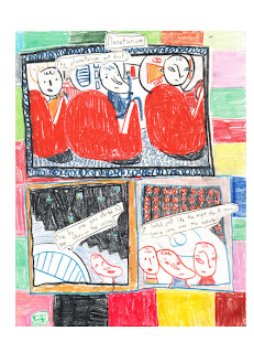
English continues his autobiographical series of comics with a couple of evocative entries. The emphasis of these stories is on his earliest childhood memories, and I love the way he homes in on tactile sensations from memory, like the feel of the chair he sat in, the distress he felt upon hearing the sound and flash of a star "explode", and the soothing sound of the planetarium show's narrator. In "Movie", his memory is as much about the way he interacted with his parents before and after a movie he saw as the movie itself. The former story looks like it was done in colored pencil, and the decorative quality of the colors he uses to balance out his panels is striking. It balances the panels and actually draws the eye in, something lacking in the second story. That sort of pleasantly ramshackle design quality of his works nicely in his second "Life of Francis" episode, which is almost expressionistic in the way it depicts feeling and emotion. Fiona Logusch's "Entangled Relationships" reminds me a bit of Jules Feiffer's work, both in terms of the way she moves her characters around and the rawness of the emotions she portrays.

The feature article on children's book illustrator Lois Lenski was positively inspiring. English is unusual for a critic in that he seems to have an intuitive sense in how to discuss the formal qualities of a work in such a way as to bring it alive for the reader. I knew nothing about Lenski's work going into this article, and English probably would have been well-served to have at least some sort of introduction to her work. That said, I appreciate his enthusiasm about the subject and the way he quickly immerses the reader in the formal and aesthetic qualities of Lenski's art.

The interview in this issue was one of the most enlightening I've ever read with a cartoonist. John Hankiewicz, creator of enigmatic & beautiful comics in minicomics and the collection Asthma, was interviewed by cartoonist Onsmith. Hankiewicz reveals much about his working process, the way he approaches doing comics, why he loves printmaking, the specifics of certain stories and his general aesthetic outlook. Onsmith uses his deep knowledge and appreciation of Hankiewicz's work to take the conversation to some interesting places, but he always allows Hankiewicz room to expand on his thoughts.

The standout feature in an issue filled with great features is Dylan Williams's strip about Alex Toth. It's a series of stand-alone images done in what looks like colored chalk, each accompanied by a caption loosely associated with (almost interpreting) the text. It's a wistful piece dedicated to Toth and the intermittent correspondence that Williams had with him over the years. It's also about relationships and friendships and the way Williams approached them and how his feelings about them changed. It ends with a statement of purpose that connects his feelings about being an artist, about Toth, about comics and about long-distance friendships. I can only imagine this piece running in a magazine like Windy Corner , and that's why Austin English's indulgence in his aesthetic passions winds up as a gift to readers.

Monday, April 29, 2013

Truth and Fiction: Madtown High 1-3

Whit Taylor is a thoughtful, interesting up-and-coming cartoonist who's mostly done autobiographical work. However, I think she's really found her voice with her high school vignettes in Madtown High, most of which are fictionalized accounts of real events. While based on her own experiences as a new kid at a high school, Taylor smooths out these events with a solid narrative structure and cohesive characterizations. She's careful to eschew easy cliches about popular kids and jocks while writing with affection about the group of oddballs she found herself associating with. Giving these life events a narrative structure allows Taylor to shape them into vignettes that flow into and out of other stories, building continuity details like any good series. It also gives her a chance to show off her comedic chops, because many of these stories are very funny. That humor is mined out of the humanity of her characters and the way she provides the kind of small, intimate details that allow a reader to get to know them in a short number of pages.

In particular, Taylor's tales of particular teachers both humanizes them and allows them to be larger than life. Their orchestra professor was obsessed with the violin player from the rock band Kansas and hoped to get him to appear as a guest at their spring concert. When he doesn't show, he's crushed. Taylor gets at the way teachers burn out and often put their hopes on the most trivial of events as a way of breaking through the crushing despair of having to teach so many apathetic children. In another issue, her account of  her AP Biology teacher going through a midlife crisis was fascinating, funny and a little sad, as his own last-ditch attempts at doing something meaningful as a teacher flamed out, leaving him to quit the profession. Yet another teacher proved to be the unlikely recipient of the affection of Taylor's stand-in Wren and several other girls, despite (really, because of) his many, many quirks. Having his photo turned into a cake was a demented master stroke, especially when the recipient kept the bit of frosting with his face on it frozen for months.

Taylor's own stand-in is a little naive and geeky, but not in a stereotypical sense. Wren is great at Science League (an interschool series of contests), develops a crush on her brother's bandmate, is clueless as to why dressing up like a beaver is probably a bad idea, and makes cheesy videos with her friends. Taylor is especially adept at taking a reader inside a world where hanging around a group of strange people (not all of whom are close friends) tends to create inside jokes and highly ritualized behavior of the off-kilter variety. While Taylor's line is crude, something about this setting frees her to draw with a lot of energy and enthusiasm, especially the odder-looking and acting characters. If anything, I'd like to see her art get even more stylized with regard to her characters, rather than try to stay within naturalistic bounds. Taylor really seems to have found her niche with this kind of storytelling, and she produced a book's worth of these strips that hold together quite cohesively while still working at an individual level as a series of discrete vignettes.

Update: Whit was kind enough to send along the fourth and fifth issues of Madtown High. These issues wrap up the series, and it was clear that she really got on a roll as she built up the series' continuity and characters. That bit of world-building added a level of depth and complexity to the series in a manner that I thought was charming. Taylor has a way of addressing typical high school concerns and activities in a way that feels real and lived-in. For example, "Sleepover" is about her female friends coming over and inevitably talking about sex, with some of her friends being more experienced than others. She was then able to turn that into a punchline. Taylor also talks about being both a nerd (competing on a physics team) and a jock (detailing her assorted forays into team and solo sports, with shot put being her best sport). There's also a specificity of time and place: it's late 90s in New Jersey, and the influence of grunge and straight-edge culture were a big deal for her peer group.

The fifth issue sends us into her senior year with cultural touchstones like 9/11 (and the ways in which various adults at her school reacted) and personal touchstones like a senior "lock-in", prom, a trip to the Jersey Shore to get drunk and graduation. Each of them is filtered through her unique sensibilities, with the "lock-in"'s discussion leading her to admit out loud that she felt different and awkward because she was one of the only black kids at a mostly white school. The Shore trip was interesting because these were straight-edge kids who decided to get drunk for the first time as a rite of passage. Taylor doesn't sensationalize or oversentimentalize high school, but she also recognizes that, for her, it was a time that was extremely important and satisfying for her, thanks mostly to her group of friends. I think this story will ring true for many.

Friday, April 26, 2013

Gag Comic Round-Up: Garrison, Stewart, Staveley, Canini/Baxter


Onion Puss #1, by Chris Garrison. The artist behind Jakey The Jerk comes up with another predictable but solid series of jokes surroundingg its bulbous, off-putting titular hero. Garrison's agreeably cartoony style is well-suited for his gags and his onion-faced main character. He's a compendium of socially awkward, offensive tics who is nonetheless a sort of innocent in the face of his abiding crush on a skinny redhead named Priscilla. The short gags featuring OP stalking her in a video store and using offensive language while trying to mirror her evangelism were OK, but the real attraction in this issue is the long story "Ghost of a Chance". It's an extended riff on "Ghost Hunters" type-nonsense, with OP being treated as a sort of loveable scamp who winds up being seduced by a real ghost and saved by a buxom blonde who tries to overlook his many, many faults by saying "We'll have to work on that". When they set up a date at the end and she says something incredibly racist, OP can only say "We'll have to work on that." Garrison is an assured draftsman who uses an exaggerated line to great effect, and the result is a solid, well-crafted joke comic.The premise of the strip and the general nature of the jokes are both silly to the point of fluff, so it's a credit to his skill that he makes this material work as well as it does.

Odd Comics #1-2, by Scott Stewart. Stewart is an accomplished style mimic who pays tribute to a deep roster of cartoonists in this series of gags, homages, puns, eye-pops and other such silliness. Early R.Crumb is his most indelible influence, especially in the series of ridiculous puns in his "Euripedes Pants" stories. Of course, Harvey Kurtzman and Will Elder's MAD is another stated influence in bits like "The Halfway House On Haunted Hill", a very funny story that puts monsters in therapeutic settings. In a more modern context, Stewart reminds me of a slightly less accomplished version of Roger Langridge. His line isn't as clean nor his mimicry as impeccable, but he shares Langridge's sheer relentlessness on the page. Hardly a panel goes by without at least three different jokes, funny drawings or puns in it. He goes deep in his homages and parodies, with "The Moon-Faced Monarch of Matzohville" being a take-off on George Carlson's "Pie-Faced Prince of Old Pretzelburg". It works as homage, but like everything Stewart does, is still very much in his own straightforward, joke-soaked style.

Issue #2 features a long homage to the characters in the comic-book based film from the 1950s, Artists and Models. It includes Stewart's imagining of the ultra-violent character shown in the movie and even includes an Alter-Ego style interview with the artist behind the strip (played in the film by Dean Martin, hence Stewart throws down tons of Martin & Lewis references in the story). While most of the stories center around getting to punchlines (as "Bad Jokes for English Majors" and "Bad Jokes for Philosophy Majors" might indicate), there's also an enigmatic, extended homage to Moebius by way of Shelley. Seeing Stewart strip down his line to a sparse minimum was interesting after seeing him go big and broad for everything else he does. The story seemed to me to be an ode to the poem "Ozymandias", only the explorer in the desert this time has the opportunity to interact with the monument, deeming it wise to simply walk away in the end. Stewart is not an innovator as a humorist; everything here feels like it's directly linked to a vast network of influences. This is not to say that these comics aren't entertaining or well-crafted. Indeed, there's a great deal of pure pleasure to be gained from looking at his drawings and connecting the dots to his many and often obscure references. I'd gladly read another issue of this comic, if only to see what Stewart is keen to mine next.

Anxious Robot Funnies #1-2, Mitt Romney Meets James Brown, by Jotham Staveley. Staveley is a relative newcomer to comics, but I find his energy and approach to be quite appealing, and he shows great promise as an artist whose sense of humor resides between pitch-black and absurd. His shtick is drawing robots and monsters in a crude, slightly over-rendered style and having them discuss issues that range from the banal to the emotional. "Battle To The Death", for example, is a conversation about one guy telling another guy that he's not going to invite him over to Thanksgiving because he and his wife are keeping it low-key. The action, however,  is that of a man battling a sort of shadowy monster in a brutal fistfight. The second issue sees the titular anxious robot putting out a tip jar for his trumpet busking performance, only to be interrupted by a male and female giant monster couple getting into a fight, then wrecking the city, then getting disintegrated by a giant robot. Staveley makes the intensity of his rendering work for him even if it lacks clarity at times, thanks to the sheer ridiculousness of what he's drawing as well as the simplicity of his figures. His Romney/JB comic is very funny, with the Godfather coming back the dead ("I'm just laying low") to slap Romney around and pound some sense into him. Staveley clearly knows his JB mythology and captures his iconic, charismatic presence. These minis are all very short (I believe they were the product of a workshop at the Center for Cartoon Studies), but it's obvious that Staveley already has a voice and style all his own; all he needs from here on out is to refine them. His short, untitled booklet of sketches (with CD!) reveals an artist bursting with ideas.

Drunken Cat Comics Anniversary and Ruffians 1-7, by Brian Canini and Derek Baxter. Canini (with occasional writing partner Baxter) has been drawing for over eleven years, and the Drunken Cat comic collects representative work from this period. Ruffians is a heavily Dave Sim-influenced series about funny animal mob hitmen, with a gorilla framing a short bear that wears boxing gloves. Neither held much interest for me; it all seemed to be material that I've seen better-written and better-drawn elsewhere. The strip about the Devil going to his high school reunion felt like a paint-by-numbers affair, as the jokes were easy to predict from beginning to end. Ruffians is an obvious labor of love whose tone is discordant from the very beginning. Like Sim's Cerebus, only a couple of the characters are anthropomorphic animals, which makes following the action a bit strange because it's almost entirely devoid of humor. Indeed, the mob and prison cliches feel pretty rote, though there are a few interesting twists and turns (like the main character, Scar, getting his Kilgore Trout moment when he meets his creator in a fumetti dream sequence). Canini's storytelling lacks clarity and style and just looks messy. Even his more recent work has a simple, bland quality that serves to move the story along and little else. His work does look better in color on his website, however.

Thursday, April 25, 2013

Sequart Reprints: Solace of the Road: Abandoned Cars

Tim Lane is one of those 20-year overnight successes in comics. He's been doing comics and illustration work for quite some time, but it's only recently that his work has become widely published. In places like Typhon and Hotwire, Lane's spare, stark pulpy stories have stood out. It's to his credit that they work even better as a collection, and Abandoned Cars feels spun from whole cloth rather than carefully stitched together from a number of disparate sources. It's an unusual work because the stories seem so familiar, which is not surprising given the broad array of influences that Lane freely admits to. At the same time, they don't seem to be particularly derivative of a single source, but are rather a fusion of inspirations from comics, film, literature and a hard-lived life. While Lane's goal was to highlight some aspects of what he refers to as "the Great American Mythological Drama" as a broad experience, the way he does it is intensely personal.

In terms of subject matter, his biggest influence is Jack Kerouac. He's drawn to the author's attempt at creating that American myth, especially in terms of wandering about the vast spaces of America. Every one of his characters is restless and unsettled. Some openly take to the road as a kind of temporary relief, while others run from their misery in more metaphorical terms. Unlike Kerouac, Lane isn't interested in building up that myth around himself; even in the autobiographical story about train-hopping titled "Spirit", he openly admits to being in the shadow of his heroes. Lane takes a big cue from Joe Sacco in this regard; not only does his art have a lot of the unfussy, naturalistic characteristics of Sacco's line, but his own self-presentation is decidedly self-deprecatory. Lane becomes one of his own characters: lonely, a little desperate, searching for something and hoping to find it on the road.

There aren't any morals or even real beginnings or endings for most of his characters' stories. There's a touch of the grotesque and the absurd in his stories that lightens and even deflates his narrative style. It's a bit reminiscent of Daniel Clowes in that respect, and I think both artists drew from a lot of the same 1950s illustration influences. Lane goes in a slightly different direction than Clowes in his use of noir stylings. The use of shadow, stark black & white imagery and close-ups recalls the work of Charles Burns, along with his character design. That said, Lane's stories aren't really like Burns' or Clowes'. The more eccentric influence of Clowes is mitigated by the spare, unadorned frankness of Ernest Hemingway.

Many of the stories center around bars and the way that they can act as refuge, crucible, storytelling center or deathtrap. In "Outing", a couple of friends narrowly dodge death in a bar filled with crazy characters, only to meet a grim end on the road. In the book's biggest standout story, "The Aries Cow", the barkeep tries to imagine the life of an old man who comes to her bar to escape his demons, only to give him a tantalizing bit of information that winds up leading him to his end. "Sanctuary" is a classic tale of a man who's done something horribly wrong and knows that he'll be punished for it, having a drink with one of the men who will be meting out that punishment, defiantly delaying his fate just a bit longer. Even Lane's version of "The Story of Stagger Lee" takes place in one of the most disreputable bars in St. Louis. Lane is clearly drawn to the bar as a place whose purpose is not just inebriation, but the possibility of human contact and communication.

If the bar represents community for Lane, the car represents not just the possibility of escape, but the illusion of solipsism. Cars are tied closely to notions of identity and triumph over one's situation. In "Cleveland", a man at the end of his rope drives to Cleveland to be present at the birth of his best friend's first child, and manages to find a spark of inspiration. "Ghost Road" is about that urge to hit the road only to find that even talking to like-minded individuals doesn't dull pain. "Doo-Wop and Planet Earth" concerns the desperate urge to connect with another as one is ready to leave town, and how that attempt is both an act of cowardice and a leap of faith.

The stationary characters in Lane's world have generally descended into madness. In the book's interstitial pieces, a shut-in is consumed by delusions of grandeur and begins having demented daydreams. In the "The Manic Depressive From Another Planet", another shut-in dares to confront the world despite his near-crippling fear. "Spirit" addresses all of the book's themes: restlessness, the attempt to create meaning out of the randomness of our lives, the way that stories and legends accrue to create our understanding of America, and the need we have to connect our own personal narratives with those overlying American legends. Lane goes a step further in building his notion of American myth with other interstitial features like paper doll cut-outs of American originals like grifters, rockabilly dancers, Chuck Berry, good cops/bad cops, etc. He opens the book with a drawing of young Marlon Brando and ends with a drawing of an older Brando, bookending two views of an actor whose own symbology declined as he aged. Abandoned Cars will appeal to anyone who's ever sought out the comfort of the road, the urge to jump a train, or who looked for answers in the company of fellow patrons at a bar.

Wednesday, April 24, 2013

The Image, Reimagined: Ticket Stub

Published by Rina Ayuyang's new imprint Yam Books, Tim Hensley's Ticket Stub is a dizzying reimagining of still scenes from film, drawn into his sketchbook during slow moments in his job as a closed captioning writer back in the 1990s. The films and TV shows he captioned range from Oscar nominees to the dregs of the B-movie file, but Hensley's poetic interpretations twist both into the hilarious, the ridiculous, and even the poignant, as the frenzied nature of his quickly-captured image burst with life on every page. Originally published serially as minicomics, Ayuyang is yet another publisher going out of her way to rescue classic minicomics series from obscurity, and this collection couldn't be more attractive. The bottom of each page has a small oval slice "punched" out of it as though it were a ticket, a clever detail that adds to the package's overall appeal.

As anyone who read Hensley's classic Wally Gropius knows,  there's a stream-of-consciousness quality to his use of language that's closely tied into surprisingly tight narratives as well as references to pop culture, literature and history. Above all else, Hensley lives to serve his gags, twisting conventional understandings of situations into something still recognizable but quite odd. In other words, it doesn't necessarily make this book any more or less easy to follow if you've seen the movies he references. He turns Love and Basketball from a romance into one of the characters becoming a foul-mouthed coach. He turns b-movie Killer Klowns From Outer Space into a deeply existential crisis of a film ("Need teen groping be such a horror?") He uses a horrible pun involving the name "Ephraim" as part of his account of the biblical film Jeremiah. Wrestlers in cheap fight films are given noble motives, while actors in art films are reduced to parody. Through it all, Hensley's patter weaves between detective novel staccato to cheap advertisement for "Colonel Corn" products to nasty zingers ("In the future, men will live in advanced technological domiciles called 'caves'" for Battlefield Earth and "A bear costume escapes from a zoo..." for Hercules in New York. I most enjoyed the absurd Hensley, like his running motif on the primacy of beards running around Gettysburg.

The last chapter is the greatest, and I can understand why Hensley left it that--there was no way to top it. It's a tour-de-force of repurposed scenes mashed together one after another. It goes from a police procedural to a beach blanket movie to Apollo 13 to even weirder pastures (the panel-to-panel switches between different people on the phone spewing nonsense was astonishing). The slightly relaxed nature of their earlier pages allowed the reader to take in the image from the film, drawn in a style that was realistic yet rendered slightly grotesque and cartoony in Hensley's hands (it's very different from his John Stanley/Dell Comics inspired work in Wally Gropius). In the last chapter, Hensley whips the reader from panel to panel with no time to breathe or think, drowning them in pure, glorious craziness. It climaxes in the Beatles singing a song using baseball play-by-play as lyrics, forcing their fans to weep as they confess their sins. Later, an unseen fans has one of the musicians sign a baseball, saying "Make it out to J.D. Sallinger". It's as fitting an end as any for a cartoonist who was clearly bored out of his mind by his job. I see these strips as a reaction both to that boredom and being forced to watch these films in a very specific way that's guaranteed to squelch any aesthetic enjoyment whatsoever from them. In Hensley's hands, it makes sense that all content was treated the same, because for a captioner, all content was the same. At the same time, it's not all ridiculousness; Hensley captures genuine insight into many of these films, boiling many of them down to their essence or bringing a new (if skewed eye) to the proceedings. The reason why the last chapter works so well as a sort of film mish-mash is because so many films are the same. That said, Ticket Stub shouldn't be read as an explicit form of film critique. Instead, it's a testament to Hensley's unique ability to process culture and images and turn them into something disorienting, hilarious and beautiful.


Tuesday, April 23, 2013

Sequart Reprints: Chewing Gum In Church

I'll confess that I've never been the biggest fan of Steve "Ribs" Weissman. Having read his Kid Firechief stories and assorted strips here and there, I'd always thought his stuff was cloyingly cute. The smartass element of his work was obvious, but it was in a weird no-man's land for me: not charming enough to work as kids' comic but not enough bite or brains to draw me in as an adult. I went into reading his new collection of strips with an open mind but low expectations.

Imagine my surprise when I found myself won over by Chewing Gum In Church, a collection of connecting gags featuring Weissman's little monsters. To put it in high concept terms, the strips feel like Peanuts meets The Addams Family. We follow the day-to-day exploits of Lit'l Bloody (a vampire), Pull-Apart Boy (a Frankenstein monster), X-Ray Spence, Kid Medusa, Dead Boy (a zombie) and Chubby Cheeks (an obnoxious fat kid). There's a gruesome, visceral quality to the strips since these kids are literally monsters, but Weissman's cute figures and thick black line balance the proceedings. What really stands out are Weissman's cruel punchlines and his intensely strange & non-intuitive use of color. Weissman goes from garish two-color strips to more standard four-color comics, with the two-color strips usually nastier. Weissman also has a lot of 4-panel (or more strips on a page), and then also stretches out several stories to a panel a page. This variation allows him to keep the reader off-guard, not knowing exactly where some stories begin and end; it creates a narrative to go along with the gags. Still and all, the gag's the thing here. The best features Chubby & Pull-Apart Boy enjoying a pie, with the latter coming up with an idea to sell them in a yard. Of course, their sign, "Guys With Pies", draws a slightly different (and more perverted) clientele than than they expected!

Like in Peanuts, the kids in the strip are wise beyond their years and can be quite cruel. The meanest of them all is Chubby, who at one point rips off Pull-Apart Boy's arm and starts beating him with it, saying "I'm doing you a favor." There's also a self-awareness at work here, as one character starts riffing on how the strip should be interpreted as a commentary on "middle-class youth" which immediately get turned into a gag. While there's obviously a lot of room for metaphor with his characters and their surroundings, Weissman is firmly rooted in the present, material and (often) the gross-out.

My favorite character is the poor put-upon Kid Medusa, shunned by all and just looking for somewhere to fit in. She envies the ants' sense of purpose and meaning and destroys their hill. She begs the queen of the ants to accept her, and not hearing anything (they are ants, after all), jumps up and down on them in frustration. Medusa then tries to join up with the bees, mistaking their swarming her with acceptance. Finally, she mistook a black widow in her mailbox as a message from her missing father, resulting in a fatal bite and a series of joyful hallucinations. Her story is the book in microcosm: somehow demented and sweet at the same time.

Monday, April 22, 2013

The Moment: Sumo

What makes Thien Pham's book Sumo (First Second) so effective is that its story is very slight and its characters barely fleshed out, but it doesn't overstay its welcome by padding itself. In its 95 pages, what Pham is really after is illustrating the implications of a single phrase: "Every moment is the moment of truth." Along the way, Pham strips his story of nearly every extraneous detail and narrative prop. Scott, a former college football player who travels to Japan to become a sumo wrestler after the love of his life leaves him, finds himself at a crossroads in his career as a wrestler. Flashing back and forth and time with the clever use of a simple color scheme, we quickly learn that Scott has faced many crossroads and has managed to come through every time. The book ends without a definitive answer regarding Scott's last bout, but that answer was unnecessary thanks to the way Pham cleverly collapsed and sped up the flashbacks at a dizzying rate at the end of the book.

Pham is in complete command of the structure of the page and the book, effortlessly guiding the reader back and forth while using his appealingly blocky, spare style. His use of color makes all the difference as a storyteller, instantly providing the reader with an understanding of how and why the setting has changed thanks to a flashback, something that's reinforced by the symbols around his page numbers. The symbol with the sumo wrestling mat represents the present, the symbol with the water tower represents his past in California, and the symbol with the fish represents the near past when he meets a girl in Japan and develops a profound connection with her. Pham implies the nature of that connection was actually deeper than the one he had with his American girlfriend, in part because of the way his new relationship was one where he not only felt accepted for who he was, but that he had something to offer her beyond surface qualities.

Pham manages to inject moments of humor into what is otherwise a very still and somber narrative when we flash back to Scott's going away party. His friends are funny and vary in their acceptance of his decision, but only out of concern for him.When Scott declares there's nothing for him in America, he lists what each of his friends have going for them, noting that his lush friend "has his beer". It's a sly line, delivered sincerely. The only false note in the comic was a scene where Scott's ex-girlfriend comes to him before he leaves and begs him to stay. He declines, saying that he can't live in the past. It's a scene that really doesn't make much sense and feels more like fantasy fulfillment than anything else. Scott already knows he can't live in the past, so that piece of imparted information doesn't add much to the narrative. Other than that one sour note, Pham's narrative is a smooth glide through to the end, when the images of a plane landing, a fish grasped for and a wrestler thrusting out his arms all converge in beautiful, understated fashion with color and line working harmoniously to instantly transmit simply-rendered information. .

Friday, April 19, 2013

Two From Toon Books: Renee' French and Philippe Coudray

Francoise Mouly's Toon Books is now partnered with Candlewick Press, a respected children's book publisher. Little has changed about them, other than formally codifying the age levels of the books in an easy to understand way. Level one is for emerging readers, level two is for ages 6-7 and level three is for ages 7-8. As such, level one books have fewer words and just one to two panels per page. Level two books are a bit more complex. The same design team and overall quality remain the same; these are simply attractive books to look at and hold, no matter one's age.

Renee French is no stranger to doing children's lit (she has a couple of great ones under he pen name Rainy Dohaney), but this is the first time she's done comics for kids. Her book Barry's Best Buddy is a masterclass on how to effectively cartoon using constraints. The story is very simple: a bird-like creature named Barry is awakened by his friend Polarhog to go on a surprise walk. Along the way, the reluctant Barry is dragged along to such activities as trying on hats at a hat store and eating blue ice cream at an ice cream stand. French embraces the panel constraint and goes even bigger in some cases, with two pages containing a single panel's worth of action. Her figures are still recognizably her, as Barry's one-eyed appearance (we only ever see one eye) and Polarhog's slightly amorphous body are a bit on the unsettling side while still being recognizably cute. French goes all-in with the big panels as she has the pair of friends ambling in slightly dull fashion from left to right. At the same time, she introduces a parade of ants moving across the panel from right to left, carrying increasing strange objects to an unknown destination. The ants are only acknowledged once, at the very beginning of the story, and are otherwise ignored even though they are in the foreground of every page. It's an ingenious storytelling device, pushing kids to read a comics page in several different ways without telling them to do so. The final payoff is not completely unexpected but it's still quite pleasant as it rewards the eye for paying attention to what the ants are doing. French's ability to write a book that is simultaneously off-kilter and straightforward in any number of ways (especially in portraying friendship) make her a perfect candidate to as many of these Toon Books as she cares to do.

Philippe Coudray's first Benjamin Bear book, Fuzzy Thinking, caused a minor sensation because of its nature as a series of one-page gags for kids. The fact that the gags were uniformly clever and excellent is what made the book so popular for adults as well. His new book, Bright Ideas!, is more of the same kind of cartooning. Every page has a story that ends with a single gag. The first panel always establishes the premise of the strip ("the first one to the top of the tree wins!", "it's my ball!", "I'm too hot!", etc). In best improv fashion, the action takes a "yes, and" turn, encounters some kind of opposition and then winds up in a punchline that directly comments on the premise in an unexpected manner. Sometimes he does this with no dialogue at all, using a simple visual to establish the premise. Again, this is a comic that forces the reader to read each panel carefully and make cognitive leaps in order to understand the punchline. For the purposes of both entertainment and education, these books do a spectacular job of exercising new ways of looking at pictures that are far more interactive and complex than a typical illustrated children's book.

Thursday, April 18, 2013

Sequart Reprints: The Baby-Sitters Club

I first encountered Raina Telgemeier's work in the form of a Meathaus-related comic called Getting The Sex Out Of The Way. In a book filled with unusual stylizations, her art stood out thanks to her clean line and cartoony figures. Later, I picked up one of her minicomics up without knowing who it was, and was again drawn in by her art, her ear for dialogue, and a certain grimness that offsets her cheerful style. There's something addictive about looking at her figures; they remind me a little of John Stanley's. Telgemeier's specialty seems to be comics involving teens and children, and her skill in getting across how they act and talk is considerable. I'd recommend checking out her autobiographical "dental drama" series: Smile. [This was subsequently published by Scholastic and was a best-seller. --RC] Telgemeier's work was noticed in a Friends of Lulu anthology by an editor at Scholastic, aka the people who publish Harry Potter books in America. Offering her a gig, Telgemeier suggested adopting the Baby-Sitters Club novels that she loved growing up. As a critic and reader, I can state unequivocably that I am not the intended audience for these books. That said, I was interested in how they scanned, how they looked and wanted to speculate on their impact.

It would seem that Telgemeier was the perfect choice for creating comics aimed at girls. Her cartoony, iconic style is warm and inviting for the eye. Her page composition is simple and uncluttered, yet she adds occasional decorative touches, especially for her chapter headers. The result is a nice bit of light entertainment, where one really feels compelled to turn the pages. In fact, the lightness of Telgemeier's style is a perfect complement to the often heavy-handed, After-School Special nature of the plots and characters. A moodier, more realsitic style would have made reading these books unbearable, but Telgemeier has a knack for keeping things light even when the book gets bogged down in issue-oriented teen drama, like divorce, parents' expectations, health issues, etc.

The first book, Kristy's Great Idea, details how four friends came together to form a baby-sitters club as a way of organizing their lives. Along the way, each character deals with their own conflicts, and conflicts with each other, before the group settles their problems at the end of the book. The second book, The Truth About Stacey, details their struggle with a rival set of baby-sitters and one character's struggle with diabetes. The characters are fairly easy to pick apart in terms of character traits: there's the tomboy, the mouse, the artistic one and the fashionista from New York with a secret.

The whole baby-sitting plot is obviously not in my frame of reference, but after talking to a number of women who grew up in the 80's, all of them noted how important these books were to them--especially because they were baby-sitters. Beyond that, the idea of a group of friends who were responsible and treated with respect by adults had to be enormously appealing. The stories were escapist, but the didactic element of the books was undoubtedly a plus for girls who wanted to see somewhat complicated feelings and situations resolved by girls who were likeable but not perfect--just like them, one presumes. The fact that friendships are shown as important but fragile, subject to hurt feelings and misunderstandings, is probably the most sophisticated element of the books.

Visually, it's clear that Telgemeier had a lot of difficult decisions to make in converting the books to comics form. With page after page of talking heads and lots of dialogue to transcribe, along with four or more characters to cram into a panel, Telgemeier often had to sacrifice backgrounds for the sake of clarity--especially since her audience was not necessarily one that could easily decode a complicated comics page. While this does aid clarity and story flow, it doesn't offer a more sophisticated reader a lot to look at in some of the panels. This is one reason why these comics cried out for color, although I'm sure that was a decision that wasn't in Telgemeier's hands. As much as I enjoy looking at Telgemeier's flowing lines, it seems as though she could have been greatly aided in getting across a lot of information with a nicely muted, pastel palette. Of course, all of that would have been irrelevant if Telgemeier's understanding of the body language and gestures of youngsters wasn't so assured. In particular, her ability to get across feelings through facial expressions with such a simple set of lines is at the heart of why these books work so well.

All told, the Baby-Sitters Club comics fill a void for tween girls. While many girls love to read manga, there's a dearth of material out there for them that reflects familiar interests, conflicts and situations. These comics fill that gap with an artist who understands the appeal of the original source material and succeeds in getting this across in a highly visually appealing package with a breezy narrative flow.

Wednesday, April 17, 2013

Small Comics by Andrew Fulton

UK cartoonist Andrew Fulton sent me a big batch of his "smaller comics": hand-crafted minicomics that indulge the artist's scatological side and show off his excellent chops. With his scratchy and delicate line, he reminds me a lot of Joseph Lambert, especially since both often like to draw silly and/or childish things. Telep is a lesser, earlier work about a woman's frustration with a dropped call. The storytelling isn't entirely coherent in this one. Pee Merm, on the other hand, is about a drunk's pool of piss transforming into a magical pool featuring the titular creature, only to have her be far nastier than she initially seemed. It's an excellent joke that he executes in a spot-on fashion, keeping things cartoony and simple. Super is about an encounter between a pervy customer and a supermarket check-out girl that turns into a very amusing and surprising game of riding a cart down a hill, with both parties winding up in compromising positions--but not unwillingly so.

Fulton's comics are invariably about being lonely and isolated and taking extraordinary means to try to relieve this state. Ben Lives In A Cabin Up A Mountain is about a big guy living in that titular cabin who shits off the edge of a mountain every night. The punchline is that he's created his own sort of shit sculpture that resembles a human--company at least, as he leaps off the mountain! Along the same lines is Can You Still Get Pregnant If The Dude Just Cries The Whole Time, which is about a hairy, tubby guy who blows up condoms, draws on them so they look like women, and then jumps up and down on them with a great deal of glee. Like all of Fulton's comics, it would be repulsive if it weren't drawn in such a cute manner.

Fulton's more recent work is a bit more introspective, while still very much in the same vein. Mad Bonaz 4 Lyfe is about two men who were lovers who are trying to break up. One makes an effort to masturbate to the thought of women while the other tries to have sex with an actual woman...but it's not quite the same. Connected by orgasm, the two simply cannot be apart, which makes for a surprisingly tender conclusion in a comic dedicated to a couple of Fulton's friends. Finally, Good abandons sex and scatology and instead focuses on a father and his children. Only this father is nearly fetal and feral, presumably after trying to look after two rambunctious boys. The way the boys draw their father back in and the way he comes back in feels both real and exaggerated, the way that parenthood itself often feels. Fulton's drawing has become much more assured as he really took time to draw dozens of tiny, scraggly lines of hair on the man's head, giving him a properly disheveled appearance to go with his long, angular limbs and torso.  These minis clearly seem to be Fulton having a bit of fun and knocking out quick, silly ideas, but it's clear that he's talented and has deeper ideas lurking under this veneer of silliness. 

Tuesday, April 16, 2013

Sequart Reprints: Little Vampire, Kaput & Zosky

First Second continues to build on their impressive stockpile of comics aimed at kids with collections of Lewis Trondheim's Kaput & Zosky and Joann Sfar's Little Vampire. Both of these comics have appeared in English in other formats, at least in pieces. Some Kaput & Zosky shorts were translated in the much-missed Trondheim spotlight series The Nimrod that Fantagraphics used to publish. A couple of the Little Vampire stories were published by Simon & Schuster five years ago, but the series ended there. First Second, with their solid design, aggressive and smart marketing and understanding of how to reach their desired audience, picked up the banner for Sfar and Trondheim.

Little Vampire is the prequel of sorts for Vampire Loves, another charmingly ambling set of stories featuring the friendly vampire. Little Vampire lives in a haunted castle with all sorts of monsters and ghosts. His desire to go to school leads to an amusing sequence where his mother and father (who turns out to be the Flying Dutchman) arrange for the whole menagerie to attend a school at night. He does the homework for a human boy, and the two wind up as fast friends. Sfar manages to make the monsters and ghosts simultaneously friendly and gruesome. Maintaining that balance is his best trick--the supernatural in all its occasionally frightening forms is on every page, yet the boldness of Little Vampire and the boy Michael offer a reassuring presence for even the youngest of readers.

The stories are Sfar at his best. The first story is about friendship, the second is about standing up to bullies, and the third is about animal cruelty. Sfar manages to get across lessons in the least didactic manner possible, thanks to his lively line, attention to the forward propulsion of the story's action, and vivid colors. At the same time, he's not afraid to go off on tangents and character soliloquies, trusting his audience enough to know that they'll realize that he'll snap back into the main narrative shortly. The second story, "Little Vampire Does Kung-Fu", takes a pretty simple idea (Michael must deal with a bully) and takes it into some very odd directions.

Michael and LV step into a painting in the haunted castle, where a rabbi points him in a direction where he can learn kung-fu. In a hilarious sequence, Michael goes through a clever series of vignettes to achieve his quest--only to find that the castle monsters have eaten his tormentor. Realizing that that would never do, he and Little Vampire have to consult a group of sorcerers to bring him back to life, but not before nearly sparking a wizard war. Finally, the bully was brought back to life a little too effectively--he became a monstrous giant who nearly squashed our heroes before they got a little help from LV's father. This story encapsulates what Sfar does so well here--he creates a narrative that doesn't talk down to children, but rather respects their intelligence and thirst for the unusual, the bizarre and even the scatological, all while crafting characters that are enormously sympathetic, distinctive and affectionate. Above all else, these stories are funny--the drawings are funny to look at, and his dialogue is filled with punchlines, plays on words and even amusing non sequiturs.

On the other hand, Lewis Trondheim's Kaput & Zosky is done in the tradition of the Warner Brothers or Terrytoons--stylish, hilarious and glorious cartoonish violence for its own sake. These stories are about two inept intergalactic conquerors whom, despite their taste for mayhem, find themselves foiled on every planet they visit. These stories were mostly drawn by Eric Cartier in a style very similar to Trondheim's, and they were later adapted for an animated series that was once aired on Nicktoons. This collection also contains a number of "The Cosmonaut" strips, written and drawn by Trondheim. In gag stories like this, Trondheim is at his best because his plots unfold like puzzles, slowly unveiling the story's clever solution (and resolution) in hilarious fashion.

For example, a planet where every being obeys them not only frustrates their desire to conquer bloodily, it winds up driving them off the planet when Kaput's suggestions of things he doesn't want to happen come to pass. On one planet, when Kaput wins on a slot machine and doesn't want the money (preferring money stolen), the money keeps doubling and doubling until he owns the entire planet--and then walks away because he doesn't want to rule a world without "kicking butt". They conquer another world by getting elected in a democratic process and are forced to flee when they're expected to live up to their promises ("...the ugly shall be beautiful!"). The duo are fleeced by a traveling arms merchant who sells weapons and something to overcome them to both our protagonists and the planet they're trying to conquer. When Kaput manages to solve the problem of the annoying salesman in a very direct fashion, it leads to the natives learning from his example and driving them off.

Like all of his comics aimed at kids, Trondheim really makes them for his own enjoyment first and foremost. As a result, any adult can read and enjoy them for the liveliness of the art, the clever storytelling, and the way he manages to slip between sophisticated and crude humor so effortlessly. The "Cosmonaut" interstitial pages fit in perfectly with this style of humor, and are perhaps even more vicious and scatological than the Kaput & Zosky strips. This book is not quite as appealing as the stories from Dungeon , mostly because these are deliberately one-note characters designed to fit a certain kind of story design. These stories are pure parody, sending up sci-fi's hoary cliches while still managing to utilize clever premises. Kaput & Zosky isn't the first book I'd recommend for someone looking to explore Trondheim's work, but it still serves as an example of his long winning streak in comics--I don't think I've ever read a Trondheim story that wasn't at least clever, well-crafted and enjoyable to read at worst, and transcendentally brilliant at best.

Monday, April 15, 2013

Personal Stories: MariNaomi, Rob Kirby, Virginia Paine


What's New Pussycat?, by MariNaomi. With small, spare drawings done on big pages, MariNaomi gives this story time to breathe, build and develop a certain uncomfortable rhythm. It's about her history with a particular dorky guy who awkwardly flirted with her over a period of years as they encountered each other at various work spaces. Each little vignette is separated by raindrops, with the rain getting heavier until the final vignette, when we learn the guy has met a tragic end. There's no real moral here, nor is this an excuse for the author to beat herself up for not seeing how deeply depressed the guy (Herbert) was. It's simply a solemn, respectful and honest appraisal of his behavior (he made her uncomfortable with mildly sexist remarks and actions), her behavior (she felt she overreacted when she finally rebuked him, years later) and the ways in which depression can lead us to dark territories. The images are spare, stark and beautiful, with some of her best-ever drawing. In particular, her figure drawing is simple but highly expressive, capturing MariNaomi's naivete as a younger woman and Herbert's complex mixture of despair, wit and desperation to connect. The author's epilogue provided interesting background information but wasn't really necessary for understanding or relating to the story.


Rob Kirby's Snack Pak #1, by Rob Kirby. Kirby is just a solid cartoonist overall with a light, fanciful touch. This grab-bag comic contains gags, diary strips, drawings and vignettes. Kirby leads a relatively quiet, successful and contented life, with most of his anxiety being directed at his career as a cartoonist. His self-caricature is one of the most charming in comics, complete with a slightly-upturned pickle nose. Kirby enjoys playing up his more embarrassing moments for laughs, like the time he felt sick and fainted on a plane or puked on a Mexican vacation. His daily strips can take on a slightly poetic tone, as he does his best work when commenting on how he interacts with his environment outside and how it makes him feel physically. He also has an ear for an anecdote, especially when he starts talking about the always-reliable comics convention stories. Then there are times when he's just plain funny, like his "Middle Age" strip about having a six-pack, drinking six packs and then having a bun in the oven and "junk in mah trunk" set to a funky beat heard only in his own mind. It's a great bit of exaggerated cartooning and a nice joke at a his own expense. Kirby's the kind of artist who can do just about any type of storytelling, and minis like this are clearly a way for him to stay nimble and loose while he's between longer projects, with results that are delightful for the reader.


MilkyBoots #14, by Virginia Paine. This comic represents a big step forward for Paine as both a writer and cartoonist. Though mostly a series of vignettes, drawings, profiles and other small pieces, it's all surrounding Paine's feelings regarding a rough break-up. What's remarkable about this comic is the way that Paine eschews that path of simple lamentation and instead tries to gain insight into her own emotional and existential points of view. It really looks like Paine put a great deal of effort into both the quality of her drawings and the design of the piece; it seems clear that she did a lot of drawing from life. Many of the vignettes experiment with all sorts of different layouts, with her use of negative space adding a lot of clarity and power to her individual images. Paine also spends time to establish her daily routines and support system in the form of her friends who sit out on the porch with her, all while examining deeper questions about herself: her sexual identity, her identity regarding relationships (polyamorous vs monogamous) and how to handle emotionally needy friends. It's a beautiful, powerful and altogether cohesive mini that's greater than the sum of its parts.

Friday, April 12, 2013

Recent CCS Work: Sophie Goldstein, Beth Hetland, Max Mose

Let's look at some recent work by grads and students from the Center for Cartoon Studies (CCS):

Fugue #3, by Beth Hetland. This is the third and final chapter of "a family in three parts" and the ways in which creativity and performance intersect in the lives of many of them. The first chapter focused on Hetland's mother, an aspiring concert pianist who freezes up before a big show and abandons performance. The second chapter focuses on her having children and how each of them related to music. Beth and her older sister never quite had the skill, but the youngest daughter, Rachel, was every bit as talented as her mother. She unfortunately suffered the same fate: freezing up before a big show and abandoning the piano. Both comics were heartbreaking in their own way, and the third chapter is both epilogue and a chance for healing. This chapter circles around to Hetland herself and her younger sister's graduation, dancing around her recent reticence to play. One thing I love about these comics is how saturated they are in music; for this family, it is very much a second language, a way of communicating. Even non-experts like Beth can't help but know and truly appreciate so many complex pieces, something that she cleverly weaves in and out of the comic by using a sort of erasure technique on musical notes. Gershwin's "Rhapsody In Blue" is the piece most often always in the background like this, which is fitting considering its highs and lows. There are two killer pages in this comic. The first is a 3 x 3 grid where each row sees each child at the piano in the left panel, an empty piano in the middle panel and each child as an adult sitting upright doing what it is they really have grown to love as adults. It's a beautiful, succinct way of summing up the family's relationship to music and the ways in which their individual passions were nurtured and encouraged. That's recapitulated on the last page, when watching the film Little Women with her mother, and transforms the line "Now it [a piano] will make music again" into "you will make your own music." What is life but finding one's own rhythm? Hetland's character designs are simple, which helps make her occasionally complicated page designs all the more easy to immediately apprehend. Her anatomy is a bit wonky at times (a number of drawings needed to be tightened up), but never to the detriment of the story's flow. This is a fine first major solo work for a talented and emotionally perceptive artist.

Betsy and Mothership Blues, by Sophie Goldstein. Despite using sci-fi trappings, these comics by Goldstein are really about deep and abiding loneliness and alienation. Mothership Blues is about a couple of glorified space janitors aboard a sort of living slug spaceship, going about their day. One of them is in love with the captain, while another makes friends with these ghostly mold creatures. Goldstein uses a clear, bold and cartoony line to propel this story of an unrequited crush and an unfulfilled desire to create family. She even uses a seemingly throwaway plot element to good use in the book's final act, adding a sense of doomed poignancy for one of the two janitors who realizes the other is his only friend.

Betsy packs an even stronger punch. Skimping on details, Goldstein slowly reveals a young woman living in a futuristic society where she has to wear an atmosphere-tight suit just to go outside who works at something called "Future Inc." She cheerfully greats a lumpen creature (one of many) called Betsy. It's clear that this is a child and the woman is trying to train her. Goldstein's understanding of body language carries this story powerfully, Details like the way little Betsy reaches up to the woman to be picked up, the way she clings to her, the way she smiles when praised and the way she ambles along indicate an artist who has a real understanding of what children are like. These scenes of tenderness make the end of the story all the more gut-wrenching, as the real purpose of the creature-children is made clear. In just twelve pages, Goldstein gets at the heart of an ethical debate that rages today, regarding bio-engineering our children and what we would do if we knew a special-needs child was going to be the result. The story just makes that debate all the more pointed. Goldstein's work reminds me a bit of Eleanor Davis or Dash Shaw in terms of the way they use sci-fi trappings to express complex emotional truths.

Terror Terror Terror, by Max Mose. Channeling his inner Rory Hayes (not to mention Al Feldstein), Mose does off-kilter horror stories with a touch of the ridiculous.His balance of genuinely scary ideas with grotesque art and a touch of parody reminds me a great deal of Rob Jackson's genre work. The opening story features death being pissed off at a bunch of people permanently on life-preserving machines, musing that he was going to reincarnate one of them as a scorpion. Like a Lewis Trondheim story, there's a lot of ridiculous dialogue surrounding a very sound idea. The same goes for "Welcome to Castle Gorgon", a Gothic potboiler about a marriage doomed to a snake-bitten end. "The Cap of the Wolf" is a fantasy story about a top-notch archer who kills a tribe of marauding wolf-skin clad men, including its lyncanthropic leader. When he kills the leader and takes the titular wolfskin cap, he naturally goes crazy and unleashes a greater evil -- only to be exploited in an ironic fashion at the end of the story. Finally, "Space Terror Maggots" is exactly what it sounds like: a grotesque story with wooden leads and stilted dialogue (not unlike a 50s sci-fi flick) who discover a series of asteroids inhabited by brain-eating maggots. The revelation in this comic is the way Mose is using color to create a sort of queasy, over-the-top and non-intuitive series of effects that really drive the emotional core of the action.

Thursday, April 11, 2013

Sequart Reprints: Sardine, Tiny Tyrant, Black Diamond Detective Agency, Professor's Daughter

The newest Sardine In Outer Space book is more of the same. Sardine, her uncle Captain Yellow Shoulder and Little Louie fly around the universe having light-hearted adventures. They're always running up against space dictator Supermuscleman and his mad scientist Doc Krok. This edition gets a bit meta, as our heroes are not only aware that they're the stars of a comic, but that they also only get 10 pages a story! Guibert and Sfar run with this idea in "Why Don't We Make A Movie?", where famous movie director Kubik tries to convince the gang to let him make a movie about them. The plot he describes comes to life as our heroes have a big space fight with Supermuscleman, but Sardine tells Kubik that his ideas aren't quite as exciting as their real lives.

The book is at its best when the premises are at their most absurd, because the plots are repetitive. The best stories include a visit to the Kingdom of Yummy, with fields of french fries, wild Burgeegies, the ketchup eruptions of Mount St. Heinz, and Weddingcake Mountain--with the King and Queen atop it. Along the meta lines, "The Sabotage Artist" is about a plot to make Sardine's comic unpopular by adding poorly-drawn characters, thanks to Supermuscleman. Then there's the Queen of Applet and her agents Dotcom, Clickalink and Doubleclick, who steal a statue and get tracked by the kids. As I noted in my review of the previous edition of Sardine, the book is best read a bit at a time, because there's not a lot of story or characterization to latch on to. However, it's ideal for younger children, especially those just getting into "real" books and comics. While Sardine's set-up is limited, the wacky scenarios that Guibert cooks up and Sfar playfully draws is a great way to get kids into comics.

Tiny Tyrant, on the other hand, is a stunningly hilarious work because of its tight plots and superb gag resolution. That's no surprise, considering that Lewis Trondheim is a gagman supreme, in addition to his many other talents. He's aided by the fantastically clean & expressive art of Fabrice Parme, whose style is reminiscient of 1960's animation. This clear-line style is a nice match for the frantic and energetic stories of young King Ethelbert, 6-year-old ruler of Portocristo. The king is a spoiled brat and terrorizes his ministers and citizens with his whims. The design of this book is fantastic: panel frames are left out. Instead, each story has a pastel background that brings the most out of the linework and the bolder colors used for the figures.
With the knowledge that Ethelbert is a little spoiled brat who will happily threaten those who disagree with him, Trondheim concocts plots that come up with an escalating set of problems and then devises an unexpected solution. In "The Ethelbertosaurus", the king is told of a dinosaur fossil being found. He immediately wants it named after himself, but balks when he sees it's a tiny creature. Wanting a larger dinosaur, he demands that his scientists create one. Through an unlikely series of events, one is created that immediately menaces him. The creature is sent back in time with Ethelbert (by accident), and the story resolves itself with a wacky set of events that is topped by a punchline that cleverly folds in events from earlier in the story.

What makes these stories so funny is that Trondheim stacks gag on top of gag, giving each story a momentum that plows toward the punchline at the end. Parme is more than up to the task of illustrating these gags, given his exaggerated figures and facial expressions. In "Safety First", Ethelbert is assigned a personal bodyguard. In order to test how good he is, he takes out a contract on his own life, and we proceed to see his bodyguard rescue him from catastrophe after catastrophe. Parme drawing "the Dastardly Detroiters" popping up out of a bunch of garbage cans is a hilarious image, one of many in a story that has genuine excitement from panel to panel. Once again, the final punchline is not only funny, it unexpectedly references an earlier plot point.

In The Professor's Daughter, Sfar and Guibert trade roles for what was actually their breakthrough work a decade ago. Guibert's moody, fuzzy art here meshes well with Sfar's melancholy fantasy romance. What I like best about this story is that its most absurd aspects are played straight. In Victorian England, an archeologist's daughter falls in love with the mummy of a former Egyptian pharoah that has come to life. Sfar understands what makes for a compeling story, because the plot is less concerned with the hows of the mummy's return than why he falls in love with the woman. Sfar spins this into a story of a son's relationship with his father, and crosses it with an ocean adventure, a prison breakout, a courtroom drama, and an absurd encounter with Queen Victoria. The comic almost feels as though it was originally twice as long, but Sfar cut out everything that wasn't essential to the story. Indeed, on the first page of the story, we're introduced to the mummy wearing a suit and out on the town with the titular daughter.

Color is a crucial component in the story's emotional narrative; the washed-out tones (watercolors?) evoke their environment so acutely that one can almost feel the fog or smell the ocean reflected in a cabin's light. As delicate as the coloring is, it's the liveliness of Guibert's figures that add drama to the action. The dreamy quality of the art allows the reader to make an easy transition between the action and several dream sequences, as well as even more absurd sequences like two mummies being laid up in hospital beds. While the book certainly has its share of shenanigans, it lingers in one's imagination because of the underlying sadness and emptiness of all its characters. The attempt to fill that void is at the heart of the book, and even the final page of the book has its own moment of tragedy despite what is otherwise a happy outcome. This book just feels like both artists having an enormous amount of fun riffing off each other, using a kitchen-sink approach to throw in everything they wanted in a story, and leaving out whatever disinterested them. It's simply a pleasure to read, from beginning to end.

Lastly, we have Eddie Campbell's The Black Diamond Detective Agency. It's based on a screenplay, and promises "mayhem, mystery, romance, mine shafts, bullets" and it certainly delivers. The story takes place around the turn of the 20th century in the American west--both in a small town and the big city. The anxiety surrounding the changes in the modern world is a running subplot that winds up holding the key to the story's mystery. The story begins with an argument between a man and a woman and the destruction of a train that kills dozens in his small town that is subsequently attributed to him. The man, John Hardin, is the sort of super-competent but haunted hero that's enormously compelling. Throwing him in with the eponymous private detective agency reminded me a bit of "The Fugitive", except the twist is that Hardin manages to disguise himself enough to temporarily join the agency!

While the story has interesting characters and some intriguing twists & turns, it really isn't much more than a rousing potboiler of an adventure story. What distinguishes it is the tour-de-force of design and composition that Campbell creates on the page. He combines his trademark scratchy style with a washed-out palette that perfectly depicts the grit and grime of the era. Acts of violence are in bold penstrokes and brighter color, popping them off the page. The pages go from full-page splashes to smaller grids to panels placed at odd angles to move the eye along the page with confusing images. Those readers who know Campbell from his autobiographical work might forget that his long-running adventure series Bacchus; he's no stranger to convoluted adventure stories. Still, this book isn't in the same league as something like Fate of the Artist, but it's a more-than-amusing diversion.

Once again, First Second excels at advancing comics that are another strain of "new mainstream" books. These comics are accessible to anyone, and the fact that they aggressively market comics for kids as well reflects the vision of the line's editor, Mark Siegel. He wanted comics to attain the same sort of respect and widespread cultural importance that they have in France, and wisely aimed his books directly at the bookstore market, but has done this so as to attract a wide audience. I wouldn't regard any of the books in this most recent wave as Great Works, but they do address comics' need for more solid, accessible and entertaining works. The term "middlebrow" is a bit too much of a pejorative to describe these well-drawn and written comics. These are, however, comics that anyone could enjoy but are clearly the personal vision of the artists involved.

Wednesday, April 10, 2013

Systems In Flux: Comics from L.Nichols

Let's take a look at a big batch of minicomics from the talented L.Nichols.

Flocks (Chapter One) was published through Box Brown's Retrofit Comics, and as such, it's the most straightforward of these comics.  Flocks was done in Nichols' most naturalistic style, with the exception of how she portrays herself. As always, she is a rag doll with x-button eyes. This is a heartbreaking account of Nichols' upbringing in the South as a devout Christian who knew from a very young age that she was a lesbian. What's remarkable about this story is not that Nichols felt like a freak and an outcast, but that she doubled and later tripled down on being more devout in an effort to receive a miracle: to not be gay anymore. She goes through full immersion baptism, more church services, more bible study, etc but still feels the full weight of being queer. This is depicted with arrows, much like a physics problem (Nichols has a degree from MIT and frequently depicts human relationships in terms of physics equations). Of course, when she more or less has an innocent first kiss with another girl (in a playacting scenario), she is both thrilled and terrified, as the arrows pierce her ragdoll body. This isn't a screed against Christianity; indeed, Nichols notes that her faith carried her through the conflict in her own family and offered her some comfort against her feelings of alienation. Rather, this is a personal story that takes aim at a cultural breakdown that crushes the faithful much more than the faithful. It's told in a restrained, almost poetic manner.

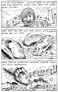
Unsurprisingly, much of Nichols' work focuses on transformation, identity and changes in systems. Energy can neither be created nor destroyed, she reminds us in one of her comics; it can only be transformed. Her adaptation of Tejal Rao's "The Shucker's Tale in her catch-all anthology Jumbly Junkery #11 is a good example of this, as it's a whimsical tale of a shucker who's an oyster whisperer of sorts, encouraging whole choruses of oyster singing despite his father's objections. Nichols turns to mythology as well in this issue, with tales of Penelope and Prometheus that get at their hidden perspectives: Penelope's pain and Prometheus' matter-of-factness through doubt. In the other stories, conflicts and relationships intertwine as Nichols' line is quite different, as she makes her characters marionettes with realistic heads but painted-on cheeks. She also has time to do a silly "Outlaw Dog" strip, which is pure, visceral fun as a post-apocalyptic, motorcycle riding anthropomorphic dog gets in a race and then blows shit up.

Input/Output and Free People get at the struggles and pressures of life and expectations. Her storytelling is far more elliptical here, as the former comic uses color to heighten the sort of conflicts we saw in Jumbly Junkery. Input/output refers to eating/excretion, but it also refers to the infusion of the soul and taking life, as well as the ways in which we all ultimately "become part of a larger system". The comic hints at our choices as humans in how we channel the energy we receive as part of a greater system, and how truly understanding our eventual fate might also transform our choices. This was Nichols' most beautiful, effective attempt at comics-as-poetry, heightened by her figure drawing, use of color and mix of realism and the grotesquely cartoony. Free People is a juxtaposition of The Autobiography of Benvenuto Cellini and images from the Free People store catalog. Nichols bends both of these sources to her general themes: pressure to conform, seeking freedom (often through radical means like escape), transformation. She turns the fashion model photographs into her cubism-inspired jigsaws (once again with painted-on cheeks that suggest both life and external manipulation). It's an interesting appropriation of other media for an artist who's produced some interesting results dabbling in comics-as-poetry. Nichols just started her own micropublishing concern, which is fitting considering how hard-working she is as an artist and how she's developed so quickly.