Thursday, February 28, 2013

Sequart Reprints: Spent

For those who are turned off by autobiographical comics, Joe Matt is often regarded as public enemy #1. His comics are literally about his masturbation habits, his antisocial behavior and hermitlike existence. As a result, they're easy to target as the sort of stereotypical narcissistic navel-gazing with which critics dismiss the entire genre. I think to a degree this charge has some merit with Matt's earlier work, as he was still working through his R.Crumb influence. However, Matt didn't have Crumb's refined drawing chops, intelligence or relentlessness in getting to the roots of his neuroses. After reading his first collection of strips, Peepshow, I lost interest in the numbing sameness of Matt's work. The "revelations" he was disclosing just weren't all that compelling, and he was nowhere near Crumb's class as a humorist.

Imagine my surprise when I read Spent and found it hilarious. Matt has simplified and refined his line over the years and used a basic 8-panel grid throughout the book. With a soft blue tint on every page, the reader's eye is drawn in to every image despite the static nature of most of the stories. Matt's clean look is ideal in setting up the real goal of this book: taking his own self-caricature to its logical extreme and expertly milking each of his most loathesome qualities for every last laugh.

What becomes obvious is that Matt long ago decided to focus on his famously eccentric, misanthropic tendencies and exaggerate them for comic effect. Even the press materials play up Matt's miserly ways, obsession with porn, urinating in jars and keeping them in his room and his willingness to humiliate himself. What one finds in these pages isn't self-reflection--it's shtick. Embarrassing, outrageous and slightly disgusting, certainly--but shtick nonetheless.

The good news for the reader is that it's good shtick. Matt's sense of comic timing has become as finely honed as his line. Each of the four chapters has a different comedic focus. The first chapter introduces Matt's primary comic foil, the cartoonist Seth. "Seth" is everything "Joe Matt" is not--refined, fussy, social, hard-working, responsible. He also relentlessly nags Matt about his lazy, apathetic, misanthropic ways, and chides him for his "witholding" ways--deliberately witholding his company from others in order to hold power over them. What makes Seth such a great character and foil for Matt is that Matt cares so little about his faults that he can blithely take Seth's abuse and then turn around and aggravate him even more.

That segues into Matt meeting up with a sleazy porn enthusiast who lets Matt borrow videotapes for a fee. The next chapter is all about Matt's ridiculous hobby of taking videotapes, copying them, and editing them down to a few precious scenes that he wanted to watch again and again. Along the way, we get flashbacks to Matt's childhood, a sort of survey of his history of masturbation and sexual humiliations. The payoff came when young Matt stole a few frames of film from a friend's full-length movie and realized that they were all shots of a man's ass--it's a delicious payoff as Matt simultaneously documents his humiliation and invites the reader to laugh at him.

The third chapter is the book's best. It's a scene in a restaurant with Matt, Seth and fellow cartoonist Chester Brown. The comic timing is not unlike the Marx Brothers, centering around Matt's cheapness. The page where Matt tries to beg bread off Seth but refuses the slice that's offered to him because Seth touched it is topped off when Seth decides to lick the entire loaf in order to piss off Matt is one of the funniest in the book. Later, when discussing comics awards, Brown & Seth mocked Matt's vanity in nominating himself combined with his extreme laziness in actually producing any work. They suggested that he should nominate himself "best editor" for his porn editing "work". The chapter picks up on an earlier plot point (Seth's obsession with an old Canadian comic strip), piles on conflict between Seth & Matt, and then concludes with Matt talking Seth into paying out for a bunch of old strips--and then finally deciding to order dinner with his new windfall. It's a great punchline, because it builds on Matt's established flaws while using them expertly to set up conflicts with his foils. For all of Matt's self-abasement, it's telling that he "allows" himself to get the upper hand in this situation.

That doesn't last long, however. The final chapter sees Matt subjected to a whole series of humiliations, culminating in his disgusting landlady lecturing him about urinating in the sink and then having a cat shit on him. It's instructive to compare Matt's autobiographical stories to Ivan Brunetti's. Both are misanthropic, neurotic and filled with self-loathing. However, Brunetti's autobiographical comics (while often funny) are an existential howl, an attempt by the artist to get at something fundamental. Matt, on the other hand, just wants us to laugh at him. His self-caricature is ridiculously over-the-top, revealing that while the events in the book may be factually true, even Matt admits to making up facts that make himself look worse to the reader. When he notes that there's "no payoff, no epiphany, no nothing", he's worried that the readers will be out for blood. He's right that there's not even a story, per se. What he does have is a lot of jokes, and they're not only good ones, they're punchlines that only Joe Matt could make. He's honed his shtick to a fine point and made an art of being Joe Matt and making Joe Matt jokes. There's nothing more to his work at this point than this deft arrangement of humiliating personal anecdotes and tics, but no one else mines this lode of humor quite like him. Ultimately, his autobiography becomes both self-parody and a parody of the genre in general.

Wednesday, February 27, 2013

John Martz and the Art of the Robot Gag

Let's look at a smattering of publications from Canadian cartoonist John Martz.

Machine Gum #2 and #3. These comics contain Martz's many, many robot-related gag comics. When Martz wants to work out an idea, he does it with his robots. Some of these strips are less gags than simple visual exercises exploring transformation, evolution, joy, despair, decay and anxiety. There's a lot of classic cartooning in Martz's work (it's clear that he's read a lot of New Yorker cartoonists), not to mention Lewis Trondheim's more stripped-down work. It's also a chance for Martz to play a horrible, merciless god to his pitiful, restless robots; in one strip, the robot literally prays and gets zapped by a lightning bolt from above. Martz also gets to the the physical qualities of line and ink in these comics, exploding his figures and often abstracting them. Really, these comics are a form of play--serious play, but play and exploration nonetheless. They're a way of telling stories or expressing emotions in as few lines as possible with a figure that will be instantly recognizable to the reader. Some are delightful, some are baffling, some are disgusting, but all of them exercise different aspects of Martz's imagination and toolbox.
Heaven All Day. This attractive Xeric Grant winner is a sort of graduate project for his robot experimentation projects. There are two parallel narratives: one involves an amateur scientist who's a glorified garbage-counter in his day job, and a down-on-his-luck robot in a world where robots are common but are considered to be second-class citizens. Little by little, we learn the man is building some kind of device out of robot scraps, and the downtrodden robot has a moment of hope followed by a brutal dismemberment at the hands of a cop. However, the one tiny part of the robot that remained wound up in the hands of the scientist, who created a device that looked like either a weapon or a portal or both; the implication at the end of the story is that change was imminent. It was interesting to see the kind of robot abuse from Machine Gum transferred to this comic and given an entirely different emotional context. Here, the beatings are poignant as well as kind of funny, especially because the reader is given little context as to what's happening on this world and why. The blue wash adds to the vague sense of melancholy in what is otherwise a cartoonish work.

Gold Star. This was my favorite of Martz's comics. It's sharper and meaner than his other works, and the intricate structure has quite a payoff. It's about a nebbishy artist of some kind coming to an Oscars-like ceremony in Hollywood and how his casual indifference to the well-being of others as well as his astounding naivete winds up having disastrous consequence. The left-handed side of each spread is a single-panel gag with text at the bottom, and they are flashbacks. The right-handed side of each page is a four-panel grid in the present at the awards ceremony, where the main character (Bunny Buckler, an anthropomorphic rabbit) wins the award and gives a rambling, bizarre acceptance speech. As the flashbacks flip by, we learn that Bunny was seduced by the LA party scene, got massively hung over, and frantically had to call down to the front desk in order to have an iron sent up.There's one hilarious page where the frantic Bunny is on stage, guzzling down an entire glass of water before he's capable of speaking. The nasty punchline of this strip is the result of meticulous, clockwork planning and clever callbacks, delivering a bit of horrifying hubris to the main character and relentlessly punishing the bell hop who was inadvertently abused by Bunny. Reading these comics felt like Martz slowly building his comedic and drawing chops from the ground up, finding out what worked on the page and what didn't, until he was confident enough to unleash a comic as intricately designed as Gold Star. While he's a good gag artist, his real talent is in long form humor, mixing poignant emotion with vicious punchlines. 

Tuesday, February 26, 2013

Sequart Reprints: Mineshaft 19

The best publications about comics are those that reflect the idiosyncratic interests and viewpoints of its creators. Mineshaft's Everett Rand and Gioia Palmieri are interested in comics of the underground era, dating up to the early alternative years. What's remarkable about this unassuming little zine is the stunning array of art and talent they're able to assemble in each issue. Issue #19, for instance, sports a front cover by Peter Bagge, a back cover by Robert Crumb, and inside illustrations by Carol Tyler and Mary Fleener. The 52-page zine is packed with rare art and strips from a list of artists that reads like a who's-who of underground stars.

The first ten pages are dedicated to some of Crumb's sketchbook drawings. These include drawings from life, hilarious strips, funny-animal bits, autobiographical confessions, etc.--all from the past ten years or so. Jay Lynch and Ed Piskor teamed up for a tale from Lynch's underground days. Mary Fleener contributed some of her excellent Mary-Land strips printed in a local California publication. There are illustrations by Simon Deitch (including one of the Bill Everett character Venus!), a strip by Penny Van Horn, a chapter from a delightfully lurid serial by Frank Stack and a crazy robot illustration by Robert Armstrong. Each page holds new and unexpected delights.

What takes Mineshaft above the status of simply being an interesting depository for underground comics art are the essays, poems and other bits of writing ephemera. Palmieri's account of meeting Peter Bagge at Heroes Con was fascinating because it came from someone who does not have the perspective of being a comics insider. Bruce Simon's illustrated essay on cartoons about television was brief but both amusing and incisive. The letters page is another little treasure trove of interesting material, including a long letter from Crumb. Mineshaft has a fairly narrow focus in the comics it chooses to run and examine, but any fan of the artists from the underground/early alternative era will find it to be essential reading. About the only thing I would have like to have seen more of in this issue are reviews, especially by artists about other artists.
Mineshaft has a lack of pretension and mercifully lacks the name-dropping tendencies of similar magazines devoted to collecting comics art from one's collection. The publishers love comics, love certain artists in particular and publish a humble magazine dedicated to seeing that love through in print. It'll be interesting to see if they ever choose to focus beyond the 1960-1990 roster of talent and devote an issue to more contemporary work.

Monday, February 25, 2013

Bleak Futures: Romberger, Ward

Let's look at two comics that answer what happens after the end of the world.


Post York, by James Romberger & Crosby. This is another recent release from Tom Kaczynski's excellent Uncivilized Books. It's not so much a complete story as it is a snippet of a day in the life of a few people living in a New York that is almost completely underwater. There are a few different storytelling methods at work here. First, Romberger's line is pleasantly loose and sketchy, inviting the reader to fill in details as it hints at the total devastation of the city. Instead of using a standard panel grid on each page, Romberger instead keeps each panel fairly separate. On some pages, the panels cascade across, as though they were flowing water. On other pages, we get a few rows where there is direct movement across the page and others where the panels are stacked on top of each other because the action is going up or down. Romberger controls mood and tone with the size of each panel, depicting claustrophobia with tiny panels and awestruck terror in larger panels. The hows and why of how the world was devastated are less important than the struggles of the nameless main character, who putters around the city looking for useful supplies. When he enters a building and is attacked by its sole occupant (a young woman), the protagonist finds himself fighting for his life, even if it's the last thing he wanted to do. Romberger seems interested in how small actions can lead to larger events in a frequently deadly chain, perhaps a reduction of how the world got to be destroyed. After "ending" the story with the young man accidentally killing the young woman, we immediately see an "or" signalling another possible ending, one where the young man escapes, frees a trapped whale and otherwise draws the fascination of the young woman. Accompanying the comic is a flexi-disc (!) by Romberger's son Crosby, who is also less interested in the apocalypse than what life is like afterwards. At just forty pages, this little taste of a story is more than enough for me as a reader to understand exactly what Romberger was driving at without beating details into the ground. It's an interesting and even brave approach to storytelling, as it risks slightness in lieu of risking bloat. It's a decision that makes sense, because I didn't feel the need to spend more time in this world by the end, especially when Romberger showed the reader a couple of different ways how life could continue to diverge.

Ritual #2: The Reverie, by Malachi Ward. Every one of Ward's stories that I've read to date has a science-fiction element, but the genre portion of the story only serves to act as a device for Ward's exploration of human relationships. The second issue of his Revival House series is a carefully-crafted set of dated vignettes that start in the present and move slowly into the future, as a family starts to disintegrate over time, with the mother dying and the father slowly losing his grip on reality. We get snapshots of times both loving and stressful with the children (a brother and sister) and their father, and we're also given the sense that their own lives haven't exactly worked out as they had hoped. When their father disappears into a powerful, drug-induced state called The Reverie, the reasons why the kids go after him in order to retrieve him are deliberately left muddy by Ward.

Indeed, the son desperately wants him back in the "real world", but is it to be a father or someone whose presence could simply fix their lives? The daughter, drawn perpetually young and even immature-looking, has similar motives. The reunion is heartbreaking and heartwarming at the same time, as Ward asks which is more important: things that happen in the "real" world, or the reassuring warmth of a beloved lie? In the end, one child chooses to stay and the other chooses to leave, and it's left as ambiguous as to which made the "right" decision--if there was one to be made. In terms of the visuals, Ward keeps things very simple and clear with his character design and only real injects any detail when the siblings enter the dream world. In terms of the story, even those images are ephemeral; they're distractions from the real drama of the story. It's a clever ploy on the part of Ward's that pays off because of the ambiguity of the ending, which simply ends in a dark room.

Friday, February 22, 2013

New Comics From Rob Jackson

It's always a happy occasion to receive new work from Rob Jackson, in part because one never knows what to expect from him. Horror? Science-fiction? Fantasy spoof? Autobio? Some combination thereof? There have been subtle changes for this artist with a remarkable work ethic. His line is still crude, but his layouts are getting clearer and simpler. His actual draftsmanship has improved, especially in a project like The Storytellers where he clearly worked a lot with outside reference material.

Let's start with part two of Jackson's horror-Americana mashup California. What I like best about it is that the protagonist, Billy, is suspicious of what deviltry his minister brother is up to, even as he can't begin to fathom the true weirdness that's going on. Expecting devil statues and whatnot, he ignores things like his brother buying occult books or bringing down dark forces as he worships on a hilltop. Jackson goes with the full Lovecraft treatment when a church aide (after drinking too much communion wine drawn from a dark, magical source) starts to grow serpents out of his body and uses them to open a mysterious door the minister had managed to uncover. While Jackson slowly reveals the increasingly creepy details behind the minister's machinations, he still keeps the reader guessing. The minister claims to be a force for good, but what's he really up to? There's a plain-spoken bluntness to Jackson's prose, that John Steinbeck-folksiness, that subverts the expected Lovecraft purple prose, making the the story all the more effective and unsettling.

The Storytellers is a labor of familial love, as Jackson weaves together family vignettes stretching over two hundred years. The story begins with Jackson's great-grandfather (also named Robert Jackson) as a boy, just after his mother had died. He was sent to live with his grandfather in his pub, who comforted the mourning lad with tales from his days as a smuggler. He told stories about his father being shot at by Americans during the War of 1812 and having his ship confiscated by them, as well as a story about his grandfather in Canada, trying to hike his way to New York after abandoning the British army. It's one of many colorful tales of Jackson run-ins with authority, including an uncle who was nearly executed in Chile, a relative who had to skip town after dropping some concrete on a cop, a female relative who skipped out on her husband to run off with a colorful salesman, a great-grandfather who drank way too much, another relative who demanded that that the men of his family have a drink and remember him at every pub en route to the cemetery (only to be thwarted by the women of the family who changed the route to avoid pubs), and a grandfather with grim war stories.

Structurally, the book (it's a beefy 75 pages) is fluid in its storytelling, jumping back and forth in time in a way that makes sense. Jackson is careful to establish key members of the family and then work forward and backward as the focus switches from young Bob Jackson to his descendants. What I like best about this book is that these are clearly treasured family stories passed down as part of a tradition of pub storytelling. Jackson clearly put a lot of thought into how to properly record these family stories in print for posterity in a way that made sense and paid proper tribute to the best of the storytellers. It helps that the family has no censor whatsoever, relishing their scrapes with the law and their adventures just outside it. Despite that craziness, one can also sense a long tradition of love, support and continuity in the Jackson clan; despite the misadventures of many children, they were always welcome back. This may be my favorite of Jackson's comics; it has the flourish of his fantasy stories with the unvarnished truth of his autobio.

Thursday, February 21, 2013

Sequart Reprints: Peanuts 1967-68 and 1969-70

This article was originally published at seqaurt.com in 2007.
**********

It's difficult as a critic to tackle Peanuts, because I was devouring these strips as soon as I could read. They're essential to the makeup of my comics-reading DNA and had an important influence on both my worldview and sense of humor. I had the fortune of gaining access to a number of reprints from the 50s and 60s as a young boy and so had an understanding at an early age that the tone and content of the strip shifted over time, since it was quite different than when I started reading the strip on a daily basis in the mid-1970s. Former Comics Journal critic Noah Berlatsky took artists like Chris Ware to task for emphasizing the melancholy nature of Peanuts rather than its wackier or more sentimental elements, but that criticism is shortsighted depending on what era of the strip one is reading. There's no question that the strip at its height (roughly from 1958-1967) is far more brutal and unsparing to its characters and far less sentimental and episodic than it would later become. That's due in part to some shifts in tone and focus on characters.

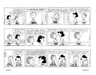
Snoopy shifts into serious fantasy-character mode here, as he appears on 32 separate pages as the World War I flying ace in the collection. Snoopy also pops up as a secret agent, an Olympic ice-skater and becomes a champion wrist-wrestler, as well as a piranha and a vulture. Schulz also seizes upon current events like measles shots (which Linus is in a panic about) and even touches on the burgeoning counter-culture. That's made explicit with the introduction of the long-haired "hippie-bird" that would later evolve into Woodstock, along with lines from Sally like "I hate your generation!". In addition to various characters protesting various things, Lucy also decides to hold a "crab-in". Schulz, unsolicited, decided to diversify his cast a bit with his first Hispanic character (Jose' Peterson, who never really went anywhere) and Franklin, the now well-known African-American character.

Charlie Brown has settled into dealing with more episodic threats to his existential well-being, with regular abuse at the hands of the kite-eating tree, yearly frustration with Valentine's Day and Lucy taking away the football, and free-floating angst with the little red-haired girl. My favorite strips always revolved around baseball, because this always pointed to Charlie Brown's greatness as a character. Despite the fact that he's a put-upon, wishy-washy nebbish, he always remains a sympathetic character because he's an active protagonist. Despite his unrelenting string of failures in pretty much everything, he never stops trying. Not only that, but with baseball in particular, he never loses his love for his pursuit and his hope that he might one day get better. There's one amazing strip from 3/15/1967 that doesn't actually have a punchline. His team has just lost their first game of the season, and Charlie Brown says, "Losing a ball game is like dropping an ice cream cone on the sidewalk...it just lays there and you know you've dropped it and there's nothing you can do...it's too late..." The last panel just has his head down, exclaiming "Rats!".

Despite everything, Charlie Brown remains a competitor, despite the fact that he's hopelessly outmatched. That deep feeling of rage is what makes him so compelling; if he was nothing but mere melancholy, he'd be insufferable. His anger at the world and his desire to change it despite all evidence to the contrary is why he's one of the greatest characters in the history of comics. There's a great sequence where Peppermint Patty offers Charlie Brown four of her own players for Snoopy and Charlie Brown accepts. He's then horrified at himself for trading away his own dog just for the sake of winning some baseball games and everyone else is even more horrified. It's the first time I can recall in this strip where Charlie Brown does the wrong thing morally and is called out on it, though he does do the right thing in the end.

The other major stars of this volume are Lucy, Linus, Sally and Peppermint Patty. Lucy engages in all of her usual crabby behavior, but her general viciousness is on full display here. She is pure, unstoppable id, frustrated only by Schroeder's total disinterest in her. Linus is both the most thoughtful character in the strip and the most ineffectual in some ways. He's more afraid of things than usual in this book: shots, being shunned by his teacher, vultures, piranha, etc. He's also the most intellectually adventurous character in the strip even though he struggles with his schoolwork. Sally is constantly confused and angry at her world, which offers a nice contrast with Lucy who demands that the world conform to her own understanding of it. Sally is baffled by everything and demands that everyone explain it to her, usually with hilarious results.

Peppermint Patty represents the biggest shift in tone for the strip. She's the first major new character in the strip to get whole weeks devoted to her and usually completely outside the purview of the regular Peanuts' gang neighborhood. It's almost like she's a character from an entirely different strip that just happens to regularly cross over with Peanuts. She's a misfit in her own way, but she's sort of Charlie Brown's mirror image: she's confident, feels loved and is never afraid to offer up her opinion. While she's a bit rough around the edges, she lacks Lucy's cruelty and Violet's cattiness. The sequence where she's the tent monitor for a group of younger girls was hilarious, and one could almost sense Schulz' excitement in doing a very different kind of story in his long-running strip, eighteen years into its production.

That's the stunning thing about this book. In over 700 strips, there are a number of long laughs to be had and very few clunkers. Schulz was always reluctant to reproduce his entire body of work (which led to the reprints and reprints of reprints with so many repeated strips) because of strips that he either thought were weak or didn't age well. In the context of a career overview such as this, I'm grateful that every strip is being reprinted, in chronological order. Seeing his line develop over time, seeing him come up with new ideas and character and which ones stuck and which ones didn't is fascinating to observe. There's also a certain delightful weight of history that builds as one goes from volume to volume. One wonders how much the intense, world-renowned fame of his strip affected him as an artist at this point. Did he feel the urge to bring back popular tropes based on reader feedback and demand, or did he ignore such concerns and simply draw what he wanted? It seems like with this volume he tried to do a little of both, keeping old fans happy while always trying to keep himself interested with new challenges.

In terms of the visuals, Schulz is years into his mature style. He's exactly what I mean when I talk about an artist needing to find the ideal style with which to express themselves with clarity. For Schulz, though his line is spare, it's full of life and liveliness. He's not afraid to stylize his drawings when need be, especially in the pursuit of action. His strip has a surprising energy and flow to it when he chooses to pursue that sort of story (usually involving Snoopy), creating an almost visceral crunch in these scenes. He's also a master of gesture, expression and the quiet moment. He leavens the frequently violent confrontations in his strip with heartfelt emotion, and is equally skilled at making his audience feel both.

This series of reprints is one of the most important in the history of comics, for so many reasons. It keeps alive the legacy of the comics artist who may have been the most important cartoonist of the latter half of the 20th century. It puts the now-ubiquitous Peanuts iconography back on comic book pages instead of simply being known through advertising and merchandising. And of course, the fact that Jeannie Schulz and the Schulz estate licensed this to Fantagraphics not only started off a new golden age of classic strip reprints, it's also funded numerous worthy publications from FBI. While those concerns are impressive, the mere fact that Fantagraphics has committed itself to this project, and that it's done so well (special kudos to Seth for design and John Waters for his very astute and engaged introduction) is a gift to fans of the art.

*********
This article was originally published at sequart.com in 2008.

In The Complete Peanuts 1969-70, it's interesting to see popular culture influence Schulz in a more direct way than before. He makes cracks about feminism and has Sally utter "I hate your generation!" to an older kid. Schulz is very much still at the height of his powers but was also looking for new ways to entertain himself while processing the world around him. The most prominent character in this volume is clearly Snoopy. Schulz assigned him a bird as a sidekick and pointedly named him Woodstock, devoting an entire strip to this revelation. It was an odd gag, as though making a reference to hippies was funny in and of itself. Most every long storyline in these years involved Snoopy: being sent before the Head Beagle (thanks to Frieda turning him in for not chasing rabbits), becoming the Head Beagle and then quitting, trying to help Woodstock fly south for the winter and getting lost, trying to find his mother, being asked to make a speech at the Daisy Hill Puppy Farm and getting caught up in an anti-war riot. The Head Beagle stuff is the strip at its weirdest, coming up with a sort of an overriding mythology that seeks to somehow connect Snoopy's behavior as a dog and his status as a sort of person. When it's revealed that Snoopy owns a piece of land that the city wants and he's unwilling to sell, he's resistant because he's not allowed to vote or run around without a leash.

That weird tension between animal and character is at play through this volume; Snoopy does things like go to the vet, goes to a kennel and is forced to stay with Lucy when Charlie Brown goes on vacation. He also spends a lot of time as the World War I flying ace, as a hockey pro (often against Woodstock), a novelist (the legendary "It was a dark and stormy night..." strips), astronaut and most oddly, a "world-famous grocery clerk". That particular set of strips almost seemed like a strange parody of the other Snoopy fantasy roles, with Snoopy even noting that there weren't more than a dozen famous grocery clerks. It's as though Schulz was fascinated by his local grocery clerk bellowing out questions at his market and had to channel this into his strip.

Peppermint Patty continued to draw a lot of focus in this volume, and much of it had a bittersweet quality. She was still confident and brash, but Schulz instilled her with all sorts of insecurities. Peppermint Patty despaired over not being beautiful, over not being able to wear sandals at school, and in general over her lack of femininity. Charlie Brown had no idea what to make of her or what to say to her, especially when she ran roughshod over him in conversations. At the same time, he was clearly pleased by her lack of pettiness and guile. About the only time Charlie Brown felt good in this volume was when he loaned a glove to a teammate of Peppermint Patty's and he wouldn't give it back. He felt good because the kid he took it resented Charlie Brown for "thinking he was better than him"--and this notion positively delighted him. Perhaps the sweetest segment in the book came when Peppermint Patty asked Snoopy (whom she didn't quite realize was a dog) to a dance as her date, and she punched out someone who made fun of him (and as Snoopy noted, he bit the chaperone on the leg). Schulz usually created his humor by constantly thwarting his characters' desires, but it seemed as though he didn't quite have the heart to do that to Peppermint Patty. She really seemed to be living in a different world than the other regular characters in the strip.

Speaking of the other regulars, they don't shine quite as brightly in this volume. Lucy, the unquestioned star and irritant of the book for many years, is reduced to more of a side character with few extended storylines. Schulz really tabled his more obscure characters like 5, Shermy, Frieda, Patty, Violet and Pigpen, especially with more vibrant characters like Peppermint Patty to explore. That said, characters like Linus and Sally get some great segments. Sally's blustery frustration with the entire world (and school in particular) draws some of the biggest laughs, especially when she yells at her brother for not knowing answers to ridiculous questions. Linus gets mixed up with Miss Othmar's teacher's strike and starts becoming increasingly cynical.
Schulz noted that every one of his characters represented an aspect of himself. Lucy was his angry id, Snoopy was his adventurous daydreamer, Charlie Brown was his neuroses and fears, and Linus was his thinker. In this volume, Linus seemed to be processing Schulz' own feelings about becoming the world's most famous cartoonist and a multimedia star. It's clear that he was somewhat bewildered by the attention and started to question his own process. There's a strip where Linus writes a fawning essay about being so happy to be back in school. When he teacher praises it, Linus turns to Charlie Brown and says, "As the years go by, you learn what sells!" That's certainly true of this strip, as Peanuts' more whimsical aspects were obviously much easier to market than Charlie Brown's persistent melancholia. Later, when giving a teacher another fawning answer and Charlie Brown calls him out on it, Linus shrugs and says "Is it so wrong to make a teacher happy?" He might as well have said "audience".

In the face of Peanuts getting more and more episodic and losing some of its bite, Schulz responded with some of his most gut-wrenching moments for Charlie Brown. The sequence where the little red-headed girl moves away, with Charlie Brown standing there without even introducing himself, is heartbreaking. All the more so as Linus is screaming at him to move and do something, and becoming furious when Charlie Brown does nothing. When Charlie Brown starts to fantasize about seeing her in the future, Linus kicks him in the ass because he knows it'll never happen and he's tired of entertaining his friend's self-delusions. Those strips are remarkably bitter, and one can sense Schulz shift away from them with some bit of Snoopy silliness as a sort of antidote.

Nothing much goes right for Charlie Brown here: his baseball team is awful, he's terrible in school and even his baseball hero, Joe Shlabotnik, fails to show up at a sports banquet because he forgot the date and city. Lucy still abuses him hilariously, especially when she tells him horrible things that will happen to him in the future that he "may as well know now". Lucy is still frustrated by Schroeder, though their interactions lead to some of the liveliest strips in the book. In particular, Schulz gets into an unusually meta gag involving "spray-on Beethoven" that is much more formally playful than one would expect from him.

I suppose the best way to describe Schulz in this book is "restless". He'd gone through many years of spilling bile on the page and was looking to go in different directions. He was being pulled by contemporary influences, the potential of new characters, the commercial considerations of his work and the genuine affection he held for his older characters. He had completed the transition as master gagsmith to someone who created amusing situations and took his characters to some strange places. No individual strip past this era would pack as much punch as his earlier work, yet their cumulative effect still revealed a master cartoonist with an impeccable sense of timing and design. Again, the chronological arrangement of the strips, allowing the audience to see the passage of time and its effect on his creative choices, becomes a crucial element in fully understanding and enjoying them. The cumulative impact of these volumes is greater than any individual strip, and that's a testament to Schulz' devotion to his craft.

Wednesday, February 20, 2013

Checking In WIth Hic & Hoc

Let's check in with some of the recent comics published by interesting new micropublisher Hic & Hoc.

Demontears, by Bernie McGovern. The title is a play on another way of representing "DTs", or "delirium tremens", a severe form of alcohol withdrawal. The comic follows the struggles of the artist with alcohol and how to overcome its debilitating effect not only on his life, but on his imagination as a creative person. When he starts getting the shakes and finds himself drinking again, the specter of alcohol is literally a shadow that forcibly pushes his skull into walls and pushes him into blackout states. In those states, McGovern is reduced to being a brain attached to a spinal cord, floating through a devastated environment. As the story proceeds, he understands that this wasteland is what's happened to his imagination and ideas as alcohol wreaked havoc on him, and the rest of the book is an extended metaphor about recovery. It's beautiful, strange and more than a little harrowing, yet has moments of whimsy and humor, especially at the end, which ends with a crude but appropriately funny joke. McGovern's thin and even fragile line is perfect for evoking his sad world of imagination, populated with all sorts of funny-looking and slightly terrifying characters. Despite the darkness of the material, there's an almost visceral joy of drawing that pops off these pages, which is fitting for someone whose very control over his hands was weakened when the DTs came on. Simply being able to get back the sheer pleasure of having total control of making marks on paper is evident on every page of the book. The visceral quality of the imaginative sections of the book are able to get across the desperation of addiction in a more poetic and powerful manner than a naturalistic approach would have been able to, and that's what makes this comic so effective.

Jammers, by Lizz Hickey. Some comics appear to have flowed effortlessly from the pen or pencil of their creator. In the case of Hickey's bizarre, frequently hilarious and sometimes distressing comics, it seems more like her images escaped from her pen, taking refuge on the page. There's actually a genuinely frightening streak of violence and danger to be found amongst the many absurd and downright stupid images and situations portrayed in this comic. The Australian frog with a knife (Tim-Tam), the "very dumb girl" Carol and her obsession with love and the other strange characters go through adventures that remind me a bit of the sort of out-there comics one might have seen in the 80s; there's hints of early, weirder Chester Brown in here along with a general NuWave sensibility. Portions of the comic are deliberately drawn to resemble children's art, a conceit that ties it into its overall sense of being outsider art. That said, one can see the mind behind the weirdness exorcising the darker parts of its id in a very direct and deliberate manner. It's as though Hickey is working out all of her worst impulses as well as the things she hates most about herself on the page.


Looking Out, by Philippa Rice. I was happy to hear that Hic & Hoc Publisher Matt Moses was publishing a comic by Rice, who's one of the exciting young talents on the British comics scene (she's a frequent contributor to Solipsistic Pop). This comic is a mix of simple figures and cluttered backgrounds about a future world where technology is complicated but doesn't always serve to make life better, especially when it breaks down. Indeed, in the same way that texting and social media serve in some ways to isolate people, this future world reduces people to tiny units in their little living pods. It's a failure of technology that pushes two people who happen to live in the same building together in that familiar and slightly clumsy & awkward way, where both parties are clearly interested but neither is exactly sure to what extent. When the main character reveals why she's alone much of the time to her potential suitor, it comes from an angle that's convoluted and science-fiction, yet also speaks of the way that obsession can drive us. The clutter and chaos of this world helps thin the more twee aspects of this romance story (both in terms of the cute figures and the situation), giving the emotions expressed a surprising amount of weight and even a sense of bittersweet delight. 


Why Is My Easy Life So Hard?, by Dina Kelberman. I blurbed the back cover of this book, so allow me to share that quote: "Dina Kelberman's comics are all about contradictions, as she tries to balance living in her own head with that desperate, nagging need to interact with others. With her minimalist line, her avoidance of conventional narrative, her counter-intuitive use of color and her focus on the decorative aspects of lettering, Kelberman cuts a unique figure in comics as a guileless provocateur as well as a humorist with surprisingly traditionalist roots." This comic really focuses in on and ruthlessly excoriates her own narcissism that borders on solipsism as her little, hair potato-shaped stand-in theatrically ignores a crying friend ("I mean, is this really all you're bringing to the table."), tries to atone by hanging out with her boyfriend (a sort of smudgy cat), and finally mocks herself by introducing TV as a cure-all for every one of her relationships. It's a funny, weird and at times powerful visual experience, thanks to that bizarre color sense of hers.

Bowman: Earthbound, by Pat Aulisio. Aulisio seems to be trying to serialize the further adventures of 2001: A Space Odyssey's Dave Bowman with as many different micropublishers as possible. The central shtick of the series is that it's as balls-out crazy and profane as the Stanley Kubrick film is austere and cold. Indeed, this comic has more in common with the kinetic craziness of Jack Kirby's 2001 adaptation than the film, other than the use of the Bowman character. Aulisio also packs his pages with crazy amounts of eye-melting detail, drawing in scads of wavy lines and debris that leave the reader off-balance when simply looking at the page. There are times when this technique goes a bit off the rails and makes it difficult to parse his pages, but he usually finds a way to rein things in a bit and return to a more conventionally solid kind of storytelling. This chapter of the Bowman saga finds him getting bored with being an all-powerful space warrior on a planet with creatures that fear and obey his every whim, until the enigmatic Monolith returns. Bowman steps through the Monolith and winds up in a Road Warrior-type earth in the far future, which suits him just fine.I don't know how tightly plotted Aulisio has made the story so far or if he's improvising it along the way, but he makes just enough nods to the original source material to keep things coherent before he runs off on some crazy, visceral and frequently nastily funny tangent.

Three Stories, by Ian Andersen. Each of the titular three stories is stripped down and simply told. The first story, "Pack Rat", is a sort of visual exercise as a blank-faced character first finds a face on the ground (two dot eyes and a line for a mouth), and then proceeds to acquire more and more material goods as he walks along, until he collapses under the weight of his possessions and loses everything--including his identity. I't unclear just how much meaning Andersen is choosing to inject into this story beyond the neat visual trick of a simple character adding more and more detail and weight, until it's all gone. The second story, "Pear", concerns what seems to be the gentle eating adventures of a river turtle. He tries to dodge a loud animal that winds up eating his food, until he devises a method to get rid of it--once and for all. Andersen likes to inject a bit of cruelty into his stories at their conclusions, and the turtle's eventual "reward" for his actions is an effective surprise. In the last story, "Howl Hole", a couple of forest tree creatures follow a howling wolf to his hole, making fun of him when they can't understand him. The reveal here is a creature suffering heartbreak, with a lack of understanding denying any possible empathy. This is a comic with modest ambitions and an understated visual approach; it's quite different from the crazier, flashier and less conventional material that Moses usually publishes. That said, there's a surprising amount of emotional depth to this comic that belies its otherwise mundane trappings.

Tuesday, February 19, 2013

Sequart Reprints: Rabbi's Cat 2

This review was originally published at sequart.com in 2007.
*********************
The first English translation of Joann Sfar's that I read was The Rabbi's Cat. I was immediately struck by the pleasantly ambling plot, the expressive & loose art, and the lively way in which Sfar grappled with questions of faith, ethnicity and identity. Grounding the book in its titular narrator, a cat that gains (and later loses) the ability to speak, he displays an enormous amount of affection for his Jewish roots in North Africa while still engaging and gently chiding rhetoric for its own sake. With the cat, the Rabbi Abraham Sfar, his daughter and the truly inspired character of Malka of the Lions (the Rabbi's cousin), Sfar manipulates the plot to simply fall in place around the lives of these characters. The way Sfar can jump between lighthearted farce and adventure to weighty matters of philosophy (frequently on the same page) is aided by the vividness of his characters, with the cat acting as the ultimate cynic.

The new volume, featuring the stories "Heaven On Earth" and "Africa's Jerusalem", has a slightly more didactic feel to its stories. Sfar more explicitly grapples with issues relating to both anti-semitism and racism. In an author's note, it's clear that he was somewhat reluctant to go in this direction but eventually notes "Chances are everything's already been said, but since no one is paying attention you have to start all over again." Sfar makes both stories work because he successfully disguises his moral medicine in the form of funny but often rip-roaring adventure stories.

"Heaven On Earth" sees Malka, the con man/living legend, growing old with his trained lion. Malka is regarded more as a curiosity than an imposing figure who saves entire towns from his (on-demand) bloodthirsty lion, and he can't bear to live like that. So he ingeniously finds a way to create a mythology around his own death as yet another way of drumming up business. In the end, an act of political courage against an anti-semitic politician, done with no other motivation than anger and outrage, winds up really ensuring his legend. That neatly ties into the nature of political struggle and political identity, an issue that is still obviously quite a valuable one. The nature of Jewish identity, belief and behavior is at once strictly codified in ancient writings and subject to thousands of years of honest debate and shifty rhetoric. Still, the idea of a religion and an ethnicity that is constantly shifting and evolving based on the nature of this unfolding communal argument obviously fascinates Sfar. It's certainly led him to sympathize with any number of viewpoints, especially as Abraham is constantly battling with his own faith.

"Africa's Jerusalem" is the most complex "Rabbi's Cat" story to date. The whole story is one long debate of sorts about the ways different religions go about their practices, the nature of fanaticism, the possibility of ecumenical communication, the way race plays into all of these factors and much more. While Sfar hammers down on his overall message pretty hard, he creates a compelling narrative by growing the story organically from the way his characters interact and then crafting an adventure story that's a sly parody in many ways. The story begins with the rabbi's daughter having trouble with her new husband, himself a rabbi more obsessed with books than her own happiness. We then meet a Russian refugee escaping from a brutal pogrom shortly after the 1917 revolution who winds up by accident in Algeria, where the story is set. There's plenty of comedy mined out of his inability to communicate, including Rabbi Sfar's old teacher thinking the Russian is a golem.

The Rabbi finally looks up a priest who helps him find a local Russian, who is now an atheist. He helps translate for the young Russian immigrant, who happens to be a painter. It turns out he's looking for a legendary "black Jerusalem" in Ethiopia, with a lost tribe of "black Jews" where he hopes to be part of a new Israel. Abraham says that there's no such as a black Jew (saying it would be too much to bear for a single people to have had to endure pogroms and slavery), but the story appears to be true. So the Russians, Abraham, and the cat set out across Africa to try and find this city. They meet up with Abraham's cousin, a Muslim cleric, who joins their party.

What follows is a series of adventures that's both in homage to and a parody of Tintin. The puckish explorer even makes a cameo as the ignorant and condescending explorer of "Tintin and the Congo", a scathing send-up of Herge. The party winds up in a Muslim prince's camp, where there's more than a little fanaticism and a clash of religious wills, along with a surprising death. The Russian artist meets a woman and Abraham marries them (after slightly bending the rules). During the arduous trip, most of the members of the party have to halt except for the happy couple. When they reach the city, the realize that not all is as its seems and everyone's perspective can get skewed if it's too closed off. The cat here is less cynical and nasty and more respectful and helpful, even getting his ability to speak back.

What saves the book from becoming a lecture is Sfar's essential light-heartedness. Even in the most harrowing of scenes, Sfar's faith in the possibilities that humanity possesses informs his worldview. Even the jaded cat can't help but be moved by the painter and many others he meets, while not afraid of meting out punishment to those that deserve it. He was the id to the Rabbi's super-ego when the series began, but it's obvious that both characters started to meet more in the middle with this story. Both have made to see that there was more to the world than could be accounted for in their point of view, and both started to understand the folly of dogmatism--either as a dogmatic holy man or dogmatic cynic. One can't help but love both of them, because they're the most complex characters in the book. Sfar is perhaps guilty of constructing a few too many one-dimensional straw men to rail against, which makes the points he's trying to emphasize a bit too obvious. However, by making the Rabbi and his cat so delightfully ambiguous and shifting in their points of view, having their worldviews threatened at every turn, he's able to mitigate the simplicity of the antagonists with the complexity of his protagonists.

That complexity and the affection he has for his characters is what draws me as a reader to them, again and again, and it's what makes Sfar such a fabulous storyteller. Sfar's figures are loose, expressive and at times rubbery. He uses a sketchy style that he will occasionally abandon to make a dramatic point of some kind, especially with the striking figure of Malka. He uses color to carry a lot of the storytelling load, giving the book a sumptuous feel. The iconic nature of most of his characters adds a touch of lightness to the visuals, never allowing it to bog down in eye-distracting ornamentation. While there are plenty of clever decorative touches, they all serve to draw the eye into his characterizations. There's a fluidity, grace and even whimsy to this book, adding to its breezy nature as a read but never quite allowing the reader to relinquish the responsibility of digesting Sfar's message.

Monday, February 18, 2013

Just Apes: Beta Testing The Apocalypse

Tom Kaczynski's stories in the anthology Mome always felt like part of a larger cycle of stories. That's certainly borne out in his collection of stories from Mome and elsewhere, Beta Testing The Apocalypse (Fantagraphics). Kaczynski's stories combine elements of cultural & economic critique with the paranoia and rawness of a JG Ballard story. His stories address aspects of modern civilization and the ways in which they break down. These stories are collected with an unusual formal gimmick that grounds each story in terms of space (distance from Minneapolis) and time in the form of a graph. He also unites his stories by creating an index, which is interesting because of the way it documents how Kaczynski's themes and motifs tend to repeat themselves. For example, there are eleven sub-entries under "architecture", a hint at just how much the structures in which we live prove are crucial to Kaczynski's ideas. The same goes for "city", "civilization", "company", "corporation", and "genetics". He also indexes all of the sound effects he uses, which is interesting because they tend to be fairly invisible when reading a story and because they are raw sound, directly tied into experience. Each story uses a single color wash that highlights an aspect of the story; for example, in "The New", the dark orange represents the primal clay of the city of Uruk.

The first story,  "100,000 Miles" employs a sickly green background in its fantasy about the end of the world in the form of a worldwide traffic jam ending society as we know it. He takes that idea further in with "10,000 Years", about a man in therapy who becomes twisted by the idea of creating a utopia on Mars, a dream held as a reaction to extreme alienation. Alienation is a key point in the brilliant "976 Sq Feet", about a couple who are driven insane by a high-rise condo built in their neighborhood. (The line the man utters when he calls 911 for his now-insane girlfriend [babbling about "double paned windows"] is priceless: "Uh, I need an ambulance...or an architect.") Kaczynski implies that the construction was less built than conjured or summoned, as though it were some sort of hideous otherworldly intelligence brought in by the nameless, faceless forces of global capitalism.

"Phase Transition"  involves a man devolving into a sort of reptile-brain state as a way of throwing off the yoke of technology. Kaczynski implies here that primitivism is its own form of false utopia, as the man becomes a megalomaniac at the end. Kaczynski tops himself  with "Million Year Boom", about a brand expert who winds up working for a bizarre "green" company, trying to come up with a corporate logo as it prepares to go public. This is ,an insane stew of paranoia, devolution, corporate messiahs, and global capitalism fused with a tribal, scatological mindset. The final panel, where the protagonist's blood spewing across a door gives him the inspiration for the logo, is a stunning moment.  Kaczynski draws with a certain looseness in his line and modifying it either with simple color or effects like zip-a-tone. These strips are dark, unsettling and thought-provoking critiques layered with multiple meanings. Again and again, his stories are about what it means to be human and how easily we give up our humanity thanks to our relationship with technology and the spaces we inhabit.

Kaczynski really has his finger on the collective neuroses of the new millennium.  A recurring theme in this book is how Kaczynski taps into how various of our senses have been warped through modern living. In "Noise: A History", Kaczynski boils down the history of the world in terms of random events and how many decibels they measured out to, from the big bang to the falling of rustling leaves. He links past to present through the use of that measure of sound, providing an interesting shorthand for understanding the world in its greatest, worst and most indifferent moments. "Hotel Silencio" is about a man who creates a hotel that employs sound-baffling technology, creating a sensation that quickly abates after its inhabitants go crazy from the lack of sound. "100 Decibels" is about how the perception of sound can be quite subjective in its own way.

 "Cozy Apocalpyse" is one of the more directly comedic stories in this collection. Here, that titular doomsday event is not only mostly in the minds of the couple who have just bought a house in the suburbs, it serves almost as a kind of much-needed aphrodisiac for a couple growing bored with each other. When it proves to be a "localized phenomenon", there's an immediate urge to reproduce it.  "Music For Neanderthals" takes things into deeper satirical territory, as a musician and actor in an extreme method-acting project about neanderthals gets his nose broken intentionally by the purview of the lunatic director. That's a prelude to the actual cave built by the director, with the acoustics and sounds developed by the actor/musician resonating to the point where they took on their own kind of power. That said, the punchline of the story still grounds this entire primal experience in the venality of Hollywood. Finally, "The New" is in some respects a recapitulation of the entire book.The protagonist is an architect, brought in to build a new city for the original city, Uruk. The essence of this elegant, elliptical story is that modernity is a falsehood. Archeologically speaking, modernity comes and goes crashing down after catastrophes, with all of civilization built and greased by blood and powered by the compressed bones of the dead. It's a comparison that Kaczynski draws again and again in this book, that the line between civilization and savagery is an exceedingly thin one, and that humans are constantly being subjected to forces and pressures that could collapse civilization along with our sanity. Far from a screed, however, Kaczynski sees both the inevitability and the humor in this in strip after strip.

Friday, February 15, 2013

Sequart Reprints: Girls Missguided

This article was originally published at sequart.com in 2006.
**************
I first discovered the comics of the Canadian comics collective Girls Missguided at last year's MOCCA festival and I'm glad that I finally have a chance to delve into it. The interesting thing about this collective is that the comics of each artist (Stef Lenk, Shannon Gerard, and Willow Dawson) have little in common with each other, other than being primarily about women. Dawson illustrates a comic about girls becoming pirates in fairly straightforward fashion, Gerard creates autobiographical musings in the form of illustrated text, and Lenk almost completely eschews the use of text in her enigmatic tales of the journey of a young girl.

Dawson illustrates a series called Violet Miranda: Girl Pirate, written by Emily Pohl-Weary. It takes as its inspiration the story of real pirates Anne Bonny and Mary Read, and it's an entirely conventional but pleasantly breezy read. The first issue introduces our protagonists Violet and Elsa, daughters of retired pirates living on a small island. When the son of the pirate captain they betrayed finds the pirate families, he kills the men and takes the women. In the second issue, the girls get used to life at sea and learn some backstory about the mammoth treasure trove the young captain is seeking. The third issue sees the girls separated but quickly turning the tables on their circumstances.

Given that this is obviously a woman-centric adventure story, the way the plot unfolds is entirely predictable, if pleasantly told. The comic is well-paced and exciting, making each issue fly by. Dawson's art is highly stylized, leaning heavily on stark black/white contrasts, a thick line and a lot of extreme close-ups. She also employs a lot of distinctive faces and odd little visual tics to tell a story (the way she drew bodily hair made it look like vines, for example, and her close-ups revealed some interesting details surrounding eyes). She brings a strong sense of composition and style to each page, but her major flaw is a difficulty in portraying action and motion. Her figures look stiff and awkward when they're in motion, which is an unfortunate contrast to how natural they look in other situations. I do think these books would be ideally suited for a teen interested in a pirate story with no holds barred in terms of violence with a different set of protagonists than one would normally expect.

Gerard uses the most realistic art style in her stories, clearly drawing straight from life in many of them. That naturalism is set off by her more lyrical use of text in these little slice-of-life observations. Hung #1 is a winter recollection of a sensual summer memory. Gerard-the-narrator recalls the scent of certain trees that smell like semen and segues into a viscerally powerful sexual memory. Hung #2 continues on the theme of reminiscence, this time focusing on how particular details of people she sees on the street remind her of a particular absent person, noting "this is the basic unit of human intimacy:--recognition". Issue #3 is the most personal and most direct, as she describes her feelings when her partner realized that he had a suspicious lump on his body.

Gerard's prose is fairly spare and while her stories are introspective, they are not without wit. There's a short story where she and a friend play "hipster bingo" at a book fair, noting a number of recurring personality archetypes--with the most annoying being "similar interest girl". For the most part, these are not quite standard comics. While the figures are not stiff, the succession of images is not fluid. There's a definite sense of narrative here and the images clearly augment the text. And the fact that they are drawings instead of photos is an important but ineffable detail--being one level away from reality gives these comics a slightly dreamy, detached quality. The design is attractive, from cover to her odd lettering style.

The two minis from Lenk, "Carnival" and "The Alteration", are the first two chapters of a longer work called The Details, which seeks to explore "patterns in human experience that are synchronous with the anatomical systems of the human body". This is an intriguing premise, though the results on the comics page are rather oblique in pursuit of this goal. The enigmatic nature of these mostly-silent comics is certainly not a detriment; indeed, these are beautiful, mysterious narrative art objects.

"The Alteration" sees a young woman entering a tailor's shop, looking for a pattern to alter her dress. The proprietress is a blank-featured humanoid, and while the young woman snatches a pattern and literally spreads it out and attaches it to her dress (with the text on the pattern morphing and changing as she does), there's an air of menace to the shop's owner. When the young woman comes out of hiding, she sees that the customers in the shop (also blank figures) have been turned into paper dolls that she was cutting up after she took their clothes. She makes a break for it, but her dress dissolves, with words spilling off her unraveling dress that say "no mention was made that the words wouldn't stick". The same character in "Carnival" attends a local fair with her anthropomorphic heart-doll. After riding a ferris wheel together, she uses the doll as a hammer on a "test-your-strength" scale, pounding it to bits in order to win a heart-shaped balloon. She then stiches the doll up with a needle and thread.

There are some interesting visual clues in this comic. We don't see the girl's face until she hammers her heart into pieces--and she has that same blank expression of the shopkeeper in "The Alteration". It's not until she sadly realizes what she's done that she has the features of a human being. The anatomical system here is obviously cardiac, and possibly cardiac arrest. The system in "The Alteration" is less clear to me--neurological, perhaps? In each of the comics, however, dehumanization seems to be a clear theme. Finding ways to escape that dehumanization--both in terms of what happens to the girl and what she does to others--is a key to both of these stories. These full-color comics are triumphs of design, combining a certain lushness with an economy of storytelling. They combine elements of narrative and poetry for an unusual experience as a reader, one that leaves me eager to see future chapters.

Thursday, February 14, 2013

Catching Up With Conundrum

Let's look at a few more recent publications from the fine Canadian publisher Conundrum.

The Blaring House, by Claire Seringhaus.This is a book of densely-detailed (think early Drew Friedman), naturalistic and completely absurd gags and borderline dada drawings. As back-cover blurber Joe Ollmann notes, there's bits of Edward Gorey and Terry Gilliam to be found in these drawings, though unlike those artists there's no attempt at a sequential narrative. Ollmann's more on target in comparing Seringhaus to Glen Baxter, both in terms of the drawing style (that stiff, old-fashioned illustration approach that Michael Kupperman also employs so well) and the single-panel design of her gags. Unlike Baxter, Seringhaus frequently goes much farther into absurdity, with images that lack a coherent punchline and are simply, profoundly odd. One can sense that these are the sort of drawings that the artist felt compelled to draw strictly for her own amusement--ideas that more-or-less escaped from her brain and out through her pen. Her naturalistic style makes these images sort of the mirror image of Sam Henderson, an artist who frequently uses similiar sorts of genuinely strange anti-humor, only with deliberately crude (but clear drawings). The antiquated feel of Seringhaus' drawing style combined with captions that sometimes comment on the image nonsensically and sometimes directly sell the gag (just like Henderson) creates a reading experience that makes each subsequent image funnier. There's an additive effect where one eventually begins to enter Seringhaus' headspace, and that is an odd feeling indeed.

Britt Wilson's Greatest Book On Earth, by Britt Wilson. This is a collection of funny and frequently delightfully filthy vignettes. Wilson is a talented draftsman who makes an easy transition between naturalistic and iconic styles of art with great ease, often mixing the two. Her cartoonier work reminds me a bit of Kyle Baker. While she draws funny pictures with great ease, her actual gag construction is a little shaky at times. Some of her comics feel like inside jokes while others sometimes have jumbled storytelling. Her Viking comics in particular sometimes felt like the reader needed to be familiar with the original source material to really understand what was going on. Still, the strip where she and a friend had to negotiate a peril-filled park on the way to celebrating Canada Day (one of my strips in this book involving scat and/or fart humor) and the story where her boyfriend falls into a hole and has to fight dinosaurs have an incredibly manic energy that's highlighted by her rubbery, expressive line. Wilson's sheer enthusiasm for drawing is such that she's sometimes a little too all over the place; a little tightening-up of the gags here and there would serve to give her work a more lasting impact.


Unspent Love, by Shannon Gerard. This is a lovely comics-as-poetry collection that's a series of vignettes that are related in an emotional sense though not a narrative one. The book's subtitle is "Things I Wish I Told You", and that's the unifying theme in this series of ruminations accompanied by pen-and-ink drawings. Gerard employs a clear, crisp and distinct line in depicting her figures moving across the page. These are not comics per se, in that they don't depict time moving forward in a conventional sense. Rather, they are more like small bursts of visual memories, like flipping through a set of snapshots from a memorable day. Gerard is a spare, evocative poet, hitting heavily on details that ground her emotions in what feel like real events. Whether or not the events in the book are autobiographical is less important than how real the sentiments feel, and so very many of them are heartbreaking. They tend to break down into drawings of men, drawings of women or drawings of both. The text sometimes directly comments on the images, and at other times is juxtaposed in opposition to it. One such strip involves happy scenes from a young couple's wedding, set against text that talks about how and why the marriage dissolved. Mostly, Unspent Love is a catalog of 20/20 hindsight and regrets ameliorated by way of confession and retrospective praise. It's a testament to both the power and fragility of love.


Tuesday, February 12, 2013

Sequart Reprints: Jam In The Band

I reviewed a mini-comics preview of Robin Enrico's Jam In The Band last fall, and I noted that I looked forward to the larger work to come. The resulting first volume of what looks to be at least a three-volume set had all of the charms of that mini and added a great deal of depth as well.

There are two competing narratives at work here, though that doesn't become clear until the end of the first volume. This is the chronicle of the rise of an all-female rock band, escaping from a tiny Pennsylvania town to some small measure of national recognition. The story centers around Bianca, the obsessive and ambitious lead singer who by force of will bosses around her bandmates with the singular goal of success. This volume explores the nature of her obsession in the form of an ongoing dialogue she has with this idealized Rock Star version of herself, a clever conceit that reveals much about her character. Jam In The Band's competing narratives are that of the unrequited love between the book's lead male protagonist, Nathan, and Bianca; and then the eventual relationship that arises between him and the band's drummer, Tiara. The clash between those two narratives doesn't come to a head in this volume, but it's strongly hinted that it will be a major part of the next.

I discussed some of Enrico's influences and similarities in my first review, which included the rock scene comics of Jaime Hernandez and the video-game influenced comics of Brian Lee O'Malley. Enrico discusses a specific video game which inspired his highly-stylized design sense (Jet Set Radio) and Seth's Wimbledon Green, which helped him organize the book. The influence of the latter allowed him to strike a number of humorous oounterparts that riffed off the main narrative, using a third-person documentary-style cutaway. This gives the book a very fluid, unpredictable quality that makes it exciting to read. We're led to believe initially that this is Nathan's story and that he would dominate the narrative, even if he was just giving us details in flashback. Instead, Enrico flits from character to character, sometimes to move along the narrative, sometimes for laughs, sometimes as a commentary on what the main characters were doing, and sometimes for pure stylistic effect. I especially liked the scrapbook pages that gave us bits and pieces about what life was like on the road.

One influence that Enrico mentioned that I thought was interesting was Pagan Kennedy's novel The Exes, about the rise and fall of an indy rock band and the interrelationships of its members. Enrico shares Kennedy's keen ear for dialogue, ability to depict the uniqueness of a certain time and place for youth culture and the bittersweet realization that youth is fleeting. What makes the story so strong is the way he's able to clearly sketch out character arcs and motivations without telegraphing his attempt in too heavy-handed a fashion. Band member Corbin hides her essential aimlessness and loneliness through drinking and hooking up. Tiara has a sense of wonder and adventure that is balanced by her love for Nathan.

Bianca is obsessed with becoming this kind of Rock Star ideal (whose eyes are always obscured--hiding what she knows?), and we see her appear in this form at the very beginning of the book. Enrico takes an interesting risk in making Bianca the focus of this book, because she's an interesting bundle of contradictions. She's the sort of vibrant personality who draws people into her orbit but doesn't always either understand or care about the effect she has on others. Her casual interest in the art of a local girl named Janette gave her the confidence boost she needed to become a successful graphic artist, for example. On the other hand, Bianca seems incapable of forging any deep, meaningful relationships with anyone around her.

If there's a single weakness in this volume, it's that the character of Nathan seems underwritten. We never get a real sense of who he is and what he cares about other than his feelings for Bianca and later feelings for Tiara. We know he's now a successful writer, but we don't get the same understanding of his life that we do even for a minor character like Janette. Hopefully in the second volume we'll get to see more of his story, since in many respects he's every bit as pivotal to the overall narrative as Bianca.

Enrico's visual sense gives the reader something exciting to look at on every page. His character design is simple but distinctive, and it's clear that he especially loves drawing interesting-looking women. There's a clarity to his aesthetic style that is enhanced by his video game influence. It's a different kind of energy than the sort of motion that is depicted in most comics; there's that sort of vaguely two-dimensional video game quality to his characters, but that allows them to move and interact with their environment in unusual ways without breaking the reader's sense of continuity on the page. The sort of excitement that Enrico manages to depict on the page will be familiar to anyone who's ever been part of a scene--either as participant or observer. The sense of the possibility of youth, the crackling energy of potential, the feeling that something special is happening (or about to happen)...Enrico captures that ascendant moment in this volume. It will be interesting to see how the conflicts he sets up in this volume play out and how well he can capture how it feels when youth is misspent and potential isn't met.