Tuesday, July 31, 2018

Carrying The Bicycle: Gabrielle Bell's Everything Is Flammable

This was originally published at Roar in 2017.

Graphic memoirist Gabrielle Bell’s comics have always been built on her deadpan and uniquely discomfiting sense of humor, subtlety, restraint, simplicity of line and design, and keeping a certain distance between herself and her readers. Because her images operate in such beautiful harmony with her dialogue, she has a way of crafting an absorbing series of narratives out of the minutiae of daily life. In reading about her childhood spent in an isolated area in California, one gets the sense that she’s someone whose socialization was never quite complete, which turned out to be both to her benefit as well as to her readers. That’s because her keen intellect and powers of observation slice through polite and assumed interactions and lead her to ask questions and act in ways that others might not.
On the one hand, Bell often presents herself as a shy and anxious misanthrope who plays up her quasi-feral tendencies. On the other hand, she’s also engaged, witty, and intellectually and emotionally curious. Because she essentially opens all of her books in media res and rarely provides any kind of background or context, she’s able to keep the reader off-balance even as she draws them into her narrative. Though Bell shows a willingness to talk about anything, that doesn’t always mean that she’s actually revealing herself to the reader. She’s able to keep her distance while relating embarrassing anecdotes that she feels compelled to relate, or as she said in her previous book, Truth Is Fragmentary, “It is humiliating to expose myself like this, but it is worse to try to hide it.”
Her latest book, Everything Is Flammable, builds on her past work by maintaining that same reserved style told in short vignettes, but she builds them into a powerful, overarching narrative that winds up being far more revealing than anything she’s ever written. As always, she divides the page into six identical square panels, two by three, in an effort to create an easy rhythm for the reader and to get them to focus less on the composition of each page and more on the content. Her thin line is given definition and depth by the mostly muted use of color, and her drawings have a weight that’s also supported by her own unique style of smudgy spotting blacks. She goes out of her way to vary the way each panel is arranged on a panel-to-panel basis as a way to avoid reader fatigue, since there’s very little in the way of action in her stories. That technique helps keep each page lively, even when it’s just people sitting around talking.
The book begins with the usual sort of Bell strips: stories about her fretting about her vegetable garden, being frustrated with her computer, and dealing with the kind of weirdos who seems to zero in on her. There’s a funny strip where she imagines having to carry “some invisible, unwieldy object, like say, a bicycle, with both hands over my head, while continuing to try to function normally”. It’s an image that resonates and reappears throughout the book, as Bell often likes that sort of poignant but comedic callback.
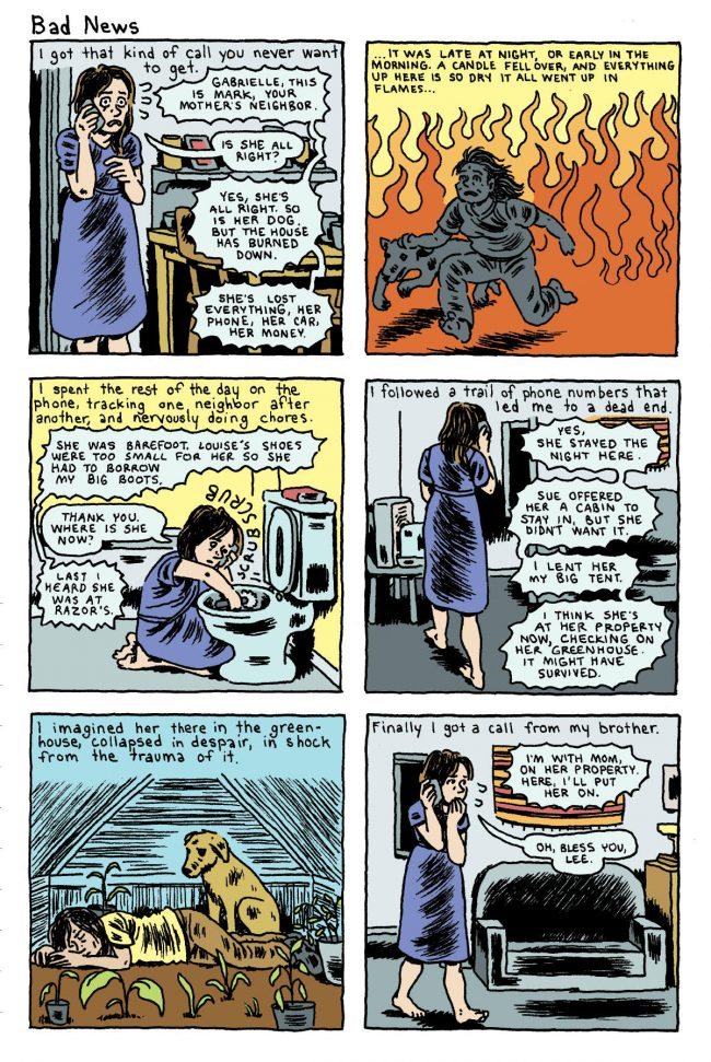
Bell then gets a call that sets the rest of the book in motion: an old neighbor tells her that her mother’s house has burned down and that she’s lost everything. That prompts her to begin one of many trips from New York to rural Northern California, with each one delving deeper into her feelings about her mother. Along the way are a number of digressions that make Bell’s work so funny, but this is a book where her tendency to sometimes slip into magical realism is entirely avoided. There’s a sense that Bell wanted to stay grounded and entirely present in this narrative, though she can’t seem to help but slip in a few of those funny digressions. A fan in Germany bought a lot of her original art, and she had the fantasy that she could bring her mom to that fan’s house and simply live with him.
It’s revealed in the book that Bell’s mother Maggie was abused by her partner Jeff. After he left, she essentially dropped out of society, happy to live on her small property with her dogs and away from others. Sometimes she would let people (like her younger next-door neighbor Gus) help her out, and other times she’d yell at them to leave. She wanted to simplify her life as much as possible, and to that end, she wanted to buy a small, prefab house to replace the one that burned down. Much of the book explores this process, as Bell also comes to terms with the fact that her mom (with good reason) was skeptical regarding Bell’s helpfulness as to this process as well as her ability to thrive in isolation. Honest to a fault, Bell cops to wanting to feel like a hero to her mother as well as hoping to generate material to do comics about.
She depicts her mother with great warmth and complexity. Maggie is a highly intelligent and sensitive person who just decided not to put up with the world’s bullshit anymore one day and who lived on her own terms ever since. It’s hard to describe her relationship with Bell; it is certainly loving and caring, but not maternal in the stereotypical sense. They are more than friends, but the bond that Bell depicts (especially on her own part) is a tremendous sense of empathy for someone who looks at the world in very much the same way she does, and who helped Bell become awake and aware. There’s also a scene with Bell’s 90 year old grandmother where Bell goes off on her for not teaching her mother the skills she needed to cope with the world or even show an interest in her now, and her grandmother tearfully replies that she didn’t know how.
What was remarkable about that scene is that the dialogue between Bell and her grandmother played out in the present tense, but Bell also added some past tense captioning that commented on what she was saying–often adding an amusingly self-deprecating comment. It speaks to her mother’s regrets and feeling that she was a terrible mother, leaving unspoken the role of her father and grandfather. The end result of the berating was both of them in tears, with Bell apologetic, and a talk the next morning that revealed that telling these truths made them closer. The Bell women may have been part of dysfunctional families, but they never had any illusions as to whom they really were.
As Bell and her mother negotiate and navigate the process of purchasing and then having a house assembled and brought to her property, there’s a separate but unspoken sub-narrative of how they both negotiate and navigate having to deal with men. Maggie’s neighbor Gus has a history of violence and time spent in prison, but he also seems genuine and caring in his own broken way. Bell is fascinated by him and “interviews” him (to his bewilderment), partly to suss out his true motivations and partly out of genuine curiosity. Bell depicts him with a certain solidness and clearly empathizes with him as a fellow outcast, even imagining shacking up with him as part of an effort to stay close to her mother as well as fulfilling a fantasy of dropping out. Bell knows that would never work for any number of reasons (hilariously picturing a “future” scene of her with children, chasing them away from their home), with her need to sometimes be in the city being one of them.
In perhaps the most subtle storytelling presentation in the entire book is the character of the salesman who sold them the house. Superficially gracious but also a somewhat unctuous character, he steadily takes opportunities to make inappropriate comments and physical overtones toward Bell. It starts with calling her “sweetie”, an unwanted hug at the close of sale and an unwanted gift of salmon, and continues on with entreaties to go fishing and concludes with a kiss on the cheek, another unwanted embrace and a speech about being glad she came into his life while his fiance’ wasn’t watching. Bell didn’t directly comment on any of this other than simply illustrating it, nor did she have to.
Bell also spends a lot of time discussing the pets (many of them pretty wild) she and her mother had had on the property, barely tamed to the point where neighbors wouldn’t allow their big dogs on their property. Bell didn’t feel an emotional connection to her pets as a child (she notes having to fake it when a cat died), but it’s clear that as she constructed her own identity as a person, a love of animals developed even as she grew to love and connect with others.
The book ends with a bookend sequence of sorts, as the apartment she was illegally subletting to a friend burned down in a fire in New York. Contrasting the empathy of her mom’s friends in California to the apathy and outright hostility in New York was something she didn’t even have to play up. There was an interesting scene where she came upon a woman who was shaking next to the subway when she and a friend were in a hurry, and Bell stopped to help her and eventually call 911. She eventually gets offered an apartment in a building for the displaced, which she immediately is charmed by but her friend is horrified by. It speaks to the way that Bell isn’t really so much of a misanthrope as she is someone who needs a certain amount of solitude. Indeed, her perception of herself as “someone barely passing” to street people makes it all the more easy for her to break the unspoken rules of living in New York and reach out to others and help those in need.
There’s a coda that features a number of silent pages of Bell back at her mom’s place, taking a walk in the woods and taking in the scenery. She encounters a dog and makes friends with but warns him off when she gets near home, because Gus’ dogs are viciously protective of territory, not even recognizing Bell. It’s a mirror image of her reaching out to help that woman amidst the barking dogs of New York and a reflection of the ways in which her growth as a person was affirmed over the course of the book. The last image in the book is a silent one of Bell soaking in a bathtub that Gus had just installed in her mother’s house, quietly portraying her restoring her strength in a place that she did so much to make happen. If Bell’s other books revealed a person whose persona seemed fractured, then this one reveals a woman who has begun to reconcile the twin needs for solitude and connection. It’s no coincidence that such a book would be her first long-form narrative, even if it was made up of vignettes.

Monday, July 30, 2018

Silver Sprocket: Benji Nate's Catboy

Originally appearing on the Vice website, Benji Nate's Catboy strips are the perfect example of an artist using the visual style and tropes of a comic aimed at children, only its audience is adults. The book's premise is a young woman named Olive who wishes she could hang out with her cat Henry as though he were a real person. The next thing she knows, he's walking upright like a person and is speaking English. The humor of the strip is often derived from Nate slipping in and out of the unshakable truth of the strip (Henry is a cat and still acts like one) to one where Henry's transformation is so easily accepted by everyone else that it becomes a slice-of-life strip. Nate also discusses gender, identity and sexuality in the strip in ways that are sometimes painfully shy but also straightforward. For example, Olive dresses Henry in her own clothing and tells him that she only has "lady clothing", and his blunt response is "I don't know what that means." It's a swift, sharp rebuke to gender modeling disguised as a cute exchange.

Unsurprisingly, the guileless and confident Henry is a big hit with everyone Olive knows--even people who never gave her the time of day, like her high school nemesis Dixie. At the same time, he's still a cat, who refuses to use a toilet, likes to eat mice and wants to have sex with other cats. Nate doesn't avoid Henry's animal aspects, but she finds ways to make them funny, rather than off-putting. He won't take showers, instead cleaning himself by licking himself like a cat does--only because he's so big, he coughs up a huge hairball. At the same time, Henry also has an endearing naivete about things like birthdays, slumber parties and pets. He falls in love with a snail as his pet after rejecting more typical ones, and he wants everyday to be his birthday. Much of the charm is in the way Nate uses simple shapes to build her characters. Olive's oval head, trophy ears, parted hairstyle and pigtails is as memorable a character design I've ever seen, especially with the way she draws eyes. It's a half-circle with the right side filled in with blacks. It's a formal device that makes it easy for Nate to express big emotions with a minimum of heavy lifting. Henry's eyes are black circles inside a slit of a white circle, which practically glow against black fur. Nate also often slaps dialogue on top of a character's head as a way of emphasizing the speech, one of many quirks that builds up the visual world of the story.

One of the running gags in the book is that Henry is better at virtually everything than Olive, who is presented as a sort of feral adult. Henry has no problem meeting women, whereas Olive is very much undecided about her own sexuality. She thinks she doesn't like boys until she meets a nice guy who seems to be flirting with her, only to offer her a job at a lunch she thought was a date. Olive has trouble finding work, but Henry somehow winds up making tons of cash as a dog sitter, which is its own series of funny vignettes. Olive doesn't have any friends, but Henry turns everyone he meets into a friend who is fascinated by his whimsical choices. Olive is an artist, but Henry goes to a life drawing class and is easily better than her on his first attempt. There's a sense in which Henry represents her best self, one with confidence and (most importantly) a lack of self-consciousness. Slowly but surely, they help each other start to self-actualize, as she gets him to understand how social customs work and he helps her take more risks. Throughout the book, there's an unshakable bond between the two, even if they happen to argue every now and then. This is just the kind of sincere, quirky book that's become a standard for Silver Sprocket. It still eschews conspicuous consumption and the culture surrounding it, but it also avoids the kind of privileged nihilism and aggression that's marked punk at other points in time.  It's a new kind of punk attitude, one emphasizing sincerity, kindness and openness.

Tuesday, July 24, 2018

Minis from Jep

Jepcomix #5 and #7 are by the cartoonist Jep (Jeff Clayton) and they are mostly four-panel autobio comics that originally appeared on the web. Issue #5, however, is mostly fiction. Using a crude, mostly stick-figure style for his stories, Jep emphasizes exaggerated gestures above all else. In the story of a mouse and a sentient ball of some kind (complete with oversized eyes and teeth), Jep's characters are in constant motion as they seek to raid the bounty of a picnic table. The cartoonist keeps details to a minimum while using a gray wash to add a bit of weight to the page. The result is a funny, clearly told story that moves along at a pleasant pace. The visual formula is repeated to a different effect in a funny reinterpretation of Jesus' pleas to God in the garden of Gethsemane. Here, Jesus talks to God in the form of a cloud and amusingly forces god to come up with good reasons why he has to die. In the end, Jesus is threatened with being dismissed altogether, so he plays along. What I like about this is that Jep is engaging in some solid theological debate in addressing some very basic assumptions.

Jepcomix #7 is a very long look at Jep's life with fighting as the narrative structure. He describes each of the encounters he had in school, where he lost every fight. There's no wistfulness or regret here, as he recognizes why kids interacted the way they did and how utterly pointless it was. This also led to a series of strips where he was followed by dolts who called him homophobic slurs. By this point, Jep was deliberately a pacifist, so he had to rely on luck and his brains in order to get out of those situations. Much of the rest of the comic is concerned with the world and his emotional state after Trump was elected. It's fascinating to read, because on the one hand Jep had done a lot of work confronting his own anger issues. Responding to a situation with blind rage was no longer his modus operandi. So Trump being elected (despite Jep being Canadian) was in many ways the ultimate test of his attempts to find tranquility.

Indeed, much of this issue focuses on tiny but steadily growing changes he sees in the world around him in terms of greater hostility, as well as his own inability to deal with his own outrage at the result of the electoral shift. He deals with this via meditation and even avoiding the internet for a couple of days. The comics in this volume are quite wordy and Jep is well aware of that, and he tries to vary formats on different days, emphasizing an image or two filling up panels with a minimum of verbiage. It all forms a curious sort of tension, as Jep acknowledges his own unresolved anger problems and his attempts at seeing the viewpoint of others while at the same time still having a short fuse and a loud mouth. This level of honesty and self-awareness, along with a commitment to engaging with the world, is unusual for this kind of autobio comic. The art becomes mostly a means to an end here despite his best efforts; it's a delivery system for his thoughts and not too much more. What he's talking about simply doesn't lend itself to stretching himself more in terms of the visuals, or at least, it doesn't lend itself to being a visual problem for Jep to solve. He gets his points across, and there's an almost frantic quality to his line and even his letter, as though he was slashing at the page as quickly as possible. These comics certainly stand out against most autobio comics of this type.                                                                                                                                                                                                                             

Monday, July 23, 2018

On The Eisner Awards

I was happy to see so many women and people of color win Eisners this year, in unprecedented fashion. Indeed, Marjorie Liu, for example, was the first woman to ever win a Best Writer award. Taneka Stotts, Roxane Gay and Alitha Martinez became just the second, third and fourth black women to win Eisners, and Jackie Ormes became the first black woman in the Eisner Hall of Fame. Emil Ferris continued to rack up every award for My Favorite Thing Is Monsters. The slate this year was more skewed this year toward the mainstream than last year's slate, when I was a juror, though it was still quite solid. However, when it came time for voting last year, the people who did the voting chose a lot of the same old things. This was really disappointing, but not surprising. This year, it was surprising to see who won, and I think it might represent a shift in those who are choosing to vote.

For those who don't understand the process, the Eisner Awards are split into current nominees and a Hall of Fame. Six jurors are selected, representing six different categories: a creator, a retailer, an academic, a librarian, a critic and someone related to Comicon itself, representing "the voice of the fan". It's an intense, bonkers process that culminates in a weekend where the jurors meet in San Diego and nominees are chosen for over thirty different categories. Once lists are narrowed a bit, the jurors then vote on a scale of 1-5 (1 is awful, 5 is absolutely outstanding) for each work in each category. The comics or books with the highest scores get nominated.

The Hall of Fame is broken up into two parts. What's important, first of all, is to understand the selection criteria as given to us by the folks who run the Eisners. We were told to select people who have had outstanding achievements and/or influence in creating comic books (which includes floppies and graphic novels but NOT comic strips.) Comic strip artists are considered only if they have had a demonstrable and significant influence on comic books. For example, Milt Gross was inducted last year, and I argued that he had a powerful effect on the artists who would create MAD, among others. I'm not sure this is really a compelling distinction anymore, especially as more work by strip cartoonists from the past is being made public. Also, the Eisners give awards for webcomics, many of which are indistinguishable from comic strips other than the format. I think some of this had to do with not competing with the National Cartoonists Society's Reuben award in the past. For better or worse, the Eisners are now the award most singularly connected to comics as a whole, and I think it's past time the Hall of Fame rules changed to incorporate comics of all kinds under one roof. The election of Charles Addams is a good step in that direction.

That said, here's the process. First, the judges get a choice on artists who are deceased. Most years, they get to select two artists. The process works like it always does: a first ballot is discussed which is influenced by past candidates, who are mentioned as possibilities. Then voting commences. The top two choices are automatically chosen for the Hall of Fame as the jurors' picks. Then a list of candidates is selected for the Hall of Fame which encompasses all eligible artists. That includes deceased artists as well as artists whose career spans at least twenty-five years. This year, that means any artist whose first work was published in 1982 or before is eligible. If you've wondered why more women or alternative-era cartoonists aren't in the Hall, this is one reason why.

Here's the other reason: once the nominees are chosen, it's up to the comics industry to vote on them. That means anyone who has been published as a writer, artist, editor, letterer at any level, as well as retailers. This may be stating the obvious, but there won't be greater diversity in the Eisner award votes without greater representation in comics itself. It is very clear that this year was an example of just that kind of diversity starting to assert itself in a public way. There are a lot of reasons why the creator pool is becoming more diverse, including but not limited to more and a greater variety of comics being available to the public now than at any other time in history; the internet wiping out gatekeeping, both in terms of consumption and creation; and the proliferation of comics schools.

I mention all of this because many are noting that Rumiko Takahashi's entry into the Hall of Fame felt overdue. In a sense, this is true, but one must remember that this was only her fifth year of eligibility. The show awarded her an Inkpot Award in 1994 when she attended the show. It can absolutely be argued that she should have been voted in in her first year of eligibility, but it's also not surprising. Her Ranma 1/2 was one of the first manga series to be widely printed in English in America, but that wasn't until 1992, meaning that older audiences who are voters didn't understand its significance or popularity; indeed, considering that "manga" is still a slur for many comics fans, it was just a matter of time until there was a tipping point of eligible, interested voters. That tipping point is now. The voting this year will not be a blip but rather the start of a trend.

Friday, July 13, 2018

Koyama: Ben Sears' The Ideal Copy

The Ideal Copy is Ben Sears third "Double+ Adventure" book for Koyama Press, part of their small but formidable listing of comics aimed at kids. This is the best of the three volumes, and I think it's because Sears scaled back a bit on the futuristic wow factor of the series and instead went back to good-old-fashioned caper storytelling. At its essence, the series features treasure hunters Plus Man (a highly adventurous kid) and his mechanical friend Hank (who is sort of like a Transformer in the way he can assume different shapes and functions), and treasure hunts are capers. Mysteries with clues that need to be unlocked, preferably with a wide variety of colorful characters. As such, this book has a well-designed structure that not only quickly establishes the main characters' prior status quo with a fun side adventure, it also puts the new adventure into motion.

Hank and Plus Man were working for the city as treasure hunters, going after those who abused the environment or otherwise did morally questionable things. When asked by the city to rob someone's grave in order to recover some post-mortem tax assets, they refuse and are made persona non grata. They get jobs as caterers and do a job in a mountain lodge working for a fraternity reunion of some kind. Sears captures the sheer unctuousness of the now middle-aged frat boys and their drunken antics, which happen to be covering up something far more sinister. As Plus Man gets curious and investigates some mysterious shenanigans, he acquires a kid and a burned-out former treasure hunter as companions.

The stakes get higher and higher for everyone as Plus Man exposes a counterfeiting ring and moves to try and stop it. Sears moves along his carefully structured plot in a relaxed, almost shambling manner as Plus Man's relentless curiosity and impertinence get him in trouble as well as give him opportunities to explore plot clues. There's a warmth in Sears' work that's unusual for science fiction, as his clear-line style and the constantly shifting background color patterns are inviting, keeping the eye moving across the page. The background colors are a sort of hidden grid in and of themselves, as Sears alternates blue, green, orange, and yellow on a number of pages--especially those with talking heads. That hidden grid keeps things flowing when the action or details on a page become more spare. On other pages, Sears has a way of doodling all kinds of details that organically fill the panel and pages they're on. That structure, mixed with what feels like a casual energy on the page thanks to his cartoonish drawing style, reveals Sears as an extremely careful and deliberate cartoonist whose serious approach doesn't detract from the liveliness of his line and the small joys of his characterizations.

Thursday, July 12, 2018

Katherine Wirick's Nervenkrank #3

The third issue of Nervenkrank, Katherine Wirick's minicomics serial about Dada artist John Heartfield, is the first that starts to get at the essence of what would become his life's work. The issue continues this historical fiction biography of the artist as he and his brother visit George Grosz, Heartfield's future Dada collaborator. While many associate Dada with cut-up techniques, dissonant live performances and other anti-art techniques, in Grosz and Heartfield they had two caricaturists who directly embodied Dada's spirit as a form of excoriating political and cultural protest. Indeed, Dada was a direct response to the slowly dawning realization that the rabid nationalism that helped lead to the war was utter nonsense that had nothing to do with the average person. Grosz and Heartfield did a lot of pen-and-ink drawings that have more in common with editorial cartooning than anything else, even if they used collage and other found-images as part of their work.

Getting back to the issue and the series in general, Heartfield (then still Helmut Herzfeld) was a sensitive, empathetic artist who wound up in the German army's version of a mental hospital a few times during his stint as a soldier. He had to dodge virulent "patriots" and others, including his landlord. Visiting Grosz was the revelation he needed in his life, because he was exposed to drawings that Grosz considered trash because no one in the art world thought them of any value: his brutal political cartoons. This sparked one of the central themes of Dada and the series itself: wrestling with the very concept of "beauty". In the eyes of Heartfield, beauty was a lie, like God and Country. It was all part of the same package, a bill of goods sold to him. "What good is this? What is it for?", he howled at his brother, saying that when he was being strapped down by the army, art wasn't going to save him. What Grosz was doing, what amazed him, was simply telling the truth about what he saw. Heartfield reasoned that if he was going to die anyway, he might as well record what it was like to live during this time, to leave behind his attempt to document the truth, as horrifying as it was. 

Dada is a paradoxical art form. It is art, using new and traditional techniques, many of them representational. It is anti-art, in that it rejects the institutions that define art and the concept of beauty removed from the everyday world. The world had become (was always?) absurd and meaningless, therefore the only sane response was art that played on this absurdity and meaninglessness, exposing it for what it truly was. Wirick masterfully not only captures and distills this moment in a single, powerful page, she also shows how this realization transforms Heartfield into someone who no longer cares what the world thinks about him, including the landlord who had verbally amused him so many times. It was also not lost on me as a reader that her use of a naturalistic, grey wash lent itself to fitting in with Grosz's images, which were in a sharper pen-and-ink without a wash, yet still fit in nicely with the overall conceit of the book. Wirick is creating a history of one man's wrestling with enormous concepts like art, beauty, nationalism, madness that aren't just abstract ideals--they are factors crashing into his every day life. The look in his eyes when he realizes that trying to combat the insanity of war with simply-defined notions of beauty was a fool's errand is the most striking image in the book; a moment of clarity but also of a mind bursting open, never to be the same ever again. It's an astonishing tipping point, and Wirick clearly gave it a lot of thought as she nailed it. 

Monday, July 9, 2018

Scholastic: Aron Nels Steinke's Mr. Wolf's Class

Aron Nels Steinke's major-publisher debut, Mr. Wolf's Class, is a pitch-perfect account of an ordinary classroom on the first day of school. It's the culmination of his career arc as a cartoonist and an expansion on his minicomics of the same name. Those comics were told entirely from his point of view as an actual teacher in a fourth grade class, but the bulk of the humor came from the things that the students said and did. Steinke is a keen observer, and when that gaze is turned on others instead of himself (as in his obsessive autobio comics), the result is a raw, hilarious and accurate account of what children are really like. In particular, Steinke captures the sense of controlled chaos in a classroom, with a teacher having to negotiate the personal narratives seventeen kids.

Steinke makes a number of smart storytelling decisions. He starts the book with a silent series of panels as Mr. Wolf fixes up his classroom. It establishes him as an important character, but then Steinke gives us one panel each on every student in his classroom going to bed the night before the first day of school in a 2 x 4 grid. That quickly established that every character is important, but the last panel introducing the kids spanning across the bottom third of the page introduces Margot. It's a clever device that hints to the reader that Margot will be a very important character. Indeed she is, as it's her first day of school in a new city. It's also Mr. Wolf's first day as a teacher at this school. Steinke gives the reader a couple of different routes into the story, as these characters serve as reader surrogates in a sense. We see the school through their eyes as being unfamiliar with a new routine, but we also get to see through the eyes of other students as well.

Steinke employs an anthropomorphic rendering of his characters, which is quite effective. First of all, it establishes a base cuteness level slightly removed from reality, which heightens what is after all a mundane setting. Second, it helps with the problem of keeping track of two dozen characters. Making each one a different animal makes it easier to remember who's who. Even with that aid, it's easy to forget the names of characters. Steinke is aware of that and incorporates it into the story, as Mr. Wolf forgets the names of some of his new students. There are some nice storytelling symmetries, as the story begins and ends with Margot and her first day, and also features Sampson with an unpleasant bus ride at the beginning of the story and a pleasant one with Margot at the very end.

Steinke weaves in a number of little stories and plots that follow each of the kids in the class. There's the prickly Aziza, sleepy Penny, cartoonist Oscar, brainy Stewart, etc. There's friendship, there's conflict, there's hurt feelings and even a missing student, as Penny takes a nap in a cardboard box. There are references to farts. Throughout the book, Steinke pokes fun at Mr. Wolf, who pats himself on the back a lot for doing a good job until Penny disappears. He also has to deal with rats in the classroom, a fellow teacher stealing his stapler and conflicts in his class.

The overall message is that adults are just as confused and clueless sometimes as kids, and they need help like anyone else. Steinke has crafted a book that will resonate with kids as feeling real but is also entertaining. It poignantly captures the way kids make friends with each other as well as the ways in which they hurt each other, even if it's inadvertent. Everything about this book is understated despite the clear amount of work Steinke put into creating a smooth structure for his story. By going after the small details instead of trying to push big events on the reader, Steinke has created a series that accurately, sweetly and amusingly chronicles the ups and downs of being a child at school.

Friday, July 6, 2018

Celebration: s! #29

s!, (formerly kus!), is the flagship anthology of kus!, the Latvian publisher that has a wide, international reach. Publishing in English, editors David Schilter and Sanita Muizniece have nonetheless always given each issue a heavily Baltic feel, and the tenth anniversary issue (#29) is a special celebration that focuses mostly on Latvia. I've said it before: Latvia is to comics as Lithuania is to basketball, meaning that these two states with small populations have a disproportionate amount of success and influence relative to their populations. Of course, all it takes to put a small press anthology is a lot of patience and determination, along with funding from the state culture foundation.

Most of the artists follow up on the celebration theme and do short stories about parties of various kinds. From Ana Vaivare's opening strip following a cat on the floor trying to get scraps from a table set for a feast Konig Lu Q's exploration of celebrations of not just commemorating booms and busts, but also causing them, there's the usual wide array of styles and visual approaches to be found. From a bright use of color from Vaivare and an open page layout to minimalist black and white and a standard grid, the anthology remains compelling throughout because no two strips look the same. The editors also made sure to alternate stylistic choices from one story to the next, such as Kaspar Grosev's swirling, almost abstract figures giving way to the over-the-top color and cartoonish monsters in Ernest and Andres Klaven's exploration of Cthulhu as a rejected slam poet. Speaking of elder gods, Reinis Peterson's red, yellow and orange-soaked silent saga has a huge boar sacrificed, a giant fire built, and a sickly green demonic figure rising out of the fire.

There's the joyous, brightly colored doodles of Davis Ozols, where happy blobs and humanoid shapes float around in rapt happiness. That's immediately followed by the unnerving "Dirty Pool", by Laura Kevins. A woman cleaning up after a party finds a friend hiding in the swimming pool in order to get away from a stalker. Next thing she knows, a chorus of "hey baby" and "aren't you going to say hello" comes from the bushes, as though they were surrounded by a pack of wolves. Staying in the pool is the only way to be safe, because "if they get wet they think they are crying--and vulnerability makes them dissolve". The humor is darkly accurate, as even the joking tone of the story is built on real-world experiences.

Other highlights include Elena Braslina's charming "The Dishes". Using a dense, scratchy style overlaid with key spot color, it tells the tale of a young woman who decides to clean a bathtub full of filthy dishes after a wild party. As she scrubs the dishes and more water winds up in the tub, she reveals a mermaid of sorts. In a neat bit of magical realism, the two escape together down the drain. The scratchy quality of her line, leaving all sorts of splatter on the page, was a perfect way of depicting the sheer amount of filth all over the place. The aquamarine skin of the woman in the tub breaks through all that splattered ink, and last panel was entirely that shade of blue-green.

Ruta Briede's "They Came" is a charming story, done in a clear green line, about a woman preparing a feast for the neighborhood cats. There's a deliberate, slow pace to this story that invites the reader to closely look at details and enjoy the unfolding events rather than worry about where they lead. Maija Kurseva's collage comics, where images are cut out of other images to form the people and furniture at a party. It's all laid over graph paper, giving it kind of an angular 80s music video aesthetic. It's the kind of piece that I love seeing in s!, as the editors are dedicated to presenting as wide a variety of visual approaches as possible. Finally, Martins Zutis' plays with the grid in an interesting way. He uses a 2 x 4 grid pattern and establishes the story on the first page, with each panel describing what is to come in the rest of the story, which is wordless. Each story unfolds a panel at a time per page; for example, the third panel down from the top on the left is "underground tea party". We see images of crystalline creatures slowly drinking tea. Each story unfolds separately, that is, until the "Volcano's first day of work" (with a mountain dressed in a business suit--a very clever visual pun) interferes when lava starts invading every other panel. It's one of many clever visual jokes as many of the mini-stories are celebrations in and of themselves.

Wednesday, July 4, 2018

Uncivilized/Odod: E. Eero Johnson's The Outliers

Odod Books, the YA arm of Uncivilized Books, has been quietly releasing some very good, mostly genre-focused books for a few years now. Peter Wartman was their trail blazer and Kickliy's Musnet is their big seller, but E. Eero Johnson's Tsu & The Outliers represents something different. This book about monsters and outsiders is for an older child audience, and there's quite a bit of intense, even frightening, action. The blurb on the back notes that the book is an outgrowth of Johnson's "hopes and fears of raising an autistic child", and that's reflected in the book's protagonist, Tsu. Tsu is nonverbal and is bullied and mocked by his schoolmates. However, he is also able to communicate with a monster in the woods, a "bigfoot" who turns out to be his friend.

The bullying aspect of the book turns out to be a fairly minor part of this relatively slender (116 pages) volume. Instead, the meat of the book concerns Tsu dealing with a talking monkey scientist and his pet serpentine chupacabra. There are several long, clever chase and fight sequences that make up the bulk of the book, and the story's outcome is not what one would think. Indeed, it sparks the next possible volume in the series, where Tsu goes off with the scientist and the other "outliers"--creatures outside the norm. Tsu's friendship with the creature named T-Chok (the bigfoot who also looks like he's part ent) is a reflection of his ability to communicate in a way and with a portion of the world that's closed off to others. It's a reflection of how his own ability to communicate with other people is closed off as well, until the scientist does something to him.

Johnson doesn't hit Tsu's communication issues hard in terms of moralizing about it; instead, it's an important part of the actual narrative. He is forced to find better ways to communicate. He shrugs off abuse because though he might struggle in school, he is at home in the dense forest. There's an odd story structure here that keeps the reader off balance. It starts in the middle of an action scene and eschews conventional pacing and three-act structure. The book also defies the typical hero's journey and gives every character murky motivations. Is the scientist good or evil, or is that classification meaningless? Is Tsu a hero or simply someone in the wrong place at the wrong time? Is Tsu entering a dangerous world with unknown terrain, or is he finally traveling into territory where he can finally be understood? Johnson keeps this all delightfully vague and is aided by his dynamic, scratchy line. The professor jumps around like a Jack Kirby character and the action is larger-than-life in that Kirby style. The single-color wash serves to highlight the dense quality of the line rather than bleed over it, making it just one more slightly off-kilter thing about this odd, compelling book.

Monday, July 2, 2018

Soaring Penguin Pressl: Boum's A Small Revolution

Soaring Penguin Press is one of many small press concerns in the U.K., and they tend to produce nicely-designed and crafted comics that lean between genre and art-comics. Boum's A Small Revolution is somewhere in-between, as it's sort of a war comic. It's the tale of a nation ruled by a tyrannical President, opposed by a Resistance of anarchists. The focus of the story is on a couple of young orphans, the daredevil Florence and the sickly Auguste. She steals food so the two of them can survive, though he has a lung disease (presumably tuberculosis) that is slowly killing him. She hangs out in a dying antiques shop to hear a record by an artist who advocated resistance but not war; it's a paradox that Florence embraces, even as he's referred to as a "deserter". From there, Auguste's older brother Dominique introduces them to the Resistance, and Florence's life is transformed.

There is a scene worthy of Chekhov in the way that it establishes a future scene in which a jovial Resistance fighter plays around with Florence, first giving her a rifle that's way too heavy for her. Then she puts a grenade in her hand, telling her to be careful not to pull the pin, and then she takes it back. After that, the action moves swiftly in this slim volume (94 pages). Boum's clear line and cute, cartoonish drawing style winds up playing a significant narrative role. Florence, with her oval-shaped head and giant, almond-shaped blue eyes is an almost painfully cute character. Boum counteracts that in the early going by showing her smoking; it's an easy, shorthand reference to show how her childhood's been destroyed. Later in the story, when Florence breaks into the Presidential palace and hugs the President's leg, it's a believable development because she is tiny and cute.

Predictably, the President is unamused by Florence, who pretends to be afraid of the Resistance. Someone peels her off of him so he can go make a televised appearance. A sympathetic official asks her if she wants to see the President record his message, leading her to hug him again. This time, the plan works, and we see a certain grenade pin that she places in his hand. It's a fitting end for a character whose life was marked by occasional bursts of beauty amidst long spells of violence and meaninglessness. When the only people in her life were taken from her, she honored their memory be becoming the very symbol of revolution that she had sought in Boris's music. Whether or not her act of violence is less important than its symbolic importance to a watching nation. For all of the flourishes related to characterization in this book, Boum never loses sight of its tight plot elements. It's not a complex story in terms of plot or themes, but Boum uses that simplicity to create a direct, powerful punch in a compact space.