Will Dinski's new book is one of his best. One of Dinski's go-to themes has been the ways in which people's lives become intertwined in unexpected and frequently toxic ways. In Trying Not To Notice, each of its four chapters are told from the point of view of one of four principal characters: a struggling stand-up comedian named John, his grizzled veteran comic friend Kyle; John's wife Amanda, who is unable to use her legs; and John's co-worker Summer. At first, it's not clear who's leading the narrative with each chapter title; for example, the first chapter is "My friend Kyle has it all figured out." It takes a couple of pages before it's clear that while the title refers to John's relationship with Kyle, it's all from Kyle's point of view.
Dinski's art has always relied on the elaboration of basic shapes to create his characters. For example, Kyle's head is essentially an upside-down triangle, while John has a classic square jaw. The simplicity of the characters is juxtaposed against Dinski's wildly inventive page compositions that vary from page to page. There are three panel pages, splash pages, seven panel pages, pages where the panels are in small circles and other techniques designed to keep the reader off-balance. As the story proceeds and gets continuously stranger, Dinski makes sure that the reader is ready for anything. The central brilliance of the book is that Dinski builds up a narrative where it seems like all of the central characters are trapped in situations that make them unhappy, with little to no hope of things changing, but Dinski reverses those expectations in unexpected ways while making the reader ask if things really are for the better.
For example, we learn from Kyle that John is a nice guy and terrible comedian who has been trying to become a successful stand-up for quite some time. Kyle tolerates John's presence and gives him meaningless advice as he badgers him into buying drinks for everyone since he has a day job. Meanwhile, we learn that Kyle is depressed because his career is stuck in neutral and he can't even get laid. There is a moment in the narrative, when Kyle is too drunk to go on and the ever-sober John has informed his friends that he's completely re-worked his set, where John takes his place and absolutely murders the room. It's an unexpected reversal of fortune that eventually helps Kyle as he finally get a girlfriend as well, as John becomes the proverbial rising tide (or in this case, a tsunami) that lifts all boats. Beneath his blank expression and lack of guile lies raw, naked ambition.
We see that start to play out in the next chapter, "My co-worker Summer has a bright future". The essential narrative of John is that a large part of his success is finding the right people to associate with, taking advantage of those relationships but also rewarding those who helped him. In the case of Summer, she assisted John with fixing the books of a Hollywood producer but then later lost her job and was embarrassingly escorted out of the building by her boss. Her reversal of fortune came when she was brought into a meeting by John with the producer, who was so attractive that Dinski drew him as having an entirely blank face. In other words, whatever one's physical ideal might be, the reader could simply imagine it. In gratitude for her help but also as a way to demonstrate his ability to get anything he wanted (including walking up to her and kissing her), he bought the firm that fired her and installed her as the new boss.
The story gets stranger in "My wife, Amanda, can do anything". There's a sense where the chapter titles are less descriptive than predictive, as her job as a photographer for digital advertisers starts to give her frightening amounts of power. After witnessing a man hitting his dog, she posted photos to an animal rights group's message board and gave out his information, which led to him being badly beaten. She was witness, judge and essentially the executioner. As her husband gets more and more famous, she finds herself paranoid about his activities and farther away from him than ever. She can do anything, despite her disabled condition, but that doesn't mean that she should.
We finally see the world through John's eyes in "My life is just the way I want", as he looks at himself in the mirror and sees a sculpted body when his average frame is reality, yet everything he writes on his to-do list winds up becoming true thanks to his relentless belief, cultivation and relationship and ruthlessness in seizing advantages. Now a big enough star that he needs to go out in public in sunglasses, he meets Summer for lunch. She has transformed from someone who said that she was more than just her job in a merciless shark who physically threatens a man in public and crushes his cell phone as she's accompanied by a phalanx of accounting cronies. He buys yet another chair for Amanda from the woman she thought he was cheating on her with, but he was entirely pure of heart despite her paranoia. He and Kyle share some ecstatic moments as John tries out new material at his old club. John and the producer toss around ideas, with a money-making super-hero role being proffered.
There's a moment at the end where his reach exceeded his grasp and his fantasy of his wife walking with him on to his set was wiped out when she was left at the bottom of a flight of stairs. For just a moment, we see the anger, worry and hostility of the people around him, until he changes his outlook (and thus, theirs as well) back to all-sunny, all the time. His wife disappeared in that scenario, but it was a matter of recalibrating the way he wanted his life rather than actually solving a problem or engaging in a conflict in any way. The fact that this chapter is silent is no accident, because John in reality is a terrible communicator, and the way he looks at the world is that he's "trying not to notice" the things that bother him. What's remarkable is how doing this enabled him to remake the world in his image like Rupert Pupkin from King of Comedy. Illusions and lies, if you can get enough people to believe in them, can become a new form of consensus reality. What Dinski suggests is that the further he went in propagating his new version of reality, the more warped it made those closest to him, though he would never see them as anything less than completely happy because he was completely happy. It's a tricky, disturbing narrative that Dinski loads with details that tell the story if one is willing to look closely enough.
Showing posts with label will dinski. Show all posts
Monday, January 23, 2017
Monday, June 20, 2016
Feelin' Minnesota: Dinski, Nilsen, Gillmer/Thompson
Minneapolis is one of the most fertile of cartooning cities. That's due in part to the presence of two of my favorite alt-comics publishers (2D Cloud and Uncivilized Books), as well as the Minneapolis College of Art and Design. I'll have features on those publishers soon, but here are a few comics from locals.
God And The Devil At War In The Garden/Conversation Gardening, by Anders Nilsen. Nilsen doesn't generally do a lot of his own minicomics these days, given that he has a couple of different publishers, but this one was a special occasion. This 9 x 13" comic on a cardstock cover and interior paper that soaks up Nilsen's line nicely, and it also contains another minicomic (Conversation Gardening) within. That minicomic is done in the style of Nilsen's Monologues comics: with a stick-figure smart ass and a surprising number of gags. The gags are rather pointed, however, and are aimed squarely at amazon.com's suppression of books not only critical of it, but of other books by the same publisher. Of course, their business model was predicated on wiping out independent bookstores in order to obtain a near-monopoly. While Nilsen's critique is on-point, he notes that his real purpose here was to continue what he calls "the conversation": the millennia-long interaction between authors and readers. Thus, he offered to anyone who sent him a receipt of one of his books purchased at an actual brick-and-mortar store a chance to send him a question/idea/thought, and he'd send the reader back a drawing in response to it. It's a clever idea to confront naked greed with creativity.
The larger comic is done in Nilsen's fare more work-intensive style that involves dense hatching and even stippling here and there. It also includes his single page silhouette style that he used for Rage Of Poseidon wherein he takes on the story of Lucifer. It's a sympathetic take on Lucifer's downfall, as he viewed himself as god's partner in creativity rather than a servant. When god created man (in his own image, which Lucifer noted in man's eyes) and noted that he might sing, Lucifer laughed. That leads to a great panel where we see a black-on-white composition where Lucifer's wings have been shorn off as he's falling from paradise. At the end of the story, we're left with Lucifer's potential reconciliation with god and his return to heaven--but not yet. The other pieces are also interesting, like "Anatomy Of A Vacant Lot", which is a witty deconstruction of the ways in which gentrification can lead to blight when the money runs out. "A Frailty Overhead" (written by Kyle Beachy) is a densely drawn account of the remnants of a resistance force being doomed by a grenade thrown down by a young girl. Nilsen captures the desperation, the detritus of their attempts to stay alive, and their resignation as each makes visible their last, dying wishes.
Intimacy Test, An Honest Performance and Quick & Painless, by Will Dinski. Any long-time reader of any incarnation of High-Low will know how much I've enjoyed Dinski's many formal experiments and decorative flourishes paired with his frequently bleak and cynical sensibilities. His latest comics are no exception.
Intimacy Test is printed on heavy cardstock with a color cardstock dustcover. Dinski has often used a stripped down, stylized approach to character design, but this comic takes that to a new extreme. Dinski's line is scratchy and ragged, designed to get across the idea of this story about a story is trying to express and nothing else. This comic is a shaggy dog story about unlikely revenge, as a possessive asshole is embarrassed by a guy talking to his girlfriend at a bar. It's narrated by the guy who embarrassed him, but the truly tragic figure in the story is his sister, whom the asshole deliberately befriends and dates (despite having a girlfriend he feels is out of his league!) in order to find information to get revenge. Thus, the emotional climax of the story wasn't when the awful guy got his petty revenge (though it's a darkly hilarious moment as the punchline of the shaggy dog joke), it's when the sister tries out her titular test on the asshole, a test whose reaction determines where she thinks a relationship is headed. Of course, the information the asshole gleaned from the test wound up fueling his revenge, and his reaction was simply to walk away without a word--the cruelest and most inexplicable reaction possible.
An Honest Performance is another emotionally brutal comic, this time told in the first person by a musician. Instead of starting the story in the middle, Dinski begins toward the very end, as the musician is discussing the final stages of a documentary about his life with a great deal of bitterness. Along the way, we learn that his wife has left him and that the crew essentially took her side in things. Throughout the comic, the musician wrestles with the word "honesty". He's praised for his honesty by the director and various people on the red carpet while noting that during one scene in his house, he figures out that he's not actually being recorded--a lack of honesty. As the story proceeds, he begins to understand that when he's being praised for his honesty, it really means something else--and it's not something that's a virtue. In fact, it's more of an acknowledgment of letting his character flaws show so broadly, of revealing himself so totally that everyone's aware of every poor decision he made and every awful thing he said. That's why the ending, where he leaves the premiere of the documentary and goes to a bar, ties the story up so neatly; at last, he can stop being honest. While the style of art here is very much the same as in Intimacy Test, the images Dinski chooses to draw are more static: he draws objects as much as he does people, and there's a deliberate lack of panel-to-panel flow on a number of pages. It's more akin to a group of photographs than a film or a comic, as those moments are frozen in time for the musician.
Quick and Painless is a collection of Dinski's short stories and minicomics, with some new material. In the interest of full disclosure, I wrote the introduction for this collection. I've reviewed many of the stories here on High-Low over the years: "Wait", "A Fine Job On The Execution", "The Pressman", "Get Away From Me", "Routine", "Are You Often Impulsive In Your Behavior?", "Covered In Confusion", and "Errand Service". For this volume, Dinski added a number of two-page stories drawn in a stick-figure style as interstitial material. They remind me a little of the gag strips that Tom Gauld does, both in terms of the stripped-down and tiny line as well as the sardonic nature of the gags. In strips like "At The End Of An Action Movie" and "At The End Of An Adventure Movie", Dinski wittily deconstructs both genres. A lot of Dinski's humor is pretty grim, like in "A Few Of My Favorite Things", wherein a group of friends unwittingly aid a friend's suicide by being astoundingly unobservant. "He Fighter Wins" is a very Gauld kind of strip, as Dinski deflates a fantasy saga by having its hero talk its villain into chilling out and taking credit for vanquishing him. There are thirteen of these interstitial strips in all, and they're the perfect kind of connecting material for the disparate material found in the book. While Dinski notes on the cover that the stories therein are "mostly about death", there's a wide enough disparity in mood and subject matter that having these palate cleansers is an effective reset, time after time. Speaking of making connections, Dinski also creates an unexpected connection between a couple of the stories that's a hilarious, fourth-wall-breaking gag. It's all part of a showcase of Dinski's shorter, punchier work that demonstrates that he's as effective in executing a sharp shock as he is setting up a long-burning narrative.
BFD 2-3, by Scotty Gillmer and Carl Thompson. This good old fashioned slice of-life comic manages to transcend its influences in crafting carefully-considered and well-rounded characters. The first issue established the Minnesota high school setting and the time period (2006) as well as the six main characters. It also introduced two bits of drama, as a generally passive girl named Kelly broke up with her loutish boyfriend Bradley, and a girl named Ava sparked a potential relationship with a cool punker named Tre. This issue follows Kelly and Ava a bit further, giving them room to narrate their own stories in their own way. Kelly's story, "Stupid Loop", is written in the form of a journal entry as she negotiates her own decision-making as it relates to her anxiety disorder, her lack of self-esteem, her therapy and her occasional suicidal ideations. Thompson's art is reminiscent of Jaime Hernandez (character design, use of blacks) and Chester Brown (delicate line weights, facial construction), as he focuses on gesture and emotional expression. Gillmer has a clear understanding of how mental illness works, with the titular "stupid loop" being an excellent model of how anxiety can supersede rationality. "A Poem For A Boy I Know" features Ava meeting up with Tre at a political event related to Tre's mother, and they initially bond over feeling out of place at the event and head out into the rain. This story is a document of a perfect, small moment that nonetheless starts to become a poem in Ava's mind even as it's still going on. The device of seeing Ava cross out words in her mind and replacing them with different ones as she was composing the poem for him was a clever technique. While there's nothing groundbreaking about this series, there's a sensitivity and sincerity in its construction that's refreshing.
God And The Devil At War In The Garden/Conversation Gardening, by Anders Nilsen. Nilsen doesn't generally do a lot of his own minicomics these days, given that he has a couple of different publishers, but this one was a special occasion. This 9 x 13" comic on a cardstock cover and interior paper that soaks up Nilsen's line nicely, and it also contains another minicomic (Conversation Gardening) within. That minicomic is done in the style of Nilsen's Monologues comics: with a stick-figure smart ass and a surprising number of gags. The gags are rather pointed, however, and are aimed squarely at amazon.com's suppression of books not only critical of it, but of other books by the same publisher. Of course, their business model was predicated on wiping out independent bookstores in order to obtain a near-monopoly. While Nilsen's critique is on-point, he notes that his real purpose here was to continue what he calls "the conversation": the millennia-long interaction between authors and readers. Thus, he offered to anyone who sent him a receipt of one of his books purchased at an actual brick-and-mortar store a chance to send him a question/idea/thought, and he'd send the reader back a drawing in response to it. It's a clever idea to confront naked greed with creativity.
The larger comic is done in Nilsen's fare more work-intensive style that involves dense hatching and even stippling here and there. It also includes his single page silhouette style that he used for Rage Of Poseidon wherein he takes on the story of Lucifer. It's a sympathetic take on Lucifer's downfall, as he viewed himself as god's partner in creativity rather than a servant. When god created man (in his own image, which Lucifer noted in man's eyes) and noted that he might sing, Lucifer laughed. That leads to a great panel where we see a black-on-white composition where Lucifer's wings have been shorn off as he's falling from paradise. At the end of the story, we're left with Lucifer's potential reconciliation with god and his return to heaven--but not yet. The other pieces are also interesting, like "Anatomy Of A Vacant Lot", which is a witty deconstruction of the ways in which gentrification can lead to blight when the money runs out. "A Frailty Overhead" (written by Kyle Beachy) is a densely drawn account of the remnants of a resistance force being doomed by a grenade thrown down by a young girl. Nilsen captures the desperation, the detritus of their attempts to stay alive, and their resignation as each makes visible their last, dying wishes.
Intimacy Test, An Honest Performance and Quick & Painless, by Will Dinski. Any long-time reader of any incarnation of High-Low will know how much I've enjoyed Dinski's many formal experiments and decorative flourishes paired with his frequently bleak and cynical sensibilities. His latest comics are no exception.
Intimacy Test is printed on heavy cardstock with a color cardstock dustcover. Dinski has often used a stripped down, stylized approach to character design, but this comic takes that to a new extreme. Dinski's line is scratchy and ragged, designed to get across the idea of this story about a story is trying to express and nothing else. This comic is a shaggy dog story about unlikely revenge, as a possessive asshole is embarrassed by a guy talking to his girlfriend at a bar. It's narrated by the guy who embarrassed him, but the truly tragic figure in the story is his sister, whom the asshole deliberately befriends and dates (despite having a girlfriend he feels is out of his league!) in order to find information to get revenge. Thus, the emotional climax of the story wasn't when the awful guy got his petty revenge (though it's a darkly hilarious moment as the punchline of the shaggy dog joke), it's when the sister tries out her titular test on the asshole, a test whose reaction determines where she thinks a relationship is headed. Of course, the information the asshole gleaned from the test wound up fueling his revenge, and his reaction was simply to walk away without a word--the cruelest and most inexplicable reaction possible.
An Honest Performance is another emotionally brutal comic, this time told in the first person by a musician. Instead of starting the story in the middle, Dinski begins toward the very end, as the musician is discussing the final stages of a documentary about his life with a great deal of bitterness. Along the way, we learn that his wife has left him and that the crew essentially took her side in things. Throughout the comic, the musician wrestles with the word "honesty". He's praised for his honesty by the director and various people on the red carpet while noting that during one scene in his house, he figures out that he's not actually being recorded--a lack of honesty. As the story proceeds, he begins to understand that when he's being praised for his honesty, it really means something else--and it's not something that's a virtue. In fact, it's more of an acknowledgment of letting his character flaws show so broadly, of revealing himself so totally that everyone's aware of every poor decision he made and every awful thing he said. That's why the ending, where he leaves the premiere of the documentary and goes to a bar, ties the story up so neatly; at last, he can stop being honest. While the style of art here is very much the same as in Intimacy Test, the images Dinski chooses to draw are more static: he draws objects as much as he does people, and there's a deliberate lack of panel-to-panel flow on a number of pages. It's more akin to a group of photographs than a film or a comic, as those moments are frozen in time for the musician.
Quick and Painless is a collection of Dinski's short stories and minicomics, with some new material. In the interest of full disclosure, I wrote the introduction for this collection. I've reviewed many of the stories here on High-Low over the years: "Wait", "A Fine Job On The Execution", "The Pressman", "Get Away From Me", "Routine", "Are You Often Impulsive In Your Behavior?", "Covered In Confusion", and "Errand Service". For this volume, Dinski added a number of two-page stories drawn in a stick-figure style as interstitial material. They remind me a little of the gag strips that Tom Gauld does, both in terms of the stripped-down and tiny line as well as the sardonic nature of the gags. In strips like "At The End Of An Action Movie" and "At The End Of An Adventure Movie", Dinski wittily deconstructs both genres. A lot of Dinski's humor is pretty grim, like in "A Few Of My Favorite Things", wherein a group of friends unwittingly aid a friend's suicide by being astoundingly unobservant. "He Fighter Wins" is a very Gauld kind of strip, as Dinski deflates a fantasy saga by having its hero talk its villain into chilling out and taking credit for vanquishing him. There are thirteen of these interstitial strips in all, and they're the perfect kind of connecting material for the disparate material found in the book. While Dinski notes on the cover that the stories therein are "mostly about death", there's a wide enough disparity in mood and subject matter that having these palate cleansers is an effective reset, time after time. Speaking of making connections, Dinski also creates an unexpected connection between a couple of the stories that's a hilarious, fourth-wall-breaking gag. It's all part of a showcase of Dinski's shorter, punchier work that demonstrates that he's as effective in executing a sharp shock as he is setting up a long-burning narrative.
BFD 2-3, by Scotty Gillmer and Carl Thompson. This good old fashioned slice of-life comic manages to transcend its influences in crafting carefully-considered and well-rounded characters. The first issue established the Minnesota high school setting and the time period (2006) as well as the six main characters. It also introduced two bits of drama, as a generally passive girl named Kelly broke up with her loutish boyfriend Bradley, and a girl named Ava sparked a potential relationship with a cool punker named Tre. This issue follows Kelly and Ava a bit further, giving them room to narrate their own stories in their own way. Kelly's story, "Stupid Loop", is written in the form of a journal entry as she negotiates her own decision-making as it relates to her anxiety disorder, her lack of self-esteem, her therapy and her occasional suicidal ideations. Thompson's art is reminiscent of Jaime Hernandez (character design, use of blacks) and Chester Brown (delicate line weights, facial construction), as he focuses on gesture and emotional expression. Gillmer has a clear understanding of how mental illness works, with the titular "stupid loop" being an excellent model of how anxiety can supersede rationality. "A Poem For A Boy I Know" features Ava meeting up with Tre at a political event related to Tre's mother, and they initially bond over feeling out of place at the event and head out into the rain. This story is a document of a perfect, small moment that nonetheless starts to become a poem in Ava's mind even as it's still going on. The device of seeing Ava cross out words in her mind and replacing them with different ones as she was composing the poem for him was a clever technique. While there's nothing groundbreaking about this series, there's a sensitivity and sincerity in its construction that's refreshing.
Labels:
anders nilsen,
carl thompson,
scotty gilmer,
will dinski
Monday, October 14, 2013
Minicomics: Seitchik, Farrell, Skelly, Dinski, Taylor
Brendon and Going Rate, by Greg Farrell. There's no question that these comics are a major step forward for Ferrell. His Yo Burbalino comics had amusing moments, as it was clear that he was a good storyteller with no end of interesting anecdotes to share, but the stories felt rushed and the execution underworked. He also relied on the cheap joke and shock because they were both easy. With Brendon, a story obviously based partly on his own experiences (though it's explicitly noted as a work of fiction), Farrell retains the crude charms of his previous comics with a far greater sense of restraint and subtlety. This is a really sharp story that has a knowing sense of just how pre-teen boys relate to each other. The story revolves around a porn mag that "Greg" trades with the titular Brendon, a Hispanic kid who's become his best friend. Farrell homes in on the frequently homoerotic relationship young boys have with each other, even as there's a hyperawareness about not really being gay. That extends as far as actually performing sexual acts on each other as a sort of way of less expressing real attraction and more as a way of using their bodies. Farrell also relates tales of cruelty, betrayal and confusion, creating a book that is light on nostalgia and heavy on lives as they were lived, warts and all. Farrell keeps his line simple and utilitarian, rarely varying line weight or using many effects. Instead of using a grid, Farrell has an open page layout, which works because of the way memories and experiences bleed into each other.
While Brendon was Farrell's best effort to date, a look at his short story collection, Going Rate, reveals that this change didn't happen in a vacuum. "White Whale" is an interesting account of Farrell's obsession with one particular missing hip-hop album from his collection, and how he feel actually he after acquires it. "Jumbo Jockey" is about the B&H lunch counter in Manhattan, and Farrell does a great job capturing the essence of the place, the kind of food they serve and the sorts of people who eat there. "420" starts out as what seems to be another tedious story about someone's personal drug habits but turns into a story about personal responsibility and being a role model, all without taking on any kind of faux-moral tone. "I Am The Son Of A Small Business Owner" talks about the realities of the internet and corporations destroying small businesses and talks about the only way a small business can survive is to provide knowledgeable and personable customer service for those who happen upon their store. There are other, more-hastily drawn stories in the book, and while they're appropriately expressive, Farrell's line is too loose in those stories.
Children of Divorce and Still Life #1, by Daryl Seitchik. Seitchik is one of my favorite young cartoonists, and she flexes some different aspects of her talents in these two minis. Still Life has strips in the vein of her recent comic Sub: meditations that dip into magical realism and stream of consciousness thinking. Seitchik uses a very simple, fluid line in relaying stories about wanting to be a ghost (and how she suddenly realized that she had become one after getting high), hilariously overreacting to her toe going numb while watching a show in bed, and flashing back to remembering the sound of an ocean she heard in a beloved sea shell while using it as an ashtray while listening to music now. The way Seitchik draws herself as tiny goes beyond simply being short, as exemplified in the strip "Dinner With An Adult", where she draws herself as just a few inches tall, sitting in a gigantic chair opposite someone asking her if she's depressed and where she sees herself in ten years. These are comics about drifting, about the feeling of being betwixt and between. Fortunately for the reader, they are stylishly drawn and quite funny. The strip where the internet gives her possibilities for why her toe is numb is amusingly drawn, as she conflates "inflamed" with "enflamed" and draws herself on fire. In other strips, the way she spots blacks to create dramatic negative space is striking.
Children of Divorce is not quite as assured in terms of the drawing, but Seitchik displays some skill in the ways in which children act cruelly toward each other. The physical version of this comic is in black and white, which actually wound up flattering her character design a bit more than the way she used color online. The main character fancies herself a witch, giving out fortunes. While she's the lead, she's far from sympathetic, as she's jealous of her best friend giving attention to "Medusa", a girl with a lazy eye who is nonetheless one of the popular kids. I loved the way Seitchik drew thin, flailing limbs and skinny legs looping around. Best of all are her exaggerated faces with contortions worthy of Peter Bagge in some panels and subtle, tiny lines that nonetheless are packed with emotion in others. Seitchik will have a comic out with Oily Comics soon, and I imagine she will shine in that format, especially since she seems comfortable with her style and storytelling abilities. I'm interested in seeing what kinds of stories she'll tell from here.
Operation Margarine #2, #3, by Katie Skelly. Skelly seems really at home in this mod-inflected road story about two women whose paths cross in interesting ways. The first issue set things up for Margarine, a rich girl frequently kept in a mental institution by her mother, and Bon-Bon a tough girl on a motorcycle who simply punches out a guy who hassles her after selling her out. These issues set up what Skelly really wants to do: draw images of the open road, introduce mysterious guys with scars and stylish women with different-colored eyes to hassle them. There are motorcycle and arms dealers in the middle of the desert and a funny diner scene wherein a long-suffering waitress is made to look every bit as interesting as the leads. Skelly clearly loves combining glamor and menace, as Bon-Bon pretty much exudes that on every page. She's like a ronin on a motorcycle, waiting for something to do and someone to protect while trying to think about her past as little as possible. Margarine has been broken for so long that she's looking for someone to put her back together in an entirely different environment. Skelly really plays to her strengths as an artist here: character design, gesture and body language. She minimizes background detail in such a way that it's not lacking on the page when needed, but doesn't interfere with the two leads when she wants the reader to zero in on them. This series will be collected by AdHouse and will undoubtedly look great.
Alarm Clock, by Will Dinski. I've been reviewing Will Dinski's comics since I began High-Low over seven years ago, and he continues to produce thought-provoking, funny and occasionally disturbing work. This mini is a grab-bag of shorter work by Dinski, including an extended sketchbook section. The cover, a tribute to Gluyas Williams' work from the 1930s, leads to a hilarious punchline when one opens up the back cover as well. It's a well-designed gag that adds an enormous amount of character detail in the service of pulling the eye in one direction. Even though this is a series of shorts, Dinski manages a callback gag in the last story from the first in two stories that otherwise have nothing else to do with each other. One's a bit of hyperbole about a man who's always late and the extreme measures he takes to try to reset the clock, and the other's a droll bit of satire about a cruel but dim executive who prefers delegating unpleasant tasks to underlings. In general, each of the strips carries the titular quality of nothing happening and then alarms going off; In "Wait", a man is anxious to shake things up, but his friend tells him to sit still despite an ever-escalating series of crazy events, until the craziest event of all is an opportunity to act. "A Fine Job In The Execution" is about a watch and a conversation a man has with himself sitting alone in a room, imagining various men of authority praising his work.It's an inner dementia at work here, an alarmed mind that is stirred by a timepiece and a possible reminiscence of being a state executioner. Dinski uses a variety of color schemes here to reflect the action; the first story employs shockingly bright colors and exaggerated figures, while "Wait" employs a red and green scheme for key phases of the story, with green representing calm and red representing action. This is a fine sample of work from a smart cartoonist with an impeccable sense of design.
Stethoscope Microphone, by Whit Taylor. This is a real change of pace for Taylor, who generally tends to do autobio and semi-autobio comics. This is a comic about the rise and fall of The Doctors, the greatest funk band of all time, and Taylor takes every music trope she can think of, puts them in a blender, and sets it on Space Bass. Taylor throws in elements from Parliament-Funkadelic, Rick James, the Beatles and every other Behind the Music idea and lets the absurdity flow. Taylor works in color here, which gives her very thin line some definition and greater structure, allowing her to pull off the kind of images she needed for the story to work. Taylor isn't afraid to get very silly, making a woman adopting the persona of Betsy Ross as the main love interest of the narrator. Overall, this is a pleasant diversion that's actually quite well-researched in its own way, and fans of funk in particular will enjoys some of the references.
Labels:
daryl seitchik,
greg farrell,
katie skelly,
whit taylor,
will dinski
Tuesday, June 11, 2013
Sequart Reprints: Will Dinski
Being only vaguely familiar with his name but not much else, I was quite pleasantly surprised by the minicomics I received from Will Dinski. They are by turns elegant, quirky, funny and enigmatic. He reminds me a bit of a young Bill Griffith, more in the "Griffith Observatory" days rather than Zippy. As an aside, make sure to visit his website, which is laid out as a photo page for the 1953 "Fraternity of Graphic Narrative". Make sure to click on each of the highlighted names to get a sort of bonus story. It's the sort of story that delights me in webcomics, something that's not quite possible with a printed comic, that formally demands a different sort of interaction between reader and artist.
Back to more old-fashioned media: I read issues 2 and 3 of his mini-series, Habitual Entertainment. Before I get to that, let's look at "The Midwestern Artist", an 8 page folding comic. It starts with a brief meditation on the notion that midwestern artists tend to be celebrated in the area only when they leave to become famous elsewhere. After reciting an anecdote about F.Scott Fitzgerald holing up in a particular Saint Paul address to write his first successful novel, Dinski does the same and emerges raving about his success as though he were Fitzgerald, causing an accident. It's the sort of dry, offbeat humor that he seems to be best at. It's not a gag, exactly, but it's an unusual and even absurd situation that doesn't have a ready resolution.
Habitual Entertainment #3 ("Bury The Hatchet And The Cross You Bear") is his most recent effort. The layout and presentation is interesting: it's on red paper, with a 5 x 5 grid. Each panel is very small, cramming a lot of information on the page. When he needs to, he expands important images to take up more of the page. He solves his space problem by placing dialogue in entire panels next to images. In order to create breaks in the story, he puts in blank panels to represent pages with a crease in them. The story is about a farmer in the future, having to deal with a son he didn't want because his wife died giving birth to him. The focus of the story seems to be on the relationship between the farmer and his son, then takes a wild left turn as the quasi-sentient machines tilling the soil do something unexpected. Despite that ending, the theme of the story (relationship between father and son, dealing with death) remained intact. There's no pat resolution here, as the anger we see in both father and son and the nature of their conflict remain on the page.
The best of the comics in this set was Habitual Entertainment #2 ("Fool's Gold"). It's a very clever and amusing story of an unemployed actor who gets a call to be a secret shopper as a quickie job. He looks it as an opportunity to act again. Along the way, he invites his ex-fiance and an old rival to his "performance", which he has advertised all over town. Coincidentally, the new boyfriend of his ex happens to work at the very coffee shop that he was to appear at for his secret shopper job. The narrator of the story is a man in an audience of some kind, recounting the events. The ending gives us a double-take and then a triple-take, as Dinski pulls the rug out from the audience.
What makes this such an effective story is the way Dinski manages to create interesting characters that have their own individual quirks, and then puts them through unusual situations. The little character tangents that he makes often wind up tying directly into the resolution of the story, along with his overall themes, even if it seems like extraneous detail at first. There are lots of side-jokes peppered throughout the story, heightening the sense of absurdity that winds up being the comic's overall theme.
As an artist, Dinski knows how to skillfully compose a page. His figures are somewhat stiff, but he compensates for this lack of fluidity by exaggerating facial features, especially absurdly long and pointed noses. That exaggeration also compensates for the sketchiness of his line. The quality of his line is workmanlike; it gets the job done and communicates things clearly and even with some subtlety. One senses that as he continues to gain experience, his draftsmanship will also smooth out a bit; at times, he looks as though he's working hard to make it look simple. One could see his improvement just judging from the transition from HE #2 to #3. His skill as a humorist is obvious, but he's a thinking man's humorist, and that's what makes him someone to watch.
Back to more old-fashioned media: I read issues 2 and 3 of his mini-series, Habitual Entertainment. Before I get to that, let's look at "The Midwestern Artist", an 8 page folding comic. It starts with a brief meditation on the notion that midwestern artists tend to be celebrated in the area only when they leave to become famous elsewhere. After reciting an anecdote about F.Scott Fitzgerald holing up in a particular Saint Paul address to write his first successful novel, Dinski does the same and emerges raving about his success as though he were Fitzgerald, causing an accident. It's the sort of dry, offbeat humor that he seems to be best at. It's not a gag, exactly, but it's an unusual and even absurd situation that doesn't have a ready resolution.
Habitual Entertainment #3 ("Bury The Hatchet And The Cross You Bear") is his most recent effort. The layout and presentation is interesting: it's on red paper, with a 5 x 5 grid. Each panel is very small, cramming a lot of information on the page. When he needs to, he expands important images to take up more of the page. He solves his space problem by placing dialogue in entire panels next to images. In order to create breaks in the story, he puts in blank panels to represent pages with a crease in them. The story is about a farmer in the future, having to deal with a son he didn't want because his wife died giving birth to him. The focus of the story seems to be on the relationship between the farmer and his son, then takes a wild left turn as the quasi-sentient machines tilling the soil do something unexpected. Despite that ending, the theme of the story (relationship between father and son, dealing with death) remained intact. There's no pat resolution here, as the anger we see in both father and son and the nature of their conflict remain on the page.
The best of the comics in this set was Habitual Entertainment #2 ("Fool's Gold"). It's a very clever and amusing story of an unemployed actor who gets a call to be a secret shopper as a quickie job. He looks it as an opportunity to act again. Along the way, he invites his ex-fiance and an old rival to his "performance", which he has advertised all over town. Coincidentally, the new boyfriend of his ex happens to work at the very coffee shop that he was to appear at for his secret shopper job. The narrator of the story is a man in an audience of some kind, recounting the events. The ending gives us a double-take and then a triple-take, as Dinski pulls the rug out from the audience.
What makes this such an effective story is the way Dinski manages to create interesting characters that have their own individual quirks, and then puts them through unusual situations. The little character tangents that he makes often wind up tying directly into the resolution of the story, along with his overall themes, even if it seems like extraneous detail at first. There are lots of side-jokes peppered throughout the story, heightening the sense of absurdity that winds up being the comic's overall theme.
As an artist, Dinski knows how to skillfully compose a page. His figures are somewhat stiff, but he compensates for this lack of fluidity by exaggerating facial features, especially absurdly long and pointed noses. That exaggeration also compensates for the sketchiness of his line. The quality of his line is workmanlike; it gets the job done and communicates things clearly and even with some subtlety. One senses that as he continues to gain experience, his draftsmanship will also smooth out a bit; at times, he looks as though he's working hard to make it look simple. One could see his improvement just judging from the transition from HE #2 to #3. His skill as a humorist is obvious, but he's a thinking man's humorist, and that's what makes him someone to watch.
Thursday, May 23, 2013
Sequart Reprints: Short-Form Round-Up: Cahill, Davis, George, Gauld, Dinski
Time to dip into my mailbox and review some interesting new short-form comics that have come my way. It's always exciting to be exposed to the work of a promising young artist for the first time, and this was certainly the case for Christopher Davis' work. Each of the three minis, though quite different, clearly could all take place in the same world. The most introspective of the minis, "I Walk With My Wife In The Evening", still takes flights of often-disturbed fancy in the narrator's mind. The narrator starts off thinking about his wife as they take a walk, but his thoughts then drift to clouds "raining down something coarse and dirty". That leads him to think about some contagion being unleashed in a city, with the government putting up razor wire and quarantining his house, and giving him a body bag for his dead wife. His thoughts then drift to the apocalyptic novel On The Beach, where a group in Australia waits for the world to end after nuclear war. Back at home, he entertains the fantasy that time can't catch up to he and his wife. The sensitivity of Davis' pencils give his meditations some narrative weight, both in how they accent and contrast his musings.
"Why I Never Joined The Strawberry Resistance" stars our same narrator, but this time it's in a very strange world. Bananamen run the world, exploiting snowmen in menial jobs. Those characters, plus a parking robot giving out tickets, all come together in a huge collision. All of this takes place against a high-tension city protest by a group called The Strawberry Resistance. The comic has the tension of a Robert Altman movie with a fanciful twist. The surreal elements help leaven the political content of the strip, allowing for a pleasantly ambiguous ending. My favorite of Davis's minis was "No Buses. Chickens.", a comic that encapsulates Davis' output. A young man is at a bus stop in front of a mini-mall in a city. Waiting endlessly for a bus, he sees a group of chickens devour a young woman who had been sitting motionless on a bus bench. We don't know how he got there or where he's going, and he basically doesn't care-- "If the buses didn't come? Then I guess I didn't have to be anywhere, any time soon, anyway". The deadpan tone and realistic pencils are a perfect balance to the grim absurdity of the strip. Davis has a very interesting future as he decides what kind of stories he wants to tell. At the moment, he's more of a writer who draws than an artist who has fully integrated both skills. His chops are incredibly impressive for a newcomer, as is his sense of composition, but it would be interesting to see him do a story where he relies more on visuals than text.
Things come into focus with the second issue of This Is Still America, by George. The reader begins to understand that the young boy who is the central character of the comic was sent to live with his vicious father because he was constantly getting into fights. His only dream is to be sent back to his mother. In this issue, his father sees him back down from a group of young toughs, and then slaps him around until he goes out to challenge them. The boy, knowing that he's breaking his word, goes back to those kids and proceeds to pummel each of them in turn--crying as he does so. The comic gets truly intriguing when we delve into the boy's fantasy life. We never see his father's face until one devastating sequence: the father burns the boy's possessions in the backyard and kills a snake with a 2-tined fork. When we finally see his face standing above the fire, he appears as the devil. The boy's dog urged him to leave at the end. Graphically, this comic is much like the first issue: spare and stylized. Something that I picked up on in this issue is the influence of video games on the comic's graphics. When the boy is playing Pac-Man, we later see him walking in the street and the view is directly from above like in a video game. Once again, George's vision is unique. The second issue seems to be leading us to the boy going off on a journey of some kind after leaving his father, but it'll be interesting to see where this story winds up.
Will Dinski is a favorite of mine, and his two new minis did not disappoint. Endorsement of Smoking is a fold-out mini designed to look like a pack of cigarettes. Once unfolded, the back of the mini shows cigarettes. The front of the mini has a strip where a character discusses the nature of addiction. The payoff, both verbally and visually, is quite satisfying, though on a small scale. What I like most about it is that it couldn't possibly work in any other format than this mini. The payoff is clever, made moreso because of the format. Others, as described in the subtitle, is "two short stories about the disenchanted and solitary". The first story, "The Pressman", is a funny and clever account of a night worker at a newspaper. For fun, he enjoys going to other people's jobs and blending into the background. He watches a corporate scandal unfold and is also in the background at the police station where they uncover the scandal. It's unclear, but implied, if he has any role in the scandal unfolding. "Get Away From Me" is about crowds, and a bird's pontification thereon. After complaining about crowds of people, he desperately tries to join up with a crowd of birds. As always, Dinski's style is utilitarian and assured. His layouts and figures don't dazzle, but instead serve the story and composition. Like many talented minicomics artists, I'm curious to see what he could do with long-form stories.
One of the first reviews I did for this site was for Alex Cahill's The Last Island. His new project is a collaboration with writer Jad Ziade called Poison The Cure. It's hard to pin down exactly what genre this falls under, but perhaps it could be called political science-fiction. The issue I received was the first of four, and it looks like it'll take a couple of years to finish it, especially since this issue was a beefy 104 pages. This issue is almost entirely prologue and set-up, yet the story is a compelling one. We spend the first 16 pages looking at the day-to-day activities of a group of alien explorers of some kind. They're sent to examine an abandoned world and figure out what happened, with the aid of one of the crewmembers who is a professional telepath. He can relive the lives of others (referred to cleverly as being a sort of reality-TV) and finds the "life-trail" of the one telepathically-aware person on earth. In trying to find out what happened to this person at the end of their "life-trail", the alien nearly has his brain fried. Going back a bit in time, the story begins.
The story takes place on Earth at some unspecified time in the future. It's the sort of dystopia where there are shady corporate and government deals. A young man returns to what seems to be his family to find out that a woman has died who is close to them. It turns out they are in a country resembling Mexico and were trying to get information on a corporation dumping toxic waste, and the woman was murdered in the process of this investigation. Throughout the course of the issue, we wonder who it is who will become the telepath. By the end, this is made clear, as the saga truly begins. We know from the ruins we see at the beginning of the story that the telepath will end up in Washington, DC, and so the rest of the story will be about that journey. Poison The Cure reminds me a bit of Megan Kelso's Girlhero serial "Bottlecap". It's a futuristic story where politics is at its core. Even the character Mugshot is someone who could have come straight out of that story. The focus of Poison The Cure is a bit different, however--the political intrigue is secondary to the mystery of how we get to this sort of apocalyptic ending. Cahill's character design is lively and carries a story that must have been challenging to depict. Cahill's secret weapon is his use of black & white contrast. His artful use of this technique makes for a nice shortcut in depicting certain scenes, though there were some occasional close-ups that were unclear and required a lot of time to decipher. That hurt the story's flow a bit, but happily those panels were few and far between. There's a long way to go in this story before it can be fully evaluated, but this is certainly an interesting start.
Lastly, there's this offering from the only "major" publisher in the group, Buenaventura Press. It's Hunter and Painter by the very droll Tom Gauld. The story is just 18 pages, long enough to set up a great gag. In a primitive culture (drawn in Gauld's spare but expressive style), an artist is expected to come up with his next great masterpiece, depicting the latest hunting conquest. He's stumped trying to find something inspiring for his next painting, but knows that all of the big conquests have been done. He hits on doing a painting of the women harvesting mushrooms, which gets him driven out of the village. A hunter who's a friend of the painter seeks him out, and they make a discovery that not only resolves that story, but provides the punchline for the story. Gauld's deadpan style makes him one of the most underrated humorists working today, and his strips are always a highlight of whatever anthology he happens to be a part of (most notably Kramer's Ergot).
Labels:
alex cahill,
christopher davis,
george,
tom gauld,
will dinski
Monday, February 4, 2013
Catching Up With 2D Cloud
One of my favorite micropublishers is Minneapolis' 2D Cloud, spearheaded by Raighne Hogan and Justin Skarhus. Let's take a look at their recent output.
Startled Maggie, by Meghan Hogan. This is a memory comic devoted to the artist's first memories, supplemented by the memories of her parents and others. It's charming in the way that anything a little kid does is charming, even when it's really obnoxious or disgusting. Hogan employs a scratchy, scribbly line that's expressive and unfussy, carrying the reader through gently captioned memories, milestones and adventures. The way Hogan draws her parents as having blank eyes behind their eyeglasses is almost as perfect as the way she draws herself: a crazy-haired curmudgeon with either a glint of mischief or a permanent scowl on her face. The panel captioned "Maggie gives orders now" features a scowling child yelling "OFF PHONE!". The other thing this comic captures so well is the seriousness of play. For a young child, play is an activity that requires intense concentration whose purpose is a kind of making or remaking of reality. Toward the end of the comic, as Maggie enters her toddler years, that scowl is replaced by a relentless sense of wonder, leading to amusing flights of fancy and endless questioning. It's an entirely accurate view of early childhood with an emphasis on the lighter side of a child's struggle to gain agency and control over her world.
Ablatio Penis, by Will Dinski. The stars and stripes and red, white and blue color scheme of the cover initially conceal the title of this comic, which is fitting considering it's all about what is concealed and why. Dinski, a long-time favorite of mine, loves to misdirect and redirect a reader's attention in interesting ways in his narratives, which is especially fitting here considering that the story is about an election. Taking no particular sides, Dinski details the machinations between charismatic Republicatn Andre St. Louis and dishwater dull democrat Susan Wallace. What's interesting about the two is that while both harbor deep secrets that could lose them the election, neither acts on that knowledge when grudge-holders pass it on to their campaigns. The secret that is revealed by an ex-girlfriend (despite his womanizing tendencies, he is a virgin) does indeed cost him the election, though the reason she does it is political, not personal (though as Dinski suggests, is there a difference?). Of course, his real secret, as suggested by the title (which means "detached penis") is never openly revealed, though it is strongly hinted at late in the book. A botched circumcision is what causes him to keep the many women attracted to him at arm's length, a secret known by only a few. In some ways, the end of the book is a shaggy dog joke, but Dinski constantly subverts expectations as to motives and gives new meaning to earlier scenes in the book when all is revealed. As always, Dinski's pacing and character design are both slightly eccentric, focusing on exaggerated, cartoony details as well as jamming a lot of panels on a single page while still leaving enough room for those individual panels to breathe. Telling the final third of the story through the eyes of a random person sitting in a diner was an especially inspired move, creating a narrative that's even more subjective and removed from the truth. "We can only know what we're shown" is the quote that concludes the book, and it sums up the ways in which St Louis lost and what secrets he was able to keep--and the price he paid. It also sums up how Wallace manages to win despite her own sordid history and robotic personal affect: what she didn't show got her elected moreso than what she did show. The difference between being and seeming has been a running theme throughout Dinski's career, and he adds an interesting layer of complexity to the subject in this book.
RDCD Fist #1.5, by Justin Skarhus. This wordless comic feels sort of a like a Rosenkrantz and Guildenstern Are Dead version of the first issue of Skarhus' comic about exploring a space and the visceral and surreal nature of violence. A ghostly, spectral character emerges from a warped television image until it coalesces into a director's chair, prints out scripts and gives them to the waiting "actors" from RDCD Fist #1, eventually swirling to form the word "action" above its head. Skarhus is an interesting thinker, and I like the way he juxtaposes simplistic scenes of violence that are the core of most genre comics with a sort of phenomenology of the entire experience of exploring the space, experiencing the fight and watching the fight all at once, both as a "real" event and as a contrived ritual done for putative entertainment. That he manages to do this despite limited drawing ability makes it all the more impressive.
High Score, edited by Raighne Hogan. This is an anthology that's part of a Kickstarter incentive for a book by Rusel DeMaria of the same title, done in full color. It's about a variety of cultural experienced related to video games. Hannah Blumenreich writes of being a girl who wanted to play a video game at daycare but found herself shunned by boys. When she finally gets a chance to play, the boys are less than cooperative in showing her how to play. Her character design is especially effective here, emphasizing the hyperbolic qualities of children. Peter Wartman's comic about his German cousin wanting to play a "Medal of Honor" game in order to "kill German people" gets at the heart of the power of video games and why it's sometimes important to take a step back. Eric Schuster's 8-bit style history of the disastrous ET Atari game is hilarious and dovetails nicely with Saman Bernel-Benrud picking the story up when thousands of copies of the game were supposedly buried in a landfill in New Mexico. He imagines a scenario where the ET-shaped spirit of the game rises out of the landfill, shedding a tear at seeing kids play other games. Toby Jones contributes a typically amusing list of how his sedentary hobbies might look as video games, in contrast to the more active creator of key Wii games doing the same with his active hobbies. Finally, Hogan himself shows off his dazzling talent as a colorist with a variety of pages involving monsters and children. Overall, the anthology is best suited for gamers, which makes sense considering its original publishing history. It certainly bears the mark of a typically well-designed and eye-catching work from Hogan.
Startled Maggie, by Meghan Hogan. This is a memory comic devoted to the artist's first memories, supplemented by the memories of her parents and others. It's charming in the way that anything a little kid does is charming, even when it's really obnoxious or disgusting. Hogan employs a scratchy, scribbly line that's expressive and unfussy, carrying the reader through gently captioned memories, milestones and adventures. The way Hogan draws her parents as having blank eyes behind their eyeglasses is almost as perfect as the way she draws herself: a crazy-haired curmudgeon with either a glint of mischief or a permanent scowl on her face. The panel captioned "Maggie gives orders now" features a scowling child yelling "OFF PHONE!". The other thing this comic captures so well is the seriousness of play. For a young child, play is an activity that requires intense concentration whose purpose is a kind of making or remaking of reality. Toward the end of the comic, as Maggie enters her toddler years, that scowl is replaced by a relentless sense of wonder, leading to amusing flights of fancy and endless questioning. It's an entirely accurate view of early childhood with an emphasis on the lighter side of a child's struggle to gain agency and control over her world.
Ablatio Penis, by Will Dinski. The stars and stripes and red, white and blue color scheme of the cover initially conceal the title of this comic, which is fitting considering it's all about what is concealed and why. Dinski, a long-time favorite of mine, loves to misdirect and redirect a reader's attention in interesting ways in his narratives, which is especially fitting here considering that the story is about an election. Taking no particular sides, Dinski details the machinations between charismatic Republicatn Andre St. Louis and dishwater dull democrat Susan Wallace. What's interesting about the two is that while both harbor deep secrets that could lose them the election, neither acts on that knowledge when grudge-holders pass it on to their campaigns. The secret that is revealed by an ex-girlfriend (despite his womanizing tendencies, he is a virgin) does indeed cost him the election, though the reason she does it is political, not personal (though as Dinski suggests, is there a difference?). Of course, his real secret, as suggested by the title (which means "detached penis") is never openly revealed, though it is strongly hinted at late in the book. A botched circumcision is what causes him to keep the many women attracted to him at arm's length, a secret known by only a few. In some ways, the end of the book is a shaggy dog joke, but Dinski constantly subverts expectations as to motives and gives new meaning to earlier scenes in the book when all is revealed. As always, Dinski's pacing and character design are both slightly eccentric, focusing on exaggerated, cartoony details as well as jamming a lot of panels on a single page while still leaving enough room for those individual panels to breathe. Telling the final third of the story through the eyes of a random person sitting in a diner was an especially inspired move, creating a narrative that's even more subjective and removed from the truth. "We can only know what we're shown" is the quote that concludes the book, and it sums up the ways in which St Louis lost and what secrets he was able to keep--and the price he paid. It also sums up how Wallace manages to win despite her own sordid history and robotic personal affect: what she didn't show got her elected moreso than what she did show. The difference between being and seeming has been a running theme throughout Dinski's career, and he adds an interesting layer of complexity to the subject in this book.
RDCD Fist #1.5, by Justin Skarhus. This wordless comic feels sort of a like a Rosenkrantz and Guildenstern Are Dead version of the first issue of Skarhus' comic about exploring a space and the visceral and surreal nature of violence. A ghostly, spectral character emerges from a warped television image until it coalesces into a director's chair, prints out scripts and gives them to the waiting "actors" from RDCD Fist #1, eventually swirling to form the word "action" above its head. Skarhus is an interesting thinker, and I like the way he juxtaposes simplistic scenes of violence that are the core of most genre comics with a sort of phenomenology of the entire experience of exploring the space, experiencing the fight and watching the fight all at once, both as a "real" event and as a contrived ritual done for putative entertainment. That he manages to do this despite limited drawing ability makes it all the more impressive.
High Score, edited by Raighne Hogan. This is an anthology that's part of a Kickstarter incentive for a book by Rusel DeMaria of the same title, done in full color. It's about a variety of cultural experienced related to video games. Hannah Blumenreich writes of being a girl who wanted to play a video game at daycare but found herself shunned by boys. When she finally gets a chance to play, the boys are less than cooperative in showing her how to play. Her character design is especially effective here, emphasizing the hyperbolic qualities of children. Peter Wartman's comic about his German cousin wanting to play a "Medal of Honor" game in order to "kill German people" gets at the heart of the power of video games and why it's sometimes important to take a step back. Eric Schuster's 8-bit style history of the disastrous ET Atari game is hilarious and dovetails nicely with Saman Bernel-Benrud picking the story up when thousands of copies of the game were supposedly buried in a landfill in New Mexico. He imagines a scenario where the ET-shaped spirit of the game rises out of the landfill, shedding a tear at seeing kids play other games. Toby Jones contributes a typically amusing list of how his sedentary hobbies might look as video games, in contrast to the more active creator of key Wii games doing the same with his active hobbies. Finally, Hogan himself shows off his dazzling talent as a colorist with a variety of pages involving monsters and children. Overall, the anthology is best suited for gamers, which makes sense considering its original publishing history. It certainly bears the mark of a typically well-designed and eye-catching work from Hogan.
Labels:
2D cloud,
justin skarhus,
meghan hogan,
toby jones,
will dinski
Tuesday, October 23, 2012
Sequart Reprints: Minicomics Round-Up
This article was originally published in 2006.
*********************
About Yr Future, Plots, Their Condolences, by Eve Englezos & Josh Moutray.. This artist duo known for putting out the Icecreamlandia minis first caught my eye a few years ago, and I always eagerly await their next bit of weirdness. Each of these minis is cleverly designed, short, and as beautiful to look at as they are hilarious. Their Condolences has the look of an old-time photo album, as we see a drawing of a man who died in the late 19th century. Eschewing their usual clear-line drawing style, Englezos & Moutray instead use heavily-shaded pencils that look uninked. The "condolences" involved may be heartfelt, but they're far from heart-warming, as each family member or servant makes nasty comments about him. The funniest page may be the last, when one of his sons holds a bird in his hands and thinks his father is there in reincarnated form.
Plots is more typical of the duo, with that oh-so-thin line of theirs being put to use in single-page gags. Every page seems to either be a set-up or a climactic point in some other story, many of them funny. The first page has a crying man hugging a friend, telling him that his wife was murdered and their place robbed. His friend replies, "I hate to tell you this, but I've got some more bad news" and then the reader's eye is drawn down to the knife in his hand. The "plots" here also imply someone plotting against someone else, be it a housewife/spy using cooking jargon as her code words, two kids using walkie-talkies to plot against their grandma, or a vulture calling his fellows to war against hyenas.
About Yr Future is the third in a series of small minis about time. This one is all about predictions, foretellings, and fate. Again, their authorial voice is one of bone-dry and bleak humor, mixed with a sense of absurdism. Their line drawings are even more amusing than usual here, considering they're drawing robots and an elderly man whose head has been transplanted onto a cyborg body. Englezos and Moutray are a unique act in comics, and their wonderfully skewed point of view mixed with an impeccably tasteful design sense makes even the shortest of their minis a rewarding experience.
Infandum #2, by Molly Lawless. Lawless is another new favorite artist of mine on the minicomics scene, thanks to her expressive pencils, sharp sense of humor, and obsession with baseball. It's those latter strips that are the most fun to read, and she's slowly on her way to compiling a collection's worth of baseball strips. Lawless strikes the right tone between smartass and historian as she has Bill Buckner "narrate" a story called "The Boner and the Muff: A Tale of Two Freds". Buckner was the first baseman who infamously let a grounder go between his legs in game 6 of the 1986 World Series, a series that his Red Sox would wind up losing. This story is about two baseball players from the deadball era (early 1900's) who had similar blunders that were blamed on their team's eventual collapse. Just like Buckner, neither player was really to blame, but couldn't outrun their notoriety. Even readers who don't like baseball will enjoy Lawless' delicate pencils and decorative touches.
Though this mini is only 8 pages long, it's a much meatier read than one would expect because Lawless jams so many panels and so much detail into each of her pages. Her first story (written by Carlton King), "Rules of Romance: Breakup Jujitsu", packs 15 panels and decorative extras onto one page. Her "Repressed Memory Theatre" is just as dense and is perhaps the funniest story in the comic. It's an autobiographical tale of young, uptight Molly being humiliated by her mother in front of her classmates at school. Lawless transforms a fairly standard reminiscence into something memorable due to her expressive figures, sense of comic timing, self-deprecating wit, and appealing sense of design. The only thing that detracts from my enjoyment of her comics is that her figure drawing suffers from being crammed into tiny panels on mini-sized pages. I'd love to see her expand her page count a bit and let her comics breathe with bigger panels. It's astounding that her comics look as nice as they do, considering that they're hand-made and photocopied. I look forward to her first collection of minis, which would do justice to her attractive art along with her sharp wit.
Just This Side Of Heaven, P.S. Comics #2 & #3, by Melanie "Minty" Lewis. I first became aware of Lewis' work in SPX 2003, and her story stood out for two reasons. First, all of the characters were clear-line anthropomorphic pieces of fruit. Second, her sense of humor regarding human interactions was pitch-black and dry. Lewis writes knowing stories about sad people living in "quiet desperation", but manages to squeeze every ounce of awkward humor out of these situations as possible. I'm a fan of this kind of "squirm humor", where the awkwardness of daily social intercourse is heightened for comic effect. Portraying these people as fruit or dogs (or table condiments) adds an extra layer of distance and absurdity to heighten the humor in the story--but at the same time, it almost gives Lewis license to make the situations all the more painful--especially if the stories seem to be based on autobiographical experiences.
Just This Side Of Heaven is a story featuring her other set of go-to representations: anthropomophric dogs. This one's about a goofy cat who lost her best friend (a dog) and is living with two new hipster cats who constantly argue and exclude him from the conversation. His dog friend appears to him in a dream and gives him good advice on how to live with his new roommates. What makes this comic so appealing is how Lewis has the animals act and live as animals (and more specifically, pets), yet the dynamic is very much of a 20-something group house, with the cat even being in school and using email. This comic was a bit more forgiving and sentimental than some of her other, nastier comics.
P.S. Comics #2 mixes up styles quite a bit. "Winners" is a hilarious account of an especially miserable high-school anecdote, done with her fruit characters. The story works because Apple is desperate to fit in, one way or another--and every attempt at trying to be cool backfires either in a whimper or in a spectacular public humiliation. "Yorkie Matrimony" is a vicious story using dogs as characters. It's the story of a friendship of two roommates gone sour, thanks to one of them deciding to get married and the other falling apart at the notion of being alone. Not since reading Hate have I enjoyed seeing a story this over-the-top and yet strangely familiar about roommates. Once again, the cuteness of Lewis employing dogs-acting-like-humans just makes the story funnier, even as the events get more pathetic. What's odd is that her use of gesture and expression seems more refined when she's drawing animals or fruit than when she draws people. "Salt & Sugar" is perhaps the most clever story in this issue. A heavily-narrated love story about the romance between a salt shaker and a sugar dispenser, Lewis does a clever parody of typical problem-romance narratives using every joke imaginable about salt and sugar. These are the first two pages of her work that I'd show to anyone to demonstrate her wit.
P.S. Comics #3's best story is "Bitter Fruit", starring her "Fruit Pals". A workplace/relationship melodrama, it once again perfectly captures not only the beats of 20-something relationships but also the inane nature of workplace life. As one female character (Pear) is dealing with being suddenly dumped by a co-worker for another co-worker, she has to fend off both the advances of and grating "advice" of another co-worker. This may be the most accomplished of all her stories, both in terms of design & composition and humorous impact. Finding a style that works for her so early in her comics career is clearly a big boost for Lewis. At this point, she simply needs to continue to further refine it. Her comics look best when they're clear, uncluttered and not overrendered, especially when she's able to add subtle decorative touches. Lewis' wit is already razor-sharp, and I'll be excited to see her continue to explore this milieu as she continues to grow as an artist.
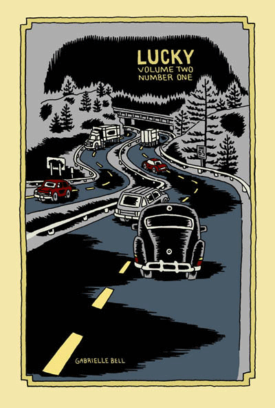
Lucky (Volume 2, #1), by Gabrielle Bell (Drawn & Quarterly). This is the only comic from a publisher on this list, but it certainly counts as a mini. Half of this comic is a story called "My Affliction", which Bell was giving away at SPX last year. I've already reviewed that story on sequart, and it was a hoot--Bell's weird sense of humor was in effect. The other half of this particular comic was a series of diary entries. Much like the minis collected in Lucky, Bell's neuroses are on full display and depicted in her typically wry, over-the-top fashion. We see her dealing with the stress of "performing" her new comic (the aforementioned "My Affliction") and preparing to be on a panel at SPX. Bell uses blacks to good effect in these stories, giving them a certain weight that at times reflects the sense of claustrophobia that her narrative portrays. It should be emphasized that Bell plays her neuroses for laughs in her typically deadpan manner, not in a "woe-is-me" sense. I've written extensively about Bell in the past, so I'll just note that if you appreciate her sense of humor and enjoy her diary comics, then I would enthusiastically recommend the new volume of Lucky.
Routine & Are You Often Impulsive In Your Behavior?, by Will Dinski. Dinski is another favorite of mine, and these two minis are both unusually presented. Routine is actually a comic on a single page of posterboard, in full color. This story is typical of Dinski's strengths as a cartoonist: his sense of panel-to-panel beats and rhythms. In a narrative, he's often fond of using a silent panel, then a narrative caption in a rapid-fire sequence. In this comic, he sets up the boring routine of a businessman in this way. A random bit of near-violence puts his routine out of balance, creating a new, quite warped routine for our hero. As always, Dinksi's page is stylish, spare and puts a bit of distance between reader and story. This is done mostly for comic effect, but there's always something a bit unsettling going on in his stories, and Routine is no exception.
...Behavior is a clever comic, also printed on cardstock. This one is meant to be folded so as to form four pages on one side. It's a story about Dinski taking a test at a Scientologist recruitment center on a whim, and the back of the comic has the results of his test. Once again, Dinski's control of story-beats drives the comic, as he breaks up the narrative with actual questions from the test. He did this to show how the way they were worded was designed to emphasize the test-taker's feelings of paranoia and inferiority. The results made Dinski out to be anxious, paranoid, critical, withdrawn, depressed, withdrawn and hyperactive (?). The punchline was that Dinski was expecting a recruiting pitch, but instead got sent on his way. The use of the test's questions dryly sets up Dinski's own critique of the proceedings in an indirect and amusing way. As always, a Will Dinski comic is smart, off-beat and comics in their purest sense; there's no way I could experience these stories as anything but comics.
Plates Are Cult #3 and Pocket Party, by Damien Jay. Jay has been making beautiful, silk-screened comics for some time now, though I first became aware of him through cartoonist Ellen Lindner. The comics I'm reviewing here are much looser, torn from his sketchbook or originally done for anthologies. Plates Are Cult #3 is in fact a mini that collects a number of short stories from other places. There's all sorts of delightful weirdness in here, including "The Merpeople of Columbus Ohio" from Mapjam, the grotesque "Frankie Pug-Dog", and the clever "Hello Everybody On The Other Side". In these comics, Jay is working through styles, influences and inspirations, using a slightly tremulous line to create expressive characters. "Hello Everybody..." is the most formally experimental, about a man trying to record voices from the spirit world. On the back of each story page, Jay blends and jams text and image, printing some of it backwards as the line between spirit and material bends and blurs. Another standout story is "Warsaw", a travel story that Jay drew, depicting one man's struggle to fend off attempts of various Polish businessmen trying to get him laid with assorted sex workers. There's a certain bleakness to Jay's art that matches the grey world of the sex trade in Eastern Europe.
While these stories had their charms, it's Pocket Party that impressed me much more. Combining sketchbook segues with a loose narrative, it's an inspired flight of fancy. Jay starts with an odd-looking man named Leslie in an abandoned town and interjects himself into the proceedings as he sees fit. He insults one of his characters, who runs off and refuses to participate further. From there, former president Gerald Ford pops up and Jay tries to lecture him on what comics are and how he fits into the story. Throughout, Jay pops into his own comic to offer random opinions, critiques of his own art and story, redrawn panels, sea monsters, Leslie being forced to play Match Game and a perilous journey through the city sewers. Jay even chides himself for being so self-referential, promising to stop it (which he eventually does, but not before he moans, "I just don't have...anywhere else to go!). Somehow, this stream-of-consciousness stew works. The looseness of the art gives it a vibrancy, as though the reader just watched it appear off the still-wet pen of the artist. Jay is funny and riffs well on the page; while the comic is admittedly self-indulgent, it's an indulgence that's quite entertaining for a reader. Jay's ability to somehow make drawing exercises (like learning how to draw fins) into amusing interludes only made me want more; given that this was actually listed as issue #1, one would hope that he'll be doing more. All in all, this is one of the most enjoyable minicomics that I've read in the past year.
Monday #1 & #2 and Yip The Wonder Dog, by Andy Hartzel. Hartzell is the creator of Fox Bunny Funny, my favorite mini of 2006. He's following up that work with a new series, based on the Adam & Eve creation myth, along with a hilarious one-shot mini originally published in another publication. The full title of Yip is The Rise and Fall of Yip the Wonder Dog, and it's a funny account of a heroic dog's journey into Hollywood fame and subsequent decadent excess. It's another wordless story from Hartzell, and while his ambitions are certainly far more modest than in Fox Bunny Funny, the payoff is no less rewarding. Hubris is punished and loyalty is rewarded in the end, but it was the sight of a dog doing lines of coke and dancing the night away (along with the other absurd but logical extremes of the narrative) that made this tidy story so much fun.
Monday is a far more ambitious story, with these first two issues being the first of five chapters. The series' central premise is dynamite: we all know what happened on the first seven days of creation--but what happened on the eighth? Adam and Eve argue about the nature of Eden, the serpent starts planting doubts, and God is hard at work at perfecting his greatest creation. After reading a number of wordless comics by Hartzell, it was a pleasure to see him script such clever banter between Adam and Eve, staying fully within their archetypical characters while expanding the creation myth.
In this story, everyone has their own agenda. Adam is desperate to stay faithful to God in spite of the doubts being planted. Eve just wants the garden to be safe, and the serpent feeds her doubts. The serpent is resentful that God punished him for hubris after he criticized his creator. Finally, God is cranky and defensive, blowing up at his creations because of his own frustration with his new creation, who is somehow resisting being born. These first two chapters set up the tensions and conflicts that are sure to come, where everyone involved is all too human--which only makes sense, since man was created in God's image.
Visually, the art doesn't quite have the snap and polish of Fox Bunny Funny. It's looser and sketchier, but no less expressive. There are also more decorative touches, with the garden of Eden holding all sorts of "eye snaps" and visual surprises. Hartzell's figures are blocky and primal, as though they were made of squares. The silkscreened covers are especially beautiful, though I look forward to its eventual overall release on better paper. Hartzell's use of themes and imagery is very different from most artists working today, and the way he incorporates mythic and archetypical imagery in his stories lends them a lot of power, even as he deflates them with humor.
Mapjam and Satisfactory Comics #7, by Isaac Cates & Mike Wenthe. Once again, full disclosure: Mike Wenthe has been a friend of mine for some years now. That said, he and his collaborator Isaac Cates have carved out an interesting niche in the world of freewheeling comics formalism. Satisfactory Comics #6 had been their most ambitious issue, with the most narratively coherent stories to go along with a slew of interesting extras and decorative touches. Issue #7 was done quite differently: it was created in an intense, 30-hour jam session. What makes this issue stand out is that despite each story having its share of pre-set rules, formal gimmicks and other built-in limitations, those boundaries were invisible to the reader. I think the main reason why was the furious pace at which these stories were written and drawn; as a result, spontaneity and looseness were the real rules here.
Given the number of jam comics and comics with specific formal rules (starting with a certain sentence, drawing with one's non-dominant hand, artists switching off panels, artists drawing different characters in the same story, improvising each panel and then switching off, etc.), I've noticed that they tend to work best as short stories. One feels the strain of the rules after more than a few pages, and the stories tend to devolve into silliness. In Sat-Com #7, it's clear that Cates and Wenthe are quite aware of this, and the result is a series of one to two pages stories that feel quite substantive. The stories range from a quiet lament on the apocalypse to an Alaskan astronaut's ruminations to a hilarious series of single-panel take-offs on famous works of literature, and much more. I particularly liked "Sinister City", which was the most formally restrictive story (single-syllable words, except for the seed sentence, written by Cates and drawn in Wenthe's non-dominant hand). The shaky pencils had a marvelous looseness to them, almost a vibratory quality, that neatly fit with the fact that the story was a retelling of a dream.
I loved the imagination of "The Xylem Cipher", about a liquid that enabled a woman to hear the speech of plants, who then discovered that this was not exactly the most exciting power in the world. This strip showed off their gag-making abilities, as they fired off every single good joke possible from this premise, and ended it on an even better joke. The range of emotional tones and genres makes the reader wonder what could possibly be next when they turn the page, and I found that this issue rewarded multiple readings. I also found their notes on the issue to be revealing as always, as they delved into their creative process.
Cates and Wenthe invited a number of others along for the ride on their ambitious Mapjam project. A wacky take on fantasy world-building stories, they had several artists contribute three bits to a fantasy world-map, split the map into nine quadrants, then handed out assignments to write a story based on that portion of the map. The results ranged from fairly standard fantasy stories to some truly ludicrous scenarios. The quality of the stories in a jam tends to depend on how much time each cartoonist puts into it. A number of the stories (especially in the first round) felt rushed and uninspired. On the other hand, those artists who were more obviously committed to the project created strips that were quite amusing. The best strip in the book came from Tom K., a contributor to Mome. In just four pages, he picked up the threads of an earlier story and took them to some unusual places. His art was stark and bold, especially a page set in a dark cave. Wenthe and Cates contributed tales of perverted minstrels, miniature questers, seasonal gods and other weirdness. Another standout contributor here was Damien Jay, whose loose style and sense of the absurd fit right into the proceedings. This was a case where the experiment and collaboration itself was more interesting at times than some of the results, but one would hope that for the next round, they'll be able to recruit cartoonists as devoted as Tom K. to pick up the baton. It'll also be interesting to see how the "exquisite corpse" nature of the experiment plays out. While not as focused or engaging as their Satisfactory Comics, Mapjam certainly has me eager to see where the stories go next.
Heart and Brain and Love Charades, by Fay Ryu. I love these wordless, colorful romantic pantomimes by Ryu. Heart and Brain features an anthropomorphic heart engaged in an unrequited relationship with an anthropomorphic brain (ambulating via its spinal cord!). The graphics are simple, reliant on Ryu's understanding of gesture and expression, and heightened by her bright colors. The only narration here are the chapter titles: "At First Sight", "Second Sight", "Third Sight", "Out Of Sight", "Hind Sight" and "In Sight". The Heart character keeps encountering Brain, but is never able to screw up the courage to talk to the object of its affection. This comic is about loneliness and how it both makes one feel like one's traversing a desert alone (an image used here more than once) and insulates us against fear of rejection. There's safety in this fear, even as Heart grows more agitated and wistful as the story proceeds. It's a beautiful, simple little story whose ambitions don't outstrip its limitations. As a result, one can see hidden depths in the familiar imagery.
Love Charades is a sort of companion piece, labled a "heart and brain exercise". It's a series of vignettes starring the aforemention characters, this time clearly as companions. The charm of this piece is the way Ryu breathes life and excitement into quotidian activities; there's a sense that these everyday experiences take on added meaning simply because they're being done by lovers. Ryu is a clear, clever storyteller who is quite adept at wringing out emotional truths with just a few strokes of a pen. I look forward to getting my hands on more of her work.
Elsewhere #3, by Gary Sullivan. The first two issues of Sullivan's travel comics used some unusual techniques in combining word and image. This issue is a collection of single-page strips called "The New Life" that appeared in a poetry/fiction journal called Rain Taxi. The strip is all over the place in a pleasing sort of way. It starts as a narrative, as a Dante-like poet meets his Beatrice in Brooklyn and they explore poetry together. Sullivan junked that narrative when he fell in love with a poet who lived in Japan named Nada Gordon, and set several of his poems to comics--in much the same way a musician would attempt to translate poetry to music.
That decision made his visual storytelling approach fairly conventional, as he used his comics either to directly illustrate his text or else comment ironically on it. The images themselves were a supplement to the words and not a form of poetry unto themselves the way they were in the first two issues of Elsewhere or for cartoonists like John Hankiewicz. In "The New Life", Sullivan doesn't seek to redefine the visual language of comics as a different kind of poetry, but rather uses it to as a tool for historical, humorous and biographical purposes.
The most successful strips in this collection were Sullivan's pieces focused on specific poets. Combining commentary, direct quoting, ironic juxtaposition of word and image, and at times genuine warmth for subject and material, these strips were perfect introductions for poetry neophytes like myself and an amusingly different perspective on these pieces for afficianados. His parodies of old Marvel and romance comics as a means of illustrating certain trends or histories in the world of poetry were funny, but he doesn't quite have the chops to pull off the style mimicry required for the full impact he was going for. Still, he comes close enough that the audience will know what he was going for.
I like the fact that Sullivan is hard to pin down. He seems interested in being several different kinds of artist and writer simultaneously. He obviously loves comics, likes the free-flowing weirdness of Flarf (the sub-genre of poetry he developed), loves history, is engaged with the world in a political and material sense, and has a sense of humor about both himself and his art. He's a bit all over the map, and it's that very lack of focus that draws me in to what he does.
Eye of the Majestic Creature #2, by Leslie Stein. Stein first came to my attention with her painstaking and unusual comic Yeah It Is!, a Xeric-winner that looked to be assembled as much as drawn, given the way she composed each page with paper cut-outs along with drawings. It was an interesting experiment to say the least, and the fact that the story itself was equally appealing to my sensibilities (about a loudmouth loner trying to relate to the rest of the world) certainly made her one to watch.
The style she uses in her minis is completely different--a very fine line, detailed pencils and even stippling for effect. Her stories are the product of an unhinged imagination, yet there is a coherent narrative to be found. Indeed, one senses that much of the story is directly autobiographical, if adorned with all sorts of weirdness. The story is about a young woman named Larry who has moved out to the country after living in the city made her too anxious. She lives alone in a house with her anthropomorphic guitar (named Marshy) and ponders misanthropy and the desperate need to connect, two contradictory impulses that nonetheless drive her.
I found myself completely drawn into the world that Stein created. Her ability to create intricate fine-line drawings whose simplicity leads the eye around the page with ease is matched only by her many decorative touches. Larry has huge, button eyes and a picklish nose to go along with her lithe frame. Stein adds a touch of the trippy and even grotesque in her drawings, with hints of Vaughn Bode popping up here and there. There are many hilarious sequences in the book, like Larry playing with a baby by bopping a doll on its head until she knocks it over and responding by quietly propping the baby back up.
This comic is mostly about the stink of alienation and loneliness. Larry can smell it on others (like a shop owner desperate for company) and is none-too-pleased to detect it in herself. Larry later house-sits for another loner-type obsessed with odd but beautiful details in life. He's a social misfit who seems content with his obsessions, like country music and barbecue. Larry is not so different from him, and draws happiness from some of the most absurd places. It's safe to say that the absurd, the cheap, and the guilelessly delightful things in life give Larry joy in a world devoid of meaning or real connection. This point of view resonates with me as a reader, and it's for this reason, along with her superior chops as an artist and imaginative composition & design that this was my favorite mini-comic to date of 2007.
*********************
About Yr Future, Plots, Their Condolences, by Eve Englezos & Josh Moutray.. This artist duo known for putting out the Icecreamlandia minis first caught my eye a few years ago, and I always eagerly await their next bit of weirdness. Each of these minis is cleverly designed, short, and as beautiful to look at as they are hilarious. Their Condolences has the look of an old-time photo album, as we see a drawing of a man who died in the late 19th century. Eschewing their usual clear-line drawing style, Englezos & Moutray instead use heavily-shaded pencils that look uninked. The "condolences" involved may be heartfelt, but they're far from heart-warming, as each family member or servant makes nasty comments about him. The funniest page may be the last, when one of his sons holds a bird in his hands and thinks his father is there in reincarnated form.
Plots is more typical of the duo, with that oh-so-thin line of theirs being put to use in single-page gags. Every page seems to either be a set-up or a climactic point in some other story, many of them funny. The first page has a crying man hugging a friend, telling him that his wife was murdered and their place robbed. His friend replies, "I hate to tell you this, but I've got some more bad news" and then the reader's eye is drawn down to the knife in his hand. The "plots" here also imply someone plotting against someone else, be it a housewife/spy using cooking jargon as her code words, two kids using walkie-talkies to plot against their grandma, or a vulture calling his fellows to war against hyenas.
About Yr Future is the third in a series of small minis about time. This one is all about predictions, foretellings, and fate. Again, their authorial voice is one of bone-dry and bleak humor, mixed with a sense of absurdism. Their line drawings are even more amusing than usual here, considering they're drawing robots and an elderly man whose head has been transplanted onto a cyborg body. Englezos and Moutray are a unique act in comics, and their wonderfully skewed point of view mixed with an impeccably tasteful design sense makes even the shortest of their minis a rewarding experience.
Infandum #2, by Molly Lawless. Lawless is another new favorite artist of mine on the minicomics scene, thanks to her expressive pencils, sharp sense of humor, and obsession with baseball. It's those latter strips that are the most fun to read, and she's slowly on her way to compiling a collection's worth of baseball strips. Lawless strikes the right tone between smartass and historian as she has Bill Buckner "narrate" a story called "The Boner and the Muff: A Tale of Two Freds". Buckner was the first baseman who infamously let a grounder go between his legs in game 6 of the 1986 World Series, a series that his Red Sox would wind up losing. This story is about two baseball players from the deadball era (early 1900's) who had similar blunders that were blamed on their team's eventual collapse. Just like Buckner, neither player was really to blame, but couldn't outrun their notoriety. Even readers who don't like baseball will enjoy Lawless' delicate pencils and decorative touches.
Though this mini is only 8 pages long, it's a much meatier read than one would expect because Lawless jams so many panels and so much detail into each of her pages. Her first story (written by Carlton King), "Rules of Romance: Breakup Jujitsu", packs 15 panels and decorative extras onto one page. Her "Repressed Memory Theatre" is just as dense and is perhaps the funniest story in the comic. It's an autobiographical tale of young, uptight Molly being humiliated by her mother in front of her classmates at school. Lawless transforms a fairly standard reminiscence into something memorable due to her expressive figures, sense of comic timing, self-deprecating wit, and appealing sense of design. The only thing that detracts from my enjoyment of her comics is that her figure drawing suffers from being crammed into tiny panels on mini-sized pages. I'd love to see her expand her page count a bit and let her comics breathe with bigger panels. It's astounding that her comics look as nice as they do, considering that they're hand-made and photocopied. I look forward to her first collection of minis, which would do justice to her attractive art along with her sharp wit.
Just This Side Of Heaven, P.S. Comics #2 & #3, by Melanie "Minty" Lewis. I first became aware of Lewis' work in SPX 2003, and her story stood out for two reasons. First, all of the characters were clear-line anthropomorphic pieces of fruit. Second, her sense of humor regarding human interactions was pitch-black and dry. Lewis writes knowing stories about sad people living in "quiet desperation", but manages to squeeze every ounce of awkward humor out of these situations as possible. I'm a fan of this kind of "squirm humor", where the awkwardness of daily social intercourse is heightened for comic effect. Portraying these people as fruit or dogs (or table condiments) adds an extra layer of distance and absurdity to heighten the humor in the story--but at the same time, it almost gives Lewis license to make the situations all the more painful--especially if the stories seem to be based on autobiographical experiences.
Just This Side Of Heaven is a story featuring her other set of go-to representations: anthropomophric dogs. This one's about a goofy cat who lost her best friend (a dog) and is living with two new hipster cats who constantly argue and exclude him from the conversation. His dog friend appears to him in a dream and gives him good advice on how to live with his new roommates. What makes this comic so appealing is how Lewis has the animals act and live as animals (and more specifically, pets), yet the dynamic is very much of a 20-something group house, with the cat even being in school and using email. This comic was a bit more forgiving and sentimental than some of her other, nastier comics.
P.S. Comics #2 mixes up styles quite a bit. "Winners" is a hilarious account of an especially miserable high-school anecdote, done with her fruit characters. The story works because Apple is desperate to fit in, one way or another--and every attempt at trying to be cool backfires either in a whimper or in a spectacular public humiliation. "Yorkie Matrimony" is a vicious story using dogs as characters. It's the story of a friendship of two roommates gone sour, thanks to one of them deciding to get married and the other falling apart at the notion of being alone. Not since reading Hate have I enjoyed seeing a story this over-the-top and yet strangely familiar about roommates. Once again, the cuteness of Lewis employing dogs-acting-like-humans just makes the story funnier, even as the events get more pathetic. What's odd is that her use of gesture and expression seems more refined when she's drawing animals or fruit than when she draws people. "Salt & Sugar" is perhaps the most clever story in this issue. A heavily-narrated love story about the romance between a salt shaker and a sugar dispenser, Lewis does a clever parody of typical problem-romance narratives using every joke imaginable about salt and sugar. These are the first two pages of her work that I'd show to anyone to demonstrate her wit.
P.S. Comics #3's best story is "Bitter Fruit", starring her "Fruit Pals". A workplace/relationship melodrama, it once again perfectly captures not only the beats of 20-something relationships but also the inane nature of workplace life. As one female character (Pear) is dealing with being suddenly dumped by a co-worker for another co-worker, she has to fend off both the advances of and grating "advice" of another co-worker. This may be the most accomplished of all her stories, both in terms of design & composition and humorous impact. Finding a style that works for her so early in her comics career is clearly a big boost for Lewis. At this point, she simply needs to continue to further refine it. Her comics look best when they're clear, uncluttered and not overrendered, especially when she's able to add subtle decorative touches. Lewis' wit is already razor-sharp, and I'll be excited to see her continue to explore this milieu as she continues to grow as an artist.
Lucky (Volume 2, #1), by Gabrielle Bell (Drawn & Quarterly). This is the only comic from a publisher on this list, but it certainly counts as a mini. Half of this comic is a story called "My Affliction", which Bell was giving away at SPX last year. I've already reviewed that story on sequart, and it was a hoot--Bell's weird sense of humor was in effect. The other half of this particular comic was a series of diary entries. Much like the minis collected in Lucky, Bell's neuroses are on full display and depicted in her typically wry, over-the-top fashion. We see her dealing with the stress of "performing" her new comic (the aforementioned "My Affliction") and preparing to be on a panel at SPX. Bell uses blacks to good effect in these stories, giving them a certain weight that at times reflects the sense of claustrophobia that her narrative portrays. It should be emphasized that Bell plays her neuroses for laughs in her typically deadpan manner, not in a "woe-is-me" sense. I've written extensively about Bell in the past, so I'll just note that if you appreciate her sense of humor and enjoy her diary comics, then I would enthusiastically recommend the new volume of Lucky.
Routine & Are You Often Impulsive In Your Behavior?, by Will Dinski. Dinski is another favorite of mine, and these two minis are both unusually presented. Routine is actually a comic on a single page of posterboard, in full color. This story is typical of Dinski's strengths as a cartoonist: his sense of panel-to-panel beats and rhythms. In a narrative, he's often fond of using a silent panel, then a narrative caption in a rapid-fire sequence. In this comic, he sets up the boring routine of a businessman in this way. A random bit of near-violence puts his routine out of balance, creating a new, quite warped routine for our hero. As always, Dinksi's page is stylish, spare and puts a bit of distance between reader and story. This is done mostly for comic effect, but there's always something a bit unsettling going on in his stories, and Routine is no exception.
...Behavior is a clever comic, also printed on cardstock. This one is meant to be folded so as to form four pages on one side. It's a story about Dinski taking a test at a Scientologist recruitment center on a whim, and the back of the comic has the results of his test. Once again, Dinski's control of story-beats drives the comic, as he breaks up the narrative with actual questions from the test. He did this to show how the way they were worded was designed to emphasize the test-taker's feelings of paranoia and inferiority. The results made Dinski out to be anxious, paranoid, critical, withdrawn, depressed, withdrawn and hyperactive (?). The punchline was that Dinski was expecting a recruiting pitch, but instead got sent on his way. The use of the test's questions dryly sets up Dinski's own critique of the proceedings in an indirect and amusing way. As always, a Will Dinski comic is smart, off-beat and comics in their purest sense; there's no way I could experience these stories as anything but comics.
Plates Are Cult #3 and Pocket Party, by Damien Jay. Jay has been making beautiful, silk-screened comics for some time now, though I first became aware of him through cartoonist Ellen Lindner. The comics I'm reviewing here are much looser, torn from his sketchbook or originally done for anthologies. Plates Are Cult #3 is in fact a mini that collects a number of short stories from other places. There's all sorts of delightful weirdness in here, including "The Merpeople of Columbus Ohio" from Mapjam, the grotesque "Frankie Pug-Dog", and the clever "Hello Everybody On The Other Side". In these comics, Jay is working through styles, influences and inspirations, using a slightly tremulous line to create expressive characters. "Hello Everybody..." is the most formally experimental, about a man trying to record voices from the spirit world. On the back of each story page, Jay blends and jams text and image, printing some of it backwards as the line between spirit and material bends and blurs. Another standout story is "Warsaw", a travel story that Jay drew, depicting one man's struggle to fend off attempts of various Polish businessmen trying to get him laid with assorted sex workers. There's a certain bleakness to Jay's art that matches the grey world of the sex trade in Eastern Europe.
While these stories had their charms, it's Pocket Party that impressed me much more. Combining sketchbook segues with a loose narrative, it's an inspired flight of fancy. Jay starts with an odd-looking man named Leslie in an abandoned town and interjects himself into the proceedings as he sees fit. He insults one of his characters, who runs off and refuses to participate further. From there, former president Gerald Ford pops up and Jay tries to lecture him on what comics are and how he fits into the story. Throughout, Jay pops into his own comic to offer random opinions, critiques of his own art and story, redrawn panels, sea monsters, Leslie being forced to play Match Game and a perilous journey through the city sewers. Jay even chides himself for being so self-referential, promising to stop it (which he eventually does, but not before he moans, "I just don't have...anywhere else to go!). Somehow, this stream-of-consciousness stew works. The looseness of the art gives it a vibrancy, as though the reader just watched it appear off the still-wet pen of the artist. Jay is funny and riffs well on the page; while the comic is admittedly self-indulgent, it's an indulgence that's quite entertaining for a reader. Jay's ability to somehow make drawing exercises (like learning how to draw fins) into amusing interludes only made me want more; given that this was actually listed as issue #1, one would hope that he'll be doing more. All in all, this is one of the most enjoyable minicomics that I've read in the past year.
Monday #1 & #2 and Yip The Wonder Dog, by Andy Hartzel. Hartzell is the creator of Fox Bunny Funny, my favorite mini of 2006. He's following up that work with a new series, based on the Adam & Eve creation myth, along with a hilarious one-shot mini originally published in another publication. The full title of Yip is The Rise and Fall of Yip the Wonder Dog, and it's a funny account of a heroic dog's journey into Hollywood fame and subsequent decadent excess. It's another wordless story from Hartzell, and while his ambitions are certainly far more modest than in Fox Bunny Funny, the payoff is no less rewarding. Hubris is punished and loyalty is rewarded in the end, but it was the sight of a dog doing lines of coke and dancing the night away (along with the other absurd but logical extremes of the narrative) that made this tidy story so much fun.
Monday is a far more ambitious story, with these first two issues being the first of five chapters. The series' central premise is dynamite: we all know what happened on the first seven days of creation--but what happened on the eighth? Adam and Eve argue about the nature of Eden, the serpent starts planting doubts, and God is hard at work at perfecting his greatest creation. After reading a number of wordless comics by Hartzell, it was a pleasure to see him script such clever banter between Adam and Eve, staying fully within their archetypical characters while expanding the creation myth.
In this story, everyone has their own agenda. Adam is desperate to stay faithful to God in spite of the doubts being planted. Eve just wants the garden to be safe, and the serpent feeds her doubts. The serpent is resentful that God punished him for hubris after he criticized his creator. Finally, God is cranky and defensive, blowing up at his creations because of his own frustration with his new creation, who is somehow resisting being born. These first two chapters set up the tensions and conflicts that are sure to come, where everyone involved is all too human--which only makes sense, since man was created in God's image.
Visually, the art doesn't quite have the snap and polish of Fox Bunny Funny. It's looser and sketchier, but no less expressive. There are also more decorative touches, with the garden of Eden holding all sorts of "eye snaps" and visual surprises. Hartzell's figures are blocky and primal, as though they were made of squares. The silkscreened covers are especially beautiful, though I look forward to its eventual overall release on better paper. Hartzell's use of themes and imagery is very different from most artists working today, and the way he incorporates mythic and archetypical imagery in his stories lends them a lot of power, even as he deflates them with humor.
Mapjam and Satisfactory Comics #7, by Isaac Cates & Mike Wenthe. Once again, full disclosure: Mike Wenthe has been a friend of mine for some years now. That said, he and his collaborator Isaac Cates have carved out an interesting niche in the world of freewheeling comics formalism. Satisfactory Comics #6 had been their most ambitious issue, with the most narratively coherent stories to go along with a slew of interesting extras and decorative touches. Issue #7 was done quite differently: it was created in an intense, 30-hour jam session. What makes this issue stand out is that despite each story having its share of pre-set rules, formal gimmicks and other built-in limitations, those boundaries were invisible to the reader. I think the main reason why was the furious pace at which these stories were written and drawn; as a result, spontaneity and looseness were the real rules here.
Given the number of jam comics and comics with specific formal rules (starting with a certain sentence, drawing with one's non-dominant hand, artists switching off panels, artists drawing different characters in the same story, improvising each panel and then switching off, etc.), I've noticed that they tend to work best as short stories. One feels the strain of the rules after more than a few pages, and the stories tend to devolve into silliness. In Sat-Com #7, it's clear that Cates and Wenthe are quite aware of this, and the result is a series of one to two pages stories that feel quite substantive. The stories range from a quiet lament on the apocalypse to an Alaskan astronaut's ruminations to a hilarious series of single-panel take-offs on famous works of literature, and much more. I particularly liked "Sinister City", which was the most formally restrictive story (single-syllable words, except for the seed sentence, written by Cates and drawn in Wenthe's non-dominant hand). The shaky pencils had a marvelous looseness to them, almost a vibratory quality, that neatly fit with the fact that the story was a retelling of a dream.
I loved the imagination of "The Xylem Cipher", about a liquid that enabled a woman to hear the speech of plants, who then discovered that this was not exactly the most exciting power in the world. This strip showed off their gag-making abilities, as they fired off every single good joke possible from this premise, and ended it on an even better joke. The range of emotional tones and genres makes the reader wonder what could possibly be next when they turn the page, and I found that this issue rewarded multiple readings. I also found their notes on the issue to be revealing as always, as they delved into their creative process.
Cates and Wenthe invited a number of others along for the ride on their ambitious Mapjam project. A wacky take on fantasy world-building stories, they had several artists contribute three bits to a fantasy world-map, split the map into nine quadrants, then handed out assignments to write a story based on that portion of the map. The results ranged from fairly standard fantasy stories to some truly ludicrous scenarios. The quality of the stories in a jam tends to depend on how much time each cartoonist puts into it. A number of the stories (especially in the first round) felt rushed and uninspired. On the other hand, those artists who were more obviously committed to the project created strips that were quite amusing. The best strip in the book came from Tom K., a contributor to Mome. In just four pages, he picked up the threads of an earlier story and took them to some unusual places. His art was stark and bold, especially a page set in a dark cave. Wenthe and Cates contributed tales of perverted minstrels, miniature questers, seasonal gods and other weirdness. Another standout contributor here was Damien Jay, whose loose style and sense of the absurd fit right into the proceedings. This was a case where the experiment and collaboration itself was more interesting at times than some of the results, but one would hope that for the next round, they'll be able to recruit cartoonists as devoted as Tom K. to pick up the baton. It'll also be interesting to see how the "exquisite corpse" nature of the experiment plays out. While not as focused or engaging as their Satisfactory Comics, Mapjam certainly has me eager to see where the stories go next.
Heart and Brain and Love Charades, by Fay Ryu. I love these wordless, colorful romantic pantomimes by Ryu. Heart and Brain features an anthropomorphic heart engaged in an unrequited relationship with an anthropomorphic brain (ambulating via its spinal cord!). The graphics are simple, reliant on Ryu's understanding of gesture and expression, and heightened by her bright colors. The only narration here are the chapter titles: "At First Sight", "Second Sight", "Third Sight", "Out Of Sight", "Hind Sight" and "In Sight". The Heart character keeps encountering Brain, but is never able to screw up the courage to talk to the object of its affection. This comic is about loneliness and how it both makes one feel like one's traversing a desert alone (an image used here more than once) and insulates us against fear of rejection. There's safety in this fear, even as Heart grows more agitated and wistful as the story proceeds. It's a beautiful, simple little story whose ambitions don't outstrip its limitations. As a result, one can see hidden depths in the familiar imagery.
Love Charades is a sort of companion piece, labled a "heart and brain exercise". It's a series of vignettes starring the aforemention characters, this time clearly as companions. The charm of this piece is the way Ryu breathes life and excitement into quotidian activities; there's a sense that these everyday experiences take on added meaning simply because they're being done by lovers. Ryu is a clear, clever storyteller who is quite adept at wringing out emotional truths with just a few strokes of a pen. I look forward to getting my hands on more of her work.
Elsewhere #3, by Gary Sullivan. The first two issues of Sullivan's travel comics used some unusual techniques in combining word and image. This issue is a collection of single-page strips called "The New Life" that appeared in a poetry/fiction journal called Rain Taxi. The strip is all over the place in a pleasing sort of way. It starts as a narrative, as a Dante-like poet meets his Beatrice in Brooklyn and they explore poetry together. Sullivan junked that narrative when he fell in love with a poet who lived in Japan named Nada Gordon, and set several of his poems to comics--in much the same way a musician would attempt to translate poetry to music.
That decision made his visual storytelling approach fairly conventional, as he used his comics either to directly illustrate his text or else comment ironically on it. The images themselves were a supplement to the words and not a form of poetry unto themselves the way they were in the first two issues of Elsewhere or for cartoonists like John Hankiewicz. In "The New Life", Sullivan doesn't seek to redefine the visual language of comics as a different kind of poetry, but rather uses it to as a tool for historical, humorous and biographical purposes.
The most successful strips in this collection were Sullivan's pieces focused on specific poets. Combining commentary, direct quoting, ironic juxtaposition of word and image, and at times genuine warmth for subject and material, these strips were perfect introductions for poetry neophytes like myself and an amusingly different perspective on these pieces for afficianados. His parodies of old Marvel and romance comics as a means of illustrating certain trends or histories in the world of poetry were funny, but he doesn't quite have the chops to pull off the style mimicry required for the full impact he was going for. Still, he comes close enough that the audience will know what he was going for.
I like the fact that Sullivan is hard to pin down. He seems interested in being several different kinds of artist and writer simultaneously. He obviously loves comics, likes the free-flowing weirdness of Flarf (the sub-genre of poetry he developed), loves history, is engaged with the world in a political and material sense, and has a sense of humor about both himself and his art. He's a bit all over the map, and it's that very lack of focus that draws me in to what he does.
Eye of the Majestic Creature #2, by Leslie Stein. Stein first came to my attention with her painstaking and unusual comic Yeah It Is!, a Xeric-winner that looked to be assembled as much as drawn, given the way she composed each page with paper cut-outs along with drawings. It was an interesting experiment to say the least, and the fact that the story itself was equally appealing to my sensibilities (about a loudmouth loner trying to relate to the rest of the world) certainly made her one to watch.
The style she uses in her minis is completely different--a very fine line, detailed pencils and even stippling for effect. Her stories are the product of an unhinged imagination, yet there is a coherent narrative to be found. Indeed, one senses that much of the story is directly autobiographical, if adorned with all sorts of weirdness. The story is about a young woman named Larry who has moved out to the country after living in the city made her too anxious. She lives alone in a house with her anthropomorphic guitar (named Marshy) and ponders misanthropy and the desperate need to connect, two contradictory impulses that nonetheless drive her.
I found myself completely drawn into the world that Stein created. Her ability to create intricate fine-line drawings whose simplicity leads the eye around the page with ease is matched only by her many decorative touches. Larry has huge, button eyes and a picklish nose to go along with her lithe frame. Stein adds a touch of the trippy and even grotesque in her drawings, with hints of Vaughn Bode popping up here and there. There are many hilarious sequences in the book, like Larry playing with a baby by bopping a doll on its head until she knocks it over and responding by quietly propping the baby back up.
This comic is mostly about the stink of alienation and loneliness. Larry can smell it on others (like a shop owner desperate for company) and is none-too-pleased to detect it in herself. Larry later house-sits for another loner-type obsessed with odd but beautiful details in life. He's a social misfit who seems content with his obsessions, like country music and barbecue. Larry is not so different from him, and draws happiness from some of the most absurd places. It's safe to say that the absurd, the cheap, and the guilelessly delightful things in life give Larry joy in a world devoid of meaning or real connection. This point of view resonates with me as a reader, and it's for this reason, along with her superior chops as an artist and imaginative composition & design that this was my favorite mini-comic to date of 2007.
Friday, September 25, 2009
Minicomics Round-Up: Downes, Madden-Connor, Dinski
Rob reviews minicomics from Christopher Downes, Will Dinski and Jonas Madden-Connor.

A DIARY OF A WORK IN PROGRESS, by Christopher Downes. As one might ascertain from the title, Downes pens a diary comic. It's unremarkable in that regard, though Downes does slowly start to reveal more about the hopes, fears and dreams of himself and his wife as time passes. Despite an obvious restlessness with regard to his life working in a department store, Downes' essentially cheery nature prevents the comic from bogging down into an autobio whine session. Indeed, he seems quite happy to be living in Tasmania with his wife and cat, pondering the issue of progeny. What makes this comic stand out is the appealing nature of his line. I love the thickness of his line, the way he densely hatches and cross-hatches and his charming character design. There's a little bit of R.Crumb, Craig Thompson, and Drew Weing (the artist whose style he most closely resembles) to be found in his art. His lettering is drop-dead gorgeous, with thick stylized letters that are printed slightly off-kilter against each other but still come together to form an attractive whole--and one that's quite easy to read. This is an artist with great chops and style who is still searching for his voice. I would be eager to see him try his hand at fiction or any kind of longer-form comic, especially one that pushes him to become more formally experimental. There are hints of that to be found in terms of the way he uses panels as a storytelling device (a panel bending back under the pressure of wind, or crashing down through two panels when he's exhausted), and I think he could tell an entertaining story as he made that kind of exploration.

COVERED IN CONFUSION, by Will Dinski. Dinski continues his recent string of excellent minis with a story that's a bit more straightforward than his usual stories. At the same time, there's a greater richness and complexity in both plot and characterization, with surprising story layers that manifest themselves in unusual ways. Dinski begins the story with a discussion of why we blush, a trope that pops up throughout the story of a woman recalling the tragic story of a favorite high school teacher. That teacher, Mr Danielson, was a quirky guy with a habit of stealing pens from other faculty and being a steadfast voice of support for his students. He was also the stereotypical absent-minded professor, something that's amusingly set up early in the book but leads to horrific consequences in the story's climax. This story is about triggers of trauma, as the woman is triggered by the cries of a baby in the apartment next door and reminded that she might have prevented the tragedy. That realization is a shattering one for the reader, yet Dinski handles it with a great deal of restraint.

All of Dinski's usual stylistic signatures are in effect here, yet stand out a bit less than usual thanks to the compelling nature of his story. There's the way he uses word balloons to block out whole panels, the way he uses a blank panel with a triangle in the corner to indicate time passing (a page being turned, as it were), his unusual character design (lots of angles, squidged eyes, bushy eyebrows) and formal flourishes (the splash pages freezing characters in time, almost like a yearbook photo, the cover glowing in the dark). The cumulative effect of Dinski's formal approach is a cold one, a coolness that distances the reader. That coolness is what allows him to tell such a downbeat story with so much restraint; the reader never feels manipulated nor is sentiment ever earned cheaply. It helps that the dialogue is never overwrought; indeed, conversations in Dinski's comics are deliberately on the spare side as he prefers to let images convey most of his story's major beats. With this story and last year's ERRAND SERVICE, it seems as though Dinski is reaching a new level of maturity and ambition as an artist, exploring emotional depths as well as creating a unique page.

OCHRE ELLIPSE #3, by Jonas Madden-Connor. Madden-Connor is an exciting newcomer whose specialty has been bold formal experiments coupled with a lingering sense of wanderlust and melancholy. The latter two aspects of his work were certainly at play in this new issue, though the formal fireworks were considerably toned down. Madden-Connor likes bending time and space as formal elements in his comics, but given that this story was about both time travel and the way one's past images accrue, it makes sense that he'd mute those formal elements.

The story seems heavily influenced by Lewis Trondheim by way of Chris Ware, though the tone is entirely his own. The figures are simple ovals (ala Trondheim's MISTER O) but retain a great deal of expressiveness. The comics' hook is killer: an unhappy, lonely man who remembers a happy childhood despite being a loner goes back in time to those happy days. Despite the fact that he can't interact with anyone as a time travel (appearing as a ghost), the visits to his childhood self with an intricately detailed fantasy life fill him with joy. The eventual resolution of the story is both heartbreaking and sweet, as the man realizes that the accumulation of his ghost images was the inspiration for that wonderful fantasy life--but that he will never be capable of any other happiness. Madden-Connor concludes the issue with the actual fantasy being played out as his childhood self imagined it, a wonderful sequence that recontextualizes earlier scenes in the book. Madden-Connor deftly uses genre trappings (even throwing a "science-fiction" sticker on the cover with an iconic ray-gun) to tell a story of one man's infinite emotional loop.

A DIARY OF A WORK IN PROGRESS, by Christopher Downes. As one might ascertain from the title, Downes pens a diary comic. It's unremarkable in that regard, though Downes does slowly start to reveal more about the hopes, fears and dreams of himself and his wife as time passes. Despite an obvious restlessness with regard to his life working in a department store, Downes' essentially cheery nature prevents the comic from bogging down into an autobio whine session. Indeed, he seems quite happy to be living in Tasmania with his wife and cat, pondering the issue of progeny. What makes this comic stand out is the appealing nature of his line. I love the thickness of his line, the way he densely hatches and cross-hatches and his charming character design. There's a little bit of R.Crumb, Craig Thompson, and Drew Weing (the artist whose style he most closely resembles) to be found in his art. His lettering is drop-dead gorgeous, with thick stylized letters that are printed slightly off-kilter against each other but still come together to form an attractive whole--and one that's quite easy to read. This is an artist with great chops and style who is still searching for his voice. I would be eager to see him try his hand at fiction or any kind of longer-form comic, especially one that pushes him to become more formally experimental. There are hints of that to be found in terms of the way he uses panels as a storytelling device (a panel bending back under the pressure of wind, or crashing down through two panels when he's exhausted), and I think he could tell an entertaining story as he made that kind of exploration.

COVERED IN CONFUSION, by Will Dinski. Dinski continues his recent string of excellent minis with a story that's a bit more straightforward than his usual stories. At the same time, there's a greater richness and complexity in both plot and characterization, with surprising story layers that manifest themselves in unusual ways. Dinski begins the story with a discussion of why we blush, a trope that pops up throughout the story of a woman recalling the tragic story of a favorite high school teacher. That teacher, Mr Danielson, was a quirky guy with a habit of stealing pens from other faculty and being a steadfast voice of support for his students. He was also the stereotypical absent-minded professor, something that's amusingly set up early in the book but leads to horrific consequences in the story's climax. This story is about triggers of trauma, as the woman is triggered by the cries of a baby in the apartment next door and reminded that she might have prevented the tragedy. That realization is a shattering one for the reader, yet Dinski handles it with a great deal of restraint.

All of Dinski's usual stylistic signatures are in effect here, yet stand out a bit less than usual thanks to the compelling nature of his story. There's the way he uses word balloons to block out whole panels, the way he uses a blank panel with a triangle in the corner to indicate time passing (a page being turned, as it were), his unusual character design (lots of angles, squidged eyes, bushy eyebrows) and formal flourishes (the splash pages freezing characters in time, almost like a yearbook photo, the cover glowing in the dark). The cumulative effect of Dinski's formal approach is a cold one, a coolness that distances the reader. That coolness is what allows him to tell such a downbeat story with so much restraint; the reader never feels manipulated nor is sentiment ever earned cheaply. It helps that the dialogue is never overwrought; indeed, conversations in Dinski's comics are deliberately on the spare side as he prefers to let images convey most of his story's major beats. With this story and last year's ERRAND SERVICE, it seems as though Dinski is reaching a new level of maturity and ambition as an artist, exploring emotional depths as well as creating a unique page.

OCHRE ELLIPSE #3, by Jonas Madden-Connor. Madden-Connor is an exciting newcomer whose specialty has been bold formal experiments coupled with a lingering sense of wanderlust and melancholy. The latter two aspects of his work were certainly at play in this new issue, though the formal fireworks were considerably toned down. Madden-Connor likes bending time and space as formal elements in his comics, but given that this story was about both time travel and the way one's past images accrue, it makes sense that he'd mute those formal elements.

The story seems heavily influenced by Lewis Trondheim by way of Chris Ware, though the tone is entirely his own. The figures are simple ovals (ala Trondheim's MISTER O) but retain a great deal of expressiveness. The comics' hook is killer: an unhappy, lonely man who remembers a happy childhood despite being a loner goes back in time to those happy days. Despite the fact that he can't interact with anyone as a time travel (appearing as a ghost), the visits to his childhood self with an intricately detailed fantasy life fill him with joy. The eventual resolution of the story is both heartbreaking and sweet, as the man realizes that the accumulation of his ghost images was the inspiration for that wonderful fantasy life--but that he will never be capable of any other happiness. Madden-Connor concludes the issue with the actual fantasy being played out as his childhood self imagined it, a wonderful sequence that recontextualizes earlier scenes in the book. Madden-Connor deftly uses genre trappings (even throwing a "science-fiction" sticker on the cover with an iconic ray-gun) to tell a story of one man's infinite emotional loop.
Subscribe to:
Posts (Atom)