*********************
About Yr Future, Plots, Their Condolences, by Eve Englezos & Josh Moutray.. This artist duo known for putting out the Icecreamlandia minis first caught my eye a few years ago, and I always eagerly await their next bit of weirdness. Each of these minis is cleverly designed, short, and as beautiful to look at as they are hilarious. Their Condolences has the look of an old-time photo album, as we see a drawing of a man who died in the late 19th century. Eschewing their usual clear-line drawing style, Englezos & Moutray instead use heavily-shaded pencils that look uninked. The "condolences" involved may be heartfelt, but they're far from heart-warming, as each family member or servant makes nasty comments about him. The funniest page may be the last, when one of his sons holds a bird in his hands and thinks his father is there in reincarnated form.

Plots is more typical of the duo, with that oh-so-thin line of theirs being put to use in single-page gags. Every page seems to either be a set-up or a climactic point in some other story, many of them funny. The first page has a crying man hugging a friend, telling him that his wife was murdered and their place robbed. His friend replies, "I hate to tell you this, but I've got some more bad news" and then the reader's eye is drawn down to the knife in his hand. The "plots" here also imply someone plotting against someone else, be it a housewife/spy using cooking jargon as her code words, two kids using walkie-talkies to plot against their grandma, or a vulture calling his fellows to war against hyenas.
About Yr Future is the third in a series of small minis about time. This one is all about predictions, foretellings, and fate. Again, their authorial voice is one of bone-dry and bleak humor, mixed with a sense of absurdism. Their line drawings are even more amusing than usual here, considering they're drawing robots and an elderly man whose head has been transplanted onto a cyborg body. Englezos and Moutray are a unique act in comics, and their wonderfully skewed point of view mixed with an impeccably tasteful design sense makes even the shortest of their minis a rewarding experience.

Infandum #2, by Molly Lawless. Lawless is another new favorite artist of mine on the minicomics scene, thanks to her expressive pencils, sharp sense of humor, and obsession with baseball. It's those latter strips that are the most fun to read, and she's slowly on her way to compiling a collection's worth of baseball strips. Lawless strikes the right tone between smartass and historian as she has Bill Buckner "narrate" a story called "The Boner and the Muff: A Tale of Two Freds". Buckner was the first baseman who infamously let a grounder go between his legs in game 6 of the 1986 World Series, a series that his Red Sox would wind up losing. This story is about two baseball players from the deadball era (early 1900's) who had similar blunders that were blamed on their team's eventual collapse. Just like Buckner, neither player was really to blame, but couldn't outrun their notoriety. Even readers who don't like baseball will enjoy Lawless' delicate pencils and decorative touches.
Though this mini is only 8 pages long, it's a much meatier read than one would expect because Lawless jams so many panels and so much detail into each of her pages. Her first story (written by Carlton King), "Rules of Romance: Breakup Jujitsu", packs 15 panels and decorative extras onto one page. Her "Repressed Memory Theatre" is just as dense and is perhaps the funniest story in the comic. It's an autobiographical tale of young, uptight Molly being humiliated by her mother in front of her classmates at school. Lawless transforms a fairly standard reminiscence into something memorable due to her expressive figures, sense of comic timing, self-deprecating wit, and appealing sense of design. The only thing that detracts from my enjoyment of her comics is that her figure drawing suffers from being crammed into tiny panels on mini-sized pages. I'd love to see her expand her page count a bit and let her comics breathe with bigger panels. It's astounding that her comics look as nice as they do, considering that they're hand-made and photocopied. I look forward to her first collection of minis, which would do justice to her attractive art along with her sharp wit.

Just This Side Of Heaven, P.S. Comics #2 & #3, by Melanie "Minty" Lewis. I first became aware of Lewis' work in SPX 2003, and her story stood out for two reasons. First, all of the characters were clear-line anthropomorphic pieces of fruit. Second, her sense of humor regarding human interactions was pitch-black and dry. Lewis writes knowing stories about sad people living in "quiet desperation", but manages to squeeze every ounce of awkward humor out of these situations as possible. I'm a fan of this kind of "squirm humor", where the awkwardness of daily social intercourse is heightened for comic effect. Portraying these people as fruit or dogs (or table condiments) adds an extra layer of distance and absurdity to heighten the humor in the story--but at the same time, it almost gives Lewis license to make the situations all the more painful--especially if the stories seem to be based on autobiographical experiences.
Just This Side Of Heaven is a story featuring her other set of go-to representations: anthropomophric dogs. This one's about a goofy cat who lost her best friend (a dog) and is living with two new hipster cats who constantly argue and exclude him from the conversation. His dog friend appears to him in a dream and gives him good advice on how to live with his new roommates. What makes this comic so appealing is how Lewis has the animals act and live as animals (and more specifically, pets), yet the dynamic is very much of a 20-something group house, with the cat even being in school and using email. This comic was a bit more forgiving and sentimental than some of her other, nastier comics.
P.S. Comics #2 mixes up styles quite a bit. "Winners" is a hilarious account of an especially miserable high-school anecdote, done with her fruit characters. The story works because Apple is desperate to fit in, one way or another--and every attempt at trying to be cool backfires either in a whimper or in a spectacular public humiliation. "Yorkie Matrimony" is a vicious story using dogs as characters. It's the story of a friendship of two roommates gone sour, thanks to one of them deciding to get married and the other falling apart at the notion of being alone. Not since reading Hate have I enjoyed seeing a story this over-the-top and yet strangely familiar about roommates. Once again, the cuteness of Lewis employing dogs-acting-like-humans just makes the story funnier, even as the events get more pathetic. What's odd is that her use of gesture and expression seems more refined when she's drawing animals or fruit than when she draws people. "Salt & Sugar" is perhaps the most clever story in this issue. A heavily-narrated love story about the romance between a salt shaker and a sugar dispenser, Lewis does a clever parody of typical problem-romance narratives using every joke imaginable about salt and sugar. These are the first two pages of her work that I'd show to anyone to demonstrate her wit.
P.S. Comics #3's best story is "Bitter Fruit", starring her "Fruit Pals". A workplace/relationship melodrama, it once again perfectly captures not only the beats of 20-something relationships but also the inane nature of workplace life. As one female character (Pear) is dealing with being suddenly dumped by a co-worker for another co-worker, she has to fend off both the advances of and grating "advice" of another co-worker. This may be the most accomplished of all her stories, both in terms of design & composition and humorous impact. Finding a style that works for her so early in her comics career is clearly a big boost for Lewis. At this point, she simply needs to continue to further refine it. Her comics look best when they're clear, uncluttered and not overrendered, especially when she's able to add subtle decorative touches. Lewis' wit is already razor-sharp, and I'll be excited to see her continue to explore this milieu as she continues to grow as an artist.
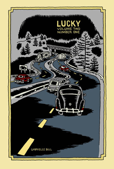
Lucky (Volume 2, #1), by Gabrielle Bell (Drawn & Quarterly). This is the only comic from a publisher on this list, but it certainly counts as a mini. Half of this comic is a story called "My Affliction", which Bell was giving away at SPX last year. I've already reviewed that story on sequart, and it was a hoot--Bell's weird sense of humor was in effect. The other half of this particular comic was a series of diary entries. Much like the minis collected in Lucky, Bell's neuroses are on full display and depicted in her typically wry, over-the-top fashion. We see her dealing with the stress of "performing" her new comic (the aforementioned "My Affliction") and preparing to be on a panel at SPX. Bell uses blacks to good effect in these stories, giving them a certain weight that at times reflects the sense of claustrophobia that her narrative portrays. It should be emphasized that Bell plays her neuroses for laughs in her typically deadpan manner, not in a "woe-is-me" sense. I've written extensively about Bell in the past, so I'll just note that if you appreciate her sense of humor and enjoy her diary comics, then I would enthusiastically recommend the new volume of Lucky.

Routine & Are You Often Impulsive In Your Behavior?, by Will Dinski. Dinski is another favorite of mine, and these two minis are both unusually presented. Routine is actually a comic on a single page of posterboard, in full color. This story is typical of Dinski's strengths as a cartoonist: his sense of panel-to-panel beats and rhythms. In a narrative, he's often fond of using a silent panel, then a narrative caption in a rapid-fire sequence. In this comic, he sets up the boring routine of a businessman in this way. A random bit of near-violence puts his routine out of balance, creating a new, quite warped routine for our hero. As always, Dinksi's page is stylish, spare and puts a bit of distance between reader and story. This is done mostly for comic effect, but there's always something a bit unsettling going on in his stories, and Routine is no exception.
...Behavior is a clever comic, also printed on cardstock. This one is meant to be folded so as to form four pages on one side. It's a story about Dinski taking a test at a Scientologist recruitment center on a whim, and the back of the comic has the results of his test. Once again, Dinski's control of story-beats drives the comic, as he breaks up the narrative with actual questions from the test. He did this to show how the way they were worded was designed to emphasize the test-taker's feelings of paranoia and inferiority. The results made Dinski out to be anxious, paranoid, critical, withdrawn, depressed, withdrawn and hyperactive (?). The punchline was that Dinski was expecting a recruiting pitch, but instead got sent on his way. The use of the test's questions dryly sets up Dinski's own critique of the proceedings in an indirect and amusing way. As always, a Will Dinski comic is smart, off-beat and comics in their purest sense; there's no way I could experience these stories as anything but comics.

Plates Are Cult #3 and Pocket Party, by Damien Jay. Jay has been making beautiful, silk-screened comics for some time now, though I first became aware of him through cartoonist Ellen Lindner. The comics I'm reviewing here are much looser, torn from his sketchbook or originally done for anthologies. Plates Are Cult #3 is in fact a mini that collects a number of short stories from other places. There's all sorts of delightful weirdness in here, including "The Merpeople of Columbus Ohio" from Mapjam, the grotesque "Frankie Pug-Dog", and the clever "Hello Everybody On The Other Side". In these comics, Jay is working through styles, influences and inspirations, using a slightly tremulous line to create expressive characters. "Hello Everybody..." is the most formally experimental, about a man trying to record voices from the spirit world. On the back of each story page, Jay blends and jams text and image, printing some of it backwards as the line between spirit and material bends and blurs. Another standout story is "Warsaw", a travel story that Jay drew, depicting one man's struggle to fend off attempts of various Polish businessmen trying to get him laid with assorted sex workers. There's a certain bleakness to Jay's art that matches the grey world of the sex trade in Eastern Europe.
While these stories had their charms, it's Pocket Party that impressed me much more. Combining sketchbook segues with a loose narrative, it's an inspired flight of fancy. Jay starts with an odd-looking man named Leslie in an abandoned town and interjects himself into the proceedings as he sees fit. He insults one of his characters, who runs off and refuses to participate further. From there, former president Gerald Ford pops up and Jay tries to lecture him on what comics are and how he fits into the story. Throughout, Jay pops into his own comic to offer random opinions, critiques of his own art and story, redrawn panels, sea monsters, Leslie being forced to play Match Game and a perilous journey through the city sewers. Jay even chides himself for being so self-referential, promising to stop it (which he eventually does, but not before he moans, "I just don't have...anywhere else to go!). Somehow, this stream-of-consciousness stew works. The looseness of the art gives it a vibrancy, as though the reader just watched it appear off the still-wet pen of the artist. Jay is funny and riffs well on the page; while the comic is admittedly self-indulgent, it's an indulgence that's quite entertaining for a reader. Jay's ability to somehow make drawing exercises (like learning how to draw fins) into amusing interludes only made me want more; given that this was actually listed as issue #1, one would hope that he'll be doing more. All in all, this is one of the most enjoyable minicomics that I've read in the past year.

Monday #1 & #2 and Yip The Wonder Dog, by Andy Hartzel. Hartzell is the creator of Fox Bunny Funny, my favorite mini of 2006. He's following up that work with a new series, based on the Adam & Eve creation myth, along with a hilarious one-shot mini originally published in another publication. The full title of Yip is The Rise and Fall of Yip the Wonder Dog, and it's a funny account of a heroic dog's journey into Hollywood fame and subsequent decadent excess. It's another wordless story from Hartzell, and while his ambitions are certainly far more modest than in Fox Bunny Funny, the payoff is no less rewarding. Hubris is punished and loyalty is rewarded in the end, but it was the sight of a dog doing lines of coke and dancing the night away (along with the other absurd but logical extremes of the narrative) that made this tidy story so much fun.
Monday is a far more ambitious story, with these first two issues being the first of five chapters. The series' central premise is dynamite: we all know what happened on the first seven days of creation--but what happened on the eighth? Adam and Eve argue about the nature of Eden, the serpent starts planting doubts, and God is hard at work at perfecting his greatest creation. After reading a number of wordless comics by Hartzell, it was a pleasure to see him script such clever banter between Adam and Eve, staying fully within their archetypical characters while expanding the creation myth.
In this story, everyone has their own agenda. Adam is desperate to stay faithful to God in spite of the doubts being planted. Eve just wants the garden to be safe, and the serpent feeds her doubts. The serpent is resentful that God punished him for hubris after he criticized his creator. Finally, God is cranky and defensive, blowing up at his creations because of his own frustration with his new creation, who is somehow resisting being born. These first two chapters set up the tensions and conflicts that are sure to come, where everyone involved is all too human--which only makes sense, since man was created in God's image.
Visually, the art doesn't quite have the snap and polish of Fox Bunny Funny. It's looser and sketchier, but no less expressive. There are also more decorative touches, with the garden of Eden holding all sorts of "eye snaps" and visual surprises. Hartzell's figures are blocky and primal, as though they were made of squares. The silkscreened covers are especially beautiful, though I look forward to its eventual overall release on better paper. Hartzell's use of themes and imagery is very different from most artists working today, and the way he incorporates mythic and archetypical imagery in his stories lends them a lot of power, even as he deflates them with humor.

Mapjam and Satisfactory Comics #7, by Isaac Cates & Mike Wenthe. Once again, full disclosure: Mike Wenthe has been a friend of mine for some years now. That said, he and his collaborator Isaac Cates have carved out an interesting niche in the world of freewheeling comics formalism. Satisfactory Comics #6 had been their most ambitious issue, with the most narratively coherent stories to go along with a slew of interesting extras and decorative touches. Issue #7 was done quite differently: it was created in an intense, 30-hour jam session. What makes this issue stand out is that despite each story having its share of pre-set rules, formal gimmicks and other built-in limitations, those boundaries were invisible to the reader. I think the main reason why was the furious pace at which these stories were written and drawn; as a result, spontaneity and looseness were the real rules here.
Given the number of jam comics and comics with specific formal rules (starting with a certain sentence, drawing with one's non-dominant hand, artists switching off panels, artists drawing different characters in the same story, improvising each panel and then switching off, etc.), I've noticed that they tend to work best as short stories. One feels the strain of the rules after more than a few pages, and the stories tend to devolve into silliness. In Sat-Com #7, it's clear that Cates and Wenthe are quite aware of this, and the result is a series of one to two pages stories that feel quite substantive. The stories range from a quiet lament on the apocalypse to an Alaskan astronaut's ruminations to a hilarious series of single-panel take-offs on famous works of literature, and much more. I particularly liked "Sinister City", which was the most formally restrictive story (single-syllable words, except for the seed sentence, written by Cates and drawn in Wenthe's non-dominant hand). The shaky pencils had a marvelous looseness to them, almost a vibratory quality, that neatly fit with the fact that the story was a retelling of a dream.
I loved the imagination of "The Xylem Cipher", about a liquid that enabled a woman to hear the speech of plants, who then discovered that this was not exactly the most exciting power in the world. This strip showed off their gag-making abilities, as they fired off every single good joke possible from this premise, and ended it on an even better joke. The range of emotional tones and genres makes the reader wonder what could possibly be next when they turn the page, and I found that this issue rewarded multiple readings. I also found their notes on the issue to be revealing as always, as they delved into their creative process.
Cates and Wenthe invited a number of others along for the ride on their ambitious Mapjam project. A wacky take on fantasy world-building stories, they had several artists contribute three bits to a fantasy world-map, split the map into nine quadrants, then handed out assignments to write a story based on that portion of the map. The results ranged from fairly standard fantasy stories to some truly ludicrous scenarios. The quality of the stories in a jam tends to depend on how much time each cartoonist puts into it. A number of the stories (especially in the first round) felt rushed and uninspired. On the other hand, those artists who were more obviously committed to the project created strips that were quite amusing. The best strip in the book came from Tom K., a contributor to Mome. In just four pages, he picked up the threads of an earlier story and took them to some unusual places. His art was stark and bold, especially a page set in a dark cave. Wenthe and Cates contributed tales of perverted minstrels, miniature questers, seasonal gods and other weirdness. Another standout contributor here was Damien Jay, whose loose style and sense of the absurd fit right into the proceedings. This was a case where the experiment and collaboration itself was more interesting at times than some of the results, but one would hope that for the next round, they'll be able to recruit cartoonists as devoted as Tom K. to pick up the baton. It'll also be interesting to see how the "exquisite corpse" nature of the experiment plays out. While not as focused or engaging as their Satisfactory Comics, Mapjam certainly has me eager to see where the stories go next.
Heart and Brain and Love Charades, by Fay Ryu. I love these wordless, colorful romantic pantomimes by Ryu. Heart and Brain features an anthropomorphic heart engaged in an unrequited relationship with an anthropomorphic brain (ambulating via its spinal cord!). The graphics are simple, reliant on Ryu's understanding of gesture and expression, and heightened by her bright colors. The only narration here are the chapter titles: "At First Sight", "Second Sight", "Third Sight", "Out Of Sight", "Hind Sight" and "In Sight". The Heart character keeps encountering Brain, but is never able to screw up the courage to talk to the object of its affection. This comic is about loneliness and how it both makes one feel like one's traversing a desert alone (an image used here more than once) and insulates us against fear of rejection. There's safety in this fear, even as Heart grows more agitated and wistful as the story proceeds. It's a beautiful, simple little story whose ambitions don't outstrip its limitations. As a result, one can see hidden depths in the familiar imagery.
Love Charades is a sort of companion piece, labled a "heart and brain exercise". It's a series of vignettes starring the aforemention characters, this time clearly as companions. The charm of this piece is the way Ryu breathes life and excitement into quotidian activities; there's a sense that these everyday experiences take on added meaning simply because they're being done by lovers. Ryu is a clear, clever storyteller who is quite adept at wringing out emotional truths with just a few strokes of a pen. I look forward to getting my hands on more of her work.

Elsewhere #3, by Gary Sullivan. The first two issues of Sullivan's travel comics used some unusual techniques in combining word and image. This issue is a collection of single-page strips called "The New Life" that appeared in a poetry/fiction journal called Rain Taxi. The strip is all over the place in a pleasing sort of way. It starts as a narrative, as a Dante-like poet meets his Beatrice in Brooklyn and they explore poetry together. Sullivan junked that narrative when he fell in love with a poet who lived in Japan named Nada Gordon, and set several of his poems to comics--in much the same way a musician would attempt to translate poetry to music.
That decision made his visual storytelling approach fairly conventional, as he used his comics either to directly illustrate his text or else comment ironically on it. The images themselves were a supplement to the words and not a form of poetry unto themselves the way they were in the first two issues of Elsewhere or for cartoonists like John Hankiewicz. In "The New Life", Sullivan doesn't seek to redefine the visual language of comics as a different kind of poetry, but rather uses it to as a tool for historical, humorous and biographical purposes.
The most successful strips in this collection were Sullivan's pieces focused on specific poets. Combining commentary, direct quoting, ironic juxtaposition of word and image, and at times genuine warmth for subject and material, these strips were perfect introductions for poetry neophytes like myself and an amusingly different perspective on these pieces for afficianados. His parodies of old Marvel and romance comics as a means of illustrating certain trends or histories in the world of poetry were funny, but he doesn't quite have the chops to pull off the style mimicry required for the full impact he was going for. Still, he comes close enough that the audience will know what he was going for.
I like the fact that Sullivan is hard to pin down. He seems interested in being several different kinds of artist and writer simultaneously. He obviously loves comics, likes the free-flowing weirdness of Flarf (the sub-genre of poetry he developed), loves history, is engaged with the world in a political and material sense, and has a sense of humor about both himself and his art. He's a bit all over the map, and it's that very lack of focus that draws me in to what he does.

Eye of the Majestic Creature #2, by Leslie Stein. Stein first came to my attention with her painstaking and unusual comic Yeah It Is!, a Xeric-winner that looked to be assembled as much as drawn, given the way she composed each page with paper cut-outs along with drawings. It was an interesting experiment to say the least, and the fact that the story itself was equally appealing to my sensibilities (about a loudmouth loner trying to relate to the rest of the world) certainly made her one to watch.
The style she uses in her minis is completely different--a very fine line, detailed pencils and even stippling for effect. Her stories are the product of an unhinged imagination, yet there is a coherent narrative to be found. Indeed, one senses that much of the story is directly autobiographical, if adorned with all sorts of weirdness. The story is about a young woman named Larry who has moved out to the country after living in the city made her too anxious. She lives alone in a house with her anthropomorphic guitar (named Marshy) and ponders misanthropy and the desperate need to connect, two contradictory impulses that nonetheless drive her.
I found myself completely drawn into the world that Stein created. Her ability to create intricate fine-line drawings whose simplicity leads the eye around the page with ease is matched only by her many decorative touches. Larry has huge, button eyes and a picklish nose to go along with her lithe frame. Stein adds a touch of the trippy and even grotesque in her drawings, with hints of Vaughn Bode popping up here and there. There are many hilarious sequences in the book, like Larry playing with a baby by bopping a doll on its head until she knocks it over and responding by quietly propping the baby back up.
This comic is mostly about the stink of alienation and loneliness. Larry can smell it on others (like a shop owner desperate for company) and is none-too-pleased to detect it in herself. Larry later house-sits for another loner-type obsessed with odd but beautiful details in life. He's a social misfit who seems content with his obsessions, like country music and barbecue. Larry is not so different from him, and draws happiness from some of the most absurd places. It's safe to say that the absurd, the cheap, and the guilelessly delightful things in life give Larry joy in a world devoid of meaning or real connection. This point of view resonates with me as a reader, and it's for this reason, along with her superior chops as an artist and imaginative composition & design that this was my favorite mini-comic to date of 2007.


No comments:
Post a Comment