Cosmoknights, by Hannah Fisher. This is a great example of how younger creators have completely eradicated the boundaries between genre comics and alternative comics. This is a slice-of-life comic that slowly reveals its more fantastical details about two young women from very different societal castes who develop an intense friendship. Tara, as we learn, is royalty. Pan, her best friend, lives a more hardscrabble existence but is in many ways her friend's connection to the outside world. This comic is all about moments and the ways in which the two characters relate to each other, and as such, it's heavy on body language cues. Fisher has a strong sense of line but an even stronger sense of how to use color as the key element of her emotional narrative. There's one sequence where the friends are at a nighttime, outdoors concert where the blacks, purples and blues provide an emotional backdrop for the friends dancing, and then later Pan shows Tara a spectacular view of the two moons of her planet. (This is when it becomes explicit that this is a science-fiction story.)
When Pan helps her friend escape from how prescribed her fate is about to become, she does it knowing that she will be arrested and will be separated from her friend no matter what. As the back cover notes, a knight can be "the devoted champion of a lady", and that's precisely the role Pan plays for Tara in this first installment of a much longer story. Fisher is able to make this comic a complete story in and of itself, with a fully realized emotional arc. Obviously, there's a longer narrative arc in the offing, but it's clear that the series' emotional arc is its most important component.
Give, by Pam Wishbow/Hunt, by Leigh Luna. This is the last release of the sadly departed Yeti Press, but it's a good one, spotlighting two up-and-coming cartoonists. Wishbow's creepy comic about plumbing the mysteries of the forest uses a sickly green as a spot color as the story's narrator tries to resurrect a dead mouse using various herbs and ephemera she finds in the forest. When she's eventually successful, she learns that getting what she wanted wasn't necessarily what was good for her, as the forest gave and then took it away. Wishbow's art is dynamic and abstracted in the way children's illustrations sometimes are, popping off the page with powerful, stylized compositions. The way Wishbow incorporated text into the art itself made the comic more immersive, creating a world that the reader is drawn into.
Luna's story juxtaposes multiple bright colors against a pitch-black story, as tradition dictates that the mothers of a small town must put their daughters out into the woods with the wolves for a night. Tellingly, there is no reason given as to why the women allow this: it simply happens, because the wolves take them. The most the women can do is prepare them, fixing their hair and putting them in beautiful dresses as a kind of "preparation" that is not actually a safeguard of any kind. The comic is a brutal condemnation of rape culture without once using the word, with the ending featuring the women taking the sons of the wolves to "teach them to be good". The comic goes from a multigenerational commiseration of helplessness and inevitability to a seizing of power and agency. There's a delicacy throughout the comic in terms of the figurework and use of color, and that doesn't change even at the end.
Duane's Big Walk, by Rusty Jordan. This is a kind of catch-all zine for some of Jordan's recent short stories involving his Duane character. Jordan's trademark is exploring various contrasts with blacks and shades of gray, with Duane musing existentially with his bird friend Christian. There's a bizarre puppet/claymation story featuring a TV newswoman whose story starts to hilariously and disturbingly unravel as the comic proceeds. The worlds that Jordan creates are evocative and strange, full of losers, bottom-feeders, hard-travelers and the desperate. "Off The Schneid!" puts them all together in a single story and lets them all intermingle. A lost romance is rekindled. A friendship is repaired. A bar is the setting for all of this, as all of these desperate people become a community of sorts. There is warmth to be found in Jordan's world, even if it's covered up by grime and toil. It's reflected in his grotesque but friendly character design, all lumps and bulging eyes and tufts of hair out of place. These characters are familiar, like on the edge of one's social circle from years ago. There's a lingering sense of absurdity in Jordan's comics and a touch of sadness combined with an unformed but still present sense of hope.
Showing posts with label rusty jordan. Show all posts
Monday, July 10, 2017
Friday, October 4, 2013
Minicomics: Burkert/Rhodes, Paine, Bongiovanni, R.Jordan, Van Sciver
Too Many Nitrous and 2 Many Nitrous, by Billy Burkert and Samuel Rhodes. These sillly and entertaining comics are very loosely based on the silly and entertaining Fast and the Furious movies. The Vin Diesel character is reimagined as a former fat kid who only takes up bodybuilding and driving as a way of getting revenge on a masked driver who destroyed his favorite fast-food joint. The comic is at its best when making fun of the ridiculous "street" lingo from the films as well as the nonsensical gearhead content relating to cars and add-ons. That latter element appears especially ridiculous as the cars are all drawn with what looks like a primitive drawing program, making the racing scenes ridiculous instead of exciting. The figures are cartoony and exaggerated, with dark, bulbous noses and rubbery faces that mimic the smirks and mugging found in the acting styles of the movies. There are absurd sub-plots (like one friend of protagonist Dom [the Vin Diesel character from the movies] going off to find ghostly racing apparel worn by his father), over-the-top slang ("Streets is up!") and other such nonsense. Fans of the films will likely enjoy the gentle pokes the comics aim in their direction, though others may be utterly baffled.
Alamo Value Plus #1, by Rusty Jordan. This is a new series by Jordan, who seems fascinated by mutating the world of low-value retail into bizarre, improbable adventures. This one features recurring Jordan character Duane and a ridiculous character named Baldemar Pretzeldorf, who recounts a harrowing tale of escaping from the Nazis with his mother while on break. Jordan's rubbery character design employs nice, fat, rounded lines and exaggerated character poses. The effect matches realistic storytelling with highly cartoony figures, not unlike a Skip Williamson drawing. Jordan actually makes the action sequence quite compelling, especially when contrasted with the adult Baldemar's bombastic speaking style ("That's the smell of another wonderful day in variety retail!") and the younger Baldemar's slang that's informed by Arnold Schwarzeneggar-style quips. This issue is packed with crazy events, yet it's really just a set-up issue. Jordan has a way of stopping on a dime and escalating the lunacy of his stories, so I'm curious as to just how demented the second issue will be, when Baldemar is confronted by his old Nazi nemesis.
Selfie, by Anna Bongiovanni. Bongiovanni's comics tend to trade in dark themes and wilderness settings, exposing the raw nerves of emotion and experience. This hilarious mini couldn't be any more different from those comics, even as it pokes at loneliness and awkwardness. The comic features a couple of friends named Riley and Sam; both are lonely and having trouble finding company in different ways. Sam is a straight woman who isn't being helped much by her flatmate Riley, an out 'n proud lesbian who is a self-described "creeper". Rather than being told in Bongiovanni's usual dense, cross-hatched style, this story is instead done in red ink with occasional yellow zip-a-tone effects and drawn in a loose, scribbly style. The only other visual effect is that whenever someone uses a phone to take a picture (like one of the titular "selfies"), an actual b&w photograph is used on the page. Whether or not that's meant to suggest that this story is loosely autobiographical or not is beside the point, because the arc of the story, featuring Riley as someone who's both swaggeringly confident and relentlessly insecure about herself, leads to some sharply-designed comedic sequences. Indeed, Riley takes a picture of a girl she instantly crushes on from afar, then winds up drunkenly running over her with her bicycle. Bongiovanni captures the desperate need for affection along with the genuinely funny tension between friends Sam and Riley, a pair that's gone far beyond the ability to truly offend the other. Bongiovanni is truly on a roll this year, and this mini is proof that she can tell any kind of story.
Kit and Luisa Stories, by Virginia Paine. This mini features three stories about a couple of teens who have a tenuous sexual and romantic relationship. Kit is a taciturn, hoodie-sporting young woman who has a serious crush on Luisa, a religious girl who nonetheless feels compelled to put Kit's affections on a string by sending her mixed messages. Paine seems to have done a lot of thinking about these two characters and knows them inside and out, which allows her to be restrained about what she chooses to show. There's a lot of deep, churning emotions and a powerful but enervating tension between Kit and Luisa, a tension that drives Kit to walk away at the end of the book even as Luisa once again is unable and unwilling to safely navigate the waters between friendship and flirtation. Paine heightens this tension by subtly introducing fantasy elements, like Luisa's ability to control fire and Kit's bizarre job involving a demented potato room. Paine's greatest asset as a drawer is her ability to zoom in and subtly depict emotions; she's on shakier ground when she tries to show dance club scenes and other, wider environments. Still, Paine's clearly hit on something here, and I look forward to seeing this story evolve as a webcomic in the future.
Saint Cole Part One, by Noah Van Sciver. This is a collection of the first 46 pages of Van Sciver's strip on his website, The Expositor. It's a typically bleak, hilarious account of a loser in over his head. In this story, a waiter named Joe has to work crazy shifts as a waiter to barely support his girlfriend and infant son. Like many of Van Sciver's characters, he is slowly undone by his own actions (boozing on the job, fantasizing about screwing a co-worker's 17 year old sister) as well as others (his hilariously shiftless, profane mother-in-law who forces her way into living with them). There's a level of grungy authenticity that's almost poetic in how Van Sciver creates a character who is unlikable yet entirely sympathetic. I can't wait to see where this one goes.
Alamo Value Plus #1, by Rusty Jordan. This is a new series by Jordan, who seems fascinated by mutating the world of low-value retail into bizarre, improbable adventures. This one features recurring Jordan character Duane and a ridiculous character named Baldemar Pretzeldorf, who recounts a harrowing tale of escaping from the Nazis with his mother while on break. Jordan's rubbery character design employs nice, fat, rounded lines and exaggerated character poses. The effect matches realistic storytelling with highly cartoony figures, not unlike a Skip Williamson drawing. Jordan actually makes the action sequence quite compelling, especially when contrasted with the adult Baldemar's bombastic speaking style ("That's the smell of another wonderful day in variety retail!") and the younger Baldemar's slang that's informed by Arnold Schwarzeneggar-style quips. This issue is packed with crazy events, yet it's really just a set-up issue. Jordan has a way of stopping on a dime and escalating the lunacy of his stories, so I'm curious as to just how demented the second issue will be, when Baldemar is confronted by his old Nazi nemesis.
Selfie, by Anna Bongiovanni. Bongiovanni's comics tend to trade in dark themes and wilderness settings, exposing the raw nerves of emotion and experience. This hilarious mini couldn't be any more different from those comics, even as it pokes at loneliness and awkwardness. The comic features a couple of friends named Riley and Sam; both are lonely and having trouble finding company in different ways. Sam is a straight woman who isn't being helped much by her flatmate Riley, an out 'n proud lesbian who is a self-described "creeper". Rather than being told in Bongiovanni's usual dense, cross-hatched style, this story is instead done in red ink with occasional yellow zip-a-tone effects and drawn in a loose, scribbly style. The only other visual effect is that whenever someone uses a phone to take a picture (like one of the titular "selfies"), an actual b&w photograph is used on the page. Whether or not that's meant to suggest that this story is loosely autobiographical or not is beside the point, because the arc of the story, featuring Riley as someone who's both swaggeringly confident and relentlessly insecure about herself, leads to some sharply-designed comedic sequences. Indeed, Riley takes a picture of a girl she instantly crushes on from afar, then winds up drunkenly running over her with her bicycle. Bongiovanni captures the desperate need for affection along with the genuinely funny tension between friends Sam and Riley, a pair that's gone far beyond the ability to truly offend the other. Bongiovanni is truly on a roll this year, and this mini is proof that she can tell any kind of story.
Kit and Luisa Stories, by Virginia Paine. This mini features three stories about a couple of teens who have a tenuous sexual and romantic relationship. Kit is a taciturn, hoodie-sporting young woman who has a serious crush on Luisa, a religious girl who nonetheless feels compelled to put Kit's affections on a string by sending her mixed messages. Paine seems to have done a lot of thinking about these two characters and knows them inside and out, which allows her to be restrained about what she chooses to show. There's a lot of deep, churning emotions and a powerful but enervating tension between Kit and Luisa, a tension that drives Kit to walk away at the end of the book even as Luisa once again is unable and unwilling to safely navigate the waters between friendship and flirtation. Paine heightens this tension by subtly introducing fantasy elements, like Luisa's ability to control fire and Kit's bizarre job involving a demented potato room. Paine's greatest asset as a drawer is her ability to zoom in and subtly depict emotions; she's on shakier ground when she tries to show dance club scenes and other, wider environments. Still, Paine's clearly hit on something here, and I look forward to seeing this story evolve as a webcomic in the future.
Saint Cole Part One, by Noah Van Sciver. This is a collection of the first 46 pages of Van Sciver's strip on his website, The Expositor. It's a typically bleak, hilarious account of a loser in over his head. In this story, a waiter named Joe has to work crazy shifts as a waiter to barely support his girlfriend and infant son. Like many of Van Sciver's characters, he is slowly undone by his own actions (boozing on the job, fantasizing about screwing a co-worker's 17 year old sister) as well as others (his hilariously shiftless, profane mother-in-law who forces her way into living with them). There's a level of grungy authenticity that's almost poetic in how Van Sciver creates a character who is unlikable yet entirely sympathetic. I can't wait to see where this one goes.
Friday, July 12, 2013
Minicomics: Taylor, Jordan/Smith, Cass, Keeper Steinke
Tabe #11, by Rio Aubry Taylor. Labeled "an abstract comic about community", Taylor's latest is a fascinating series of drawings that packs a surprising emotional punch. There are varying types of abstract shapes: squiggles, straight line patterns, hair-like tangles of lines, blotches, grey shapes that look like torn pieces of paper glued to the page, and things that operate as captions that contain "text" that looks like an alien language. There are moments where the page explodes like a supernova against a night sky, and then it fades back into what looks like a drawing of the circulatory system. There are pages where the drawings seem to be in harmony and others where the drawings look to be in opposition. What makes the comic work so well is Taylor's sense of rhythm and balance on the page, creating a sense of independent intelligence in each drawing while never creating anything that's directly figurative.
History In Ruins #1-2, by Rusty Jordan and Andrew Smith.Both of these comics are just twelve pages long, but they pack a truly bizarre punch in each installment.The main character, Duane Fields, is the sort of greasy loser that is not unfamiliar to alt-comics fans, a Clowesian character who works part time at a drug store and shoplifts on the way out. I'm not sure what the division of labor is here in terms of story and art, but the figure work has a sweaty, rubbery quality to it. There's an almost clownish, Skip Williamson quality to these odd-looking characters that makes this feel like it could have been published forty years ago in an issue of Arcade. That's especially true because the second issue takes us away from the more alt-comics narrative of the deluded loser and brings us to far weirder territory. Living in the basement of his mother's house with a near-sentient mouse and assorted "experiments", he spies upon his mother (wearing inappropriately sexy clothes around her son, though she still treats him like he's a toddler) being threatened by a gang of thugs. When she is later kidnapped, the story is transformed into a wacky revenge narrative. I have no idea where things are headed next (I get the sense that much of this comic is improvised), but each page is a visual treat and full of surprises.
Mr Wolf #2, by Aron Nels Steinke. In Steinke's autobio series, Big Plans, his Mr Wolf character is usually an expression of his range. It's interesting that he's chosen to rework it as an uncertain authority figure to reflect his status as a first and second grade teacher, transforming all of the characters into anthropomorphic animals. These fictionalized strips obviously draw heavily from his real life experiences and encounters, and I'd imagine that many of the characters are composites rather than outright fictions. These strips are the best comics of Steinke's career in my opinion, because it balances his need to constantly scrutinize and microanalyze his decision-making and emotions with actually having to deal with the emotions and minds of dozens of children. His observations about the kids are warm and knowing without descending into saccharine sweetness or sentimentality. Indeed, there's something raw and real about his observations and how in many ways he's more like one of them than he is like many of the adults, even if he is an authority figure whom many of the children respect and admire. It also helps that this strip is very funny, with Steinke no doubt curating the funniest things he's experienced or heard other teachers relate to him. His drawing is simple, cute and powerfully expressive, getting across the emotions and mental states of the kids with greater facility than if he had used a more realistic approach. Comics about teaching are still fairly rare, and I hope Steinke continues to develop his observations and witty, humane approach to discussing the children under his tutelage.
The Drowning Ring and Uh Oh Dojo, by Mike Keeper. I couldn't find any website info for these idiosyncratic zine/comics fusions. The Drowning Ring is a small booklet that is absolutely jam-packed with trivia, comics, ephemera and a narrative about being a lifeguard in a particular beach community. There's something remarkably knowing about the gags, the language and the weirdness of being part of lifeguard culture that Keeper brings to life. His actual comics have a surprising level of careful detail when he chooses to illustrate something in a naturalistic style, but he mostly prefers quicker, cruder renderings and iconic drawings. I have no idea how many of the details he throws at the reader are actually true, and I prefer to keep it that way. It's like reading a Leon Beyond comic, where one knows that Leon is mostly feeding you lies, but they are so enjoyable that one wants more and more. The whole thing is a very appealing mess, as the layout is frequently sloppy and slapped together, but it's an obvious labor of love. Uh Oh Dojo is a short and magazine-sized comic that's just eight pages long, but packed with comics and repurposed photos. It's about Keeper hearing about the death of his former karate sensei (teacher) and the likelihood that he had killed himself. It spurs Keeper to think about suicide in general, while circling back to the history of karate, to his own life and the things he learned in karate. It's a comic with no pat answers or lessons, just many questions solemnly asked in an unusual package. It's Keeper's attention to fine details while making sure to get across the essential emotions of a situation that make these comics worth reading.
The Index #4, by Caitlin Cass. Cass's deeply introspective series about insignificance, meaning and knowledge has now taken a firm turn into the realm of fantasy. After raising the specter of indexer Paul Otlet and zipping everyone to a fairly intact library of Alexandria, Diogenes wanders into the proceedings of this issue. He's the antithesis of Otlet, who spends his time with words and writings; Diogenes viewed anything less than a total lifestyle commitment to one's ideas as a kind of inauthentic living. As the cast of this comic has expanded, Cass has juggled a new character into every issue to likewise expand the nature of the ideas at work. One of the leads, Susan, kept blank cards because their potentiality and nothingness comforted her equally, balancing her own sense of nothingness. When the other lead, John, started writing ideas on them willy-nilly it was as a way of rejecting his former career as a graduate student trying to get words to do his bidding. Otlet's index of ideas was the impossible task of trying to categorize all universal knowledge using a finite and clumsy set-up. Cass is careful to keep the non-apparitions in the story close to their somatic roots, giving them hunger and restlessness as they drift away from the performative spaces of the ghosts. This was a fascinating issue that betrays no particular allegiance to any of these points of view, which is what makes it so interesting. Her drawings are functional if unremarkable, sloppily but accurately getting across her points of view quickly and directly.
Saturday, August 20, 2011
Comics-As-Poetry: Badman, Moulger Digest, G. Thomas, Moreton
More cartoonists are engaging in the creation of comics-as-poetry. That's both in terms of trying to come up with formal constraints that act like rules such as meter and rhyme scheme in standard poetry, as well as giving the reader images that they must parse and attempt to understand on their own. Here are a few recent examples.
The Escapologist #1, by Simon Moreton. This is Moreton's most explicit dip into comics-as-poetry, dipping into the playbooks of Warren Craghead and Kevin Huizenga here. This 10-page mini follows the author dissolving into a ghost-like figured trailed by lines, squiggles, symbols and geometric figures (the kind of lines you might see in a Craghead story/poem) and concentrates on the phenomenology of everyday observation. As we see the ghost/spirit drift out over the city and then the sea, Moreton ties the carefully-rendered naturalistic drawings with brief lines of text, noting "These dunes/this sea/this paper, this ink/these lines/we hold it all together/just being". The idea that our own observations of the world create that world in much the same way that the artist creates the images on the page is an interesting one. More to the point, the close observation of the environment qua environment (as opposed to our everyday use of the environment) is posited as a valuable end in and of itself, whose smallest details might yield interesting connections. Moreton's line is especially sharp in this comic, featuring enough detail to give the reader the flavor of each observed setting without drowning it in too many lines.
Dodo Comics #1, by Grant Thomas. This is a highly structured series of strips that each feature a different set of formal constraints. The intent is to create a visual rhyme scheme and meter for comics in some, and to emphasize certain aspects of the comics reading experience in others. For example, "Where Do Ideas Come From?" uses a scheme called "reducto", which alternates between a medium shot and a close-up of either one or many figures, closing with a shot with no entities in the final panel on the page. It's an interesting idea, although the resulting comic here is mostly fluff and not especially interesting to look at. More successful is "Visions of Gehanna", a reinterpretation of a Bob Dylan song as a vision of hell. Here, Thomas employs smudges to interesting effect, duplicating the original song's suffocating quality through visuals. "The Duel" and "Chase" were also interesting, as Thomas took panels from other comics and removed every thing from them except speed lines, rain lines and indicators of light. Given just the title of each, it's quite easy to contextualize it in terms of the stated subject.
Untitled by Rusty Jordan & Andrew Smith. This is a flip-book, where each artist does half of the mini. Jordan's half features figures heavily influenced by underground figures like Robert Crumb but also appropriates the rubber-faced and lipped aspects of how black characters were once drawn in comic strips. The character in this story is not written so as to be explicitly African-American, and that distinction adds a bit of key dissonance to the proceedings, because there's a disconnect between image and story. Smith is one of the few cartoonists who focuses on scatology whose work I actually like, because he goes beyond simply doing a shit joke and creates something a bit more transgressive. Smith is an ace draftsman but goes deliberately simple and crude for this story involving a woman jogging who is accosted by a would-be rapist. She oddly bends over for him, only to violently defecate in his face. Given the way that Smith keeps the dialogue deliberately light and banal, this image becomes all the more powerful and hilarious. It's a gag-inducing gag and an effective one at that.
Moulger Bag Digest #3, by Brent Harada & Rusty Jordan. This is an almost wordless, densely drawn comics that features a series of very loose narratives. The emphasis here is on the reader's reaction to individual images and then reprocessing them as a gestalt on the page. One of the key recurring motifs is the way images break down: fracturing, going into fractals, melting, warping, etc. Harada & Jordan employ a number of familiar techniques here, including collage, psychedelic art (in terms of both op-art effects as well as Skip Williamson-style figures), comics-as-poetry "rhyming" (like when a plant and then a chair act as stand-ins for a lonely man and his life) and sheer, grotesque figure-work. I found this to be the most refined and approachable of their comics, which probably has something to do with their approach as well as something to do with the way my approach to comics like this has changed.
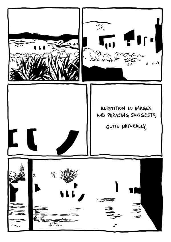
Badman's Cave, by Derik Badman. This was the most interesting instance of comics-as-poetry in the group, given its ambition and complexity. Badman reinterpreted the art from a Jesse Marsh-drawn issue of Gene Autry Comics and placed in text from random internet searches. Like Thomas, he removed the original figures from his drawings. Badman goes a step further by mixing the Western backgrounds of mountains, deserts, forests and traditional town with abstractions. Clouds and dust drift by almost sentiently, while buildings turn into geometric figures as Badman makes extensive use of blacks to get the eye to roll across the page. Badman's selection of prose is also quite interesting, as he comments on the repetition and "rhyming" of images by noting that "the world speaks, but mysteriously, incompletely closely associated with a metaphor within." As the comic flips between abstract and concrete, Badman is suggesting a greater sense of connection between the two worlds, an essentially mysterious connection "grasped in repetition, images and phrasing suggests a glimpse of the dark portraying the gods". Meditating on and considering the images can provide, in flashes, that deeper sense of connection between the conceptual and the real, the perceived and the actual, between time and place. The mini would have benefited from better paper and darker, richer blacks to make that black/white contrast really pop on the page. I think it would also have made his individual images a bit more distinctive. Still, this is Badman's most fascinating and successful comics experiment to date.
The Escapologist #1, by Simon Moreton. This is Moreton's most explicit dip into comics-as-poetry, dipping into the playbooks of Warren Craghead and Kevin Huizenga here. This 10-page mini follows the author dissolving into a ghost-like figured trailed by lines, squiggles, symbols and geometric figures (the kind of lines you might see in a Craghead story/poem) and concentrates on the phenomenology of everyday observation. As we see the ghost/spirit drift out over the city and then the sea, Moreton ties the carefully-rendered naturalistic drawings with brief lines of text, noting "These dunes/this sea/this paper, this ink/these lines/we hold it all together/just being". The idea that our own observations of the world create that world in much the same way that the artist creates the images on the page is an interesting one. More to the point, the close observation of the environment qua environment (as opposed to our everyday use of the environment) is posited as a valuable end in and of itself, whose smallest details might yield interesting connections. Moreton's line is especially sharp in this comic, featuring enough detail to give the reader the flavor of each observed setting without drowning it in too many lines.
Dodo Comics #1, by Grant Thomas. This is a highly structured series of strips that each feature a different set of formal constraints. The intent is to create a visual rhyme scheme and meter for comics in some, and to emphasize certain aspects of the comics reading experience in others. For example, "Where Do Ideas Come From?" uses a scheme called "reducto", which alternates between a medium shot and a close-up of either one or many figures, closing with a shot with no entities in the final panel on the page. It's an interesting idea, although the resulting comic here is mostly fluff and not especially interesting to look at. More successful is "Visions of Gehanna", a reinterpretation of a Bob Dylan song as a vision of hell. Here, Thomas employs smudges to interesting effect, duplicating the original song's suffocating quality through visuals. "The Duel" and "Chase" were also interesting, as Thomas took panels from other comics and removed every thing from them except speed lines, rain lines and indicators of light. Given just the title of each, it's quite easy to contextualize it in terms of the stated subject.
Untitled by Rusty Jordan & Andrew Smith. This is a flip-book, where each artist does half of the mini. Jordan's half features figures heavily influenced by underground figures like Robert Crumb but also appropriates the rubber-faced and lipped aspects of how black characters were once drawn in comic strips. The character in this story is not written so as to be explicitly African-American, and that distinction adds a bit of key dissonance to the proceedings, because there's a disconnect between image and story. Smith is one of the few cartoonists who focuses on scatology whose work I actually like, because he goes beyond simply doing a shit joke and creates something a bit more transgressive. Smith is an ace draftsman but goes deliberately simple and crude for this story involving a woman jogging who is accosted by a would-be rapist. She oddly bends over for him, only to violently defecate in his face. Given the way that Smith keeps the dialogue deliberately light and banal, this image becomes all the more powerful and hilarious. It's a gag-inducing gag and an effective one at that.
Moulger Bag Digest #3, by Brent Harada & Rusty Jordan. This is an almost wordless, densely drawn comics that features a series of very loose narratives. The emphasis here is on the reader's reaction to individual images and then reprocessing them as a gestalt on the page. One of the key recurring motifs is the way images break down: fracturing, going into fractals, melting, warping, etc. Harada & Jordan employ a number of familiar techniques here, including collage, psychedelic art (in terms of both op-art effects as well as Skip Williamson-style figures), comics-as-poetry "rhyming" (like when a plant and then a chair act as stand-ins for a lonely man and his life) and sheer, grotesque figure-work. I found this to be the most refined and approachable of their comics, which probably has something to do with their approach as well as something to do with the way my approach to comics like this has changed.
Badman's Cave, by Derik Badman. This was the most interesting instance of comics-as-poetry in the group, given its ambition and complexity. Badman reinterpreted the art from a Jesse Marsh-drawn issue of Gene Autry Comics and placed in text from random internet searches. Like Thomas, he removed the original figures from his drawings. Badman goes a step further by mixing the Western backgrounds of mountains, deserts, forests and traditional town with abstractions. Clouds and dust drift by almost sentiently, while buildings turn into geometric figures as Badman makes extensive use of blacks to get the eye to roll across the page. Badman's selection of prose is also quite interesting, as he comments on the repetition and "rhyming" of images by noting that "the world speaks, but mysteriously, incompletely closely associated with a metaphor within." As the comic flips between abstract and concrete, Badman is suggesting a greater sense of connection between the two worlds, an essentially mysterious connection "grasped in repetition, images and phrasing suggests a glimpse of the dark portraying the gods". Meditating on and considering the images can provide, in flashes, that deeper sense of connection between the conceptual and the real, the perceived and the actual, between time and place. The mini would have benefited from better paper and darker, richer blacks to make that black/white contrast really pop on the page. I think it would also have made his individual images a bit more distinctive. Still, this is Badman's most fascinating and successful comics experiment to date.
Wednesday, October 28, 2009
Minicomics Round-Up: Krall, Turnbull, Viola, Ineke, Runkle, Jordan & Harada
Time for another look at a variety of minicomics that have been sent my way. Reviewed are RUNX TALES #2 by Matt Runkle; HERMAN THE MANATEE #1 & 2 by Jason Viola; THE SLEEP OF KINGS by Ibrahim Ineke; PRIZE #2 by Hawk Krall; INVASIVE EXOTICS #2 by Jack Turnbull; and MOULGER BAG DIGEST #2 by Rusty Jordan & Brent Harada.

RUNX TALES #2, by Matt Runkle. Runkle has a crude but expressive line, but these comics popped off the page because of his terrific design sense. In this large format comic (8.5 x 11), the standouts were "Nora Stories" and, oddly enough, a long essay on ranch dressing. With the former, Runkle's character design was key, especially with regard to the huge eyeglasses of the title character (they fairly overwhelmed her face) and the sleazy vagrant named Crow who somehow kept popping up in her life. Nora's exasperated but resigned body language was nicely related by Runkle, particularly in the way she looked exactly like a weirdo magnet--the sort of person freaks gravitate toward because they know they'll be tolerated. Runkle's comics essay on the virtues of ranch dressing leaned heavily on his use of white-on-black images and a clever use of fonts. Runkle was more than a little tongue-in-cheek in this essay, especially when he compared the dressing to semen and noted that many of the folks he waited on reacted to it much like a desired money-shot.

Runkle's own personal observations also had some amusing moments. "Wrestling With The Truth" was about his high school experiences as a wrestler, while dealing with the awkwardness of being gay in rural America. While that was the backdrop of the story, the meat of it dealt with what happened when he was thrown to the mat in practice and hit his head hard. He saw a vision where for a second, "it all made sense": a middle-aged woman, a ladder and other vague details. Runkle contrasting this to San Francisco goddess worship was hilarious, noting that this goddess was very much of her surroundings: "farm-hardened, sensible and the type that would hate new-agers". His story about a recently deceased friend of his was touching, funny and compelling, detailing the ways in which this trans friend embraced living. Runkle is a great cartoonist despite being a mediocre draftsman who plays to his strengths, understands how to compose a page, and focuses on his line expressing his sense of humor and point of view. The result is one of the more entertaining one-man anthologies I've read in quite some time.

HERMAN THE MANATEE, #1 & 2 by Jason Viola. At first glance, I thought this might be a series of cute strips about a manatee and worried that it might be a bit saccharine. Then I read the first strip and realized that it was about a manatee who was hit by a speedboat in strip after strip. It was the equivalent of reading a collection of PEANUTS wherein every strip featured Lucy pulling the football away from Charlie Brown. Varying the set-up to a situation with the same punchline every time is not easy, but Viola went through a lot of variations: flashing back to childhood, being deceived by god, playing Marco Polo, doing a Gorey pastiche, etc. By volume 2 of this mini, Viola started an extended narrative about the perils of having a protected pond, including being forced to pose for humiliating photos with tourists and being exploited for money. Viola is a good gagsmith with an appealing line who gets a lot of mileage out of being extremely cruel to his characters for no particular reason. Herman isn't punished because he deserves it; it's simply his fate to have his head hit by boats. While I can understand the difficulty of coming up with variations on a particular formula, I did think that Viola started to drift away from what made his strip successful when he went on to do the longer storyline. His attempts at satire were clumsy, but more problematic was that he was trying to turn Herman into a real protagonist. Sure, he still turned out to be a failure, but it still felt like an uneasy match of ambition and character. Herman is perhaps less like Charlie Brown (a sad-sack who is multidimensional) and more like Wile E Coyote, and the extended storyline felt like Viola was plopping him down into a story that didn't suit the character.

THE SLEEP OF KINGS, by Ibrahim Ineke. Ineke is a Dutch artist with a fine arts background who has recently started to move into comics work. His specialty is horror, but less an American sense of horror and more of a Japanese one. That is, the ideas presented and hinted at by the story are more awful than the standard American presentation of gore. There's also a bit of Lovecraft to be found here, in that evidence of something ancient & horrible is discovered with disastrous results. The story finds two boys playing sword and sorcery games in the woods. When one boy disappears for a bit, his friend finds him with his back to him, unresponsive--and surrounded by buzzing insects. What I liked about this story is that its horror takes place in broad daylight, with light and shadow cleverly deployed when an eclipse occurs. Ineke only hints at what's happening here: stones in a circle with some sort of mystic runes, and some type of demonic possession. All the reader needs to know is that both boys meet a terrible end in a story that moves leisurely but doesn't outstay its welcome.
Ineke's figures, especially in close-up, have a scribbly & energetic quality to them that made them come alive. Indeed, there's a spontaneity to his line that made reading this sort of story more entertaining than usual, given that I'm used to a certain slickness with American horror comics. There were some panels where he seemed to be losing a bit of control with regard to characters in motion (not surprising for someone from a fine arts background); panel-to-panel transitions as well as characters in relation to each other are things that I imagine he'll continue to improve on as he continues to draw comics. He's certainly an interesting artist, and I'll be curious to see how he would tackle a longer-form work.

PRIZE #2, by Hawk Krall. I first became aware of Krall's work in the pages of Danny Hellman's anthology TYPHON, with his "Summer of Seven-Eleven" story being a standout. PRIZE is a collection of shorter strips in three different categories: stories about working the graveyard shift at a 7-11, stories about living in squalid conditions with his art school roommates ("Living In Filth"), and tales from the kitchens of a big city ("Dirty Dish"). Krall's work is very much in the tradition of underground comics, with a particular focus on grotesque character design. Krall is a great yarn-spinner, especially when he zeroes in on the most sordid details. He plays up the absurdity of living with filthy roommates in a run-down apartment, of the frequently disgusting truth of working conditions in a kitchen, and the sort of people he encountered working in a convenience store. His ability to capture the characters he met and crystalize them in short order made strip after strip a hilarious experience.

Of the three different features, I thought "Dirty Dish" was the funniest and most original. They're presented as single-page strips, and it's a format that flatters Krall's style. Krall doesn't vary his line or panel composition much from strip to strip. With his longer stories, the reader is hammered in panel after panel by Krall's grotesque imagery, and the effect can be suffocating at times. "Dirty Dish" not only opens up the page a bit, it finds Krall concentrating on a single image or idea and playing that out. The strip also provides the reader a peek into the world of professional kitchens. Krall portrays it as an unrelenting series of hostile encounters, where the workers struggle to hold on to their sanity. He also made it seem like fun, at least in the sense that huddling in a foxhole develops camaraderie. Even in strips that seemed a bit cluttered, Krall's ability to escalate situations is the hallmark of his very sharp sense of comic timing.

INVASIVE EXOTICS #2, by Jack Turnbull. Turnbull's APOLLO ASTRO series of minicomics that he published before he went to art school positioned him high on my list of interesting young artists. His new series is a radical departure from those comics that clearly displayed his influences (Clowes, Ware & Tomine in particular) but still showed that his voice was one that needed to be heard. INVASIVE EXOTICS is a mash-up of a startling array of genres, including sci-fi, conspiracy fiction, psychedelic social satire, slice-of-life, and crime fiction. While not a direct influence, Matthew Thurber's 1-800-MICE is the closest point of comparison I can think of, though Turnbull's comic is not as tightly plotted or outrageous in its conceits.

Most stories involving satires of corporate America tend to fall flat, but Turnbull mutated an obvious visceral dislike of Coldstone Creamery (the one where the servers are forced to sing whenever they get a tip) into an over-the-top conspiracy story. I've always liked Turnbull's elongated character design, and the slightly bigfoot nature of his character design serves the story well. The villainous "Slimecold" CEO resembled a warped Bozo the Clown, with pointy hair that he used as corporate iconography. His scheme was to force out the residents of Brooklyn using a mutated form of killer ant that would cause them to flee, create gentrification and then provide the sort of Brooklyn where he could open up many more stores. He's opposed by a small cadre of eco-terrorist types, with the character of Jane Easewell being Turnbull's all-purpose satire of scientist-as-action hero. The first issue sees her go on a one-woman commando raid at a Slimecold lab in a sequence that's deadpan in its depiction but completely ridiculous. At the same time, there's a pastiche of slice-of-life romance going on in the backdrop that gets dramatically halted when the ant rampage story slams into it.

This comic is jam-packed with ideas, characters and crazy page layouts. At times I think it's too all over the place, as Turnbull seemed to want to draw every single idea he had had for the past several years in one series. The action scenes, while funny, didn't really work on their own visually because there's a lack of fluidity in the way he depicted motion. His figure-to-figure interactions also felt a bit stiff. The comics simply seemed rushed at times, with a slew of spelling errors and some cramped panels. That said, there was a lot to like in INVASIVE EXOTICS. Panels where you see ants who have been put to sleep with tiny little "zzz"s next to their head displayed just how loony Turnbull was getting here, while still positing the insects as a very real threat. Turnbull created caricatures that, while exaggerations, still have a lot of uncomfortable truths to them. This comic simply needs to be refined, edited and cleaned up; the energy, ideas and images are all there.

MOULGER BAG DIGEST #2, by Rusty Jordan & Brent Harada. This is a comic very much in the Fort Thunder tradition, with a big dose of Gary Panter. There is a kind of narrative at play here, on pages dominated by psychedelic character design that's mashed up much like a collage. The narrative involves ambling movements followed by utter stillness and a sense of characters constantly changing and pulsing into one another. What's surprising about this comic is the way my eye was able to latch on to the figures on the pages. Even the most jam-packed pages had a few images that seemed to pop out at the reader. I'm not sure what to make of this succession of images that combined figure and structure, other than I liked looking at it. It certainly felt like an object that was meant to be looked at more than read, especially given the oblique nature of its narrative.

RUNX TALES #2, by Matt Runkle. Runkle has a crude but expressive line, but these comics popped off the page because of his terrific design sense. In this large format comic (8.5 x 11), the standouts were "Nora Stories" and, oddly enough, a long essay on ranch dressing. With the former, Runkle's character design was key, especially with regard to the huge eyeglasses of the title character (they fairly overwhelmed her face) and the sleazy vagrant named Crow who somehow kept popping up in her life. Nora's exasperated but resigned body language was nicely related by Runkle, particularly in the way she looked exactly like a weirdo magnet--the sort of person freaks gravitate toward because they know they'll be tolerated. Runkle's comics essay on the virtues of ranch dressing leaned heavily on his use of white-on-black images and a clever use of fonts. Runkle was more than a little tongue-in-cheek in this essay, especially when he compared the dressing to semen and noted that many of the folks he waited on reacted to it much like a desired money-shot.

Runkle's own personal observations also had some amusing moments. "Wrestling With The Truth" was about his high school experiences as a wrestler, while dealing with the awkwardness of being gay in rural America. While that was the backdrop of the story, the meat of it dealt with what happened when he was thrown to the mat in practice and hit his head hard. He saw a vision where for a second, "it all made sense": a middle-aged woman, a ladder and other vague details. Runkle contrasting this to San Francisco goddess worship was hilarious, noting that this goddess was very much of her surroundings: "farm-hardened, sensible and the type that would hate new-agers". His story about a recently deceased friend of his was touching, funny and compelling, detailing the ways in which this trans friend embraced living. Runkle is a great cartoonist despite being a mediocre draftsman who plays to his strengths, understands how to compose a page, and focuses on his line expressing his sense of humor and point of view. The result is one of the more entertaining one-man anthologies I've read in quite some time.

HERMAN THE MANATEE, #1 & 2 by Jason Viola. At first glance, I thought this might be a series of cute strips about a manatee and worried that it might be a bit saccharine. Then I read the first strip and realized that it was about a manatee who was hit by a speedboat in strip after strip. It was the equivalent of reading a collection of PEANUTS wherein every strip featured Lucy pulling the football away from Charlie Brown. Varying the set-up to a situation with the same punchline every time is not easy, but Viola went through a lot of variations: flashing back to childhood, being deceived by god, playing Marco Polo, doing a Gorey pastiche, etc. By volume 2 of this mini, Viola started an extended narrative about the perils of having a protected pond, including being forced to pose for humiliating photos with tourists and being exploited for money. Viola is a good gagsmith with an appealing line who gets a lot of mileage out of being extremely cruel to his characters for no particular reason. Herman isn't punished because he deserves it; it's simply his fate to have his head hit by boats. While I can understand the difficulty of coming up with variations on a particular formula, I did think that Viola started to drift away from what made his strip successful when he went on to do the longer storyline. His attempts at satire were clumsy, but more problematic was that he was trying to turn Herman into a real protagonist. Sure, he still turned out to be a failure, but it still felt like an uneasy match of ambition and character. Herman is perhaps less like Charlie Brown (a sad-sack who is multidimensional) and more like Wile E Coyote, and the extended storyline felt like Viola was plopping him down into a story that didn't suit the character.
THE SLEEP OF KINGS, by Ibrahim Ineke. Ineke is a Dutch artist with a fine arts background who has recently started to move into comics work. His specialty is horror, but less an American sense of horror and more of a Japanese one. That is, the ideas presented and hinted at by the story are more awful than the standard American presentation of gore. There's also a bit of Lovecraft to be found here, in that evidence of something ancient & horrible is discovered with disastrous results. The story finds two boys playing sword and sorcery games in the woods. When one boy disappears for a bit, his friend finds him with his back to him, unresponsive--and surrounded by buzzing insects. What I liked about this story is that its horror takes place in broad daylight, with light and shadow cleverly deployed when an eclipse occurs. Ineke only hints at what's happening here: stones in a circle with some sort of mystic runes, and some type of demonic possession. All the reader needs to know is that both boys meet a terrible end in a story that moves leisurely but doesn't outstay its welcome.
Ineke's figures, especially in close-up, have a scribbly & energetic quality to them that made them come alive. Indeed, there's a spontaneity to his line that made reading this sort of story more entertaining than usual, given that I'm used to a certain slickness with American horror comics. There were some panels where he seemed to be losing a bit of control with regard to characters in motion (not surprising for someone from a fine arts background); panel-to-panel transitions as well as characters in relation to each other are things that I imagine he'll continue to improve on as he continues to draw comics. He's certainly an interesting artist, and I'll be curious to see how he would tackle a longer-form work.

PRIZE #2, by Hawk Krall. I first became aware of Krall's work in the pages of Danny Hellman's anthology TYPHON, with his "Summer of Seven-Eleven" story being a standout. PRIZE is a collection of shorter strips in three different categories: stories about working the graveyard shift at a 7-11, stories about living in squalid conditions with his art school roommates ("Living In Filth"), and tales from the kitchens of a big city ("Dirty Dish"). Krall's work is very much in the tradition of underground comics, with a particular focus on grotesque character design. Krall is a great yarn-spinner, especially when he zeroes in on the most sordid details. He plays up the absurdity of living with filthy roommates in a run-down apartment, of the frequently disgusting truth of working conditions in a kitchen, and the sort of people he encountered working in a convenience store. His ability to capture the characters he met and crystalize them in short order made strip after strip a hilarious experience.

Of the three different features, I thought "Dirty Dish" was the funniest and most original. They're presented as single-page strips, and it's a format that flatters Krall's style. Krall doesn't vary his line or panel composition much from strip to strip. With his longer stories, the reader is hammered in panel after panel by Krall's grotesque imagery, and the effect can be suffocating at times. "Dirty Dish" not only opens up the page a bit, it finds Krall concentrating on a single image or idea and playing that out. The strip also provides the reader a peek into the world of professional kitchens. Krall portrays it as an unrelenting series of hostile encounters, where the workers struggle to hold on to their sanity. He also made it seem like fun, at least in the sense that huddling in a foxhole develops camaraderie. Even in strips that seemed a bit cluttered, Krall's ability to escalate situations is the hallmark of his very sharp sense of comic timing.

INVASIVE EXOTICS #2, by Jack Turnbull. Turnbull's APOLLO ASTRO series of minicomics that he published before he went to art school positioned him high on my list of interesting young artists. His new series is a radical departure from those comics that clearly displayed his influences (Clowes, Ware & Tomine in particular) but still showed that his voice was one that needed to be heard. INVASIVE EXOTICS is a mash-up of a startling array of genres, including sci-fi, conspiracy fiction, psychedelic social satire, slice-of-life, and crime fiction. While not a direct influence, Matthew Thurber's 1-800-MICE is the closest point of comparison I can think of, though Turnbull's comic is not as tightly plotted or outrageous in its conceits.

Most stories involving satires of corporate America tend to fall flat, but Turnbull mutated an obvious visceral dislike of Coldstone Creamery (the one where the servers are forced to sing whenever they get a tip) into an over-the-top conspiracy story. I've always liked Turnbull's elongated character design, and the slightly bigfoot nature of his character design serves the story well. The villainous "Slimecold" CEO resembled a warped Bozo the Clown, with pointy hair that he used as corporate iconography. His scheme was to force out the residents of Brooklyn using a mutated form of killer ant that would cause them to flee, create gentrification and then provide the sort of Brooklyn where he could open up many more stores. He's opposed by a small cadre of eco-terrorist types, with the character of Jane Easewell being Turnbull's all-purpose satire of scientist-as-action hero. The first issue sees her go on a one-woman commando raid at a Slimecold lab in a sequence that's deadpan in its depiction but completely ridiculous. At the same time, there's a pastiche of slice-of-life romance going on in the backdrop that gets dramatically halted when the ant rampage story slams into it.

This comic is jam-packed with ideas, characters and crazy page layouts. At times I think it's too all over the place, as Turnbull seemed to want to draw every single idea he had had for the past several years in one series. The action scenes, while funny, didn't really work on their own visually because there's a lack of fluidity in the way he depicted motion. His figure-to-figure interactions also felt a bit stiff. The comics simply seemed rushed at times, with a slew of spelling errors and some cramped panels. That said, there was a lot to like in INVASIVE EXOTICS. Panels where you see ants who have been put to sleep with tiny little "zzz"s next to their head displayed just how loony Turnbull was getting here, while still positing the insects as a very real threat. Turnbull created caricatures that, while exaggerations, still have a lot of uncomfortable truths to them. This comic simply needs to be refined, edited and cleaned up; the energy, ideas and images are all there.

MOULGER BAG DIGEST #2, by Rusty Jordan & Brent Harada. This is a comic very much in the Fort Thunder tradition, with a big dose of Gary Panter. There is a kind of narrative at play here, on pages dominated by psychedelic character design that's mashed up much like a collage. The narrative involves ambling movements followed by utter stillness and a sense of characters constantly changing and pulsing into one another. What's surprising about this comic is the way my eye was able to latch on to the figures on the pages. Even the most jam-packed pages had a few images that seemed to pop out at the reader. I'm not sure what to make of this succession of images that combined figure and structure, other than I liked looking at it. It certainly felt like an object that was meant to be looked at more than read, especially given the oblique nature of its narrative.
Subscribe to:
Posts (Atom)