
The Escapologist #1, by Simon Moreton. This is Moreton's most explicit dip into comics-as-poetry, dipping into the playbooks of Warren Craghead and Kevin Huizenga here. This 10-page mini follows the author dissolving into a ghost-like figured trailed by lines, squiggles, symbols and geometric figures (the kind of lines you might see in a Craghead story/poem) and concentrates on the phenomenology of everyday observation. As we see the ghost/spirit drift out over the city and then the sea, Moreton ties the carefully-rendered naturalistic drawings with brief lines of text, noting "These dunes/this sea/this paper, this ink/these lines/we hold it all together/just being". The idea that our own observations of the world create that world in much the same way that the artist creates the images on the page is an interesting one. More to the point, the close observation of the environment qua environment (as opposed to our everyday use of the environment) is posited as a valuable end in and of itself, whose smallest details might yield interesting connections. Moreton's line is especially sharp in this comic, featuring enough detail to give the reader the flavor of each observed setting without drowning it in too many lines.

Dodo Comics #1, by Grant Thomas. This is a highly structured series of strips that each feature a different set of formal constraints. The intent is to create a visual rhyme scheme and meter for comics in some, and to emphasize certain aspects of the comics reading experience in others. For example, "Where Do Ideas Come From?" uses a scheme called "reducto", which alternates between a medium shot and a close-up of either one or many figures, closing with a shot with no entities in the final panel on the page. It's an interesting idea, although the resulting comic here is mostly fluff and not especially interesting to look at. More successful is "Visions of Gehanna", a reinterpretation of a Bob Dylan song as a vision of hell. Here, Thomas employs smudges to interesting effect, duplicating the original song's suffocating quality through visuals. "The Duel" and "Chase" were also interesting, as Thomas took panels from other comics and removed every thing from them except speed lines, rain lines and indicators of light. Given just the title of each, it's quite easy to contextualize it in terms of the stated subject.

Untitled by Rusty Jordan & Andrew Smith. This is a flip-book, where each artist does half of the mini. Jordan's half features figures heavily influenced by underground figures like Robert Crumb but also appropriates the rubber-faced and lipped aspects of how black characters were once drawn in comic strips. The character in this story is not written so as to be explicitly African-American, and that distinction adds a bit of key dissonance to the proceedings, because there's a disconnect between image and story. Smith is one of the few cartoonists who focuses on scatology whose work I actually like, because he goes beyond simply doing a shit joke and creates something a bit more transgressive. Smith is an ace draftsman but goes deliberately simple and crude for this story involving a woman jogging who is accosted by a would-be rapist. She oddly bends over for him, only to violently defecate in his face. Given the way that Smith keeps the dialogue deliberately light and banal, this image becomes all the more powerful and hilarious. It's a gag-inducing gag and an effective one at that.
Moulger Bag Digest #3, by Brent Harada & Rusty Jordan. This is an almost wordless, densely drawn comics that features a series of very loose narratives. The emphasis here is on the reader's reaction to individual images and then reprocessing them as a gestalt on the page. One of the key recurring motifs is the way images break down: fracturing, going into fractals, melting, warping, etc. Harada & Jordan employ a number of familiar techniques here, including collage, psychedelic art (in terms of both op-art effects as well as Skip Williamson-style figures), comics-as-poetry "rhyming" (like when a plant and then a chair act as stand-ins for a lonely man and his life) and sheer, grotesque figure-work. I found this to be the most refined and approachable of their comics, which probably has something to do with their approach as well as something to do with the way my approach to comics like this has changed.
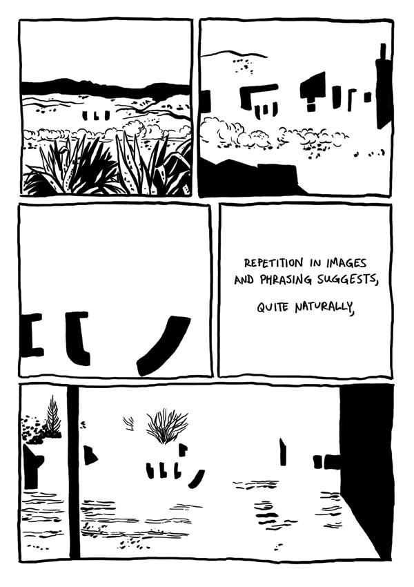
Badman's Cave, by Derik Badman. This was the most interesting instance of comics-as-poetry in the group, given its ambition and complexity. Badman reinterpreted the art from a Jesse Marsh-drawn issue of Gene Autry Comics and placed in text from random internet searches. Like Thomas, he removed the original figures from his drawings. Badman goes a step further by mixing the Western backgrounds of mountains, deserts, forests and traditional town with abstractions. Clouds and dust drift by almost sentiently, while buildings turn into geometric figures as Badman makes extensive use of blacks to get the eye to roll across the page. Badman's selection of prose is also quite interesting, as he comments on the repetition and "rhyming" of images by noting that "the world speaks, but mysteriously, incompletely closely associated with a metaphor within." As the comic flips between abstract and concrete, Badman is suggesting a greater sense of connection between the two worlds, an essentially mysterious connection "grasped in repetition, images and phrasing suggests a glimpse of the dark portraying the gods". Meditating on and considering the images can provide, in flashes, that deeper sense of connection between the conceptual and the real, the perceived and the actual, between time and place. The mini would have benefited from better paper and darker, richer blacks to make that black/white contrast really pop on the page. I think it would also have made his individual images a bit more distinctive. Still, this is Badman's most fascinating and successful comics experiment to date.


Thanks for the review Rob, I really appreciate it.
ReplyDeleteAnd now I have to look up some of these other artists.