Showing posts with label brent harada. Show all posts

Saturday, August 20, 2011

Comics-As-Poetry: Badman, Moulger Digest, G. Thomas, Moreton

More cartoonists are engaging in the creation of comics-as-poetry. That's both in terms of trying to come up with formal constraints that act like rules such as meter and rhyme scheme in standard poetry, as well as giving the reader images that they must parse and attempt to understand on their own. Here are a few recent examples.


The Escapologist #1, by Simon Moreton. This is Moreton's most explicit dip into comics-as-poetry, dipping into the playbooks of Warren Craghead and Kevin Huizenga here. This 10-page mini follows the author dissolving into a ghost-like figured trailed by lines, squiggles, symbols and geometric figures (the kind of lines you might see in a Craghead story/poem) and concentrates on the phenomenology of everyday observation. As we see the ghost/spirit drift out over the city and then the sea, Moreton ties the carefully-rendered naturalistic drawings with brief lines of text, noting "These dunes/this sea/this paper, this ink/these lines/we hold it all together/just being". The idea that our own observations of the world create that world in much the same way that the artist creates the images on the page is an interesting one. More to the point, the close observation of the environment qua environment (as opposed to our everyday use of the environment) is posited as a valuable end in and of itself, whose smallest details might yield interesting connections. Moreton's line is especially sharp in this comic, featuring enough detail to give the reader the flavor of each observed setting without drowning it in too many lines.


Dodo Comics #1, by Grant Thomas. This is a highly structured series of strips that each feature a different set of formal constraints. The intent is to create a visual rhyme scheme and meter for comics in some, and to emphasize certain aspects of the comics reading experience in others. For example, "Where Do Ideas Come From?" uses a scheme called "reducto", which alternates between a medium shot and a close-up of either one or many figures, closing with a shot with no entities in the final panel on the page. It's an interesting idea, although the resulting comic here is mostly fluff and not especially interesting to look at. More successful is "Visions of Gehanna", a reinterpretation of a Bob Dylan song as a vision of hell. Here, Thomas employs smudges to interesting effect, duplicating the original song's suffocating quality through visuals. "The Duel" and "Chase" were also interesting, as Thomas took panels from other comics and removed every thing from them except speed lines, rain lines and indicators of light. Given just the title of each, it's quite easy to contextualize it in terms of the stated subject.


Untitled by Rusty Jordan & Andrew Smith. This is a flip-book, where each artist does half of the mini. Jordan's half features figures heavily influenced by underground figures like Robert Crumb but also appropriates the rubber-faced and lipped aspects of how black characters were once drawn in comic strips. The character in this story is not written so as to be explicitly African-American, and that distinction adds a bit of key dissonance to the proceedings, because there's a disconnect between image and story. Smith is one of the few cartoonists who focuses on scatology whose work I actually like, because he goes beyond simply doing a shit joke and creates something a bit more transgressive. Smith is an ace draftsman but goes deliberately simple and crude for this story involving a woman jogging who is accosted by a would-be rapist. She oddly bends over for him, only to violently defecate in his face. Given the way that Smith keeps the dialogue deliberately light and banal, this image becomes all the more powerful and hilarious. It's a gag-inducing gag and an effective one at that.

Moulger Bag Digest #3, by Brent Harada & Rusty Jordan. This is an almost wordless, densely drawn comics that features a series of very loose narratives. The emphasis here is on the reader's reaction to individual images and then reprocessing them as a gestalt on the page. One of the key recurring motifs is the way images break down: fracturing, going into fractals, melting, warping, etc. Harada & Jordan employ a number of familiar techniques here, including collage, psychedelic art (in terms of both op-art effects as well as Skip Williamson-style figures), comics-as-poetry "rhyming" (like when a plant and then a chair act as stand-ins for a lonely man and his life) and sheer, grotesque figure-work. I found this to be the most refined and approachable of their comics, which probably has something to do with their approach as well as something to do with the way my approach to comics like this has changed.
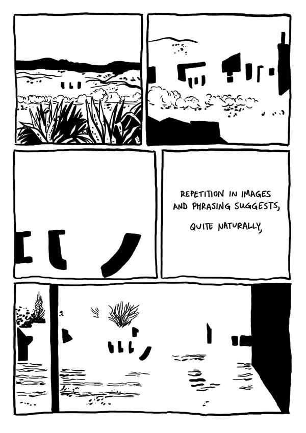

Badman's Cave, by Derik Badman. This was the most interesting instance of comics-as-poetry in the group, given its ambition and complexity. Badman reinterpreted the art from a Jesse Marsh-drawn issue of Gene Autry Comics and placed in text from random internet searches. Like Thomas, he removed the original figures from his drawings. Badman goes a step further by mixing the Western backgrounds of mountains, deserts, forests and traditional town with abstractions. Clouds and dust drift by almost sentiently, while buildings turn into geometric figures as Badman makes extensive use of blacks to get the eye to roll across the page. Badman's selection of prose is also quite interesting, as he comments on the repetition and "rhyming" of images by noting that "the world speaks, but mysteriously, incompletely closely associated with a metaphor within." As the comic flips between abstract and concrete, Badman is suggesting a greater sense of connection between the two worlds, an essentially mysterious connection "grasped in repetition, images and phrasing suggests a glimpse of the dark portraying the gods". Meditating on and considering the images can provide, in flashes, that deeper sense of connection between the conceptual and the real, the perceived and the actual, between time and place. The mini would have benefited from better paper and darker, richer blacks to make that black/white contrast really pop on the page. I think it would also have made his individual images a bit more distinctive. Still, this is Badman's most fascinating and successful comics experiment to date.

Wednesday, October 28, 2009

Minicomics Round-Up: Krall, Turnbull, Viola, Ineke, Runkle, Jordan & Harada

Time for another look at a variety of minicomics that have been sent my way. Reviewed are RUNX TALES #2 by Matt Runkle; HERMAN THE MANATEE #1 & 2 by Jason Viola; THE SLEEP OF KINGS by Ibrahim Ineke; PRIZE #2 by Hawk Krall; INVASIVE EXOTICS #2 by Jack Turnbull; and MOULGER BAG DIGEST #2 by Rusty Jordan & Brent Harada.

RUNX TALES #2, by Matt Runkle. Runkle has a crude but expressive line, but these comics popped off the page because of his terrific design sense. In this large format comic (8.5 x 11), the standouts were "Nora Stories" and, oddly enough, a long essay on ranch dressing. With the former, Runkle's character design was key, especially with regard to the huge eyeglasses of the title character (they fairly overwhelmed her face) and the sleazy vagrant named Crow who somehow kept popping up in her life. Nora's exasperated but resigned body language was nicely related by Runkle, particularly in the way she looked exactly like a weirdo magnet--the sort of person freaks gravitate toward because they know they'll be tolerated. Runkle's comics essay on the virtues of ranch dressing leaned heavily on his use of white-on-black images and a clever use of fonts. Runkle was more than a little tongue-in-cheek in this essay, especially when he compared the dressing to semen and noted that many of the folks he waited on reacted to it much like a desired money-shot.

Runkle's own personal observations also had some amusing moments. "Wrestling With The Truth" was about his high school experiences as a wrestler, while dealing with the awkwardness of being gay in rural America. While that was the backdrop of the story, the meat of it dealt with what happened when he was thrown to the mat in practice and hit his head hard. He saw a vision where for a second, "it all made sense": a middle-aged woman, a ladder and other vague details. Runkle contrasting this to San Francisco goddess worship was hilarious, noting that this goddess was very much of her surroundings: "farm-hardened, sensible and the type that would hate new-agers". His story about a recently deceased friend of his was touching, funny and compelling, detailing the ways in which this trans friend embraced living. Runkle is a great cartoonist despite being a mediocre draftsman who plays to his strengths, understands how to compose a page, and focuses on his line expressing his sense of humor and point of view. The result is one of the more entertaining one-man anthologies I've read in quite some time.


HERMAN THE MANATEE, #1 & 2 by Jason Viola. At first glance, I thought this might be a series of cute strips about a manatee and worried that it might be a bit saccharine. Then I read the first strip and realized that it was about a manatee who was hit by a speedboat in strip after strip. It was the equivalent of reading a collection of PEANUTS wherein every strip featured Lucy pulling the football away from Charlie Brown. Varying the set-up to a situation with the same punchline every time is not easy, but Viola went through a lot of variations: flashing back to childhood, being deceived by god, playing Marco Polo, doing a Gorey pastiche, etc. By volume 2 of this mini, Viola started an extended narrative about the perils of having a protected pond, including being forced to pose for humiliating photos with tourists and being exploited for money. Viola is a good gagsmith with an appealing line who gets a lot of mileage out of being extremely cruel to his characters for no particular reason. Herman isn't punished because he deserves it; it's simply his fate to have his head hit by boats. While I can understand the difficulty of coming up with variations on a particular formula, I did think that Viola started to drift away from what made his strip successful when he went on to do the longer storyline. His attempts at satire were clumsy, but more problematic was that he was trying to turn Herman into a real protagonist. Sure, he still turned out to be a failure, but it still felt like an uneasy match of ambition and character. Herman is perhaps less like Charlie Brown (a sad-sack who is multidimensional) and more like Wile E Coyote, and the extended storyline felt like Viola was plopping him down into a story that didn't suit the character.


THE SLEEP OF KINGS, by Ibrahim Ineke. Ineke is a Dutch artist with a fine arts background who has recently started to move into comics work. His specialty is horror, but less an American sense of horror and more of a Japanese one. That is, the ideas presented and hinted at by the story are more awful than the standard American presentation of gore. There's also a bit of Lovecraft to be found here, in that evidence of something ancient & horrible is discovered with disastrous results. The story finds two boys playing sword and sorcery games in the woods. When one boy disappears for a bit, his friend finds him with his back to him, unresponsive--and surrounded by buzzing insects. What I liked about this story is that its horror takes place in broad daylight, with light and shadow cleverly deployed when an eclipse occurs. Ineke only hints at what's happening here: stones in a circle with some sort of mystic runes, and some type of demonic possession. All the reader needs to know is that both boys meet a terrible end in a story that moves leisurely but doesn't outstay its welcome.

Ineke's figures, especially in close-up, have a scribbly & energetic quality to them that made them come alive. Indeed, there's a spontaneity to his line that made reading this sort of story more entertaining than usual, given that I'm used to a certain slickness with American horror comics. There were some panels where he seemed to be losing a bit of control with regard to characters in motion (not surprising for someone from a fine arts background); panel-to-panel transitions as well as characters in relation to each other are things that I imagine he'll continue to improve on as he continues to draw comics. He's certainly an interesting artist, and I'll be curious to see how he would tackle a longer-form work.


PRIZE #2, by Hawk Krall. I first became aware of Krall's work in the pages of Danny Hellman's anthology TYPHON, with his "Summer of Seven-Eleven" story being a standout. PRIZE is a collection of shorter strips in three different categories: stories about working the graveyard shift at a 7-11, stories about living in squalid conditions with his art school roommates ("Living In Filth"), and tales from the kitchens of a big city ("Dirty Dish"). Krall's work is very much in the tradition of underground comics, with a particular focus on grotesque character design. Krall is a great yarn-spinner, especially when he zeroes in on the most sordid details. He plays up the absurdity of living with filthy roommates in a run-down apartment, of the frequently disgusting truth of working conditions in a kitchen, and the sort of people he encountered working in a convenience store. His ability to capture the characters he met and crystalize them in short order made strip after strip a hilarious experience.

Of the three different features, I thought "Dirty Dish" was the funniest and most original. They're presented as single-page strips, and it's a format that flatters Krall's style. Krall doesn't vary his line or panel composition much from strip to strip. With his longer stories, the reader is hammered in panel after panel by Krall's grotesque imagery, and the effect can be suffocating at times. "Dirty Dish" not only opens up the page a bit, it finds Krall concentrating on a single image or idea and playing that out. The strip also provides the reader a peek into the world of professional kitchens. Krall portrays it as an unrelenting series of hostile encounters, where the workers struggle to hold on to their sanity. He also made it seem like fun, at least in the sense that huddling in a foxhole develops camaraderie. Even in strips that seemed a bit cluttered, Krall's ability to escalate situations is the hallmark of his very sharp sense of comic timing.


INVASIVE EXOTICS #2, by Jack Turnbull. Turnbull's APOLLO ASTRO series of minicomics that he published before he went to art school positioned him high on my list of interesting young artists. His new series is a radical departure from those comics that clearly displayed his influences (Clowes, Ware & Tomine in particular) but still showed that his voice was one that needed to be heard. INVASIVE EXOTICS is a mash-up of a startling array of genres, including sci-fi, conspiracy fiction, psychedelic social satire, slice-of-life, and crime fiction. While not a direct influence, Matthew Thurber's 1-800-MICE is the closest point of comparison I can think of, though Turnbull's comic is not as tightly plotted or outrageous in its conceits.

Most stories involving satires of corporate America tend to fall flat, but Turnbull mutated an obvious visceral dislike of Coldstone Creamery (the one where the servers are forced to sing whenever they get a tip) into an over-the-top conspiracy story. I've always liked Turnbull's elongated character design, and the slightly bigfoot nature of his character design serves the story well. The villainous "Slimecold" CEO resembled a warped Bozo the Clown, with pointy hair that he used as corporate iconography. His scheme was to force out the residents of Brooklyn using a mutated form of killer ant that would cause them to flee, create gentrification and then provide the sort of Brooklyn where he could open up many more stores. He's opposed by a small cadre of eco-terrorist types, with the character of Jane Easewell being Turnbull's all-purpose satire of scientist-as-action hero. The first issue sees her go on a one-woman commando raid at a Slimecold lab in a sequence that's deadpan in its depiction but completely ridiculous. At the same time, there's a pastiche of slice-of-life romance going on in the backdrop that gets dramatically halted when the ant rampage story slams into it.

This comic is jam-packed with ideas, characters and crazy page layouts. At times I think it's too all over the place, as Turnbull seemed to want to draw every single idea he had had for the past several years in one series. The action scenes, while funny, didn't really work on their own visually because there's a lack of fluidity in the way he depicted motion. His figure-to-figure interactions also felt a bit stiff. The comics simply seemed rushed at times, with a slew of spelling errors and some cramped panels. That said, there was a lot to like in INVASIVE EXOTICS. Panels where you see ants who have been put to sleep with tiny little "zzz"s next to their head displayed just how loony Turnbull was getting here, while still positing the insects as a very real threat. Turnbull created caricatures that, while exaggerations, still have a lot of uncomfortable truths to them. This comic simply needs to be refined, edited and cleaned up; the energy, ideas and images are all there.

MOULGER BAG DIGEST #2, by Rusty Jordan & Brent Harada. This is a comic very much in the Fort Thunder tradition, with a big dose of Gary Panter. There is a kind of narrative at play here, on pages dominated by psychedelic character design that's mashed up much like a collage. The narrative involves ambling movements followed by utter stillness and a sense of characters constantly changing and pulsing into one another. What's surprising about this comic is the way my eye was able to latch on to the figures on the pages. Even the most jam-packed pages had a few images that seemed to pop out at the reader. I'm not sure what to make of this succession of images that combined figure and structure, other than I liked looking at it. It certainly felt like an object that was meant to be looked at more than read, especially given the oblique nature of its narrative.