Tuesday, January 1, 2013
Sequart Reprints: 10 Great Minis From MoCCA 2005
*******
Readers only vaguely familiar with the concept of mini-comics will be relieved to know that it's nearly impossible to pin down what is and isn't a mini-comic. Generally, they are small (but not always), usually relatively brief (anywhere between 8 and 80 pages), hand-made, frequently self-published, and often with personal touches like silk-screened covers, hand-stitched bindings, etc. Often, they serve as a sort of proving ground for young and/or inexperienced artists, though there are several accomplished artists who publish nothing but minicomics. The line between minicomics and zines is often blurred, but they often share similar content, a similar aesthetic, and the same sort of autobiographical self-expression.
The ten mini-comics I picked for this list were chosen based on how substantial they were (I skipped over some worthy 8-12 page minis simply because there wasn't enough "there" there), notable aesthetic or narrative qualities (preferably both), and formal elements unique to the world of minicomics. The artists range from absolute newcomers to those who have books from major publishers.
1. VAGABONDS #1.5: OF TWO MINDS, by Josh Neufeld (http://www.JoshComix.com). $2, 16 pages. Neufeld recently won a Xeric grant for A FEW PERFECT HOURS, distributed by Alternative. It's a collection of travel comics he had done over the years in his two-man anthology, KEYHOLE, and various other places. But Neufeld is also well known for doing a number of collaborative works (AMERICAN SPLENDOR the highest profile), and this mini is an exceptional collection of such stories. Neufeld adapts the poetry of several authors to comics, the most notable being "Time of Arrival". This is a single page with a 4x6 panel grid arrangement. The entire grid taken as a whole is an airplane, and Neufeld chops up the words of the poem into individual panels that comprise the plane. It's a clever formal trick and an effective means of getting across the poem's intent. Neufeld also did a story drawn with his non-dominant hand, imagining that such a person existed in his mirror and setting the story from the point of view of that character, and also draws a page using dialogue from an issue of Superman and completely recontextualizes its meaning with his new art. The mini is attractively packaged and extensively notated.
2. SATISFACTORY COMICS #6, by Isaac Cates & Mike Wenthe (isaac.cates@aya.yale.edu). $3, 28 pages plus extras. Full disclosure: Mike Wenthe is a long-time friend of mine. However, the work that he and his partner have produced speaks for itself. The duo has long thrived on experimentation with the form for their attractive minis, with other participants drawing panels for inclusion, providing built-in story constraints or throwing in random elements for the Cates-Wenthe team to work into their stories. As one might expect, jam comics are frequently better in theory than in practice, and some of their stories suffer from a lack of narrative cohesion. However, their output in the last year or so has shown considerable and sustained growth. Their latest effort is so jam-packed with different kinds of stories, ideas and clever geegaws that the result is a sort of miniature version of the comics issue of McSweeney's that Chris Ware edited. This issue features two comics based on a map created by a group of creators; an autobiographical story about online game addiction; a detective story wherein each page must mirror the form of a stanza of a sestina; an adaptation of Job 41, and a minicomic tucked into the front cover and a random shuffle comic paperclipped into the back.
3. NO PUNCHBACKS, by Kelly Denato & Christine Nimocks (http://www.nopunchbacks.com). $5, 28 pages. Amazingly, this is the debut comic for this duo, although initially No Punchbacks Press contained more contributors. Denato is an animator by trade, and it shows in her story, "Nanni-Nanni Boo-Boo". It's a wordless tale about a man who buys a bird and a fish from a pet shop whom are already friends, and how the fish is taken away. Her style resembles CHUNKY RICE-era Craig Thompson and Sara Varon, with a clean, assured line creating a cartoony world. Nimocks is a fine artist whose style and content is radically different than Denato's. She employs a scribbly line and deals with more autobiographical subjects, including internet dating. This is a remarkably accomplished first comic, with attractive packaging and smart storytelling. Interestingly, the duo was inspired by past visits to MoCCA to create their own comic.
4. SEE SAW, by Sara Edward-Corbett (http://www.greenfog.com, http://www.partykausa.com). $8, 35 pages plus extras. The artist is the most impressive member of the Partyka collective, and her strips here are reprinted from the New York Press. She uses a thin, precise line but balances this with heavy blacks and cross-hatching, giving these tales of schoolchildren an extra weight. The strips are about brother & sister Georgie & Olga, psychopathic Chucky and lovesick Meals. Georgie is an ultra-intelligent little nebbish, while his sister is constantly paranoid. Her dreams of being killed by a gangster octopus (complete with mask) are vivid, and while we feel her fear, the whole set-up is still hilarious. The comic is hand-stitched, with a "cootie-catcher" enclosed in the back.
5. APOLLO ASTRO #9: JOURNEY OF GEORGE, by Jack Turnbull. (http://www.jackturnbull.com). $5, 30 pages. Turnbull abandons his anthology-style for his mini and devotes an issue to his Walking George Potato character. The simplicity of the George and Veggie characters are balanced by Turnbull's lavish backgrounds and the Dreaded Bellpepper Storm Toucan, not to mention a gorgeous silkscreened cover It's a simple story, well-told, that owes as much to Dr Seuss as it does to Chris Ware. Turnbull's biggest strength is his ability to draw out every ounce of expression from his characters using just a few lines. He took a chance using characters that had mostly inhabited one-off strips and plugged them into a larger narrative, and it worked well. This issue is part one of a larger story.
6. COUCH TAG #2, by Jesse Reklaw. (http://www.hobocomics.com). $2, 20 pages. Reklaw is the artist of the syndicated dream strip, SLOW WAVE. This mini has a simple premise: it's about the thirteen different cats Reklaw had during his childhood. What makes this such a great read is that this is really an autobiographical account of his family, but telling it through the device of when certain pets were around and making that the focus of the narrative makes the side details all the more intriguing. Little touches like designing different logos for each cat's introduction and skipping long periods of time between pets make this a great read.
7. THESE THINGS THESE THINGS, by Jeffrey Brown. (http://www.theholyconsumption.com). $4, 36 pages. Brown's scratchy art style and his focus on his love life in his major works for Top Shelf have made him a love him or leave him sort of artist. Personally, I can't get enough of his comics and their lack of adornment when dealing with major drama. Beyond his graphic novels, his minis are often just as compelling for very different reasons. Brown lets his sense of humor show more in his minis, and tells different kinds of stories. This mini deals with some of the events in ANY EASY INTIMACY, providing a sort of closure as Brown deals with yet another broken relationship, the quest to find the artist who performed a particular song, and a book tour with some fellow artists.
8. SUMMA CUM LAUDE, by Eve Englezos & Josh Moutray. (http://www.icecreamlandia.com). 10 pages. The comics that this duo creates are unlike anything else out there today. This latest work, a little bridge between issues of the sublimely strange Icecreamlandia, is designed to look like a minature diploma case. As you open it up, the pages fold out accordian-style, revealing a bizarre science fair. For some reason, the adults are all in 18th century aristocratic dress (complete with powdered wigs and corsets). The dialogue follows from this absurd set-up ("Why, yes, it seems pretty obvious to me now that the dinosaurs were in 3-D.") As always, the realistic, clear-line art belies the insanity of the set-up.
9. A CASE IN TOKYO, by Damien Jay. $10, 22 pages. This comic wins the "most beautiful mini" award, hands-down. Printed on a heavy cardstock and hand-assembled, the coloring process used to illustrate this creepy little story makes the whole thing feel like a children's book gone horribly wrong. The story describes a mental patient who in fact may be possessed, and the momentary clarity she displayed in this state. Her clarity was so incisive that everyone couldn't stand to be around her, until the spell faded and "she became a stupid person once again." While a very quick read, the visuals alone make this a worthwhile purchase. Jay gets the most out of the minicomic format, using every hand-crafted trick in the book.
10. ISOLATION CHAMBER #2, by Ed Piskor (wimpyrutherford@hotmail.com). $1.50, 16 pages. Of the comics on this list, this is the only diary strip. Diary strips (much like personal zines or blogs) can get boring quickly if the author simply devotes it to standard quotidian concerns. It's important to establish some sort of angle early on to differentiate it from other kinds of autobiography. Piskor does this through establishing his voice loud and clear in the early going: he's a curmudgeon who knows a lot of strange people, and isn't afraid to dish. He manages to inject sincerity into his description of his relationship with his baby sister without seeming overly sentimental. He struggles with what to put in his journal and what to censor, some interesting interactions with his parents, and a local group of comics creators. There are weird stories about his interactions with junkies, talks with Harvey Pekar and his feelings about becoming semi-famous. At the end, Piskor announces that the cartoon journal took up all of his time and discontinued it--an interesting statement in itself. Piskor is a real talent and has an interesting voice; it'll be interesting to see what he does after he finishes up his work with Harvey Pekar.
Tuesday, October 23, 2012
Sequart Reprints: Minicomics Round-Up
*********************
About Yr Future, Plots, Their Condolences, by Eve Englezos & Josh Moutray.. This artist duo known for putting out the Icecreamlandia minis first caught my eye a few years ago, and I always eagerly await their next bit of weirdness. Each of these minis is cleverly designed, short, and as beautiful to look at as they are hilarious. Their Condolences has the look of an old-time photo album, as we see a drawing of a man who died in the late 19th century. Eschewing their usual clear-line drawing style, Englezos & Moutray instead use heavily-shaded pencils that look uninked. The "condolences" involved may be heartfelt, but they're far from heart-warming, as each family member or servant makes nasty comments about him. The funniest page may be the last, when one of his sons holds a bird in his hands and thinks his father is there in reincarnated form.
Plots is more typical of the duo, with that oh-so-thin line of theirs being put to use in single-page gags. Every page seems to either be a set-up or a climactic point in some other story, many of them funny. The first page has a crying man hugging a friend, telling him that his wife was murdered and their place robbed. His friend replies, "I hate to tell you this, but I've got some more bad news" and then the reader's eye is drawn down to the knife in his hand. The "plots" here also imply someone plotting against someone else, be it a housewife/spy using cooking jargon as her code words, two kids using walkie-talkies to plot against their grandma, or a vulture calling his fellows to war against hyenas.
About Yr Future is the third in a series of small minis about time. This one is all about predictions, foretellings, and fate. Again, their authorial voice is one of bone-dry and bleak humor, mixed with a sense of absurdism. Their line drawings are even more amusing than usual here, considering they're drawing robots and an elderly man whose head has been transplanted onto a cyborg body. Englezos and Moutray are a unique act in comics, and their wonderfully skewed point of view mixed with an impeccably tasteful design sense makes even the shortest of their minis a rewarding experience.
Infandum #2, by Molly Lawless. Lawless is another new favorite artist of mine on the minicomics scene, thanks to her expressive pencils, sharp sense of humor, and obsession with baseball. It's those latter strips that are the most fun to read, and she's slowly on her way to compiling a collection's worth of baseball strips. Lawless strikes the right tone between smartass and historian as she has Bill Buckner "narrate" a story called "The Boner and the Muff: A Tale of Two Freds". Buckner was the first baseman who infamously let a grounder go between his legs in game 6 of the 1986 World Series, a series that his Red Sox would wind up losing. This story is about two baseball players from the deadball era (early 1900's) who had similar blunders that were blamed on their team's eventual collapse. Just like Buckner, neither player was really to blame, but couldn't outrun their notoriety. Even readers who don't like baseball will enjoy Lawless' delicate pencils and decorative touches.
Though this mini is only 8 pages long, it's a much meatier read than one would expect because Lawless jams so many panels and so much detail into each of her pages. Her first story (written by Carlton King), "Rules of Romance: Breakup Jujitsu", packs 15 panels and decorative extras onto one page. Her "Repressed Memory Theatre" is just as dense and is perhaps the funniest story in the comic. It's an autobiographical tale of young, uptight Molly being humiliated by her mother in front of her classmates at school. Lawless transforms a fairly standard reminiscence into something memorable due to her expressive figures, sense of comic timing, self-deprecating wit, and appealing sense of design. The only thing that detracts from my enjoyment of her comics is that her figure drawing suffers from being crammed into tiny panels on mini-sized pages. I'd love to see her expand her page count a bit and let her comics breathe with bigger panels. It's astounding that her comics look as nice as they do, considering that they're hand-made and photocopied. I look forward to her first collection of minis, which would do justice to her attractive art along with her sharp wit.
Just This Side Of Heaven, P.S. Comics #2 & #3, by Melanie "Minty" Lewis. I first became aware of Lewis' work in SPX 2003, and her story stood out for two reasons. First, all of the characters were clear-line anthropomorphic pieces of fruit. Second, her sense of humor regarding human interactions was pitch-black and dry. Lewis writes knowing stories about sad people living in "quiet desperation", but manages to squeeze every ounce of awkward humor out of these situations as possible. I'm a fan of this kind of "squirm humor", where the awkwardness of daily social intercourse is heightened for comic effect. Portraying these people as fruit or dogs (or table condiments) adds an extra layer of distance and absurdity to heighten the humor in the story--but at the same time, it almost gives Lewis license to make the situations all the more painful--especially if the stories seem to be based on autobiographical experiences.
Just This Side Of Heaven is a story featuring her other set of go-to representations: anthropomophric dogs. This one's about a goofy cat who lost her best friend (a dog) and is living with two new hipster cats who constantly argue and exclude him from the conversation. His dog friend appears to him in a dream and gives him good advice on how to live with his new roommates. What makes this comic so appealing is how Lewis has the animals act and live as animals (and more specifically, pets), yet the dynamic is very much of a 20-something group house, with the cat even being in school and using email. This comic was a bit more forgiving and sentimental than some of her other, nastier comics.
P.S. Comics #2 mixes up styles quite a bit. "Winners" is a hilarious account of an especially miserable high-school anecdote, done with her fruit characters. The story works because Apple is desperate to fit in, one way or another--and every attempt at trying to be cool backfires either in a whimper or in a spectacular public humiliation. "Yorkie Matrimony" is a vicious story using dogs as characters. It's the story of a friendship of two roommates gone sour, thanks to one of them deciding to get married and the other falling apart at the notion of being alone. Not since reading Hate have I enjoyed seeing a story this over-the-top and yet strangely familiar about roommates. Once again, the cuteness of Lewis employing dogs-acting-like-humans just makes the story funnier, even as the events get more pathetic. What's odd is that her use of gesture and expression seems more refined when she's drawing animals or fruit than when she draws people. "Salt & Sugar" is perhaps the most clever story in this issue. A heavily-narrated love story about the romance between a salt shaker and a sugar dispenser, Lewis does a clever parody of typical problem-romance narratives using every joke imaginable about salt and sugar. These are the first two pages of her work that I'd show to anyone to demonstrate her wit.
P.S. Comics #3's best story is "Bitter Fruit", starring her "Fruit Pals". A workplace/relationship melodrama, it once again perfectly captures not only the beats of 20-something relationships but also the inane nature of workplace life. As one female character (Pear) is dealing with being suddenly dumped by a co-worker for another co-worker, she has to fend off both the advances of and grating "advice" of another co-worker. This may be the most accomplished of all her stories, both in terms of design & composition and humorous impact. Finding a style that works for her so early in her comics career is clearly a big boost for Lewis. At this point, she simply needs to continue to further refine it. Her comics look best when they're clear, uncluttered and not overrendered, especially when she's able to add subtle decorative touches. Lewis' wit is already razor-sharp, and I'll be excited to see her continue to explore this milieu as she continues to grow as an artist.
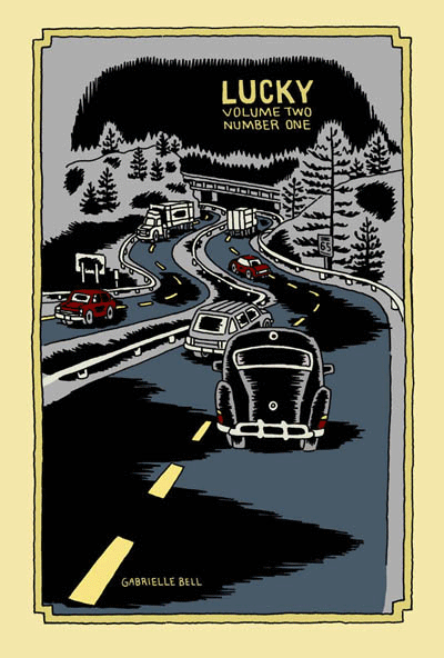
Lucky (Volume 2, #1), by Gabrielle Bell (Drawn & Quarterly). This is the only comic from a publisher on this list, but it certainly counts as a mini. Half of this comic is a story called "My Affliction", which Bell was giving away at SPX last year. I've already reviewed that story on sequart, and it was a hoot--Bell's weird sense of humor was in effect. The other half of this particular comic was a series of diary entries. Much like the minis collected in Lucky, Bell's neuroses are on full display and depicted in her typically wry, over-the-top fashion. We see her dealing with the stress of "performing" her new comic (the aforementioned "My Affliction") and preparing to be on a panel at SPX. Bell uses blacks to good effect in these stories, giving them a certain weight that at times reflects the sense of claustrophobia that her narrative portrays. It should be emphasized that Bell plays her neuroses for laughs in her typically deadpan manner, not in a "woe-is-me" sense. I've written extensively about Bell in the past, so I'll just note that if you appreciate her sense of humor and enjoy her diary comics, then I would enthusiastically recommend the new volume of Lucky.
Routine & Are You Often Impulsive In Your Behavior?, by Will Dinski. Dinski is another favorite of mine, and these two minis are both unusually presented. Routine is actually a comic on a single page of posterboard, in full color. This story is typical of Dinski's strengths as a cartoonist: his sense of panel-to-panel beats and rhythms. In a narrative, he's often fond of using a silent panel, then a narrative caption in a rapid-fire sequence. In this comic, he sets up the boring routine of a businessman in this way. A random bit of near-violence puts his routine out of balance, creating a new, quite warped routine for our hero. As always, Dinksi's page is stylish, spare and puts a bit of distance between reader and story. This is done mostly for comic effect, but there's always something a bit unsettling going on in his stories, and Routine is no exception.
...Behavior is a clever comic, also printed on cardstock. This one is meant to be folded so as to form four pages on one side. It's a story about Dinski taking a test at a Scientologist recruitment center on a whim, and the back of the comic has the results of his test. Once again, Dinski's control of story-beats drives the comic, as he breaks up the narrative with actual questions from the test. He did this to show how the way they were worded was designed to emphasize the test-taker's feelings of paranoia and inferiority. The results made Dinski out to be anxious, paranoid, critical, withdrawn, depressed, withdrawn and hyperactive (?). The punchline was that Dinski was expecting a recruiting pitch, but instead got sent on his way. The use of the test's questions dryly sets up Dinski's own critique of the proceedings in an indirect and amusing way. As always, a Will Dinski comic is smart, off-beat and comics in their purest sense; there's no way I could experience these stories as anything but comics.
Plates Are Cult #3 and Pocket Party, by Damien Jay. Jay has been making beautiful, silk-screened comics for some time now, though I first became aware of him through cartoonist Ellen Lindner. The comics I'm reviewing here are much looser, torn from his sketchbook or originally done for anthologies. Plates Are Cult #3 is in fact a mini that collects a number of short stories from other places. There's all sorts of delightful weirdness in here, including "The Merpeople of Columbus Ohio" from Mapjam, the grotesque "Frankie Pug-Dog", and the clever "Hello Everybody On The Other Side". In these comics, Jay is working through styles, influences and inspirations, using a slightly tremulous line to create expressive characters. "Hello Everybody..." is the most formally experimental, about a man trying to record voices from the spirit world. On the back of each story page, Jay blends and jams text and image, printing some of it backwards as the line between spirit and material bends and blurs. Another standout story is "Warsaw", a travel story that Jay drew, depicting one man's struggle to fend off attempts of various Polish businessmen trying to get him laid with assorted sex workers. There's a certain bleakness to Jay's art that matches the grey world of the sex trade in Eastern Europe.
While these stories had their charms, it's Pocket Party that impressed me much more. Combining sketchbook segues with a loose narrative, it's an inspired flight of fancy. Jay starts with an odd-looking man named Leslie in an abandoned town and interjects himself into the proceedings as he sees fit. He insults one of his characters, who runs off and refuses to participate further. From there, former president Gerald Ford pops up and Jay tries to lecture him on what comics are and how he fits into the story. Throughout, Jay pops into his own comic to offer random opinions, critiques of his own art and story, redrawn panels, sea monsters, Leslie being forced to play Match Game and a perilous journey through the city sewers. Jay even chides himself for being so self-referential, promising to stop it (which he eventually does, but not before he moans, "I just don't have...anywhere else to go!). Somehow, this stream-of-consciousness stew works. The looseness of the art gives it a vibrancy, as though the reader just watched it appear off the still-wet pen of the artist. Jay is funny and riffs well on the page; while the comic is admittedly self-indulgent, it's an indulgence that's quite entertaining for a reader. Jay's ability to somehow make drawing exercises (like learning how to draw fins) into amusing interludes only made me want more; given that this was actually listed as issue #1, one would hope that he'll be doing more. All in all, this is one of the most enjoyable minicomics that I've read in the past year.
Monday #1 & #2 and Yip The Wonder Dog, by Andy Hartzel. Hartzell is the creator of Fox Bunny Funny, my favorite mini of 2006. He's following up that work with a new series, based on the Adam & Eve creation myth, along with a hilarious one-shot mini originally published in another publication. The full title of Yip is The Rise and Fall of Yip the Wonder Dog, and it's a funny account of a heroic dog's journey into Hollywood fame and subsequent decadent excess. It's another wordless story from Hartzell, and while his ambitions are certainly far more modest than in Fox Bunny Funny, the payoff is no less rewarding. Hubris is punished and loyalty is rewarded in the end, but it was the sight of a dog doing lines of coke and dancing the night away (along with the other absurd but logical extremes of the narrative) that made this tidy story so much fun.
Monday is a far more ambitious story, with these first two issues being the first of five chapters. The series' central premise is dynamite: we all know what happened on the first seven days of creation--but what happened on the eighth? Adam and Eve argue about the nature of Eden, the serpent starts planting doubts, and God is hard at work at perfecting his greatest creation. After reading a number of wordless comics by Hartzell, it was a pleasure to see him script such clever banter between Adam and Eve, staying fully within their archetypical characters while expanding the creation myth.
In this story, everyone has their own agenda. Adam is desperate to stay faithful to God in spite of the doubts being planted. Eve just wants the garden to be safe, and the serpent feeds her doubts. The serpent is resentful that God punished him for hubris after he criticized his creator. Finally, God is cranky and defensive, blowing up at his creations because of his own frustration with his new creation, who is somehow resisting being born. These first two chapters set up the tensions and conflicts that are sure to come, where everyone involved is all too human--which only makes sense, since man was created in God's image.
Visually, the art doesn't quite have the snap and polish of Fox Bunny Funny. It's looser and sketchier, but no less expressive. There are also more decorative touches, with the garden of Eden holding all sorts of "eye snaps" and visual surprises. Hartzell's figures are blocky and primal, as though they were made of squares. The silkscreened covers are especially beautiful, though I look forward to its eventual overall release on better paper. Hartzell's use of themes and imagery is very different from most artists working today, and the way he incorporates mythic and archetypical imagery in his stories lends them a lot of power, even as he deflates them with humor.
Mapjam and Satisfactory Comics #7, by Isaac Cates & Mike Wenthe. Once again, full disclosure: Mike Wenthe has been a friend of mine for some years now. That said, he and his collaborator Isaac Cates have carved out an interesting niche in the world of freewheeling comics formalism. Satisfactory Comics #6 had been their most ambitious issue, with the most narratively coherent stories to go along with a slew of interesting extras and decorative touches. Issue #7 was done quite differently: it was created in an intense, 30-hour jam session. What makes this issue stand out is that despite each story having its share of pre-set rules, formal gimmicks and other built-in limitations, those boundaries were invisible to the reader. I think the main reason why was the furious pace at which these stories were written and drawn; as a result, spontaneity and looseness were the real rules here.
Given the number of jam comics and comics with specific formal rules (starting with a certain sentence, drawing with one's non-dominant hand, artists switching off panels, artists drawing different characters in the same story, improvising each panel and then switching off, etc.), I've noticed that they tend to work best as short stories. One feels the strain of the rules after more than a few pages, and the stories tend to devolve into silliness. In Sat-Com #7, it's clear that Cates and Wenthe are quite aware of this, and the result is a series of one to two pages stories that feel quite substantive. The stories range from a quiet lament on the apocalypse to an Alaskan astronaut's ruminations to a hilarious series of single-panel take-offs on famous works of literature, and much more. I particularly liked "Sinister City", which was the most formally restrictive story (single-syllable words, except for the seed sentence, written by Cates and drawn in Wenthe's non-dominant hand). The shaky pencils had a marvelous looseness to them, almost a vibratory quality, that neatly fit with the fact that the story was a retelling of a dream.
I loved the imagination of "The Xylem Cipher", about a liquid that enabled a woman to hear the speech of plants, who then discovered that this was not exactly the most exciting power in the world. This strip showed off their gag-making abilities, as they fired off every single good joke possible from this premise, and ended it on an even better joke. The range of emotional tones and genres makes the reader wonder what could possibly be next when they turn the page, and I found that this issue rewarded multiple readings. I also found their notes on the issue to be revealing as always, as they delved into their creative process.
Cates and Wenthe invited a number of others along for the ride on their ambitious Mapjam project. A wacky take on fantasy world-building stories, they had several artists contribute three bits to a fantasy world-map, split the map into nine quadrants, then handed out assignments to write a story based on that portion of the map. The results ranged from fairly standard fantasy stories to some truly ludicrous scenarios. The quality of the stories in a jam tends to depend on how much time each cartoonist puts into it. A number of the stories (especially in the first round) felt rushed and uninspired. On the other hand, those artists who were more obviously committed to the project created strips that were quite amusing. The best strip in the book came from Tom K., a contributor to Mome. In just four pages, he picked up the threads of an earlier story and took them to some unusual places. His art was stark and bold, especially a page set in a dark cave. Wenthe and Cates contributed tales of perverted minstrels, miniature questers, seasonal gods and other weirdness. Another standout contributor here was Damien Jay, whose loose style and sense of the absurd fit right into the proceedings. This was a case where the experiment and collaboration itself was more interesting at times than some of the results, but one would hope that for the next round, they'll be able to recruit cartoonists as devoted as Tom K. to pick up the baton. It'll also be interesting to see how the "exquisite corpse" nature of the experiment plays out. While not as focused or engaging as their Satisfactory Comics, Mapjam certainly has me eager to see where the stories go next.
Heart and Brain and Love Charades, by Fay Ryu. I love these wordless, colorful romantic pantomimes by Ryu. Heart and Brain features an anthropomorphic heart engaged in an unrequited relationship with an anthropomorphic brain (ambulating via its spinal cord!). The graphics are simple, reliant on Ryu's understanding of gesture and expression, and heightened by her bright colors. The only narration here are the chapter titles: "At First Sight", "Second Sight", "Third Sight", "Out Of Sight", "Hind Sight" and "In Sight". The Heart character keeps encountering Brain, but is never able to screw up the courage to talk to the object of its affection. This comic is about loneliness and how it both makes one feel like one's traversing a desert alone (an image used here more than once) and insulates us against fear of rejection. There's safety in this fear, even as Heart grows more agitated and wistful as the story proceeds. It's a beautiful, simple little story whose ambitions don't outstrip its limitations. As a result, one can see hidden depths in the familiar imagery.
Love Charades is a sort of companion piece, labled a "heart and brain exercise". It's a series of vignettes starring the aforemention characters, this time clearly as companions. The charm of this piece is the way Ryu breathes life and excitement into quotidian activities; there's a sense that these everyday experiences take on added meaning simply because they're being done by lovers. Ryu is a clear, clever storyteller who is quite adept at wringing out emotional truths with just a few strokes of a pen. I look forward to getting my hands on more of her work.
Elsewhere #3, by Gary Sullivan. The first two issues of Sullivan's travel comics used some unusual techniques in combining word and image. This issue is a collection of single-page strips called "The New Life" that appeared in a poetry/fiction journal called Rain Taxi. The strip is all over the place in a pleasing sort of way. It starts as a narrative, as a Dante-like poet meets his Beatrice in Brooklyn and they explore poetry together. Sullivan junked that narrative when he fell in love with a poet who lived in Japan named Nada Gordon, and set several of his poems to comics--in much the same way a musician would attempt to translate poetry to music.
That decision made his visual storytelling approach fairly conventional, as he used his comics either to directly illustrate his text or else comment ironically on it. The images themselves were a supplement to the words and not a form of poetry unto themselves the way they were in the first two issues of Elsewhere or for cartoonists like John Hankiewicz. In "The New Life", Sullivan doesn't seek to redefine the visual language of comics as a different kind of poetry, but rather uses it to as a tool for historical, humorous and biographical purposes.
The most successful strips in this collection were Sullivan's pieces focused on specific poets. Combining commentary, direct quoting, ironic juxtaposition of word and image, and at times genuine warmth for subject and material, these strips were perfect introductions for poetry neophytes like myself and an amusingly different perspective on these pieces for afficianados. His parodies of old Marvel and romance comics as a means of illustrating certain trends or histories in the world of poetry were funny, but he doesn't quite have the chops to pull off the style mimicry required for the full impact he was going for. Still, he comes close enough that the audience will know what he was going for.
I like the fact that Sullivan is hard to pin down. He seems interested in being several different kinds of artist and writer simultaneously. He obviously loves comics, likes the free-flowing weirdness of Flarf (the sub-genre of poetry he developed), loves history, is engaged with the world in a political and material sense, and has a sense of humor about both himself and his art. He's a bit all over the map, and it's that very lack of focus that draws me in to what he does.
Eye of the Majestic Creature #2, by Leslie Stein. Stein first came to my attention with her painstaking and unusual comic Yeah It Is!, a Xeric-winner that looked to be assembled as much as drawn, given the way she composed each page with paper cut-outs along with drawings. It was an interesting experiment to say the least, and the fact that the story itself was equally appealing to my sensibilities (about a loudmouth loner trying to relate to the rest of the world) certainly made her one to watch.
The style she uses in her minis is completely different--a very fine line, detailed pencils and even stippling for effect. Her stories are the product of an unhinged imagination, yet there is a coherent narrative to be found. Indeed, one senses that much of the story is directly autobiographical, if adorned with all sorts of weirdness. The story is about a young woman named Larry who has moved out to the country after living in the city made her too anxious. She lives alone in a house with her anthropomorphic guitar (named Marshy) and ponders misanthropy and the desperate need to connect, two contradictory impulses that nonetheless drive her.
I found myself completely drawn into the world that Stein created. Her ability to create intricate fine-line drawings whose simplicity leads the eye around the page with ease is matched only by her many decorative touches. Larry has huge, button eyes and a picklish nose to go along with her lithe frame. Stein adds a touch of the trippy and even grotesque in her drawings, with hints of Vaughn Bode popping up here and there. There are many hilarious sequences in the book, like Larry playing with a baby by bopping a doll on its head until she knocks it over and responding by quietly propping the baby back up.
This comic is mostly about the stink of alienation and loneliness. Larry can smell it on others (like a shop owner desperate for company) and is none-too-pleased to detect it in herself. Larry later house-sits for another loner-type obsessed with odd but beautiful details in life. He's a social misfit who seems content with his obsessions, like country music and barbecue. Larry is not so different from him, and draws happiness from some of the most absurd places. It's safe to say that the absurd, the cheap, and the guilelessly delightful things in life give Larry joy in a world devoid of meaning or real connection. This point of view resonates with me as a reader, and it's for this reason, along with her superior chops as an artist and imaginative composition & design that this was my favorite mini-comic to date of 2007.
Monday, August 24, 2009
Minicomics Round-Up: Gfrorer, Neely, Huizenga, Jackson, Jay, Platt, Beyer, Wiedeman

ARIADNE AUF NAXOS, volume 1&2, by Julia Gfrorer. These fall into the category of what I call "ramble comics"--minis where the artist takes the reader on a rambling journey that usually features themselves or a stand-in as a character and where the action and scenery is fluid to the point of surreality. I'd throw Jonas Madden-Connor and Damien Jay (especially in POCKET PARTY) in this category as well. The title of the comic refers to a Richard Strauss opera that originally followed a long play that was about a commedia dell'arte being thrust into the middle of a serious work. In much the same way, Gfrorer thrusts herself into the middle of other storylines, fed by pop culture concerns. The results are hilarious, with her thin and spontaneous line feeding her twin concerns of absurdity and sheer horror.

The first issue, themed around the idea of time, features Julia encountering James Bond in his different incarnations, then getting bored and drawing Gilgamesh meeting Simon Templar (The Saint)--with herself as a character in that meetup. That duo starts making out, leaving Julia to comfort Gilgamesh's now-left out pal Enkidu. Julia goes on to meet up with Doctor Who (leading to a comedy routine the two), St Francis of Assisi (whom she horrifies by chomping on a live rabbit) and Lancelot, whom she contacts with her mind. This is a playful comic where horrible & inexplicable things can happen at the drop of a hat. It has the feel of total spontaneity on each page, but really seems to conform more to the principles of long-form improv. That is, while each individual page and panel might be improvised, there's an underlying structure that is referred to from time to time and that pops up in surprising ways.
The second issue's theme is death, and it mostly sees Julia wandering around as a sort of ghost zombie after the king of the witches kills her. There's an obsession with nomenclature and language that pervades this comic, especially the ways in which focusing in on picayune details obscures real meaning. Grforer expresses this idea with deadpan wackiness, with dialogue a bit reminiscent of Mat Brinkman's MULTI-FORCE: slang and curses spoken by supernatural characters. Doctor Who pops up again, this time dancing around the theme of regeneration. This comic is as much about the creation of the comic as it is a narrative, as Grforer never lets the reader forget that the comic is being drawn and that she is drawing it, even as strange things happen to her. The drawings have the crackling energy of sketchbook spontaneity but with a wit that provides a solid support structure.

SELF-INDULGENCE, by Tom Neely. This little mini is a wordless bit of body comedy/horror from an artist who combination of bigfoot drawing and naturalism creates an unsettling atmosphere. The concept is simple: a pair of naked twins faces each other and one starts eating the other whole. As he's doing this, his twin is excreted out the other side, until the original image is duplicated as the book's final panel. With Neely, the fun is in the visceral, inky details and exaggerated body language. The way he elongates arms and legs while drawing pubic hair in exacting detail is the sort of thing that creates the old/new tension in his comics, a visual signature of sorts. I believe he customizes the cover for this comic when purchased at conventions (he did a drawing of the wolf from THE BLOT on mine), which is just a bonus for this beautiful comic.

GREAT DEEDS AGAINST THE DEAD, by Rob Jackson. This is another off-kilter genre comic from the prolific Jackson, in the tradition of Lewis Trondheim & Joann Sfar. This time around, Jackson takes on the occult, in this story about a haunted house manipulating a widower. Jackson manages to hit every note and cliche' while still telling a straight-ahead story, including occult investigators, paintings coming to life, being forced to sleep in a haunted house overnight and deadly cemetery statues. At the same time, Jackson's characters often drift off on amusing tangents, like the musings of a literary agent and the matter-of-fact rantings of the demonic house. Jackson's crude but earnest line tackles occult conventions with gusto, and that simplicity subverts the usual visual cliches one associates with the genre. Jackson backs up that feature with what looks to be some drawings from life that form a rough narrative of a day out. The main critique I might make of Jackson's work is to further simplify his line. There are times when he overrenders a bit in an effort to provide atmosphere, and it's distracting. Taking a further cue from the simple but clear style that Trondheim employs would go a long way to making his genre explorations all the more effective.

RUMBLING, Chapter 2, by Kevin Huizenga. With the cancellation of his D&Q series OR ELSE, Huizenga announced that he'd be continuing his "Rumbling" story in minicomics form. The second issue adds a bit of context and backstory to the vague sense of dread regarding an exile trying to evade the ramifications of a religious war. What's fascinating about this adaptation of a story by Giorgio Mangenelli is how Huizenga works in his visual and verbal interests into a previously existing narrative structure. There are the wide shots of countrysides and night skies, this time imbued with a feeling of doom instead of the usual sense of awe. There are the diagrams and philosophical asides that now represent life and death instead of merely playful exploration. It even features his signature everyman character Glenn Ganges, whose intellectual curiosity is subsumed in favor of survival and desire for human contact is warped into hermitage. The most fascinating thing about this story is the way Huizenga presents iconography as something that has lethal real-life consequences--both in a predictable way (religious wars) and unexpected (science wars). Glenn eschews all conflict and dips into his true love of ancient history, a pastime derided as heretical by all. Huizenga jumps around chronologically, going from quiet reflection to moments of danger along the way in rapid succession. It's a rich and potent stew from one of the most interesting cartoonists working today.

MY EXPLODING HEAD, by John R. Platt. Platt noted that this was his first mini-comic, and he was wise to play to his strengths as an artist. This is an 8-page collection of gags and observational humor that reminds me a bit of the sort of thing that Shannon Smith does. Platt employs a simple line that eschews extraneous details and overrendering and displays a knack for character design. His best strips actually feature jokes about monsters (like "Mummy Dearest" holding a wire hanger) and especially Bigfoot. Platt also did a micro-mini comic called "My Beard In Alternate Dimensions", which featured a number of funny Don Martin-style drawings of reimagined facial hair. There are downbeat undertones to his gags, as Platt also refers to his ongoing battles with depression, and it's interesting to see him deflect this particular show of emotion with jokes. It feels like Platt is slowly trying to figure out what he does best as a cartoonist and humorist, and I think that will be an interesting process.

THE NATURAL WORLD #2, by Damien Jay. One of my favorite minicomics artists returns with another chapter in what's shaping up to be a grimy fantasy epic. I'm reminded a bit of Terry Gilliam's film JABBERWOCKY, a medieval epic that paid special attention to the mud, manure and sheer unpleasantness of the life of a serf. Jay's greatest skill as an artist is his character design. The way he draws eyes (especially the bulging eyes of the forest hermit who falls in love with a female villager), facial expressions and gesture makes each page a pleasure to simply look at. While the pages look fine in greyscale, I must admit that I'd be very curious to see him unleash his vivid color sense on this story. There's an ease of pace to this story featuring all sorts of character bits, but I was surprised at the way Jay managed to pick up seemingly disparate plot threads and connect them. My favorite sequence in the comic featured a woman trying to hit on the village blacksmith, who was utterly immune and oblivious to her advances. The way she subtly removed her head scarf and tried to stand seductively, only to never even get the slightest glance from her intended, made what was essentially an extended conversation into something that drew the eye to the page. I'm guessing that this story will be Jay's longest sustained narrative to date.

CASUAL SEX and CITY UNDER SAND, by David Beyer, Jr. These are two sharp but very different looking minis. CITY UNDER SAND began as a 24-hour comic but turned into a comic mostly done on the subway--and given that the bulk of the narrative concerns a subway ride gone horribly awry, it's fitting. The story reminds a bit of Yuichi Yokoyama's TRAVEL in that it's a wordless comic that follows a particular traveler through a weird environment but doesn't seek to explain what he's doing or why. Beyer uses an expressive, scribbly style that's fleshed out with what looks like magic marker, adding atmosphere. I liked the way Beyer shifted the focus of the journey from what seemed like a long, arduous desert journey to a subway ride instead.

While CITY UNDER SAND was all about mood, CASUAL SEX was all about a clever device setting up a punchline. Beyer employs a naturalistic pencil style here in his depiction of a young man who wakes up with just one thought: "sex". That thought carries over throughout the day, culminating in a trip to the bar where he says things like "obnoxious sexual advance!" only to get slapped or drinks poured on him. The punchline of the strip, where the person he goes home with has more in store for him than he expected, was a perfect comeuppance for this walking pile of hormones. I get the sense that Beyer is very much still trying to figure out exactly what he wants to do as an artist in terms of the sorts of stories he wants to tell. It also seems as though he's trying to settle on a visual style. It's clear that his chops are already first-rate, with the confidence to create more spontaneous comics without overrendering like CITY UNDER SAND but the skill to pull off something trickier in CASUAL SEX. Beyer has the potential for a very

THE DEFORMITORY, by Sophia Wiedeman. This is a Xeric grant-winning book that's a collection of related short stories about the denizens of a sort of asylum for freaks. Wiedeman uses an intensive black & white pencil style with lots of hatching and cross-hatching but simple figures and faces. Her figures actually remind me a bit of Gabrielle Bell, but even more cartoony. Wiedeman's pages are cramped and claustrophobic, which I think is an intentional effect to heighten the occasional two-page spreads. These are cramped and claustrophobic stories about desperate people who have put themselves in tough situations.

The book is framed by the story of a young boy who sees a unicorn in a forest and is frozen by the memory, building himself a tower in hopes of one day seeing it again. Then we meet Dolores, a woman whose hands warped and deformed but one day turned into sentient crab-like appendages who became her friends. They pointed her to the Deformitory, a place where she would be accepted. It becomes evident that her hands have their own agenda as they point out the Heart Monster as something to be feared, when it seems that this may not be the case. That subsequent Heart Monster strip is a sort of pivot point for the book that takes it in a darker direction; the style she uses here is even more cartoony, even as the Heart Monster meets a bitter end.
From there, Wiedeman introduces us to a mermaid with tentacles who can't make friends and whines incessantly about it. When a slug-girl offers to hang out, the mermaid recoils in disgust, revealing her own shallow nature. We're then returned to a now happy Dolores, who makes the mistake of getting a date, sending her hands into a jealous fury. They attack her date, belittle her for crying, slowly torment her over time and then try to kill her. She drowns them in a bucket but immediately regrets it, given that they're all she had. The book's final pages find the man from earlier in the book finally meeting his unicorn again, bringing it within sight of a forlorn Dolores, offering a glimpse of hope for all.
Dolores' hands are a potent metaphor for any sort of self-destructive behavior or addiction. Even when they were trying to kill her, she desperately wanted them back. Wiedeman manages to sidestep hammering this idea home with the visceral nature of her storytelling. The panels where Dolores is drowning her hands are larger than most in the book, and her line is much more detailed; so as to force the reader to feel the impact of the event. There's also a lot of unexpected humor in the book (especially in the mermaid chapter) that leavens out the more melodramatic elements of the story. The best thing about the book is its elegant structure; its formal elements provide a solid framework for its flights of fancy. Like most young cartoonists, Wiedeman simply needs to refine her linework. Some of her use of cross-hatching seems overly fussy, detracting from her character work. Her use of gesture also seemed a bit awkward at times, especially when characters interacted with each other. Still, this was an enormously ambitious early work for the cartoonist, one worthy of wide attention.
Saturday, December 13, 2008
Off-Beat Genre: Mini-Comics
Minicomics have the freedom to take genre ideas in some unusual directions. Each of the artists discussed in this article looks at science-fiction, fantasy, heroic epics, and manga-inspired adventure in different ways to different effects.

NURSE NURSE #3, by Katie Skelly. The third issue of Skelly's psychedelic sci-fi series starring a nurse's adventures in outer space was especially enjoyable. The action in this issue centered around the weird goo emitted from a certain kind of butterfly infecting Nurse Gemma's ship, causing a love-induced short circuit. A pair of sharply-designed pirates then infiltrate her ship, one of them a half-human/half-panda. This series is dominated by Skelly's unusual stylistic choices, both in terms of character design and page design. There are all sorts of unusual angles, characters in odd poses and flourishes that dominate whole pages, like Gemma sliding through a tube. Skelly's command over her line and the world she's created grows issue by issue, immersing the reader into a freaky and fabulous environment. Her use of body language, gesture and character interaction carries the story, with just enough background details to impart information without detracting from the real action. My only complaint is that each issue is too short (18 pages); I sense that the story will really cohere once it's collected.

SATISFACTORY COMICS #8, by Isaac Cates & Mike Wenthe. The comics of Cates & Wenthe are best known for two things: the closeness of their collaboration and the self-imposed rules, limitations and formal boundaries they like to place on themselves when they are creating their comics. While the latest issue is no exception, the result is perhaps the most entertaining, organic effort I've seen from them yet. The format, unsurprisingly, is quite clever: each page is presented as a separate postcard, bound by a wrap-around strip of paper. The back of each postcard/page reveals the particular constraints placed upon them (some of them revealed in highly specialized comics jargon) and which of their colleagues suggested the constraints.
The story, "Stepan Crick and the Chart of the Possible", is an extremely clever fantasy story about a young wizard's apprentice sent to procure a map from a particular mapmaker. The apprentice winds up having all sorts of unexpected adventures against a set of opponents he winds up feeling some sympathy for. While Cates & Wenthe manage to tell a dense, satisfying story in just ten pages, they leave the ending quite open for further adventures. Much like Lewis Trondheim & Joann Sfar's DUNGEON, I found myself both amused by certain formal tricks on the page and the slight tweaking of the genre, but also genuinely wrapped up in the story itself. As for those constraints, they ranged from style mimicking of Steve Ditko or Peter Bagge to drawing a page without a panel grid. My favorite, where references to Marcel Duchamp were required, was a stunning action sequence done in the style of Duchamp's famous "Nude Descending A Staircase" painting. The comic was done in full color, which greatly flattered the pencils and made each page pop. Hopefully we'll be seeing more of these characters from this art duo.
THE NATURAL WORLD #1, by Damien Jay. Jay is one of the most underrated artists in comics. His minis are consistently beautiful and entertaining art objects. Jay's character design is clever and expressive, and this comic is no exception. This purports to be the first issue of a series, and it's set in some generic medieval village where a pious village elder has hired a crew to completely remove a huge and supposedly evil thicket inhabited by a witch. Meanwhile, the elder's mentally deficient brother is out hunting mushrooms when he is startled by something and runs to tell his brother, who happens to be philandering with a local woman. The issue ends with an image that indicates things aren't quite what they seem.

Jay is quite leisurely in parceling out plot points in this issue, concentrating on character. He has a marvelous looseness to his line reminiscent of Jules Feiffer in this issue. The characters are all simple, sharp angles punctuated by a line here or there to indicate motion or emotion. There's a flow to this comic that made it a breezy read even as it was mostly just characters talking to each other. That's a tribute to Jay's skill in depicting expression and gesture, even with fairly simplified, iconic character designs. Like many of the other minis reviewed in this article, I only wish another issue would arrive shortly.
MOTRO #1, by Ulises Farinas. MK Reed recommended this comic to me, and it's a pretty delightful mix of Conan-style heroic fantasy and psychedelia. MOTRO can be found at the act-i-vate.com website, but Farinas gives the reader their money's worth with the intricate design of this comic. The cut-out cover, the string binding it and the clever use of hidden color immediately drew my eye. This issue discusses the fate of a boy deemed to be Motro, the warrior who would end winter. We see him go through a variety of trials that turns into an encounter with a Yellow Submarine-inspired character named the Master of Fate.
Farinas merges bigfoot character design, a very thin line, a touch of psychedelia with a sharp use of black and white contrasts. The result is a comic that is too weird to take at face value, yet tells an entirely coherent, straightforward story. It's by far the most eccentric of the comics reviewed in this article, moreso even than Skelly's comics. His aesthetic is certainly in the "take-it-or-leave-it" realm occupied by folks like Brian Chippendale and Gary Panter (though in a very different way), and for some a little might go a long way. Overall, I found this comic charming and funny, enjoying it more with each subsequent reading.
SUPER PRO K.O.!, ACTION FRIENDS, and EBALL & CHADWICK by Jarrett B. Williams. These are all very short (8-10 pages) minicomics that show off Williams' skill in character design and interaction. SUPER PRO K.O.! introduces us to a mixed martial arts fighter's apprentice with a lot of potential; ACTION FRIENDS is about a group of animal commandos who rain death on a group of developers; and EBALL & CHADWICK is a wordless tale of two creatures in a forest. Williams' style reminds me a bit of Brandon Graham, mixing manga and graffiti stylizations into pages filled with unusual composition and design choices. Williams loves using weird angles, unusual grid construction and going big and loud on his pages. The weakest of the three comics was ACTION FRIENDS, written by a different person; the gags here were all sort of obvious. The strongest was the very strange EBALL & CHADWICK, a short story following the title characters (a little walking puff of flame and a one-eyed horned creature) on a journey with a group of anthropomorphic, singing leaves. The slickness of Williams' line was a perfect match for the simplicity of his character design. It's difficult to say much more given the shortness of these comics, but he certainly has a lot of potential as a storyteller and illustrator.