Showing posts with label tom neely. Show all posts

Thursday, October 31, 2013

Minis: Alternative Comics #4, Henry and Glenn Forever and Ever #3, Abyss, Reich #10


Alternative Comics #4, edited by Marc Arsenault. In addition to reviving Alternative as a publisher, Marc Arsenault has also revived its flagship comic book anthology. This is a solid entry featuring established and promising cartoonists alike. The Mike Bertino cover is hilarious and weird, giving the book a slightly more underground feel than past issues, while the back cover's collaboration between Craig Thompson and Theo Ellsworth brought the best out of both cartoonists. Even in a relatively short comic, Arsenault's sequencing is carefully considered, as a series of one-pagers by Grant Snider act as detailed palate cleansers at regular intervals. He keeps the reader occupied in these thematically (but not narratively) related strips with multiple panels that lead the eye around the page in interesting ways, be it a meeting of frustrated artists, a checklist for summer or a series of directions on how to make a time machine. The simplicity of his line makes it easy to follow the pages and adds a further palate-cleansing quality to them.


Noah Van Sciver's "It Can Only Get Better" is my vote for best strip in the anthology, as he uses the sort of period detail he became known for in The Hypo and creates a hilarious and vicious send-up of cartoonists and cartooning. It reminded me a bit of the old B.Kliban strip where the caption is "Out of the way, swine-- a cartoonist is coming!", only taken to the next level, as an early 19th century political cartoonist enjoys his life and his ability to kill or fuck with relative impunity--and imagines their status in society will only continue to rise. Other highlights include brief pieces from Sam Alden (still in his drawing phase where his figures look not unlike Nate Powell's), the usual silliness by Sam Henderson (the "Grapes Hawthorne" typically creating an over-the-top version of a typical encounter with a certain kind of annoying person) and a Blobby Boys story by Alex Schubert that cleverly has most of its action take place off-panel. I was happy to see new work by Allison Cole and Andy Ristaino, with the former's thick, blobby figures still packing an emotional punch and the latter's exaggerated satire going to some amusingly dark places. The James Kochalka stories left me cold; his autobio attempts being poetic but feels self-indulgent, and his kids' story is unrelentingly twee. I did enjoy the focus on David Lasky, including a couple of strips and an interview that stripped the questions away and was reformatted to appear as more of an artist's statement. Lasky certainly deserves this kind of exposure as an artist whose mix of formalism and humanism in his drawing style make him a potent storyteller. I hope that Arsenault continues to make the appearance of the anthology an annual event, as there aren't very many anthologies of any quality that have open submission policies.


Henry and Glenn Forever and Ever #3, edited by Tom Neely. This may be my favorite series in all of comics right now, thanks to Neely finding new ways to go to the well in telling jokes about Henry Rollins and Glenn Danzig as cohabitating lovers. There are three reasons why the anthology is so consistently entertaining. First, the stories avoid homophobic jokes by design. Indeed, many of the cartoonists involved in the anthology self-identify as being queer, which makes their presence in an alt-comics anthology (unfortunately) a bit of a rarity. Second, the gags, which tend to focus on Henry & Glenn, all come from a place of fandom, as they're very much insider jokes that poke fun at punk and metal from a devotee's perspective. Third, Neely is careful to rotate the roster of guest artists from issue to issue so as to provide as wide a range of styles as possible. This issue features the continuing saga of Henry and Glenn squabbling because of the presence of Glenn's mother, a sweetness and light type who drives everyone crazy with the insistence of her niceness. Neely clearly has a ball drawing Dan DeCarlo-style caricatures of various rock and comics personalities, the best being his send-up of death metal icon Gaahl.

Mari Naomi's story about Henry & Glenn's more quotidian visit to the pharmacist was a nice palate cleanser after Neely's craziness and the in-your-face craziness of Justin Hall's epic of Glenn descending into "Gaydes" in order to search for Henry's soul after he dies. Hall goes after every gay stereotype imaginable in hilarious fashion, from the Cavern of the Catty Drag Queens to the Dungeon of the Leather Daddies ("where there is no safe word!"). The usual array of pin-ups and Michael DeForge's funny take on the relationship problems that might occur if the two tried to collaborate musically, drawn in his uniquely deformed style, makes for a memorable capper. Neely will publish one more issue before trying to collect the material, which I think is wise, since while what started as a cocktail napkin doodle has taken on a life of its own, it will hit the diminishing returns stage at some point.

Abyss, by Saman Bemel-Benrud. This is an interesting little comic published by 2D Cloud. It's reminiscent of the sort of comics that Tom Kaczynski does, wherein critiques of capitalism and the architecture that emerges as a result are engaged. Bemel-Benrud's approach is a whimsical one, wherein "augmented reality ghosts" are included as a feature for a new condo development. The ghost encourages a woman to jump down and visit it after she takes a photo of its image on her phone. Pixellation and fractalization are two running visual themes in this comic, as both ghost and woman cross over into a space that makes them aware of their intersecting with three and four dimensional reality. There's also a sense where technology takes on a new, comforting role, one where the digital becomes visceral. There's an almost cheery openness regarding the woman's attitude toward this kind of neat, compartmentalized side-effect of capitalism, one that focuses on its aesthetic qualities. Her boyfriend is the opposite, decrying the lack of authenticity of such spaces as he is unable to interface with the ghost and the ideas it represents in the same way. Bemel-Benrud is cagey as far as what side he's arguing for as both characters land solid points, but the optimism of the woman is quite persuasive, even as she keeps the details of her ghost encounter to herself. The visuals in this comic are simple, bordering on crude, but Bemel-Benrud is able to make that work by using a pleasing blue color wash and as many iconic images against a blank background as possible.This comic is less interesting to look at than it is to think about, because one wonders if the woman was enlightened or infected by her contact with the digital specter--or perhaps both.


Reich #10, by Elijah Brubaker.The tone that Brubaker set in this biography of psychologist Wilhelm Reich has always been even-handed and fair. Reich is treated neither as a dangerous madman nor a visionary; instead, he's presented as brilliant, innovative, fallible, arrogant and hypocritical. That treatment continues even as Reich's theories grow all the more bizarre and show the limitations of his knowledge of science beyond psychology. He made the leap to consider that radioactive materials like radium react badly to his orgone energy generators without understanding the effects of radioactive materials, for example. In this issue, his theories take another leap into observing what appear to be UFOs (what he called EAs) that appeared to run on orgone energy. He saw them as a threat to the earth, one that could be defeated by his of his cloudbuster gun that acted as a sort of lightning rod for that energy. Brubaker cleverly parallels Reich's own narrative of being a sort of scientist-soldier needing to find and fight energies with his corrosive paranoia regarding his wife and a colleague having an affair, demanding written confessions and pushing away loyal colleagues. This is despite the fact that Reich himself had affairs with dozens of women in the interest of sexual openness and resisting self-oppression. At the same time, Brubaker injects a running note of sadness, as the deluded Reich thinks the president is supporting his research covertly even while the FBI and FDA view him as a dangerous crackpot. This paranoid had real enemies, but he simply wasn't savvy enough to understand how to fend off his real enemies while pushing away his true allies. Brubaker's scratchy but simple line perfectly captures Reich's many emotional states. In one panel, when Reich is furious, Brubaker drops the lines that form his face and just leaves in the eyes and other facial figures that are given weight by densely hatched lines representing his rage. It's an eye-catching panel, one of many in this issue.The way that Brubaker distorts anatomy gives his work a powerfully expressive quality without betraying the verisimilitude of his use of body language and especially gesture.

Friday, July 5, 2013

Musical Anthologies: As You Were and Henry & Glenn: Forever & Ever


As You Were #1, edited by Mitch Clem. This "punk comix" anthology is at times loose, sloppy, unfocused and self-indulgent. At other times, it's charming, funny, fascinating and visually striking. The astute reader can draw their own conclusions as to how this relates to punk rock itself. The theme of this issue is "house shows", a particularly insular topic that lent itself to self-indulgence. Thankfully, the anthology starts out strong with a typically charming preamble about house shows from Ramsey Beyer. Anthony Sorge's story about a basement haunted by the ghosts of mosh pits past was funny and drawn in a cartoony style that added to the humor. Kim Funk's autobio story about his band following up an obnoxiously sexist group (including the prerequisite rape joke) is full of righteous outrage, as they happened to be in the rare environment where a queer band was supported by the audience and those running the show. The other band and their GG Allin-shirt wearing superfan got kicked out. The raw simplicity of Funk's style was perfect for capturing the events of that night. Clem himself contributes a fantastic autobio story about feeling lonely living in a new city, feeling awkward being around new friends that have known each other for a long time, and feeling uneasy in punk scenes. This led him to skip an acoustic house show, which happened to be the Mountain Goats (aka John Darnielle solo) doing a show in someone's living room. It's an incredibly revealing and sad story that is still entirely wrapped up in music.

From there, things start to break down a bit. Andy Warner's "Whisper" is a highlight that amusingly reveals the kind of sonic blast that can interrupt intimate moments. However, Josh P.M. Frees' "My Parents' House" is an example of the self-indulgence I referenced earlier. Complete with photos and multiple, self-satisfied references to a particular group house, this story meanders even as it tries to be poignant. It still had the potential to really get across meaning and feeling, but Frees repeated the same points on why this place was awesome several times and did more telling than showing. The anthology did finish strong, with Bill Pinkel's "The Frowning Of A Lifetime", which was about a guy playing show "cop" by physically picking up a woman who was drunk and bumping into others without fully understanding what went on or respecting her space. It gave a lot more thought to one's own actions than most of the stories in this book. Finally, Emilya Francis' "69 Gay Street" succeeds in getting across that poignant sense of belonging with a more restrained sense of storytelling and a lovely grey-wash over her delicate line. I'll be curious to see if Clem can keep this anthology going and what subject he chooses next.


Henry & Glenn Forever & Ever #2, edited by Tom Neely. America's favorite couple returns after a first issue that sold a jaw-dropping 71,000 copies. Considering that this is a simple lark in the grand scheme of Tom Neely's career, it must continually amuse and frustrate him that this is the most financially successful comics project of his career. That said, Neely has recruited absolutely stellar work for this series, in addition to doing his own stories. The comic simply looks great from beginning to end, and even the filler (like the pin-ups) all add value to this tight and lean collection of silliness. To reiterate the concept, this series imagines macho rockers Henry Rollins and Glenn Danzig as lovers, living in suburban bliss (more or less). While the stories are totally silly and fictional, there are still sly nods to reality. For example, in the first story done by Neely, it begins with Danzig getting back to doing comics again, this time doing a pitch-perfect pastiche of Jack Kirby's 70s comics. Juxtaposing that against the Dan DeCarlo style he uses for "reality" is especially funny, particularly when Danzig starts having a hissy fit. The central joke of this strip is that Glenn's mother, whom Glenn had kept locked away, is an abomination because she's a very nice Christian, buying them lots of supplies because they won't make it through the Rapture.

Mark Rudolph's heavy-metal fantasy story about Glenn undergoing a very domestic sort of quest is hilarious, thanks to his gift for caricature and spoof. Will Elder style eye-pops (like a framed crochet with an upside-down cross that says "Unbless this Mess") only add to the fun. The real stunner in this issue is Josh Bayer's thunderous "Same Time, Next Year", which captures his unique ability to nail historical events while creating an outrageous and fictive structure. In his trademark swirly, cluttered and yet entirely clear style, Bayer takes us to several key years in the relationship between Rollins and Danzig as they go through career and personal ups and downs. Bayer takes us into the future where they apparently have to fight aliens and then deal with the mutations brought on by a nuclear holocaust. Yet, he ends the comic on a heartfelt and earned moment that's a callback to the beginning of the story. Throw in some pin-ups by Katie Skelly, Tom Scioli and Andy Belanger, along with a funny back-page story by Max Clotfelter, and you have an item that a lot of people will want to get their hands on.

Monday, May 13, 2013

Rhythm & Rhyme: Asthma, The Blot and Comics-As-Poetry

In the early stages of any media, the influence of a preceding art form is readily apparent. Early films were shot without much camera movement and editing and looked much like staged plays, for example — a self-imposed limitation that was shattered by cinematic visionaries. Similarly, the earliest published American comics in the 19th century on through the popularization of the medium in American comic strips in the 20th century took their cues from the popular media of the time, which was driven by linear narrative rather than experimentation with form: whether a single panel, a comic strip or a comic book, comics presented a clear and usually literal delineation of an idea. Whether that idea was a story, a gag or a political idea, this fusion of word and image has had its own set of self-imposed limitations. As comics evolved and developed their own avant-garde movement, artists such as Tom Neely and John Hankiewicz, have embraced a different form of expression in the comics medium: the use of comics-as-poetry.

First, a word of clarification: There is a difference between what I refer to comics-as-poetry and illustrated poems. There have been some recent works where cartoonists tackle previously published works by poets in an attempt to provide an appropriate visual. In this instance, the poem and the image are separate entities that may comment on each other but do not create a gestalt. There has always been a tension between illustration and cartooning, and this is a perfect example of where the line is drawn between the two forms.

Reading comics-as-poetry
 
Poetry exploits language, abstracting beyond its initial meaning for aesthetic and other purposes, while at the same time remaining more condensed and less straightforward than most prose. As such, poetry requires an active reader who must interact with the text rather than be led along to an inevitable end. The slippery, elusive nature of poetry gives the reader the responsibility to engage every word and the power to wrestle meaning from the text. Meanings can be teased out through initial surface impressions, emotional impressions, phenomenological study and an analysis of the poem’s symbology based on the first three steps.
Just as a reader must employ different reading techniques with poetry and prose, comics-as-poetry must be read the same way, with attention to the visual cues that interact with text or act on their own adding an additional layer of complexity. Poetry provides a narrative as much as any other art form does, and likewise, the comics analyzed below are examples of comics-as-poetry that offer a very rich, complex and mysterious kind of narrative that, like poetry, requires the engagement of the reader.

What separates what I call comics-as-poetry from more conventional comics? That difference is overdetermined in many respects. There is often a denseness in each panel and page that requires unpacking, a higher level of commitment to closely reading each word and image and how specifically they interact. More conventional narratives can of course make use of symbol and metaphor but rarely at the level of abstraction and fluidity that characterizes comics-as-poetry. Unlike a standard comic, there can be an emphasis on the image qua image, as the artist lingers on the plastic qualities of an image and asks that the reader do so as well. In this sense, the imagery in comics-as-poetry simply isn’t a shorthand way of delivering easily digested narrative clues but, at the same time, is not merely decorative or illustrative. Poetic language is often highly symbolic, dense and abstract, taking readers out of their comfort zone. In much the same way, comics-as-poetry not only uses compact, frequently cryptic imagery in order to force the reader to engage it outside of the framework of an expected narrative, it also adds an additional layer of complexity when the reader is also asked to grapple with the tension between word and image.

It is important to note that formalist experimentation for its own sake, à la http://www.tomhart.net/oubapo/, is not what I would consider to be comics-as-poetry. Such experimentation is valuable in understanding the forms, limits and possibilities available in constructing comics, but they don’t relate to the aims of comics-as-poetry. There is no emotional or symbolic meaning to be taken from those comics, and this is something at the heart of comics-as-poetry; an exploration and demarcation of the contents of our inner worlds: be it emotions, ideas, dreams or symbols.

John Hankiewicz and Asthma
 
John Hankiewicz has long created strips with an enigmatic, elusive quality that fully employ the language of comics, with conventional page and panel designs recognizable to any reader of the form. Though on the surface level his iconic imagery seems familiar, his comics do not have a traditional, linear, plot-driven narrative, but rather an emotional and cryptographic one in which meaning is more challenging to tease out. Best known for his depiction of mundane objects, such as chairs, as a sort of visual rhyming device, Hankiewicz’s comics force the reader to immerse himself/herself in the imagery and yield to the emotion generated by the flow of images. He discussed his creative method at a recent gallery talk at the Minneapolis College of Art and Design as well as at SPX 2006, noting that he “rhymes” an image with the one that precedes it. Hankiewicz’s panels depict emotions in the same manner that abstract expressionist paintings were meant to provoke an emotional reaction: without the benefit of recognizable iconographic reference points.

Asthma (Sparkplug Comic Books, 2006), a collection of Hankiewicz’s stories, reveals a number of repeating motifs and variations on themes. His most heavily cross-hatched and realistically rendered strips tend to be the most static of his comics. The more cartoony or iconic figures in his strips tend to have the most movement, both within each panel and in terms of panel-to-panel transitions. Hankiewicz often subverts the reader’s expectations of what is to appear in a comic strip, making full use of familiar tropes of the form to create meaning.

In line with traditional comic-strip form, “Amateur Comics” (above), a series of silent one-page strips, is prefaced by a provocative question – “How Did You Happen to Stop?” — and an almost corny title such as “Balmy Comics” (a clever subversion of the standard purpose of such titles to draw a reader’s eye) to accompany its imagery. Hankiewicz creates a rhythm with the alternating images of a man in the first panel and a chair in the next, sometimes with an object contrasting with images of the man. This repeats three more times, acting as a sort of “verse” for each strip. The common objects that we see (chairs, bowls, bottles, radios) are stripped of their everyday meaning and context here. The man is either stock-still or frantically, almost spasmodically, moving out of a sense of desperation or boredom rather than purpose. In the middle of the story, lightning (a heavily used motif of Hankiewicz’s) pops out of a speaker; it is unclear if this represents sound, electricity, energy or simply movement. The lightning changes the action and rhythm of the strip, providing a variation on the previous “verse,” as the man appears in panels where he’s not “supposed” to be. Perhaps this is how Hankiewicz plays with the idea of reader expectations in terms of continuity of images: in the last strip, with the question “When Might You Actually Learn? (Fresh Comics)”, the man is completely absent, as Hankiewicz draws panels devoid of the man — with the exception of his shoes, which appear in the penultimate panel.

The tension between text and image, especially with regard to the titles of his strips, is as important to experiencing and understanding his strips as the images themselves. The text does not serve to “explain” the image; instead, its purpose in this strip seems to shift from strip to strip. At times, the questions asked and the titles of the strips seem to act as an admonition to the man in the strip, to the readers themselves and perhaps even to the artist. The fact that the word “comics” is in the title of this suite of strips is no accident; this is a deliberate experiment on and with the form, and Hankiewicz demands that the reader keep up. At the same time, Hankiewicz never indulges in mere formalist trickery for its own sake; rather, there is always an emotional content to even the most cryptic of his strips.

“Amateur Comics” illustrates Hankiewicz’s most deliberate use of the rhythms of poetry to create feeling and meaning. The rigid panel set-up and dense rendering make it difficult for the eye to latch on to each panel as if it were a standard narrative comic. One is forced to slow down and give oneself over to the strip’s own rhythms, which become increasingly oppressive as it proceeds. The use of repetition and slight variation immerses the reader in this world, where one wonders why this man is in the house and what he is feeling. We sense boredom, desperation, an urge to connect or create, and a general sense of trying to find his purpose. When he finally breaks the tension and leaves (or disappears?), we get a resolution of sorts, with the text offering a clue that he has moved on and the shoes perhaps indicating that he’s barefoot and hence less constrained. What he has moved on to or moved away from is open to interpretation. One could say that the man has moved away from repetition and paralysis. Another way to view the strip is as a metaphor for the creative process, where the man found a way to break out of routines that inhibited his ability to innovate. Taking that a step further, the strip itself is a means of addressing and breaking out of narrative traps and structures: for the man, for Hankiewicz himself and for the readers who grapple with the piece.
In “Martha Gregory,” Hankiewicz moves in a completely different direction from “Amateur Comics.” This story, using a six-panel grid on every page, is a series of realistically rendered talking heads. Each sub-story is ironically titled; for example, in “Martha Gregory, Intrepid Scholar,” the title character struggles with her own thoughts as she defends her graduate thesis. In each strip, we learn more about Martha, a poet, and her difficulty articulating her desires to the outside world. Halfway through the comic, its perspective flips to an elderly male sculptor while still retaining the title “Martha Gregory.” Both characters wrestle with creation, communication and how these two possibilities interrelate.

The transition from female to male character may be an implication that Martha disappears into a fantasy of this male sculptor, possibly as a poetic narrative. We never learn the man’s name, for example, and the fact that each episode still bears her name supports this possibility — especially since the structure and nature of his struggle is very similar to Martha’s. The main difference is that in some respects he is an idealized version: a romantic who has a love affair by mail, an accomplished artist, and a man who has confronted death and overcome it. Martha notes in her last strip that she would like to simply disappear. Once again, the reader is forced to grapple with the huge amount of emotional information provided by way of text this time, with the images only giving context and a sense of rhythm.
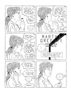
A running sub-theme in Hankiewicz’s work is the possibility of creation and communication. In “Martha Gregory,” the emotions running through the story are conveyed by the stream-of-consciousness thought balloons. The six-panel grid grounds her thoughts temporally, adding story beats to her mental wanderings. Through the realistic depiction of the figures, Hankiewicz discourages easy reader identification with the characters. Instead, the reader is immediately thrust into the “otherness” of Martha, forced to grapple with her thoughts, fears and hopes. Martha’s feelings are often contradictory, balancing the hopeful energy of creation with the desperation inherent in her inability to fruitfully communicate her desires. It is that tension that perhaps triggers the change midway through the story, where the male artist has a somatic cause for his initial inability to communicate and yet overcomes it to spark a personal and creative set of connections.

Hankiewicz’s most enigmatic use of symbology comes in “Jazz,” a series of four-panel strips that are perhaps the most fully realized of his comics and a fine example of comics-as-poetry. These strips are about opposites and are expressed using the full range of the comics language. This range of visual approaches inherent in comics gives each strip its power, meaning and ability to express the tension between opposites. Some of the strips are titled “Asthma,” implying constriction and desperation. Some are titled “Jazz,” implying free-flowing, unrestricted and improvisational movement. Various other titles (“Soup,” “Nap,” “Prayer,” “Laundry”) depict varying levels of stasis and motion, energy and entropy. His visual approach, informed by George Herriman’s Krazy Kat and other classic strips, veers into strictly realistic depiction of a man and woman. ”Jazz” also embodies a frequent motif in Hankiewicz’s work, the sudden transformation of realistically depicted hands into cartoon hands. That transformation has a price, as that hand is shown as being injured by a flash of the lightning so often seen in his strips. At the same time, this transformation of hands can be likened to the kind of word-play seen in poetry. ”Jazz” is a symbolic narrative, an exploration of active and passive states of transformation, and an exploration of the relationship between word and image that is intrinsic to poetry.

In his work, Hankiewicz explores ways in which the mundane becomes alien and threatening, how communication can be a form of aggression, the madness that isolation can induce, and the possibility that we are essentially doomed to be isolated from both the world and each other. At the same time, this quest for connection is our only chance at creating meaning and purpose, impossible as it may seem. Hankiewicz’s comics are the most compelling of those that attempt to illustrate the complexity and frustration that this process can elicit. Indeed, for the reader seeking to explore comics-as-poetry, the work of Hankiewicz is essential because it so effectively subverts reader expectations and challenges them to wrestle with the form and meaning of his comics, effectively providing a bracing crash course.

Tom Neely and The Blot
 
Like Hankiewicz, Tom Neely’s The Blot (self-published) uses familiar, old-time cartoon imagery and then subverts its use in a visceral, violent manner. Informed and influenced by Floyd Gottfredson’s old Mickey Mouse comics, among other artists of the era, Neely introduces the reader to the sort of rubbery, cartoony figure that is aesthetically conventional in such a story. When the nameless protagonist is confronted with an apparently ravenous blot of ink that often fills up an entire page, it becomes the ultimate apocalypse for a cartoon character: the obliteration of identity and form on the page.

However, the blot is composed of ink, the raw stuff of cartoon creation, full of possibility. As the protagonist proceeds, the blot alternatively (and sometimes simultaneously) represents creation, destruction, seduction, sexuality, brutality, oblivion and, above all else, knowledge. When the protagonist is spotted by a woman in a cafe who instantly understands his dilemma, she awakens this knowledge of his potential as master of his own fate and world. It is not unlike Eve offering Adam the fruit from the tree of knowledge. The blot acts as the stuff of being and identity.

The protagonist’s immediate reaction to his newfound power over his reality is to immediately recreate a conventional existence for the woman with whom he is now in love. However, it is clear that she is attracted to possibility, power and motion above all else. She despises the static life that the protagonist offers her, so she betrays him for a monstrous, all-black wolf-creature. It is not a coincidence that she is attracted to a creature consisting entirely of ink, the stuff of creation, a creature that fully embraces the possibilities of its power and the potential for violence that this entails. Confronting the protagonist, she compels him to commit horrific acts of violence upon himself. The violence is brutal and visceral but simultaneously cartoonish and uncomfortably realistic, as though Mickey Mouse had been savagely battered, beaten and splintered. She then tenderly kisses the protagonist and tells him everything is going to be all right, and he is then healed by the blot, having had an epiphany.

Neely’s use of vibrant color on the last few pages of the story indicates, perhaps, that the protagonist has a more full understanding of his potential. Formally, The Blot is a manifestation of the creative urge. The artist is creator and destroyer of his character’s lives and narratives, and Neely here imbues his hero with the same power. That power is both liberating and frightening, and Neely expresses it with images that are both familiar and mysterious. He takes advantage of the reader’s comfort and knowledge of cartoon images and then re-imagines them, instilling in them the possibilities of life, death, sex and purpose.

The Blot functions as comics-as-poetry in the way that it subverts a reader’s familiarity with its imagery, turning it on its head. The reader must grapple with Neely’s use of abstract (but still formally contextualized) ink blots as a device designed to elicit emotion. While Neely provides various visual and textual cues that offer hints as to what feelings he’s trying to portray, it’s up to the reader to interpret them. Neely’s use of nostalgic cartoon imagery for his figure work is quite deliberate and jarring, forcing the reader to understand these seemingly familiar characters in a new emotional context. The use of cartoon masks to “cover up” emotion, the oppressiveness of a seemingly endless sea of blank-faced characters trying to smother the protagonist, and the way that lines appear and disappear (literally rewriting reality for the characters) are examples of how typical comics tropes are subverted and repurposed to elicit terror and wonder for both the characters and the readers.

That meta-awareness of the reader being constantly reminded by Neely that he is working with ink on paper serves as both a narrative abstraction and emotional intensification for the reader, who is drawn into the lives of the characters through the simplicity of their iconic representation. While there is a narrative of sorts in The Blot, it is a narrative of ideas and emotions more than a conventional one. Neely achieves a level of immediacy on each page, creating a powerful emotional shorthand designed to get across the intensity of feeling, be it dread, joy, fear, desperation or longing. His iconic imagery acts as dense bundles of emotional information that, when unpacked by the reader, provide a powerful experience and insight into the creative process.

Conclusion
 
Both John Hankiewicz in Asthma and Tom Neely in The Blot are interested in the possibility of communication and purpose beyond the traditional narrative in comics art. Neely’s approach is more direct and visceral, but no less capable of absorbing multiple interpretations. As a reader and critic, one must be capable of addressing these works differently than most comics. A conventional analysis of plot and character simply does not apply here, nor do standard analyses of the use of visuals. Only a close examination of how words and images actually interact and the ability to let them wash over one to feel their impact can tease out meaning or meanings. Like all the best poetry, what a reader gets out of comics-as-poetry is entirely dependent on how willing they are to truly engage the material and articulate the feelings it evokes.

(This article was originally published at tcj.com in 2009.)


Sunday, December 13, 2009

Rhythm & Rhyme: Asthma, The Blot & Comics-as-Poetry

Over at the Comics Journal, I've published an essay I'm particularly proud of. It's on what I'm calling Comics-As-Poetry, and I explore this idea in the work of two artists whose work I admire greatly: John Hankiewicz's ASTHMA and Tom Neely's THE BLOT.

Here's a link to part one, part two and part three

Monday, August 24, 2009

Minicomics Round-Up: Gfrorer, Neely, Huizenga, Jackson, Jay, Platt, Beyer, Wiedeman

Rob reviews another selection of minicomics from old pros and newcomers alike. Reviewed are ARIADNE AUF NAXOS V. 1 & 2, by Julia Gfrorer; SELF-INDULGENCE, by Tom Neely; GREAT DEEDS AGAINST THE DEAD, by Rob Jackson; RUMBLING Chapter 2, by Kevin Huizenga; MY EXPLODING HEAD, by John R. Platt; THE NATURAL WORLD #2, by Damien Jay; CASUAL SEX and CITY UNDER SAND, by David Beyer, Jr.; and THE DEFORMITORY, by Sophia Wiedeman.


ARIADNE AUF NAXOS, volume 1&2, by Julia Gfrorer. These fall into the category of what I call "ramble comics"--minis where the artist takes the reader on a rambling journey that usually features themselves or a stand-in as a character and where the action and scenery is fluid to the point of surreality. I'd throw Jonas Madden-Connor and Damien Jay (especially in POCKET PARTY) in this category as well. The title of the comic refers to a Richard Strauss opera that originally followed a long play that was about a commedia dell'arte being thrust into the middle of a serious work. In much the same way, Gfrorer thrusts herself into the middle of other storylines, fed by pop culture concerns. The results are hilarious, with her thin and spontaneous line feeding her twin concerns of absurdity and sheer horror.


The first issue, themed around the idea of time, features Julia encountering James Bond in his different incarnations, then getting bored and drawing Gilgamesh meeting Simon Templar (The Saint)--with herself as a character in that meetup. That duo starts making out, leaving Julia to comfort Gilgamesh's now-left out pal Enkidu. Julia goes on to meet up with Doctor Who
(leading to a comedy routine the two), St Francis of Assisi (whom she horrifies by chomping on a live rabbit) and Lancelot, whom she contacts with her mind. This is a playful comic where horrible & inexplicable things can happen at the drop of a hat. It has the feel of total spontaneity on each page, but really seems to conform more to the principles of long-form improv. That is, while each individual page and panel might be improvised, there's an underlying structure that is referred to from time to time and that pops up in surprising ways.

The second issue's theme is death, and it mostly sees Julia wandering around as a sort of ghost zombie after the king of the witches kills her. There's an obsession with nomenclature and language that pervades this comic, especially the ways in which focusing in on picayune details obscures real meaning. Grforer expresses this idea with deadpan wackiness, with dialogue a bit reminiscent of Mat Brinkman's MULTI-FORCE: slang and curses spoken by supernatural characters. Doctor Who pops up again, this time dancing around the theme of regeneration. This comic is as much about the creation of the comic as it is a narrative, as Grforer never lets the reader forget that the comic is being drawn and that she is drawing it, even as strange things happen to her. The drawings have the crackling energy of sketchbook spontaneity but with a wit that provides a solid support structure.


SELF-INDULGENCE, by
Tom Neely. This little mini is a wordless bit of body comedy/horror from an artist who combination of bigfoot drawing and naturalism creates an unsettling atmosphere. The concept is simple: a pair of naked twins faces each other and one starts eating the other whole. As he's doing this, his twin is excreted out the other side, until the original image is duplicated as the book's final panel. With Neely, the fun is in the visceral, inky details and exaggerated body language. The way he elongates arms and legs while drawing pubic hair in exacting detail is the sort of thing that creates the old/new tension in his comics, a visual signature of sorts. I believe he customizes the cover for this comic when purchased at conventions (he did a drawing of the wolf from THE BLOT on mine), which is just a bonus for this beautiful comic.


GREAT DEEDS AGAINST THE DEAD, by Rob Jackson. This is another off-kilter genre comic from the prolific Jackson, in the tradition of Lewis Trondheim & Joann Sfar. This time around, Jackson takes on the occult, in this story about a haunted house manipulating a widower. Jackson manages to hit every note and cliche' while still telling a straight-ahead story, including occult investigators, paintings coming to life, being forced to sleep in a haunted house overnight and deadly cemetery statues. At the same time, Jackson's characters often drift off on amusing tangents, like the musings of a literary agent and the matter-of-fact rantings of the demonic house. Jackson's crude but earnest line tackles occult conventions with gusto, and that simplicity subverts the usual visual cliches one associates with the genre. Jackson backs up that feature with what looks to be some drawings from life that form a rough narrative of a day out. The main critique I might make of Jackson's work is to further simplify his line. There are times when he overrenders a bit in an effort to provide atmosphere, and it's distracting. Taking a further cue from the simple but clear style that Trondheim employs would go a long way to making his genre explorations all the more effective.


RUMBLING, Chapter 2, by Kevin Huizenga. With the cancellation of his D&Q series OR ELSE, Huizenga announced that he'd be continuing his "Rumbling" story in minicomics form. The second issue adds a bit of context and backstory to the vague sense of dread regarding an exile trying to evade the ramifications of a religious war. What's fascinating about this adaptation of a story by Giorgio Mangenelli is how Huizenga works in his visual and verbal interests into a previously existing narrative structure. There are the wide shots of countrysides and night skies, this time imbued with a feeling of doom instead of the usual sense of awe. There are the diagrams and philosophical asides that now represent life and death instead of merely playful exploration. It even features his signature everyman character Glenn Ganges, whose intellectual curiosity is subsumed in favor of survival and desire for human contact is warped into hermitage. The most fascinating thing about this story is the way Huizenga presents iconography as something that has lethal real-life consequences--both in a predictable way (religious wars) and unexpected (science wars). Glenn eschews all conflict and dips into his true love of ancient history, a pastime derided as heretical by all. Huizenga jumps around chronologically, going from quiet reflection to moments of danger along the way in rapid succession. It's a rich and potent stew from one of the most interesting cartoonists working today.


MY EXPLODING HEAD, by John R. Platt. Platt noted that this was his first mini-comic, and he was wise to play to his strengths as an artist. This is an 8-page collection of gags and observational humor that reminds me a bit of the sort of thing that Shannon Smith does. Platt employs a simple line that eschews extraneous details and overrendering and displays a knack for character design. His best strips actually feature jokes about monsters (like "Mummy Dearest" holding a wire hanger) and especially Bigfoot. Platt also did a micro-mini comic called "My Beard In Alternate Dimensions", which featured a number of funny Don Martin-style drawings of reimagined facial hair. There are downbeat undertones to his gags, as Platt also refers to his ongoing battles with depression, and it's interesting to see him deflect this particular show of emotion with jokes. It feels like Platt is slowly trying to figure out what he does best as a cartoonist and humorist, and I think that will be an interesting process.


THE NATURAL WORLD #2, by Damien Jay. One of my favorite minicomics artists returns with another chapter in what's shaping up to be a grimy fantasy epic. I'm reminded a bit of Terry Gilliam's film JABBERWOCKY, a medieval epic that paid special attention to the mud, manure and sheer unpleasantness of the life of a serf. Jay's greatest skill as an artist is his character design. The way he draws eyes (especially the bulging eyes of the forest hermit who falls in love with a female villager), facial expressions and gesture makes each page a pleasure to simply look at. While the pages look fine in greyscale, I must admit that I'd be very curious to see him unleash his vivid color sense on this story. There's an ease of pace to this story featuring all sorts of character bits, but I was surprised at the way Jay managed to pick up seemingly disparate plot threads and connect them. My favorite sequence in the comic featured a woman trying to hit on the village blacksmith, who was utterly immune and oblivious to her advances. The way she subtly removed her head scarf and tried to stand seductively, only to never even get the slightest glance from her intended, made what was essentially an extended conversation into something that drew the eye to the page. I'm guessing that this story will be Jay's longest sustained narrative to date.

CASUAL SEX and CITY UNDER SAND, by David Beyer, Jr. These are two sharp but very different looking minis. CITY UNDER SAND began as a 24-hour comic but turned into a comic mostly done on the subway--and given that the bulk of the narrative concerns a subway ride gone horribly awry, it's fitting. The story reminds a bit of Yuichi Yokoyama's TRAVEL in that it's a wordless comic that follows a particular traveler through a weird environment but doesn't seek to explain what he's doing or why. Beyer uses an expressive, scribbly style that's fleshed out with what looks like magic marker, adding atmosphere. I liked the way Beyer shifted the focus of the journey from what seemed like a long, arduous desert journey to a subway ride instead.

While CITY UNDER SAND was all about mood, CASUAL SEX was all about a clever device setting up a punchline. Beyer employs a naturalistic pencil style here in his depiction of a young man who wakes up with just one thought: "sex". That thought carries over throughout the day, culminating in a trip to the bar where he says things like "obnoxious sexual advance!" only to get slapped or drinks poured on him. The punchline of the strip, where the person he goes home with has more in store for him than he expected, was a perfect comeuppance for this walking pile of hormones. I get the sense that Beyer is very much still trying to figure out exactly what he wants to do as an artist in terms of the sorts of stories he wants to tell. It also seems as though he's trying to settle on a visual style. It's clear that his chops are already first-rate, with the confidence to create more spontaneous comics without overrendering like CITY UNDER SAND but the skill to pull off something trickier in CASUAL SEX. Beyer has the potential for a very


THE DEFORMITORY, by Sophia Wiedeman. This is a Xeric grant-winning book that's a collection of related short stories about the denizens of a sort of asylum for freaks. Wiedeman uses an intensive black & white pencil style with lots of hatching and cross-hatching but simple figures and faces. Her figures actually remind me a bit of Gabrielle Bell, but even more cartoony. Wiedeman's pages are cramped and claustrophobic, which I think is an intentional effect to heighten the occasional two-page spreads. These are cramped and claustrophobic stories about desperate people who have put themselves in tough situations.

The book is framed by the story of a young boy who sees a unicorn in a forest and is frozen by the memory, building himself a tower in hopes of one day seeing it again. Then we meet Dolores, a woman whose hands warped and deformed but one day turned into sentient crab-like appendages who became her friends. They pointed her to the Deformitory, a place where she would be accepted. It becomes evident that her hands have their own agenda as they point out the Heart Monster as something to be feared, when it seems that this may not be the case. That subsequent Heart Monster strip is a sort of pivot point for the book that takes it in a darker direction; the style she uses here is even more cartoony, even as the Heart Monster meets a bitter end.

From there, Wiedeman introduces us to a mermaid with tentacles who can't make friends and whines incessantly about it. When a slug-girl offers to hang out, the mermaid recoils in disgust, revealing her own shallow nature. We're then returned to a now happy Dolores, who makes the mistake of getting a date, sending her hands into a jealous fury. They attack her date, belittle her for crying, slowly torment her over time and then try to kill her. She drowns them in a bucket but immediately regrets it, given that they're all she had. The book's final pages find the man from earlier in the book finally meeting his unicorn again, bringing it within sight of a forlorn Dolores, offering a glimpse of hope for all.

Dolores' hands are a potent metaphor for any sort of self-destructive behavior or addiction. Even when they were trying to kill her, she desperately wanted them back. Wiedeman manages to sidestep hammering this idea home with the visceral nature of her storytelling. The panels where Dolores is drowning her hands are larger than most in the book, and her line is much more detailed; so as to force the reader to feel the impact of the event. There's also a lot of unexpected humor in the book (especially in the mermaid chapter) that leavens out the more melodramatic elements of the story. The best thing about the book is its elegant structure; its formal elements provide a solid framework for its flights of fancy. Like most young cartoonists, Wiedeman simply needs to refine her linework. Some of her use of cross-hatching seems overly fussy, detracting from her character work. Her use of gesture also seemed a bit awkward at times, especially when characters interacted with each other. Still, this was an enormously ambitious early work for the cartoonist, one worthy of wide attention.

Tuesday, January 6, 2009

sequart #190: Mini Comics Round-Up: Neely, Ayuyang, Sayers, Mardou

Rob reviews a variety of intriguing minicomics. (These reviews originally appeared on sequart.com)


YOUR DISEASE SPREAD QUICK and BRILLIANTLY HAM-FISTED, by Tom Neely. Neely is the artist behind THE BLOT, one of the more astonishing recent major comics debuts. Neely's work falls squarely into what I call "comics-as-poetry". I've written about THE BLOT and this topic for another website (which has yet to debut), but briefly, comics-as-poetry is not the same thing as an illustrated poem. Rather, it's a comic that utilizes the same sort of strategy that poetry does in terms of beat, rhythm and abstraction. It eschews standard narrative and forces the reader to engage the work. Unlike most narratives, which have an immersive quality (carrying the reader smoothly through the story), comics-as-poetry is most frequently anti-immersive: the reader is aware of each word, each image, each panel. It's up to them to create connections between word and image.


Neely's artistic style makes for an interesting series of contrasts. He draws much of his inspiration from classic animation and comics from around the 1920s, and his comics have a rubbery, cartoony quality that draws the reader to its surface qualities. At the same time, he subverts reader expectations with images that are often gruesomely visceral. Another trope of his is his use of ink blots. These blots have multiple meanings, depending on the context, but generally represent both creation and destruction. Neely also has an extensive background in fine arts, and as a result his comics have a tension between the flow between panels & pages and the powerful single image.


That tension is highlighted in YOUR DISEASE SPREAD QUICK, a minicomic "inspired by the music of the Melvins". Neely draws from the lyrics and characters of the album "(A) Senile Animal" to create an apocalyptic narrative. Flipping between a horse-headed man crying doom to a spectral figure drawing ink from the horse to a heavily-bandaged multiple amputee inching along the ground, Neely spends the story introducing doomed protagonists who are victimized by schemers (exemplified by a two-page spread of some of history's nastiest monsters). The bandaged man winds up turning the tables after being sacrificed to a huge eagle, and the world winds up transforming into a mass of doom-saying horse-headed men. The last page, with one of them screaming "The world is full of evil!" as he's buffeted by thousands just like him, is a funny bit of irony. Having not heard the album for reference, this comic is still an eye-popping read because of the way Neely creates a flow of imagery. The back cover, featuring an obligatory Hostess Pies parody starring the Melvins, is a bit of wish-fulfillment with a slightly salacious ending.


BRILLIANTLY HAM-FISTED is a collection of "comic strip poems" originally published on Neely's website. Neely dips a bit into John Hankiewicz territory here in terms of the way he uses realistically depicted ordinary objects in his strips and gives them a different meaning by virtue of the way they're juxtaposed. The similarities end there, because Neely is still working in a classic comics tradition by using a four-panel grid for each strip. He also is more deliberate in the way he contrasts word and image--sometimes working in concert, sometimes at deliberate cross-purposes. "Sunday Afternoon" is a strip featuring a common Neely image: a crowd so tightly packed there's nowhere to breathe or move. Panel by panel, the phrase "Some people just can't appreciate the pathos of it all" is uttered by someone in the crowd--but we don't know who, because the figures are so tiny. Of course, the actual identity is unimportant, since all of the characters look exactly alike and are in precisely the same jam.


The themes running through these strips include suffocation, failure, anxiety, and the desperate attempt to connect--both on an emotional level and as an artist. "Art" features the artist taking off his glove and cutting off his hand, even though he knows we "would prefer cheap decorations". Some of the strips are more engaging than others; some make a quickly-absorbed point while others require multiple readings. It's fascinating to see Neely continue to mix old cartooning traditions with formal experimentation. The contrasts and contradictions inherent in his style and methods are what make him an artist to watch.


Rina Ayuyang's recent string of sketchbook/diary minicomics has been quite engaging. The best quality of her recent OVERWHELMING WOT-NOT, for example, is the spontaneity and liveliness of her approach. She manages to sprinkle quotidian observations, joys and frustrations into narratives that are surprisingly coherent given her loose approach. Her self-characterization in her comics is as someone who's constantly frazzled, harried and short of inspiration, yet the comics themselves have a clever exuberance. In "Fire!!", Ayuyang manages to relate an amusing workplace anecdote, throwing in a couple of gags related to an annoying co-worker and then shifting seamlessly to a related event at home. It has a light, breezy tone that simultaneously feels like a funny memory recorded for posterity in a journal and a polished narrative.


"Sushi Times" is a rougher, sketchier story that's as much about Ayuyang's often misplaced sense of empathy as it is about a particular lunchtime incident. "Happiness" and "A Dream of Sandra Bernhard" are slightly melancholy ruminations disguised as rambling anecdotes. The best story in this mini is "This Is The Day", a story that's both about writer's block and a way of fighting her way out of it. Faced with a blank sheet of paper and nothing to say, Ayuyang at first retreats into time-wasting activities, but soon tries to find ways to inspire herself. She draws support and wisdom from her friends, gets told to practice what she preaches after telling a friend to value her work, gets a hilarious "pep talk" from her father and vows to get back to her Big Story after a brush with mortality. What I admire most about this mini-comic is that it works as a form of art therapy. Instead of staring blankly at a sheet of paper because she can't work on her "real" project, Ayuyang engages in a form of highly polished doodling. In her recent work, she's become much more relaxed and comfortable with her storytelling, which has translated to a real sense of playfulness on the page. While I'm eager to see her eventual long-form project, I hope she continues to give us these pleasurable little side projects.


One of the specialties of the cartoonist Mardou seems to be examining friendships both deep and casual, especially among women. In MANHOLE#3, her character Bea takes us through a first-person account of the history of her friendship with Carrie. Both rock scenesters, Mardou tells a story of a friendship that was really a platonic love affair. Her use of detail and ability to evoke emotion through vivid anecdotes really gets across the depth and importance of this friendship, at least through Bea's eyes. The story does meander a bit and coalesces a bit more after a second reading, especially after one reads the ending. Indeed, as Bea is about to become the mother of a girl, her experiences with Carrie became all the more important in her memory, as a sort of continuum of feminine connection.


Mardou's line is sketchy and loose but highly expressive. Her character design is varied and effective, with her eyes in particular carrying a lot of the narrative's load. In the story, Mardou had a way of the story's leads creating meaningful eye contact with each other that frequently reduced the men they were with to mere props. In retrospect, Bea could see the end of their friendship coming, but there was nothing that really could be done about it. Sometimes, some friendships have a limited time span, no matter how intense they may be in the moment. This story is about a series of moments that had a life-changing quality to them; Bea knows that they're gone forever, never to be reclaimed, but the memories will always linger and influence her the rest of her life.


I WISH YOU WERE DEAD: THINGPART COLLECTION #6, by Joey Sayers. This is a drop-dead hilarious collection of 4-panel gag strips from Sayers' THINGPART website. Sayers specializes in classic "turn the idea on its head" humor, presenting a premise that the reader expects to go in one direction and then subverting it by the third panel before ending with the punchline. To this end, she employs a cartooning style that is simultaneously minimalist and grotesque. The design of her characters' bodies and backgrounds is bland and is just there to provide points of information and reference. The faces and heads are another matter.


Sayers draws round, stick-figure style heads with crudely-rendered faces: dots for eyes and simple mouths. Those mouths are often filled with just 2 or three teeth that almost resemble fangs. Like Matt Feazell, the master of stick-figure comics, Sayers' characters are still enormously expressive, with Sayers' refined understanding of gesture and body language shining through the simplicity of her line and aiding the punchline. Sayers is a flat-out great gagsmith, either taking an absurd idea to its logical end (like an employer praising what are suggested to be a commercial artists' samples but look like blank squares to the reader--until we see that the artist is applying for a job at "White Cardboard Squares, Inc.") or subverting a familiar scene (like a teenager asked to say grace who instead insults Jesus' tastes in food, is praised by his parents in doing so, and leads Jesus to buy the junky "Sugar Bomb" cereal the kid wanted instead). Sayers' work is also in the Michael Kupperman/Martha Keavney area of absurdist humor, but her goals and methodology are different. Fans of those humorists should certainly check out her website, especially since Sayers has such a high hit/miss ratio.