Tuesday, October 23, 2012
Sequart Reprints: Minicomics Round-Up
*********************
About Yr Future, Plots, Their Condolences, by Eve Englezos & Josh Moutray.. This artist duo known for putting out the Icecreamlandia minis first caught my eye a few years ago, and I always eagerly await their next bit of weirdness. Each of these minis is cleverly designed, short, and as beautiful to look at as they are hilarious. Their Condolences has the look of an old-time photo album, as we see a drawing of a man who died in the late 19th century. Eschewing their usual clear-line drawing style, Englezos & Moutray instead use heavily-shaded pencils that look uninked. The "condolences" involved may be heartfelt, but they're far from heart-warming, as each family member or servant makes nasty comments about him. The funniest page may be the last, when one of his sons holds a bird in his hands and thinks his father is there in reincarnated form.
Plots is more typical of the duo, with that oh-so-thin line of theirs being put to use in single-page gags. Every page seems to either be a set-up or a climactic point in some other story, many of them funny. The first page has a crying man hugging a friend, telling him that his wife was murdered and their place robbed. His friend replies, "I hate to tell you this, but I've got some more bad news" and then the reader's eye is drawn down to the knife in his hand. The "plots" here also imply someone plotting against someone else, be it a housewife/spy using cooking jargon as her code words, two kids using walkie-talkies to plot against their grandma, or a vulture calling his fellows to war against hyenas.
About Yr Future is the third in a series of small minis about time. This one is all about predictions, foretellings, and fate. Again, their authorial voice is one of bone-dry and bleak humor, mixed with a sense of absurdism. Their line drawings are even more amusing than usual here, considering they're drawing robots and an elderly man whose head has been transplanted onto a cyborg body. Englezos and Moutray are a unique act in comics, and their wonderfully skewed point of view mixed with an impeccably tasteful design sense makes even the shortest of their minis a rewarding experience.
Infandum #2, by Molly Lawless. Lawless is another new favorite artist of mine on the minicomics scene, thanks to her expressive pencils, sharp sense of humor, and obsession with baseball. It's those latter strips that are the most fun to read, and she's slowly on her way to compiling a collection's worth of baseball strips. Lawless strikes the right tone between smartass and historian as she has Bill Buckner "narrate" a story called "The Boner and the Muff: A Tale of Two Freds". Buckner was the first baseman who infamously let a grounder go between his legs in game 6 of the 1986 World Series, a series that his Red Sox would wind up losing. This story is about two baseball players from the deadball era (early 1900's) who had similar blunders that were blamed on their team's eventual collapse. Just like Buckner, neither player was really to blame, but couldn't outrun their notoriety. Even readers who don't like baseball will enjoy Lawless' delicate pencils and decorative touches.
Though this mini is only 8 pages long, it's a much meatier read than one would expect because Lawless jams so many panels and so much detail into each of her pages. Her first story (written by Carlton King), "Rules of Romance: Breakup Jujitsu", packs 15 panels and decorative extras onto one page. Her "Repressed Memory Theatre" is just as dense and is perhaps the funniest story in the comic. It's an autobiographical tale of young, uptight Molly being humiliated by her mother in front of her classmates at school. Lawless transforms a fairly standard reminiscence into something memorable due to her expressive figures, sense of comic timing, self-deprecating wit, and appealing sense of design. The only thing that detracts from my enjoyment of her comics is that her figure drawing suffers from being crammed into tiny panels on mini-sized pages. I'd love to see her expand her page count a bit and let her comics breathe with bigger panels. It's astounding that her comics look as nice as they do, considering that they're hand-made and photocopied. I look forward to her first collection of minis, which would do justice to her attractive art along with her sharp wit.
Just This Side Of Heaven, P.S. Comics #2 & #3, by Melanie "Minty" Lewis. I first became aware of Lewis' work in SPX 2003, and her story stood out for two reasons. First, all of the characters were clear-line anthropomorphic pieces of fruit. Second, her sense of humor regarding human interactions was pitch-black and dry. Lewis writes knowing stories about sad people living in "quiet desperation", but manages to squeeze every ounce of awkward humor out of these situations as possible. I'm a fan of this kind of "squirm humor", where the awkwardness of daily social intercourse is heightened for comic effect. Portraying these people as fruit or dogs (or table condiments) adds an extra layer of distance and absurdity to heighten the humor in the story--but at the same time, it almost gives Lewis license to make the situations all the more painful--especially if the stories seem to be based on autobiographical experiences.
Just This Side Of Heaven is a story featuring her other set of go-to representations: anthropomophric dogs. This one's about a goofy cat who lost her best friend (a dog) and is living with two new hipster cats who constantly argue and exclude him from the conversation. His dog friend appears to him in a dream and gives him good advice on how to live with his new roommates. What makes this comic so appealing is how Lewis has the animals act and live as animals (and more specifically, pets), yet the dynamic is very much of a 20-something group house, with the cat even being in school and using email. This comic was a bit more forgiving and sentimental than some of her other, nastier comics.
P.S. Comics #2 mixes up styles quite a bit. "Winners" is a hilarious account of an especially miserable high-school anecdote, done with her fruit characters. The story works because Apple is desperate to fit in, one way or another--and every attempt at trying to be cool backfires either in a whimper or in a spectacular public humiliation. "Yorkie Matrimony" is a vicious story using dogs as characters. It's the story of a friendship of two roommates gone sour, thanks to one of them deciding to get married and the other falling apart at the notion of being alone. Not since reading Hate have I enjoyed seeing a story this over-the-top and yet strangely familiar about roommates. Once again, the cuteness of Lewis employing dogs-acting-like-humans just makes the story funnier, even as the events get more pathetic. What's odd is that her use of gesture and expression seems more refined when she's drawing animals or fruit than when she draws people. "Salt & Sugar" is perhaps the most clever story in this issue. A heavily-narrated love story about the romance between a salt shaker and a sugar dispenser, Lewis does a clever parody of typical problem-romance narratives using every joke imaginable about salt and sugar. These are the first two pages of her work that I'd show to anyone to demonstrate her wit.
P.S. Comics #3's best story is "Bitter Fruit", starring her "Fruit Pals". A workplace/relationship melodrama, it once again perfectly captures not only the beats of 20-something relationships but also the inane nature of workplace life. As one female character (Pear) is dealing with being suddenly dumped by a co-worker for another co-worker, she has to fend off both the advances of and grating "advice" of another co-worker. This may be the most accomplished of all her stories, both in terms of design & composition and humorous impact. Finding a style that works for her so early in her comics career is clearly a big boost for Lewis. At this point, she simply needs to continue to further refine it. Her comics look best when they're clear, uncluttered and not overrendered, especially when she's able to add subtle decorative touches. Lewis' wit is already razor-sharp, and I'll be excited to see her continue to explore this milieu as she continues to grow as an artist.
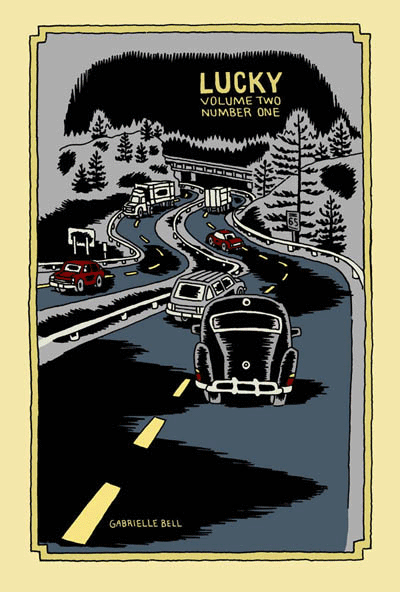
Lucky (Volume 2, #1), by Gabrielle Bell (Drawn & Quarterly). This is the only comic from a publisher on this list, but it certainly counts as a mini. Half of this comic is a story called "My Affliction", which Bell was giving away at SPX last year. I've already reviewed that story on sequart, and it was a hoot--Bell's weird sense of humor was in effect. The other half of this particular comic was a series of diary entries. Much like the minis collected in Lucky, Bell's neuroses are on full display and depicted in her typically wry, over-the-top fashion. We see her dealing with the stress of "performing" her new comic (the aforementioned "My Affliction") and preparing to be on a panel at SPX. Bell uses blacks to good effect in these stories, giving them a certain weight that at times reflects the sense of claustrophobia that her narrative portrays. It should be emphasized that Bell plays her neuroses for laughs in her typically deadpan manner, not in a "woe-is-me" sense. I've written extensively about Bell in the past, so I'll just note that if you appreciate her sense of humor and enjoy her diary comics, then I would enthusiastically recommend the new volume of Lucky.
Routine & Are You Often Impulsive In Your Behavior?, by Will Dinski. Dinski is another favorite of mine, and these two minis are both unusually presented. Routine is actually a comic on a single page of posterboard, in full color. This story is typical of Dinski's strengths as a cartoonist: his sense of panel-to-panel beats and rhythms. In a narrative, he's often fond of using a silent panel, then a narrative caption in a rapid-fire sequence. In this comic, he sets up the boring routine of a businessman in this way. A random bit of near-violence puts his routine out of balance, creating a new, quite warped routine for our hero. As always, Dinksi's page is stylish, spare and puts a bit of distance between reader and story. This is done mostly for comic effect, but there's always something a bit unsettling going on in his stories, and Routine is no exception.
...Behavior is a clever comic, also printed on cardstock. This one is meant to be folded so as to form four pages on one side. It's a story about Dinski taking a test at a Scientologist recruitment center on a whim, and the back of the comic has the results of his test. Once again, Dinski's control of story-beats drives the comic, as he breaks up the narrative with actual questions from the test. He did this to show how the way they were worded was designed to emphasize the test-taker's feelings of paranoia and inferiority. The results made Dinski out to be anxious, paranoid, critical, withdrawn, depressed, withdrawn and hyperactive (?). The punchline was that Dinski was expecting a recruiting pitch, but instead got sent on his way. The use of the test's questions dryly sets up Dinski's own critique of the proceedings in an indirect and amusing way. As always, a Will Dinski comic is smart, off-beat and comics in their purest sense; there's no way I could experience these stories as anything but comics.
Plates Are Cult #3 and Pocket Party, by Damien Jay. Jay has been making beautiful, silk-screened comics for some time now, though I first became aware of him through cartoonist Ellen Lindner. The comics I'm reviewing here are much looser, torn from his sketchbook or originally done for anthologies. Plates Are Cult #3 is in fact a mini that collects a number of short stories from other places. There's all sorts of delightful weirdness in here, including "The Merpeople of Columbus Ohio" from Mapjam, the grotesque "Frankie Pug-Dog", and the clever "Hello Everybody On The Other Side". In these comics, Jay is working through styles, influences and inspirations, using a slightly tremulous line to create expressive characters. "Hello Everybody..." is the most formally experimental, about a man trying to record voices from the spirit world. On the back of each story page, Jay blends and jams text and image, printing some of it backwards as the line between spirit and material bends and blurs. Another standout story is "Warsaw", a travel story that Jay drew, depicting one man's struggle to fend off attempts of various Polish businessmen trying to get him laid with assorted sex workers. There's a certain bleakness to Jay's art that matches the grey world of the sex trade in Eastern Europe.
While these stories had their charms, it's Pocket Party that impressed me much more. Combining sketchbook segues with a loose narrative, it's an inspired flight of fancy. Jay starts with an odd-looking man named Leslie in an abandoned town and interjects himself into the proceedings as he sees fit. He insults one of his characters, who runs off and refuses to participate further. From there, former president Gerald Ford pops up and Jay tries to lecture him on what comics are and how he fits into the story. Throughout, Jay pops into his own comic to offer random opinions, critiques of his own art and story, redrawn panels, sea monsters, Leslie being forced to play Match Game and a perilous journey through the city sewers. Jay even chides himself for being so self-referential, promising to stop it (which he eventually does, but not before he moans, "I just don't have...anywhere else to go!). Somehow, this stream-of-consciousness stew works. The looseness of the art gives it a vibrancy, as though the reader just watched it appear off the still-wet pen of the artist. Jay is funny and riffs well on the page; while the comic is admittedly self-indulgent, it's an indulgence that's quite entertaining for a reader. Jay's ability to somehow make drawing exercises (like learning how to draw fins) into amusing interludes only made me want more; given that this was actually listed as issue #1, one would hope that he'll be doing more. All in all, this is one of the most enjoyable minicomics that I've read in the past year.
Monday #1 & #2 and Yip The Wonder Dog, by Andy Hartzel. Hartzell is the creator of Fox Bunny Funny, my favorite mini of 2006. He's following up that work with a new series, based on the Adam & Eve creation myth, along with a hilarious one-shot mini originally published in another publication. The full title of Yip is The Rise and Fall of Yip the Wonder Dog, and it's a funny account of a heroic dog's journey into Hollywood fame and subsequent decadent excess. It's another wordless story from Hartzell, and while his ambitions are certainly far more modest than in Fox Bunny Funny, the payoff is no less rewarding. Hubris is punished and loyalty is rewarded in the end, but it was the sight of a dog doing lines of coke and dancing the night away (along with the other absurd but logical extremes of the narrative) that made this tidy story so much fun.
Monday is a far more ambitious story, with these first two issues being the first of five chapters. The series' central premise is dynamite: we all know what happened on the first seven days of creation--but what happened on the eighth? Adam and Eve argue about the nature of Eden, the serpent starts planting doubts, and God is hard at work at perfecting his greatest creation. After reading a number of wordless comics by Hartzell, it was a pleasure to see him script such clever banter between Adam and Eve, staying fully within their archetypical characters while expanding the creation myth.
In this story, everyone has their own agenda. Adam is desperate to stay faithful to God in spite of the doubts being planted. Eve just wants the garden to be safe, and the serpent feeds her doubts. The serpent is resentful that God punished him for hubris after he criticized his creator. Finally, God is cranky and defensive, blowing up at his creations because of his own frustration with his new creation, who is somehow resisting being born. These first two chapters set up the tensions and conflicts that are sure to come, where everyone involved is all too human--which only makes sense, since man was created in God's image.
Visually, the art doesn't quite have the snap and polish of Fox Bunny Funny. It's looser and sketchier, but no less expressive. There are also more decorative touches, with the garden of Eden holding all sorts of "eye snaps" and visual surprises. Hartzell's figures are blocky and primal, as though they were made of squares. The silkscreened covers are especially beautiful, though I look forward to its eventual overall release on better paper. Hartzell's use of themes and imagery is very different from most artists working today, and the way he incorporates mythic and archetypical imagery in his stories lends them a lot of power, even as he deflates them with humor.
Mapjam and Satisfactory Comics #7, by Isaac Cates & Mike Wenthe. Once again, full disclosure: Mike Wenthe has been a friend of mine for some years now. That said, he and his collaborator Isaac Cates have carved out an interesting niche in the world of freewheeling comics formalism. Satisfactory Comics #6 had been their most ambitious issue, with the most narratively coherent stories to go along with a slew of interesting extras and decorative touches. Issue #7 was done quite differently: it was created in an intense, 30-hour jam session. What makes this issue stand out is that despite each story having its share of pre-set rules, formal gimmicks and other built-in limitations, those boundaries were invisible to the reader. I think the main reason why was the furious pace at which these stories were written and drawn; as a result, spontaneity and looseness were the real rules here.
Given the number of jam comics and comics with specific formal rules (starting with a certain sentence, drawing with one's non-dominant hand, artists switching off panels, artists drawing different characters in the same story, improvising each panel and then switching off, etc.), I've noticed that they tend to work best as short stories. One feels the strain of the rules after more than a few pages, and the stories tend to devolve into silliness. In Sat-Com #7, it's clear that Cates and Wenthe are quite aware of this, and the result is a series of one to two pages stories that feel quite substantive. The stories range from a quiet lament on the apocalypse to an Alaskan astronaut's ruminations to a hilarious series of single-panel take-offs on famous works of literature, and much more. I particularly liked "Sinister City", which was the most formally restrictive story (single-syllable words, except for the seed sentence, written by Cates and drawn in Wenthe's non-dominant hand). The shaky pencils had a marvelous looseness to them, almost a vibratory quality, that neatly fit with the fact that the story was a retelling of a dream.
I loved the imagination of "The Xylem Cipher", about a liquid that enabled a woman to hear the speech of plants, who then discovered that this was not exactly the most exciting power in the world. This strip showed off their gag-making abilities, as they fired off every single good joke possible from this premise, and ended it on an even better joke. The range of emotional tones and genres makes the reader wonder what could possibly be next when they turn the page, and I found that this issue rewarded multiple readings. I also found their notes on the issue to be revealing as always, as they delved into their creative process.
Cates and Wenthe invited a number of others along for the ride on their ambitious Mapjam project. A wacky take on fantasy world-building stories, they had several artists contribute three bits to a fantasy world-map, split the map into nine quadrants, then handed out assignments to write a story based on that portion of the map. The results ranged from fairly standard fantasy stories to some truly ludicrous scenarios. The quality of the stories in a jam tends to depend on how much time each cartoonist puts into it. A number of the stories (especially in the first round) felt rushed and uninspired. On the other hand, those artists who were more obviously committed to the project created strips that were quite amusing. The best strip in the book came from Tom K., a contributor to Mome. In just four pages, he picked up the threads of an earlier story and took them to some unusual places. His art was stark and bold, especially a page set in a dark cave. Wenthe and Cates contributed tales of perverted minstrels, miniature questers, seasonal gods and other weirdness. Another standout contributor here was Damien Jay, whose loose style and sense of the absurd fit right into the proceedings. This was a case where the experiment and collaboration itself was more interesting at times than some of the results, but one would hope that for the next round, they'll be able to recruit cartoonists as devoted as Tom K. to pick up the baton. It'll also be interesting to see how the "exquisite corpse" nature of the experiment plays out. While not as focused or engaging as their Satisfactory Comics, Mapjam certainly has me eager to see where the stories go next.
Heart and Brain and Love Charades, by Fay Ryu. I love these wordless, colorful romantic pantomimes by Ryu. Heart and Brain features an anthropomorphic heart engaged in an unrequited relationship with an anthropomorphic brain (ambulating via its spinal cord!). The graphics are simple, reliant on Ryu's understanding of gesture and expression, and heightened by her bright colors. The only narration here are the chapter titles: "At First Sight", "Second Sight", "Third Sight", "Out Of Sight", "Hind Sight" and "In Sight". The Heart character keeps encountering Brain, but is never able to screw up the courage to talk to the object of its affection. This comic is about loneliness and how it both makes one feel like one's traversing a desert alone (an image used here more than once) and insulates us against fear of rejection. There's safety in this fear, even as Heart grows more agitated and wistful as the story proceeds. It's a beautiful, simple little story whose ambitions don't outstrip its limitations. As a result, one can see hidden depths in the familiar imagery.
Love Charades is a sort of companion piece, labled a "heart and brain exercise". It's a series of vignettes starring the aforemention characters, this time clearly as companions. The charm of this piece is the way Ryu breathes life and excitement into quotidian activities; there's a sense that these everyday experiences take on added meaning simply because they're being done by lovers. Ryu is a clear, clever storyteller who is quite adept at wringing out emotional truths with just a few strokes of a pen. I look forward to getting my hands on more of her work.
Elsewhere #3, by Gary Sullivan. The first two issues of Sullivan's travel comics used some unusual techniques in combining word and image. This issue is a collection of single-page strips called "The New Life" that appeared in a poetry/fiction journal called Rain Taxi. The strip is all over the place in a pleasing sort of way. It starts as a narrative, as a Dante-like poet meets his Beatrice in Brooklyn and they explore poetry together. Sullivan junked that narrative when he fell in love with a poet who lived in Japan named Nada Gordon, and set several of his poems to comics--in much the same way a musician would attempt to translate poetry to music.
That decision made his visual storytelling approach fairly conventional, as he used his comics either to directly illustrate his text or else comment ironically on it. The images themselves were a supplement to the words and not a form of poetry unto themselves the way they were in the first two issues of Elsewhere or for cartoonists like John Hankiewicz. In "The New Life", Sullivan doesn't seek to redefine the visual language of comics as a different kind of poetry, but rather uses it to as a tool for historical, humorous and biographical purposes.
The most successful strips in this collection were Sullivan's pieces focused on specific poets. Combining commentary, direct quoting, ironic juxtaposition of word and image, and at times genuine warmth for subject and material, these strips were perfect introductions for poetry neophytes like myself and an amusingly different perspective on these pieces for afficianados. His parodies of old Marvel and romance comics as a means of illustrating certain trends or histories in the world of poetry were funny, but he doesn't quite have the chops to pull off the style mimicry required for the full impact he was going for. Still, he comes close enough that the audience will know what he was going for.
I like the fact that Sullivan is hard to pin down. He seems interested in being several different kinds of artist and writer simultaneously. He obviously loves comics, likes the free-flowing weirdness of Flarf (the sub-genre of poetry he developed), loves history, is engaged with the world in a political and material sense, and has a sense of humor about both himself and his art. He's a bit all over the map, and it's that very lack of focus that draws me in to what he does.
Eye of the Majestic Creature #2, by Leslie Stein. Stein first came to my attention with her painstaking and unusual comic Yeah It Is!, a Xeric-winner that looked to be assembled as much as drawn, given the way she composed each page with paper cut-outs along with drawings. It was an interesting experiment to say the least, and the fact that the story itself was equally appealing to my sensibilities (about a loudmouth loner trying to relate to the rest of the world) certainly made her one to watch.
The style she uses in her minis is completely different--a very fine line, detailed pencils and even stippling for effect. Her stories are the product of an unhinged imagination, yet there is a coherent narrative to be found. Indeed, one senses that much of the story is directly autobiographical, if adorned with all sorts of weirdness. The story is about a young woman named Larry who has moved out to the country after living in the city made her too anxious. She lives alone in a house with her anthropomorphic guitar (named Marshy) and ponders misanthropy and the desperate need to connect, two contradictory impulses that nonetheless drive her.
I found myself completely drawn into the world that Stein created. Her ability to create intricate fine-line drawings whose simplicity leads the eye around the page with ease is matched only by her many decorative touches. Larry has huge, button eyes and a picklish nose to go along with her lithe frame. Stein adds a touch of the trippy and even grotesque in her drawings, with hints of Vaughn Bode popping up here and there. There are many hilarious sequences in the book, like Larry playing with a baby by bopping a doll on its head until she knocks it over and responding by quietly propping the baby back up.
This comic is mostly about the stink of alienation and loneliness. Larry can smell it on others (like a shop owner desperate for company) and is none-too-pleased to detect it in herself. Larry later house-sits for another loner-type obsessed with odd but beautiful details in life. He's a social misfit who seems content with his obsessions, like country music and barbecue. Larry is not so different from him, and draws happiness from some of the most absurd places. It's safe to say that the absurd, the cheap, and the guilelessly delightful things in life give Larry joy in a world devoid of meaning or real connection. This point of view resonates with me as a reader, and it's for this reason, along with her superior chops as an artist and imaginative composition & design that this was my favorite mini-comic to date of 2007.
Sunday, October 2, 2011
Pleasant Distraction: Frog & Owl


Lawless works strictly in pencil, and the simplicity of her characters allows her to add all sorts of detail around them. There's one strip where Owl is wrapped up in a quilt that has a delicate checkerboard pattern. There's another strip where Lawless comments on the simplicity of her figures by drawing naturalistic versions of her characters who note that "something is amiss". Most of the strips don't rely on visuals to tell the joke; Lawless simply makes each strip nice to look at as a matter of course. In many respects, Frog & Owl is a throwback strip, something that might have appeared in the newspaper forty years ago in terms of its size and aesthetic qualities. Of course, by throwing out any sense of continuity, Lawless simply makes it about the gag every time, slapping a different story on these two blank slate characters in every strip. As far as the quality of the gags themselves, Lawless has a pretty good hit to miss ratio, with most of them being pleasant chuckles rather than laugh-out-loud guffaws. Frog and Owl is the epitome of pleasant if forgettable, though if no particular strip was especially memorable, I still wanted to read more of them.

Friday, May 1, 2009
Sequart Reprints: Minicomics Round-Up
Shannon Smith
There's a bunch of micro-minis in this batch, with several 4-page minis detailing a wild schoolboy from Smith's childhood and a vengeful possum. One of them was a 12-hour comic and they all have a tossed-off, disposable feel to them. A more substantive entry is BRUSH AND PEN, a stylish mini that pins its effectiveness on how Smith portrays its characters. The main character is an anthropomorphic pen named Clicky and it concerns his travails with his wife, a beautiful but "high-maintenance" brush. The story leads up to the two of them having the writing implement version of having sex: dipping into an inkwell and drawing on fresh sheets of paper. There's a great panel where Brush dips her head into the ink and flings her head back, ink spraying everywhere. It's a genuinely sensuous image that leads to a clever sequence where the two characters express their passion on the page, with the accumulated ink leading to a blackout (quite literally). Smith's playful figures remind me a bit of Steve Lafler's work. This mini had modest ambitions but fulfilled them admirably, and I'm curious to see what else Smith can do. Go to www.shannonsmith.net for more details.
Rob Jackson
Jackson is from England, though he spent some time in South Korea teaching english. That story is detailed in RANDOM JOURNEYS #1 in "1st Day At Work", where Jackson is led to a red-light district by his boss because "here you can make lots of foreign friends!" Things get weirder from there, as he's led to a public bath and gets a rubdown, getting cleaned in places he wasn't expecting. The beleaguered Jackson makes an amusing narrator, and his dry, smart-ass wit shines through all of his stories, even when they are ostensibly serious.
That's certainly true of the main story in this mini, an account of a jungle expedition, but even moreso in CAFE' LE GUILLOTINE: THE FRENCH REVOLUTION. It's a straightforward account that somehow manages to mine the absurdity of that historical event. Especially random beheadings, heads on pikes, King Louis trying to pass as a commoner, storming the Bastille, Caps of Liberty and other wackiness. There are two very clever pages where Tom Paine (author of Common Sense and a key figure in the American Revolution) is in Paris and nearly lynched by a crowd for not wearing a Liberty Cap before he's saved. Jackson really captures the paranoia and general craziness that gripped a nation that desperately needed change. Of course, once the revolutionaries gained power, it didn't take long for backbiting, power grabs and murder in the name of the state to grab hold. Jackson's take on it was that everyone involved was a yahoo, with the revolutionaries ultimately tapping Napolean. The center of the story concerns the title cafe, across the square from where most of the executions took place, and the beheadings became public sport. (An aside where a woman bakes a "monarchist pudding" and is sent to her death sort of sums it all up.)
Jackson's ambitions as an artist currently outstrip his abilities. His composition is impressive--there's a great-looking page where the panels are arranged to look like a guillotine. The crudeness of his figure work is probably his biggest weakness as an artist, though he compensates for this by using a few recognizable iconic trademarks for each major character. Robespierre wears glasses (adding to his aura of nerd-drunk-with-power), Marat has a bandage on his head, Desmoulins has long black hair, etc. The limitations of his draftsmanship were aided by the light-hearted approach he took to this story. Jackson's brains, wit and compositional sense are currently his strengths, and I hope that he continues to work on his weaknesses, because he's made some interesting choices so far in his comics career. See smallzone.co.uk for more information.
Molly Lawless
Lawless' entry is SLEEPWALKER #1, and more info (including a link to her excellent sketch blog) can be found at sleepwalkercomic.blogspot.com. Lawless didn't write the bulk of this 16 page mini, which is unfortunate because those pages she did write were quite witty. I'm a sucker for sports comics and her one-pager on the Washington Senators' last game in 1971 (complete with the game being called because the fans stormed the field) was amusing and sharply drawn. Lawless almost completely eschews the use of blacks, preferring a heavily cross-hatched style that adds weight to the page without interfering with the reader's ability to process it. She perhaps overdoes it on this page, though the crowded and cross-hatched panels reflect the weirdness and claustrophobia of the event itself.
The main narrative in this issue was written by Carlton King and it's called "The Turning of the Worm". Her art breathes a bit more here, with a lot more white space. Her figure work is wonderful to lay one's eyes on. The body language is subtly detailed, the figures are expressive, and eccentricities are conveyed without the use of too much exaggeration. Her art reminds me a little of Alison Bechdel's (with a bit of Renee French thrown in), especially the way she uses facial expressions to convey meaning so effectively. The story concerns a fantasy nerd who gets a job essentially running the life of a sad-sack but very successful fantasy author. The nerd is enormously self-deluded regarding his own importance and of course is friends with similarly self-deluded creative/political types. This first episode is mildly diverting, but the one-dimensional nature of the characters makes me wonder how far this storyline can be stretched.
The rest of the issue has some nice gag work. There's a great page called "Alien Bride", the cover of an absurd bridal magazine that has a bride with metallic claws weepily lamenting "No ring for me..." Lawless clearly has a ton of talent (she does a lot of illustration work), and I hope she continues to write her own material.
Dave Bradbury's PICTOZINE
PICTOZINE is an anthology by cartoonists from New Zealand. There's a nice diversity of styles here, but each individual strip is too short to really get a sense of what each author is capable of. The two exceptions are by the best-known artists here, and their work frankly towers over every other entry in the anthology. The first is a bunch of Fred the Clown strips by Roger Langridge, who is merely one of the best humorists working in comics today. His design sense, gorgeous line, expressive figures and absurd sense of humor are a pleasure to read anywhere. The second exception is more of an illustrated essay by Dylan Horrocks, creator of HICKSVILLE (one of my all-time favorite comics). Horrocks writes an essay about his "lighthouse library", the ideas that have been in his head for years but he hasn't yet drawn. It's a revealing look at his struggle to be prolific, cleverly laid out as an extended checklist of ideas.
There are other funny bits: Robin E Kenealy checks in with "I Made a Toastie Pie for Satan", a gag that pretty much explains itself. Matt Scheurbert's "Discovery" is a one-pager wherein a man picks up a sheet of paper with a surprising message on it; the dominant use of black adds a bit of weight to a clever but slight set-up. On the other end of styles, Steve Saville's stylized and exaggerated figures in "The Forgotten" nicely match the nihilism of the strip.
The other strips don't do much for me. Some are slick but empty (like VL Dreyer's fantasy sequence), some have gags that are punchless (Grant Buist's "Fitz Bunny in Hell") and some have interesting ideas and images that are hard to follow (Tim Danko, I think). Another problem is that the order of the stories doesn't exactly match up with the artist list on the back, and not every story contains an artist's signature. As a whole, it's not an entirely satisfying read. The only thread running between every entry is that each artist is from New Zealand, and that's not quite enough to provide a coherent reading experience. Overall, I'd say that this was a noble experiment that didn't quite work, but it did at least expose me to a few more artists whom I want to see more out of. Contact Dave Bradbury at dave@pictozine.co.nz for
details on ordering.
Elizabeth Genco & Assorted Illustrators
Genco submitted two minis: WEIRD SISTER and RED. Both are horror comics, a genre in which I don't have much interest. Still, Genco managed to win me over with an intelligent, clever approach to old saws like witch and werewolf stories. Not an artist herself, she was somewhat at the mercy of her illustators, and the style of each artist had a huge impact on how effectively each story completed its aims.
WEIRD SISTER is about a young witch who summons up a hellhound to kill a couple of vicious thugs, protects a special child from someone she accidentally drove mad, and protects a friend from her now-undead ex-boyfriend. What's most interesting about the stories is the way Genco slowly reveals details about the character and her motivations. She's a witch who has some sort of mission here, but what exactly the mission might be isn't clear. The lack of detail the reader is given in the first story is not aided by the murky art by Adam Boorman. It's hard to make out what's happening from panel to panel at times, and the attempt by the artist to create a mood is hampered by this lack of clarity.
On the other hand, the extreme stylization of Dash Shaw in the second story makes it an interesting read. The man accidentally driven insane by the young child is a sweaty, scarred mess; we can feel his desperation as he's about to kill the child. Meanwhile, Shaw's composition and style choices on the two big action pages nicely convey the weirdness of the situation. There's almost a Ditko-esque quality to some of the action and close-ups of the characters. Again, we don't learn much about a lot of the characters in this story, but we are left wanting to know more. The art-comics sensibility that Shaw brings to a horror story is quite an effective pairing.
That's what makes the third story such a disappointment. Jeff Zornow's generically-slick horror style, combined with a cliched ex-boyfriend from hell storyline, makes this a rather dull episode. Especially since the main character gets out of every jam in the same way (summoning up the hellhound). It was disappointing because the reader could at least somewhat sympathize with the madman in the second story; the zombie boyfriend here is a rather tedious self-destructive tough guy. There is some interesting potential in this cycle of stories, especially the idea of a witch in modern Brooklyn. The idea of secret magic in the city is a clever one, but I wish all of the characters could be fleshed out as well as the protagonists--especially the male characters here.
Genco likes writing psychotic male characters, and does a decent job in RED. Sequart.com's own Kevin Colden does the art, with clever splashes of red throughout. Indeed, the use of color actually acts as a secondary narrator of sorts, drawing one's eye to important story points. Using the psycho as the story's narrator reduces the cliche' factor a bit, especially when we are introduced to our heroine on page two. In a black-and-white comic, she is wearing a red hoodie that draws not only our eye, but also that of the psycho killer, who has just claimed another female victim. She's Little Red Riding Hood, and he's the vicious wolf. He follows her and they strike up a conversation, and she winds up inviting him over to her sister's house for dinner. When the moon comes up, he gets a big surprise when the real wolves are revealed. The end is enormously clever and satisfying, in large part due to Colden's expressive figures and the use of color. I also like the fact that Genco seems to specifically write horror from almost a feminist perspective, which is a welcome point of view for a genre that at times has been notoriously
misogynistic. Check out http://www.streetfables.com for more.
Saturday, December 13, 2008
Miscellaneous Mini-Comic Round-Up
FLYING MACHINE and MIDDLE OF THE OCEAN, by Lydia Conklin). Every once in a while, I receive a submission for review by an artist I've never heard of that stops me in my tracks. Lydia Conklin's minicomics fall into that category. The visual approach is simultaneously crude (reminiscent of David Heatley in many respects) and sophisticated as she depicts the lives and dreams of children. MIDDLE OF THE OCEAN is a matter-of-fact account of a young girl named Nanette who hates everyone but her dog, whom she declares must marry her. She reasons that this must be done in the middle of the ocean, where she finds a number of other people who are also married to their dogs. There's a flatness of affect to this story that contrasts with the nature of the play/fantasy that is revealed to the reader. As Lynda Barry notes, play is a serious thing for children and so are fantasies. Even as Nanette makes faces and rolls around with her dog, her fantasy of falling in love with her dog is told in a straightforward, unironic manner.
MIDDLE OF THE OCEAN is a similarly straightforward story, though this time it seems to be at least somewhat autobiographical. It's an unromanticized account of how children interact with each other in pursuit of play. Young Lydia and her friend Elisabeth hit on a plan to create a "flying machine" but have to cajole tiny Brianna to be their guinea pig. She accedes, but only if the other girls refer to her as Purple Star Rainbow. Tension is added when Brianna's bully older sister, Erica, has to be kept out of the loop. The "machine" is a box lifted up by jump ropes, and naturally the bottom of the box falls out when she's lifted up. The epilogue, detailing Erica's death eight years later, is an interesting coda that shows how this incident tapped into Lydia's sense of guilt. She knew what she was doing was somehow "wrong", yet felt compelled to do it.
Conklin uses the crudeness of her figure drawing as a strength in these stories. Her figures are expressive, especially in the way she draws eyes and mouths, and she has a real understanding of gesture and body language. That comes from her background as a painter, I would guess, but her paintings I've seen by her have always had a narrative element. Technically speaking, the one distracting element of her primitive style is her lettering and word balloon placement. However, she works big (no more than two panels on a page) and gives her characters a lot of space to breathe in her panels. I noted a similarity to David Heatley's work, but I think perhaps Lauren Weinstein is a more apt comparison. They share similar sensibilities, backgrounds and even subject matter. I'll be quite interested to see how she develops as a cartoonist.
THE GOOD SAMARITAN, by Shawn Cheng. In many ways, Cheng is the most visually dazzling member of the Partyka comics collective, and this comic is a perfect display of his formal pyrotechnics. The story is simple: a traveler finds a giant beast/man lying covered in rocks and takes steps to try and help him, first with water, then with raw meat. The final punchline is a great one, revealed only when Cheng pulls back and lets us see a bit more of the bigger picture. It's a clever gag, but what makes this such an appealing comic is the way Cheng constructs it as much as draws it. The swaths of color he uses on the salmon-colored construction paper are bold and distinctive, especially the pale white of the wind and the beast and the burnt orange used to decorate the title character and his speed lines. There's an almost visceral quality to Cheng's coloring technique. This is an older comic (2004), and while it's not as meticulously drawn as his later comics, one can see him already taking a number of formal risks. The story he collaborated on with Sara Edward-Corbett that was reprinted in BEST AMERICAN COMICS 2008 is a step in the right direction of getting him the wider recognition that he deserves.
OCHRE ELLIPSE #1 and #2, by Jonas Madden-Connor. Issue two of this series was nominated for an Ignatz and just won the Isotope award, and both honors are well-deserved. That said, both of these comics have the feel of an artist just warming up and figuring things out as he goes along, trying to contain a score of ideas whirring about his head. Madden-Connor tells stories about people in motion that are circular in nature, as one portion of the stories segues into something completely different only to come back around to the original theme or motif in unexpected ways. The first issue starts with a strip featuring Aristotle talking about birds. We pull back to see that Madden-Connor's stand-in (an anthropomorphic mynah bird) is reading this story. He then becomes a giant, smashes out of his house, goes on a rampage and grows large enough to see an airplane--where it's revealed that he is in fact a passenger on this plane having a daydream. He has another daydream where he starts talking to clouds and finally starts reading a book--a book whose text takes over the rest of the comic. That story is a sort of metacommentary on the daydreams in this issue as well as a reference to Jonathan Swift, and that joke is concluded on the last page, when he shrinks.

Madden-Connor's line has a ragged, sketchbook quality in the first issue that seems ill-suited to the kind of formalistic fireworks he's playing with here. His line becomes much clearer and his background choices far bolder in the second issue, which expands on a number of ideas and techniques he used in the first issue. This issue loops its characters and stories in unexpected ways, made all the more interesting in the use of certain formal techniques. For example, the contents and even the word balloons in the first story in the issue are placed at 45 degree angles--tilted. It grid panels themselves are standard squares and rectangles, making the read crawl up or down a panel to read it. It really puts us into the head-space of the character Spot, who has a crush on the checkout girl at a supermarket. The page where he "talks" to her through the logos of assorted products and is "answered" in the form of receipts is funny and clever, one of many visually striking things about this section. Above all else, Madden-Connor's line here is clean, with the occasional thicker line used for emphasis.
The story segues into Madden-Connor's mynah alter-ego going to the same store and meeting the same girl, with a very different outcome that appears to bleed into the sort of surreal imagery of the first imagery. Instead, we stop right in the middle to reveal that Madden-Connor is in fact showing Spot this very story in his sketchbook, and goes on to tell a story about what turns out to be the checkout girl trying to find if she's actually related to a discredited scientist. Before we reach the answer, Spot changes trains (not really wanting to talk to Madden-Connor) and sees the girl again, contemplating whether or not he should wake her up on her train. This issue is remarkably well-designed and executed, and has many moments of quiet humor. His character design was simple but striking, and his use of gesture was much more sophisticated in this issue. I see Madden-Connor as an artist who perhaps needs to pare his line down even more, because his ideas really shine when his pages have room to breathe and make use of white space. If these comics are his debut, then it's clear he has a bright future ahead of him. I would love to see him really address a particular feeling or emotion in his next comic and build his ambitious framework around exploring that idea. The emotional exploration he makes in the first two issues is a cursory one, even as Madden-Connor concentrates on a motif or theme from an intellectual standpoint. It will be interesting to see him really flesh out human emotion in future issues.
WATER FLIES, by Renee French. No one draws creepy better than Renee French, who is especially good at turning something that seems cute at first into something enormously unsettling. In a matter of just a couple of pages, French introduces us to a humanoid who loves feeding carnivorous water flies outside his aquatic home. Fascinated by their lives, the person can't resist trying to interact with them under water in their natural habitat. This of course leads to disaster in ways that could not be foreseen; suffice it to say that the flies were much more intelligent than the person suspected--and quite malevolent. The comic was drawn in French's simplified (for her) art style; spare but still possessing a certain lushness and playfulness. There's a final punchline in the comic that reveals the sort of food that the flies really wanted that is a perfect summation of French's macabre sense of humor.
THE RUMOR, THE DIVIDE and PIE, by Falynn Koch. Koch certainly has great chops as a cartoonist, but these minis feel more like something one would see in a sketchbook than fully-formed ideas. THE DIVIDE is a very cleverly presented short mini about the skies opening up and separating a couple and them finding a way to get back together. PIE is about an interloper winning a pie-making contest and the blowback she gets from the other jealous participants. THE RUMOR is an intricately design mini about how rumor solidifies to become fact in the minds of many after it's spread around enough times. PIE and THE DIVIDE are nicely designed and presented but fairly forgettable. THE RUMOR is extremely intricately assembled with expressive and striking character design and a clever concept as the rumor is spread from place to place in a house. The little pouch the comic comes in looks silkscreened and is certainly striking, but the contents are no less painstakingly drawn. It seems clear that Koch is a developing talent trying different avenues to find her voice as an artist. THE RUMOR shows that she has some ambition and is trying to find the best way to harness it. She's someone to keep an eye on.
WHY DID I PUT THIS TOWN ON MY FACE?, by Matt Weigle. Weigle, another of the Partyka artists, draws comics that are funny and slightly unsettling. This is a collection of short stories that appeared in various anthologies, and there are some clever gag strips here. "A Story" uses a static visual grid (with a minor change in one panel) to deliver a gag; it's a nice introduction to his brand of humor. Weigle often combines a conceptual punchline or twist with the most scatological of situations; most of his stories also tend to center around the passage of time as a key component of the set-up. "The Salt Lick" has a grim and visceral punchline to the concept of someone putting up a lure for deer, eventually leading them right into a butcher shop. "The Omega Dome" takes us from an apocalyptic War of the Worlds scenario to a farting contest to determine world supremacy--except that it's a meta-commentary on fart jokes. "Your Career Is Not Working Out Like What You Had Planned" shows us the unfortunate but predictable deaths of three people in particular professions--and the out-of-left field death of a fourth in a home run of a punchline. There's a restless playfulness in Weigle's work as he balances intellectual, aesthetic and humorous concerns. While his line his completely different, his work reminds me a bit of John Kerschbaum's in its nastiness, occasional obliqueness and willingness to go to silly extremes to get across a punchline. He's certainly an artist deserving of wider recognition.
SWEETHEART COMICS #1-3, by Austin English. These comics feature the sort of memory strips and unusually skewed stories of growing up that English does in his WINDY CORNER MAGAZINE. It's unclear which (if any) of these anecdotes is supposed to be autobiographical (other than some being from first-person perspective), but that information isn't really pertinent. The strips are less about events than they are feelings about these events. Sometimes those feelings are direct and obvious, like "I was happy to be a part of it", but in others it's as though he's trying to get record the experience of deja vu'. His art is extremely crude but has an immediacy to it that manages to capture those thoughts and feelings. There's also a sense of distortion to his figures (and his comics are dominated by figures as opposed to a sense of place) that's both disorienting and warm.
I missed the idiosyncratic use of color that's a hallmark of his WINDY CORNER strips. That changed a bit with the standout issue of the bunch, #3. His account of someone named Laurie and her troubled relationships, along with the story "Joel and Me", about a dialogue with and eventual surrender to one's own inner darkness, were both notable in the way he used black. His line got much thicker and as a result his figures were more solid in his panel design; they "held space" better than thinner-lined figures that blurred into the rest of the panel. That was true of issue #2 as well; the first story where we meet Austin's friends has a number of appealingly chunky figures. I didn't like the single panel-per-page set-up in #2 because it hurt the intimacy that English seemed to be driving at. The way he layered panels in unusual way in #3 added to that sense of immediacy. I like the way that English is constantly pushing himself in an effort to create clearer lines of expression and the way he balances editing and assembling a magazine with his own development as an artist.
CURIO CABINET #3, by JB. This was a comic I had heard about but not yet read until I picked up a copy at SPX. This is a collection of densely rendered but cartoony strips with a surreal slant. The first strip, "Human Again" details the day spent by a sentient hatchet that tries to commit suicide over the love of an anthropomorphic teapot by jumping off a building. The ax accidentally kill a bystander when it reaches bottom and winds up in lockup--in this case, a tool shed. Another strip details the horror felt by a man on a car ride in the desert with a friend as time fractures. One man is swatted out of the car by the end of god (in the form of a giant dog's paw) and the other repeatedly experiences this before managing to call some confused policemen. Another story finds a dinosaur summoned by a bagpipe player that winds up melting a field of soldiers with its sonic breath.
The stories are silent and have the feeling of dream logic combined with a certain well-defined set of personal symbols and characters. Each story has its own internal logic as JB isn't interested in "explaining" these images; they really speak for themselves. Indeed, one of the chief virtues of his comic is the clarity of JB's storytelling. We may be asked to swallow weird premises (like the metaphorically sentient ax) or accept bizarre endings (like godlike dogs watching over the world), but the way the story flows is crystal clear. JB actually uses a fairly naturalistic approach to character design, with his dense pencil work giving each panel and drawing a certain heft. His work reminds me a little of Eric Haven's, in that genre conventions, non sequiturs, oblique symbology random outbursts of violence and blunt moments of humor all blend together in take-it-or-leave-it fashion. It's the very definition of "cult comic".
WIZZYWIG #1.5, by Ed Piskor. This is a dense, 32-page preview of the second volume of Piskor's story about a composite of early computer hackers. As in the first volume, Piskor uses a variety of narrative techniques to keep the reader off-balance. He uses flashbacks, an omniscient narrator, a friend of the main character broadcasting on his own radio show, immersive action with no narration, talking heads and more. It's clear that Piskor absorbed a lot of lessons from working with Harvey Pekar in that he goes to great lengths to provide visual variety on his pages for a story that's mostly just people sitting around and talking. With his slightly exaggerated character design (ao many of his characters are gloriously ugly) and grab-back of narrative techniques, a potentially static subject becomes dynamic in Piskor's hands. I'm eager to see the rest of volume 2 when it arrives.
INFANDUM! #3, by Molly Lawless. This 8 page, 8 1/2 x 11 comic is more of the same from Lawless--which is a very good thing. There are more tales from baseball's often inglorious past, more stories about her sometimes dubious exploits as a long-distance runner, and more cheerfully disdainful advice and commentary on relationships. As always, her baseball strips are her best comics, a smooth combination of diligent research and irreverence. One of the strips is about Roger Connor, baseball's career home run record-holder prior to Babe Ruth--a record that no one knew or cared about until Ruth made home runs popular. It's a strip as much about the stats geekery surrounding baseball as it is about Connor himself. Another strip, about Wally Pipp, the man Lou Gehrig legendarily replaced in the Yankees lineup, is told from Gehrig's point of view and is both charming and witty.
Lawless packs a lot of detail into her pages, and each one is designed rather oddly. Her panels are of irregulas size and shape, word baloons and captions spill out of her grid, and her figures are both rendered with great detail and cartoonily expressive. Her pages wobble but seldom break, as the reader is whipped from panel to panel. Lawless is skilled at keeping the reader's eye on task in the way she places captions and word balloons, making each panel and page easy to follow. It doesn't hurt that she balances anecdotes with bon mots and assorted smart-ass remarks in support of her art. Lawless makes clutter work for her, and in fact her more visually cluttered pages are more fun to look at than her cleaner, simpler pages.


