Showing posts with label dan archer. Show all posts

Thursday, June 22, 2017

Stanford GN Project: A Place Among The Stars

I've long been fascinated by the Stanford Graphic Novel Project. As far as I can tell, it's a unique endeavor for non art-schools in that it asks a group of students to create an entire, full-length book in just one year. There are further restrictions: it has to be based on real events and have some kind of social justice component. The results have frankly been all over the place, with 2010's Pika-Don (about a man who survived the bomb dropping at both Hiroshima AND Nagasaki) by far the most successful and the best-looking. The time constraints, the fact that many of the students are raw beginners, the distribution of labor (which inevitably is not equal) and many other factors have led to the books being more of a curiosity than something worth reading on its own.

The latest book I've received, 2014's A Place Among The Stars, is right up there with Pika-Don in terms of overall success. Interestingly, it predated the success of the book (and later smash hit film) Hidden Figures, which was about another little-known aspect of NASA, its "human computers" who were women and largely African-American. The book from Stanford is about the Mercury 13: thirteen female pilots who were given an opportunity to train and be evaluated for the possibility of going out into space in the early 1960s. It's an incredibly compelling narrative, and it's unsurprising and unfortunate that it's not common knowledge--especially given the rampant sexism in society and the quasi-military culture of NASA. Another interesting thing about the book is just how little the artists behind the project had to go on with regard to deep knowledge of the program. There were a few reference books, but this is something that really demands an oral history to really get at its deep roots.

That said, given the relative paucity of reference material, the artists did a remarkable job in creating a compelling, fluid narrative by focusing on several key characters and filling in some blanks. Fortunately for them, the key characters were memorable individuals indeed, Jerrie Cobb was a young and accomplished pilot who held a number of world records. Janey Hart was an accomplished pilot who was married to a senator. Randy Lovelace came up with the idea of training female astronauts (thinking they might be better suited to the rigors of space and were smaller than male astronauts) as part of NASA. And Jackie Cochran was the most famous female pilot in America, but a bit past her prime. That simple mix produced a compelling narrative that didn't feel at all dumbed-down, as every character was given shading and nuance.

Reading the end notes, the instructor team of Dan Archer (CCS grad and cartoonist), Scott Hutchins & Shimon Tanaka (writers) made one key change. Instead of having three teams on the book (writers, thumbnailers, artists), they instead made every writer a thumbnailer. Thumbnailing doesn't require drawing skill, but it does require an understanding of cartooning and storytelling. Doing this made it an easier process to translate their initial ideas into a form that was easy for the artists to translate. The actual drawing in the book is frequently shaky, especially with regard to anatomy. However, the cartooning is fine. The characters stayed on model on page after page despite having a number of different pencilers, their characters in relation to space were consistent and body language was well-expressed.

In terms of the writing, the authors did a great job setting up the main characters and their feats as pilots, the excitement of potentially going into space, and the many hurdles they had to face as women. Jealous, alcoholic husbands. Jobs that fired them for taking time off. Taking care of children with no one willing to help. Sexist and flip attitudes from men of all stripes, especially journalists. Indifference and scorn from male astronauts. Being told they weren't qualified because they hadn't flown jets, but being denied that opportunity because it was restricted to the military--which they couldn't join. An interesting twist in the story was that it was Randy Lovelace's idea to begin with, and that a lot of opposition came from a jealous Jackie Cochran, who wanted to be the first woman in space despite not qualifying physically for the opportunity. It all came to a head in a Congressional hearing where Lovelace refused to appear and Cochran stabbed the other pilots in the back. It wasn't just sexism that sank the program, but glory-hogging and grandstanding as well.

Wisely, the authors made sure to include an epilogue that not only followed what the pilots wound up doing after their program was permanently discontinued, but also how the US space program changed to eventually include women. The overall result was a pleasant, page-turning book that was painstakingly researched, nicely-colored in tones that were chosen to match the era. I could easily see a more polished version of this book being published by First Second or Scholastic as part of a historical or science-related YA line. Archer really hit on something by forcing everyone to do at least something that was visual by making the writers thumbnail, and the result was a pleasantly cohesive book that still upheld all of the values of the program.

Thursday, November 28, 2013

Thirty Days of CCS #28: Adventures In Cartooning, CCS Booklet, Jai Gronofsky, Dan Archer, Ian Richardson


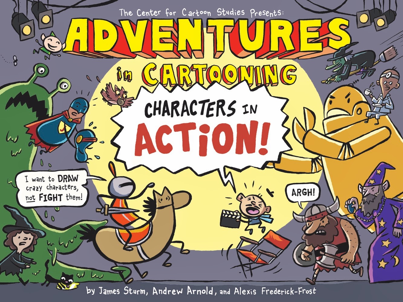
The newest book in the First Second line of Adventures in Cartooning, Characters In Action!, returns to the original's tactic of doing a full story and then explaining its techniques for imitation at the end.  CCS chief James Sturm once again teams up with grads Andrew Arnold and Alexis Frederick-Frost (who handles most of the art chores) to create a charming, funny and ultimately useful guide to character generation. The story follows the knight who's been the protagonist of each book, trying to figure out why her castle is under assault by a host of weirdos. A Hollywood director named "Otto Airs" (ouch) is casting his new movie, which leads to all sorts of shenanigans. It was quite clever of the team to compare casting a movie with creating one's own comic book characters, which made it natural to discuss "wrong" fits for roles, what a "right" fit looks like, etc. When it came time to actually discuss specifics, the reader is ready to absorb the highly useful tips on how to design simple characters that are easily reproducible from panel to panel, how to tell characters apart using only body language, how to draw different character expressions, etc. There isn't an emphasis on more advanced ideas like panel-to-panel and page-to-page transitions, just a grounding in the basic skills to encourage a fledgling cartoonist to draw a story with confidence. In that respect, it's the most useful book yet in the series.


The promotional pamphlet for CCS has traditionally been a strong comic in its own right. This year's pamphlet, drawn by Brandon Elston, is no exception. His style is a mix of underground exaggeration and alt-comics cartoonyness, drawing from the same sort of classic comics and kids comics that folks like Terry Laban, Jaime Hernandez, Peter Bagge and Robert Crumb did. His style is in the same ballpark as fellow underground enthusiasts Joseph Remnant, Ed Piskor and Noah Van Sciver. However, Elston's art is much more rubbery and clear-lined than those artists. Elston uses cross-hatching when appropriate, but his work is nowhere near as dense as those peers; instead, he prefers to use strong black and white contrasts to heighten his goofy, grotesque character work. This is a talented artist still cycling through his influences but already demonstrating he has the chops to do any kind of work he wants.

Let's take a further look at a trio of CCS cartoonists who sent me word of their on-line efforts.  First up is Jai Granofksy, who's doing a traditional webcomic called Waiting For Baby. It's just 29 pages in at the moment, but there's something wonderfully earnest and intimate in the way he's revealing both himself and his relationship with his girlfriend, Shira. The story starts with his courtship of Shira, one that spanned a number of years, and has stopped with Granofsky encounter a minefield of self-doubt and depression as he's wondering if he's a fit candidate to be a father. His character design is fleshy and cartoony, with lots of big bodies and expressive faces. He reminds me a bit of Mike Dawson, who employs a similar style of expressive realism in his comics as the reader always knows that this is a story with real emotional stakes that's given just a hint of distance with character design and expressions that occasionally get rubbery and distorted. His use of color is mostly muted and restrained, until he needs to emphasize something like a bedbug infestation. That restraint allows him to occasionally use color as a sort of exclamation mark,and it's an effective storytelling tool. Granofsky's story is one that's as much about his own painful self-exploration as it is (at this point) about the pregnancy and fatherhood, as a family dynamics experience hammered home his terror that he might pass on bad genetic traits. The framework of the pregnancy takes it out of the realm of simple autobio navel-gazing, as does his honest devotion and care for both his girlfriend and the future baby.

Second is Ian Richardson, who sent me links to three stories. All three are about prey and predators to some extent. "Prey" is the most visually direct version of this kind of horror story, as a creepy man follows a young girl (complete with balloon) down into a deserted subway stop, only to find out that prey that was too good to be true certainly was. This comic is interesting because of Richardson's interesting use of weird angles to create a disorienting effect for the reader. "Husk" has a visceral quality not unlike that of a Tom Neely comic (without the same level of polish), as this time the predator is a former companion: a black, mossy substance that has sharp, needle-like edges. That substance protected a mariner who happens upon a magical island (that looks not unlike human skin), but when it looks like the island's magic will free him of it, the substance acts violently. The least successful of the three stories is "Alpha", an overly talky comic about a dog that eventually takes revenge on an old woman who kills her husband (and the dog's master). This revelation is not made explicit, but is telegraphed way ahead of time like an old EC comic. That's the oldest story discussed here, and the subsequent stories feel like Richardson attempting to explore the same kind of idea in more subtle and visually exciting fashion. "Prey" in particular is especially promising  because it succeeds in providing the kind of visual shock that "Alpha" does not.

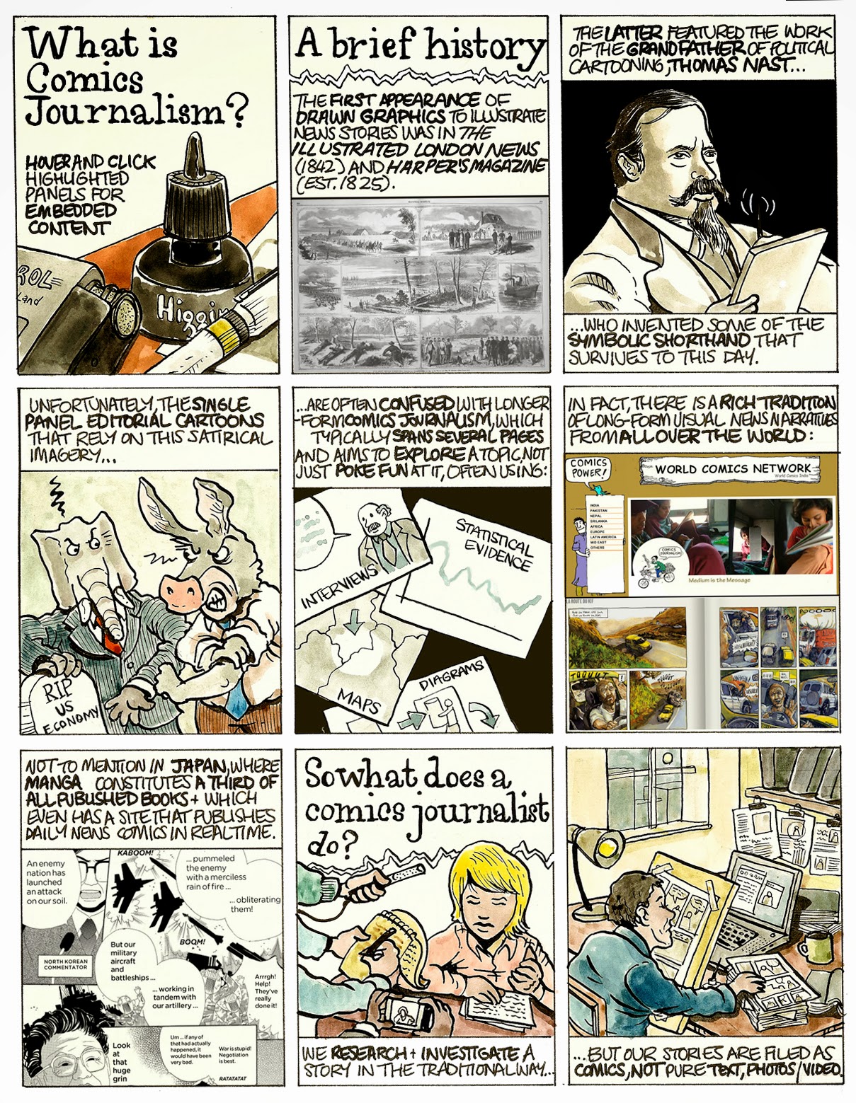
Lastly is the prolific Dan Archer, the cartoonist/journalist whose work is everywhere these days. His "Introduction to Comics Journalism" is a useful an d visually fluid overview of the discipline/art, one that gets to the heart of the "objectivity" debate in journalism. Archer makes up for his limited rendering ability by trying to think of innovative, interactive ways comics can relate a story, like in this account of the 2007 Nissor Square shootings in Iraq. Archer uses a slide show to advance the timeline on top of a map with simple icons, and the reader then clicks on "hot spots" to read a brief comic describing the action. It's an amazingly effective way to get across eyewitness accounts of a complicated and awful incident. This strip is a more standard approach, as Archer uses the effective device of using one person's anecdotal experience to bring the global slave trade into sharper relief. When Archer uses a single shade to accentuate his drawings, it gives his comics power and consistency. However, when he tries to use too much color in too small a space, like in this strip about the US banking crisis, the result is a cluttered and fussy looking page that's hard to read. That strip about the shootings in Iraq was like nothing I've never seen before; it had some small elements of animation but its design and heart was all about comics. I'd love to see a similar kind of comics/map/timeline combination for other events in the future from him, as it really takes advantage of technology without simply having bells and whistles for their own sake.

Friday, December 7, 2012

New Comics And A New Kickstarter From Dan Archer

Dan Archer is a busy man. Behind Joe Sacco, he's probably the most adventurous comics journalist in the world. He's very much into social justice, human rights,  and bringing problems related to oppression, poverty, violence and general wrongdoing by both the state and big business to light. He's currently in Nepal, trying to gather funds for an incredibly ambitious project. He's interviewing survivors of human trafficking and experimenting with the plan of disseminating materials related to avoiding becoming a victim of human trafficking (in comics form). He's also going to document this experience in real time at his website, which is a comics journalism first. The money will go to travel, translators, supplies, etc. Please consider checking out his kickstarter fund.

Archer drew and co-wrote (with Adam Bessie) a series of stories related to the ill-named concept of "education reform" in the USA, which is mostly an excuse to privatize and exploit something best left in the realm of public goods.  the first story, "The Disaster Capitalism Curriculum", contains a number of the sort of striking and provocative images that Archer's come to be known for. He and Bessie also break issues down succinctly and with impact, outlining the ways in which Milton Friedman-style naked capitalism turns schools into a test-and-drill culture where any thought of learning is snuffed out. In "Murky Waters", Bessie & Archer discuss what is the free-market fantasy: a landscape where prior economic structures can be stripped away and replaced entirely by a free-market solution. That became the case in New Orleans after Hurricane Katrina, where public school teachers were (illegally) fired and a network of charter schools were set up. Archer cleverly illustrates the debate between a local advocate and a Stanford free-market think tank member, depicting them rowing a boat in opposite directions in one panel. An interactive version of the comic includes links to a number of other sources, providing quick reference to claims made in the article. The third chapter, "The Finnish Alternative", details the ways in which a state that astutely supports the welfare of children as a public good can provide an educational system built on a model that encourages learning through doing and experience (things that lead to actual learning) rather than rote test-taking. These are well-reasoned but pointed comics that match graphic clarity with the power and complexity of its ideas. I especially like the way Archer uses color to catch the eye without it becoming garish, though lettering was a problem in some of the strips as Archer started to run out of room.

On a very different note, Archer did a comic for the National Parks Conservancy Trust about John Giles, a man who tried to escape from Alcatraz in Escape From Alcatraz: The Lone Wolf Breakout. This one plays to Archer's skills as a historian, researcher and documentarian rather than an activist or polemicist, and he's able to coolly lay out the facts while still providing a narrative that's quite tense. The story follows a jailed train robber and murderer known for being a jail-jumper who took advantage of the privileges afforded him thanks to good behavior and sheer luck to engineer an escape attempt. Working the laundry detail during World War II, Giles managed to slowly construct a uniform, ID and papers that he hoped would pass the eye test once he slipped out of his detail. Unfortunately for him, his absence was noted quite quickly and he was found out, but he was very close to freedom. Archer's art has never looked better than in this comic, as he was clearly stretching a different set of artistic muscles. In particular, there's a flair and level of detail in his facial depictions that I hadn't seen before, and he also takes full advantage of being able to use color.

Saturday, June 6, 2009

More From CCS: Dan Archer, Colleen Frakes, Jose-Luis Olivares, Jeremiah Piersol

Rob reviews some recent releases from some CCS grads and alumni. Included are WOMAN KING by Colleen Frakes, ARCHCOMIX #1 by Dan Archer, END OF EROS & POLITE FICTION #1 by Jose-Luis Olivares and THE MARVYNS: PROPER DECEPTION, by Jeremiah Piersol.

Let's look at some recent work by some graduating students and an alumnus of the Center For Cartoon Studies (CCS). The four projects reviewed couldn't be any more different from each other. Dan Archer's comic continues along the lines of the sort of polemics one might see in WORLD WAR 3 ILLUSTRATED. Jose-Luis Olivares' comics fall very much into the "mark-making" school of comics, with thick blotchy lines carrying the narrative almost exclusively. Colleen Frakes continues with her modern myth-making rooted in sex & identity, while Jeremiah Piersol pens a wild tale that owes a great deal to Gilbert Hernandez in its willingness to break boundaries as well as some of its visual flourishes.


WOMAN KING, by Colleen Frakes. Frakes' work reminds me a bit of Eleanor Davis in the way she works in myth and allegory, putting a modern spin on it. WOMAN KING is the final product of a story that's appeared in various stages in anthologies and minis, about a very young girl who is named "king" of the bears, who take up arms against their human enemies. Like Davis, there's a sensitivity in her line that borders on fragility, informing the actions and gestures of her characters. Earlier versions of the story felt overrendered, but the final output has a simplicity and delicacy to its line that put total trust in her own character designs and their ability to convey emotional information.

The delicacy of Frakes' line is usually juxtaposed against a certain savagery of subject matter. In a Frakes comic, someone is usually going to get killed or maimed, and I've always admired the rather matter-of-fact way this is delivered. Old fairy tales were rife with all sorts of mayhem (and sometimes even for instructive purposes), and Frakes recreates that feeling in her comic. The structure of this comic is one of its strengths, as we follow the girl from age 3 to 5 to 7 to 9 and so on, up to age 18. The most distinctive contrast in the book is the innocence of the girl with the ferocity of the bears, who are seeking bloody vengeance on all humans for taking their land. The book brings up questions of the difference between justice and revenge. The child is quietly miraculous, bringing down sheep from her dreams, only to look on horrified as the starving bears feast on them.


At a certain point, the bears' vengeance turns bloodier and bloodier, eclipsing the girls' ability to understand her role. For the bear leader, she's a sort of symbol or token, a way to weaken their enemies in a talismanic fashion. When the leader finally tires of war and plans to marry the girl off to a human king, he's not cognizant of the metamorphosis the girl has made: for all intents and purposes, she considers herself a bear, one of "us" and not "them". This transformation became complete after the girl met a human boy and was then inadvertently betrayed by him, completing the circuit of a cycle of violence. Frakes deliberately quotes back key dialogue and symbolic actions toward the end of the book, emphasizing the cyclical nature of revenge and how it feeds on itself, exploiting the innocent. Frakes is careful not to be heavy-handed in delivering this message, allowing the reader to tease it out (with the exception of the last image in the book, which spells it out just a bit). Frakes' work is all about how we perceive and react to the Other, set against a pleasant line that invites the reader to deeply and fully immerse themselves in the story.

ARCHCOMIX #1, by Dan Archer. With a silkscreened cover image of Richard Nixon, one could instantly tell that this was going to be an attack comic. I've always been made somewhat uneasy by comics that were both directly political and prescriptive, since it's easy for such work to fall into propaganda. Art falls by the wayside in such efforts, serving only to advance a particular rhetorical position. Such comics also tend to stop trying to tell a story and fall into lecture bullet points. I thought this was true at times in Archer's WHAT A WHOPPER, which is what made this collection of short stories such a welcome departure.

Certainly, Archer's political edge is still in full force. "Lunch On K Street" is a lecture about how lobbying is done disguised as a human interest story, and that disguise works quite nicely. "Global Meltdown" is a bit of a fantasy revenge story, but it's also a bluntly accurate comparison of Wall Street predators as deer caught in the headlights. One reason why this comic works well is that Archer varies his tone, writing glowingly positive accounts of a woman who works on a cruelty-free farm and a group of amusing gay marriage protesters. His best short strips are those where a story is laid out but the reader is given more leeway to make their own judgments. "Take Me Out To The Gun Show" is an incisive but playful bit of reportage that allows its targets to hang themselves, while "Beggars" is a memorable anecdote about how a micro-trend of beggars on a bridge (one with horrible gangrene) hints at larger problems.

The centerpiece of the issue is the first part of "The First 9/11", about the US government's direct hand in an infamous military coup in Chile in 1970. Being of Chilean descent, I was already well aware of many of the facts of this incident, yet Archer created a compelling and chilling narrative about the hows and whys of the coup. The source documents he used to spin this story were equally fascinating. What is hinted at but not fleshed out in this part of the story was the way Chile wound up as a lab for the laissez-faire economic theories of Milton Friedman, and how this eventually nearly ruined the nation.

As an artist, Archer needs to play to his strengths, which sometimes contrasts with his storytelling aims. He's not a very strong naturalistic artist, leading to some stiff figures and clumsily-designed characters. When he relaxes and allows himself to work in a slightly cartoonier style, his pages come alive. I'm not saying he needs to marry his political interests with a bigfoot style, but rather ensure that his visuals aren't working against his story. A little exaggeration and a little playfulness with his character design will relax a reader, allowing them to more fully absorb what the artist is trying to say. That's another reason his Chile strip was so effective: he quickly abandoned trying to recreate realistic renditions of Nixon and Henry Kissinger and instead created simpler caricatures that readers could easily identify and move on from. As he continues to loosen up his line, his political comics will only have a much greater impact. I hope that he continues to develop the Chile story, expand it, and redraw certain sections; it could be a potentially fascinating, explosive statement.


END OF EROS and POLITE FICTION #1, by Jose-Luis Olivares. While Olivares is certainly interested in narrative, he's also interested in the visceral qualities of each panel he's drawing. The texture of line, the visual effect of tools like zip-a-tone and the way blacks are spotted are as much on his mind as the story he's telling. This gives his stories a certain raw power and influences his subject matter. In particular, he's fascinated with the way eschatology converges into creation myth. In END OF EROS, a couple engaging in sex literally become physically merged at the same time this happens to millions of others. Taking this to its logical outcome, you have a race of huge, misshapen creates with diffuse and now-primitive wills lumbering about the world. Olivares goes crazy with his monstrous character designs, gleefully approaching this sort of Gnostic idea with a smudgy line and dialogue that devolves into primitive symbology. This is a sort of shaggy dog of a comic, as he stretches and stretches the idea out for a number of pages, but the climax is still reasonably satisfying.


POLITE FICTION starts with "Creation Myth", a story that begins with what we think is a retelling of Adam & Eve but is really about how vowels were created. It's a bit of a visual lark, cleverly designed. The more interesting stories were "Buh", a series of strips about a primitive man engaging in silent adventures and discovering things like art and magic; and "Munster", another wordless tale about a creature kept in a basement who gets out. The former is Olivares' best cartooning: cleverly designed characters, clarity in line despite its chunkiness, and funny punchlines (and sometimes not-quite-punchlines). I don't think he quite had the chops to pull off the desired effect in the latter story, as the creature emerged into a huge, ornate church and was then ordered back downstairs by the hand of god. There's enough information given to have the joke make sense, but with perhaps a lesser level of impact if we had seen something a bit more naturalistically rendered. That said, Olivares is certainly an artist who will benefit from being highly prolific. There's no question that he's imaginative and has an interesting point of view; the rest will start to coalesce as he keeps writing. He's actually only finished his first year at CCS, so we'll see what he builds up to next year.


THE MARVYNS: PROPER DECEPTION, by Jeremiah Piersol. This comic felt like a weird, alternate-world version of Gilbert Hernandez's LOVE & ROCKETS X. Set in Los Angeles, that comic was the intersection of racial tension, punk rock, the sex lives of teens, the status of being a foreigner in the US and much more. It had a huge, sprawling cast and was filled with ambiguity. THE MARVYNS takes a number of cues from Beto. First, the cast is similarly huge and quirkily memorable. Second, it concerns itself with what lies beneath the surface of polite society. Third, Piersol owes a lot to Beto's character design and rubbery line. Piersol's line is not graceful or flowing, but has a sort of fascinating ugliness to it, much like the characters in Hernandez's world. In THE MARYVNS, even the good-looking characters are ugly.

The main difference between the artists is that Piersol is less interested in contocting a balanced stew of fleshed-out characters than he is in cooking up an over-the-top social satire. This is a story in the tradition of Roger Corman: sex as a form of power relation and exploitation, freely mixed in with violence, degradation, social humiliation and every other soap opera trope in the book. When one of the main characters in the vast ensemble explains away being late to work by making up a story about her daughter trying to kill herself, one gets the sense that there are no limits here. Piersol introduces each character vignette with a fake ad that promises total transformation by way of material consumption (like a clothing ad whose tagline reads "Let's start a revolution").

Another influence here is the story (and later film) Short Cuts, one where a number of characters live out there lives and cross over briefly (and sometimes significantly) with other characters. But in THE MARVYNS, every character's story is an operatic one. So we are introduced to a man who was rejected for a loan at a bank one of the characters worked at, promising to blow himself and the bank up with dynamite strapped to his body. We meet a woman who not only has a crush on the woman from earlier in the story, we find out she's a practicing witch casting a spell to capture her heart.

It's a larger-than-life comic, and this 64-page promo version was even printed big: 9" x 12". Every vignette has a crazy twist or weird development that covers as many aspects of the seedy underside of polite society as possible. Subtle is not what Piersol's going for here, but he makes going big and loud work for him. At the moment, he doesn't quite have the chops to create as many varied character designs as he'd like; there's a certain sameness to some of the characters in the book. While his characters have great facial expressions, their body language is sometimes a bit awkward and stiff. This book really needs to flow from story to story to create that sweeping, soap opera feel, and the stiffness of some characters hinders that flow (that's especially true of the male characters in the book). One can forgive this because of the level of his ambition and cleverness, but I do wonder if the finished version of this story will be published as is or if any pages will be redrawn. Piersol is another one of those CCS grads who are utterly devoted to comics and have just finished an intense experience that has made them better cartoonists because it afforded them the time and opportunity to do nothing but draw and write. As long as he continues to refine his style and loosen up just a bit, he has the potential to do some very eye-catching and provocative stories.