Showing posts with label derik badman. Show all posts

Monday, May 22, 2017

Comics-As-Poetry #4: Derik A Badman

Derik A. Badman has been dedicated to creating comics-as-poetry in the form of juxtaposed found imagery and found text. In the past, he's used images from old romance and western comics to create new meanings, but in these issues of his MadInkBeard comic, he goes in a different direction. In #5, he used a black background for his four panel template, blowing it up across two pages to make the small details stand out as much as possible. It's a classic abstract comics technique, creating sequentiality without narrative. In this comic, it's especially interesting because the lines of each panel are slightly different in terms of weight and solidity, creating a viewing experience that is deliberately less fluid. It also sets the reader up for Badman's next move, which is introducing text and images in the panels. There are allusions to nature and explicit mention of the moon and the possibility of its double, leading Badman to explore that imagery, including a panel that makes it appear that the viewer is in the forest.

From there, Badman explores images from washed-out photos from nature and other things, random bursts of color and verbal cues related to nature that are explored through the use of color and shape. There's an especially clever sequence where the cue is "we do not forget attachment" and the third panel has no top border as some blue shapes come pouring through. The fourth panel finds order restored with a top border present, penning in a wash of contoured blue. Badman concludes the issue riffing on the phrase "the three kinds of world", with all sorts of photos teasing this out, then uses erasure techniques in exploring the phrase "the way it manifests itself in everything", striking out one or more of the words in order to create a different context. This issue really worked well, maintaining Badman's restlessness with regard to how best to create images. His use of found images will likely always be a part of his work, but seeing him at least vary the sources made his work seem much fresher than it has been for a while. Not only that, but he played around with the words themselves in a way that was interesting, playing with their simultaneous presence and absence through the use of strike-outs.

Madinkbeard #6 is a fun issue with a clever core idea: taking bits from other artists on the envelopes and other packaging sent with minicomics and creating a narrative of sorts with that, an "unwitting collaboration", as he notes on the cover. Accompanying the images is text from Allan Haverholm that's all about reaching out to others through the mail and with personal notes, putting out information that will outlive one's immediate agency. The various shapes and colors accompanying the text are wonderful, with lots of drawings from Warren Craghead and Simon Moreton in particular. That's a great duo, given the fact that they love doodling in general, but also because of how they are able to break down images to just a few squiggles and lines. Adding the plastic quality of envelopes, tape, post-it notes, etc. gives the comic a lovely texture. Badman sequences things in such a way that images of a kind often appear together, like a series of faces drawn by different artists all seeming to stare off at different boats appearing on the horizon on the right side of the page. The end result is a comic with a sense of warmth that's unusual for Badman's output, in part because it was easy for Badman to pick up on this feeling from the actual materials that he received.

Friday, August 31, 2012

Comics-as-Poetry and Stylized Comics: Badman, Adams, Shrestha


MadInkBeard #1 & #2, by Derik Badman. Badman is an artist who specializes in repurposing previously existing text and images for poetic effect. This is his new (mostly) one-man anthology comic that's a catch-all for his shorter projects. The first issue uses text from Henry David Thoreau's Walden journals juxtaposed against Badman's recreations of comics by a variety of cartoonists, including Charles Schulz, Mike Sekowsky and a variety of other romance comics artists. He did this as part of the "30 Days of Comics" challenge that Allan Haverholm participated in (which I reviewed on 8/20/2012), and the results are understandably mixed given that restriction. His strip on 11/3/2011 was a great one, with the text reading "They will occur with/some essential difference/though at the risk/of endless iteration" and each of the four panels depicting the very outside edge of a house. The last two panels originally come from Schulz, and this is an example of one of Badman's comics working because of the way he was able to match text to image while creating a sort of poetic narrative with the actual images themselves. Things pick up again when he switches to using romance comics art that totally repurposes Thoreau's original text. Badman creates something lively and spirited with his use of spot color, adding hues in an almost abstract manner to create atmosphere and contrast. From there, he switches to near-abstract uses of color, grounded only by the text which suggests fires, breezes and at times extreme close-ups. Badman also includes a page each from Haverholm, Warren Craghead and Simon Moreton, all of whom did their own variations on the challenge. Craghead's drawings on leaves were fascinating, while Moreton's use of smudging and water effects reminded me of some older Craghead comics.

The second issue is all photocomics (what we tend to call "fumetti" in the US even though this term is not quite accurate), including a long essay on the history of the technique and its general lack of favor in the US. Badman tries a variety of approaches here: anchoring the photos with poetic text that tells a vague story, wordless pages that coalesce around types of images, and a visual photo narrative of sorts that dips into abstraction. Of the three approaches, I thought the first was the least interesting. There's a rigidity about the photographic image that for me resists poetic text; it's almost intrusive to see words with these images. I thought his attempts of the second sort were interesting, matching angles, shapes, colors and textures in each photo to form photo patterns. I thought the visual photo narrative was the most interesting, as the reader is led along a leafy path, up a set of stairs and into a dark forest. Here, the concrete and "real" qualities of the photos work in their favor, as the reader is led somewhere that seems to actually exist, until they are confronted with alternating images of pure light and darkness. I wouldn't mind seeing more experiments of this sort from Badman, who certainly opened my eyes to the possibilities of the photo comic, even if it seems clear that he's struggling to discover them himself. As always, Badman's comics fascinate and raise questions about the formal nature of the art.

Period, by Christopher Adams.  Adams is an up-and-comer whose first book is about to debut at SPX, published by the folks over at 2D Cloud. His work is all about stillness, quiet, and everyday experience as a kind of marvel. This comic follows a family as they go about their day, pelting the reader initially with a 4 x 8 panel grid that emphasizes the ways in which our morning routines blend into each other. Adams jumps back and forth in time as memories take over the narrative for extended periods of time and fantasies (like flying on a hammerhead shark) intrude on work rituals. Adams explores the family unit as one that is stultifying in its boredom because of the repetitive nature of its interactions but at the same valuable for that very reason. There's an extended sequence where a father players his young daughter in Wii tennis while her mother looks on that's remarkably true to life in how toddlers interact with their parents. From there, we see vacations, garbage day and other either memorable moments or quotidian rituals burned into memory, before consciousness recedes and we see mountains, just as the comic opened with a seahorse floating around and smoking a cigarette. This comic works because of Adams' chunky line and attention to detail; the reader is drawn to every panel as an event worth watching, even as Adams draws the reader's eye across the page quickly. Adams' work looks even better in color, and I'm hoping that his new book will fall into that category.

Genus #1 & #2, by Anuj Shrestha. This mini reminds me a lot of Adrian Tomine's work, if Tomine wrote conspiracy/mystery/sci-fi stories wherein a significant number of people had had their heads replaced by grotesque, bulbous plant-like organisms. Shrestha's line weight, character design and overall restraint as a storyteller all seem to be in Tomine's balpark, but the Lovecraftian body horror that runs throughout the series is heightened precisely because of that distance and restraint. The first issue is entirely silent, as a man wakes up from a nightmare where a spore organism is vomited out of his mouth to go to a job interview. From there, he begins to notice that a number of people have had their heads replaced, only to be confronted with the dead corpse of a "plant man", as he's discovered with the body a la an Alfred Hitchcock scene out of North By Northwest. At the end of the first issue, he discovers that his nightmare is coming true, as he feels protuberances on the back of his neck. The second issue is driven by narrative captions and a chase scene that feels a bit like The Matrix, as the hero is guided by a mysterious caller on his cell phone on how to escape his pursuers, down to drinking special hot sauce that cures him of the condition, or rather, allows him to control his transformation. I love the way that Shrestha plays around with familiar genre tropes while not alighting upon a particular genre; instead, he keeps the reader as off-balance and bewildered as the protagonist, who must wonder not only what he's up against, but who's helping him and why. This is a wonderfully clever and smartly designed comic that looks like it's headed in some interesting directions.

Coin-Op #4, by Peter & Maria Hoey.The brother and sister combo return with another comic's worth of the surreal and the mundane with a crisp, beautiful line and rich sense of color. It's no surprise that one of their strips was printed in an issue of Blab!, given that that publication is well-known as the intersection between the art world and the comics world. Once again, the stories are a mix of modern and postmodern, with an art deco feel representing the former and a fractured storytelling sensibility representing the latter. The highlights of this issue include "An Occurrence at Pont Neuf Bridge", a story that playfully riffs on the Hoey's own cinematic tendencies by providing three layers of storytelling. First, there's the wide-angle shot of a director screaming at a runaway actor to get back. Second is the highly cinematic series of small panels in the middle of the page which emphasize both motion and the actor's own dreamy, dazed narration. Finally, there's a series of single-page panels emphasizing particular story elements from classic films, abstracting a motion picture down to a few static elements. It's a funny story both about the obsessiveness of directors and the feeling of detachment the actor feels from reality--fueled in part by being in a movie.

Going back to the art deco/Max Fleischer feel are "Valse Mecanique" and the latest installment from "Saltz and Pepz". The former reminds me a bit of Metropolis, given the robot society and how it works within an oppressive government, although this strip is more about creativity in such environs. The latter story's anthropomorphic dogs once again get in trouble with the law, this time over a Thelonius Monk record. Naturally, this leads them to travel back in time to meet Monk himself and steal a wallet from an associate of the jazz musician's. It also wouldn't be an issue of Coin-Op if there wasn't at least one story with fractured storytelling,as "The Slippery Lobster" sees the Hoey's use a 4 x 3 panel grid both as a single image and as a series of panels telling a propulsive story. This story is about motion coming in a number of different directions: left to right, right to left, upper left to lower right, upper right to lower left. That motion is given real stakes when boats threaten to run into each other and a lobster fisherman eventually loses his catch. It's a tremendously clever, witty comic that uses formal innovations to tell a very simple story, incorporating both movement and simultaneity into a page that makes it static and dynamic at the same time, depending on how the reader approaches it. This is a fine showcase for two illustrators who are also top-notch cartoonists.

Thursday, April 12, 2012

Comics-As-Poetry: Badman, Moreton, Zervakis

Let's look at some recent minicomics examples of comics-as-poetry:
No Way Constant and Untitled (Sternwood), by Derik A. Badman. Badman is a critic whose comics play around with appropriating and repurposing the texts and images of others to create new and frequently elliptical meanings. Untitled is one of his most successful comics to date. The front half of the comic consists of images appropriated from stills taken from a variety of film noir examples, including The Big Sleep. We see close-ups of doors, telephones, revolvers, cameras, statues with hidden compartments, shower stalls with bullet holes, and finally a wisp of cigarette smoke in the dark. Badman is ingenious in the way he strings together unrelated images and completely eschews depicting any people to create a more accessible narrative, yet the atmosphere he creates and the images he chooses make it easy to roughly understand what's happening. The key here is his choice of a midnight-blue wash in every panel, truly creating the "noir" atmosphere found in those sort of movies. The back half of the comic has a dark yellow wash and similarly depicts a place and a set of objects. The difference is that it's modern-day and that the things he depicts are stripped of the cultural meaning imbued in film noir: it's just a normal person going about their day. Yet, many of the objects he portrays could easily have a sinister bent depending on coloring choices and the juxtaposition of images. This comic is a witty depiction of how we read, comprehend and contextualize images.


No Way Constant is just as intriguing in its own way, working as a mash-up between Robinson Crusoe and 1940s/1950s romance comics and jungle girl comics. The way he juxtaposes Crusoe author Daniel DeFoe's prose regarding desire and danger with both the sort of action one would see in a jungle comic and the yearning found in a romance comic is especially clever. The one problem with this attempt is that Badman's attempts at copying masters of motion like Jesse Marsh comes out looking stiff. The sheer lushness of image that made those comics interesting is absent here, and as a reader I found myself being taken out of the page by the crudeness of some of the drawings--especially the figure work. It was an interesting experiment, but it's nowhere near as fluidly successful as Untitled.


Strange Growths #15, by Jenny Zervakis. For a variety of reasons, this 90s and early 2000s minicomics mainstay has had a reduced work output over the past few years. Like her friend and peer John Porcellino, she does autobio comics with a heavily poetic bent, focusing on the meaning to be found in small but significant moments. Her line is scribbly and warm, echoing the way her text invites the reader into her life without necessarily giving them much context. It's a portrait of a life lived, moment by moment, told in a series of short anecdotes. "Iceberg", for example, talks about an iceberg screensaver on her computer that comes to represent the feeling of stasis she herself was experiencing--especially with regard to being creative. This issue marks the melting of that iceberg, as she herself put forth the question. Much of this issue focuses on family, like the sort of things her daughter says or connections back to her relatives in Greece. Zervakis seeing the world through the eyes of her daughter is especially fascinating, as she treats her observations seriously but without overt sentimentality. Zervakis also has an ear for what others say that's reminiscent of Harvey Pekar, like a conversation she overheard on a bus between two people who were putting down someone else. There's a lyricism present in her work that gives each story a satisfying quality on its own, but the accretion of her short stories in this issue adds up to a gestalt that's warm, sincere and honest.


Smoo Comics #4 and The Escapoligist, by Simon Moreton. Moreton continues to refine his voice as a poet and cartoonist. Smoo #4 is an especially lovely meditation on the town he grew up in as a teen-ager called Marlow, which is essentially a suburb of London. Working with a spare, scribbly and occasionally smudged pencil line, Moreton evokes memories through geometric figures, lines and shadows. The way in which he leaves so much open space on each page allows the reader to fill in the gaps while still maintaining the essential sketchiness of both image and memory. Moreton takes the reader on a recapitulation of his perceptual journey of Moreton, going from the awe of childhood to the contempt of his teenage years to the ways in which he and his friends tried to create meaning. The revelations Moreton provides about his sense of growing old externally but not feeling it internally are not especially innovative, but that does not diminish the impact of the revelation as he feels it, nor the beautiful way that he expresses it on the page. I loved the added touch of Moreton attaching an envelope that has a postcard and a hand-drawn map of Marlow.

If Smoo is Moreton's take on John Porcellino, then The Escapologist is his attempt at Warren Craghead's style of comics-as-poetry. Here, Moreton cleverly juxtaposes the solidness of place (brick walls, bushes, lawns of carefully cut grass) with his geometrically spectral figures. Like in Smoo, this is a comic about being from a particular place and knowing particular people, and how the sum total of our personality is constructed in part by our relationships with others. It's a short and sweet depiction of a feeling and a sense of loss, of being connected and feeling apart.

Saturday, August 20, 2011

Comics-As-Poetry: Badman, Moulger Digest, G. Thomas, Moreton

More cartoonists are engaging in the creation of comics-as-poetry. That's both in terms of trying to come up with formal constraints that act like rules such as meter and rhyme scheme in standard poetry, as well as giving the reader images that they must parse and attempt to understand on their own. Here are a few recent examples.


The Escapologist #1, by Simon Moreton. This is Moreton's most explicit dip into comics-as-poetry, dipping into the playbooks of Warren Craghead and Kevin Huizenga here. This 10-page mini follows the author dissolving into a ghost-like figured trailed by lines, squiggles, symbols and geometric figures (the kind of lines you might see in a Craghead story/poem) and concentrates on the phenomenology of everyday observation. As we see the ghost/spirit drift out over the city and then the sea, Moreton ties the carefully-rendered naturalistic drawings with brief lines of text, noting "These dunes/this sea/this paper, this ink/these lines/we hold it all together/just being". The idea that our own observations of the world create that world in much the same way that the artist creates the images on the page is an interesting one. More to the point, the close observation of the environment qua environment (as opposed to our everyday use of the environment) is posited as a valuable end in and of itself, whose smallest details might yield interesting connections. Moreton's line is especially sharp in this comic, featuring enough detail to give the reader the flavor of each observed setting without drowning it in too many lines.


Dodo Comics #1, by Grant Thomas. This is a highly structured series of strips that each feature a different set of formal constraints. The intent is to create a visual rhyme scheme and meter for comics in some, and to emphasize certain aspects of the comics reading experience in others. For example, "Where Do Ideas Come From?" uses a scheme called "reducto", which alternates between a medium shot and a close-up of either one or many figures, closing with a shot with no entities in the final panel on the page. It's an interesting idea, although the resulting comic here is mostly fluff and not especially interesting to look at. More successful is "Visions of Gehanna", a reinterpretation of a Bob Dylan song as a vision of hell. Here, Thomas employs smudges to interesting effect, duplicating the original song's suffocating quality through visuals. "The Duel" and "Chase" were also interesting, as Thomas took panels from other comics and removed every thing from them except speed lines, rain lines and indicators of light. Given just the title of each, it's quite easy to contextualize it in terms of the stated subject.


Untitled by Rusty Jordan & Andrew Smith. This is a flip-book, where each artist does half of the mini. Jordan's half features figures heavily influenced by underground figures like Robert Crumb but also appropriates the rubber-faced and lipped aspects of how black characters were once drawn in comic strips. The character in this story is not written so as to be explicitly African-American, and that distinction adds a bit of key dissonance to the proceedings, because there's a disconnect between image and story. Smith is one of the few cartoonists who focuses on scatology whose work I actually like, because he goes beyond simply doing a shit joke and creates something a bit more transgressive. Smith is an ace draftsman but goes deliberately simple and crude for this story involving a woman jogging who is accosted by a would-be rapist. She oddly bends over for him, only to violently defecate in his face. Given the way that Smith keeps the dialogue deliberately light and banal, this image becomes all the more powerful and hilarious. It's a gag-inducing gag and an effective one at that.

Moulger Bag Digest #3, by Brent Harada & Rusty Jordan. This is an almost wordless, densely drawn comics that features a series of very loose narratives. The emphasis here is on the reader's reaction to individual images and then reprocessing them as a gestalt on the page. One of the key recurring motifs is the way images break down: fracturing, going into fractals, melting, warping, etc. Harada & Jordan employ a number of familiar techniques here, including collage, psychedelic art (in terms of both op-art effects as well as Skip Williamson-style figures), comics-as-poetry "rhyming" (like when a plant and then a chair act as stand-ins for a lonely man and his life) and sheer, grotesque figure-work. I found this to be the most refined and approachable of their comics, which probably has something to do with their approach as well as something to do with the way my approach to comics like this has changed.


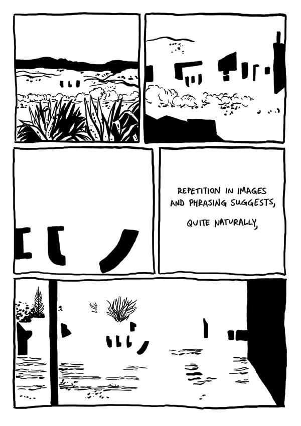
Badman's Cave, by Derik Badman. This was the most interesting instance of comics-as-poetry in the group, given its ambition and complexity. Badman reinterpreted the art from a Jesse Marsh-drawn issue of Gene Autry Comics and placed in text from random internet searches. Like Thomas, he removed the original figures from his drawings. Badman goes a step further by mixing the Western backgrounds of mountains, deserts, forests and traditional town with abstractions. Clouds and dust drift by almost sentiently, while buildings turn into geometric figures as Badman makes extensive use of blacks to get the eye to roll across the page. Badman's selection of prose is also quite interesting, as he comments on the repetition and "rhyming" of images by noting that "the world speaks, but mysteriously, incompletely closely associated with a metaphor within." As the comic flips between abstract and concrete, Badman is suggesting a greater sense of connection between the two worlds, an essentially mysterious connection "grasped in repetition, images and phrasing suggests a glimpse of the dark portraying the gods". Meditating on and considering the images can provide, in flashes, that deeper sense of connection between the conceptual and the real, the perceived and the actual, between time and place. The mini would have benefited from better paper and darker, richer blacks to make that black/white contrast really pop on the page. I think it would also have made his individual images a bit more distinctive. Still, this is Badman's most fascinating and successful comics experiment to date.