Showing posts with label andrew smith. Show all posts
Friday, July 12, 2013
Minicomics: Taylor, Jordan/Smith, Cass, Keeper Steinke
Tabe #11, by Rio Aubry Taylor. Labeled "an abstract comic about community", Taylor's latest is a fascinating series of drawings that packs a surprising emotional punch. There are varying types of abstract shapes: squiggles, straight line patterns, hair-like tangles of lines, blotches, grey shapes that look like torn pieces of paper glued to the page, and things that operate as captions that contain "text" that looks like an alien language. There are moments where the page explodes like a supernova against a night sky, and then it fades back into what looks like a drawing of the circulatory system. There are pages where the drawings seem to be in harmony and others where the drawings look to be in opposition. What makes the comic work so well is Taylor's sense of rhythm and balance on the page, creating a sense of independent intelligence in each drawing while never creating anything that's directly figurative.
History In Ruins #1-2, by Rusty Jordan and Andrew Smith.Both of these comics are just twelve pages long, but they pack a truly bizarre punch in each installment.The main character, Duane Fields, is the sort of greasy loser that is not unfamiliar to alt-comics fans, a Clowesian character who works part time at a drug store and shoplifts on the way out. I'm not sure what the division of labor is here in terms of story and art, but the figure work has a sweaty, rubbery quality to it. There's an almost clownish, Skip Williamson quality to these odd-looking characters that makes this feel like it could have been published forty years ago in an issue of Arcade. That's especially true because the second issue takes us away from the more alt-comics narrative of the deluded loser and brings us to far weirder territory. Living in the basement of his mother's house with a near-sentient mouse and assorted "experiments", he spies upon his mother (wearing inappropriately sexy clothes around her son, though she still treats him like he's a toddler) being threatened by a gang of thugs. When she is later kidnapped, the story is transformed into a wacky revenge narrative. I have no idea where things are headed next (I get the sense that much of this comic is improvised), but each page is a visual treat and full of surprises.
Mr Wolf #2, by Aron Nels Steinke. In Steinke's autobio series, Big Plans, his Mr Wolf character is usually an expression of his range. It's interesting that he's chosen to rework it as an uncertain authority figure to reflect his status as a first and second grade teacher, transforming all of the characters into anthropomorphic animals. These fictionalized strips obviously draw heavily from his real life experiences and encounters, and I'd imagine that many of the characters are composites rather than outright fictions. These strips are the best comics of Steinke's career in my opinion, because it balances his need to constantly scrutinize and microanalyze his decision-making and emotions with actually having to deal with the emotions and minds of dozens of children. His observations about the kids are warm and knowing without descending into saccharine sweetness or sentimentality. Indeed, there's something raw and real about his observations and how in many ways he's more like one of them than he is like many of the adults, even if he is an authority figure whom many of the children respect and admire. It also helps that this strip is very funny, with Steinke no doubt curating the funniest things he's experienced or heard other teachers relate to him. His drawing is simple, cute and powerfully expressive, getting across the emotions and mental states of the kids with greater facility than if he had used a more realistic approach. Comics about teaching are still fairly rare, and I hope Steinke continues to develop his observations and witty, humane approach to discussing the children under his tutelage.
The Drowning Ring and Uh Oh Dojo, by Mike Keeper. I couldn't find any website info for these idiosyncratic zine/comics fusions. The Drowning Ring is a small booklet that is absolutely jam-packed with trivia, comics, ephemera and a narrative about being a lifeguard in a particular beach community. There's something remarkably knowing about the gags, the language and the weirdness of being part of lifeguard culture that Keeper brings to life. His actual comics have a surprising level of careful detail when he chooses to illustrate something in a naturalistic style, but he mostly prefers quicker, cruder renderings and iconic drawings. I have no idea how many of the details he throws at the reader are actually true, and I prefer to keep it that way. It's like reading a Leon Beyond comic, where one knows that Leon is mostly feeding you lies, but they are so enjoyable that one wants more and more. The whole thing is a very appealing mess, as the layout is frequently sloppy and slapped together, but it's an obvious labor of love. Uh Oh Dojo is a short and magazine-sized comic that's just eight pages long, but packed with comics and repurposed photos. It's about Keeper hearing about the death of his former karate sensei (teacher) and the likelihood that he had killed himself. It spurs Keeper to think about suicide in general, while circling back to the history of karate, to his own life and the things he learned in karate. It's a comic with no pat answers or lessons, just many questions solemnly asked in an unusual package. It's Keeper's attention to fine details while making sure to get across the essential emotions of a situation that make these comics worth reading.
The Index #4, by Caitlin Cass. Cass's deeply introspective series about insignificance, meaning and knowledge has now taken a firm turn into the realm of fantasy. After raising the specter of indexer Paul Otlet and zipping everyone to a fairly intact library of Alexandria, Diogenes wanders into the proceedings of this issue. He's the antithesis of Otlet, who spends his time with words and writings; Diogenes viewed anything less than a total lifestyle commitment to one's ideas as a kind of inauthentic living. As the cast of this comic has expanded, Cass has juggled a new character into every issue to likewise expand the nature of the ideas at work. One of the leads, Susan, kept blank cards because their potentiality and nothingness comforted her equally, balancing her own sense of nothingness. When the other lead, John, started writing ideas on them willy-nilly it was as a way of rejecting his former career as a graduate student trying to get words to do his bidding. Otlet's index of ideas was the impossible task of trying to categorize all universal knowledge using a finite and clumsy set-up. Cass is careful to keep the non-apparitions in the story close to their somatic roots, giving them hunger and restlessness as they drift away from the performative spaces of the ghosts. This was a fascinating issue that betrays no particular allegiance to any of these points of view, which is what makes it so interesting. Her drawings are functional if unremarkable, sloppily but accurately getting across her points of view quickly and directly.
Saturday, August 20, 2011
Comics-As-Poetry: Badman, Moulger Digest, G. Thomas, Moreton
More cartoonists are engaging in the creation of comics-as-poetry. That's both in terms of trying to come up with formal constraints that act like rules such as meter and rhyme scheme in standard poetry, as well as giving the reader images that they must parse and attempt to understand on their own. Here are a few recent examples.
The Escapologist #1, by Simon Moreton. This is Moreton's most explicit dip into comics-as-poetry, dipping into the playbooks of Warren Craghead and Kevin Huizenga here. This 10-page mini follows the author dissolving into a ghost-like figured trailed by lines, squiggles, symbols and geometric figures (the kind of lines you might see in a Craghead story/poem) and concentrates on the phenomenology of everyday observation. As we see the ghost/spirit drift out over the city and then the sea, Moreton ties the carefully-rendered naturalistic drawings with brief lines of text, noting "These dunes/this sea/this paper, this ink/these lines/we hold it all together/just being". The idea that our own observations of the world create that world in much the same way that the artist creates the images on the page is an interesting one. More to the point, the close observation of the environment qua environment (as opposed to our everyday use of the environment) is posited as a valuable end in and of itself, whose smallest details might yield interesting connections. Moreton's line is especially sharp in this comic, featuring enough detail to give the reader the flavor of each observed setting without drowning it in too many lines.
Dodo Comics #1, by Grant Thomas. This is a highly structured series of strips that each feature a different set of formal constraints. The intent is to create a visual rhyme scheme and meter for comics in some, and to emphasize certain aspects of the comics reading experience in others. For example, "Where Do Ideas Come From?" uses a scheme called "reducto", which alternates between a medium shot and a close-up of either one or many figures, closing with a shot with no entities in the final panel on the page. It's an interesting idea, although the resulting comic here is mostly fluff and not especially interesting to look at. More successful is "Visions of Gehanna", a reinterpretation of a Bob Dylan song as a vision of hell. Here, Thomas employs smudges to interesting effect, duplicating the original song's suffocating quality through visuals. "The Duel" and "Chase" were also interesting, as Thomas took panels from other comics and removed every thing from them except speed lines, rain lines and indicators of light. Given just the title of each, it's quite easy to contextualize it in terms of the stated subject.
Untitled by Rusty Jordan & Andrew Smith. This is a flip-book, where each artist does half of the mini. Jordan's half features figures heavily influenced by underground figures like Robert Crumb but also appropriates the rubber-faced and lipped aspects of how black characters were once drawn in comic strips. The character in this story is not written so as to be explicitly African-American, and that distinction adds a bit of key dissonance to the proceedings, because there's a disconnect between image and story. Smith is one of the few cartoonists who focuses on scatology whose work I actually like, because he goes beyond simply doing a shit joke and creates something a bit more transgressive. Smith is an ace draftsman but goes deliberately simple and crude for this story involving a woman jogging who is accosted by a would-be rapist. She oddly bends over for him, only to violently defecate in his face. Given the way that Smith keeps the dialogue deliberately light and banal, this image becomes all the more powerful and hilarious. It's a gag-inducing gag and an effective one at that.
Moulger Bag Digest #3, by Brent Harada & Rusty Jordan. This is an almost wordless, densely drawn comics that features a series of very loose narratives. The emphasis here is on the reader's reaction to individual images and then reprocessing them as a gestalt on the page. One of the key recurring motifs is the way images break down: fracturing, going into fractals, melting, warping, etc. Harada & Jordan employ a number of familiar techniques here, including collage, psychedelic art (in terms of both op-art effects as well as Skip Williamson-style figures), comics-as-poetry "rhyming" (like when a plant and then a chair act as stand-ins for a lonely man and his life) and sheer, grotesque figure-work. I found this to be the most refined and approachable of their comics, which probably has something to do with their approach as well as something to do with the way my approach to comics like this has changed.
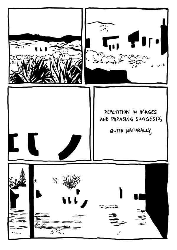
Badman's Cave, by Derik Badman. This was the most interesting instance of comics-as-poetry in the group, given its ambition and complexity. Badman reinterpreted the art from a Jesse Marsh-drawn issue of Gene Autry Comics and placed in text from random internet searches. Like Thomas, he removed the original figures from his drawings. Badman goes a step further by mixing the Western backgrounds of mountains, deserts, forests and traditional town with abstractions. Clouds and dust drift by almost sentiently, while buildings turn into geometric figures as Badman makes extensive use of blacks to get the eye to roll across the page. Badman's selection of prose is also quite interesting, as he comments on the repetition and "rhyming" of images by noting that "the world speaks, but mysteriously, incompletely closely associated with a metaphor within." As the comic flips between abstract and concrete, Badman is suggesting a greater sense of connection between the two worlds, an essentially mysterious connection "grasped in repetition, images and phrasing suggests a glimpse of the dark portraying the gods". Meditating on and considering the images can provide, in flashes, that deeper sense of connection between the conceptual and the real, the perceived and the actual, between time and place. The mini would have benefited from better paper and darker, richer blacks to make that black/white contrast really pop on the page. I think it would also have made his individual images a bit more distinctive. Still, this is Badman's most fascinating and successful comics experiment to date.
The Escapologist #1, by Simon Moreton. This is Moreton's most explicit dip into comics-as-poetry, dipping into the playbooks of Warren Craghead and Kevin Huizenga here. This 10-page mini follows the author dissolving into a ghost-like figured trailed by lines, squiggles, symbols and geometric figures (the kind of lines you might see in a Craghead story/poem) and concentrates on the phenomenology of everyday observation. As we see the ghost/spirit drift out over the city and then the sea, Moreton ties the carefully-rendered naturalistic drawings with brief lines of text, noting "These dunes/this sea/this paper, this ink/these lines/we hold it all together/just being". The idea that our own observations of the world create that world in much the same way that the artist creates the images on the page is an interesting one. More to the point, the close observation of the environment qua environment (as opposed to our everyday use of the environment) is posited as a valuable end in and of itself, whose smallest details might yield interesting connections. Moreton's line is especially sharp in this comic, featuring enough detail to give the reader the flavor of each observed setting without drowning it in too many lines.
Dodo Comics #1, by Grant Thomas. This is a highly structured series of strips that each feature a different set of formal constraints. The intent is to create a visual rhyme scheme and meter for comics in some, and to emphasize certain aspects of the comics reading experience in others. For example, "Where Do Ideas Come From?" uses a scheme called "reducto", which alternates between a medium shot and a close-up of either one or many figures, closing with a shot with no entities in the final panel on the page. It's an interesting idea, although the resulting comic here is mostly fluff and not especially interesting to look at. More successful is "Visions of Gehanna", a reinterpretation of a Bob Dylan song as a vision of hell. Here, Thomas employs smudges to interesting effect, duplicating the original song's suffocating quality through visuals. "The Duel" and "Chase" were also interesting, as Thomas took panels from other comics and removed every thing from them except speed lines, rain lines and indicators of light. Given just the title of each, it's quite easy to contextualize it in terms of the stated subject.
Untitled by Rusty Jordan & Andrew Smith. This is a flip-book, where each artist does half of the mini. Jordan's half features figures heavily influenced by underground figures like Robert Crumb but also appropriates the rubber-faced and lipped aspects of how black characters were once drawn in comic strips. The character in this story is not written so as to be explicitly African-American, and that distinction adds a bit of key dissonance to the proceedings, because there's a disconnect between image and story. Smith is one of the few cartoonists who focuses on scatology whose work I actually like, because he goes beyond simply doing a shit joke and creates something a bit more transgressive. Smith is an ace draftsman but goes deliberately simple and crude for this story involving a woman jogging who is accosted by a would-be rapist. She oddly bends over for him, only to violently defecate in his face. Given the way that Smith keeps the dialogue deliberately light and banal, this image becomes all the more powerful and hilarious. It's a gag-inducing gag and an effective one at that.
Moulger Bag Digest #3, by Brent Harada & Rusty Jordan. This is an almost wordless, densely drawn comics that features a series of very loose narratives. The emphasis here is on the reader's reaction to individual images and then reprocessing them as a gestalt on the page. One of the key recurring motifs is the way images break down: fracturing, going into fractals, melting, warping, etc. Harada & Jordan employ a number of familiar techniques here, including collage, psychedelic art (in terms of both op-art effects as well as Skip Williamson-style figures), comics-as-poetry "rhyming" (like when a plant and then a chair act as stand-ins for a lonely man and his life) and sheer, grotesque figure-work. I found this to be the most refined and approachable of their comics, which probably has something to do with their approach as well as something to do with the way my approach to comics like this has changed.
Badman's Cave, by Derik Badman. This was the most interesting instance of comics-as-poetry in the group, given its ambition and complexity. Badman reinterpreted the art from a Jesse Marsh-drawn issue of Gene Autry Comics and placed in text from random internet searches. Like Thomas, he removed the original figures from his drawings. Badman goes a step further by mixing the Western backgrounds of mountains, deserts, forests and traditional town with abstractions. Clouds and dust drift by almost sentiently, while buildings turn into geometric figures as Badman makes extensive use of blacks to get the eye to roll across the page. Badman's selection of prose is also quite interesting, as he comments on the repetition and "rhyming" of images by noting that "the world speaks, but mysteriously, incompletely closely associated with a metaphor within." As the comic flips between abstract and concrete, Badman is suggesting a greater sense of connection between the two worlds, an essentially mysterious connection "grasped in repetition, images and phrasing suggests a glimpse of the dark portraying the gods". Meditating on and considering the images can provide, in flashes, that deeper sense of connection between the conceptual and the real, the perceived and the actual, between time and place. The mini would have benefited from better paper and darker, richer blacks to make that black/white contrast really pop on the page. I think it would also have made his individual images a bit more distinctive. Still, this is Badman's most fascinating and successful comics experiment to date.
Wednesday, September 2, 2009
Mainstream/Underground: Neptune and Sausage Hand
Rob reviews NEPTUNE, by Aron Nels Steinke (Sparkplug Comic Books and Tugboat Press) and SAUSAGE HAND, by Andrew Smith (Sparkplug Comic Books and Teenage Dinosaur).

It's been interesting to see Sparkplug team up with other like-minded publishers for some recent releases. I noted in my last post that the Portland publishers have sort of formed a continuum in terms of tastes and the artists who publish with each. Tim Goodyear's Teenage Dinosaur is the most punk/underground/DIY of the three, both in terms of politics and imagery from the id. Greg Means' Tugboat Press has the cleanest and most "mainstream" comics, concentrating on clear narratives and imagery. Sparkplug is the most innovative of the three publishers and is somewhere inbetween the other two--sympathetic to both storytelling poles but beholden to neither. Dylan Williams publishes as material as experimental as Austin English, Juliacks, Dunka Jankovic, John Hankiewicz, and Olga Volozova, but also publishes wacky work from Jason Shiga & Philip Barrett and more straightforward work from Elijah Brubaker and Trevor Alixopolous. Williams has a nearly unerring eye in identifying new and emerging talent, and his catholic tastes have been a significant factor as to why.

I'm not sure what precipitated co-publishing SAUSAGE HAND and NEPTUNE, though I might guess that it was an effort to pool resources to offset publishing costs. Considering that the three publishers have twice collaborated on their free comic book day releases, I wouldn't be surprised to see this model continue. These two books couldn't be any more different: Aron Nels Steinke's NEPTUNE is an all-ages book, while Andrew Smith's SAUSAGE HAND is a grotesque bit of body horror and exploration of insanity. The covers of each book prepare the reader perfectly for what lies within: NEPTUNE uses a perfectly-manicured but clear line in arranging its principal characters, while SAUSAGE HAND has a stark, black cover--as though something dreadful and pornographic lies under its covers.

Steinke's work here is reminiscent of James Kochalka, Jordan Crane, John Porcellino and Jef Czekaj. He uses a deceptively clear and simple line (like Porcellino) but crams his pages full of decorative detail--especially wider shots. Visually, this is a charming book, even if it does feel derivative of Crane's THE CLOUDS ABOVE. In terms of the story, NEPTUNE has the cloying, self-satisfied nature of a Kochalka comic. I found myself being consistently annoyed by the brother and sister protagonists of the story: the brother was whiny and the sister overbearing. The title dog's story seemed a bit undercooked; I would have preferred a bit more in the magical realism department than what Steinke gave us. Indeed, on the back cover, Steinke promised the reader "amazing things, fantastic things, confusing and contradicting things". The only event that fell into any of those categories was a big flood that magically went away. The story instead focused on the bossy girl's narrative, which was a lot less interesting than a potentially magic dog.

The sense I got was that the reader was supposed to identify and root for the two lead kids, but their weird sense of entitlement (especially with regard to school, where almost everyone was trying to be as nice as possible to them) was actively repulsive. Having read a lot of comics for kids in the past few years, NEPTUNE is as good as any of them in terms of design and visual appeal. I'm just not entirely sure exactly what sort of child it was intended for. This is unfortunate, given Steinke's obvious gifts as a storyteller. I've greatly preferred the autobiographical stories I've seen from Steinke in places like PAPERCUTTER, and I think the tone he strikes in those stories didn't quite translate in NEPTUNE.

SAUSAGE HAND has a hallucinatory quality that grabs the reader from the first page and never relents. There's a bit of Crumb, a bit of Tony Millionaire, and some seeming inspiration from Heinz Edelman. That said, Smith's stark, nightmarish comics also owe more of a psychological debt to Ivan Brunetti's SCHIZO. This is a story about one man's literal battle with his own psyche, delving into mystery and noir along the way. It starts with the title character going to a movie where a villain manipulates one brother into killing another. Sausagehand suffers from extreme social anxiety/misanthropy, wherein the thought of any contact with other people was both repulsive and paralyzing.

From there, Sausagehand passes out due to food poisoning, wherein he meets what appears to be the right hemisphere of his brain, who recommends a particular course of action. That winds up being a bad idea, but Sausagehand ducks into a bookstore wherein he finds a book called "Spoilers", written by God. That sequence summed up the book's appeal: a rubbery line and an equally elastic sense of logic and humor. The climax of the book is funny and confounding on several levels, where we see our hero ending up exactly where he wants to be--which isn't necessarily a great place. What's surprising about the book is how tightly plotted it winds up being, even amidst the weirdness, gore, violence and uncomfortable & claustrophobic angles. That's what sets it apart from other modern underground comics: there's a clarity in the storytelling that feels calculated and carefully planned. That structure keeps the reader moving from page to page, no matter what weirdness Smith throws at them. The result is a fascinating first major work, though I do wonder where the artist will go from here, given how singular his style is.

It's been interesting to see Sparkplug team up with other like-minded publishers for some recent releases. I noted in my last post that the Portland publishers have sort of formed a continuum in terms of tastes and the artists who publish with each. Tim Goodyear's Teenage Dinosaur is the most punk/underground/DIY of the three, both in terms of politics and imagery from the id. Greg Means' Tugboat Press has the cleanest and most "mainstream" comics, concentrating on clear narratives and imagery. Sparkplug is the most innovative of the three publishers and is somewhere inbetween the other two--sympathetic to both storytelling poles but beholden to neither. Dylan Williams publishes as material as experimental as Austin English, Juliacks, Dunka Jankovic, John Hankiewicz, and Olga Volozova, but also publishes wacky work from Jason Shiga & Philip Barrett and more straightforward work from Elijah Brubaker and Trevor Alixopolous. Williams has a nearly unerring eye in identifying new and emerging talent, and his catholic tastes have been a significant factor as to why.

I'm not sure what precipitated co-publishing SAUSAGE HAND and NEPTUNE, though I might guess that it was an effort to pool resources to offset publishing costs. Considering that the three publishers have twice collaborated on their free comic book day releases, I wouldn't be surprised to see this model continue. These two books couldn't be any more different: Aron Nels Steinke's NEPTUNE is an all-ages book, while Andrew Smith's SAUSAGE HAND is a grotesque bit of body horror and exploration of insanity. The covers of each book prepare the reader perfectly for what lies within: NEPTUNE uses a perfectly-manicured but clear line in arranging its principal characters, while SAUSAGE HAND has a stark, black cover--as though something dreadful and pornographic lies under its covers.

Steinke's work here is reminiscent of James Kochalka, Jordan Crane, John Porcellino and Jef Czekaj. He uses a deceptively clear and simple line (like Porcellino) but crams his pages full of decorative detail--especially wider shots. Visually, this is a charming book, even if it does feel derivative of Crane's THE CLOUDS ABOVE. In terms of the story, NEPTUNE has the cloying, self-satisfied nature of a Kochalka comic. I found myself being consistently annoyed by the brother and sister protagonists of the story: the brother was whiny and the sister overbearing. The title dog's story seemed a bit undercooked; I would have preferred a bit more in the magical realism department than what Steinke gave us. Indeed, on the back cover, Steinke promised the reader "amazing things, fantastic things, confusing and contradicting things". The only event that fell into any of those categories was a big flood that magically went away. The story instead focused on the bossy girl's narrative, which was a lot less interesting than a potentially magic dog.

The sense I got was that the reader was supposed to identify and root for the two lead kids, but their weird sense of entitlement (especially with regard to school, where almost everyone was trying to be as nice as possible to them) was actively repulsive. Having read a lot of comics for kids in the past few years, NEPTUNE is as good as any of them in terms of design and visual appeal. I'm just not entirely sure exactly what sort of child it was intended for. This is unfortunate, given Steinke's obvious gifts as a storyteller. I've greatly preferred the autobiographical stories I've seen from Steinke in places like PAPERCUTTER, and I think the tone he strikes in those stories didn't quite translate in NEPTUNE.

SAUSAGE HAND has a hallucinatory quality that grabs the reader from the first page and never relents. There's a bit of Crumb, a bit of Tony Millionaire, and some seeming inspiration from Heinz Edelman. That said, Smith's stark, nightmarish comics also owe more of a psychological debt to Ivan Brunetti's SCHIZO. This is a story about one man's literal battle with his own psyche, delving into mystery and noir along the way. It starts with the title character going to a movie where a villain manipulates one brother into killing another. Sausagehand suffers from extreme social anxiety/misanthropy, wherein the thought of any contact with other people was both repulsive and paralyzing.

From there, Sausagehand passes out due to food poisoning, wherein he meets what appears to be the right hemisphere of his brain, who recommends a particular course of action. That winds up being a bad idea, but Sausagehand ducks into a bookstore wherein he finds a book called "Spoilers", written by God. That sequence summed up the book's appeal: a rubbery line and an equally elastic sense of logic and humor. The climax of the book is funny and confounding on several levels, where we see our hero ending up exactly where he wants to be--which isn't necessarily a great place. What's surprising about the book is how tightly plotted it winds up being, even amidst the weirdness, gore, violence and uncomfortable & claustrophobic angles. That's what sets it apart from other modern underground comics: there's a clarity in the storytelling that feels calculated and carefully planned. That structure keeps the reader moving from page to page, no matter what weirdness Smith throws at them. The result is a fascinating first major work, though I do wonder where the artist will go from here, given how singular his style is.
Labels:
andrew smith,
aron nels steinke,
sparkplug,
teenage dinosaur,
tugboat
Subscribe to:
Posts (Atom)