Thursday, December 31, 2020

31 Days Of CCS, #33: Fantology Issue 2

The second issue of Kristen Shull and Emily Zea's Fantology arrived just under the gun for inclusion in this feature. Unsurprisingly, this issue was generally superior to the first, often in surprising ways. For editors figuring out how best to assemble an anthology, the second issue is the one where all the kinks are generally hammered out in terms of process and production. In an anthology where very little is at stake in terms of money but a lot is at stake in terms of editorial credibility, young editors have to take risks on the kind of work they accept. There were a few newcomers in this issue and the returns were fairly positive on them; indeed, some of these stories were the best in the whole volume. 


One of the more surprising and delightful aspects of this volume is that the shared-world conceit of the first volume not only carried over here, but that some artists used the creations of other artists from the first volume to strong effect. This is another similarity to the Cartozia Tales series edited by Isaac Cates, only without the OuBaPo-style rigidity with regard to rules and switching every issue. This felt like a relaxed and fun one for artists to play together in the same world. Speaking of relaxed, the issue's theme of "Flora & Fauna" struck a nice balance between having no theme and having one that produced too much of the same thing. Each artist was simply compelled to come up with a new animal or plant during the course of their story. Some of them were incidental, and some of them drove the plot. 

While fantasy stories often devolve into world-building exercises, it was clear that Fantology's artists were generally far more interested in character-building. The characters drove the plots, and in the cases where they were returning characters, the stories served to expand on their histories and personalities. All of this is also tightened up by the anthology's narrator and gimmick Bartlebee the Bard, who not only informed the readers as to the anthology's theme, but also introduced each story and served as a natural piece of interstitial material. Unfortunately, one thing that got by the editors was matching up page numbers and the table of contents, which only had a passing resemblance to each other for many entries. 


The continuing adventures of several characters were certainly highlights. Shull's own saga of Sabi and Kata (the elf and the wizard) once again had an episode that was not only entirely satisfying on its own merits but also moved along the larger plot. It even hooked in a character from a group introduced by Leise Hook in the first issue. Given that the main characteristic of the character was his lusciousness, this was right up Shull's alley. Catalina Rufin's continuing adventures of Brono and Satu, the barbarian and his child, continued to be pitch-perfect. While retaining a rough fantasy aesthetic, the gentle quality of the story belied its concept. Filipa Estrela's gentle saga of Frill and Frond, the mushroom person and goblin who became partners in the first issue, is expanded here as the parameters and boundaries of their relationship are tested. Indeed, this is less a fantasy comic than it is a comic about relationships with fantasy trappings, although Estrela made those trappings delightful. Emily Zea's "Troubled Waters" continues the adventures of Princess Trudy and pirate captain Troub. It's a funny and compelling story, as it's made clear that Troub is more closely connected to Trudy than she first let on. Zea's linework here seems considerably more rushed in this issue than the first, however. Alex Washburn's story about a group of dysfunctional explorers maintained its humor thanks to Washburn's thick line and irreverent storytelling. 


The most interesting artists that were new to me were Tao Tao Jones and Chelsi Fiore. The former wrote a compelling story about the Pea from the "Princess and the Pea" becoming a cherished heirloom to a family of servants, until one of them broke away and created her own country based around the pea's growth. Jones' line is thin and scribbly, which suits the material, although I found myself wishing her script was a bit larger. Fiore's story about a desert traveler encountering a fuzzy little potato-like animal was imaginatively drawn and worked well with its short length. It was not just a story about reuniting a child with their family but also about an explorer who respected the environment they traveled in. 

This anthology was filled with pleasant interactions in this particular world, proving that not every fantasy story has to be about conflict. Eddie O'Neill and Kay Brand told a story about a couple going hunting for eggs and herbs so they could have brunch together; the plot was thin, but it was all about fleshing out their dynamic as a couple. Emily Bradfield's story had a little more action, but it was about a witch and a new witch wishing to be her friend and work comrade and how routine can often prevent us from making connections. Rainer Kannenstine's story is a send-up of boastful fantasy tropes. Kat Ghastly offered up more of a psychedelic bit of lore than a story, but it worked as a visually impactful opener. 


There were three stories that particularly stood out. Keren Katz's detailing of how the coin-people introduced in the first issue reversed their process and undid everything that was purchased with them was both conceptually fascinating and heart-rending. In terms of style, there's no one who draws with her level of detail and conceptual power. Kevin Fitzpatrick's meaty story about a potions-master and his imprisonment was full of fascinating character details, ethically thorny dilemmas, and extensive mastery of light and dark contacts. Emil Wilson's story about hunters discovering a bear with an orange tree growing on it not only had an exciting blend of naturalism and weirdness, it also was emotionally complex and touching. 

At 252 pages, the volume felt a little bloated. There were several stories that were had to parse or process visually that could have been eliminated. While the slighter stories were enjoyable, this issue felt unbalanced in that direction. The more complex stories really stood out in this volume, but their tone was subdued by the lighter fare in some of the other stories. Creating a balance in an open-call anthology is extremely difficult, but it's a credit to Shull and Zea that they were able to sequence things in such a way that they were nearly able to pull it off. 

31 Days Of CCS, #32: Tillie Walden

It's fascinating to watch Tillie Walden's progression as an artist, because it's clear that with every project, she's adding some new technical skills to her toolbox. In her first book, it was hard to tell any of the characters apart, because Walden admitted that she didn't really like drawing people. She liked drawing buildings. She addressed that in subsequent work that was more directly character-oriented, while still keeping the key element of her work: a strain of magical realism that seeped onto every page until it became the new defacto reality. Walden mastering other formal elements, like a sophisticated use of color, made each subsequent work even richer, though she never strayed from the romantic fantasy elements in her comics.


Her most recent book, 2019's Are You Listening?, is a lot of things at once. It's a road story. It's a classic quest. It's a romance. It's science-fiction. It's magical realim. It's a highly personal story about paths that were clearly intimately familiar to Walden. At it's core, however, this is a story about trauma and how we deal with it. In particular, it's about how some people are not allowed to have the space to even speak their trauma and what happens because of it. 

It's the story of Bea and Lou, both running away from a small town in Texas for different reasons. For Lou, who's in her late 20s, she's running away from the trauma of her mother's death as well as the expectations put upon her as someone who developed the skills of a prodigy at a young age. Bea is in her late teens and is running away from an abusive situation, one where she has no voice to speak on it. All she can think to do is just run. She happens upon Lou, who takes pity on her, and together they drive through Texas. 


Lou is driving to see her aunt, while Bea lies to her about where she's going. Lou once again takes pity on her and allows her to simply travel with her. For about the first half of the book, Walden builds up both their stories and neuroses, hinting at their deeper roots, while drawing what amounts to a love letter to her Texas home. Walden builds a master class on the use of light, especially at night time. It's not simply dark on the road; it's a kaleidoscope of bruised pinks and purples, harsh oranges, and cheery yellows. The world becomes a little stranger and a little more stark on these back roads. 

When they meet a cat on the road and decide to return it to its owners. They name the cat Diamond, and it has a tendency to run away but lead them to useful places. This is when their journey becomes increasingly strange, as they seek out a town that doesn't exist on maps called West, and they are pursued by sinister agents of the Office of Road Inquiry, who badly want the cat. One of the running subplots in the book is Lou teaching Bea how to drive. It's a useful skill, but it's also a metaphor for the role Lou plays for Bea in this book. She's not a rescuer. She can't solve Bea's problems. She's not her mom or her sister or her lover. But Lou has been through some things and knows that if you can be mobile, you can outpace your problems for a while. 


They both learn lessons from the cat. The most important one that's revealed is that the cat, despite the belief of the Office of Road Inquiry and their own eyes, does not possess magic powers. The magic is in the land, available to anyone who sees it and believes in it. There are some spectacular chase scenes worthy of Carl Barks in the book; they are beautifully cartoony and ridiculous, but also terrifying. The heroes just barely stay a step ahead of their pursuers, we discover, because they want to stay ahead of them.They find West and Bea returns the cat because her will is far stronger than she understands. It's the steely will of a victim who refuses to be victimized again. It's the will of a survivor, and that's what Bea and Lou are.

The question "Are You Listening?" refers to how we listen to the land and ourselves--our own potential. Lou is a fascinating character because there are ways that she's lived a life similar to Walden's. As she depicted in Spinning, Walden spent years as a competitive ice skater, throwing her entire life into it, until she just quit. Walden then threw that intense discipline and work ethic into comics, completing six graphic novels in about five years' time and graduating from CCS. That too, took its toll. Being a prodigy doesn't necessarily just mean displaying great talent at a young age. It's a reflection of the obsessive need to be good at a certain thing and practicing it endlessly. Sometimes, you need a break. Sometimes, you need to visit your aunt, especially when other aspects of life come crashing down on you. Walden shows a great deal of kindness to these characters, allowing them to get what they need from this trip while supporting each other. She feels for both of them, because she understands what both went through, to different degrees. 


The only thing I wanted from this book that I didn't get was for it to be bigger. It needed to be French-album size in order to really stretch out its pages. It needed Texas to feel bigger. It needed the colors to really spread across its pages. The size and scope of its environment needed to swallow up its characters just a bit more, allowing them to grow in stature, emotionally speaking, when the time came. Despite the hundreds of pages Walden has drawn up to this point, featuring bold experiments and resonant characters, it still feels like this is all prologue. This was the first book of hers that started to balance her playful sense of experimentation with more personal storytelling, all while staying within her usual lane of exploring particular kinds of friendship and love. It's exciting seeing her on this journey. 

31 Days Of CCS, #31: Aaron Cockle

Aaron Cockle continued to roll on with three new issues of his enigmatic series Andalusian Dog in 2020. Ostensibly about the development of and playing of an apocalyptic video game, Cockle's comics dig deep into the relationship between capitalism and metaphysics. In the January issue, Cockle makes notes that seem almost autobiographical at times in recalling hearing about a Samuel Beckett story involving artificial intelligence and reading about them on comics-futurist websites. This was all while working a strange receptionist job in New York that also involved oversight in moving from building to building. This framework was built over a series of neon Risographed pages that discussed superpositioning. The back half of the issue discusses various kinds of player traps in the game that are mostly conceptual, as well as a history of player dwellings. All of this makes a great deal of sense if you have any experience playing free-flowing, world-building games like Minecraft, only with a far deeper degree of ontological power. 


In the February issue, dreams and diagrams take center stage. This issue is super text-heavy and surprisingly sexual, as the dream diary often refers to unspecified sexual relationships and masturbation. The text is over more of that pink and blue neon Risographed coloring, adding dissonance to the storytelling even as Cockle adds "panels" to each page over the text, even if they don't conform to typical panel-to-panel storytelling. That makes this comic especially difficult to parse, although I think the information-jamming is part of the point. In all of the Andalusian Dog comics, Cockle is deliberately playing with the concept of how the brain is unable to comprehend multiple streams of information. 


In the October issue, Cockle used a slightly more straightforward approach as he imagined a scenario influenced by the science-fiction writer A.E. van Vogt and his novel The World Of Null-A. Van Vogt was a big influence on Philip K. Dick precisely because his scenarios did not quite add up. They had a mysterious, evasive quality that appealed to him, and it's clear that van Vogt influenced Cockle here, along with Dick, Borges, and others. One of the stories seems to be related to the project/video game and is related to astral projection and time travel, and how they are related. The stories relate to the plot of van Vogt's novel, and to how having an "extra brain" makes him an ideal detective in a world without crime. In general, van Vogt's project was talking about intuitive leaps in thinking rather than deductive reasoning, and all of that is very much in line with Cockle's project. He keeps coming at the reader at oblique angles, where it's difficult to determine how much of his project is carefully-planned and how much is not only improvised but entirely random, like a Dada performance that relies on the subconscious. There is a game and a meta-game, a story and a meta-story, and Cockle is deliberately cagey on how the two are to be sorted out. 

Wednesday, December 30, 2020

31 Days Of CCS, #30: Dakota McFadzean

Dakota McFadzean's short stories reflect desolation. His stories are set in rural Canada, and the isolation of the area is almost palpable and contributes to the sense of existential dread and horror that is in every one of his stories. I've reviewed most of the stories in his newest collection, To Know You're Alive (Conundrum), in High-Low and other places, but the design of the book and the sequencing of the stories gives them a different context, so I decided to review them with fresh eyes. 


One running theme in McFadzean's work is the liminal space between reality and frightening fantasy and how children often make no distinction between the two. In "Gnoshlox," for example, an adult recalls playing in a sandbox and creating these sort of clay golem creatures he called "Gnoshlox." It was all matter-of-fact, and one day it ended, with the implication being that he changed somehow and was no longer able to make it happen. It was, metaphorically, the difference between magical thinking and the age of reason. This story was part of a suite about childhood experiences. "The Truck" is about the way children push each other to cross and push ethical lines and social mores, and what happens when lines are crossed. 


"Buzzy" expands on this idea and explores the ways in which socialization can warp kids. The title character is a misanthropic kid who starts going to a new school and finds that while he has to deal with the same kind of assholes as ever, his weird tics and explosive temper doesn't make life any easier for him. That's especially true when he doesn't know how to react to someone being nice to him and inevitably drives her away. McFadzean leans heavily on a John Stanley/Little Lulu style of scaled-down, cute-kid drawings as a way of contrasting the idealized quality of kids with a frequently more brutal reality. "Good Find" is a sort of companion piece to "Truck" in that an older kid eggs on a younger kid...but it's slowly revealed that this is a world where their monstrous features are just a casual fact of everyday life. "Hollow In The Hollows" moves the ages up a bit, where there's a greater understanding of one's own actions and how we hurt each other. It ends on a hopeful note, where the magic that one of the characters so desperately wishes is real manifests in the presence of a friend who has forgiven her behavior.

The "Intermission" section contains short pieces that reveal that even when McFadzean does gag work, it's tinged with dread. The most disturbing is "Ghostie," which is about a Casper-type boy ghost who gets rousted by bumbling ghost hunters and their monkey, and then remembers for a moment that he is dead and lets out a howl. It's funny and terrible all at once. "The Pasqua Penny Savor" draws a little on Chris Ware and others who've done fake comic strip pages with tiny panels, and it mixes in fantasy stuff with unnerving slice-of-life comics about families and parenting. 


The second half of the book is about the transition and tension between childhood and adulthood. The longest story is a gibberish title where the bear from a cereal box comes to life and menaces a kid in a non-stop parade of horror that's jammed into 24 panels per page. It's frantic and disturbing, as the kid does whatever he can to stop the leering, cheery menace that only seems to mutate and multiply. After seemingly vanquishing it, the bear returns in his adulthood to menace him further...only for the kid to pop back into childhood. The key to the story is its use of a bloodline spot red. It's sparing at first, but the kid eventually accepts the monster as his entire world is red. This silent story is an effective metaphor for understanding that our fears never really go away, but we can accept them. 

"Debug Mode" is about a programmer trying to find bugs in a game for a company with a weird hierarchical structure, only to learn that the game is much broader than she suspected. "First" is about first contact with an alien lifeform whose lack of demonstrable intelligence, but the story is really about the way in which social media and our cultural attention span quickly moves on to new, frequently stupid topics when the old one fails to entertain. "To Know You're Alive" is an autobiographical story about McFadzean taking care of his difficult toddler son. Being alone and taking care of a kid who is absolutely melting down is unbelievably difficult, and McFadzean captures the horror of that moment of losing one's temper and yelling back. That forbidden, guilt-inducing feeling of wanting to be freed from the burden. It centered around Mr. Rogers' Neighborhood on an old website, including weird, creepy episodes that were silent or filmed in the dark. 

The story reflected that key understanding that time is a different construct for kids, who will pass through that inconsolable rage and return to the steady-state of seeing his parents as his whole world and needing his father because he's scared. It is a fitting capper to a collection that reflects a parent's anxieties: fear of a child dying, fear of a child being bullied, fear of a child bullying, fear of a child not fitting in, and fear of failing your own children above all else. It's not an accident that the entire collection uses red as a spot color, because these stories are about McFadzean facing and ultimately accepting his own fears, understanding that they will always be there. We are always in the red.

Tuesday, December 29, 2020

31 Days Of CCS, #29: Anna Sellheim

Anna Sellheim is best known for her raw and open autobiographical work, but the work she submitted for this year's CCS review is varied in terms of genres and approaches. In the DC Zinefest Covid-19 Zine, she had a one-page autobio piece done in Sellheim's usual style. She draws herself in a hoodie, her face obscured, which has always been an interesting part of her stylistic choices that make her work so distinctive. Many of Sellheim's comics are about her deeply-ingrained anxiety order, but this comic about the pandemic is funny because she revealed that when a real crisis comes along, she can handle it. It's her life the rest of the time that gives her problems! At the same time, she shares her brittle bone disease diagnosis that affects her hands, and how having to take off the gloves and repeatedly wash them is literally painful. It concludes with her tiny dogs not caring in the least that her hands are in pain, because they need walking, and dealing with that need is clearly centering.

Sellheim is an excellent letterer and makes that part of her style. She knows how to balance image and word balloons even in a particularly wordy strip. Her lettering is clear and the various kinds of word balloons she uses feel as much a part of the gestalt of the image as the actual characters. Everything about her drawing is very slightly wobbly, from the freehand panel composition to the actual drawing itself, and this raw, expressive style is well-suited for the kinds of stories she tells. 


My Lifelines is a painted mini meant for a mini-comics vending machine at a book festival. Seeing Sellheim slather on color, in comparison to their crisp line, is an interesting change of pace. The comic is about her two dogs and how they are helping her through the isolation she has to go through since she had to quarantine herself for possible coronavirus. The way she draws her dogs is adorable and some of her best character design; the tiny dogs' personalities come through in the shapes she used to build them. This is less a story and more of an experiment designed to have a strong visual impact. 

The Intern is an interesting departure for Sellheim, although she's done horror comics before. Co-written by Leah Weightman, it's a cleverly-constructed horror piece with a number of swerves. Its main character is Katie, a summer intern in Washington, DC. Right away, the reader is informed that there's been a rash of interns disappearing, with her mother asking after her safety. There are a lot of subtle character touches, like Katie talking about wishing she was talking to her grandmother, that don't seem significant at the time but play a role later. There's a swerve regarding who the murderer might be, then another swerve regarding Katie's fate with regard to the murderer. There's a series of panels where the murderer thinks they have easy prey in their kindly disguise, until Katie calmly explains that's not fooled in the least and the creature removes her arm from around Katie and starts to shake. This comic is in black and white, and Sellheim doesn't quite pull off the atmosphere needed in the story with her backgrounds, which are frequently cluttered with extra lines that detract from the narrative. This is a story that cried out for a simpler line approach and color.

#saveTucaandBertie is a tremendous short story that starts with something relatively trivial that ultimately reveals a deep, simmering rage. When the Lisa Hanawalt-created show Tuca And Bertie was canceled after a single season, Sellheim first reflected on not being a big fan of it at first. Then she enjoyed it not because of its humor (which wasn't her style) but because of the way it portrayed female friendships and how boundaries are often tromped upon. When she learned it was canceled, a slow-building rant built up and exploded in a conversation with her mom, as she decried the sexism that was inherent in the cancellation, then it morphed into a rant about oppression in general. Two things stood out: Sellheim's open-page layout with a clever use of spot color (in part to evoke the imagery from the show) and how Sellheim often depicts her emotions exploding because of how difficult she finds it to connect to them. 

Dreamzine is a blender's worth of Sellheim's comics. It's a comic inspired by dreams, and Sellheim noted that she only wanted to use positive or funny dreams--no nightmares. The logic in the strips is wonderful; in the first story, an anthropomorphic cat (with four fully-exposed teats) does a brief stand-up routine before she introduced an artist whose brilliant new installation was...the burrito. Hilariously, he didn't accept questions about his art, but he did invite questions about the night he ate the delicious burrito that inspired him. Sellheim's use of spotting blacks and color contrasts is especially sharp here, something that was no always present in her work. 

A dream about encountering Jesus in the Antarctic, only she's the comic strip character Cathy, was absolutely hilarious. That particular reveal is done to heighten its comedic punch, and the entire strip is very much in character, even as Jesus asks her to become a Christian. Sellheim uses spot color, loose sketches, pencil-heavy images, and an array of different techniques that somehow all flow within the comic. Sellheim closes the comic in a remarkable way; a dream comic that she had drawn about being a lawyer for a family of murderers that included the comic strip character Nancy was found in the hospital she was visiting because of surgery for her mother. The mention of murder triggered an intervention by the hospital's administration and nearly landed her in a psych ward! That particular true story was far weirder than anything else in the comic. It's a reflection of willingness to go deep and talk about whatever is bothering her through her comics, as though that's the way she best communicates with those feelings and ideas. 

Monday, December 28, 2020

31 Days Of CCS, #28: Rainer Kannenstine

Rainer Kannenstine is an artist experimenting with different kinds of fantasy and sci-fi storytelling. His latest comic, Bog Beast, is a silly, all-ages adventure about an obsessed captain and his easygoing prey. Spoofing Moby Dick is always a good place to start from, and Kannenstine commits to total ridiculousness in this comic. The comic opens in a swamp, where the captain's crewmen Joe and and Jeff argue about the existence of the Bog Beast. The tone is set with their over-the-top character design; Joe has a nose like a toucan and Jeff resembles a leprauchan with a jaunty derby. Jeff then opines that the Bog Beast exists and it must be the missing link between cow and lobster. Kannenstine isn't so much crafting gags with punchlines but rather making every panel laughable and silly. 


There's lots of slapstick involving Jeff and Joe, including managing to end up in specially-designed bag traps. The Bog Beast turns out to be friendly and laid-back. The Captain's reason for her hatred of the Bog Beast is absurd. There's an extended flashback sequence to kindergarten done in crayon, as though it was in a kid's hand. The story's flow is effortlessly smooth as Kannenstine goes from silly situation to silly situation. That smoothness is earned through his visual approach. Kannenstine keeps his figures simple and stylized, but their construction is rock-solid and the way they interact in space is natural. However, it's Kannenstine's use of color that does much of the work in keeping things moving. His choices are deliberately non-naturalistic; instead, color is used to add weight to pages, fill up negative space, accent character design, and add to the light-hearted nature of the story. There's not a wasted line or any over-drawing in this comic, and that allows Kannenstine to accomplish his goal of writing and drawing wonderful nonsense. 


Sunday, December 27, 2020

31 Days Of CCS, #27: Bread Tarleton

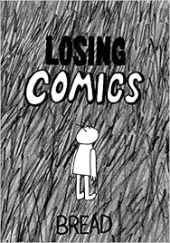
Bread Tarleton's ambitious Losing Comics is a fascinating metacommentary on storytelling in the manner of Pirandello meets Scott McCloud. Indeed, the title and the cover logo were direct references to McCloud's book on comics art, Understanding Comics. However, the simple, iconic character is dropped into the middle of a story and is alerted of this fact by the unseen narrator, who is said to represent the artist. It's left up to the nameless character to find their purpose, all while Tarleton explores the elastic nature of comics storytelling. 


The book has the cadence of certain manga in terms of its willingness to slow storytelling down to a crawl and force the reader to advance the action slowly, turning page after page in order to move things along. The existential quality of the comic also reminds me a bit of Anders Nilsen's "Monologues" comic, only this book doesn't have the jokey quality of Nilsen's work. Indeed, there is an impassioned sincerity to the struggle of the protagonist, as they go from confusion at their predicament and the narrator's purpose for them to anger at their fate to despair to determination. All they could do was keep going, trying to understand themselves while desperately wishing for connection. 

Losing Comics is a perfect example of cartooning and drawing being related but separate skills. The drawing in this book is simple and non-naturalistic. The cartooning, however, is complex and deeply affecting. Beyond Tarleton's command of gesture, there's a sequence where the character desperately wants the reader to tell them what they should look like, tortuously altering their face again and again. It's heart-breaking and dramatic, and it's a testament to Tarleton's skill as a cartoonist that each image is as powerful as the next. It's followed by an expression of gratitude toward the reader for bringing them to life by reading the book and accompanying them on their journey, even if it's a journey that they ultimately completed through their own willpower. It's a testament to the power of seeking out connection and understanding that we are always connected to others, even if it's not immediately obvious. 

The character's journey is the journey of anyone who struggles to understand their purpose in life, who feels everything is absurd and meaningless, and doesn't even know who they really are. In the end, the struggle, the journey, and the company provide enough meaning, a sentiment earned not through treacly sentimentality but through a viscerally difficult trek for the character and the reader. Losing Comics is a powerful conceptual achievement that may not seem beautiful on its surface, but it's more than worth exploring to get to its underlying truths.

Saturday, December 26, 2020

In Praise Of Annie Koyama

Annie Koyama is shuttering Koyama Press for good at the end of the year. Her books will still be available from distros like Spit And A Half and in stores, but she'll be moving on to a new phase in her career. She's not leaving comics, but I imagine what she does next will be very different.

On twitter, she asked if there were specific books that meant something to readers. I've been lucky enough to have read virtually everything that's ever been published by Koyama, and I've reviewed a huge chunk of it. Annie, you'll see more reviews of older stuff coming out from me in 2021, so it will still linger on for a bit!

Annie's choices as a publisher were idiosyncratic and diverse. All it took was for her to believe in what the artist was doing. While she did have an eye on sales, she certainly didn't give a fuck about trends. Indeed, part of her mission was finding an audience for up-and-coming artists, artists who were undeservedly ignored, artists too weird to find a home elsewhere, queer artists, artists of color, and most especially fellow Canadians. Not every book she published was precisely my thing, as her aesthetic interests diverged from mine in some ways, but I always respected her choices and took every book that she published seriously as a critic. 

A few quick thoughts on particular artists and books that I liked best. You have to start with Michael DeForge, whose uncompromising work was nurtured by Annie as he became one of the most popular and influential cartoonists of the past decade. Lose was one of the best periodicals during that period, with each issue surpassing the next on a regular basis. 

Jane Mai's work was a hurricane of powerful, expressive cartooning; frank talk about mental illness; and a curious, probing intellect that relished and dissected its own obsessions and interests. Her books are not lauded enough in critical circles.

I was delighted that Annie got to publish original work from Eric Kostiuk Williams. He's a staggering young talent with prodigious drawing and cartooning skills, a deep thinker, and a socially connected political voice. That's especially true with issues local to Toronto. 

Jessica Campbell is one of the funniest cartoonists alive. I will always regret that I wasn't able to convince my fellow judges of the genius of Hot Or Not: 20th Century Male Artists. The follow-up, XTC-69, was even funnier. Anyone who's ever followed my work knows that while I like all sorts of comics, I'm a gag man at heart. And it's REALLY hard to make me laugh. Campbell does it, every time. 

On the other hand, it took no effort to convince my fellow judges to nominate Daryl Seitchik's Exits for an Eisner. Seitchik needed about one mini-comic before she snapped into her current, fully-formed style. She's one of the best cartoonists working today, and I expect we will see big things from her in the future. 

Koyama published Julia Wertz's The Infinite Wait, which was the best work of Julia Wertz's career up to that point. Wertz's willingness to reveal herself, get laughs, and take delight in things that she loved was a perfect balance of what's so appealing about her work in general.

Eleanor Davis' You, A Bike, And A Road is a staggeringly beautiful comic. Davis' drawings are almost too raw and beautiful to bear. Its depiction of her physical and emotional journey on her bike ride across the country is pure magic, even as she's processing the darkest of depressions. 

Finally, Koyama was the publisher of note for Keiler Roberts, one of my favorite cartoonists of all time. I have had the privilege of writing about virtually everything she's ever done. There aren't many cartoonists whose work I look forward to reading more than hers. At heart, she's a gag woman, even as she's writing about having bipolar disorder and MS and feeling like a bad mother. 

Beyond what she's published, Annie continued a legacy of ethical behavior in publishing inspired by people like Dylan Williams. In turn, she is inspiring younger publishers. She did right by her artists and everyone in comics. Her generosity is legendary. However she chooses to continue to work in the comics community, I know that it will make it better. Even if she never does another thing, her legacy in producing great comics is secure. Thank you, Annie Koyama. 


31 Days Of CCS, #26: Fantology

Every year, someone from CCS always seems to step up to do the work of editing and publishing an anthology. It's a time-tradition that has produced some excellent comics, including Sundays, Irene, Maple Key Comics, and most recently Brainworm. This time around, it's Fantology Volume 1: Origins, edited by Kristen Shull and Emily Zea. It's a straight-up fantasy anthology that makes no apologies for its subject matter and celebrates it with gusto. Not everyone in the book is a CCS student or grad, so for the purposes of this review, I will mostly focus on the CCS contingent.


While there are some solid entries in this anthology, the care that editors Shull and Zea put into make it greater than the sum of its parts. From Tess Scilipoti's simple but eye-catching cover design to the interstitial rhymes of Bartlebee the Bard to the choice of paper stock, this is a cohesive-looking and attractive book. Shull and Zea also chose to put these stories in a shared world (similar to what Isaac Cates did in Cartozia Tales), with a map at the beginning giving readers a rough understanding of that world and where the stories take place. It's a clever device that helps draw together a number of disparate styles and as well as skill levels.


Catalina Rufin's "The Quest" is one of the highlights of the anthology. Rufin went all-in on a thick line weight and spotting blacks and it works well with her relatively simple but expressive character design. It's an interesting contrast, because fantasy art with this kind of line usually tends to be more naturalistic and dramatic, but with the story's actual emotional narrative arc, that contrast between dramatic and pared-down made sense. The story follows a warrior and a young apprentice magician sidekick, and his supposed quest against a powerful witch. Rufin touchingly and hilariously subverts this trope in a way that still makes sense within the genre but also makes fun of warrior-types who can't express their feelings.


Filipa Estrela's "Discovery" is another delightful, warm story about a goblin who happens upon an island inhabited by mushroom people called Mycelia. Estrela cleverly sets the entire paradigm of an explorer on its ear, as Frond the Goblin realizes that she can't report her discovery of the island to anyone, lest it be despoiled by invaders. There's a delightful romance between Frond and Frill, the Mycelium who greets her on the island, and it leaves off on a note that implies that there could be future stories featuring this couple. The one problem with this story is that Estrela's line is light to the point of illegibility at times; it looks more like detailed thumbnails rather than a completed story. The story is also highly text-heavy, and there's some awkwardness with word-balloon placement. This was also a story that fairly cried out for color to add some weight to its pages, but the anthology was of course in black and white. 

I reviewed Alexander Washburn's "Clan Zargs" last year, as he submitted it as a separate feature. It's a nice fit in the anthology, as his anthropomorphic animal character design, thick line weight, and use of negative space allow the pages to breathe while he tells his silly and funny story about a newly-formed group of treasure hunters. I also reviewed Shull's "Thirsty" in her entry this year for CCS, and it perfectly encapsulated the best of fantasy fiction. It's not just telling a fantastical story, but introducing characters who are trying to tell their own story and create their own identity. 


Rainer Kannenstine's "The Apotheosis Of Jahk" is a well-realized story of a fisherman and a malevolent being named Titanis who at first offers friendship and wisdom to Jahk and those around him, but later inspires bloodlust and conquest. It's a story of a seemingly impossible moral problem and how Jahk failed it. Kannenstine's bold use of black and white contrasts matches his simple line nicely; it's a good example of creating a powerful set of images without overrendering.


Zea closed the anthology with "Seas The Day," a delightful coming-of-age fantasy story about a young princess who wants to be a warrior like her older brothers and the pirate who raids their city. Zea's sketchy pencil drawings and spare but powerful inking make each drawing pop off the page without losing any of their expressive power. 

Natalie Wardlaw and L.S. Hook both contributed short pieces. Wardlaw's was a silent story about finding a fairy with torn wings and mending them. It's simple, sweet, and drawn in Wardlaw's signature elegant line. Hook's contribution isn't so much a comic as it is a series of hunky drawings of men on an island that so enchanted the explorer that they chose to remain there. Both are the kind of short, intermediary pieces that provide flavor in anthologies like this. Amy Burns' "When The Gods Grew Bored" is a powerful creation myth for a particular group of people that's well designed and cartooned. Burns' attempt at a naturalistic approach didn't quite land because her character design was too crude; her lettering was also all over the place, which was distracting. 

Other interesting contributions included Jared Beerman's highly atmospheric fumetti photos of miniatures telling a story, Eliot Crow and Keren Katz's haunting story of a people turned into currency in the desert and what ultimately happens to them; Emily Bradfield's story of an official trying to thwart poachers and its surprising outcome; and Tay James' funny story of a young potion-maker trying to decide her future. 

Another volume of this anthology has been produced, and I'll be curious to see what kind of a jump the dedicated creators, as well as the editors, made. The second volume of an anthology tends to be the one where the editors figure out how to fix the errors they made in the first volume, so I'm eager to see what kind of leap they all make. 

Friday, December 25, 2020

31 Days Of CCS, #25: Kristen Shull

Kristen Shull is one of the hardest-working of the CCS cartoonists, having published in the last two years a short fantasy comic, a biographical comic, a 32-page erotic fantasy comic, two years' worth of daily diary strips (and counting), and co-editing two fantasy anthologies. As I noted in my evaluation of her work from last year, she has done the work of getting better in public.

This year, I'm going to take a look at the collected Ego Gala, which has all of her daily diary strips from 2019. I've reviewed most of these before, but I will be reviewing them again in conjunction with Hell Bait, her erotic fantasy comic, as well as "Thirsty," her story from Fantology Volume 1. (I'll be reviewing the rest of that CCS-heavy anthology in a separate post.) Rather than critique each comic separately, I'll be doing a more generalized critique of her work in part, as she notes in her diary strips, she wanted to achieve the same effect in both her autobio and fantasy work: "Find the familiar." That means finding a way to reach and connect to her audience while telling her story, no matter the genre. 

1. All the way open. Once again, to use the Alex Hoffman parlance with regard to autobiography, Shull's memoir is as open as it gets. That's not just because Shull writes about subjects like her sex life, partying, mental health, loneliness, her insecurities as an artist, and much more, but also because she provides a strong emotional context for all of this. She does have a brief intro providing a bit of informational context for certain events in her life, but those were honestly not really needed to understand the emotional contexts of the events or her relationships. Shull balanced this openness against her responsibility to tell a story. While there's a bit of the "then I ate breakfast, then I ate dinner" quotidian dullness found in many diary strips, Shull either limits that as much as possible in telling a story, makes it part of a gag somehow, or at least does a funny or interesting image to go with it. Consciously or not, Shull never lets go of the story.  

2. Fearless. As I've noted elsewhere, it is a mistake to label autobio cartoonist's work as "honest," because how on earth would the reader know? Shull noted in a diary strip that one note she had received during a critique is that she was fearless in terms of what she draws, and that's a far better description. Shull isn't afraid to write about her fears, her vulnerabilities, her absurdities, her desires, and her adventures. While there were times where she felt a little embarrassed about drawing highly personal and intimate activities, it didn't stop her from continuing to write about them. As Gabrielle Bell once wrote, "It is humiliating to expose myself like this, but it is worse to try to hide it." Shull doesn't try to hide it. At the same time, "fearless" is not "reckless." She has an understanding of her responsibility with regard to how she depicts others, especially with regard to how they might make her feel. That comes out during a period where she felt particularly fragile, and she wrote about how she told her housemates that she wanted them to be nicer to her.

3. Bacchus and Minerva. Throughout her diary comics, Shull is referred to as the "Bacchus of CCS." She's not just fun at parties, but she actively encourages merriment in all sorts of ways. There's a visceral quality to her stories lacking in much autobio, and she's not afraid to share it: drinking, doing drugs, having sex, playing rugby, running, exercise, eating fancy meals, "hashing" (sometimes referred to as "the drinking club with a running problem"), etc. If it involves physical sensation, then Bacchus craves it and wants to share it. What Shull doesn't explicitly say is that if she's Bacchus, then she's also Minerva. Wise, introspective, thinking about the future--thinking too much, frequently. It's an interesting dichotomy, but an important one, because Shull may be a Bacchus for parties, but it's Minerva who gets the work done. 


4. The laboratory. Doing a diary strip like this is an act of will. It not only forces productivity, but it reminds cartoonists that the perfect is the enemy of the good--and the finished. It reminds them not to be too cute or precious with their work. It forces them to find good storytelling shortcuts and stops them from over-rendering. At the same time, drawing like this makes one a better draftsman. It's also highly low-stakes, so it allows artists to experiment with page design, storytelling techniques, narrative ideas, etc. The most interesting aspect of Shull's autobiographical work is that willingness to experiment.

5. Fantasy is reality. That said, Shull's autobio work is a solid example of the diary form, but that very format is in itself limiting and limited. While I can see Shull continuing her diary indefinitely for many reasons, it's clear that her true talents lie in fantasy storytelling. Hell Bait, for example, pulls off the remarkable trick of being an x-rated comic with explicit sex scenes that are entirely in service to the larger story. The premise, wherein a local witch who has a FWB arrangement with a demon and has to trick him into killing another demon by way of coitus interruptus, is absolutely ingenious. Shull not only has the instincts and ability to tell a good fantasy yarn, she's able to tell an absolutely hilarious and hot story that doesn't mock either fantasy or erotica. 

"Thirsty," her story in Fantology, is the best entry in the book. In the span of 12 pages, Shull establishes and cleverly resolves an interesting problem, draws horrifying lake monsters, and creates a working bond between a wizard and an elf. Shull crafted a satisfying one-shot story while leaving room for a larger saga if she chooses to go that route. All of her storytelling is excellent. 

6. The next step. Shull openly discussed not being able to imagine doing a longer work in her diary, but the reality is that she progressed in a manner that makes the most sense for a young cartoonist. Start small, finish short work, and keep putting out new comics. With enough pages under your belt, the idea of a longer work no longer seems as unattainable. Indeed, that concept for a fantasy epic started percolating in her head toward the end of 2019. Shull's future clearly is in the realm of fantasy; she's a sharp and witty writer and a great visual problem-solver. The one thing she needs to add to her toolbox is color. Her line is not quite forceful enough to drive an entire comic of this kind on its own, and while her understanding of gesture and body language are highly-developed, there's a certain blandness to the way she designs faces--especially compared to the exciting way she draws monsters. Learning to work with color would help with this while taking a load off other aspects of drawing. I think the ideal scenario is somewhere between Hell Bait and "Thirsty": a smart, engaging, high fantasy epic for adults. There's no question that Shull has the ability and the ambition to do so. 

Thursday, December 24, 2020

31 Days Of CCS, #24: Lauren Hinds

One reason I appreciate Lauren Hinds' comics is because it's clear how carefully she thinks through her work. Writing mostly about teens and children, her close study of family dynamics and disciplined restraint in depicting the breakdowns of families and friendships gives her work an almost uncomfortably intimate quality. 

In Jeremy (published by Robyn Chapman's Paper Rocket Mini Comics), Hinds depicts a turbulent friendship between two boys from different backgrounds. Implicitly set in Hinds' home country of Trinidad and Tobago, it's told from the point of view of an unnamed white kid with a protective family and his best friend, a Black kid named Jeremy whose family mostly ignored him. It really does like like the journal a kid might make, with every page designed on lined paper as though the kid was drawing the comic on notebook paper. Each page has a single panel and cursive writing below, narrating the story. Hinds' figure drawings have the deliberate spontaneity of a child's attempt at drawing, only with much greater technique and understanding of how a page works. 

In telling the story, Hinds is careful not to pass judgment on her characters. Jeremy is clearly a lonely kid, but he made for a frustrating friend. The narrator had a number of memorable adventures with him, but Jeremy insulted him when he couldn't go out with him. Jeremy also got his ass kicked on a consistent basis by the white kids at their school, but he never backed down from them. The most fascinating part of the narrative is the mixed messages the narrator receives from adults. A teacher tells him to stop hanging out with Jeremy. His mother says that he's too smart to hang out with Jeremy. His uncle, however, tells him that Jeremy is much tougher than he is, and this is all part of the narrator's general low self-esteem. In Jeremy, he sees someone who seems so much more free, brave, and imaginative than he is. He doesn't understand the things his friend is missing in his life. 

Eventually, after a misadventure where Jeremy's bossiness turns into outright disregard for his friend's safety, they drift apart. Hinds reinforces this in an interesting way. There isn't a dramatic moment of conflict, just that awkward phase where one person tries to ignore another. The beginning of the comic is in full, lush color reflecting the vivid quality of the narrator's memories and experience of these adventures. As the story unfolds and things slowly split apart, the colors start to fade. They're reduced to spot colors before the incident where they are nearly attacked by dogs occurs, and when the dogs appear, the comic reverts entirely to black and white. What is unstated in Hinds' comics is every bit as important as the things she spells out.

The Quiet Family explores similar territory and uses the same kinds of narrative techniques. This time, it's a young girl who's curious about the Bedoe family that moves in next door, because they're so quiet. This comic is much more emotionally charged and less subtle than Jeremy, as it doesn't take long for Kessa, the narrator, to deduce that Mr. Bedoe is abusive in the same way her dad was. Whenever Mr. Bedoe saw her or talked to her, Kessa felt uneasy, and for good reason. He was eventually arrested for assaulting his wife, who was protecting her daughter from him. There is a real sense of mourning and lost opportunity in this comic; Kessa feels bad for the girl because of what she went through (knowing it was what she went through as well) but also because she mourns what could have been a close friendship. While this narrative is far more dramatic and explosive, Hinds still shows a great deal of restraint as an artist. There's tremendous tension, but Hinds opts against melodrama. Paired with Jeremy, one can see a potential collection of stories told in this vein. 

Wednesday, December 23, 2020

31 Days Of CCS, #23: Sam Nakahira

Sam Nakahira's development as an artist has been interesting, because while she's clearly headed to a career doing long-form, personal journalistic comics, she's taken the opportunity while at CCS to branch out a little and try different things. It's made her a better cartoonist, in part because her journalistic comics have sometimes been so deeply researched that it didn't leave a lot of room to have fun drawing things. Her mission was to transmit information clearly and succinctly, and that sometimes meant comics that weren't terribly interesting to look at on a purely surface level. 


That's certainly not the case with her selection of minis here. Cursed Hands is absolutely soaking in atmosphere, with black gutters and dense hatching immediately establishing an oppressive backdrop. The story is about a puppetmaker who creates puppets that are so lifelike that the small town she lives in think she's a witch. Her lover leaves after being unable to endure the abuse of the townsfolk. In response, the puppetmaker crafts a doll in the image of her lover so lifelike that it actually comes alive, drawing the attention of the devil. She tempts her with all sorts of things in order to get her hands, but the final confrontation is defiant. This story depended entirely on Nakahira's ability to get across emotion through body language and her ability to draw dolls and puppets. Her rendering is still on the rough side, but the actual cartooning nails every goal. The use of splash pages and unusual close-ups is highly effective in conveying mood as well. 


Copycat is a story that originally appeared in an anthology, but this solo edition similarly uses black gutters to set the story's tone. This one's about an art student named Mei and another student named Katie who befriends her. It doesn't take long for Mei to realize that Katie was starting to copy her sense of fashion, her musical choices, and even her choice of majors. It became clear that Katie wasn't just copying Mei but also trying to replace her. The final pages are chilling and inevitable. In this comic, keeping her character designs relatively simple allowed Nakahira a lot of room to experiment with different facial expressions and work in a horror vein with many of them. The bland friendliness of Katie in particular was cleverly played up as highly unsettling. 


The Quantum Worlds Of Bernice Bing is very much in Nakahira's bailiwick. This is a typically scrupulously-researched biographical comic about abstract expressionist artist Bing that's filled with Nakahira's own reactions and interests. Bing defied categorization, being less interested in getting on the treadmill of an art "career" and the capitalistic and competitive path this demands and much more interested in community outreach. Nakahira relentlessly pursues the hypocrisy and blatant sexism of the fine arts world and holds Bing up as a model for someone who did things on her own terms. 

Visually, Nakahira makes a lot of smart decisions in this comic. Clearly working from photographs and original paintings, Nakahira keeps character design simple. It's naturalistic, but Nakahira is more interested in capturing the essence of her subject rather than attempt to convey a detailed likeness of her subject. More importantly, Nakahira wanted to create a sense of what Bing's use of color was like, flinging colors across the page as though Bing was a wizard. This effect works, as once again Nakahira's goal wasn't to create precise reproductions of these paintings but instead of what it's like to experience them. That use of color makes this comic exciting to look at as well as read, and it's a testament to Nakahira's hard work on both clarifying her line and making her pages more visually striking.  

Tuesday, December 22, 2020

31 Days Of CCS, #22: John Carvajal

John Carvajal has done a lot of work illustrating genre stories as well as writing and drawing his own short stories.  His first long-form book, Sunshine State, is clearly a much more personal work, drawing on his own experience as the child of immigrants and trying to find his way as he doesn't feel entirely a part of either Latinx or Anglo culture. Set in Tampa, it follows a directionless young man named Milo as he tries to navigate post-high school life with his friends. It's a slice-of-life story that follows Milo from innocent house parties where he dulls his existential ache with pot and alcohol to him engaging in riskier and riskier behavior. The core of the book is that because Milo doesn't have a true sense of identity, he also has a corresponding lack of agency. There's nothing he really wants to do or be; it all seems pointless. 


There's a clever visual trick that Carvajal uses throughout the book. Whenever Milo smokes up, the smoke billows up around in the form of little skulls. Later, when he feels anxious (especially around his parents), the skull-smoke wafts up from his imagination. The skulls represent a number of things: when he's high, he's experiencing a "little death" of his consciousness, his awareness, and his grip on reality. While Milo didn't want to be aware or connected to his daily reality, that came at a cost, and directly tied back into that loop of anxiety. 


Much of the dialogue in the book is in Spanish, and that in itself is a pointed form of commentary, because it's Milo's family that only speaks to him in Spanish as Colombian natives. Carvajal seems to connect Milos feelings of alienation toward being Latinx to his father's constant, withering disapproval and disappointment. His father isn't a screamer or yeller, but he's blunt in clearly wanting a better life for his son and has low tolerance for his son's bullshit. Milo seems to connect the identity of being Latinx in America with being like his dad, and it's something he clearly doesn't want. But though he's white-passing (unlike his friend Aldo, who is dark-skinned), he doesn't feel like he's part of that mainstream culture either. 

It's no wonder that not only did he find himself drifting, but that he found his way to increasingly alienated subcultures. He kind of fell into selling pot, but Carvajal masterfully portrays that constant tension and feeling of paranoia that begins when you step outside the law. Even seemingly benign interactions have that moment of danger where it feels like it could all go wrong. His depictions of the kinds of things people do while high, while blackout drunk, and on psychedelics all resonate, as he accurately portrays the pleasures and risks of each.


Carvajal divided the book up into different seasons, allowing time to pass more quickly. He goes from not knowing what to do with his life in summer to starting to sell pot and getting caught by his father in fall. That was a brutal scene, as he lied through his teeth about why he had a pipe and pot, and his father calmly instructed him to flush away the drugs and smash the pipe, telling him that he didn't come to this country for this shit. His mother tearfully wailed that his uncle tied because of this. The drug business in Colombia was serious, and the sheer disappointment from Milo's father (encapsulated in a visceral sigh as he knew his son was lying) had those smoke skulls welling up again, as Milo simply couldn't confront his own actions in a meaningful way. 

In the winter, Milo has moved out and immediately not only experiences his apartment getting robbed, but is roped into going with his roommate and a mob and trying to track down their stuff door-to-door. It's an initiation into a new world he's also not comfortable with, but it's a symptom of how alienating himself from his family hasn't done anything to actually find himself. He has a hard-partying girlfriend and he's doubled-down on his dealing, starting to meet far more dangerous dealers further up the food chain. Worse, his identity has become that of a drug dealer, alienating his friends. Another set of dealers comes to his house, looking for money and drugs, and he tries to finger his neighbors. Then he gets blackout drunk and in an accident. Then the neighbors confront him about him trying to narc on them, and his life gets threatened. It's an all-too-predictable chain of events for someone like him at the bottom of the food chain. He loses his place to live and his girlfriend.

Milo is self-aware. He doesn't want to be doing all of this, but when Aldo asks him what he does want to do, all Milo can say is "I've never really had any desire to do or be anything." Milo was never given the template to fit into a pre-existing structure nor the personal agency to choose his own path, because he felt his own agency was worthless--in part because of things his father said to him. When Aldo reminds Milo that he can draw, and that there are possibilities there, that sets events into motion that not only give Milo a new future outside of his Tampa bubble, but also sets the stage for his father to tell him that he loves him and will always be there for him--and that he understands Milo has trouble expressing emotions. It's a tender and true moment, because Carvajal is careful never to portray Milo's dad as villainous or abusive--just as someone who didn't understand how to support his son emotionally. 

Carvajal's use of color adds much to the comic's emotional narrative. So much of what happens to Milo is left unsaid, and the watercolors emphasize his moods and those of the people around him. His figures are cartoony, which makes some of the trippier and more surreal images in the book easier to understand and hook back into the overall emotional narrative. Carvajal's use of Tampa itself as a background is a key element of the book as well. When you grow up in a tourist town, its bright trappings can seem rather drab if you're inured to them. Carvajal also clearly has his finger on the pulse of what it's like to be Latinx in a Florida city, as it's possible as an immigrant to never actually have to assimilate to white American culture, depending on where you're from and where you're living. That's certainly true of the Cuban community in Miami, but many Central and South American countries have huge communities in Florida. That's why for someone like Milo, who never had a strong sense of self, it was so easy for him to feel a kind of personal and cultural paralysis. He never found a place to belong until he actually listened to his friends who loved him best and drew encouragement. Even at that, the dramatic nature of his travails is deliberately undercut by his flat emotional affect, so that him going to art school is a good first step, it's only a first step. Carvajal doesn't overplay his hand in transforming the character, because he clearly had so far to go, and that was an interesting variation on this kind of story. 


Monday, December 21, 2020

31 Days Of CCS, #21: Ivy Lynn Allie

Ivy Lynn Allie's most recent minicomics show an artist who's come into her own stylistically and as a writer. Her short fiction is exceptionally clever, subtle, and unsettling, and her ability to effortlessly cross genres mark her as someone who can go in any direction as a cartoonist and do well.


Last Stop, for example, mixes two genres. There's a heaviness to this story as she quickly establishes her nameless protagonist as a man who's reached the end of his rope. He's broke, he doesn't have a job, and he's completely isolated himself from his family and his therapist. Allie gets this across with one succinct panel. This is a character psychodrama. The story begins when he falls asleep on the subway, only to awaken at a stop where a talking raccoon in a cop's uniform rousts him and throws him off the train, and he finds himself in a part of the city where anthropomorphic animals are dominant. That minor-key tone of his depression mixed with the weird absurdity of the world he finds himself trapped in are a potent high-concept, and him finding another human and glomming on to him provide the spark for the beginning of a potentially longer story. As it stands, the combination of despair and lunacy resonates. One can see Allie's drawing tighten up and sharpen as the issue unfolds, with the black gutter space emphasizing the comic's sense of gloom. The character design, especially for the animals, is expressive; it's silly but also gritty and realistic at the same time.

My Friend Meredith is a brutal take on how childhood friendships can be every bit as abusive as other relationships. A girl named Terri and her family visit their friends, and a loving, open Terri is happy to see her same-age friend, Meredith. Allie is not subtle in waving the red flags regarding Meredith from the beginning: she wants Terri to watch a scary movie at her, and then screams at Terri and hits her with a pine cone when Terri beats her in a foot race. The point of the story is not that it establishes Meredith as a sociopath (and Allie does pile it on), it's that Terri is willing to take it, because she thinks of her as a friend, no matter what. What's left unsaid are the social forces that pushed Terri to think this was so, and how her faith in them clearly wavered in the comics' final, silent panels. 

Sanity Check was not only the most fully-realized of these three comics, it was one of the better minicomics I read in 2020. It's a collection of her shorter comics in the tradition of series like Eightball, and the small aesthetic touches and interstitial pieces in the comic make it greater than the sum of its parts. It's a satisfying read from beginning to end, starting with "Of Course, No One Knew." Allie begins the piece in media res, as she at first leads the reader to believe that this is a flashback comic of some kind with invisible narrators talking about a film they had made together. Allie deliberately confuses the reader as to the point of view in this story while relishing the opportunity to talk about the making of a small-budget horror flick. The swerve she introduces has a huge payoff that makes everything make sense while revealing how different projects can be hugely meaningful to people, especially young people. 

"I Made A Friend," with pink as its spot color, is a horribly tragic and tender account of the magic spark of creativity and how cruelly and quickly it can be snuffed out. "The Situation" is about a woman whose job it is to remove poisonous toads, but who didn't want to kill them. The decisions she's forced to make are heartbreaking, but it's even more heartbreaking when it's clear this experience hardened her emotionally. The pea soup-green in this comic is crucial in establishing its atmosphere. Allie's restraint as a storyteller and willingness to explore emotionally complex characters and situations signals that she's ready to sink her teeth into a longform comic or continue to build this body of short story work. 

Sunday, December 20, 2020

31 Days Of CCS, #20: Emil Wilson

When Emil Wilson came to CCS, he had a career in graphic design and illustration. He knew how to effectively design a page. After a year in the program, he's also become an excellent writer and cartoonist. His dry sense of humor and ability to plumb the depths of human despair in interesting ways reminds me a great deal of Will Dinski's work, especially when one also considers the formal and design qualities of their work. 

The Final Results follows the final journey of Carl, a man who dies in his sleep and stops at an afterlife computer terminal that is there to answer his questions about anything. Carl asks how many times he had sex, who stole a childhood bicycle, and if the Cubans killed JFK. Then he goes deeper: who was his soulmate? What was his ideal career supposed to be? Occasionally, the computer would tell him things like "the future is not supported on this device," which was clever. The comic was done in black and white, with the ink line droppping out for Carl. He was drawn in a spectral blue with a blue sky background, which was a smart visual solution in depicting his non-corporeal state. Wilson's figure drawing is still a work in progress, but the actual character design was excellent, as he excels in crafting ordinary-looking schlubs. 


Potato, Potato, Potato was a sweet comic about dementia. A quick note: Wilson excels at typography and lettering. He's a smart and sharp designer with regard to fonts and overall design and has a knack for knowing what will work for each story, because he never repeats the same design. His lettering is bold but organic and never lacks for clarity. This comic was about an old married man and woman and his creeping dementia. When he appeared naked in the living room with a collander on his head one morning, she knew what was happening. After the usual round of doctors and advice from her children, she gave him a photo book in an effort to jog his memory. He responded by trying to eat one of the photos. In a marvelous, hilarious twist, she joined him in his nonsensical behavior--yelling at the trash can, putting all the furniture outdoors, etc. But she also put on dance records at random and he responded to that. The final page, where she tells him about a tree and he responds, "Potato," was especially sweet, because she responds in kind and it is comforting for them both. Here, Wilson's character work is absolutely spot-on. Gesture, facial expressions, and especially the way the characters interact in space are so intimate it's almost painful. It's an absolutely lovely, charming comic.

The Sorry Man is yet another visual experiment. It's a comic with an unusual open-page layout, where images are matched with lines of dialogue. The story is about a man whose job is writing elaborate apologies to aggrieved customers of a particular airline. Whatever the complaint, no matter how small or petty, he had a way of completely acquiescing to their emotional demands. It's not just a matter of apologizing though; it's wording it in a very precise but passive-aggressive manner that relieves his employer of responsibility. The parallel story was that his young daughter was dealing with a mean-spirited bully at school. After the usual advice of being extra-nice to her backfired while he was dealing with an incident where a psychotic flier was restrained with duct-tape over her mouth, he snapped. He told his daughter it was OK to get mad, and she promptly beat down her bully and made her bleed. His ultimate solution to both problems in the form of letters was cutting, dark, and hilarious. The moody brushwork and innovative lettering solutions that added clarity to the piece were indicative of a cartoonist who carefully thought out the solutions to visual and narrative storytelling problems.

(Probably) The Last Time is a memoir of COVID and his dying father. Once again, it's a visual departure from his other comics. Wilson's versatility is one of his best qualties as a cartoonist, because he can work in a wide variety of styles. This was done scrapbook/collage style, with hand lettering. It's a series of two-page spreads, with some dominant header often done in the style of an advertising font. The story follows Wilson visiting his father on the west coast after he was told that he probably had just three months to live. His sarcastic sister, needy mom, and suddenly emotional and open father are all part of the cast of characters, as is Wilson's husband Giacomo. A memoir about a specific set of emotions regarding his father went absolutely haywire when COVID struck and forced Wilson to make a number of difficult choices regarding his schooling, and it got even more complicated when his husband got sick. This is a bracing, funny, and knowing story about a family that for all its dysfunctions, was still incredibly important to Wilson. The moments of affection and honesty his dying father gave him were depicted as almost overwhelming in the way they surprised him. The visual bag of tricks Wilson unleashed on the reader made every spread exciting and challenging. I'm especially excited to see Wilson's senior thesis project, given his progress and ambition as a cartoonist.