Heroes Con is coming up this weekend, so I thought I'd reprint this report from Indy Island back in 2008. It was originally published at sequart.com.
***
I was only able to hit Heroes Con 2008 for a single day this year, the first time I've attended since 2001. Tom Spurgeon refers to it as the "last great American con". It's unusual today because it's locally owned and operated, and it focuses solely on comics despite being a mainstream event. There's no focus on TV, movies and nude models like at San Diego or the assorted Wizard events. It doesn't share the stage with science-fiction or fantasy, like many cons. There are no gaming tables. It's just row after row of comics retailers selling rarities or offering huge deals; and the artists themselves, selling art, sketching and signing autographs. In the last couple of years, Heroes Con has done something interesting. Convention director Shelton Drum has allowed Dustin Harbin to create "Indy Island" at Heroes. There's obviously a real dedication to featuring alt/indy/underground/etc. comics at this show, because the con gave them free tables and hotel rooms.
As a result, comics fans in the Southeast were exposed to publishers like PictureBox, Sparkplug, Buenaventura Press and Bodega for the first time. Comics fans got to see panels with the likes of Dan Nadel, Jaime Hernandez, Sammy Harkham, Kevin Huizenga and more. Several grads from the Center for Cartoon Studies had a booth, selling the new SUNDAYS 2. Many new participants at Indy Island reported slow sales and an audience that didn't quite know what to make of them, but others who were veterans of the show noted that they saw fans who sought them out because they had been there before. We'll see who decides to give it another go next year.
My main order of business was picking up comics for review, and there was an astonishing assortment there. I only wish I had had more time to get more minis by authors with whom I was unfamiliar. This column will examine the first set of minis I received; upcoming columns will look at recent books from Sparkplug, Bodega, PictureBox and minis from the likes of Laura Park, Liz Baillie, MK Reed, Papercutter and more.
FRED THE CLOWN # 5 1/2, by Roger Langridge. Langridge is one of the greatest humorists working today, in a class with cartoonists like Michael Kupperman, Sam Henderson, John Kerschbaum, Evan Dorkin, Ivan Brunetti, Lauren Weinstein and others. Langridge's line is bold, and no one uses effects like spotting blacks or zip-a-tone to any greater effect than him. This Fred mini is his first work with this character in some time, and Langridge reveals at the end that he had decided to abandon the character (and short-form gag cartooning) altogether in favor of long-form work that he felt he was "supposed" to do. Then he slowly realized that maybe long-form comics weren't what he did best, that in fact, these Fred comics were the best format for him to unleash his insane imagination. Turns out, he's right--I never wanted him to stop putting out issues of Fred in the first place. What's remarkable about them is the remarkable range of emotions and stories he's able to get across on the page.
Fred the Clown can be a tragic figure, a heroic figure (if an inept one), a scatological character, a source of pure absurdity, a tool for parody, and a pathetic scapegoat for the most vicious exploiters in life. Langridge has the ability to simultaneously evoke the feeling of classic 1920's comics and silent movies while using a crisply modern style. This 30-page minicomic doesn't have a single clunker in it, but for some reason his Western strips starring Fred (a classic, Bozo-haired clown) were especially funny. "Lonesome Cowboy Fred", which turns the high-noon showdown cliche on its head when the villain winds up kissing Fred, is classically set up with a perfect punchline. While that strip was silent (where Langridge especially excels due to his ability to depict gesture and expression), "A Hatful of Dullard" sees Langridge use rhyming verse to ridicule Fred, before it ends in a non sequitur punchline. I hope that this mini spurs Langridge to continue to work in short-form gags, and for smart publishers to collect these strips when he's built up enough.
IS IT BACON? and UNDERPANTING, by Matt Wiegle. Wiegle is an enormously clever cartoonist whose work I've admired for some time. A member of the Partyka collective, Wiegle gets my current tag of "artist deserving more widespread recognition". UNDERPANTING is a hilarious string of gags about a pair of demonic underpants and their reign of destruction through history. One gag finds a man in a Salvation Army and finds that the "boxers are whispering outlandish and unrealistic promises to me." IS IT BACON? teaches us to identify bacon, and not to be fooled by things with bacon's distinctive striped pattern, like hair, tree's bark, etc., noting that "history is strewn with the bodies of those who took for bacon that which was not". These minis work because Wiegle goes to great lengths to sell his gags, and he tells them with a straight face. His ability to sell a gag by drawing an incredibly detailed pirate ship or skeleton gnawing on a tree because it thought it was bacon brings to mind the skill that Michael Kupperman brings to his humor. I haven't seen much longer-form work out of him recently, but I hope this trend is reversed soon.
PHASE 7 #13 and PHASE 7 FUNNIES, by Alec Longstreth. Longstreth is pretty much the most enthusiastic artist that I know of--not just of his own work (which he tirelessly promotes), but the medium in general. One can sense his burning devotion and need to create comics, a devotion that extends to even the most monotonous aspects of creation. At this point of his career, I actually think his real talent rests not in his autobiographical or observational comics, but in clever, intensely heartfelt fantasy/adventure comics like his ongoing "Basewood" story. Still, there's something enjoyable about reading his comics essay on "Depictions of Everyday Life Throughout Art History". The effect is not unlike Scott McCloud in UNDERSTANDING COMICS (a clear influence), as his talking head narrator shifts forms depending on what era and type of art he's discussing. The page where he shifts from impressionism to abstract expressionism is particularly amusing. In PHASE 7 FUNNIES, a collection of strips from a variety of magazine gigs, his single-panel gag strips fall pretty flat. However, in stories like "Emma The Emo Emu" and "Audible Alphabet", Longstreth's gentle, goofy wit shines. The latter story in particular cleverly uses sound effects and a propulsive story to go through A to Z, one panel at a time. While not every comic Longstreth publishes is a home run, I'm always interested to see what he'll do next.
CRUSTACEAN FRUSTRATION and ATOM BOMB BIKINI #5, by Robert Ullman. Ullman's mostly an illustrator these days (out of necessity), so it's always nice to see an actual comic from him. CRUSTACEAN FRUSTRATION is a nice silent mini about a chef who hits the skids after a lobster escapes from him. Ullman's combines his lush line with a simple visual style to create a delightful story with a funny punchline. While Ullman is known as the king of indy comics cheesecake art, it occurs to me that he'd be great at creating comics for children. There's an inherent cuteness to his design that gives even his nude drawings a winsome quality, making them sexy without being sleazy. That's certainly on display in ATOM BOMB BIKINI #5, his latest collection of illustrations culled from his professional work (he illustrates Dan Savage's Savage Love column for a few alt-weeklies), commissions and other odds and ends. Any fan of classic pin-up art should check out Ullman's work, because he excels in that tradition. I understand that he's been working on a long-form work on the side for quite some time, and I hope that he's able to complete this soon, because I miss the easygoing slice-of-life comics he used to do in his mini FROM THE CURVE. I'll be very curious as to what he has to say in his new work.
MONSTER TREASURE DIGEST 0.5, by Maria Sputnik. I picked up this mini from Dylan Williams' Sparkplug table on a whim, and it's 24 pages of inspired lunacy. Sputnik describes herself as a former zinester, and there's certainly that DIY zine feel to this mini. There's a sort of loopy dream logic to her stories. "Until I See You Next" is about a young woman whose boyfriend is lost in the perilous Big Nose national park, narrated by a talking chicken. "Four Legs" sees Maria trying to choose a horse, winding up with the Worst Horse, who is tiny and smokes cigarettes. That story is continued as Maria realizes that she's been hexed (a gynohex, to be precise) and has to negotiate a complex bureaucracy in order to combat it. There's a delightful feeling of not knowing what's going to come along next, a sense of mystery and discovery on every exuberant page. The art is rough, but Sputnik's sense of composition carries her stories, along with her fervent imagination. It reminds me a little of Dame Darcy's early work in terms of its singular and devoted vision. Contact the artist at monstertreasure@gmail.com.
Tuesday, May 31, 2011
Sunday, May 29, 2011
New Review @TCJ: Melvin Monster Volume 3
Here's my review of D&Q's third volume of John Stanley's Melvin Monster.
Thursday, May 26, 2011
Taking Stock: Smoo Comics

The cartoonist Simon M does autobio work in the vein of John Porcellino or Jeff Levine, in that he's interested in depicting his environment as a counterpoint to expressing particular feelings and memories. In this Smoo minicomics series, he's shown considerable progress as an artist from the first issue in 2007 to the third issue in 2010. From the very beginning, he's shown a strong interest in crafting challenging page layouts, with many a striking splash page illustrating his emotions. The greatest area of development has been his growing confidence as a storyteller, both in terms of the boldness & strength of his line and his willingness to really discuss raw, painful emotions in a visually powerful manner.

The most notable story in the first issue is its opener, "There's A World Going On Underground". Simon observes a little heat-emitting pillar in his city and connects it to an imaginary world underground. Simon sometimes has a tendency to really start rambling as he tries to connect thought to image, which is unfortunate because his text sometimes gets in the way of his strong compositional skills. This story is text-heavy, but his prose here mixes well with his fanciful images of blind typists, spy snails and shadowy boardrooms. The problem with his line, like many emerging artists, is that he overrendered at certain times in an effort to try to present a powerful image and underrendered at times when he was trying to be subtle. As a result, his draftsmanship distracted from his otherwise striking image-making.

The second issue shows Simon M much confident in his line, though there's again a lack of concision in the use of prose. The best story is "A Case In Point", wherein Simon examines his own faulty memory by trying to flesh out a glimmer from his childhood wherein he kills a rodent that his cat had caught. Simon really lets his pages breath here, eventually stretching the narrative out to a single image per page with bare-bones descriptions. I found the end of the story especially effective, as Simon doesn't try to tie the memory into a particular lesson about "the price of mortality"; indeed, there's a palpable frustration in that this exercise had no discernible lessons at all. This story was a breakthrough in that Simon didn't try to tie his rambling together with a neat bow. Issue #2.5 was a collection of drawings and loose story ideas that once again had some striking images that would reemerge in #3.

The third issue is by far the most ambitious and most assured. It's a dark story that explores (with the distance of Simon talking to a loved one on the phone) about a hellish period of his life when he was menaced on the phone for reasons that were unclear. He leavens the darkness with moments of whimsy: in considering the phone as a tool like any other, he draws some amusing images, including an Egyptian god with a laser gun. He prepares the audience for the issue's darker moment with a spare interlude wherein he considers telephone poles during a drifting period of his life. His depictions of how he failed to deal with this series of traumatic events, how he tries to deal with it now, and how he battles with the destructive inner voice of anxiety and despair are all brutally frank but wonderfully restrained and even funny. With a more focused emotional track in this issue, his digressions didn't feel like simple rambling; instead, they were more like counterpoints and moments of relief before the moment of dread was fully explored. Simon M is starting to transcend his influences, but more importantly he's unlocking ways to use his strengths as an artist and meld them with his particular point of view and observational acuity.
Monday, May 23, 2011
Public Service: New Minis From Susie Cagle

Susie Cagle is rare among twenty-something cartoonists in that her comics have an explicitly political bent. This is not to say that they are polemics; indeed, these autobiographical accounts of her own personal commitment to a variety of causes are ambivalent at best. That ambivalence is not so much directed at the cause itself, but at the very human foibles of those who try to carry out that cause in the field. As such, Cagle refers to herself as a "reportage cartoonist": an autobio cartoonist who doesn't pretend to be unbiased as she reports on what she sees in the field. Cagle's politics are progressive/leftist, but she's hardly a party-line artist. Indeed, her experiences as a member of a movement reveal the cracks that form in every political assemblage. Cagle has two chief virtues as an artist. First, she's an excellent draftswoman. She adds a slightly grotesque touch reminiscent of the work of Gabby "Ken Dahl" Schulz, along with Schulz' propensity for making lettering a key aspect of his visual approach. Second, Cagle adds a light, whimsical touch to her comics to leaven the political medicine she's reporting on, starting with her own frumpy self-caricature.

The second issue of Nine Gallons (Microcosm Publishing) continues Cagle's account of her time spent with Food Not Bombs, a "non-organization dedicated to fighitng hunger with vegetarian meals comprised mainly from wasted food". The title refers to the soup pot they carried with them. Cagle quickly learned in the first issue how little camaraderie there was to be found in the group and how much was demanded of her. This issue explores her own motivations in greater depth, partly in the way Cagle interacts with her roommate. Like many white leftists who come from some degree of privilege, Cagle struggles with her status as a potential revolutionary. There's an interesting sequence where she has an internet exchange with a friend regarding an "anarchist people of color" rant decrying Food Not Bombs because it's mostly a white leftist organization. Cagle leaves unresolved the idea of whether this group is part of the solution (fighting hunger) or part of the problem (preventing minority groups from doing it themselves).

Of greater interest is the conflict she has with her roommate. At first, the roommate scoffs at Cagle spending so much time with FNB when Cagle encourages her to participate. When the roommate claims to be inspired to volunteer at the food bank but also plans to videotape the experience as part of an art project. In a sequence that's a bit too on-the-nose, Cagle goes off on her friend, decrying her for making the experience all about her--when in fact she was having her own argument shoved back in her face. Do one's motivations matter when it comes to helping others? Is there really such a thing as altruism? Ultimately, the critique in this comic is as much about herself as it is on the less savory aspects of FNB, but I'm curious to see how far she takes this critique and how nuanced she makes it.

I'm Here From The Government (the link is to an incomplete webcomic version of the story) documents Cagle's stint as a "census enumerator"; i.e., one of those folks who went around to directly gather census information from hard-to-reach segments of the population like those living in shelters, group homes or on the streets. While it was clear that Cagle took this job to help make sure that the populace that tends to get ignored in census-taking was counted in order to help with proper government aid, she was still somewhat horrified to discover that she was now "a fed". She even had to swear an oath to defend the Constitution and follow a chain of command.

This comic was drawn a little more loosely than Nine Gallons. The figures are much smaller, the grids are tinier and her observations are a little less personal and quotidian. It's also much funnier, as Cagle recounts the false names ("Fuck This" and "This Is Bullshit" among others) written down for her at a youth home and snickers at how seriously her group leaders take the whole chain of command concept. Cagle also gets in a couple of jabs at some of the more questionable aspects of the sense. One woman is reluctant to give her race because she had heard this was how Japanese-Americans were rounded up prior to World War II. A man is distressed at the wastefulness of the paper usage of the census, and Cagle has no counter but to say "this is how we do it."
I thought I'm Here From The Government was a more interesting comic than Nine Gallons because it felt less calculated, especially at an emotional level. Cagle wants us to consider her own thoughts and feelings in a far more direct way in Nine Gallons than she does in I'm Here From The Government, and that degree of narrative & emotional manipulation (while part of the point of the story) made me feel like I was being led along by the nose as a reader. To be fair, the issue of Nine Gallons that I read is part of a larger narrative, and so it's unclear just where Cagle will take the story. That said, I thought the looser approach used in I'm Here From The Government allowed Cagle to take more risks as an artist, like in one segment where she's part of an overnight trip to document people sleeping in parks where all the dialogue is rendered as unintelligible squiggles. I do admire the fact that Cagle manages to devote herself to an organization and its goals while keeping on eye on its structure and the ways it works in real time with real people. I'm curious to see what she'll try next; for some reason, I can see her joining a political campaign and documenting that experience.
Friday, May 20, 2011
Exploring The Past With Colleen Frakes & Nomi Kane

Nomi Kane and Colleen Frakes have done recent minicomics that are quite personal in different ways. Frakes is best known for her dark takes on fables and myth making and even says in her new comic Island Brat (Koyama Press) that she's generally uncomfortable doing autobio comics. She makes that clear with her self-caricature, a wonderfully twisted series of angles that's usually positioned at a weird angle relative to the panel she's in. Her image also rarely looks directly at the reader; even when she faces the reader, her dot eyes dart to the side, up or down. There's a story she wants to tell, but she's uncomfortable being at the center of it.

It's not even a particular narrative she wants to tell, exactly, which I think is part of her awkwardness. Essentially, this comic is about her feelings regarding the closure of what passes for a home town: an island near the state of Washington that housed a prison. The island was only accessible by air or sea. The rest of the island was a nature preserve, so she grew up in what amounted to living as a pioneer of sorts, or perhaps a member of "the Others" on the TV show Lost, given that they had modern amenities in the middle of an island wilderness. The state decided to close the prison to save money and so the island would be shut off from the public from that time forward. Frakes and her family were invited to the closing ceremonies, and the bulk of the comic concerns her family's tour of the island and her own flashbacks to life there.

Frakes was not happy to live there as a teen, given that none of her friends would visit her there, that she couldn't swim in the ocean because of currents and because she could only have limited interaction with the woods because it was a preserve. In short, living there was frequently weird and boring. As an adult, she remembered with a bit more fondness having the opportunity to hang out at the beach whenever she wanted and the thrill of seeing dolphins jump in the ocean. It must have incredibly jarring for Frakes to go from a decade of island living in a tiny, close-knit community to go to college. At the same time, I imagine going to tiny White River Junction to attend the Center for Cartoon Studies must have been a little like going back home--only this time with a group that became close-knit by dint of their mutual passion.

More than anything, one gets the sense that this was a comic that Frakes felt she had to do, not just wanted to do. It's as though she sensed the window was closing to record and appreciate these memories and share them with others. In many respects, this comic was as for her family as much as it was about herself, and as such it's far more personal, specific and personal than the average diary comic. She documents a particular time, place and a set of feelings centered around being a teenager--the most volatile and melodramatic part of anyone's life. As a work of art, it holds the status of personal but minor work. Its structure is all over the place, lurching from past to present, with the present-day tour being of less natural interest to the reader than a more detailed depiction of growing up in such an unusual environment. Indeed, if Frakes had been more interested in exploiting her past for purely narrative purposes, she likely would have minimized the modern-day scenes with her family or simply used them as a framing device. Instead, she chose to focus the story on honoring and respecting her past, coming to terms with and appreciating an experience that has now completely passed her by, one that she couldn't fully grasp while she was living it. I can actually see a longer work being born out of this placeholder, but it's already clear that her other tales of loners, orphans and the otherwise isolated already have their roots in her experiences.
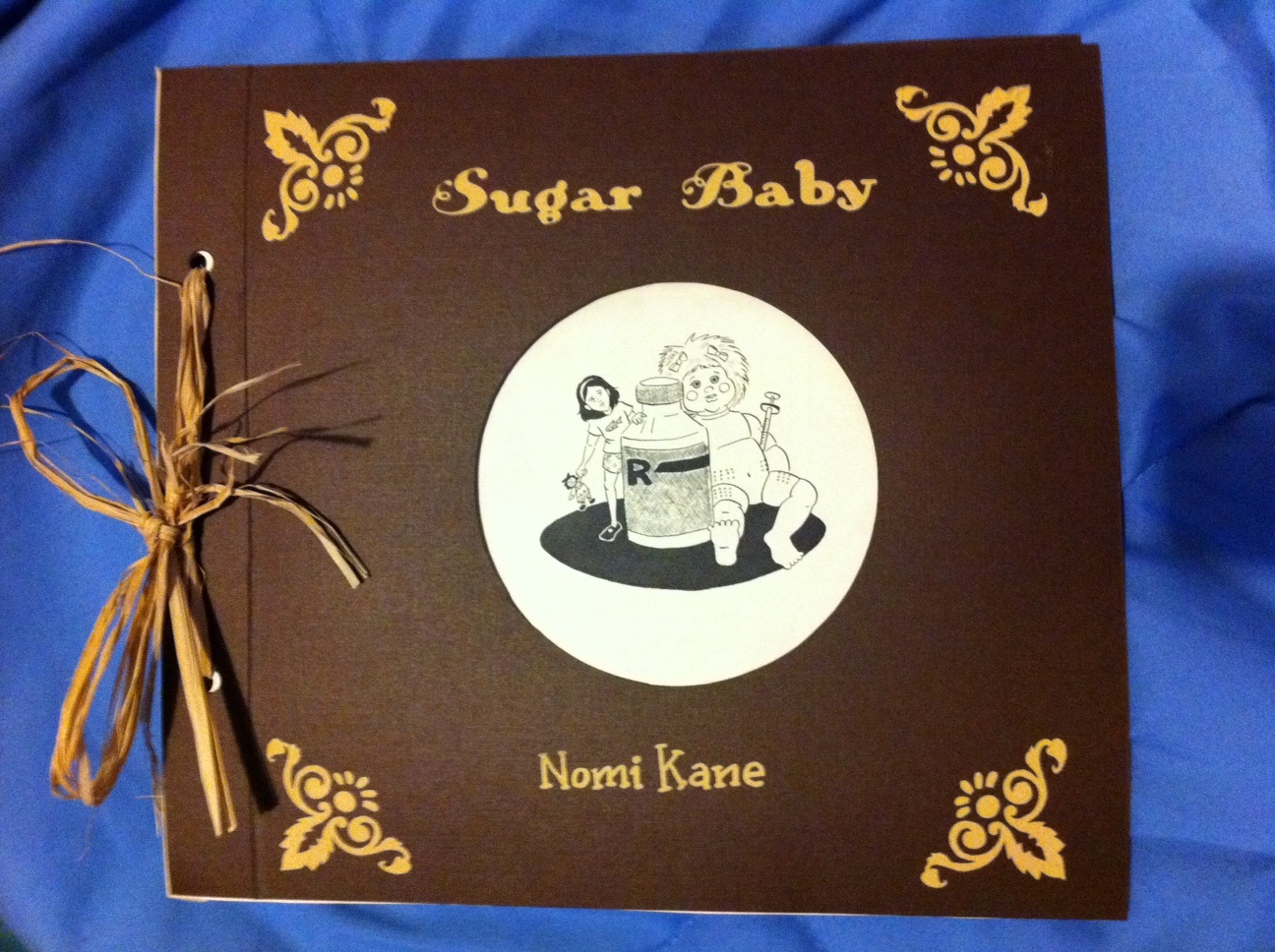
In Sugar Baby, Nomi Kane takes a different approach. The newly-minted graduate of CCS put together a simple but elegant package about her childhood experiences with diabetes. Oddly enough, fellow CCS grad Sam Gaskin had a similar comic called Sugar Cube that was about the same experience, though it was told in a very different fashion. Kane's clear, simple line is used to great effect as she puts together cleverly designed vignettes. Kane at times steers into public service announcement territory with short bits about how she dealt with the fear and anxiety related to diabetes at both a physical and social level. However, diabetes also acts as a framework for her narrative and as an antagonist for her character. That loose framework allows for a lot of vignettes about her family, including one story about a relative who shows her how to put on makeup and another story about Passover in her house.

Kane is a crisp storyteller and her pages are light and airy. There were times I wished she had used blacks or hatching a bit more often just to add a bit of density to her pages. There were times when her pages lacked weight simply because of the way she structured them, with eye-popping images sometimes occurring away from the center. Kane gave equal weight to every panel, it seems, and without leading the eye to certain key panels, certain images (like vomiting at a doctor's office or seeing an array of needles) lost some of their power. That said, Kane gets lots of key details right. Her lettering and logo design are both impeccable. She combines a certain looseness of detail with her naturalistic rendering approach. Her faces are expressive and her use of body language helps convey a lot of information without words. Like Frakes, there's a tight bond with the rest of her family that's an inextricable part of her personal narrative.

Kane obviously has a lot of talent and is comfortable working her way around a page. I usually tend to tell young cartoonists to clean up their line because they over-render. In Kane's case, there were times that I thought she under-rendered, where a more detailed line could have added additional poignancy to Kane's childhood dilemma. Indeed, the scenes where young Nomi is in a car are some of the most memorable because Kane pays so much attention to hatching the car seats. I understand that she was going for a positive and uplifting book and genuinely had a great time being raised by her family, but I wish she had pushed the boundaries of her storytelling a little bit more. I'll be curious to see if Kane's comics continue to be on the ephemeral side, if she evolves into a completely different kind of cartoonist over time or if she manages to combine the frothier aspects of her comics with a darker tone. Since her storytelling fundamentals are so rock-solid, Kane is one artist that I'd really like to see experiment as much as possible with a more immersive style.

Tuesday, May 17, 2011
Another Worthy Kickstarter Effort: Zak Sally
Anyone who's read my columns knows how much I admire the work of Zak Sally. He's trying to assemble the funds to publish (on his own press) a collected edition of his outstanding Ignatz series Sammy The Mouse. Here are links to my reviews of the first and third issues of the series. Here's a link to Sally's kickstarter page. As of 5/17/11, Sally is just $900 away from his goal of $4300 to fully fund his book. Unsurprisingly, there are some pretty great incentives still available.
New Review @TCJ: Habitat #2
Over at The Comics Journal website, my review of Dunja Jankovic's Habitat #2 has been posted.
Wednesday, May 11, 2011
New Post: Developments Arrested-- Mid-Life and Reunion

Pascal Girard's Reunion and Joe Ollmann's Mid-Life are books with similar sensibilities but different approaches. Both are self-deprecatory (sometimes to the point of self-flagellating) accounts of emotionally stunted men at facing crises that are entirely of their own making. Both books are autobiographical up to a point, but clearly take a lot of creative license in order to stitch together a narrative as well as emphasize the humorously pathetic nature of their protagonists. Girard's "Pascal Girard" character is faced with his ten year high school reunion while Ollmann's "John Olsen" is a new dad at 40-something years old who finds himself smitten with a children's music performer. Both characters are dissatisfied with their lot in life in a typically bourgeois kind of way; both have perfectly nice, successful and satisfying lives but have the nagging feeling that there's an ideal version of themselves that they're not quite living up to. It's certainly not an unusual feeling for men of that age, and both books are mostly predictable in how they unfold. Both men are obsessed with their appearance, both men sabotage their own successful lives for their ridiculous fantasies and both men wind up humiliating themselves in spectacular (if differing) ways.

Girard's approach is as loose as Ollmann's is labored. It feels like something torn out of a sketchbook, with no narrative captions, no chapter separations and no panels. Each page feels open and loose, an organic and relaxed approach that belies the sheer relentlessness of Girard's comedic assault upon the reader and his own person. The very first page introduces the reader to Girard's self-caricature, an awkward & stubbly presence throughout the book. The character is obsessed with being considered a "winner" and so is lured to the reunion by an email from a girl for whom he always harbored a crush. He hides that from his girlfriend as he decides to lose fifty pounds to look good for his old crush. That triggers a series of events where Girard, to use some delightful Yiddish terms, is both schlemiel and schlemazel. That is, he's an awkward person who manages to offend and annoy any number of well-meaning friends and acquaintances, as well as someone who has a lot of bad luck.

With 156 pages of this material, Reunion at times feels like too much of a good thing. Girard never embues "Girard" with a single positive trait. It's a bold move to make your protagonist so thoroughly pathetic and loathsome, especially when you throw in the cruel self-caricature (the exaggerated chin he draws on himself and the sweat stains he draws on his clothes are especially amusing) without narrative captions to help defend himself. The first half of the book sees him preparing for and anticipating the reunion, as he looks at Facebook photos of sexy old classmates and fantasizes about being desired by Lucie, his old crush. He starts to lose weight but is in pain from a bad tooth and constant cramping in his legs. Even as he loses weight, he tries to ignore a huge wart on his finger and the fact that his jutting jaw is becoming ever more pronounced. He manages to offend everyone at a dinner party he's dragged to while embarrassing himself by revealing that his socks are full of holes when he has to take his shoes off.

At the reunion itself, he arrives overdressed and proceeds to either abuse or get abused by every single person. He ignores the people who genuinely want to see him. He interrupts conversations and overreacts to perceived slights. The climax of the book comes when his mouth is in pain, he cramps up and his glasses get broken. Friendly former classmates work on all three problems at once as he squirms on a bench, creating the funniest photo of the night. He gets several lectures on not focusing so much on appearances and being a "winner". I was worried that Girard was going to cop out as his namesake went through a pat learning experience, but he stays the course and piles on an exquisite final physical comedy sequence and a topper gag on top of that as the final panel.
The book was a bit of a grind at times, especially during the first half. It's a book whose humor is dependent on schadenfreude at the expense of the author, but the author invites the reader to laugh at his hubris and vanity. There are times that he perhaps thinks his foibles are funnier than they actually are, but it's a credit to his skill as a cartoonist that he was able to blast through the book's slower moments with a series of gags that were not only funny in the moment, but paid off earlier set-ups. Mid-Life similarly has a final act filled with hilarious humiliations, but how Ollmann gets there and the ultimate message of the book are quite different. There are lessons to be learned in Ollmann's book, whereas for Girard, the lessons are far less important the comedy inherent in them.

Ollmann's book is rigidly structured and it's obvious that every page and every panel has been labored over intensely. There's an almost tortured quality to his line, as if he's afraid of having much white space poke through. His line is thick, and while his characters are cartoony (with some of them bordering on the grotesque), he fills them with detail. Olsen in particular gets lavished with a sort of self-loathing and self-obsessed detail: liver spots, lines on his forehead, random tufts of hair, a paunchy stomach, etc. That said, one never gets the sense that Ollmann doesn't trust his line enough to really tell his story, as he uses a lot of distracting greyscaling to fil up space. This is unfortunate, because his drawings are funny enough to carry the story on their own.

The book's first page is hilarious, as the Olsen character has to deal with the shit of his three cats and a feces-filled diaper left on the floor; the line "there's more poop in my life than a German porn film" was a laugh-out loud moment for me as a reader. Ollmann proves throughout the book that he's witty writer who can dish out punchlines and shtick. Indeed, Ollmann is as sure-footed a scripter as he is unsteady a draftsman. At times, text overwhelms his panels, either with Olsen's brutally self-deprecating narrative captions or frequently long-winded dialogue. There were times that I wished he used a smaller 2 x 3 or 2 x 2 grid instead of the 3 x 3 grid that Ollmann employs with few exceptions throughout the book in order to let his pages breathe a little. Mid-Life has a cramped, frantic quality as a result of its panel layout that doesn't always seem to be the author's intention.

Indeed, what I like best about the book is the way Ollmann brings the narrative conflict to a slow boil and frequently pauses along the way in order to reflect. The story involves an exhausted Olsen, having passed 40 and in a constant state of exhaustion due to dealing with a young child, desperately wanting to feel young and vital again. The wrinkle here is that he was a young parent and has two adult daughters, meaning that he never did get to have those carefree days of youth. He spends time after he and his wife divorce trying to play catch-up, and there's a sense throughout the Olsen is chasing some idealized state of youth and desirability that is entirely a fantasy.

Olsen develops a remote crush on Sherri Smalls, a children's musician who is on the cusp of a major career decision: should she accept a job as the host of a kid's show on a Disney Channel-type network, even if it means completely selling out? That crisis is punctuated by her inability to find the right kind of relationship, even as she's attracted to older men (in a bit of foreshadowing that is not exactly subtle). Olsen's burgeoning obsession affects his job performance and his relationship with his second wife. It's as much a fantasy about creating an escape hatch from one's current life as it is something centered on someone in particular. Throughout the book, Olsen simultaneously apologizes for and tries to explain his position while letting the reader know his behavior is awful. At 172 pages, there are about fifty pages of exposition that drag the book down and feel ridiculously self-indulgent. Olsen starts to repeat details and feelings that seemed obvious and cliche' the first time around, let alone the second.

That said, once Ollmann gets to Chapter 17 (103 pages into the book), the book picks up in painfully funny fashion. Contacting Smalls to do an interview in New York City as part of a related work assignment, there's an amazing scene the night before he leaves where his wife pours her heart out to him, regretting their recent lack of intimacy and their constant bickering. Olsen doesn't want to hear it, in part because he wishes he could meet Smalls with his marriage in a state of uncertainty, a feeling that immediately produces guilt but doesn't go away. The New York sequences are as sharp as the middle of the book was flat, as Olsen and Smalls meet, he lies to her about being married, they find they have chemistry, and a guilt-ridden Olsen decides not to go through with it. However, a baffled Smalls calls to tell him she's coming over to talk about this, leading to a number of scenes of great physical comedy that climaxes with Olsen hiding behind a plant in the hotel's lobby in an effort to hide from her.
Regrettably, Olsen tries to tie up loose ends into a neat package at the end, as he ponders all of the ways he plans to change, how the trip was an eye-opener for him and he owed his wife honesty. Sure, there's a plot-derailing bit at the end, but it still feels a bit like Ollmann lets his character off the hook more than a little, and certainly much more than Girard did. There's still a lot to like in this book and I admire Ollmann's willingness to flog himself for humor as much as he did, but the book would have benefited from a less-is-more approach.
Monday, May 9, 2011
New Post: The Trials of Sir Christopher

The Trials of Sir Christopher, by Colleen Frakes, is a collection of two stories born out of National Novel Writing Month (NaNoWriMo) written in drawn in consecutive years. In the span of a month, Frakes created a 100-page story from beginning to end. As such, this book has the feel of a drawing & writing exercise more than a carefully-crafted work with multiple levels of complexity. Compared to Frakes' Woman King, for example, this book is little more than a pleasant lark. That said, there's much to like here. The art throughout is fabulously loose and expressive, conveying information with grace and wit. No line feels tortured or overly labored, which I imagine is the purpose of exercises like this: to excise an artist's tendency to be overly precious or OCD about particular panels or lines and instead focus on images that move along the narrative. Frakes clearly uses different tools for each of the stories; the first story looks like it's drawn with a thin-line pen, while the second story is drawn using a thicker line, looking more like Frakes' standard work.

The book very much falls into Frakes' favored storytelling bailiwick: the fractured fairy tale. Frakes enjoys mining the darker edges of such stories, with few of her stories winding up with happy endings. The narrative follows a slightly hapless knight who's charged by his king to rescue his daughters from a dragon. He initially is roundly defeated by the dragon, who has already burned the princesses to a crisp. After a series of misadventures, a lady in the lake aids him and he kills the dragon. The ending is quite downbeat, even as it's punctuated by odd moments of humor. The second issue finds Christopher becoming a sailor and going to an island where he encounters an oracle and inadvertently unleashes a monster. This chapter is sillier than the first, and there seems to be a lot of wandering around hitched to a few plot points.

If the story itself doesn't contain much substance, the actual storytelling is remarkably fluid. The spontaneity of Frakes' line brings a lot of life to the proceedings. Her thick squiggles and curves bring Christopher to life, and her selective use of backgrounds creates a world for him to explore. The backgrounds frequently drop away on the page when we close in on Christopher talking to someone, but the expressiveness of those scenes makes that irrelevant. There are few true talking head scenes; when there's a conversation, we generally see full bodies, and the characters do something interesting in relation to each other. Creating a geometric space in those panels between the characters and perhaps a single object establishes a nice tension that makes the reader want to keep going even if there isn't true action on the page. That tension may well be the key to this book's success. The actual panel-to-panel flow isn't especially smooth, nor are the actual fight scenes, but the beautiful panel composition is a model of how to solve storytelling problems. I'll be curious to see how she carries over these fast-moving techniques to her future work.

Saturday, May 7, 2011
New Post: Minicomics From Aaron Cockle

Annotated #6, by Aaron Cockle and Derring-Do #5: Derring-Dune represent a new arm of elliptical storytelling and comics-as-poetry. Cockle's latest issue of his one-man anthology Annotated may be his best yet. As always, his comics are suffused with dread, paranoia and the absurd, but this issue punctuates this atmosphere with unexpected punchlines. The first story, "The Proto-Reactionaries", is about a diplomat visiting a writer held in some kind of concentration camp. The two men exchange information about some kind of monstrous world-wide conspiracy. The diplomat has a beard of bees, while the prisoner has a beard composed of broccoli. That tiny absurdist touch not only winds up defining the differing levels of privilege of the two men (as well as providing a point of tension), it also leads to a killer punchline.
Throughout this mini, Cockle uses a more minimalist line and an interesting compositional device. Every page has huge but even swaths of white space at the top and bottom, pushing the panels into a single square in the center of each page. Thick gutters make it easy to go from panel to panel, but the way Cockle forces the eye in the "action" of the page in its center is intentionally jarring. Despite the stillness of his storytelling style (indeed, this comic lacks a kinetic charge), the reader is nonetheless made to believe that every single panel contains powerful, essential information. It's a neat trick that helps inculcate that sense of dread and paranoia in the reader, making them expect the worst on any given page. Keeping his art and figures simple also allows the reader to fly from panel to panel; in the past, Cockle's deficiencies as a draftsman sometimes detracted from the atmosphere he tried to create.

Take '>', for example. This is another slice of espionage mixed with absurdism, as two agents report to giant-headed creatures about the activities of a group of people. Cockle's use of negative space and blacks here aims at baffling the reader, until the final reveal and punchline turns this into an office comedy. The figures are rendered as simply as possible, with the reveal of the giant-headed creatures coming as a shock but acting in a matter-of-fact fashion. "1-15" is a more typically grim Cockle story about a report on a woman who makes reports in notebooks. It's implied that the third-person narrative is really a first-person account of her own thoughts. Visually, it's the most interesting thing Cockle has done to date, as he dips into uninked pencil drawings for a dream sequence and mixed media combined with "text-jamming" in a panel about reclaiming old text. At its heart, this story is about the possibility of creation and being forced to deal with what Lynda Barry refers to as The Two Questions: "Is this good? Do I suck?" In the process of trying to create, these are the questions that strangle creativity and lead to despair. By simplifying his line, Cockle has allowed more complex aspects of his work to take center stage. Hopefully we will continue to see him continue to refine his line.

Derring-Do #5, subtitled "Derring-Dune", is listed as the "Science Fiction Issue". The anthology includes Cockle's '>' (here called "The Micropolitan") as well as a wonderfully sketchy story by Brendan Leach, whose Pterodactyl Hunters was a favorite comic from last year. Most of the other artists contribute wonderfully oblique stories that each touch on futuristic topics in different ways. Laura Laurus offers two "future" strips from The New Yorker, positing a kind of topical humor based on superficial future trends. Ray Bruwlheide's "work" uses Floyd Gottfredson-style art in its depiction of a future where we all wear TVs on our heads that depict our thoughts. It's a silent story that uses the the rhythms of early animation that plays out in an expected distopic fashion but is a genuine pleasure to look at. Michael Rae Grant's "Fourth Dimension" strips, which involve asking 4th and 5th dimensional creatures what it's like in their spheres, turns out to be hilarious and visually engaging.

Matthew Phelan's story and Bruwelhelde's "Party" are far more conventional narratives, with the former in particular feeling somewhat cliched in creating its high-stakes future-capitalist atmosphere. Sara Lautman's strips are scribbly to a degree where it can be difficult to engage them, though I was fascinated by the nature of that scribble. Katie Fricas' "Santa's First Christmas" is an odd duck even compared to the other stories, employing white-on-black psychedelia with an immersive quality as its letters become part of the art. All told, this is a surprisingly coherent minicomics anthology with nice production values and differing but complementary styles of art and storytelling. The only real negative is that several of these stories were the first chapters of longer stories, which is a pet peeve of mine for anthology series, with some exceptions. In what was otherwise a cohesive reading experience, leaving the reader hanging was bothersome, especially since one was left wanting more.
Thursday, May 5, 2011
New High-Low at TCJ: Top 25 Minicomics of 2010
Here's my latest column at the Comics Journal, listing the Top 25 Minis of 2010 plus some other related comics.
New Review @TCJ: Blammo #7
Here's my review of Noah Van Sciver's Blammo #7, over at the Comics Journal.
New Post: Tomb of Horrors: Dungeon Quest, Volume 2

Joe Daly's comics are an unequivocal delight. The second volume of his role playing/video game send-up and tribute, Dungeon Quest, is a visual feast from beginning to end. Of course, this feast may be mere junk food, but his sheer commitment to the adventurous reality that his characters encounter makes the reader care about the most ridiculous of scenarios. This volume is actually far more straightforward as an adventure story than the first volume. It's much less meta, for one thing; a new reader would have no clue that the story began when main hero Millennium Boy blows off his homework in search of adventure in his suburb. By the time we reach the forest depicted in volume 2, it's as though he and his party have entered a completely different world.

Dungeon Quest is visually exciting for two reasons. First, Daly lavishes a tremendous amount of attention and detail on action, backgrounds and setting. The forest is densely hatched and cross-hatched, the vegetation is given loving detail, the monsters are vividly drawn and in constant motion. Second, the characters themselves are drawn in a cartoony style that draws the eye to them immediately. Their faces in particular couldn't be any simpler: dots for eyes, a line for a mouth, and a squiggle for a nose. That simplicity leaves lots of white space in the area of the characters' faces, naturally drawing in the eye to focus in on them. That one technique makes every fight easy to follow, no matter how dense the action.

While there's less of the languid, stoner sort of humor in this volume, that's not to say that there's not a lot of laughs to be found. Daly likes to employ a matter of fact and visceral crudeness in his stories, from a message capsule flying out of one character's anus during a fight to basic bathroom humor presaging a clash with giant spiders. In-between combat, Daly has his characters engage in information-processing in the form of stoner/slacker humor. The party gets stoned one night while contemplating their adventures, hoping that they will get even better weed and more elaborate pipes in the future. After another fight, one character gets high on cocaine and starts bullying another party member, until Millennium Boy talks him down. The dialogue is incongruous with the deadly seriousness of the fights themselves yet fits in nicely with the world Daly has created. At heart, every adventurer in a RPG is a bored person who's looking to explore their world.

World-building and exploration of a space is at the core of Dungeon Quest. In an excellent and revealing interview with Tom Spurgeon, Daly reveals the debt he owes to Fort Thunder cartoonists like Mat Brinkman and Brian Ralph. Books like Climbing Out and Teratoid Heights feature simple characters with simple motivations who explore spaces and deal with the creatures they find. By fusing this idea more deliberately with the video game aesthetic that's also a driving force behind this comic, Daly creates an experience that mimics the experience of driving a character or characters through their world, down to the acquisition and cataloging of objects as well as "leveling up" after a major fight. While the characters are experiencing the rush of exploring ancient ruins and completing quests, there's also the sense that they are experiencing and commenting on this experience the way a video game player might. While the encounters and fights are serious, Daly infuses the whole comic with a sense of absurdism, from the nature of one of their quests (to assemble an Atlantean resonator guitar), to the silly name of the objects they pick up. That interview notes that Daly wants each volume to have its own distinct feel, with some being devoted to fights and others indulging in more humor (and one would guess, meta-humor). It's clear that this volume is one that was all about fights, and there are indications that the next volume will be more talky. While there are a number of alt-comics fantasy series being published these days (with Trondheim & Sfar's Dungeon the best), Daly's fusion of underground comics sensibilities with the blunt directness of the video game playing experience is unique and leaves the reader wanting more.
Tuesday, May 3, 2011
New Post: Minis from Laura Terry, Ross Wood Studlar, Bill Volk & Sean Ford
Here are some recent minicomics by alumni from the Center for Cartoon Studies.


Stranger Knights, by Bill Volk, Mary Soper & Casey Bohn. This is a slight but amusing anthology edited by Volk, an artist who seems drawn to a grungy and unglamorous version of folklore and myth-making. All three feature smart-ass and off-kilter superhero stories. Volk uses a clear and clean line in depicting the adventures of Shamash, the Mesopotamian god of justice. Midway through, the story takes a left turn as he must go home to ask a favor of his grandfather, Enlil, who insists that he try some potato chips. Despite the story's whimsical trappings, it has the tight plot of a Silver Age Marvel story, right down to the interpersonal squabbling of Shamash's superhero teammates in the "Stranger Knights". That light touch, combined with just a touch of angst, continues in the Volk-written, Soper-drawn story of Incantrix X. This is a sci-fi superhero story about a character who uses her mind-clouding abilities to defeat alien dinosaur men but is given a prophecy about turning evil in the future. Soper's line is expressive and exceedingly fine, which gives the whole story a breezy feel. Bohn's work is similarly quirky, as he depicts the adventures of a superhero who uses an electric guitar to fight evil. His art is crude, not unlike a Golden Age cartoonist who had a week to crank out a nine page story, but it has a primitive energy and stays remarkably clear. I wouldn't say that Stranger Knights is a remarkable comic, given the scores of fusion-light superhero comics that have emerged from the alt-comics scene in recent years. I will say that it's one of the more enjoyable comics of its kind that I've encountered, especially in the way that it kept its mood light while being entirely aware of the sort of story it was telling. This looks like it will be the first issue in a series, and I'd like to see what Volk can do in future issues.

Only Skin #7, by Sean Ford. This is the final issue of this storyline, one that will be collected by Secret Acres in 2012. That publisher has released minicomics collections from several CCS cartoonists, including Sam Gaskin, Joseph Lambert and (tangentially) Ken Dahl. Ford says in this issue's notes that the series will continue with a new story. I won't say much about the actual story given that this is the last chapter, but this is very much a denouement to the explosive events of the previous issue. It's a line-dividing issue that very much has the feel of a monster or zombie film where the heroes didn't quite win and are lucky to get out alive. What's interesting is that ultimately the most destructive, (literally) society-obliterating elements of the story turn out to be human ones. Ford makes this issue a mirror of the first one, where there was page after page of bleak, full-page shots of the desolate setting. In this issue, we see that environment burned down in page after page, with Ford's distinctive smeared pencils creating an eerie, shifting environment. This series has been quite an opening salvo in Ford's young career, one that has seen him refine his line while creating beautifully composed and balanced pages.

Morning Song and b.f.f by Laura Terry. Terry has always been a strong storyteller with a distinctive voice, but these two minis demonstrate a newfound devotion to craft and detail. They're both what I refer to as "convention minis"; that is, minicomics that are art objects as well as comics. They generally tend to be slightly flashier and more gimmicky than a standard mini. What makes these minis by Terry stand out is the way she manages to fold in function along with form. The gimmick of each mini serves the actual story (slight as it is) well, and the story would not be able to function well if it didn't appear in this particular form. Morning Song, for example, is an eight-panel comic. It's about a young man whose fiddle playing gently nuzzles the wildlife from sleep to wakefulness. It's tucked into a cute cardboard rodent head. When you pull the comic out, we then read the first two pages, as we see the song bringing dawn. The reader then unfold the comic up to reveal the next four panels, as we meet the musician. Finally, we unfold the comic one more time to its full 11 x 17" length to see the final scene. Reading this wordless comic takes less then thirty seconds, but the physical experience of folding and unfolding it is a clever way of making the reader understand the passage of time.

b.f.f. has a clever wrap-around cardstock cover featuring two girls in a tree; opening up the right front flap changes the picture so that only the girl on the left is present. This story reveals just how much Terry's overall chops have improved. Her line is thinner and more confident at the same time. One of Terry's strengths has always been the depiction of movement, and this mini sees her using some interesting techniques to depict movement by moving the reader's eye across the page in a zig-zag fashion. The story is semi-auto-bio, based on a childhood experience where she had her heart broken by a girl. What I liked best about it is the way it resolves; rather than end on a self-pitying note or a cheer-up platitude, it instead unites "Laura" and her anthropomorphic heart by having them engage in "petty revenge". Terry seems ready for a next-level jump, and so I will be quite interested in seeing her tackle a long form work or short story collection.

Avian Tales From Crater Lake, by Ross Wood Studlar. Studlar is a park ranger who also happened to attend "cartoon school". Unsurprisingly, his subject tends to be nature. In terms of his drawing, this comic is a step forward from the previous comic I reviewed of his, The Raven And The Crayfish. His line is no longer quite as labored; drawing directly from nature is a nice match for the looseness of his line. This eight-page comic is a collection of small observations of birds at Crater Lake, from young eagles' leaps out of their aerie to the way diving ducks plowed several dozen feet into the crystal-clear lake in order to devour fish. Studlar also has a prose piece connecting mythology and folklore to the unpredictable and threatening nature of storms on the lake. This is a slight comic at best, one that hints at many more interesting anecdotes and observations to come. Studlar is clearly still trying to figure out just what it is he wants to do as a cartoonist, and his eye and interests are so different from that of the average cartoonist that he has the potential to do some interesting work. A book full of these stories and observations, linked together with prudent editing, could produce a unique comics artifact. As long as he continues to use a more restrained line for both his true life and mythological interests, that book could be a compelling read.

Avian Tales From Crater Lake, by Ross Wood Studlar. Studlar is a park ranger who also happened to attend "cartoon school". Unsurprisingly, his subject tends to be nature. In terms of his drawing, this comic is a step forward from the previous comic I reviewed of his, The Raven And The Crayfish. His line is no longer quite as labored; drawing directly from nature is a nice match for the looseness of his line. This eight-page comic is a collection of small observations of birds at Crater Lake, from young eagles' leaps out of their aerie to the way diving ducks plowed several dozen feet into the crystal-clear lake in order to devour fish. Studlar also has a prose piece connecting mythology and folklore to the unpredictable and threatening nature of storms on the lake. This is a slight comic at best, one that hints at many more interesting anecdotes and observations to come. Studlar is clearly still trying to figure out just what it is he wants to do as a cartoonist, and his eye and interests are so different from that of the average cartoonist that he has the potential to do some interesting work. A book full of these stories and observations, linked together with prudent editing, could produce a unique comics artifact. As long as he continues to use a more restrained line for both his true life and mythological interests, that book could be a compelling read.
Sunday, May 1, 2011
New Post: The Minicomics of Steve Seck
Steve Seck is a graduate of the Center for Cartoon Studies who is currently crafting a slacker humor series in both webcomics and minicomics form. Life is Good can best be described as a cross between Pogo and Hate, if that makes any sense. There's also a bit of John Kerschbaum's work to be found in these pages. These comics are interesting because they're a clinic in how a young cartoonist can hide their weaknesses while highlighting their strengths as they figure things out in public. As a draftsman, Seck is competent but unremarkable. He sometimes relies too much on hatching and shading to the detriment of the page as a whole. There's something ugly about his art and figure work in particular.

Seck understands that ugly can be funny. He compensates for his deficiencies as a draftsman by rendering his characters as anthropomorphic animals and objects. His figures are expressive and bizarre, drawing in the eye with great ease. He draws his character's eyes as thick vertical lines, topped by thick horizontal lines as eyebrows. That simple technique gives him quick and total mastery over his characters' facial expressions, which is key because the reactions of his characters set up much of his humor. Mixing cartoony, expressive art with grotesque imagery has been a standard part of the underground comics playbook for more than forty years, but Seck breathes his own life into the formula thanks to the voices he creates for his characters.

The series follows the exploits of Brownie, an anthropomorphic beer bottle living in the city who has just lost his job. His best friend is Charles, a drunken alligator who lives in the pond of a public park. The series follows the increasingly pathetic and drunken adventures of the slightly uptight Brownie and the reckless & slightly stupid Charles in a manner that reminds me a bit of the relationship between Buddy Bradley and Stinky Brown in Hate. There's a friendship there, but Brownie also feels a good bit of antipathy for Charles, especially when it involves bringing in true lowlifes like the hilarious Sewer Gator, a hypermasculine idiot who loves to get drunk, get into literal pissing matches and challenge people to fights.

At the other end of the social commentary spectrum there's Dr Peace Rock and his common-law wife Unity Flower. An anthropomorphic flower and tree, respectively, Seck sets them up for a savage satire of the impotence and self-aggrandizement of lefty academic types. The unctuous Dr Peace Rock is a marvelously slimy character, manipulating and passive -aggressively browbeating his mate into "correct" action while ruining her bookstore business and mocking her for being "merely" vegan. The later issue where we see a very different side of their relationship, this time from her point of view, was surprisingly poignant and affecting. If Seck pours the invective on a bit thick here, it's clear that he's doing the same for all of his characters, who are all deeply and amusingly flawed. Brownie in particular is partly a voice of reason, but he makes spectacularly bad life choices while sitting in judgment of others.
There's a sort of rambling narrative to this comic, as Brownie negotiates being unemployed and Charles winds up as the spokesman for a clean up the park protest organized by Dr Peace Rock (even as he makes Unity Flower do all the work). Of course, Charles is responsible for wrecking the park in the first place. That narrative is mostly there to keep the characters moving and interacting with each other so as to create conflict and jokes. Seck could stand to liven up his layouts a bit in order to pick up the energy of his book. He has funny-looking characters which would allow him to stretch the limits of reality a bit (a la Peter Bagge's Hate) while still retaining the internal logic of his story's structure. Too many of his pages are static and feature talking heads. Even the pages with action sometimes tend to relegate it to the upper corners of the page, blunting their impact. When he does liven things up a bit (mostly when Sewer Gator, his funniest character, is around), his line gets a bit crazier. Those are the pages that take the greatest advantage of his particular visual style.
That style is in its best effect in the one-off The Trial of Sweetie Snake, a comic influenced as much by Looney Tunes as they are any particular comic. It's a take-off on the OJ Simpson trial by way of a snake killing a prospector after donning a number of disguises. It's jammed full of visual "eye-pops", bad puns and ridiculous situations. It lacks the slice-of-life dialogue that informs the characters in Life Is Good, but maintains a higher and more manic level of energy throughout. Seck continues to grow as a cartoonist and humorist and shows a lot of potential. Each issue of Life Is Good is stronger than the next as he is able to build on his character development and put them through increasingly weird and awkward situations. He's already done the hard part by developing his own voice and style; from here on out, it's all about refinement and increasing his own personal degree of difficulty.
Subscribe to:
Posts (Atom)


