Thursday, May 31, 2012

The Fine Print: Dungeon Quest Book Three


At nearly 250 pages, the third volume of Joe Daly's Dungeon Quest is about twice the length of either of the first two volumes. This loving tribute and send-up of quest-based games that explore particular environments devotes a lot of its time to stoner humor as well as elaborately-staged fight sequences. Daly is equally adept at portraying long, drawn-out arguments and debates between his characters and allowing his characters to silently inhabit and traverse a space for pages at a time. The humor is frequently scatological, even as there are long metaphysical discussions of the stoner variety. In this volume, Daly provides a ton of mythological backstory as well, even providing several text pages of something called "The Romish Book Of The Dead", a source guide about a key ethnic group that existed after the fall of Atlantis. While there's a lot of information that's dumped in this book, Daly doesn't skimp on the jokes or the fights.
 
Once Daly commits to a bit, he goes all the way, as when the fighter/thief character Steve is determined to get a particular bag of weed from a vending machine in a temple. He manages to distend and distort his entire body to do so, unlocking a weird new stretching power along the way. From there, there's a long sequence of the characters getting stoned and arriving at various revelations/absurd observations. Daly doesn't stop there. After Steve goes unconscious from the potency of the pot, he later wakes up and recounts his weed-induced vision of feeling his body and discovering he had a second penis that he had to carry around. Like everything else in this series, this bit of nonsense is treated seriously, but the characters never fail to take the piss out of each other when they do something weird. For example, when hulking brute Lash Penis defeats a vicious dog creature by yanking on his penis and punching his balls (in a truly strange sequence), Millennium Boy calls him out on it, with Lash sheepishly saying "Uh....no." The interplay between those is usually my favorite part of the book. In another scene both scatological and practical, Lash puts a "bullet" filled with small supplies into an unconscious Steve's anus. When he notices that the anus practically sucks it up on its own, Millennium Boy proceeds to theorize that barometric pressure had something to do with it. A baffled Lash, upon hearing MB talk about different amounts of air in one's hands, yells "NO! How can you hold the air in your hands?".  MB simply says "Let's just say his ass sucked it in", and Lash triumphantly yells "YEAH! It sucked it in!"  Lash may be incredibly stupid, but that doesn't mean that the things Millennium Boy pontificates about make any sense.

By this point, these characters seem entirely divorced from the modern city-dwelling folk we met in the first volume and have been totally subsumed in this weird forest world of womraxes and brigands. The bandits they meet are armed with weird weapons like a gas grenade gun rather than actual guns, and their "big boss" is a steam golem. Adding to the weirdness is the introduction of Lou, a "little forest-man", who helps the party only when Lash agrees to give him a hand-job that spans three highly-detailed pages. Upon ejaculating, his seed creates a sapling that will one day bear fruit that will create more little men of the forest. This is typical Daly: every joke and weird moment has a mythological resonance. Lou is a hilarious addition to the proceedings, as he frequently humps Lash's leg and the back of his head even as he dispenses sage advice about how to proceed in the forest and rescue the distaff member of their party, Nerdgirl, from the bandits that ambush them and take their stuff. The final action sequence, where a nude party battles the bandits, is both ridiculous and exciting. Daly clearly takes the action scenes seriously, as he meticulously shows every detail of the fight, how enemies are vanquished, killing blows, etc. It's the sense of detail of a gamer, really, where we want to see those details. However, the action and detail in the book never obscure the fact that this is primarily a humor book, and he never lets too many pages go by without either a gag or a funny argument or a weird vision of some kind.

The simplicity of his character design is the key to the book's visual success. Once again, Lash is the best character because of the tiny facial features on a huge body--frequently it's just 2 dots for eyes, a squiggle for a nose and a line for a mouth. At the same time, Daly has a rock-solid understanding of anatomy and musculature in particular. There's a wonderful crispness to his line that mixes the clear-line style of Herge' with a slightly thicker line weight and greater willingness to use blacks to create atmosphere. It's a style that's simultaneously dense but clear, allowing the reader to take in a lot of detail quickly and admire the craftsmanship at work without distracting too much from the flow of the story. By this point, the reader will know if this is their cup of tea; anyone who enjoys alt-comics takes on fantasy and/or stoner humor will find this a sheer delight. I'd say the sheer level of craftsmanship and the way Daly shifts storytelling modes so quickly would at least interest other readers, especially those who enjoy deadpan absurdism, since that's the core of Daly's sense of humor. For the continuing fan of this series, Daly continues to raise the stakes in each volume and adds richness and depth for those who are looking for more detail. Above all else, he does for the reader what he does with his party: he keeps things moving even when his characters are navel-gazing.

Wednesday, May 30, 2012

Another Worthy Kickstarter: Digestate

I wanted to make mention of an interesting anthology seeking Kickstarter funds called Digestate, which features a pretty amazing cast of creators that includes Berke Breathed (of Bloom County fame), Alex Robinson, Josh Bayer, Jeffrey Brown, Renee French, Sam Henderson, John Kerschbaum, James Kochalka, Minty Lewis, Brian Ralph, Noah Van Sciver and many other excellent cartoonists. The topic is food and the ways in which it impacts our lives. Please consider donating to what should be a beautiful, fascinating book.

Tuesday, May 29, 2012

Oddball and Not-Quite-Comics

A number of comics I receive resist easy categorization and many of them are barely recognizable as comics.  Let's take a look at some of them.

Jesus Needs Help, by David Germain.This is a strange little book that is essentially a heavy-handed anti-censorship screed. It features a group of monkeys representing a variety of anti-censorship sources preventing Jesus from reading the Beatitudes (aka "The Sermon on the Mount").  On a surface level, it looks like it was drawn using a tablet, as each of the characters looks like a frozen still from a cartoon. Drawing the various censorship opponents as monkeys and equating each of their positions speaks to the artist's lack of subtlety and nuance regarding this issue. On the other hand, I can understand and respect the idea of a free-speech absolutist in the name of art and self-expression (which is his argument), though how that translates to a sermon (a proscriptive lecture, not a work of art) seems to muddy the waters a bit. Equating feminists and "Black Panthers" with Nazis is also a broad brush stroke that is so hyperbolic that it approaches nonsense, especially since he doesn't exactly equip his "monkeys" with anything resembling a rational argument. If one agrees that it's not rational or socially responsible to yell "fire" in a crowded theater, then one can begin to actually debate the limits of free speech. Even in the strictest libertarian sense, there can be speech designed to be fraudulent or imply the use of force--which of course are the two libertarian bugaboos. This comic doesn't really work as a form of satire, a coherent philosophical argument or a form of entertainment.

Catch-Up #1 Bonus Round, edited by Josh Burggraf, Mark Hensel and PB Kain. This is the comics/illustration publication that went with the first issue of the literary magazine Catch-Up. While out of print, it's well worth tracking down. It opens with the surreal art of Jeffrey Meyer, who uses collage that features photos, drawings, paintings and cartoony work in an interesting fashion. Much of the comic is influenced by the Fort Thunder school of monster-making and having the environment drive the narrative as characters explore space. Pat Aulisio uses the detail-packed version of this style in his story, with almost no white space used. PB Kain takes the opposite route, using a minimalist line and an abundance of white space in depicting a battle between a Sea-Beast and Sky Lumberjacks. Malachi Ward eschews any interest in story in "Cave", preferring to solely focus on the details in a given environment. Katie Skelly's "Space Girl", with distorted limbs and a galaxy emanating from her cigarette, is a perfect example of the psychedelic glamor at which she excels. The issue's true stand-out feature is Lane Milburn's "Perceived Obsolescence", a pastiche of pulp and Golden Age and EC sci-fi tropes (there are touches of Wally Wood to be found) that eventually turns into a modern, satirical statement on corporate greed. Milburn's gorgeous, sumptuous use of color is deliberately garish at points, all the better to highlight the absurdity of the situation and the ways in which the common man is hopelessly manipulated by those with money and power. The production values and editorial care taken in this anthology make it a cut above the average collection of young talent.


Drunken Master #10 and #12, edited by Kiyoshi "Lucky" Nakazawa. These zines are filled with the kind of energy and on-the-scene presence that remind me a lot of the early issues of Motor Booty. Like that classic magazine from the 80s and 90s, the editor is a cartoonist who writes and draws about his interests and recruits others to do the same. This includes mixed martial arts, strange bands like Ninja Academy, cauliflower ears and things local to Los Angeles. His own comics range from the MMA saga "Prize" (an earnest take on just what it takes to be a fighter) and his humor strip "Won Ton Not Now", both of which bear his loose, expressionist style that pulses with energy. These zines are personal and intimate, with lots of references to Nakazawa's own life and photos from events around town. I especially enjoyed his interview with MMA battler Josh Barnett, a savage fighter who loves anime, manga, heavy metal, Love and Rockets and toys. There's an ease and intimacy in the interview that comes from Nakazawa's obvious admiration for Barnett, but this doesn't stop him from asking tough questions about performance enhancing drugs. The zines are a little short of professional, as the layouts are decidedly DIY and spelling errors abound. None of this matters all that much as Nakazawa and his friends seem to have the pulse of interesting alt-culture in LA and genuinely love comics. If you love zines that reflect the passion of their editors, then Drunken Master is well worth a read no matter what your interests happen to be.

December 3rd, 1967: An Alien Encounter, by Michael Jasorka. One can't help but love this fastidiously-designed and entirely unironic transcription of one man's encounter with a UFO and its denizens. The late 60s and early 70s saw a rash of UFO fever across the country, as any number of people talked about seeing mysterious objects, time lags, etc. One Herbert Shirmer, a young police officer in Nebraska, happened to see the standard cigar-shaped craft with lights on patrol late at night, something that he reported to his chief. Jasorka dutifully documents all of this with newspaper accounts of the time, but this comic is most interesting because there's a CD that goes with it that features an interview with Shirmer. Jasorka comes right out and says that he believes Shirmer's story, and illustrates it in a style reminiscent of Steve Ditko.  It's not an out-and-out swipe, but rather a stylistic decision that makes the comic look like a Ditko-drawn monster comic from the early 60s. Shirmer relates that the details of what he saw didn't come out until he was put under deep hypnosis by the Air Force, which revealed that he was taken on board the ship by its humanoid pilots and shown where they were from, what they were doing on earth (collecting electricity) and how their craft worked--along with a lot of other things that he didn't understand.  Whether or not the story is true is not especially relevant to me as a reader; it was more interesting to hear Shirmer tell his narrative (for it surely is a narrative by this point in time) and how others treated him as a result. As a result of that one incident, Shirmer has lived the life of a man with a crazy story that he tells again and again. He is now inextricably bound to this account which he can never prove (nor can it be disproved), at the mercy of the scorn of his peers and only receives positive attention from the curious and the converted. It's a tragic story no matter how one looks at it.


Furreh Nuuz TeeVee, by Joe Meyer. This is a satire of a particular sub-strata of fan culture that doubles as a lifestyle choice: furries. Meyer is a willing participant in the culture, and they tend to be the ones who deliver the most vicious and accurate barbs. That's certainly true here, as Meyer dishes on drama in the online furry community (the internet adding a layer of crazy to the proceedings) and isn't afraid to name names, a fact that nearly got him banned from any number of places. Meyer is a skilled draftsman who loves dealing in the grotesque and excess in depicting events like furry conventions, but despite his annotations at the bottom of each strip, this comic is really just one long inside joke that only made sense at the time of publication on the web. As such, it's more interesting for anthropological reasons than for humorous ones, as the jokes so heavily reference specific people and events that they make little sense. And a joke that you have to explain with footnotes doesn't become any funnier to the uninitiated. Still, I was fascinated by the inside descriptions of the culture from someone who clearly appreciates it but isn't afraid to laugh at its own inherent ridiculousness.

Randy Packs, designed by Tony Ong. These are good old-fashioned trading cards wherein various alt-cartoonists and illustrators draw a particular sort of sex act, ranging from a Rusty Trombone to a Topeka Destroyer and all points in-between. The backs of the cards even combine to form one of two puzzles depicting further sex acts, but you have to collect them all in a series in order to see it. The real fun is to see which artists go literal in depicting frequently scatological and disgusting sex acts and which play them off as jokes (I enjoyed Sam Henderson's solution to depicting a Pearl Necklace). While there are plenty of artists known for drawing gross stuff on hand (Ivan Brunetti, Renee French and Johnny Ryan, to name three), there are some inspired unexpected choices as well, like Vanessa Davis and Steven Weissman. If you enjoy gross-out art or strange side-projects by your favorite alt-cartoonists, I'd check them out.


Friday, May 25, 2012

Comics For Kids: A Survey Of New Material


A truism in the world of publishing is that comics for kids are one of the few growth areas available.  Whether they're aimed at new readers, readers on their way to developing a lifelong passion for reading, or for the fabled "all-ages" audience that also encompasses adults, there seem to be more publishers who have a real sense of what they're doing in creating comics. 

Let's begin with Francoise Mouly's remarkable Toon Books line.  When she started this imprint, she actually tried to shop her idea (comics aimed at emerging readers from ages two through five in hardcover form), she was rejected across the line because every publisher didn't quite know what to make of her end product.  She saw it through herself and made it an offshoot of RAW Junior, and the results have been quite successful.  In addition to winning several industry awards, the Toon Books have also become staples at libraries.  One of the slight modifications she's made is indicate the specific reading level for each book with an easy numerical code.  One indicates the youngest readers (kindergarten and first grade), and the content focuses in on a single character or two doing specific things while using a limited vocabulary.  Two is the middle level (first and second grade), with multiple protagonists interacting with each other, a larger vocabulary and a story arc.  Three is aimed roughly at second and third graders, as characters interact with the larger world around them, the books are divided into chapters and the vocabulary tops 1000 words.  Mouly has done a nice job of getting cartoonists to write these children's books, but she's also excelled at getting children's book authors to write these comics.

The most recent batch includes three such books, including an author new to the Toon Books line in Philippe Coudray.  His book, 
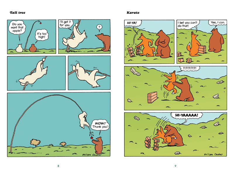
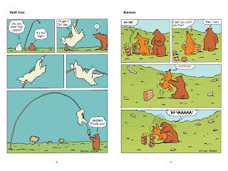
Benjamin Bear in Fuzzy Thinking, marks the first book of gag comics for kids that Ton Books has published.  It's a legitimately funny book of single-page gags, with four panels to a page.  It's a perfect primer in how to teach kids humor whose punchline takes an unexpected detour from its premise.  Every single joke is a sight gag, making it perfect for kids.  It's an unexpected pleasure to read a children's book where no lessons are to be taught or examples followed other than making the cognitive leap of understanding a certain form of humor.  On the other hand, Geoffrey Hayes contributes a new character, Patrick in A Teddy Bear's Picnic And Other Stories.  Hayes is a remarkable craftsman with years of illustration experience, but his true love was always the comics he would make as a child with his brother Rory.  Done in colored pencil, this book has a warmth and organic feel unmatched by other children's books.  There's an incredible sense of comfort to be found in these pages, even as Hayes playfully and skillfully leads the young reader through a fairly complex set of panels on each page.  He can't help but have images sticking out of panels, having panels disappear altogether, and having other panels act as decorative devices.  For the youngest of readers, Agnes Rosenstiehl returns with Silly Lilly in What Will I Be Today?  The titular character tries out all sorts of professions, from musician to city planner to vampire (!), with amusing variations on each job for the young girl.  Rather than the fluid panel-to-panel transitions of Hayes, Rosenstiehl employs a deliberately posed technique in each panel, allowing a young reader to see how Lilly is moving from panel to panel very slowly.  It's a clever technique that introduces the idea of the passage of time from panel to panel to young readers.  None of these books are cheap (about $13 for 34 pages), but the production design is top-notch.  The Hayes books and the Coudray books are definite keepers for anyone, but if I were buying these for a child, I might check some of them out of a library first to see what they liked best.

A book done in much the same format as the Toon Books is Aron Nels Steinke's The Super-Duper Dog Park.  I wasn't keen on his first book for kids, Neptune, given that it violated the "show, don't tell" rule.  It kept talking about how wacky things were instead of really making things wacky.  With his new book, Steinke (once again working with Blue Apple Books "Balloon Toons" line--they published his second book for kids, The Super Crazy Cat Dance) gets straight to the telling from the very beginning.  An important rule for keeping kids involved in your book is to provide a propulsive sense of momentum and to keep it going, which is what Carl Barks was so good at in his Disney comics.  Here, Steinke tells the reader that a bunch of people are going to a dog park, he follows their car to the park, and then everyone plays in the souped-up dog park until it's time to go.  Using a clear and simple line, he devotes each page to a different part of the park, including a section where dogs make music.  There are lots of eye pops and sumptuous background details, but the characters themselves are kept simple.  There are amusing bits but no real jokes, per se--Steinke seems to be aiming at delighting and amusing rather than trying to make his audience laugh out loud. Steinke is not in the same class as the Toon Books creators, but it's clear that he's making strides in determining his strengths.

First Second aims a lot of their books at young readers, but Nursery Rhyme Comics is their youngest-skewing book to date.  Edited by Leonard Marcus, the book features a murderer's row of cartoonists and illustrators putting their spin on classic nursery rhymes.  Some create entirely new dialogue and narratives to go with the rhyme, like James Sturm's back-talking "Jack Be Nimble".  Lucy Knisley took the rather dreadful rhyme in "There Was An Old Woman Who Lived In a Shoe", turning a story about a woman whipping her children before bed into a rock 'n roll babysitter who forms a band called The Whips with the children she tends to .  Craig Thompson's "The Owl and the Pussycat" is drop-dead gorgeous, turning this poem into a true romantic fantasy.  Raina Telgemeier makes sure that "Georgie Porgie" gets his for making the girls cry, in her own gentle way.  Jordan Crane really shows off his chops as someone familiar with doing books for kids with his version of "Old Mother Hubbard" that shows off a new dimension to his work: as a bigfoot cartoonist.  Jaime Hernandez' "Jack and Jill" displays his facility for drawing children.  There really aren't many duds here, but the work of the natural cartoonists is better than that of the illustrators, at least in terms of trying to interpret the work in a new way.  The biggest surprise is recent CCS grad Mo Oh, whose "Hush, Little Baby" is superb.  It's funny, playful, visually dynamic and genuinely touching.  I'd be excited to see her do a longer work of this kind.

One of the biggest publishers for children is Scholastic, the company that publishes the Harry Potter books in America.  They usually know what they're doing, although they did turn down Toon Books.  They jumped into comics by publishing collected, colorized editions of Jeff Smith's Bone, then went on to publish Raina Telgemeier's smash hit Smile.  They sent me something odd in a comic booklet of Scooby Doo! A Merry Scary Holiday, by Lee Howard and Alcadia Scn.  This is a straightforward adaptation of an old Scooby-Doo cartoon, a property whose durability is puzzling thanks to the hokey plots and dated 70s quasi-stoner "humor".  There's something weirdly comforting about the stale formula that little kids today seem to like, in so much as it allows the funny talking dog to run around.  This is a faithful enough adaptation, but without the cartoon's sole redeeming quality (the chase scenes that were genuinely fun), it's mostly a bore.  There's a weirdly sentimental ending tacked on as well.

On the other hand, Scholastic struck gold again with the Amulet series, by the driving force behind the Flight anthologies, Kazu Kabuishi. The last couple of volumes have been New York Times bestsellers. It's a tribute to his skill as a storyteller that a new reader can dive right into the fourth volume (I'd only read the third volume but remembered very little from it) and very quickly pick up on the conflicts and character interactions.  Kabuishi makes a couple of interesting storytelling choices in these books.  His character designs are simple and cartoonish, but the backgrounds are done in sumptuous, breathtaking color.  He's gotten better at both as he's developed as an artist, always keeping his characters as the focus of the reader's eye but letting them drink in the lush backgrounds and action sequences when appropriate.  As with most of the material in Flight, the story itself is predictable and formulaic, though he keeps things moving at a quick pace.  It's very much a variation on the Harry Potter story: young person receives a power they're not prepared for, then is thrust into a situation where they have to rise to the occasion to save their family and friends.  There are betrayals and an impossibly powerful enemy, and comic relief characters that come in from time to time.  It moves like clockwork, but it all feels a bit cold and precise to me.

Perhaps that's why I enjoyed their newest offering, Pandemonium, by Chris Woodring and Cassandra Diaz.  There's the usual fantasy political intrigue, magic spells and whatnot (and author Woodring takes it seriously), but there's a jokey quality to the proceedings in this book that give it a level of charm that the deadly-serious Amulet books lack.  The story of Seifer Tombchewer, a boy kidnapped in order to take the place of a missing prince he happens to greatly resemble, is a familiar one.  He's a fish out of water put into a series of dangerous (but frequently funny) situations, and his ability to navigate them (and attract help) surprises even him.  Diaz' art is strongly manga-influenced, dovetailing nicely with the book's more playful aspects.  Woodring tosses in the usual plot twists and hints at future revelations in other volumes, but the book works because the reader gets to know Seifer and his friend Carcassa (the names in the book alone are worth the price of admission).  About the only problem is that Diaz's facility for clearly delineating fight scenes is weak, and the moody color scheme does her no favors in that regard.  I had to read a few pages several times just to figure out precisely what happened during action sequences, which is not a good sign.  Given how much the rest of the book worked, it's a forgivable offense.

Finally, there's the category of the all-ages book.  Fantagraphics' translation of The Littlest Pirate King, by David B and Pierre Mac Orlan.  This edition is done in full European album size, allowing David B's art to really pop off the page.  This is the rather grim story of the Flying Dutchman and his damned crew, cursed to never be given their final rest even as they try to destroy their ship.  Then they come across a baby and raise him as one of their own, planning to kill him when he reached age ten.  Instead, the boy's presence brought the crew of skeletons joy as he ran around the ship, and he wanted nothing more than to be dead so as to be like the rest of his "family".  The crew starts to feel regret at keeping him on board, and so drops him off on land--not realizing that they deposited him on an iceberg, dooming him to a lonely death.  It's a horrific ending as many fairy tales are, one made all the sadder by the possibility of happiness that both crew and boy felt earlier in the book.

From Drawn & Quarterly comes Jinchalo, by Matthew Forsythe.  Forsythe's debut, Ojingogo, effortlessly combined whimsy and menace, and Jinchalo takes that a step further.  The mostly wordless story is heavily influenced by certain manga tropes in terms of character design, but the storytelling is distinctly Western.  It concerns a young girl with a voracious appetite who is charged to go out and get some food for her family.  She meets an anthropomorphic bird with a magic egg, bumps into him, and winds up with his egg.  From there, the girl embarks on a series of bizarre, almost hallucinatory adventures.  At one point, she steps out of the story and drags the artist into things, demanding he fix a particular image.  She winds up traveling into her own future before coming back down to earth with food, but her father gives her a big surprise.  This book is charming, cute and horrific in turns and simultaneously, creating scenarios that any child could follow and both laugh and wince at.  Forsythe's cartooning is excellent throughout, creating images that are familiar in form but entirely his in the way he moves them across the page.  This is a book that will delight, amuse and confound any close reader.

Wednesday, May 23, 2012

Brief Comments On Genre Comics:Inner Sanctum, Octobriana, Pang, Dream Scar, Necropolis

Time to catch up on a large variety of genre-related comics that have come my way.


Octobriana: Samizdat Edition, by Steve Orlando, Chas Truog and Thomas Mauer.  This is a new story about the controversial public domain character allegedly created by a group of dissidents in the USSR but was actually perpetrated as a fraud by a Czech writer who stole commissioned artwork.  The writer of this ashcan edition wrote a thesis paper on the subject and decided to try his hand at writing a character who's appeared in any number of places (including Brian Talbot's classic The Adventures of Luther Arkwright).  In Orlando's take, the title character is a Russian "goddess of passion" created by a group of pagans who had sex with the corpse of a dead goddess.  It feels like a story in the vein of a Grant Morrison or especially Allen Moore, given that sex and sexual energy are keys to the storyline--especially in how they are repressed. 

Some of the more interesting ideas regarding the story are only touched on briefly, like her quest to be accepted by the other gods, her sexual relationship with Anubis, and her friends the Torn Warlock.  That's a sect of mystics who all happen to be children of Rasputin doing as many good deeds as possible before they die so as to spite their father.  Most of the story is spent on Octobriana hunting down a woman with psychic abilities who's taking people at the point of orgasm and turning them into savage killers.  Despite the nature of the sexually charged violence in this comic, it's all pretty straight-ahead in terms of the storytelling.  In fact, it's overwritten at times, strangled a bit by the multiple narrators in addition to dialogue that also explains what's going on.  Orlando drops the reader into the middle of Octobriana's own story and tries to get them to catch up (with success), but he overdoes it a bit and telegraphs what's going on with the villain of the piece.  The edition of the book I received was a black and white galley; the book's publisher (Poseur Ink) tried a Kickstarter campaign to print the book in color, which did not take off.  I enjoyed the roughness of Truog's (best known for his run on Animal Man with Morrison) art, as it had a sturdiness in its structure typical of old-school superhero illustrators but was a tad more on the grotesque side in this comic.  It would have been interesting to have seen this book in color and with a bit more polish (and perhaps a bit more editing).

Pang The Wandering Shaolin Monk, by Ben Costa.  This is another heavily-researched comic that's a bit clunky in spots but picks up steam along the way.  Costa's approach to telling the story of a rotund monk named Pang is reminiscent of Eric Shanower's reworking of the Trojan War in Age of Bronze: picking and choosing from history in ways the make the most sense to him.  The story is heavily footnoted, which slows it down considerably at the beginning as Costa opts to plunk the reader straight into the middle of Pang's story, filling in background details by way of flashback.  This book is the first volume of a larger epic and so it takes its time in establishing its hero and his world.  We learn a lot of details about Pang's life in a Shao-Lin monastery, how the politics of the time conspired against the continued existence of his temple and how he set out to find a couple of his brother monks as they were all called upon to preserve key texts of the temple.  Pang, who's sort of the Sad Sack of Shao-Lin kung fu fighters, manages to escape an ambush by the skin of his teeth as his entire world disappears before his eyes when the temple is destroyed. 

This volume follows his fish-out-of-water adventures in a nearby city as he searches for his brothers.  There are run-ins with bullying government officials, a meeting with a benevolent inn owner, and feelings of attractions for the innkeeper's niece.  That's pretty much all boilerplate stuff.  Where Costa excels is in his depiction of the quotidian details of everyday life as a monk and juxtaposing that against the extraordinary circumstances surrounding the destruction of the time.  Costa creates a credible romance and adds an unexpected complexity to Yang Yang (his potential love interest) simply by dint of letting their friendship breathe on the page a bit.  He also establishes a series-wide continuity by introducing a mysterious, powerful opponent who works for the government and is after one of Pang's books.  The simplicity of Costa's thick line gives it a sort of supple power that is undermined somewhat by his color palette.  A book like this, with extremely simple figures, calls for muted colors.  That's especially true given the book's many fighting scenes.  Instead, Costa overpowers too many pages with deep reds and purples.  There's sometimes too much going on with his color scheme to quickly understand the action in each panel.  It's unfortunate that the restraint and wonderful simplicity in his line and character design is garbled by these choices, but it made reading a number of pages a chore rather than the romp that Costa clearly intended.

Dream Scar by Adam Jakes (email: bladedtad73@hotmail.co.uk).  This is the fourth issue of "The Continuing Chronicles of Floid" and a strange place to be plopped into as a first-time reader, as Jakes maintains a tight sense of continuity.  He provides a breathless recap page that took me a couple of readings to parse, as it involves subconscious manifestations that emerge separate from their host, a corrupted super-assassin and the brother who loves her, brutal conflicts and a timely resurrection.  This comic isn't what I would call good, per se, but it is relentlessly strange and seems to be a pretty direct expression of the artist's creative will.  The art in particular is fascinating: a sort of cross between Todd McFarlane's use of black wispy lines and monsters, Rob Liefeld's love of cyborgs and strange costumes, and the slightly stiff naturalistic poses of a Tony Harris.  Throw in wonky panel formatting mixed in with moments of beautiful stillness, and you have a comic that's truly all over the place.  The story is a standard quest as the now-recovered assassin is looking for the person who corrupted her, traveling the globe with her friends and family.  This is somewhere between a superhero comic, a horror comic, a fantasy comic and something that feels deeply personal on the part of the artist.  While the comic is frequently a mess and threatens to unravel at any given moment, it's certainly never boring and it's sort of entertaining, so long as one is willing to accept the ride that the artist is offering. 

Inner Sanctum, by Ernie Colon. This can only be described as a vanity project by the longtime comics veteran known for his work at Harvey and various adventure/fantasy comics.  He adapts a number of stories from the titular 1940s radio show and does his best to convey the creepiness that those shows created with their outstanding voice actors.  The problem is that most of the stories are pretty silly and light on actual scares or tension, especially for a modern audience.  Some of the stories are much better written than others, like the zombie tale "The Voice On The Wire" which is more of a murder-mystery tale than a horror story (which helps it succeed).  Others, like the Lovecraft-influenced "The Horla" don't really make much sense, while "Death of a Doll" (about the physical manifestation of the devil) is just plain silly.  What is undeniable is that Colon draws the hell out of these stories.  He mixes a beautifully fluid, clear line with a wonderfully scribbly quality, going heavy on the inks in some stories while seemingly shooting straight from his pencils in others.  He takes an otherwise stupid story like "The Undead" (about a woman who thinks her husband is a vampire) and turns it into something sexy, stylish and creepy.  He imbues "The Voice On The Wire" with bigfoot humor to match it against the sexy sophistication of its protagonist.  He turns a predictable story in "Mentallo" (about a magician who double-crosses a rival after he threatens him) into something that seemingly could only work as comics, as he brings us a page of horrific transformation of the villain at the end.  I would have loved to have seen Colon paired up with a good horror writer for this sort of project, because he's obviously only gotten better as a draftsman.  It's certainly worth a look for fans of the artist.

Necropolis, by Frank Hudec, Spike O'Laochdha, and Crystal MacMillan.  The slick art of O'Laochdha bears a lot of promise, as it has flashes of personal eccentricities that are otherwise buried in the typical naturalistic horror style and the overheated color choices of MacMillan.  Unfortunately for him, Hudec engages in "tell, don't show" storytelling as he tells the reader the backstories of the protagonist, his sister and their city on the first page but starts the comic as though this is all a mystery.  The result, about a man who can see the past of any place or thing by touching it, feels simultaneously anticlimactic and cliched.  Rather than feel like an individual comic book with some real meat on it as a single issue, it feels like a fragment--and a padded one at that.  There are some other technical things that bothered me.  For example, the lettering job was badly bungled, as many of the word balloons are far bigger than necessary on several of the pages, resulting in either a few words in a huge word balloon, or letters that are far bigger than necessary.  That sort of thing would have been forgivable if the reader was given any reason to care about the characters, but the comic has more mood than substance and seems more an excuse to mash up genres as a high-concept exercise than a compelling attempt at creating characters that are emotionally believable in a fantastic world.

Saturday, May 19, 2012

Now and Then: Coin-Op Comics #3


Coin-Op #3, by Peter & Maria Hoey.  It took me forever to get around to reviewing this stylish and strange little comic, partly because its visual style seemed so familiar yet unplaceable.  Upon rereading it, it finally hit me: the comic, both in terms of form and style, is a mash-up between the distinctive modernist flair of Max Fleischer and the post-modern construction of Matt Madden.  Both of those artists aren't afraid to dip into the surreal or silly as they tell their stories.  For Fleischer, he created an atmosphere and background setting that was every bit as important as the characters he depicted in his cartoons of Popeye and Superman.  The Hoeys seize on that with their "Saltz and Pepz" strip, as two Fleischer-esque anthropomorphic dogs try to make their way in a harsh, rainy city.  They eventually fall into a nightmarish, regimented world that's given a dreamy atmosphere with the issue-wide use of a blue-green tint that's meant to evoke the night. 

The Madden influence (which can also be described as a Chris Ware influence or even Richard McGuire influence) involves the Hoeys' experimentation with panel formatting, as they break up the page with multiple panels while using the full arrangement of panels to create a different gestalt in "The John Lee Hooker Highway Rest Stop Blues."  The Hoeys get even more ambitious with "Jingle In July", which uses a 5 x 4 panel grid depicting action from panel to panel and page to page, but each page also works as a fractured, single image.  It's four quick moments in time as a liquor store is robbed, a truck smashes into an ice-cream truck, a man in a dentist's office runs to stop a man with a jackhammer, a boy on a skateboard plows into a pedestrian, and scores of feathers are released onto the street when the truck gets into an accident.  It has that Madden crispness, with simple but distinct character design and a reliance on the language of comics.  The heavy use of sound effects is very comic booky and aims at creating the sense of simultaneity that the Hoeys are pursuing. 

Those sensibilities are merged in the very odd "The Fred Balloon', a send-up of magical realist stories that features a balloon being transformed by a power line into a sentient being that eventually starts taking over other balloons and forming a DNA strand in the sky.  It's a funny, odd and understated bit of weirdness that is effective because of the "cool", almost metallic color scheme and the overall restraint of the artists as storytellers.  Their graphics sensibility is so indelible (if familiar) that it's easy for them to hang back and let the images guide the text, rather than the other way around.  There are other oddities in this issue, like a series of one-page articles about obscure jazz musicians as well as a collage strip that repurposes photos with new color schemes, a comic-style grid, and swathes of color.  However, it's their most ambitious formal experiments that really carry the issue.  That's not because the experiments are especially innovative (indeed, they all feel familiar), but because they are so entertaining and well-executed.

Thursday, May 17, 2012

Step Up: Big Plans #5

As I noted in this review of Aron Nels Steinke's Big Plans #4, he seemed to be a talented artist with a simple but distinctive visual flair who was in search of his voice.  With his Kickstarter-powered fifth issue, he's coming much closer to realizing his potential as an artist.  This is the work of an artist who's much more confident and self-assured than the one who flailed in the first three issues of his series.  It's a visually stylish comic that lets the images do much of the talking.  Reining himself in in terms of his earlier wordiness was his most important move, as he's learned to integrate word and image with greater skill, ease and grace.  It's one thing to be influenced by John Porcellino.  It's quite another thing to put Porcellino's example as an artist who emphasizes the quiet, poetic moments of life and integrate it with one's own aesthetic to create something new.  For Steinke, an artist who seems to burst with enthusiasm and ideas, it's been all about learning restraint and how to express oneself clearly and forcefully while avoiding bombast.

Steinke begins this autobiographical comic with a story about loving guns as a youngster.  I love the way he plays with formatting as he goes from a 12-panel grid (with some of the panels entirely composed of text) to a four-panel grid centered in the middle of the page, to a one-panel shot (where all the panels are still the same size) that emphasizes negative space, to a full-page splash shot, back to the original grid.  It's a clever way of modulating impact and emotion, as well as providing beats and rests for the reader as Steinke shifts the focus from the past to the present, where he witnesses a shooting in a shopping mall parking lot.  His description of the euphoria he felt after he went into the mall after the shooting ended in order to buy a silly gift was interesting.  The story's punchline (wherein his wife suggests that they buy a gun) was an amusing one.  "&F&(*F Old People" was more of a trifle, invoking his rage/passion-inspired Wolf alter ego as its main character.  There were a couple of interesting observations, but it ultimately devolved into silliness.

"Home Alone", on the other hand, was my favorite story in the comic.  This one is the most clearly influenced by Porcellino, as it involves the author walking away from the internet in frustration in order to take a walk to the store.  It's a beautifully-illustrated story, using a number of different visual angles and styles to break up the action.  Steinke uses interesting visual signifiers to depict noise, tying them into the comic's recurring motif: Steinke's feelings of anger and the way in which it affects him in a visceral manner.  The end of the story, wherein Steinke falls asleep after drinking the beer he bought at the store, is all about how drinking was a way to numb the anger.

"Make The Light" is mostly an interior monologue about trying to get to a talk hosted by two beloved cartoonists and the ways in which he acts like a dick to his wife, who is driving.  It's a story about how desire leads to unhappiness when not reined in by compassion, something that dawns on him when he's at the lecture and realizes it's terrible.  It's not what he wanted to hear (especially jokes about cartoonists not making any money), and his guilt at having put his wife through an unpleasant experience is expressed by showing him as almost manic after he walks out of the lecture early.  The simplicity of Steinke's line combined with his eye for decorative details create a beautiful, cartoony environment for his breakthroughs and insights as a person and artist.  His stories flow nicely together and he really takes his time and allows pictures to slowly tell a story.  He's coming into his own as an autobiographical cartoonist, and his use of an emotional through-line that runs in all of his stories is an interesting hook, as well as his mostly restrained style of storytelling (there are a couple of over-the-top moments) in depicting the emotion of anger. 

Thursday, May 10, 2012

Transformation: Glamazonia The Uncanny Super-Tranny


The genius of Justin Hall's amusing, satirical take on superheroes by way of a drag queen lens is that superheroes, at their essence, are drag queens.  They stand out from the crowd wearing brightly colored, revealing outfits that draw attention as they prepare to wrestle other men. Their journey is one of transformation from an identity that can't really fully contain who they truly are into their real, colorful selves.  It's somewhere beyond cliche' to point out the obviously homoerotic aspects of superhero comics.  Rick Veitch wrote the definitive statement on that with Brat Pack.  That's not what Hall is after in his collection of short stories Glamazonia, The Uncanny Super Tranny (Northwest Press).  He takes that idea of superhero-as-drag and spoofs it to the end while demonstrating how useful the drag trope is in thinking about superheroes.  Using the deliberately outrageous and delightfully narcissistic patois of drag-speak, Hall gives Glamazonia five different secret origins, has her constantly reject the attentions of a would-be sidekick (Rent Boy), puts her on the grassy knoll at JFK's assassination and has her compete in a Contest of Champions (the prize: super-pets!).  Even better, he collaborates with an all-star team of queer cartoonists in a series of short "One To Glam On" segments that are the best part of the book.  The segment with Ed Luce of Wuvable Oaf is a particular highlight, as Glamazonia gives a group of bears advice on keeping their body hair healthy and free of split ends.

Hall has a way of seamlessly working in more than a dozen different guest artists into the proceedings, using a vivid (and occasionally garish) color palette to provide continuity between different styles.  Everything has such a light touch that it doesn't matter all that much when the art becomes more realistic, or more cartoony, or more deliberately sexy, or more deliberately funny.  Hall also navigates between serious issues (gay-bashing, identity crises as a kid, transitioning) and ridiculous scenarios (wacky time-bending adventures) with ease, using the same snappy and bitchy one-liners would would expect from a transsexual who is an entertaininer.  Glamazonia is unrepentantly sarcastic and self-centered, willing to save the world but not if she's busy with her nails.  She's not so much a real character as she is a smartass alter-ego.  She reminds me a little of DiDi Glitz, Diane Noomin's cartoon alter-ego.  Blond, bewigged, fabulous and a little bit bitchy, but their hearts are in the right place.  Both characters seem to be a way of exercising a particular part of the artists' personality that's ultra-extroverted, outspoken, witty, obnoxious, a little trashy and not afraid to get what they want.

Hall also appropriately skewers all the usual superhero markers, injecting new humor into the origin stories of the likes of Superman, Batman, Spider-Man, Iron Man, and "the hero of the beach" from the old Charles Atlas ads found in comic books.  That latter story is especially funny, as Glamazonia is transformed from skinny old Mac into a fabulous, bionic super-tranny who goes back to the beach to grab the bully who kicked sand in his face--and makes him her boyfriend!  The best super hero parody is "Rent Boy: Year One", wherein Jon Macy does the art and does a very funny approximation of the grim 'n gritty style of David Mazzucchelli.  The overall feel of the book is breezy but unrestrained in its exploration and satire of both superhero tropes and gay issues.  There's something to offend nearly everyone, if they're looking to get offended, but Hall's sharp wit, sturdy drawing and general geniality makes this an entertaining read from start to finish.

Monday, May 7, 2012

Indulgence: Teleny and Camille

Teleny is a novel that was written in secret by Oscar Wilde and his young circle of writer friends. It's rich and challenging both as a work of literature and as a work of erotica. Jon Macy, a cartoonist who's been making comics for twenty years, decided to try to adapt this novel to comics as Teleny and Camille. A veteran of drawing gay porn and horror comics, he would seem a natural fit to illustrate Wilde & company's frequently florid and sometimes horrific prose.  However, this adaptation has a number of major problems. Some of that lies in the source material. As the clever introduction indicates, Teleny was written serially by Wilde and his anonymous friends; each addition to the manuscript was delivered to a trusted bookseller. However, the result is all over the place.  Some writers are interested in focusing on the romance between a Victorian-age gentleman and a charismatic, foreign-born pianist. Others seek the liberating power of depicting gay sex as explicitly as possible on the page, knowing that if this work was exposed to the public that they ran the risk of hard labor in prison. After a while, it seemed like each writer was trying to top the next in writing elaborate, charged and extremely explicit sex scenes. The bigger problem is that the main characters suffer as a result, feeling more like vessels than vividly drawn, realistic men. Trying to piece together the romantic and explicitly erotic stories and their sometimes jarring tones was undoubtedly not an easy task for Macy.

Macy struggles to create a book that's consistently interesting on a visual level. Certainly, he's up to the task of depicting the book's many sex scenes, up to and including the sensational orgy scene that ends in tragedy. He does a fine job in balancing the beauty and emotion of sex with the raw animal passion of the act, depicting scenes with an expressionist flourish and intricate decorative touches. In the scenes that feature hallucinations or nightmares, Macy's horror background also serves him well, especially when one character dissolves into another. However, virtually all of his other scenes are boring and feel rushed.  Unless two characters are having sex or kissing, he doesn't have a great grasp on how bodies relate to each other in space, nor is his body language very expressive.

Macy drew his own introduction where he talks about how hard it was to adapt this work, especially in terms of what to keep and what to omit. In a moment that recasts that introduction into a moment of self-indulgence, he says "I think Oscar would approve".  After he finishes the book, he bemoans that so many gay-themed stories end in tragedy. His friend tells him that the book already has four or five authors, so why not add yourself to the list? This results in a ridiculous bit of self-indulgence as Teleny and Camille are rescued by a friend and run away to Paris. Frankly, it flies directly in the face of the characters as written; they didn't come to a tragic end simply because they are gay, but rather because of Teleny's pride. Afflicted by debts, he repeatedly refused to let the love of his life help him. Instead, he lied to Camille and slept with Camille's mother, who paid his debts in exchange for sex. Sure, it's a melodramatic ending, but it was clear that this was the direction in which the book was heading. It's very much a standard Victorian-era tragedy, where true loves are prevented from being together. Instead, Macy inserts what feels like fan fiction, complete with dialogue that is anachronistic at best and didactic at worst. While I understand that this was an attempt at self-empowerment after such a grueling adaptation ended on such a down note, it felt like something that belonged in a sketchbook, not as an alternate ending in an otherwise faithful adaptation. It simply didn't make sense and was one of many reasons why Teleny and Camille is a failure, albeit an ambitious and well-intentioned one.

Thursday, May 3, 2012

Trust Me: Tom Gauld's Goliath

Tom Gauld's first book for Drawn & Quarterly, Goliath, is his latest in a series of deadpan but heartbreaking comics involving futility and the inevitability of the individual in the face of an uncaring universe.  Gauld's retelling of the story of David & Goliath from the latter's point of view is in turns funny, sad, exasperating and ultimately tragic story made all the more so by the ending that we know is coming.  Gauld turns around the ultimate underdog story into a simple misunderstanding as one man gets swept up in forces beyond his comprehension and happens to be in the wrong place at the wrong time. 

In Gauld's story, Goliath is indeed a Philistine solider, but he excels at administration and paperwork and has no skill or stomach for actual battle.  One gets the sense that he was swept up in a war with the Israelites against his will, putting him at the mercy of ruthlessly ambitious generals and vain kings.  Goliath is a fairly gentle soul who also has no interest in the main form of entertainment at the Philistine camp: betting on animals fighting each other.  Goliath is not given to speeches or moralizing, other than choosing to act in certain ways.  One gets the sense that he doesn't quite understand why certain things are wrong--he simply doesn't do them.  However, as the story proceeds and Goliath becomes more and more cynical about his task--to march down into the valley and challenge a champion from Israel to face him, winner take all--we see him almost reach a breaking point with regard to loyalty to his country and army.  His captain, who came up with the scheme thinking that the Israelites would be too scared to send one man against the hulking (but secretly gentle) Goliath, told him to simply trust him.  Throughout the course of the story, that trust is eroded as no one emerges from the enemy camp.  The only thing keeping Goliath there (he had abandoned his old camp to stay in the valley) was concern for the young shield-bearer who came out every morning.

On the day of his death, Goliath is felled by someone who's a combination of his shield-bearer and his captain: someone idealistic, faithful, ambitious, ruthless and crazy.  Only Goliath's concern for his shield-bearer allows David (in full speechifying mode) to get the drop on him with his sling, and that's that.  I don't get the sense that Gauld is passing judgment on David or casting him as a villain (indeed, the villain is really the captain), but rather portraying him as just a kid pushed by circumstance.  He happens to be in the right place at the right time as much as Goliath is in the wrong place at the wrong time. Rightfully so, the story ends right after David chops off Goliath's head as the captain's clever scheme backfires spectacularly. 

Gauld wrings a lot of humor out of this story thanks to his spare line and use of simple but powerful figures.  Goliath is really a triangle with an oval on top of that, with two lines appearing as legs and thinner, curvier lines acting as arms.  When the characters are viewed as a distance, this is literally what they become on the page--just shapes.  The heavy use of brown is a nice reflection on the dust on the soldiers.  While it's not an uncommon trick to retell classic stories from the point of view of the antagonist, Gauld is restrained in how far he takes this technique.  He doesn't set out to make Goliath a hero or a tragic figure undone by his own hubris.  Indeed, it's Goliath's sheer ordinariness that makes this such a moving story.  This is the way the world works: the ordinary are punished for things that they have nothing to do with for no reason at all.  It's a bleak conclusion, both alleviated and exacerbated by the many moments of humor Gauld injects into the narrative.

Tuesday, May 1, 2012

Two New Comics From Michael DeForge

Michael DeForge has become one of the most exciting cartoonists in the business in part because of his relentless work ethic and constantly straining imagination.  Let's catch up with a couple of recent comics of his:


Incinerator.  DeForge is becoming known for his horror and fusion comics, but it should never be forgotten that his greatest virtue is his sense of humor.  Incinerator is an absurd comic that generates several exquisite gags surrounding a crazy purpose: a rubbery figure has a torso that looks like the back of Snoopy, thanks to the fact that his mother was a beagle.  I have no idea what spurred this agreeably stupid idea, other than the pure shape of the figure, which is done in silhouette on the inside front cover.  As with , it's the small movements of his characters that speak volumes, like the gorgeous girl who's eyeing our hero so oddly on the first page of the story despite being part of the mob that beats him up.


From there, the comic goes from set-up to gag to set-up to gag, like his torso being taken to a veterinary hospital and the rest of him going to another hospital.  Or going to group therapy and being told that transference (the process of identifying group members as members of one's own family) is normal, only to find that the group consists almost entirely of members from his own family.  The ending features a Citizen Kane reference along with a final gag that reveals what that girl on the first page was really after.  Other than handing someone all three issues of his series Lose, this is the first comic I might give to someone interested in what DeForge is all about.  The comic certainly satirizes family dynamics, therapy and relationships, but at its heart it's mostly concerned with some great jokes and strange images.  It's a comic as informed by the sensibilities of Gilbert Hernandez (the importance of sex and the lingering images of a desolate but beautiful environment) as it is Charles Schulz (the obvious, in terms of Snoopy, but also in terms of having a sad-sack protagonist and a smart-ass pet).


Open Country #2.  This is the second issue of what will be a five part series--a 90 page comics novella, essentially.  The first issue introduced us to the concept of psychic projection as an art form as well as a potentially troubled relationship.  As the series proceeds, it seems that one of its major themes is the potential for narcissism at the heart of all self-expression.  We meet a look-alike of the female psychic-projecting artist at the beginning of the story, who both laments her status as an unpaid intern and uses it to her own advantage in gaining the attention and attraction of Philip, the male lead of the series.  DeForge's understanding of body language is highly refined, allowing a set of exchanges between the look-alike (Cody) and Philip wherein the body language has almost nothing to do with the actual dialogue, and yet conveys the real meaning at work here.  The cartoony nature of DeForge's line means that an exaggerated raise of her eyeballs is a highly coquettish gesture. 

Cody reveals that the artist's image is just that--a highly calculated image designed to make her sound more profound than she actually is.  It's a way of justifying the narcissism of a show that's entirely about one's own projection, even if that projection is one of pain and body horror.  When DeForge cuts to Phillip's girlfriend in a bathtub, practicing her own psychic projections, the text is that of a blog entry that subconsciously reveals her own frustrations as an artist and person.  Even the end of the entry, where she invites people to a screening of her films but emphasizes all of the bands that will be there (as a way of getting people to actually come) reveals both her insecurity and her own doubts about the validity of self-expression.  There's more going on in this comic in terms of imagery that seems less clear, but I imagine that will coalesce in future issues.  When this is collected and color is added to the picture, it's going to open a lot of people's eyes with regard to his talent.