Dakota McFadzean came into CCS as an already fully-formed talent, but it's clear that his experience there only served to bolster his confidence and encourage him to take even more chances as a creator. In his first collection of short stories, Other Stories and the Horse You Rode In On, McFadzean manages to create a surprisingly coherent meta-narrative. McFadzean is not unlike Joseph Lambert in that many of his stories have to do with the ways in which children engage the world in magical realist terms, but there's a certain melancholy that pervades his work in ways that it doesn't for Lambert. A big part of that is McFadzean's work is marked by its sense of restraint and subtlety, even in the craziest of situations.
For example, the opening story "Standing Water" is about a kid navigating a world that's frozen in time, as though he were the only one who could travel through a world that's entirely underwater. Friends, family and pets float limply in the water, and his attempts at interacting with the world reveal a hidden well of meanings that have lost all their significance in the wake of what is essentially the end of the world. What seem to be acts of revenge or cruelty lose their meaning, leading him to a sense of sad resignation in a totally absurd situation. There's no background or explanation given here, because the emotional resonance of this world is what's important.
The same is true in "Unkindness", which is one of McFadzean's very best stories. It's typical of his work in that it depicts small town life in Canada in an entirely unromanticized fashion and also contains unexplained elements of magical realism. While there's a strong streak of naturalism running through his work (the world he creates feels quite solid and real), his character design here is looser and more expressive. He allows for a certain rubbery quality of reality that gives him the opportunity to mold and bend it. An "unkindness" is what is referred to as a gathering of ravens, and there is indeed a mysterious and surprising visitation by the birds in the dead of winter. The birds observe, feed and even communicate (one says "goodbye" to a little boy), often by creating a series of mysterious lines and circles in the snow. The title also refers to small acts of unkindness in the story, leading up to a mother essentially telling her teenage daughter that she was a mistake. There's a sureness to the way in which McFadzean flips from character to character in this story, each of whom are just trying their best to get by in life without a whole lot of happiness or fulfillment. When one character tells another "I'm going home to run out the damn clock like I do every damn day", it's a brutal statement of how life is that comes after a joke that covers up that fact. There's also a sort of hidden momentum and tension in this story generated by the wild card factor of the birds and the repressed emotions that well up as the story unfolds, exploding in a manner that is unexpected. It's also a story about different entities being at cross-purposes and being unable or unwilling to fully communicate their desires. That's made literal in the mystery of the ravens--there's no real sense of what their purpose is or if they mean harm to the humans in the town, but it's also expressed in the way that characters talk past each other. McFadzean never spells out the secrets and mysteries in his stories, preferring that they hold a charge for the reader to interpret as they see fit.
One running theme in the book is that of loss or the sense that something is about to end. That's true in "Boxes" (about a young woman leaving a town and the people she sees on the bus behind) and "Skeletons" (about a boy telling his best friend he's going to move). The former story concerns the boxes we put other people in as we classify them, the ways in which others see us that we don't understand, and the ways in which categories in general limit us. The latter involves a supernatural element, as the titular skeletons refer to what happens when we look back. If that seems like a heavy-handed metaphor, it's mitigated by the way in which McFadzean uncannily is able to get at the ways in which kids actually behave toward each other as well as the genuinely spooky nature of his imagery. "Seelie Court" is a different take on this kind of relationship, where two friends share their difficulties as young adults in a context of wishing magic was true. While McFadzean offers a visual hint regarding this magic, the real power here is in the way the two boys are able to talk to and relate to each other in an honest manner, while still retaining the profane, slightly distancing tactics that boys have with regard to their feelings.
Another story about loss and memory is "Ghost Rabbit". This story features the parallel narrative of a young girl growing up in a house where her mother struggles with her own mentally decaying mother along with an anthropomorphic rabbit haunted by the titular ghost rabbit. The lingering images of memory loom large in this story and they're elegantly portrayed by McFadzean. McFadzean implies that the anthropomorphic rabbit's narrative is a product of the girl's imagination as she processes the repeated phone conversations her mother has with her grandmother, until she actually sees a rabbit in the wild. Initially, that real-life meeting leads to a joyous fantasy sequence (featuring two pages of the characters dancing with each other excitedly in a manner not unlike that of Charles Schulz or Bill Watterson characters) but the ghost lingers further when she understands that the rabbit is sick and soon dies. We see that small ghost hop after her when she comes inside after covering the dead rabbit with leaves, as the girl has acquired the same sort of ghost that she imagines her mother is burdened with. This is a simple, elegant and poetic story.
McFadzean also seems to be fascinated by the human capacity for cruelty. "Everything You Can Think Of Is True" is about a child who can literally think a weird, child's version of anything he wants into existence--only he's being held by scientists for experiments. McFadzean's primitive line used for the things the child imagines is almost heartbreaking in its execution, especially when the child literally disappears into his fantasies. "Brokenface" is another more fanciful tale involving a man without a face and the assorted cartoonish indignities he suffers as a result; the story has the rhythm of a Milt Gross strip, even as it grows weirder and more contemplative by its conclusion. "Snotgurgle" transfers McFadzean's interest in the real lives of fantastic creatures like gnomes into a nightmarish torture scenario, one whose seemingly happy ending is a cruel fake-out of its own. "And The Horse You Rode In On" is an Archie pastiche that features extended segments about a lone horseman riding out on the prairies by himself, relishing his solitude. This is the daydream of a nebbish who is manipulated, abused and/or ignorde by school administrators, fellow students and his parents. He has a laughable lack of agency even as he's drawn to fit in a kind of Archie-verse, content to flit from embarrassment to embarrassment even as he refuses to truly knuckle under to anyone else's desires. There's a delicious, unresolved tension at the end of the story where the protagonist is given a chance to renounce his "purity" once and for all with a bag of weed that was given to him, but it's unclear what path he will choose.
The oddest story in the book is "Leave Luck To Heaven". It's about a young man visiting a slightly older person to have a "session" playing a video game. The structure of the session is more like Lacanian psychotherapy, wherein the analyst is often cold and demanding, threatening to throw out the analysand if they detect inauthentic action or speech. This has the rhythm of therapy, with the interesting detail that the reader can't see the eyes of either character. The corpulent, slovenly and highly erudite analyst has long hair that obscures his eyes, while the analysand is wearing glasses that deflect the reader's gaze. This device prevents the reader from getting a clear idea of either character's motives, forcing one to rely entirely on body language and what is actually said. The story also features the only color portion of the book, which plays out in a Chris Ware-style diagram that's also a sort of circuitry sketch. The story sums up McFadzean's work in a nutshell: subtle, bizarre, restrained, probing, melancholy, hopeful and mysterious. Like the analyst, McFadzean has no interest in giving readers pat answers to the scenarios he introduces. Instead, he wants readers to experience the isolation, loneliness, tenderness, familiarity and strangeness of the environments he creates and the people he introduces. Thanks to his skill as a draftsman, storyteller and writer of dialogue, each and every story is a success, and each story builds on the momentum of the next.
Saturday, November 30, 2013
Friday, November 29, 2013
Thirty Days of CCS #29: Irene 3
Irene is currently the best of all the CCS-related anthologies. The editorial crew of Andy Warner, DW and Dakota McFadzean is not only a talented group in their own right as artists, they also seem to have a great sense of how to bring each of their aesthetic approaches to bear in the anthology in a manner that produces a cohesive final product instead of a bunch of stories that clash. For example, DW's scribble aesthetic and repurposing of text for decorative reasons is in line with the old Fort Thunder group, so it only makes sense that Leif Goldberg should contribute a story here. In "Newton's Mist", we see a figure battling against the forces of physics in a magical forest; though just two pages, the images are primitive and powerful. DW himself takes on what I like to call the Mat Brinkman spot in the anthology: creating a series of related interstitial images. In this case, it's scrawled, funny images of a band called "Veronica and the Good Guys". Some of the drawings are tiny and fine, while others are blown way up in order to give the reader a sense of the thickness of the line. Indeed, the essence of DW's drawings is to constantly remind readers that they are drawings, that they're made out of ink.
Andy Warner's influence can be felt with the presence of Barack Rima, a Libyan cartoonist and filmmaker whose dream comic "Nap Before Noon" is a fascinating trip not only through his own subconscious, but through the cultural and political landscape of Libya. The shadowy, hand-constructed look of each page certainly bears the mark of his cinematic influence, yet he's interested in the single, striking image above all else on page after page. This story held down the middle portion of the book, and it served as a fascinating change of pace, resembling nothing else in the book. Warner's "Boatlife", by contrast, is a slice-of-life story told in his typical naturalistic style. Relating two teenage girls hanging out in a cemetery, it's the sort of "nothing happens" story that's nonetheless full of crucial emotional beats and events that create lasting memories.
McFadzean's closest aesthetic compatriot in this comic is Sophie Goldstein, whose "Edna II" I reviewed here. Like McFadzean, Goldstein's storytelling is crisp, clean and assured, which allows her to go off on flights of fancy or use cartoony figures in a story that is otherwise naturalistically told. McFadzean drew DW's story "Ten Minutes' Break", a fascinating and funny workplace strip about three creatures essentially dealing with creation myths and alien civilizations. However, it's entirely from the point of view of working stiffs taking a break from their otherwise endless labors. McFadzean's every bit as good drawing fantastic characters and weird scenery as he is drawing average people and the plains of Saskatchewan.
Certainly, there are creators present here who cross lines. Alabaster's "Gin" combines the fanciful, beautiful and cartoony art with a story that's emotionally painful and raw, all wrapped in a quirky, decoratively interesting package. Jess Worby's "The Sasquatch In Brooklyn" has a heavily-shaded, ramshackle aesthetic that fits right in with DW, but it's easy to see how its humor and characterizations fit in with the other editors. The same is true for Mark Connery's "Whots It Mean", bringing more of that ragged art that brings a bawdy sense of humor to the proceedings. I would guess that the origin of this fused editorial aesthetic is that the CCS experience is one that encourages artists to understand and appreciate the work of artists whose approaches are radically different from their own. I would also guess that the editors deliberately sought out work that combined different aspects of their own aesthetic interests.
The stories by Luke Howard and Ben Horak are other good examples of this. Howard's "Dance Yourself To Death" is perhaps his most original, best-realized story to date. Using a slightly flat line and character design style, this story of the dark ways in which artists gain inspiration has a powerful payoff at the story's climax and then another shock in its denouement. In an anthology filled with downbeat and often disturbing stories, it was the perfect capper for the book. Horak's "What're Fiends For?" is a more broadly comic story, but no less dark than Howard's work. It's the ultimate example of a well-meaning but utterly destructive friend. Horak impressively manages to up the ante of menace in a rhythm not unlike that of a Looney Tunes cartoon, only with a viscerally disturbing ending.
It's likely that Kramer's Ergot and perhaps Non are significant influences on Irene. Both of those anthologies were fueled in part by Fort Thunder's influence and contributors; Goldberg himself is a KE alumnus, of course. It's certainly not a straight copy, but rather an influence in the sense that the editors wanted certain kinds of aesthetic approaches to comics to be present in the anthology, and once selected, they wanted those artists to have total freedom. For example, Dan Rinylo's "Find 'Sleepy'" is less a story than a reader activity, as they must find the one "sleepy" ghost on page after page of other ghosts. Cleverly, the pages are designed to make the reader's eye explore a space in much the same way a Brian Ralph or Brian Chippendale story might, only it could easily appear in Highlights or the old Nickelodeon magazines as well. Irene continues to be an anthology that's greater than the sum of its parts, a statement that's all the more impressive when one considers how individually excellent many of the stories are.
Labels:
alabaster,
andy warner,
ben horak,
dakota mcfadzean,
dw,
leif goldberg,
luke howard
Thursday, November 28, 2013
Thirty Days of CCS #28: Adventures In Cartooning, CCS Booklet, Jai Gronofsky, Dan Archer, Ian Richardson
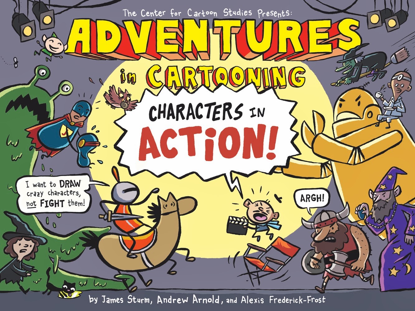
The newest book in the First Second line of Adventures in Cartooning, Characters In Action!, returns to the original's tactic of doing a full story and then explaining its techniques for imitation at the end. CCS chief James Sturm once again teams up with grads Andrew Arnold and Alexis Frederick-Frost (who handles most of the art chores) to create a charming, funny and ultimately useful guide to character generation. The story follows the knight who's been the protagonist of each book, trying to figure out why her castle is under assault by a host of weirdos. A Hollywood director named "Otto Airs" (ouch) is casting his new movie, which leads to all sorts of shenanigans. It was quite clever of the team to compare casting a movie with creating one's own comic book characters, which made it natural to discuss "wrong" fits for roles, what a "right" fit looks like, etc. When it came time to actually discuss specifics, the reader is ready to absorb the highly useful tips on how to design simple characters that are easily reproducible from panel to panel, how to tell characters apart using only body language, how to draw different character expressions, etc. There isn't an emphasis on more advanced ideas like panel-to-panel and page-to-page transitions, just a grounding in the basic skills to encourage a fledgling cartoonist to draw a story with confidence. In that respect, it's the most useful book yet in the series.
The promotional pamphlet for CCS has traditionally been a strong comic in its own right. This year's pamphlet, drawn by Brandon Elston, is no exception. His style is a mix of underground exaggeration and alt-comics cartoonyness, drawing from the same sort of classic comics and kids comics that folks like Terry Laban, Jaime Hernandez, Peter Bagge and Robert Crumb did. His style is in the same ballpark as fellow underground enthusiasts Joseph Remnant, Ed Piskor and Noah Van Sciver. However, Elston's art is much more rubbery and clear-lined than those artists. Elston uses cross-hatching when appropriate, but his work is nowhere near as dense as those peers; instead, he prefers to use strong black and white contrasts to heighten his goofy, grotesque character work. This is a talented artist still cycling through his influences but already demonstrating he has the chops to do any kind of work he wants.
Let's take a further look at a trio of CCS cartoonists who sent me word of their on-line efforts. First up is Jai Granofksy, who's doing a traditional webcomic called Waiting For Baby. It's just 29 pages in at the moment, but there's something wonderfully earnest and intimate in the way he's revealing both himself and his relationship with his girlfriend, Shira. The story starts with his courtship of Shira, one that spanned a number of years, and has stopped with Granofsky encounter a minefield of self-doubt and depression as he's wondering if he's a fit candidate to be a father. His character design is fleshy and cartoony, with lots of big bodies and expressive faces. He reminds me a bit of Mike Dawson, who employs a similar style of expressive realism in his comics as the reader always knows that this is a story with real emotional stakes that's given just a hint of distance with character design and expressions that occasionally get rubbery and distorted. His use of color is mostly muted and restrained, until he needs to emphasize something like a bedbug infestation. That restraint allows him to occasionally use color as a sort of exclamation mark,and it's an effective storytelling tool. Granofsky's story is one that's as much about his own painful self-exploration as it is (at this point) about the pregnancy and fatherhood, as a family dynamics experience hammered home his terror that he might pass on bad genetic traits. The framework of the pregnancy takes it out of the realm of simple autobio navel-gazing, as does his honest devotion and care for both his girlfriend and the future baby.
Second is Ian Richardson, who sent me links to three stories. All three are about prey and predators to some extent. "Prey" is the most visually direct version of this kind of horror story, as a creepy man follows a young girl (complete with balloon) down into a deserted subway stop, only to find out that prey that was too good to be true certainly was. This comic is interesting because of Richardson's interesting use of weird angles to create a disorienting effect for the reader. "Husk" has a visceral quality not unlike that of a Tom Neely comic (without the same level of polish), as this time the predator is a former companion: a black, mossy substance that has sharp, needle-like edges. That substance protected a mariner who happens upon a magical island (that looks not unlike human skin), but when it looks like the island's magic will free him of it, the substance acts violently. The least successful of the three stories is "Alpha", an overly talky comic about a dog that eventually takes revenge on an old woman who kills her husband (and the dog's master). This revelation is not made explicit, but is telegraphed way ahead of time like an old EC comic. That's the oldest story discussed here, and the subsequent stories feel like Richardson attempting to explore the same kind of idea in more subtle and visually exciting fashion. "Prey" in particular is especially promising because it succeeds in providing the kind of visual shock that "Alpha" does not.
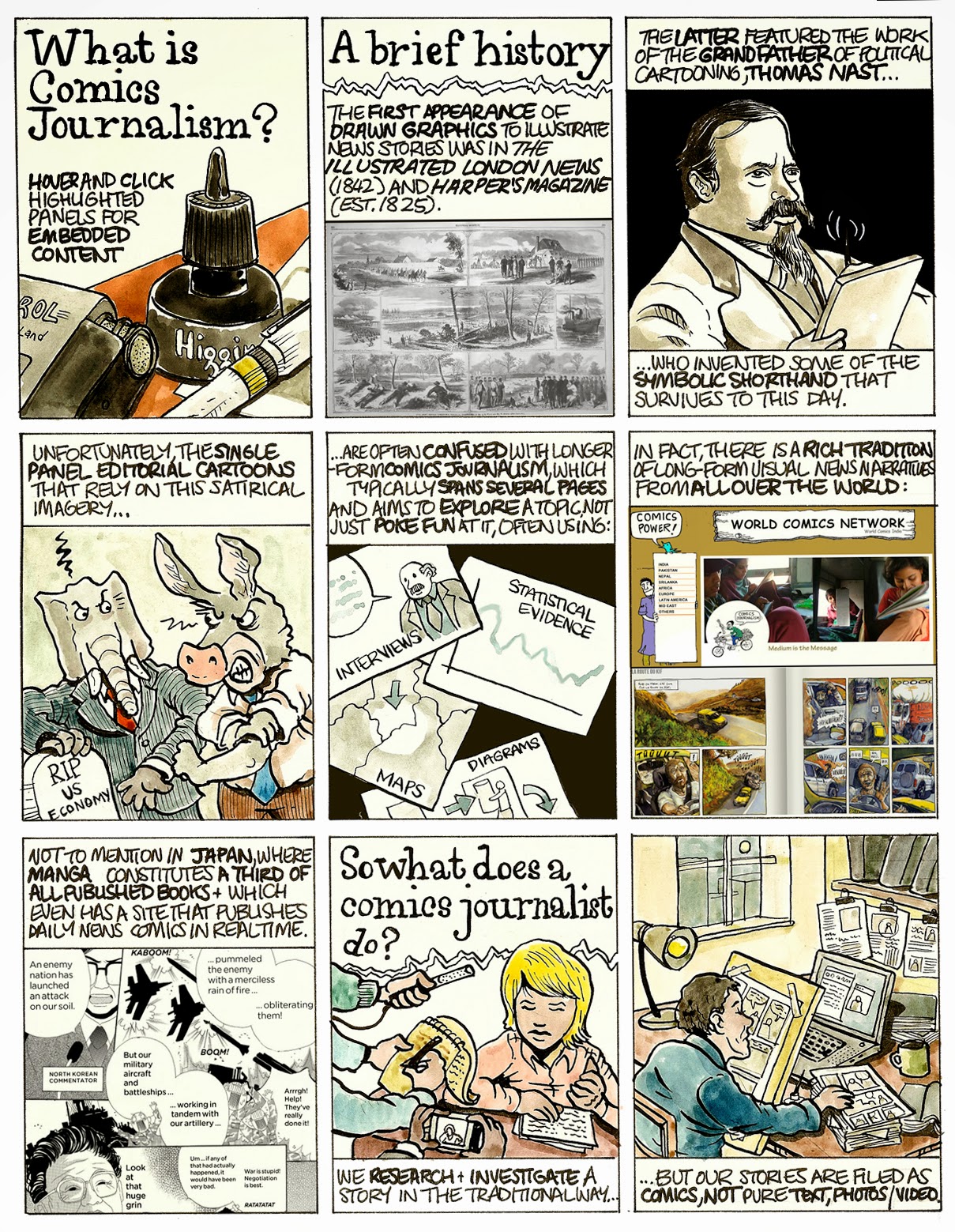
Lastly is the prolific Dan Archer, the cartoonist/journalist whose work is everywhere these days. His "Introduction to Comics Journalism" is a useful an d visually fluid overview of the discipline/art, one that gets to the heart of the "objectivity" debate in journalism. Archer makes up for his limited rendering ability by trying to think of innovative, interactive ways comics can relate a story, like in this account of the 2007 Nissor Square shootings in Iraq. Archer uses a slide show to advance the timeline on top of a map with simple icons, and the reader then clicks on "hot spots" to read a brief comic describing the action. It's an amazingly effective way to get across eyewitness accounts of a complicated and awful incident. This strip is a more standard approach, as Archer uses the effective device of using one person's anecdotal experience to bring the global slave trade into sharper relief. When Archer uses a single shade to accentuate his drawings, it gives his comics power and consistency. However, when he tries to use too much color in too small a space, like in this strip about the US banking crisis, the result is a cluttered and fussy looking page that's hard to read. That strip about the shootings in Iraq was like nothing I've never seen before; it had some small elements of animation but its design and heart was all about comics. I'd love to see a similar kind of comics/map/timeline combination for other events in the future from him, as it really takes advantage of technology without simply having bells and whistles for their own sake.
Wednesday, November 27, 2013
Thirty Days of CCS #27: Luke Howard
Luke Howard is an artist with a considerable amount of talent who is rapidly cycling through an array of influences that reflect his rendering skill and sharp sense of design. To be sure, Chris Ware's combination of precision and emotional vulnerability can be found on these pages. Gabby Schulz's witheringly cynical point of view and grotesque character design may be seen on others. The single biggest influence seems to be that of the angular and colorful design qualities of Lilli Carre, an influence that's even clear with the level of ambiguity Howard seems to enjoy inserting into his narratives.
Junior is his longest work in this set of comics I received, and it's like a weird Ware/Schulz matchup. It concerns the titular character on a trip to visit an aunt he never knew he had (he was adopted by a lesbian couple) to sign over the estate of the father he never knew. The issues of having a missing father and the painful attempts to make any kind of connection with a relative obviously suggest Ware, but the hilariously awkward but strangely self-aware and lovable nature of Junior suggest Schulz or even Peter Bagge. Junior, with a wispy blonde mustache and the sort of ballcap and shorts that a ten year old might wear instead of a grown man, is the sort of character incapable of not saying every single thing on his mind. Ranging from asking another man to hold his hand during a plane take-off because he was scared to vocalizing the real tension between himself and his aunt, things get delightfully weird when he starts a dialogue with a cardboard box. That bit of magical realism is never explained, yet it made total sense in the context of the story. Junior a sad, funny comic that punctures its pathos with weirdness and tinges its humor with longing and despair, and this dynamic plays out both in terms of the story and the illustrations.
Howard's also published a trio of flip-comics, containing two stories apiece. She Me You/Goldfish Day is a good illustration of the different sort of styles Howard works in. "She Me You" is a heavily Carre'-influence story about a man who confesses his attraction to another woman to his wife, which causes her to move to the ceiling, away from his life and other people entirely. With characters that possess sharp, angular features and a blue wash as part of another magical realist setting, one can sense Carre's similar preference for stories about alienation. The main difference is that Howard's approach is slightly warmer and more direct. "Goldfish Day" features a more tremulous line and character design that's closer to Joseph Lambert. Indeed, it's about young girls experiencing the joys of goldfish ownership (and camaraderie in general), until one girl's goldfish simply doesn't die like the others do. That sense of survivor's guilt and rejection by her friends as a result is presented as a traumatic event, yet one that the reader can't help laugh out loud at.
Forms/Copy shows off two more sides of Howard. "Copy" is about two small magical beings, one constantly yapping and complaining about the other's general perfectness. As they walk through a forest that's at once gritty-looking and clearly shaded with computer effects, Howard keeps ramping up the annoying qualities of the one character, until he's given a surreal comeuppance that wouldn't seem out of place in a comic by Brian Chippendale. "Forms" returns to the more angular side of Howard, coupled with that slightly cartoony character design, as it tells the tale of two men, ignorance, fear and the cyclical destruction of beauty as a result. Howard frequently writes about characters who put themselves into difficulties because they are unwilling or unable to perceive their own mistakes and tendencies; he punishes them because they punish themselves.
Finally, How To Be Shapes/Best Seller is Howard's most design-heavy comic in terms of how the design affects the narrative. "How To Be Shapes" involves a curious toddler who wonders about what happens to the blocks he pushes into a cube toy once they enter, and so magically squeezes himself inside. However crossing over changes him into a spectral creature that slips in and out of people--eating their food, seeing what they see, etc until they die of starvation. Howard's use of color is crucial in telling this story, especially in terms of the transition from child to creature. "Best Seller" is a love story between two books at a store, one a work of historical fiction and the other a sci-fi novel. It has a funny, strange ending that makes sense in context with the rest of the story. Both stories, which rely so much on color, have sort of a NoBrow aesthetic to them, as though they were first cousins to Jon McNaught or Luke Pearson. Howard's understanding of how to use color as a form of narrative is every bit as sophisticated as theirs. These comics are funny, clever and technically accomplished, but I still get the sense that Howard is rooting around and dabbling in a variety of styles as he endeavors to find his own voice. It's clear that that voice will have a degree of sweetness to it but an even larger hunk of cruelty, cynicism and grotesqueness to it. It may also be the case that he never settles on a particular visual style, instead preferring to match his art to his subject matter. In either case, his work ethic and chops both indicate that he's a cartoonist well worth watching.
Junior is his longest work in this set of comics I received, and it's like a weird Ware/Schulz matchup. It concerns the titular character on a trip to visit an aunt he never knew he had (he was adopted by a lesbian couple) to sign over the estate of the father he never knew. The issues of having a missing father and the painful attempts to make any kind of connection with a relative obviously suggest Ware, but the hilariously awkward but strangely self-aware and lovable nature of Junior suggest Schulz or even Peter Bagge. Junior, with a wispy blonde mustache and the sort of ballcap and shorts that a ten year old might wear instead of a grown man, is the sort of character incapable of not saying every single thing on his mind. Ranging from asking another man to hold his hand during a plane take-off because he was scared to vocalizing the real tension between himself and his aunt, things get delightfully weird when he starts a dialogue with a cardboard box. That bit of magical realism is never explained, yet it made total sense in the context of the story. Junior a sad, funny comic that punctures its pathos with weirdness and tinges its humor with longing and despair, and this dynamic plays out both in terms of the story and the illustrations.
Howard's also published a trio of flip-comics, containing two stories apiece. She Me You/Goldfish Day is a good illustration of the different sort of styles Howard works in. "She Me You" is a heavily Carre'-influence story about a man who confesses his attraction to another woman to his wife, which causes her to move to the ceiling, away from his life and other people entirely. With characters that possess sharp, angular features and a blue wash as part of another magical realist setting, one can sense Carre's similar preference for stories about alienation. The main difference is that Howard's approach is slightly warmer and more direct. "Goldfish Day" features a more tremulous line and character design that's closer to Joseph Lambert. Indeed, it's about young girls experiencing the joys of goldfish ownership (and camaraderie in general), until one girl's goldfish simply doesn't die like the others do. That sense of survivor's guilt and rejection by her friends as a result is presented as a traumatic event, yet one that the reader can't help laugh out loud at.
Forms/Copy shows off two more sides of Howard. "Copy" is about two small magical beings, one constantly yapping and complaining about the other's general perfectness. As they walk through a forest that's at once gritty-looking and clearly shaded with computer effects, Howard keeps ramping up the annoying qualities of the one character, until he's given a surreal comeuppance that wouldn't seem out of place in a comic by Brian Chippendale. "Forms" returns to the more angular side of Howard, coupled with that slightly cartoony character design, as it tells the tale of two men, ignorance, fear and the cyclical destruction of beauty as a result. Howard frequently writes about characters who put themselves into difficulties because they are unwilling or unable to perceive their own mistakes and tendencies; he punishes them because they punish themselves.
Finally, How To Be Shapes/Best Seller is Howard's most design-heavy comic in terms of how the design affects the narrative. "How To Be Shapes" involves a curious toddler who wonders about what happens to the blocks he pushes into a cube toy once they enter, and so magically squeezes himself inside. However crossing over changes him into a spectral creature that slips in and out of people--eating their food, seeing what they see, etc until they die of starvation. Howard's use of color is crucial in telling this story, especially in terms of the transition from child to creature. "Best Seller" is a love story between two books at a store, one a work of historical fiction and the other a sci-fi novel. It has a funny, strange ending that makes sense in context with the rest of the story. Both stories, which rely so much on color, have sort of a NoBrow aesthetic to them, as though they were first cousins to Jon McNaught or Luke Pearson. Howard's understanding of how to use color as a form of narrative is every bit as sophisticated as theirs. These comics are funny, clever and technically accomplished, but I still get the sense that Howard is rooting around and dabbling in a variety of styles as he endeavors to find his own voice. It's clear that that voice will have a degree of sweetness to it but an even larger hunk of cruelty, cynicism and grotesqueness to it. It may also be the case that he never settles on a particular visual style, instead preferring to match his art to his subject matter. In either case, his work ethic and chops both indicate that he's a cartoonist well worth watching.
Tuesday, November 26, 2013
Thirty Days of CCS #26: Awesome Sound, Can't Lose, Stranger Knights 4
Awesome Sound is an anthology published by Sean Knickerbocker. The low-fi cover belies the beautiful contents within, which look like they were printed on a risograph. DW's endpapers, which forcefully push both text and image to the point of violent distortion, are fitting for a comic that's so visceral and unsettling. Dan Rinylo's "Beast" is told with an Ernie Bushmiller-style simplicity, as the young boy's face here is two big black dots for eyes, a black line for a nose and a mouth that goes from black line to black oval, depending on his emotions. Using a nine-panel grid after an initial splash page that establishes the boy at the edge of a forest, each page is interesting because the central panel is almost always a scene of stillness: we see the boy looking, see him smiling, see him in the middle of walking and then see him running from right to left when wild dogs start chasing him. That sets the story from amusing to frenetic, but the final middle panel is an image of an empty street--right before a wild dog who is chasing the boy is run over by a car. It's both dark and comedic, given the x over the dog's eye and the generally cartoony nature of the story, but the bright red blood on a page that's mostly black and white adds a level of terror to the proceedings.
Knickerbocker's "Do You Still Feel Alone?" begins with a brother and sister in the woods, on the run from something unseen. The way he throws the reader right into a chase scene propels the story right along, heightening its tension from the very beginning. That tension is ramped up when they are assaulted by a nude man, who is stabbed to death by the sister. Knickerbocker pulls back further, revealing that this is an island where a plane has crashed, its inhabitants reduced to life-and-death struggle. It's a brutal, unforgiving little tableau that has no pat ending, and the fact that it's drawn in that cartoony style reminiscent of Chuck Forsman and Sammy Harkham makes it all the more unsettling. Indeed, the later story where a young couple sets themselves on fire in a house (revealing a pentagram on the floor) is a sort of cousin to the sort of thing Forsman did in The End Of The Fucking World. Finally, Juan Fernadez's red ink two-pager is a perfect fit, as his scribbled-out faces go through a progression of consumption. This mini is short but every image packs a punch.
Can't Lose is an old-fashioned fanzine dedicated to the TV show Friday Night Lights. It's everything a fanzine should be: in-jokey, craft-conscious, and gently mocking in a reverent manner. "Coached" by superfan Melissa Mendes, this zine has an interesting sprinkling of well-known cartoonists. Popular topics include the Christian speed-metal band that the character Landry starts ("Crucifictorious"), the comically awful Billy, younger brother of lead character Tim (Henry Eudy does a fine job of pointing out just how weaselly he is while Nomi Kane posits a magical night the two share in the desert), and how doubters often come around to becoming obsessed with the show. Jon Shaw's "Friday Nightlife" speaks to this, as a character who mocks a couple mourning the last episode starts to watch it and eventually enters his own weird world of living out other, self-imagined seasons. Sam Spina actually made me laugh out loud in a strip where he and his wife are asked why South Carolinians are buying Texas beer, and they reply in unison "Texas forever". My favorite strips were Dan Zettwoch's hilarious story about Dillon getting routed because Saracen used photocopies from the playbook to hang up Crucifictorious flyers (lovingly designed and drawn by Zettwoch, of course) and Jeff Lok's tale of escalating terrible behavior being excused "They're good kids". Can't Lose even has a cut-out Tim Riggins paper doll. While bits of it might me mystifying to those in the dark, the premise is laid out clearly enough for the jokes to land.
Stranger Knights 4 was published, as always by Bill Volk. This light-hearted fantasy/sci-fi/superhero anthology has always been on the uneven and amateurish side. This issue is the first to look good from cover-to-cover, and each story is funny to boot. Volk's "Brega and Snurrd" sees him use a cleaned-up, simplified version of his line that emphasizes character expressiveness above all else. The story follows familiar Dungeons & Dragons/fantasy tropes, but it's really about the relationship between a mother and her teenaged daughter. Of course, the mother here is a bearded dwarf and her daughter is trying to pass as human at her wizarding school. When the mother demands the presence of her daughter for an adventure (ie, bonding session), tension arises in an amusing manner. This is a crisply-paced story that actually gets across real feelings in its fantasy context. I'd love to see more from these characters and their world. The Volk-written "Thousand Year Grudge" (drawn by Bryan Stone) is a denser, grittier story involving anthropomorphic animals, thievery, romances gone bad and multiple double-crosses. The thickness of Stone's line is coupled with cross-hatching, lots of spotted blacks and other noir visual effects to counter the funny animals and the wonderfully ludicrous character of Maggie, the young bird who decides to be a thief. Ann Lewis' "Headless" is a bit on the cruder side in terms of rendering, but her use of humorous body language in telling a story about an empty but animated suit of armor sells it effectively. Finally, the Volk-Mary Soper continuing collaboration "Incantrix X" continues to be a reliably amusing story with idiosyncratic character design and odd design choices.
Monday, November 25, 2013
Thirty Days of CCS #25: Max Mose, Rio Aubry Taylor, Casey Bohn, Bill Bedard
Max Mose's recent comic The Grove is another of his sci-fi/horror commentaries on capitalism and culture at large. With a beautiful and disturbing silkscreened cover, this full-color piece (printed on a risograph, perhaps?) is one of his most striking works. Working in similar waters as Matthew Thurber, the story concerns a rapacious city literally draining the inspiration out of its artists for the benefit of its corporate classes, overseen by a sort of magical deity of capitalism. When one of the city's citizens rebels, he's shot out of a cannon into the nearby forest. Of course, when he messes with the "unnatural" order of things, a reprisal is ordered and the book's final conflict occurs. Mose leavens this critique with absurd imagery, jokes, self-aware critiques of his critiques and a general sense of awareness that the state of nature is no more welcoming or just than humanity's need to construct and eventually exploit its resources and then each other. Mose's pencils have become much sharper and cleaner while still retaining the grotesque and frequently bug-eyed quality that makes his pages pop. His use of color has been a big boost in getting him to make his pages cleaner and simpler, but he also seems to have found just the right groove and sense of confidence in letting go of clutter and over-rendering. That new simplicity only makes the images we do see all the more powerful, weird and funny.
Bill "Billage" Bedard is another CCS cartoonist whose work I only saw for the first time at SPX. Coffee Hunters represents the silly, sketchy side of the artist. With cartoony characters and stick figure warriors that are heavy on gesture and body language in telling their story, this mythological spoof features a tribe hunting for wild coffee. Rife with coffee and bean puns, this scratchy little mini is packed with eye pops and other visual jokes as well. It's dopey and good-natured, understanding that this is a bit of entertaining fluff that's nonetheless prepared with care and affection. On the other hand, his full adaptation of Samuel Taylor Coleridge's epic lyrical poem The Rime Of The Ancient Mariner represents the serious, delicate side of the artist. Bedard truly engages the poem, using a thin line but a lot of grey-scale shading to add a bit of depth. Still, the whole story conveys the ethereal, monstrous, fantastic and spiritual aspects of the poem, with the Mariner's spectacles giving him a further sense of removal from his crew and the reader as well. The nightmarish qualities of the poem translate quite well to comics, with a number of lines leaving Bedard plenty of room for visual interpretation regarding violence, spirits and storms. In other, more still scenes, Bedard captures that deathly tranquility as well, his illustrations a fine counter-point to Taylor's rich and evocative language. Bedard's natural sketchy, grungy style eventually takes over the story, which is all for the better for this comic, as it's not a neat or comforting tale.
Rio Aubry Taylor's first issue of the moving and unsettling Love, Currently sees him break new ground as an artist.Told in a distinctive white-on-black page with various color fields and patterns popping into panels, it's a story of a man named Lan who fails to come to terms with his own anger and fear after the death of his daughter. First his marriage disintegrates, and then his life in general goes to hell. This is a first-person account of his own attempt at self-destruction and abandonment of his faith in the world, god and humanity. Taylor's art is haunting and evocative, as the way he often likes to use abstract patterns, light fields and dense cross-hatching serves a narrative purpose as a reflection of Lan's consciousness and emotional state. At just eight pages, it's Taylor's most coherent, dense and emotional work; I am eager to see where he will be going with this series.
Casey Bohn is one of the more distinctive stylists I've seen from CCS. His comics have tended toward loopy science-fiction that is conversant in all of the genre's tropes yet subtly commenting on its cliches and tendency toward obvious metaphors. It's a gentle nudging to be sure, as Bohn's art both celebrates its Jack Kirby influence with its bold, almost abstract use of thick lines and odd angles and is well aware of the silliness of its imagery. President X concerns an astronaut who becomes aware that aliens are about to invade Earth and establish a puppet president (the titular President X, who barely appears in this comic despite his distinctive appearance--it's a sort of shaggy dog element). It takes him years to get back, and no one believes him but a hilariously depicted group of hippies. Of course, they prove to be crucial allies, but Bohn plays up the violence vs non-violence angle in an amusing, heightened manner. The climactic fight is absolutely hilarious, as the eyeball-shaped alien is thwarted by its own digestive juices ("I'm eating myself! I...I'm delicious!"). Bohn represents the sort of humorist whose knowledge of and ability to work within a genre sharpens the humor within the piece while providing a credible, enjoyable story.
Bill "Billage" Bedard is another CCS cartoonist whose work I only saw for the first time at SPX. Coffee Hunters represents the silly, sketchy side of the artist. With cartoony characters and stick figure warriors that are heavy on gesture and body language in telling their story, this mythological spoof features a tribe hunting for wild coffee. Rife with coffee and bean puns, this scratchy little mini is packed with eye pops and other visual jokes as well. It's dopey and good-natured, understanding that this is a bit of entertaining fluff that's nonetheless prepared with care and affection. On the other hand, his full adaptation of Samuel Taylor Coleridge's epic lyrical poem The Rime Of The Ancient Mariner represents the serious, delicate side of the artist. Bedard truly engages the poem, using a thin line but a lot of grey-scale shading to add a bit of depth. Still, the whole story conveys the ethereal, monstrous, fantastic and spiritual aspects of the poem, with the Mariner's spectacles giving him a further sense of removal from his crew and the reader as well. The nightmarish qualities of the poem translate quite well to comics, with a number of lines leaving Bedard plenty of room for visual interpretation regarding violence, spirits and storms. In other, more still scenes, Bedard captures that deathly tranquility as well, his illustrations a fine counter-point to Taylor's rich and evocative language. Bedard's natural sketchy, grungy style eventually takes over the story, which is all for the better for this comic, as it's not a neat or comforting tale.
Rio Aubry Taylor's first issue of the moving and unsettling Love, Currently sees him break new ground as an artist.Told in a distinctive white-on-black page with various color fields and patterns popping into panels, it's a story of a man named Lan who fails to come to terms with his own anger and fear after the death of his daughter. First his marriage disintegrates, and then his life in general goes to hell. This is a first-person account of his own attempt at self-destruction and abandonment of his faith in the world, god and humanity. Taylor's art is haunting and evocative, as the way he often likes to use abstract patterns, light fields and dense cross-hatching serves a narrative purpose as a reflection of Lan's consciousness and emotional state. At just eight pages, it's Taylor's most coherent, dense and emotional work; I am eager to see where he will be going with this series.
Casey Bohn is one of the more distinctive stylists I've seen from CCS. His comics have tended toward loopy science-fiction that is conversant in all of the genre's tropes yet subtly commenting on its cliches and tendency toward obvious metaphors. It's a gentle nudging to be sure, as Bohn's art both celebrates its Jack Kirby influence with its bold, almost abstract use of thick lines and odd angles and is well aware of the silliness of its imagery. President X concerns an astronaut who becomes aware that aliens are about to invade Earth and establish a puppet president (the titular President X, who barely appears in this comic despite his distinctive appearance--it's a sort of shaggy dog element). It takes him years to get back, and no one believes him but a hilariously depicted group of hippies. Of course, they prove to be crucial allies, but Bohn plays up the violence vs non-violence angle in an amusing, heightened manner. The climactic fight is absolutely hilarious, as the eyeball-shaped alien is thwarted by its own digestive juices ("I'm eating myself! I...I'm delicious!"). Bohn represents the sort of humorist whose knowledge of and ability to work within a genre sharpens the humor within the piece while providing a credible, enjoyable story.
Labels:
bill bedard,
casey bohn,
max mose,
rio aubry taylor
Sunday, November 24, 2013
Thirty Days of CCS #24: Queerotica
Queerotica is the aptly-titled anthology containing "queer erotica". What I found interesting about it is that the editorial team of Allie Kleber, Joyana McDiarmid, Laurel Lynn Leake and Sasha Steinberg specifically asked each contributor to come up with their own definitions of both "queer" and "erotica". That bit of editorial direction proved crucial in forcing each artist to think deeply about their choices in coming up with pieces (stories or illustrations) that fully expressed their own understanding of the term. Reclaiming pornography/erotica is something that every generation of cartoonists seems to do every few years, from the earliest underground comics (both gay and straight) to anthologies like Smut Peddler, True Porn, Dirty Stories and Thickness. Each one of those books had a strong editorial hand that both selected and directed their contributors to think about identity and sex in particular ways, and Queerotica's finely-honed editorial edict led to a surprisingly coherent and fluid read.
The anthology itself is beautifully designed. Leake's front cover is sensitive and evocative, with hands belonging to various genders and identities interlocking with each other, evincing both desire and tenderness. The back cover's parade of different shoes amusingly both recapitulates the front cover's theme of diversity and gives it a slightly dirtier take, suggesting what happens when shoes come off. The book's purple ink was an interesting choice, working well for the large variety of storytelling choices and line weights in the book. The pin-ups all contained striking images, some sillier than others. One person's erotic image is of course completely ridiculous to another person, so the pinup by "A.B. Fiddlestyx" featuring a furry reflection in a mirror just made me laugh. Laura Terry's monster orgy was deliberately funny but also had a strange erotic charge. Rio Aubry Taylor's beautiful drawing of two figures in an intimate embrace was the perfect complement to Terry's over-the-top image, once again recapitulating the kinds of pieces a reader would find throughout the anthology. That was repeated with Miz Moody's feather tickling illustration and Rachel Dukes' frank but tender image of a woman in front of her partner wearing a strap-on dildo.
The opening piece, Alexis Cornell's "Arbiter and the Bird", features two women in bed, as one is nervous about having sex. It's a funny, sensitive piece that explores the very idea of sex as a key component of relationships and how this can be difficult for many people. Cornell nails the characters' body language and relationship to each other in space, which is absolutely crucial for a story about this level of intimacy. Morgan Boecher's "To Share" is about how difficult it can be to find a sexual partner, someone to share his body with, after he made the transition from female to male. Boecher makes the most of his somewhat crude line to tell a story that's in turns sad, funny and hopeful. "Headspace", by Ivy Weine and Kleber, is a mild BD/SM tale, the sort that uses it as a healing force. Parts of it felt pretty rote and cliched, and at ten pages the story started to verge into self-indulgence. Kleber's illustrations for it were quite good, especially the weird, freckled character design for one of the protagonists.
Kimball Anderson and Leake's piece, "Are You Sure" is not unlike Cornell's piece, but this time it features two (physically gendered) men. Leake's choice to use a fuzzy, distorted line and a thin line weight was interesting and appropriate, given the difficult feelings discussed in this story. That fuzziness made the intensity of their actual sexual contact all the more intense as one partner engages the other in his reticence and gender ambiguity (the partner identifies as the non-gender specific "neutrois"), while the other has to confront his partner's differing sex drive. By contrast, Lena Chandhok's line in "Oral Sex" is smooth and even cartoony, as she relates an argument between two women experimenting with talking dirty to each other, the awkwardness and upset that this causes, and their eventual make-up sex. Chandhok's approach here is direct, both in terms of the humor and emotional content and the explicitly detailed manner in which she drew the sex scenes.
Joyana McDiarmid's "Nothing In this World" explores polyamory and one woman's struggle with the concept, as well as her (soon to be ex-) boyfriend's being OK with her having sex with women but not men. For this character, she views any sexual encounter outside of their relationship as cheating and is distressed to find out that he doesn't. This leads her to an encounter with a woman who talks about polyamory and her relationships with other women, bringing her into a moment concentrating totally on the present and what they bring to each other. McDiarmid certainly doesn't skimp on the sex scenes either, but they're completely integrated with the story's emotional content, down to the very end. Her rendering style, with angular faces that have a minimal level of detail combined with her fleshy way of drawing bodies, makes this one of the most effective stories in the book.
Fydor Pavlov's "Gentleman's Gentleman" is more traditional gay porn drawn in a thin, delicate line; there's not much more to the story than just the sex scene. Lawrence Gullo's "The Fisherman" and Laura Hughes' "The Outlaw" are two example of using fantasy tropes to explore sex and identity. Gullo's story about an alienated fisherman neatly ties in issues related to otherness as the title character winds up having a silent sexual relationship with a gender-ambiguous mermaid/man. Hughes' story doesn't escape its fantasy tropes, mostly goes for laughs and winds up as the only juvenile story in the anthology. The book ends on a strong note with Melanie Gillman's "Wrappers" is a different kind of fantasy story, one in which both gender and genitalia are totally different constructs. Her character design here is especially excellent, as she quickly deflects reader expectations while still being able to relate both the embarrassment and powerful sense of discovery when two people explore each other's bodies. The way Gillman also subtly explores concepts like gender pronouns is also quite clever. Steinberg's "Somnata" is a beautiful and later hilarious way to celebrate this anthology, as it starts with three figures dancing an erotic and delicate ballet (Steinberg's line is beautiful and thin here) and ends with Steinberg himself crashing the party. All told, Queerotica has a high batting average of quality stories for the initial volume of such an anthology, and its impeccable design and careful sequencing by its editors make it a feast for the eyes.
The anthology itself is beautifully designed. Leake's front cover is sensitive and evocative, with hands belonging to various genders and identities interlocking with each other, evincing both desire and tenderness. The back cover's parade of different shoes amusingly both recapitulates the front cover's theme of diversity and gives it a slightly dirtier take, suggesting what happens when shoes come off. The book's purple ink was an interesting choice, working well for the large variety of storytelling choices and line weights in the book. The pin-ups all contained striking images, some sillier than others. One person's erotic image is of course completely ridiculous to another person, so the pinup by "A.B. Fiddlestyx" featuring a furry reflection in a mirror just made me laugh. Laura Terry's monster orgy was deliberately funny but also had a strange erotic charge. Rio Aubry Taylor's beautiful drawing of two figures in an intimate embrace was the perfect complement to Terry's over-the-top image, once again recapitulating the kinds of pieces a reader would find throughout the anthology. That was repeated with Miz Moody's feather tickling illustration and Rachel Dukes' frank but tender image of a woman in front of her partner wearing a strap-on dildo.
The opening piece, Alexis Cornell's "Arbiter and the Bird", features two women in bed, as one is nervous about having sex. It's a funny, sensitive piece that explores the very idea of sex as a key component of relationships and how this can be difficult for many people. Cornell nails the characters' body language and relationship to each other in space, which is absolutely crucial for a story about this level of intimacy. Morgan Boecher's "To Share" is about how difficult it can be to find a sexual partner, someone to share his body with, after he made the transition from female to male. Boecher makes the most of his somewhat crude line to tell a story that's in turns sad, funny and hopeful. "Headspace", by Ivy Weine and Kleber, is a mild BD/SM tale, the sort that uses it as a healing force. Parts of it felt pretty rote and cliched, and at ten pages the story started to verge into self-indulgence. Kleber's illustrations for it were quite good, especially the weird, freckled character design for one of the protagonists.
Kimball Anderson and Leake's piece, "Are You Sure" is not unlike Cornell's piece, but this time it features two (physically gendered) men. Leake's choice to use a fuzzy, distorted line and a thin line weight was interesting and appropriate, given the difficult feelings discussed in this story. That fuzziness made the intensity of their actual sexual contact all the more intense as one partner engages the other in his reticence and gender ambiguity (the partner identifies as the non-gender specific "neutrois"), while the other has to confront his partner's differing sex drive. By contrast, Lena Chandhok's line in "Oral Sex" is smooth and even cartoony, as she relates an argument between two women experimenting with talking dirty to each other, the awkwardness and upset that this causes, and their eventual make-up sex. Chandhok's approach here is direct, both in terms of the humor and emotional content and the explicitly detailed manner in which she drew the sex scenes.
Joyana McDiarmid's "Nothing In this World" explores polyamory and one woman's struggle with the concept, as well as her (soon to be ex-) boyfriend's being OK with her having sex with women but not men. For this character, she views any sexual encounter outside of their relationship as cheating and is distressed to find out that he doesn't. This leads her to an encounter with a woman who talks about polyamory and her relationships with other women, bringing her into a moment concentrating totally on the present and what they bring to each other. McDiarmid certainly doesn't skimp on the sex scenes either, but they're completely integrated with the story's emotional content, down to the very end. Her rendering style, with angular faces that have a minimal level of detail combined with her fleshy way of drawing bodies, makes this one of the most effective stories in the book.
Fydor Pavlov's "Gentleman's Gentleman" is more traditional gay porn drawn in a thin, delicate line; there's not much more to the story than just the sex scene. Lawrence Gullo's "The Fisherman" and Laura Hughes' "The Outlaw" are two example of using fantasy tropes to explore sex and identity. Gullo's story about an alienated fisherman neatly ties in issues related to otherness as the title character winds up having a silent sexual relationship with a gender-ambiguous mermaid/man. Hughes' story doesn't escape its fantasy tropes, mostly goes for laughs and winds up as the only juvenile story in the anthology. The book ends on a strong note with Melanie Gillman's "Wrappers" is a different kind of fantasy story, one in which both gender and genitalia are totally different constructs. Her character design here is especially excellent, as she quickly deflects reader expectations while still being able to relate both the embarrassment and powerful sense of discovery when two people explore each other's bodies. The way Gillman also subtly explores concepts like gender pronouns is also quite clever. Steinberg's "Somnata" is a beautiful and later hilarious way to celebrate this anthology, as it starts with three figures dancing an erotic and delicate ballet (Steinberg's line is beautiful and thin here) and ends with Steinberg himself crashing the party. All told, Queerotica has a high batting average of quality stories for the initial volume of such an anthology, and its impeccable design and careful sequencing by its editors make it a feast for the eyes.
Subscribe to:
Posts (Atom)