Showing posts with label ellen lindner. Show all posts

Wednesday, August 23, 2023

Lost Diamonds #2 by Ellen Lindner

As I've noted before, Ellen Lindner has really found an interesting new niche with her baseball comics. Her latest issue (#2) of Lost Diamonds, "a history of gender rebellion in American Baseball," Lindner is doing a deep historical dive, going after primary sources wherever possible. As a result, this is as rigorous a study in the historical suppression of baseball based on gender as possible. Lindner's clear-line style and eye-pleasing blue wash (a bit of nostalgia), along with her amiable narration, make this a fascinating history even for those not interested in baseball. It's important to understand that this goes and went far beyond sports. The cultural importance of baseball was so overwhelming in the early 20th century that excluding women (as well as non-whites) was a deliberate strategy aimed at excluding them from the larger cultural conversation. As Lindner points out, despite many barriers, women still found ways to participate in the sport, and she's trying to make these stories better known. 


Lindner picks up the narrative in the early 20th century and the "Bloomer Girls" teams, so-called because they were trousers instead of skirts. Lindner brings up the St. Louis Black Bronchos, a barnstorming Black team of women. Not only were they dismissed by certain modern historian when they were re-discovered recently, Lindner notes that their performances were ridiculed by journalists of their era. When a writer referred to them as incompetent, Lindner points out that the game the reporter was writing about was actually quite close. This wasn't just a matter of opinion; without TV or other media to carry games, a false newspaper report damaged the team's gate. 

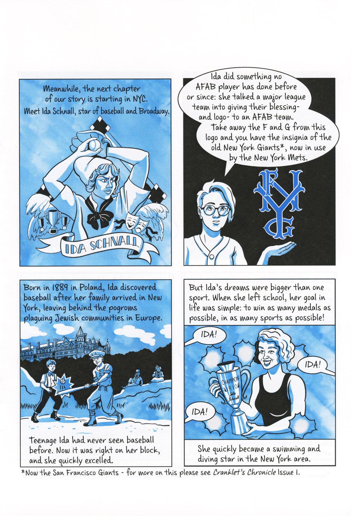
Lindner then goes into detail about uber-athlete Ida Schnall, an immigrant who immediately mastered baseball, swimming, and diving. She was denied an Olympic appearance because the US Olympic Committee didn't field a team, citing the immodesty of swimsuits. As a result of doing Broadway shows as a diver, she got to know baseball players doing side hustles, like legendary pitcher Christy Mathewson and manager John McGraw doing vaudeville. Through her connections, she founded the New York Female Giants, who drew a number of fans and harassment by the police. Another superstar was Lizzie Murphy, who held her own playing against men. Lindner notes that the success of players like Murphy led to exploitation, like in the case of a former major-leaguer taking a young team of women to Japan, only to abandon many of them when the money ran out. When money was finally raised to bring them back, one young player was swept overboard at sea. 


The Eastside Girls, a Black team that formed out of the local YWCA in Los Angeles, formed their own league, playing against the likes of the Japanese Girls, a team of Asian-American girls. It was a way of establishing one's identity in the most American thing possible, along with other positives like community, camaraderie, and the confidence that's built through sport. Girls wanted to play baseball because it was fun and let them hang out with their friends and meet new people (just like boys), but it was also a means to unlock wider acceptance overall. This was not unnoticed by men in power, who banned women from baseball in a number of places starting in the late 20s. This culminated in infamous baseball commissioner Kennesaw Mountain Landis banning pitching sensation Jackie Mitchell (who struck out Babe Ruth and Lou Gehrig back-to-back in an exhibition game) and all women from organized baseball.  It was one thing for women to play; it was quite another for them to make those in power uncomfortable. This is the gender rebellion in a nutshell: an arbitrary attempt to hold others down in order to maintain power. There was no good reason to keep women out of baseball. As long as the sport existed, women played it. Men simply didn't want women playing in their sandlot, and as long as they had the money and influence, they made the rules. 

As Lindner explains, however, it's hard to keep the marginalized down forever. This is a history, to be sure, but it is also a polemic. It's a correction of the record based on facts, statistics, and first-person observations. Lindner is painstaking in her research, but this is far from a dry recitation of facts: through her lively art (and excellence in drawing clothes above all else), Lindner recreates each era in a way that makes the concerns and wants of the players feel contemporary. 

Monday, November 15, 2021

Ellen Lindner's Lost Diamonds Part One

Anyone who's read this blog over the years knows how much I've enjoyed Ellen Lindner's evolution as a cartoonist. One of the things I find most interesting about her work is her devotion to baseball, and in particular, her research into the role of women (or female-presenting people, as she notes) in the history of the game. Lost Diamonds is subtitled "A History Of Gender Rebellion In American Baseball," and she examines this through a particular critical lens. Rather than accept the premise that there are no female baseball players, she instead asks the question: "Why aren't there any female baseball players? What structures have prevented this from happening?"


Baseball is one of the few sports, even today, where women don't play it at any organized level other than Little League, and even that took a number of lawsuits. The only other sport where that's the case is American football, and even that has been slowly changing on a high school level, albeit in fits and starts. Sure, there's softball, but it's not the same sport. Lindner makes the case that the same individuals and forces who conspired against being inclusive of women with regard to baseball were the same ones who banned black players from major league baseball for close to sixty years. They wanted to keep it white and male, and they even created narratives around this idea and propagated it through the press and the very companies that created baseball-related products. 


Indeed, Lindner notes that the origins of baseball date back to the 1700s and were both imported from Europe and combined with extant indigenous ball-and-stick games. It's just that the ball-and-stick games played in Europe were often played by women and sometimes by all genders together. Baseball became a national obsession in the US and drew interest from everyone. Just as there were well-known male barnstorming teams that went from town-to-town, so too there were women's teams, including one out of Philadelphia that was all black women. Racist press coverage diminished their nationwide appeal. At the same time, baseball teams started popping up on all-women's colleges in the northeast US. The forces that propagated the idea that baseball was "invented" by Abner Doubleday instead of being a comglomeration of many different but similar games became reified as a way of making baseball the exclusive province of white men. 

Lindner also notes that the fashion of wearing corsets, giving women extremely restricted movement, didn't help during the late 19th century. Narratives about the "fragility" of women propagated through the press also didn't help. Through it all, Lindner inserts herself as an amiable narrator, gently guiding the reader through a great deal of historical injustice with a smile. However, she's unsparing with regard to the facts, and she wields that historical record (and the attempts to alter this narrative) like a slugger. Lindner's strength as an artist has always been her skill in drawing clothing and fashion, especially from different historical eras. That's on full display here, and the blue wash adds to that sense of this being a historical document. 

This is a fascinating piece of comics journalism, and it's striking that there aren't more of these kinds of comics when it comes to sports. Sports has its share of built-in narratives with regard to the games themselves, but the behind-the-scenes events and the weird characters in the game make it an incredibly easy transfer for comics. I hope Lindner is able to eventually get a book out of this. 

Wednesday, May 22, 2019

Ellen Lindner's The Cranklet's Chronicle #2

Ellen Lindner's work has often dipped into the past, especially New York in the late 19th and early 20th centuries. Her comics have usually focused on women in these eras, in part because their stories are not well served from this time. Her latest series, The Cranklet's Chronicle, serves an especially underserved topic: the role of women in major league baseball. Linder is also not afraid to tackle difficult topics, and issue #2 was as much about race as it was about gender with regard to the game. With tremendous storytelling clarity, a pleasant line and crackling dialogue, Lindner told the story of Effa Manley, the only woman admitted to the Baseball Hall of Fame. She co-owned the Newark Eagles of the Negro League and won a championship with them, only to see the league disintegrate when Major League Baseball finally deigned to bring in black players. It's a fascinating story that has a lot of twists and turns.

There's something particularly interesting in reading stories about women who defied the societal barriers arrayed against them in achieving remarkable things. In Manley's case, she also had to deal with issues related to race. Manley grew up thinking she was biracial, but her white mother revealed that her father was not who she thought he was. An affair with a white man made Manley technically white--but she grew up thinking she was black and in a black community, and she chose to continue to live as a black woman. The whole experience, as Lindner noted, had Manley saying, "Whatever I am...I will be exceptional!" 

Lindner's use of blue tones throughout creates a slightly nostalgic air, as though one was watching vintage footage of these events. She traces Manley and her husband Abe after they created the Eagles, creating an exciting narrative as Manley's business sense and charisma was a perfect match for her husband's ability to evaluate talent. It's a story that's a triumph and a tragedy, as her moment of triumph was taken away from her--she never got to be involved in baseball ever again. Fortunately, a reporter was able to catch up with her late in her life to get her story down, and it's truly a doozy. Linder does that story justice, finding ways to both focus on the exciting narrative as well as offer commentary on race and gender in America.

Wednesday, October 17, 2018

Minis: E.Lindner

Pitching A Fit In The Big City was partly a walk down memory lane for me, as I've been reading Ellen Linder's work since the very beginning of her career. This collects stories from 2001-2016, published in various minis and anthologies, as well as a couple of new stories. Lindner has always been a great writer in particular, even in her earliest stories like "Pieces", where she talked about the memory of her grandfather talking at her, cutting her to metaphorical bits because of her relative unimportance in the interaction. Lindner used a big, chunky line in the early days, like in her memoir about 9/11. It was a striking approach, but she's evolved and has used a number of different approaches. Her story about working at the Museum of Modern Art was fun because of the way she incorporated so many of the holdings as visual elements in her narrative.

Then there's "Hygienic Sex", a bawdy and hilarious memoir about a past relationship and its complications. Lindner's autobiographical tone has often had an amusingly formal feel to it, especially when she's deliberately trying to be funny. The tone is almost that of an old-time romance comic, paired with a raunchy and crude series of events. Lindner is a long-time city dweller, and her settings are often in flats, subways and the claustrophobic living conditions in a city. "What The Iguana Saw" was about dealing with a peeping Tom, an apathetic police response, and a totally random question asked by a cop. Lindner has a way of supporting funny moments, crystallizing the essence and leading it up to it with amusing details.

Lindner is also great at taking on a specific topic and building a story around it. In "Me And My Sari", Lindner talks about the garment given to her by her mother-in-law, the times she's worn it and why, and responses she's received by wearing it. "Bill Murray's Doughnut" is interesting because it details her experience as an extra on a film set, hoping for an encounter with Murray. A story about a facebook connection became interesting when she realized that a close friend of hers in England knew someone she dated in high school. Lindner took that coincidence and realized that a lot of negative perceptions she had about her experience weren't his fault. "Goodbye" was the most recent story in the issue and certainly the most devastating and raw. Here, Lindner talked about her tendency to used bake goods as a way of showing affection and recalling a time when a misunderstanding regarding this made an abusive ex-boyfriend flip out and put his hands around her throat. Lindner details her naivete and trusting nature, and how she was so baffled and stunned and hurt by the experience. Lindner then abandoned her typical, fluid line and switched to herself in the present day, drawn in a naturalistic style with a gray wash, as she talked about coming to terms with this story. This was a beautiful and haunting story that was a fantastic capper for this one-woman anthology, demonstrating Lindner's growth as an artist.

Monday, April 23, 2018

Minis: E. Lindner, J. Kieffer

The Cranklet's Chronicle #1, by Ellen Lindner. I've been enjoying Lindner's minis for close to twenty years now. While I've enjoyed her fiction, it's her autobio and reportage that I've always liked the best. That's because her authorial voice is witty and crisp, and her ability to draw people in stylish clothes is rare in comics. I was thus especially delighted to see the first issue of The Cranklet's Chronicle appear in the post, which is a minicomic series devoted to women in baseball. The titular "cranklet" is the feminized version of "crank", an obsolete term for a baseball fan. Lindner's always had an eye for style in any number of eras, so it's no surprise that she'd want to bring back an especially apt and fun description.

Using a light and dark blue wash, Lindner introduces this issue's main story by noting that in many ways, baseball is sexist. Yet she grew up a fan, just like her mom, and when her attention turned to the role of women in the game, she learned that the founder of her favorite team, the New York Mets, was one Joan Whitney Payson. The rest of the issue tells her story, as a woman born into wealth and obsessed with the New York Giants, just like her mom. Lindner really hits on the idea that sports (and baseball in particular) is largely a generational phenomenon, where one generation passes on the love of the game but also a lifetime of memories spent together enjoying the game. Later on, Payson bought shares of the Giants and witnessed the likes of Willie Mays making his famous over-the-shoulder catch in the World Series.

When several east coast teams got the idea to head west (as Lindner points out, this only happened because of post-war advances in air travel), the majority owner of the Giants turned down an offer from Payson to buy the team and keep it there and instead moved it to San Francisco. Lindner offered up a juicy fact that there was a move to start a new league to rival Major League Baseball, and Payson was encouraged to buy in. Before any of that came to pass, MLB headed off that potential crisis by offering New York a new expansion team and inviting Payson to be the owner. That team would be the Metropolitans, or Mets, and they actually played at the Polo Grounds (the Giants' old stadium) before they moved to Shea Stadium in Queens. What makes this story so fun in Lindner's hands is that she knows which anecdotes to play up, like Payson's fan superstitions amusing the crowd or manager Gil Hodges walking out of a room in anger after being mocked by a roomful of sportswriters. Lindner later cleverly tied Payson's devotion to the 1969 World Series champs to her own mom's who recalled sitting in a room with a bunch of other nurses in the clinching day game.

Lindner hits on all the emotional aspects of sports and how they intertwine with the game itself. Baseball games are long and the season is incredibly long. For a devoted fan, this creates a nice rhythm, a natural rise and fall that simultaneously makes the players a part of their daily life. The connection between different generations of fans and then the way in which the fans' overall excitement can energize a city--especially a city where everyone walks, like New York--are phenomena that go beyond the simplicity of a game and serve a function as a kind of shared belief system that everyone is part of. Lindner also includes a brief interview with (gasp!) a fan of the New York Yankees (the leviathan of baseball), asking about her fandom, the way it related to her fandom, etc. Lindner wrote this in such a way that non-sports fans could appreciate it, though it will obviously resonate more with fans of either baseball or sport in general.

Cabbagetown 1-3 and Drawing Thinking Of You Dancing, by Jason Kieffer. Jason Kieffer is at his best when he's writing and drawing about the down & out and dispossessed people of Toronto. I found myself disappointed in this minicomics version of that sort of story. Kieffer essentially indulges three different storytelling urges in each issue: the "real" origin of city-related symbology, tales of Native American gods like Coyote, and his more typical interactions with Toronto's homeless. The first bit, where he analyzes items like the statue in front of the police station or goes on about the Queen of England still being the real ruler of Canada, sound like typical conspiracy theory fodder. That there's Masonic imagery everywhere isn't exactly news, for example. The fact that he threw in a casual transphobic joke in the middle of one of his investigations certainly didn't add anything positive to these rants.

The Coyote stories he chose to tell were usually focused on sex and/or scatology, and that got old fairly quickly. The effect wasn't even shocking as much as it was juvenile. The stories that were focused elsewhere lacked cleverness, with every moment of the story being telegraphed from the very start. The best of his stories about locals was about "Ursula" in #2, which told her story with a degree of sensitivity and kindness that was in marked contrast with the far more aggressive "Jen" in #3. Kieffer positions himself as a fellow member of Toronto's underclass and positions himself on the sidewalk for "people-watching". The truth seems to be that he's more of a dabbler in that world than the real inhabitants of the underclass who are trying to cope (poorly) with mental illness and addiction, who lack that self-awareness that Kieffer possesses. As such, they are always filtered through Kieffer's own sense of safety and awareness. He doesn't mock his subjects, but they are very much "othered", even if it's done in a sympathetic manner. That said, that he engages with them at all is affirming their humanity in a way that most aren't willing to do.

The mini about dancing (co-credited to the dancer, Mairi Greig) is interesting in the way that an illustrated poem is interesting. It is an adornment entirely exterior to the original work of art itself. It is amusing and possibly interesting but unnecessary. In the case of this mini, it was interesting to see Kieffer try to capture the movements and sounds of a long dance routine, but the way he did it made him incapable of expressing what it is a dancer does with their body to create expression. It's similar to an illustrated poem vs comics-as-poetry; the first slaps an image on top of text, and there's no real two-way interplay. The second takes the rhythms of poetry and translates them (both textually and visually) into comics form, aiming for the effect of poetry rather than simply its form. Similarly, it is possible to draw comics-as-dance (Keren Katz does this), where the ways in which bodies are flattened and contorted as dancers are transformed into shapes on the page. This was an interesting experiment for Kieffer and Grieg that ultimately wound up being tedious in its repetitiveness.

Thursday, June 18, 2015

Mini Fiction: Reed, Lindner, Trower


The Titular Hero, by MK Reed and Jonathan Hill. For a writer who got her start doing slice-of-life comics, Reed certainly has a talent for writing fantasy. This mini that originally appeared online not only gets at the mechanics of being a fantasy adventurer, it also takes the piss out of the ridiculous amounts of sexism that pervades the genre. Hill can draw anything Reed throws at him, in this story about a party going to a seedy part of town and being exposed to certain seedy books. The "Lady Bosoms" title is a particular best-seller, and Hill drawing the spoof of big-breasted heroine while the adventurers critique it incredulously works quite well. Like all of the fantasy excerpts that Reed has written, I found myself wanting to find out what happens next with this group of characters.


The Black Feather Falls, Book Two, by Ellen Lindner. Lindner's elegant and stylish whodunnit continues, as her two female protagonists (a boutique worker and a secretary) follow the trail of a murder up to a remote island near Scotland. The book is part murder mystery, part buddy action story and part exploration of dark, personal roots. The two women overcome some rather extreme sexism in hilarious and dogged fashion as they piece together clues to essentially solve some of the whys and hows of the case, setting up the climactic third book. The story is really about trying to create a new identity and running away from one's past. In the case of Tina Swift, the protagonist, she hints that she was able to create a new life for herself after a life of abuse and horrible circumstances. Of course, the surprise ending of this book showed that she couldn't quite outrun every aspect of her past. Once again, the use of vivid and rich colors as well as the stylized character designs and lettering, give this comic a distinct and powerful sense of time and place. That's true of both the backgrounds but especially the fashions. Lindner is truly hitting her stride with this series.


REM Pt. 1, by M.R. Trower. Speaking of leaping forward, REM is Trower's best work to date. Like many of their comics, REM is a story about finding one's identity in a culture that demands that one fits into a set of rigorously defined categories. The story follows a young person named Rem who's about to go through the process of being sorted into a profession/caste by means of the mark placed their body by the "holy beast". When there's no mark to be found, Rem runs away, eventually finding safety with a group of fellow "deviants". The end of this chapter finds Rem embracing their new role, even as their future is uncertain. This is a story that begins with the nagging sense of not fitting in but that quickly moves on to its hero having a new sense of purpose, one filled with mystery, awe and wonder. Trower lists Moebius as an influence, and that's apparent both in terms of the intricacy of the line drawings & character design, as well as the trippiness of the backgrounds. Moebius' stories also tend to be about transformation and struggle, though Trower's take on this is uniquely theirs.

Thursday, July 24, 2014

Brit Comics: The Comix Reader

The Comix Reader is the brainchild of British cartoonist, Richard Cowdry. He edits and contributes material to each issue. Its format is that of a classic comics broadsheet; each issue is 24 pages and in full color. His stated purpose in publishing it was to revive the anything goes, "fun" and "free-spirited" nature of the underground press of the 60s and 70s. That's a line I've heard quite often from slightly older cartoonists in the US who decry literary comics and cartoonists and prefer their comics to be as id-soaked, vulgar and free-wheeling as possible. Naturally, there's room for all sorts of comics, but those that invoke the underground frequently have a chip on their shoulder while staking out their territory.

Fortunately, Cowdry abandons this rhetoric after the first issue and simply went about the business of recruiting a wide variety of artists to regularly contribute to the Reader. Having read the first five issues, it establishes a nice rhythm to see some artists return in issue after issue, while having more samples of work made me appreciate other artists more. Cowdry has made a sustained effort to recruit a number of female cartoonists and obviously has no editorial mandates as to what he wants each cartoonist to do. The result is a melange of gag strips, local/topical humor, autobio comics, whimsical fantasy strips, low-res drawings and highly detailed renderings. The Reader has gotten stronger from issue to issue, and that's a testament to each cartoonist obviously trying to contribute their best material and up their game in each subsequent installment. Rather than review particular issues, I thought I'd highlight some of the cartoonists who caught my eye. While this is a long list, there's still about a dozen other cartoonists published in the Reader who didn't draw my attention one way or another.

Richard Cowdry: Cowdry himself is an excellent and vicious satirist. Some of the strips here were reprinted in his Downtown collection, which I reviewed here.

Saban "Shabs" Sazin: The cartoony style of this artist emphasizes bold, sweeping expressions by his characters. Sazin smartly and amusingly addresses working-class woes as well as the experience of being an immigrant in the U.K. His thick line looks especially great soaking up color on a big page.

Lord Hurk: Hurk most closely resembles the underground cartoonists to which Cowdry refers than anyone else in the Reader. His comics are in turn bizarre, hilarious and imaginative as he imagines the adventures of the Lonely Bomb, Diamond Chops and misshapen superhero The Magnificent Orb. Hurk's chops are unassailable and his work looks especially effective in color. While he taps into that anarchic underground sensibility in terms of his ideas and wild visuals, he avoids scatology for scatology's sake; every gross gag is in service of the story or satire. His figures are grotesque, funny and distorted, but his work doesn't rest on grossing out the reader.

Kat Kon: Kon tends to work really big--like just four panels per huge page. That's because she likes to blow up faces and really zero in their weirder qualities. In issue #2, she works a bit smaller, but still with that thick line that emphasizes character expression and lots of spotting blacks. Issue #3 has one image where a woman has a shirt that says "I refuse to smile for no reason" and loads of dead bodies around her; it's a darkly amusing take on a persistent feminist issue that pervades any number of culture. The fifth issue reinforces this with her take on being a barista and the kinds of comments she gets. Kon isn't much one for metacommentary, letting her figures and images speak for themselves. The format certainly flatters her art and adds greatly to its punch.

Alex Potts: His comics took time to really grow on me, as he tends to use a 5 x 7 grid in each issue. That grid minimizes his art while pushing the reader through quickly, but his low-key narratives regarding the character Philip have a surprisingly dark tone to them. Potts reminds me a bit of Chris Ware in the way he uses small panels to his advantage and lets the reader figure out the implications of the character's story for themselves.

Steve Tillotson: Of all the artists in the Reader, Tillotson is the one who took the greatest advantage of the formal possibilities of working big. His trademark is using a grid that simultaneously depicts a single image and that breaks it up to allow individual actions by the characters. His rendering is superb, as he draws both cute & simple characters as well as lush backgrounds. I'm not sure I'd be up to seeing a book's worth of his strips, but that's what makes him perfect for an anthology.

Ellen Lindner: A long-time favorite of mine, Lindner uses her Reader space for autobio (which has always been funny and sharply observed) and splashes it with huge swaths of vivid color. Oranges, yellows, greens, pinks and purples all tend to dominate her comics here, grabbing the reader's eye while she relates witty and thoughtful anecdotes.

Sina Shamsavari: His autobio centers around relationships and loneliness as a gay man in London. His line varies from a bold, naturalistic style to a more fragile, angular look that incorporates splashes of color. I love the way he varies approaches from issue to issue. In some, he does a single narrative and in others, four 2 x 3 panel mini-narratives. All of them focus on the pros and cons of being alone, of being an outsider even in gay culture. The comics are philosophical and thoughtful rather than whiny, but one can still feel Shamsavari's(variously also known as Sina Evil and Sina Sparrow) the depths of his sadness. That's mitigated by the ways in which he finds to express himself. The sophistication of his autobio is a perfect balance for the sillier stuff in the Reader.

Paul O'Connell: O'Connell's biography of model and singer Sabrina in #1 was a strong piece, using photo-reference to create a narrative while giving it a "pop art" effect through the nonintuitive application of color. Less successful was a "clowns in hell" experiment with Addy Evenson; this page was dissonant to the point of incoherency.

Julia Homersham: Homersham appeared in the first two issues with a number of goofy gags that riff on inanimate objects like food or animals behaving as humans. The first issue features single-panel gags, while the second issue is all strips of various lengths. Homersham is heavy on both verbal and visual puns, and there are some groaners in there. In the context of the reader, her work acts as a nice palate cleanser for heavier work. Her "History of English Puddings" page is not strictly comics, but the nomenclature and explanation of many of these bizarre dishes is both bewildering and amusing.

Tobias Tak: Tak is a great draftsman who pulls out all the stops with his use of color. The actual content of his comics is usually self-consciously twee, which makes reading them a slog. They're like reading a Richard Sala comic without any of the bite or the brains and tend to act as a roadblock while reading the anthology. It's labored whimsy.

Gareth Brookes: His page about birds singing to humanity about its arrogance was one of the most overtly-precious, tedious and annoying lectures I've ever seen in comics. The birds are nicely-illustrated, but they're only illustrations and lie inert on the page.

Tim & Alex Levin: Their "Jones" gag strips, in issue after issue, are sloppy without any charm. The jokes themselves are easy pop cultural targets, dumb scatological humor, or bits of randomness that don't go anywhere.

Peter Lally: His take-off on the artist Banksy was silly, poorly-drawn and had an obvious punchline. Much better was "Taxi", a fascinating slice-of-life story (drawn white-on-black backgrounds) that reveals a lot about working-class taxi drivers and an older generation in general. The style Lally used was bold and eye-catching, instantly drawing me in.

Bernadette Bentley: Bentley writes, smart, funny and sharply-observed autobio comics. Her strip about being a guard in a museum and desperately trying to find things to do to stave off boredom is clever for her use of strike-outs in her text to couch meanings. The story about her mother trying to use art to draw out mentally handicapped people that was subsequently shot down by superiors was heart-breaking.

Barnath Richards: He did just one page for the Reader, but it's a doozy: a beautifully drawn and colored one-pager about remembering a TV show from his youth about a robot. In just three panels, he captures the vividness of this memory without wallowing too much in the nostalgia of the moment.

Hannah Eaton: Her densely rendered story about her grandfather hauling corpses for a living was funny and evocative of a different and often stranger era.

Jimi Gherkin: Gherkin's comics are mostly silly, but I thought his affectionate tribute to Harvey Pekar and R.Crumb in "The Jimi Gherkin Name Story" was effective both as homage and as a way of exploring his own past.

Elliot Baggott: Baggott is another artist who dove into the opportunity given to him by having such a big page with enormous relish. His first strip, a single illustration that follows a fox down a building and through a city, is a marvel of clear formal cleverness. His silent strip in #3, done in the style of stained glass, is a gag about how movable type transformed the world, complete with a plop take at the end. If his first strip was remarkable for its use of negative space, the second one is fascinating due to how the reader is dropped into a landscape entirely suffused with color. "Boss Talk" in #5 is a more conventional strip that's a takedown of thinly veiled sexism.

Bird: Bird's mediation on why we worship what we worship and the sheer weirdness of being alive in #3 was funny and thoughtful, and his thin line combined with a restrained use of color made it a highlight. Jokes about allergies and "Happy Days" in #4 could have been hacky, but they were so well-constructed that the set-ups were just as amusing as the punchlines; the character construction was completely different than his work in #3 but their rounded, roly-poly quality was entirely appropriate for this sort of joke.

Maartje Schalkx: Schalkx's strips are models of economy and efficiency, as they mostly depict just her head, and remove most of her facial features at that. There's one strip in particular where we see just her head on a pillow and her eyes open, staring at a man sleeping next to her with his eyes closed. She flips back and forth in sequence on a panel-free page, sparking a silent reverie about perhaps why she's there and who she happens to be sleeping next to. Another issue simply featured her head bouncing down the page, while another issue features her head interacting with other heads at an LGBT disco, where she's trying hard to pick someone up. That strip also features soft pastels in the background, adding to the ethereal feel of that particular scenario. Schalkx uses the entire page in smart ways that made seeing her work a pleasure in every issue.

Craig Burston: I'm not generally a fan of 8-bit style drawings, but Burston's "Low-Res Des" strips are funny because they make the formal qualities of the work part of the narrative. The strip about the fly (in an homage to the film The Fly) was especially amusing.

Ralph Kidson: Kidson's first strip was called "Big Balls Crow", which is about all you need to know about it. The rest of his work in the Reader is silly without otherwise being distinctive.

Sean Duffield: I found little to interest me in Duffield's work; when it wasn't mining scatological humor for its own sake, it seemed overly provincial. It was too locked into local, political and popular references to resonate with me, though perhaps that wouldn't be true of someone living in Britain.

Noelle Barby: Her autobio strip about encountering the forces of sexual debauchery (at last!) in high school was hilarious, as were the depictions of her particular sexual misadventures. Seeing Lust narrate her disappointing future sexual adventures in high school was also amusing, though Barby did at least hold out hope for herself for "life after high school".

James Parsons: Parson's first strip that sees football hooligans wearing the red cross on their faces was mostly clever because of the red crosses on the ambulances that arrive after the inevitable dust-up. His strip in #5 about developing a crush on the actress Sarah Douglas, who played the villainous Ursa in Superman II. It's the rare strip that's both intensely personal and dedicated to one's id but also finds ways to ridicule his own obsessions. The drawings themselves are hilarious--especially the cartoony ones of his penis.

Sally-Anne Hickman: Hickman's "SallyShinyStars" comic strip was a highlight of #5, detailing in grotesque and colorful fashion certain anecdotes about working in a market and the sort of customers she encountered. Her self-caricature is especially amusing.

Friday, October 25, 2013

Adventure Comics: Lindner, Cartozia Tales, Von Gieson


The Black Feather Falls, by Ellen Lindner. This period whodunnit is a perfect fit for Lindner's distinctive visual style. Set in 1920s London, the story follows an expat American named Tina Swift who sees a body covered up by police in front of her workplace. When certain things about the behavior of the police and a weird clue (a black feather falling out of a bible with a missing page) pop up, she enlists the aid of a woman at a newspaper, whose boss also turns up missing under similarly mysterious circumstances.  Lindner cleverly has her heroines navigating sexism as a barrier as great as the mystery itself, with Swift seeking help from unconventional sources, many of them scandalous. Lindner is totally in her element here, clearly having a ball drawing fancy period clothes and splashing her pages with orange, yellow and lavender.The brightness of these colors adds a highly refined sense of stylization and elegance to this murder mystery, making it feel very much like a sophisticated story rather than something "real", yet Lindner is careful to ground her characters in humanizing detail. The result is a delightful balance between a tightly-plotted and paced mystery and a colorful character-oriented narrative.

Cartozia Tales #2, edited by Isaac Cates. The second issue doesn't quite have the same level of aesthetic appeal in terms of its guest stars as the first (replacing Jon Lewis and Dylan Horrocks with James Kochalka and Adam Koford was a step down), but seeing the characters and settings rotate over to a new set of artists was fascinating. Indeed, it's in keeping with the very mission of the comic, which will see characters pop in and out depending on what area of the map the artist in question chooses to focus on. The interesting result, as editor Cates points out, is seeing what essential elements of each character remain after being handed to different artists with greatly differing styles. One thing I greatly enjoyed was seeing a number of different formal tricks in use, which makes sense given that the whole series is essentially one big formal trick. The biggest trick of all is making the contents enjoyable as stories first and experiments second, something that Cates (and artist partner Mike Wenthe) cut their teeth on for years in their Satisfactory Comics series. Beckie Gautreau and Sarah Becan, in their story about "Upside-Town", tell the entire story upside-down, because that's how physics works in the magical city. However, the word balloons are right-side-up because that's how they want the story to be read. A good example of issue-to-issue continuity is Tom Motley taking the storytelling crow from the first issue and actually expanding a panel from the first issue into a larger panel that reveals a brand new context. It's a clever move that also expands upon the overall narrative. The two MVPs of the issue are Shawn Cheng, thanks to his delicate linework and imaginative, lush design; and Lupi McGinty, whose playful and cartoony style is a perfect match for the robot and the scullery girl we met in the previous issue. Of course, the issue in general is packed with extras, like paper dolls, pin-ups, etc. I'm delighted to report that Cates met his Kickstarter goal, because he has the potential to publish a truly memorable all-ages series that works for a number of audiences.


Eel Mansions #2 and #3, by Derek Von Gieson. These comics just get crazier and crazier. There's so much going on and Von Gieson is so restless in racing from storyline to storyline that these comics fairly vibrate with energy. In some respects, this comic is like if Dylan Horrocks' Hicksville had thrown in a supernatural conspiracy plot in on top of the larger story of a critic trying to get at a cartoonist's working process. Indeed, much of the second issue is devoted to an interview between a critic and cartoonist Janet Planet, criticizing her recent work (the hilarious named Doomin, which is a cross between Tove Jannson and Simon Hanselman's comics) and telling her to get back to her long-running series. We see pages of her comics (as well as her friend's) interspersed between pages of the actual narrative.One of her characters is even an autobiographical cartoonist, and we see her work as well! Inbetween those long meta sequences, we see bits and pieces of the queen of the lizard men, a retired mystic brought back in for a big case with the tempting thought that his family might be alive, a couple of weird children wander around, a rookie government agent is given his occult indoctrination, and other crazy stuff. Von Gieson's work crackles with excitement, as the pages look like they're simply flowing from his pen. One almost senses that like his comics writer stand-in, this series gives him a chance to draw whatever the hell he wants on a page-by-page basis. He gets to switch between his typical, brushy style to a something more cartoony, then something denser and harsher when he feels like drawing monsters. All of these stories fit together and even overlap at points, and I imagine he'll continue to draw those narrative strings closer together in future issues.

Friday, August 23, 2013

Taking Flight: The Strumpet #2

The second issue of the all-women cartoonist anthology The Strumpet sees editors Ellen Lindner & Jeremy Day reach out beyond the USA and England to include cartoonists from all over the world. The result is another strong issue with a few dead spots here and there. Fitting for a comic whose contributors come from a variety of countries, this issue's theme is travel. That's a time-honored comics anthology theme, but there are definitely some interesting wrinkles in this book. For one thing, The Strumpet has creators with a widely diverging range of ages and even experience. Many of the cartoonists published comics when they were younger, stopped for many years to raise children, and have now gotten back into it. Kickstarter played a major role in getting this book published, and the editors went all-out in providing a dense reading experience at 92 pages, one that still flows reasonably well.

Despite its international cast, at its heart, The Strumpet still feels very British. That's due to its origins in its predecessor, Whores of MENSA. Indeed, eleven of the twenty-two artists in this issue are either from or currently live in Britain. That gave Lindner & Day an easy way to design the issue's story order, as they tended to alternate a UK creator with an artist from another country. The stories range from slice-of-life to flights of fancy and points in-between. For example, Myfanwy Tristram kicks off the issue with a career woman and mother struggling to get her daughter dressed and the garbage out because she's running late for her job...which turns out to be as an astronaut! It's a cute story where Tristram drops all sorts of  hints before the final reveal, and I especially love the plain, blocky character design choices she uses. Robin Ha's "Trenitalia" is a more typical traveler-in-a-foreign land sort of story, one that celebrates what starts off as a traumatic experience on a train in Italy and ends in a bit of romance. Once again, character design is a key to the story's success, as her own self-caricature goes from serene contemplation to exploding in horror and back again, in the face of a cartoonishly tyrannical train conductor. Rachael Ball's densely-penciled "Shadows" does a few interesting things. The text itself has certain storytelling properties, as words are stacked atop each other to mimic things like the flow of water downward. This fantasy story has the feel of a fairy tale in terms of its character design and execution, and there are moments of real dread in it, thanks to the way she draws a gang of menacing crows.

Lindner's own story of being an extra in a film that starred Bill Murray was a particular delight. Her autobio stuff always has a particularly bouncy feel to it, and I've noticed that her line has become a bit thinner and more cartoony. Her pages are still pretty dense thanks to the way she packs in and varies shading, but they're even more breezy and fun to look at than before. Patrice Aggs' long story about a couple quarreling is light on subtlety (the guy is a jackass from the beginning) and drags a bit as a result, but her character drawings are sketchy and lovely. Nicola Streeten's bracing story about an abortion clinic in Thailand is visually stunning, using blotchy water color effects in black and white. The lack of respect she was shown was discouraging, and the fact that so many groups and members of government are conspiring to limit access to legal and safe abortions as a choice makes this story all the more relevant. Dutch-born artist Maartje Schalkx is one of my favorite Strumpet discoveries, as her densely-shadowed pencils are a treat to look at; her story her is a simple reminiscence of her great-grandfather's bike shop.

Karrie Fransman is one of the more clever cartoonists in terms of solving design problems, and her strip that tales her from Brussels to Moscow for comics-related events alternates a line of simply-rendered, similar images with a line of text and then repeats the rest of the way. It's like looking at cave art. Julia Scheele's strip is also formally interesting, as four panels of two women sitting in a bus and having conversation are plastered across a two-page spread of the city itself. The anthology drags a bit with Badaude's comic about a visit to a studio; it's strangled by word balloons, confusingly laid out and feels too long. Tanya Meditzky's piece is moody and interesting to look at, but her use of cursive script for lettering for one of her characters makes it difficult to read.

That's why the transition to comics by Lisa Rosalie Eisenberg and Juhyun Choi were so welcome. Eisenberg's open-line style (almost no blacks or shadows) gives her account of missing her old home a children's book feel, one that makes sense given the magical realist events that occur in the story. Choi's account of her uncle's life and his orchard are serene and serious, aided by a similarly still and straightforward illustration style. Emily Ryan Lerner's simple road trip story similarly uses a stripped-line, basic line, only the story is sillier is more dedicated to the simple thrills of friendship.

The anthology concludes with three radically different stories. Julia Scheele's ode to her bus line features drawings of buildings and streets in London along her route; it's a sort of thank you note to the visual feast she gets to see every day. Marguerite Dabaie's outer space story features crazy character designs and lots of gags centering around glam, while Kat Roberts' fantasy story about what happens to the ashes of the father of two adult children is an absolute delight. Finally, Kripa Joshi's back cover featuring her zaftig character Miss Moti is another visual joy, thanks partly to the use of color.

Throw in the chummy familiarity of the editorial and a couple of pages of comics reviews, and you have an anthology that has the sensibility of an old-fashioned zine while featuring a lot of high-quality work. Not everything here is first-rank material, but almost everything ranges from solid to very good, with the stories by Lindner and Fransman emerging as my favorites. The Strumpet is notable because many of these artists don't have other regular printing outlets, and this anthology is giving them wider and more regular exposure. The anthology really stands out as a result of Lindner and Day taking risks with their choices, and I like that the series will have some regulars appearing in every issue along with new and old talent popping up here and there..

Thursday, May 16, 2013

Sequart Reprints: Anthology Round-Up

I review a lot of anthologies, usually in great detail. There are a number of anthologies that I've read where I don't have quite as much to say about them, so I thought I'd compile some brief thoughts about each of them in this article.


Whores of Mensa #2. This anthology, named after a classic Woody Allen short story, is presented by Jeremy Dennis, Mardou and Ellen Lindner. The theme of this issue seems to be a sexual exploration of "east meets west", many of them period stories. Lindner is a long-time minicomics favorite of mine, and her wry sense of humor is on display with a send-up of Jane Eyre where Jane winds up marrying into a harem. Mardou has two stories, one an expose on the belly-dancing instruction racket and another sharply humorous variation on the anthology's title, as she is a "literary prostitute" who winds up dealing with a john who's obsessed with children's literature ("a paedo-reader"). Dennis contributes a story about a 19th century man who overcomes his melancholy by traveling to an Arabic country and later posing nude. These are smart, sharp stories, packaged with an attractive cover in an oversized format. Dennis has a scribbly style that nicely complements Lindner's bold, smooth blacks and Mardou's exaggerated naturalism. When reading an anthology, I often think about if I've read this kind of story a million times before, because such stories tend to fade from my memory moments after I've read them. With this comic, I'm happy to say that this isn't the case, and that it even rewards multiple readings.

You Ain't No Dancer, Volume 2.  This anthology, from New Reliable Press, has the theme of "youth". Most of the stories in this pleasant but largely forgettable collection focus on childhood reminiscences, frequently of the "I was such a loser" variety. As a result, there's a kind of numbing sameness from story to story, even though most of the entries are solidly crafted. The only really amateurish entry is a gross-out called "A Filth Hole Adventure" by Fred Grisold and Jamie Dee Gailey which, while crudely drawn and loaded with spelling errors, does at least have a perverse kind of energy. In an anthology filled with blandly sweet memories, cutesy fantasy characters or familiar self-flagellation, that story, while not especially good, at least broke up the monotony.

That said, there are some exceptions here. The ever-delightful Hope Larson contributes a two-page "Recipe For Youth", using that brief space to create some evocative images. Colleen MacIsaac's "Indian Princesses" is really well-drawn and has a funny punchline dealing with some ethnic misunderstandings over a Halloween costume. Grant Reynolds has a truly disturbing story in "Litter", using a lot of blacks to depict a litter of puppies and their very short life--and the contentment they feel both in the womb and in a sack going into a river. "Sharp Young Minds" from Phil McAndrew stands out because it's so well-drawn and has such a sharply-delivered punchline. The main problem with this anthology, as with many anthologies, is that some of the stories (especially by some of the bigger names like Jeffrey Brown and Liz Prince) are short to the point of being ephemeral, while many of the other stories tend to blend into each other thanks to the theme.


Pictozine II, edited by Dave Bradbury. In my review of the first volume of this all-New Zealand anthology, I noted that as a whole the project was a noble experiment that didn't quite work. Editor Dave Bradbury clearly stepped up his game in finding contributors for this second volume, because on the whole it's a much stronger collection. There are 36 stories by 37 contributors for a total of 151 pages. While there are once again varying levels of ability and professionalism, about 1/3 of the stories is solid, another 1/3 is excellent, and the last third were either too crude, dull or otherwise unremarkable.

Once again, top Kiwi legends Dylan Horrocks and Roger Langridge contribute strips, and once again they're some of the very best in the book. Langridge's "Shirley Temple Meets Frankenstein" is his philosophical absurdism at its best. His line is so crisp and his use of blacks so commanding that it almost hurts to look at his art. Horrocks' "Siso" is a staggering short story, with an iconic set of characters designed to resemble the sort of characters one would see in a children's book. He evokes war, peace and a sense of dread & calm all at once.

There's more to see here than just Horrocks and Langridge, however. Cover artist Mat Tait also contributed a silent story of birth and death for a Maori tribe. Brent Willis has a funny but disturbing story about growing up with communist parents in the late 1930's who felt they had to make nice with Nazis because of the Soviet-Nazi non-aggression pact. Carlos Wedde did an angularly-designed take on Harvey Pekar-style anecdotes, talking about a haircut he got from a couple of guys who turned out to be racists. Robyn Kenealy has a cute one-pager about Roddy McDowall that is the model of what one should expect from a one-page strip. Tim Danko returns with another unusual strip about a ship tossed at sea (set to "Eye of the Tiger"!), with a post-modern commentary on the edges.

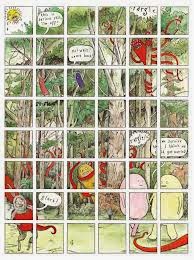
Other highlights include a creepy fine-line strip by Heather Buchanan about a sheep and a skeleton that acts as a mother figure; a funny, heavily stippled piece by Jess Johnson spoofing the art world; and a clever 1-page stirp by Sheehanbros that makes great use of negative space to tell a story about a family's sleeping habits. Perhaps my favorite story was by Samuel Killean-Chance. Titled "Cliff Trap", it's a Mat Brinkman-esque story of a couple of bulbous creatures. One is pursued by a sort of tentacled creature and falls off a cliff. The action is simple, but his composition, backgrounds, fluidity in depicting motion and character design draw the reader fully into the story. I love the story's ambiguity and Killean-Chance's willingness to leave the backstory unexplained. This is an artist I hope to see much more from in the future.

All told, this was an interesting, varied read with a number of different approaches. It was an especially impressive effort for what seemed to be an open-submissions anthology (albeit one open to New Zealanders or those associated with New Zealanders in some form). If Bradbury continues to publish these anthologies (and I hope that he does), at some point he's going to need to start to make some difficult choices as an editor and only publish the best stories. This would have been an excellent 100-page anthology; as it stands, it's a very good 150-pager. I'd also like to see longer contributions by some of the artists; some of the 1-pagers felt tossed-off at best. That said, there were some excellent 1-page strips in here. The upswing in quality from the first to second volumes of Pictozine was quite impressive, and I hope to see a similar arc for a potential third volume.


CANDY OR MEDICINE #2, edited by Josh Blair. This modest anthology informs the reader right from the start that it "always seeks contributors of all skill levels for future volumes". With such a focus, it's not surprising that so much of the work in here is so rough. The anthology does lure the reader in with some Matt Feazell (king of stick-figure mini-comics) sketches, and they are indeed nice. The vast majority of the work in here, while containing some enthusiasm and creative spark, is mostly unremarkable. There are some funny ideas that aren't executed well because the artists' ability to render isn't at a level that meets their needs. There are some nicely-drawn comics that are hard to follow--a victim of composition and panel flow. There are some cute one-off strips that were instantly forgettable.

There were exceptions, however. Richard Cabeza's apparent use of a computer to draw a couple of gag strips about snowmen and turtles elicited some chuckles. Writing gag strips that work is extremely difficult, and it's even harder to use visuals to support a joke. Cabeza is clearly pretty clever and is an example of someone who made the best possible use of visuals in support of his ideas. Blair's own "Lunarcy" strip has a small but amusing payoff, nicely using repetition to get his point across. However, the best strip in the book belonged to Liza Miller. Utilizing expressive stick figures, she created an amusing strip about a woman playing around with a scarf, laughing at her own silliness. What I liked about this strip was the strong handle Miller has on gesture, especially with such a stripped-down set of figures. The wobbly-constructed panels added to the sort of rubbery, exaggerated action depicted in each scene. Miller's ambitions may have been most in this strip, but it was the most fully-realized comic in the anthology. I hope that she continues making comics, and that the other artists in the book strive to find out exactly what it is that they want out of making comics and immerse themselves in that process.


Syncopated, Volume Three, edited by Brendan Burford. This is one of my favorite anthologies, due in large part to Burford's strong editorial hand. The general theme of the anthology is reportage and "first-person journalistic essays". As such, the stories here have a firm sense of time and place, yet cover a wide variety of styles. In this volume, some of the themes that appear in the stories include perilous travel, treasures hidden and unappreciated, places whose times have come and gone and in general the way time erodes everything. This is a stylish, well-designed comic that is pleasant to read and look at. Burford and his cartoony line have stories that bookend this volume. One's about the old Fulton Fish Market in New York that's been moved and converted into a mall, and Burford goes on to make points about homogenization. That's a theme that runs throughout the book--the stories celebrate people and places that defy such homogenizaton. The last story is about the origin of the nickname "Gotham"--a phrase that originally was thought to meant a city of fools, but upon further investigation revealed that it's a city of natives who fiercely protect what's theirs, using deception when necessary.

Dave Kiersh has a story about hanging out with a friend of his grandmother's who turned out to be an avant-garde filmmaker in the 1950's. There's an earnest sweetness to this story as Kiersh enthuses over his relationship both with his grandmother and this artist, and while he's sad that both are gone he treasures their memory. Nick Bertozzi's rollicking, harrowing account of "The Voyage of the James Caird" shows that this anthology isn't all solemn meditation--this was a fascinating account of a risky rescue sea voyage. Meathaus collective artist Jim Campbell, along the same lines, contributes "T.R. And the Thieves", a hilarious account of pre-presidential Theodore Roosevelt tracking down some thieves during a harsh winter with his men. Campbell's rubbery style is a perfect fit for the larger-than-life TR. The intrigues as his crew tracks down thieves in the forest reminded me a bit of the gripping Blueberry stories of Charlier & Moebius, only with a slightly more farcical air.

Burford includes some contributions that have a particularly striking visual approach. Tom Devlin's doodles aren't any kind of narrative, but are particular in how they were created--in a coffee shop with other cartoonists. Seeing a man who mostly works as a designer these days unleash his creativity on a page makes me wish he cartooned more these days. Greg Cook contributes an account of his local neighbors who went off to Iraq. Cook reverses positive and negative space in his depiction of figures, so it appears we are only looking at shadows. Paul Hoppe has a series of sketches about gentrification in Brooklyn, while Burford has an essay about the tugboat graveyard in New York and Susie Cagle writes about the history of a particular decaying building in Brooklyn.

All told, the variety of storytelling approaches and cartoonists, the enthusiasm with which each creator tackles their subject, and the particular writers and artists who contributed to this anthology made it one of the best comics of 2007. Anyone interested in the life of cities, exciting accounts of historical voyages, and the possibility of finding hidden treasures on a day-to-day basis should seek this book out. This anthology doesn't seek to revolutionize comics as a form, but rather seeks to examine specific times and events with existing storytelling structures. I hope another volume will be released sooner rather than later, because Syncopated succeeded in its goals and has become an overlooked treasure in itself.


Potlatch Project 5, published by Steven Noppenberger. This anthology was created several years ago from a group of creators whose entries were rejected by the SPX anthology, so they decided to publish their stories and donate the profits to the Comic Book Legal Defense Fund. This is the fifth iteration of that project, now no longer being done for the CBLDF. It's a mixed bag of superhero, sci-fi, fantasy and slice-of-life comics. A couple of them seem to be excerpts from other series, or episodes from a series. Few of the stories made much of an impression. Even a funny artist like Stan Yan contributed what amounts to a throwaway gag story, while publisher "Noppie" had a nice-looking (with a really beautiful line) but somewhat incoherent episode of a larger fantasy story. The only segment that I really enjoyed was David Recine's "Murky Waters" a funny series of slice-of-life bits with surprising action elements and good punchlines. His line is a bit crude, but functional. One cannot fault the enthusiasm or intentions of the artists involved, but at this point this anthology series might be running out of steam.


Blurred Vision 3. This is an interesting assemblage of comics creators and fine artists working in the comics milieu. There are hyper-realists like Karl Stevens, Woojung Ahn and the enigmatic Toc Fetch. Stevens' "Love" presents frozen moments in time as a couple wordlessly relaxes on a couch as a man strokes her hair. We don't see the whole picture here--just bits and pieces of the woman's face, the man drinking water, and the TV shows they're watching. Ahn's "Adventures of the Right Hand" is a cute but creepy account of how an overworked right hand escapes, finds itself in the harshness of the big city, then gets sewn on to a new arm. Fetch's strips defy easy description. The hyper-realism of his images is contrasted with the weird mythology he alludes to in his text.

There are some familiar alt artists here like Ethan Persoff, Henriette Valium, Dash Shaw and Bishakh Som (from the old Hi-Horse anthology). Valium reworked an old Captain America story into "Captain Angry White", a typically outrageous and extreme entry from him. Persoff had an entry in an ongoing story called "The Dog and the Elephant", using his somewhat still, animation-influenced style to create tension in his stories. Som's "You Make Me Feel So Real" is a visceral story about a dancer who dips into her memories as she practices a rigorous piece. The way Som simultaneously visually depicts movement against that narrative of memory along with the beats of sound effects, culminating in the character recovering from an asthma attack, makes for a powerful reading experience.
Perhaps my three favorite pieces came from artists whose work I'm not familiar with. Henrik Rehr's "Apple" and "Bald Men" utilizes a fractured arrangement of text (almost like snapshots) illustrating a brief, poetic series of thoughts. Koren Shadmi's "Know Thy Self" is a hilarious, revolting story of a young woman who reaches through her navel to pull out various of her organs, anthropomorphized into singing, dancing, smiling creations...until her body collapses. Stem's "Shadowhouse" is a cleverly composed and designed story that makes great use of negative space, about a young child who discovers a parallel, house under his bed and travels there at night. It's both creepy and sweet in its own way. The eccentric choices in this anthology led to an interesting reading experience, where despite a lack of a theme, the different stories complement each other well.


Blab 17, edited by Monte Beauchamp. Blab is a long-running anthology that stepped in when Art Spiegelman and Francoise Mouly quit editing RAW. This issue features a couple of former RAW artists like Sue Coe and Drew Friedman and in general continues to use a number of items from the RAW playbook. For example, there's a wide diversity of styles and creators from other countries represented here. Under editor Beauchamp, Blab has occasionally veered a little too far away from narratives in favor of flashy imagery. That's mostly not the case here, other than a series of illustrations covering about a 12-page span. Blab is a sort of cousin to Kramer's Ergot, though perhaps not as aggressively experimental; and Hotwire, though not as inspired by underground comics tradition.

There's all sorts of storytelling traditions and genres represented. The silent "Membrane" by Paco Alcazar is a chilling, bizarre horror story. Peter Kuper's "Nine Lives" is an amusing autobiographical short, while Spain relates a story of his turn in factory life. There's absurdity like Mark Landman's "Fetal Sunday Funnies" (starring Fetal Elvis) and Matti Hagelberg's "Christmas In Shacktown" (featuring James Bond villain Blofeld aiding Hansel and Gretel). There's historical reportage like Geoffrey Grahn's "The Dutch Tulip", about the tulip speculation craze, odd archival material like vintage roller skate labels and a tribute to Bazooka Joe, and Playboy cartoon parodies. Esther Pearl Watson (a relative newcomer to comics) contributes a remarkable two-pager about a haunted funeral plot. The change in tone and style from story to story can be almost dizzying at times, but it all seems to fit into the anthology's overall aesthetic. Not everything in here is a hit for me (I thought the attempts at poetry were especially overwrought or grating), but it's all at least interesting to look at. The fact that Beauchamp has kept the anthology going for so long, with so many different talented artists, is a remarkable testament to his commitment to his artistic vision and willingness to continue to mine the worlds of comics and fine art for images that need a publishing home.

Friday, October 7, 2011

Another Worthy Kickstarter Effort: The Strumpet

I've enjoyed Ellen Lindner's work for some time now, both her solo comics as well as the anthology she co-edited, Whores of Mensa. That anthology is being reconfigured and retitled as The Strumpet (a brilliant choice), and they're doing a Kickstarter campaign. They're only stumping for a modest $1000, and given the quality of the contributors (Lindner, Mardou, Megan Kelso, among others), I'm hoping they can meet their goal without too much trouble.

Monday, June 20, 2011

Whores of Mensa #5, Candy or Medicine 13

Time to look at a couple of minicomics from near and far.

Candy or Medicine #13, edited by Josh Blair. The latest in this all-comers minicomics series is the usual mixed bag of visual & narrative approaches. William Cardini's story, as always, was welcome to see, as he unleashed his usual Mat Brinkman-style exploration of environment with monsters and robots. It's a nice mix visually between heavy use of black in negative space with wavy lines filling up entire panels. There's also a slice-of-life gag from Katie Omberg that was fairly routine up until the punchline, which actually landed with some force. Brad W. Foster shows once again that he's a fine artist, even if his gag was less-than-inspired. As an editor, Blair has shown a tendency to try to print some genre-oriented stories, like this issue's "The Cloud Catcher" by Christopher Tupa. It's a mildly amusing fantasy story that lacks visual appeal thanks to its use of grays; it probably looks more interesting in color. Blair's commitment to a variety of material as well as experience & even talent levels has always been impressive, and some interesting names have floated through this anthology as a result.

Whores of Mensa #5, edited by Ellen Lindner & Jeremy Day. Kickstarter strikes yet again to produce another attractive, lengthy comics anthology. In the past, the Whores of Mensa anthology printed no more than three or four cartoonists. This UK-centered anthology has also traditionally published the work of women, a tradition that continued in this issue with one exception. Each issue has also revolved around a loose theme; this issue's central idea is "parties". This approach spawned a surprising number of variations on the experience of a party. Patrice Aggs, for example, set her comic in a hair salon where everyone there talks about potentially attending a party at a club later that night. Aggs skillfully depicts the inanity of workplace chatter with great affection. Perhaps too much affection, as the comic slightly outstays its welcome at seven pages.

Sarah McIntyre's two-pager about being forced to fold paper napkins for her mother's parties, on the other hand, benefited from its brevity, as it possessed a clever punchline. Co-editrix Jeremy Day's nine-panel comic "Larderella" is typically cheeky, turning the Cinderella story on its head with the prince being interested in the heroine's shoes for a quite unexpected reason. Cloidhna Lyons' story features lovely art with bold black lines, but it was more than a bit predictable and ultimately forgettable as a result. Francesca Cassavetti's childhood anecdote is typical of her in that she goes from the general (attending all sorts of parties) to the specific (a party that her secret crush Serge was supposed to attend) with great fluidity, easing the reader to her eventual punchline. Her scribbly art is a perfect match for the kinds of stories she tells.

Co-editrix Ellen Lindner, long a favorite of mine in the minicomics world, shows off a remarkable amount of polish in her story of a young woman bouncing from London to New York with great misgivings. Her precise misgivings go unrevealed, but her tendency to bounce from affair to affair may well have something to do with it. There's a stark precision to Lindner's line combined with a certain stiffness of figure that almost reminds me of Steve Ditko. It's stagy, an aesthetic that fits due in part to its nature as a period piece. Howard John Arey (formerly of the High-Horse collective) contributes a two-pager about the sort of person who isn't invited to a party, but desperately longs to be. It's a clever story with an agreeably sloppy line. Emily Ryan Lerner's story about two friends negotiating a New Year's Eve party at an unfamiliar apartment has the sort of specific detail that this sort of slice-of-life story demands. The simple line allows the reader to fly across the page.

My favorite story was that of Maartje Schalkx's, a cleverly-designed map comic that follows her progress walking up a street (shown as walking "up" a landscaped page) with a lost little boy. There's a remarkable spareness of line and image in this comic, as she has the street map take up most of each page. Finally, Tanya Meditzky's comic features small drawings and tiny print, which was certainly distracting as a reader. The simplicity of her line allows her to lead the reader across and around the page with surprising fluidity, much like the conga line she depicts. Whores of Mensa #5 is somewhat uneven but overall still a coherent and joyful shout of a comic. It's another example of the way the British comic scene is growing and the variety of approaches that are springing up.