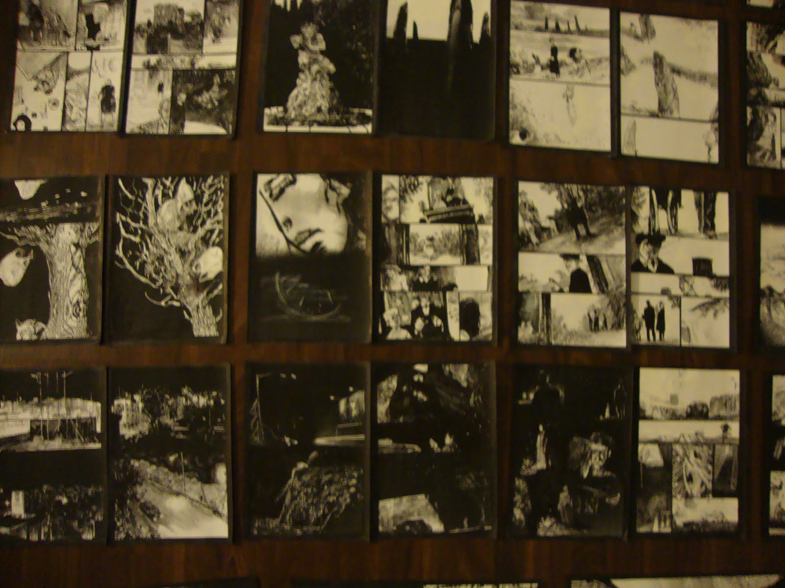
The key phrase in Julia Gfrorer's remarkable book from Fantagraphics, Black Is The Color, comes when the two protagonists (a doomed sailor and a mermaid) are cuddling together in a boat. After coaxing all sorts of stories and confessions out of him, she tells him that he really doesn't want to know about her. When pressed, she replies "You think you do, but you'll be happier if I let you wonder about it." The reason why this phrase is so important is that it underlines the relationship between mermaids and humans: the mermaids have their own society filled with precisely the same sort of petty concerns and backbiting as human society, but the mermaids prefer to be fantasy figures to the humans. In that way, they remain above them. Sure, the mermaids are objectified and reduced to fantasy objects, but in Gfrorer's world here, they always maintain the upper hand. They regard humans as a kind of entertainment, as it's cruelly revealed when a crowd of mermaids and mermen float in choppy waters in order to see a lightning storm set a ship on fire. Its puerile, mean-spirited entertainment, yet the mermaids also display the capacity for compassion and beauty as well. Gfrorer offers only hints of mermaid society, but she reveals enough to let the reader know that mermaid society and modern society are fairly interchangeable. It's not an accident that the book's cover features the mermaids and mermen floating in the ocean, waiting for something to come along and entertain them. Preferably something gruesome.
I've included Gfrorer as one of the stalwarts of what I've dubbed the "Coal Mine School": artists who plumb the depths of despair, torment and degradation to find nuggets of beauty and even humor. (Others include JT Dockery, Anna Bongiovanni, Chris Wright and Caitlin Skaalrud). Indeed, every one of Gfrorer's comics is told with the same pitch-black sense of humor, especially in terms of its dialogue. I especially enjoy the frequently anachronistically modern dialogue she employs in tales from the past; it heightens the sense of humor and distance even as the reader is dragged straight into tragedy and suffering. In this story, Warren is forced out to sea by his captain because of diminishing provisions; it's essentially a death sentence. Things get worse when Warren contracts tuberculosis from his fellow cast-off. In Warren's mind, whether or not the mermaid is real is an open question, but the comfort he receives makes this irrelevant. There's no doubt that the mermaid is real, given the scenes that Gfrorer depicts of mermaid society. I suppose that the entire back half of the book could be an elaborate hallucination, but Gfrorer plays fair with her readers.
The most interesting segment in the book comes when it seems like Warren has somehow made it home to his wife and baby. He shakes off any warmth in order to immediately have sex with her, a need that Gfroer makes palpable and desperate on the page. It's a passionate, tender scene that of course is revealed to be a dream--or is it, given that we see his wife wake up with salt water in her mouth? Is it her dream, his dream, or a gift from the mermaids as he's dragged down under when he does? Gfrorer wisely leaves that to the reader's imagination, as Warren is dragged down into the depths of the ocean that become blacker and blacker until they become white. There's no question that the scratchy intensity of Gfrorer's line is the key to the book's success. What she tries to get across on many of its pages is the view that Warren sees as he goes in and out of consciousness: the sea, the sky, the clouds, a set of lines that become more abstract as they are frequently the only thing he sees. There is stultifying boredom relieved by visits from the mermaid, but even those visits are a kind of assault on his sanity as he understands it. Every line is an assault, from the tiny stilettos that comprise the dense waves to the darkness of night that is almost invasive. Warren doesn't get to live on like Coleridge's Ancient Mariner, but he does get a last chance at comfort and goes out on his own terms. In a story where death is a certainty, that kind of dignity represents a kind of triumph, one more authentic than if Gfrorer had let the happy ending be real.
Showing posts with label Julia gfrorer. Show all posts
Wednesday, January 8, 2014
Monday, October 21, 2013
Minicomics: Nichols, Cantirino, Remnant, Gfrorer, Reklaw
Flocks, Chapters 2 and 3, by L.Nichols. These are the next two chapters in Nichols' meditation and exploration of faith and growing up as a queer born-again Christian. Each issue tends to cover similar ground, circling back to a variation on a theme. For example, the second issue, subtitled "body of conflict", gets at Nichols' body-image issues, knowing exactly what she wanted to look like as a kid but knowing it "wasn't OK". Using her distinctive rag doll self-caricature, Nichols depicts the forces and pressures she felt as a child and teen using the nomenclature of physics, though those arrows bearing down on her pierced and drew blood. The comic is heartbreaking in that she has a strong sense of identity but prays desperately to change, to conform, to not be a sinner. It never works, and at the end of the issue she goes back out into nature with the animals and woods that provide her so much comfort because they allow her to be herself as she is.
The third issue ("Nature vs Nurture") focuses less on body image and more on faith itself. A constant, running theme throughout this comic is Nichols refusing to demonize faith and religion, despite her experiences. She talks about the feeling of community she frequently felt, the power and mystical intensity of gospel services, and the comfort she felt in the idea that god was all around. At the beginning of this issue, she quotes a pastor quoting the Bible, referring to the "still, small voice of God". This concept made sense to her, that almost Buddhist idea that she was "part of something larger".Once again, that voice was best heard out in nature, where it was easier to see oneself as part of something larger instead of hearing the loud, angry voices decrying homosexuality and sinners. As Nichols notes, those were the voices of man, not God. While Nichols works through a lot of pain in these comics, it's not done in anger, but rather in appreciating beauty. Nichols' approach is to match the hate she felt for herself and the hate she felt from others with gentleness and care. Her use of full color to depict just how vibrant her environment was to her is a key to the success of these comics, because one can sense the joy radiating from those sequences. These comics are not a chance for revenge, but rather a plea for understanding. I hope she keeps going.
Turnpike Divides Part 2, by Sally Cantirino. The first issue sets up a story about a young man returning home to New Jersey to attend the funeral of his best friend, with the strong sense that said friend drove his car deliberately into a pole. This issue picks up on the ramifications of this event, as the man (Alec) tries to gain comfort from his ex-girlfriend (Lily). Cantirino nails the ways in which twenty-somethings relate to each other as they find themselves drifting through life, and this comic takes dead aim at narcissism and self-pity. Alec tries to find ways to blame himself for his friend's death and condemns those around him for not mourning him sufficiently, before Lily reveals a key fact about his death and generally puts him in his place. It's also about no longer being part of a place, about its relevance to one's life being entirely in the past. Cantirino's line is a little on the busy side, making the pages a bit denser to read than they need to be, but she does capture a sense of time and place. She notes that she used a lot of reference to real places for this story, and it's easy to see that; the spaces here look lived-in and well-trod. She also has a real knack for drawing night scenes and snow, which added a lot of atmosphere to the story. A student at the Sequential Artists Workshop (SAW), her ambition as a cartoonist is clear.
Blindspot #3, by Joseph Remnant. The latest issue of the talented Remnant's one-man anthology focuses on autobio stories this time around, but each of the four has a very specific tone and purpose. At the same time, each of them fervently questions both himself and the cultural values surrounding him. In "L.A. Coffee Shop", Remnant takes aim at all of the "creative types" who fulfill every LA stereotype one can imagine, both in terms of the way they dress and the things they say. Of course, Remnant takes a step back and aims those barbs for himself as well, letting the other artist he saw in the cafe draw a picture of Remnant looking like an idiot. "Pappy Ron's Pizza" takes dead square aim at the controversy over Papa John's Pizza refusing to comply with the Affordable Healthcare Act because it would eat into their profits and "force" a small increase of the price of pizza. Here, Remnant watches a "news" report from a right-wing TV network that fully supports "Pappy Ron". From there, driving to various locations during con season leads him to choosing that pizza joint...but he just can't quite go through with it. It's a strip where Remnant is literally nauseated by the patter the Pappy Ron employee is forced to spew out, but it's also a story where Remnant follows through on his principles.
"Elevator" finds Remnant confronting his past in the face of an old friend and an odd interaction with him, as well as going back to his old school. This unsettling story then quickly resolves in a way that makes sense, and the jarring ending doesn't feel like a cop-out because of the warning Remnant receives during the course of the narrative. The story that sort of recapitulates all the others is "You Are Here", which is about depression and how Remnant used meditative hiking up a hill as a form of therapy. Walks have a way of first stirring up bad thoughts and then dissolving them through sheer physical exertion, and Remnant works through his miasma and depression by forcing himself through. It's a story that touches on John Porcellino and his zen comics poetry, using many silent panels to create a rhythm that Remnant feels while walking. The slow, steady progression from panel to panel is modulated by the density of Remnant's cross-hatching, especially when Remnant walks slowly through shadowy parts of a forest. It's interesting to contrast the relative calm and quiet of that darkness to the darkness Remnant wakes up to in "Elevator". As always, Remnant's skill as a cartoonist is superb, with complete control over his line and his page. Like many artists inspired by underground cartoonists, Remnant's layouts are relatively straightforward, though he does something unusual on many pages with a 3-2-3 grid. The reader tends to go to the center of the page in grid set-ups, but Remnant deflects the reader's eye with two central panels in the middle of the page, forcing them to take in both of the central panels as a single image and then the rest of the page. Remnant wants the reader to look at every panel and follow its rhythm to the next, even when there are silent beats and delays. The way he formats the page makes the reader do this if they want to follow the story, and he faithfully puts a lot of clear but detailed information in every panel. Location, mood and body language are all keys in Remnant's comics and it's obvious that he wants the reader to closely follow all three. Even though this issue is autobiographical, Remnant is less interested in being confessional than sharing relatable stories.
Black Light, by Julia Gfrorer. Ever since publishing her first book with Sparkplug, Gfrorer has been creating one astounding, unsettling and frequently erotic story after another. This mini collects four short stories from a variety of sources, and what's remarkable about it is the way she takes tired fantasy and horror tropes (a vampire, Death, a deadly water nymph, and a magical bear) and transforms them into something that's actually frightening and real. That's because while the genre trope is often part of the story's big reveal, it's never the most frightening thing about the story. For example, "River of Tears" starts with the sort of party scene that Gfrorer excels at depicting, but soon segues into a series of texts from a suicidal junkie girlfriend. The horror here is not the Grim Reaper coming to take her away, but rather the mind-rending horror of dealing with that kind of emotional manipulation. "Phosphorus" is horrifying not because there's a monster in a pond, but rather because it's about sexual violence and humiliation."All Is Lost" is a downbeat story because it flips around the expectation of a monster menacing a child and suggests that it's the mother who is really the monster. Finally, "Unclean" and its ultimate monstrous revelation only works because of the way Gfrorer sets up and details the woman's betrayal. Indeed, she even suggests that the vampire is less of a predator than the woman's cheating ex-boyfriend. Her line is scratchy, harsh and dense, all befitting the kinds of stories she tells. Gfrorer is a smart storyteller above all else; one can sense just how much thought goes into each story and how certain elements, once revealed, will resonate for the reader. Her work rewards multiple readings because of its thoughtfulness and attention to detail, as well as her deep understanding of interpersonal dynamics and how they become dysfunctional.
LOVF New York: Destination Crisis., by Jesse Reklaw. This is a harrowing, intense account of Reklaw journeying to New York City and inadvertently going off his meds and becoming homeless for a period of time. Published by Robyn Chapman's Paper Rocket Minicomics, it's a beautiful, full-color minicomic that contains comics, sketches, collaborations with others and tenuous threads of narrative. It's a comic that's as much about the process of making a comic as it is the material itself, because the original pages got rained on at one point and the colors bled into each other. It's a collaboration with the elements as well as other artists, and a document of Reklaw going through a manic phase when he was off his meds. The line between typical member of society and being homeless is shown to be remarkably thin, especially when someone is dealing with mental illness. This comic rewards multiple readings simply because each page is so dense and filled with detail, scrawled jokes, background gags and references to New York. The city plays a huge role, given how unforgiving it is to the poor, but also because Reklaw went to the city to try and do business, even going to the weekly open tryout at The New Yorker. This comic represents a side of Reklaw I've never seen before. He's an artist whose comics are generally neat and ordered, hewing to strict grids and other formal constraints. Here, he's all over the place in spectacular fashion.
Labels:
jesse reklaw,
joseph remnant,
Julia gfrorer,
l.nichols,
sally cantirino
Friday, August 12, 2011
Into The Void: Julia Gfrorer, Ibrahim Ineke, Sean Andress
Let's look at three minicomics that focus on different aspects of darkness, horror and fear.
Moral Geometry #2, by Sean Andress. Of the three artists discussed here, Andress' comic is the most conventional. This is a straight-up horror comic with a silent, dream logic narrative. Andress' line is thick and rubbery with dense hatching; the result is a page that looks like partly like it's melting and partly like its decaying. Andress goes for grotesque overload, overpowering the reader with intense but clear images that nonetheless have a fairly simple through line and a dark sense of humor. The action follows a sort of bizarre performance as a man with a crown looks down a hall to find a demonic creature tossing an object that's part head and part balloon at a blindfolded creature with a spike sticking out of its mouth; the effect is that it's some sort of strange party game. The more interesting story finds a family of lumpen figures sitting down at a table for dinner. The putative father figure pierces a roast, which squirts blood into the mouths of everyone at the table. Things go horribly awry as a particularly disgusting birth occurs, the new creature threatens the house we see at the beginning of the book and the man with the crown laughs in fun. This is less a coherent narrative than a series of loosely connected images, and Andress revels in the excess of his images in panel after panel. Despite the violence and gore, this comic really is pinned to a humorous sort of logic, which puts it a step above a splatterfest that is simply trying for shock.
Various comics by Ibrahim Ineke. The Netherlands-based artist specializes in an oblique depiction of fear. Using a ballpoint pen, white-out and a photocopier, Ineke creates whirling environments of black and white shadows enveloping his characters, and as a result, the reader. "Empty Quarter" finds a man walking a lonely city street receiving a piece of paper that falls from above. Opening it up, it seems to lead him to a seemingly empty but creepy building. After fleeing the building, he falls, the piece of paper flying out of his hand. As a clever, gimmick, Ineke inserted a blank but stained and folded piece of paper into the back of the comic, as though it fluttered out of the comic. Like all of his comics, it's marked by extremely dense hatching marked with streaks of white. "In Prism" is a story whose title winds up being a dark play on words, as a hotel manager investigates an Alistair Crowley-type mystic and whether or not he and his order are abusing his young niece, who is "a medium". Unlike most of this stories, this one mostly concerns its figures rather than its environment, and the result is a scratchy, expressionistic approach. This is his most conventional story to date, though its end has quite a visual kick to it. Finally, there's the untitled, magazine-size comic that features a boy and girl and unnamed horror. The boy happens to see a corpse with no face when on a business trip with his father and uses this image to terrify and coerce the girl. The story has a hallucinatory quality, as the faceless corpse (all the more terrifying because he has a few teeth left in his jaw) suddenly appears in a sequence where reality seems quite fluid, resulting in the children losing their faces and then page after page of people at the ocean, waves crashing and dragging a woman down. The book segues into a sequence where a woman is in a curiosity shop buys an item that draws unwelcome company. Once again, Ineke shifts between the power of the intense, individual image and the need to relate a narrative. This is certainly his most ambitious comic, given its length, recurring images and stunning use of his tools to create a dense environment of light and darkness that demands its readers to engage it fully, peeking into the darkest cracks to suss out meaning.
Too Dark To See, by Julia Gfrorer. Of all the work discussed in this column, Gfrorer's comic is by far the most disturbing. Using a clear, light line, lots of open space and a minimal use of blacks, Grfrorer nonetheless crafts a story that's terrifying because of its implications. Grfrorer's themes frequently revolve around the supernatural, sex, death and lies. This story is a bizarre mash-up of a typical slice-of-life relationship story and a horrifying supernatural story of sexual violation, lies and distance. The story is simple: a 20-something couple is lying in bed asleep when a female shadow creature seduces the man by first going down on him and then saying that she'll go away if he'll have sex with her, saying "I just need your cum". While his girlfriend never finds out about this encounter, it casts a long figurative shadow over their relationship as he immediately becomes more distant and she immediately becomes more paranoid. When she finds "something black" on her genitals, she accuses him of cheating, but the implication of what she might be afflicted is especially chilling. The ending is ambiguous, as there is a segue between the aftermath of the couple arguing and the shadow creature and her lover coalescing and mocking the couple for naming their imminent baby with a "hipster grandpa name". The implication, of course, is that the male shadow had sex with the woman and impregnated her. This is a truly grim story, and perhaps its bleakest aspect is how easily the shadows were able to get exactly what they wanted from the couple, even as the first page of the book showed how much in love they supposedly were. Gfrorer has carved out a unique place in comics with her subject matter and every new comic she releases is worthy of close attention.
Moral Geometry #2, by Sean Andress. Of the three artists discussed here, Andress' comic is the most conventional. This is a straight-up horror comic with a silent, dream logic narrative. Andress' line is thick and rubbery with dense hatching; the result is a page that looks like partly like it's melting and partly like its decaying. Andress goes for grotesque overload, overpowering the reader with intense but clear images that nonetheless have a fairly simple through line and a dark sense of humor. The action follows a sort of bizarre performance as a man with a crown looks down a hall to find a demonic creature tossing an object that's part head and part balloon at a blindfolded creature with a spike sticking out of its mouth; the effect is that it's some sort of strange party game. The more interesting story finds a family of lumpen figures sitting down at a table for dinner. The putative father figure pierces a roast, which squirts blood into the mouths of everyone at the table. Things go horribly awry as a particularly disgusting birth occurs, the new creature threatens the house we see at the beginning of the book and the man with the crown laughs in fun. This is less a coherent narrative than a series of loosely connected images, and Andress revels in the excess of his images in panel after panel. Despite the violence and gore, this comic really is pinned to a humorous sort of logic, which puts it a step above a splatterfest that is simply trying for shock.
Various comics by Ibrahim Ineke. The Netherlands-based artist specializes in an oblique depiction of fear. Using a ballpoint pen, white-out and a photocopier, Ineke creates whirling environments of black and white shadows enveloping his characters, and as a result, the reader. "Empty Quarter" finds a man walking a lonely city street receiving a piece of paper that falls from above. Opening it up, it seems to lead him to a seemingly empty but creepy building. After fleeing the building, he falls, the piece of paper flying out of his hand. As a clever, gimmick, Ineke inserted a blank but stained and folded piece of paper into the back of the comic, as though it fluttered out of the comic. Like all of his comics, it's marked by extremely dense hatching marked with streaks of white. "In Prism" is a story whose title winds up being a dark play on words, as a hotel manager investigates an Alistair Crowley-type mystic and whether or not he and his order are abusing his young niece, who is "a medium". Unlike most of this stories, this one mostly concerns its figures rather than its environment, and the result is a scratchy, expressionistic approach. This is his most conventional story to date, though its end has quite a visual kick to it. Finally, there's the untitled, magazine-size comic that features a boy and girl and unnamed horror. The boy happens to see a corpse with no face when on a business trip with his father and uses this image to terrify and coerce the girl. The story has a hallucinatory quality, as the faceless corpse (all the more terrifying because he has a few teeth left in his jaw) suddenly appears in a sequence where reality seems quite fluid, resulting in the children losing their faces and then page after page of people at the ocean, waves crashing and dragging a woman down. The book segues into a sequence where a woman is in a curiosity shop buys an item that draws unwelcome company. Once again, Ineke shifts between the power of the intense, individual image and the need to relate a narrative. This is certainly his most ambitious comic, given its length, recurring images and stunning use of his tools to create a dense environment of light and darkness that demands its readers to engage it fully, peeking into the darkest cracks to suss out meaning.
Too Dark To See, by Julia Gfrorer. Of all the work discussed in this column, Gfrorer's comic is by far the most disturbing. Using a clear, light line, lots of open space and a minimal use of blacks, Grfrorer nonetheless crafts a story that's terrifying because of its implications. Grfrorer's themes frequently revolve around the supernatural, sex, death and lies. This story is a bizarre mash-up of a typical slice-of-life relationship story and a horrifying supernatural story of sexual violation, lies and distance. The story is simple: a 20-something couple is lying in bed asleep when a female shadow creature seduces the man by first going down on him and then saying that she'll go away if he'll have sex with her, saying "I just need your cum". While his girlfriend never finds out about this encounter, it casts a long figurative shadow over their relationship as he immediately becomes more distant and she immediately becomes more paranoid. When she finds "something black" on her genitals, she accuses him of cheating, but the implication of what she might be afflicted is especially chilling. The ending is ambiguous, as there is a segue between the aftermath of the couple arguing and the shadow creature and her lover coalescing and mocking the couple for naming their imminent baby with a "hipster grandpa name". The implication, of course, is that the male shadow had sex with the woman and impregnated her. This is a truly grim story, and perhaps its bleakest aspect is how easily the shadows were able to get exactly what they wanted from the couple, even as the first page of the book showed how much in love they supposedly were. Gfrorer has carved out a unique place in comics with her subject matter and every new comic she releases is worthy of close attention.
Monday, August 24, 2009
Minicomics Round-Up: Gfrorer, Neely, Huizenga, Jackson, Jay, Platt, Beyer, Wiedeman
Rob reviews another selection of minicomics from old pros and newcomers alike. Reviewed are ARIADNE AUF NAXOS V. 1 & 2, by Julia Gfrorer; SELF-INDULGENCE, by Tom Neely; GREAT DEEDS AGAINST THE DEAD, by Rob Jackson; RUMBLING Chapter 2, by Kevin Huizenga; MY EXPLODING HEAD, by John R. Platt; THE NATURAL WORLD #2, by Damien Jay; CASUAL SEX and CITY UNDER SAND, by David Beyer, Jr.; and THE DEFORMITORY, by Sophia Wiedeman.

ARIADNE AUF NAXOS, volume 1&2, by Julia Gfrorer. These fall into the category of what I call "ramble comics"--minis where the artist takes the reader on a rambling journey that usually features themselves or a stand-in as a character and where the action and scenery is fluid to the point of surreality. I'd throw Jonas Madden-Connor and Damien Jay (especially in POCKET PARTY) in this category as well. The title of the comic refers to a Richard Strauss opera that originally followed a long play that was about a commedia dell'arte being thrust into the middle of a serious work. In much the same way, Gfrorer thrusts herself into the middle of other storylines, fed by pop culture concerns. The results are hilarious, with her thin and spontaneous line feeding her twin concerns of absurdity and sheer horror.

The first issue, themed around the idea of time, features Julia encountering James Bond in his different incarnations, then getting bored and drawing Gilgamesh meeting Simon Templar (The Saint)--with herself as a character in that meetup. That duo starts making out, leaving Julia to comfort Gilgamesh's now-left out pal Enkidu. Julia goes on to meet up with Doctor Who (leading to a comedy routine the two), St Francis of Assisi (whom she horrifies by chomping on a live rabbit) and Lancelot, whom she contacts with her mind. This is a playful comic where horrible & inexplicable things can happen at the drop of a hat. It has the feel of total spontaneity on each page, but really seems to conform more to the principles of long-form improv. That is, while each individual page and panel might be improvised, there's an underlying structure that is referred to from time to time and that pops up in surprising ways.
The second issue's theme is death, and it mostly sees Julia wandering around as a sort of ghost zombie after the king of the witches kills her. There's an obsession with nomenclature and language that pervades this comic, especially the ways in which focusing in on picayune details obscures real meaning. Grforer expresses this idea with deadpan wackiness, with dialogue a bit reminiscent of Mat Brinkman's MULTI-FORCE: slang and curses spoken by supernatural characters. Doctor Who pops up again, this time dancing around the theme of regeneration. This comic is as much about the creation of the comic as it is a narrative, as Grforer never lets the reader forget that the comic is being drawn and that she is drawing it, even as strange things happen to her. The drawings have the crackling energy of sketchbook spontaneity but with a wit that provides a solid support structure.

SELF-INDULGENCE, by Tom Neely. This little mini is a wordless bit of body comedy/horror from an artist who combination of bigfoot drawing and naturalism creates an unsettling atmosphere. The concept is simple: a pair of naked twins faces each other and one starts eating the other whole. As he's doing this, his twin is excreted out the other side, until the original image is duplicated as the book's final panel. With Neely, the fun is in the visceral, inky details and exaggerated body language. The way he elongates arms and legs while drawing pubic hair in exacting detail is the sort of thing that creates the old/new tension in his comics, a visual signature of sorts. I believe he customizes the cover for this comic when purchased at conventions (he did a drawing of the wolf from THE BLOT on mine), which is just a bonus for this beautiful comic.

GREAT DEEDS AGAINST THE DEAD, by Rob Jackson. This is another off-kilter genre comic from the prolific Jackson, in the tradition of Lewis Trondheim & Joann Sfar. This time around, Jackson takes on the occult, in this story about a haunted house manipulating a widower. Jackson manages to hit every note and cliche' while still telling a straight-ahead story, including occult investigators, paintings coming to life, being forced to sleep in a haunted house overnight and deadly cemetery statues. At the same time, Jackson's characters often drift off on amusing tangents, like the musings of a literary agent and the matter-of-fact rantings of the demonic house. Jackson's crude but earnest line tackles occult conventions with gusto, and that simplicity subverts the usual visual cliches one associates with the genre. Jackson backs up that feature with what looks to be some drawings from life that form a rough narrative of a day out. The main critique I might make of Jackson's work is to further simplify his line. There are times when he overrenders a bit in an effort to provide atmosphere, and it's distracting. Taking a further cue from the simple but clear style that Trondheim employs would go a long way to making his genre explorations all the more effective.

RUMBLING, Chapter 2, by Kevin Huizenga. With the cancellation of his D&Q series OR ELSE, Huizenga announced that he'd be continuing his "Rumbling" story in minicomics form. The second issue adds a bit of context and backstory to the vague sense of dread regarding an exile trying to evade the ramifications of a religious war. What's fascinating about this adaptation of a story by Giorgio Mangenelli is how Huizenga works in his visual and verbal interests into a previously existing narrative structure. There are the wide shots of countrysides and night skies, this time imbued with a feeling of doom instead of the usual sense of awe. There are the diagrams and philosophical asides that now represent life and death instead of merely playful exploration. It even features his signature everyman character Glenn Ganges, whose intellectual curiosity is subsumed in favor of survival and desire for human contact is warped into hermitage. The most fascinating thing about this story is the way Huizenga presents iconography as something that has lethal real-life consequences--both in a predictable way (religious wars) and unexpected (science wars). Glenn eschews all conflict and dips into his true love of ancient history, a pastime derided as heretical by all. Huizenga jumps around chronologically, going from quiet reflection to moments of danger along the way in rapid succession. It's a rich and potent stew from one of the most interesting cartoonists working today.

MY EXPLODING HEAD, by John R. Platt. Platt noted that this was his first mini-comic, and he was wise to play to his strengths as an artist. This is an 8-page collection of gags and observational humor that reminds me a bit of the sort of thing that Shannon Smith does. Platt employs a simple line that eschews extraneous details and overrendering and displays a knack for character design. His best strips actually feature jokes about monsters (like "Mummy Dearest" holding a wire hanger) and especially Bigfoot. Platt also did a micro-mini comic called "My Beard In Alternate Dimensions", which featured a number of funny Don Martin-style drawings of reimagined facial hair. There are downbeat undertones to his gags, as Platt also refers to his ongoing battles with depression, and it's interesting to see him deflect this particular show of emotion with jokes. It feels like Platt is slowly trying to figure out what he does best as a cartoonist and humorist, and I think that will be an interesting process.

THE NATURAL WORLD #2, by Damien Jay. One of my favorite minicomics artists returns with another chapter in what's shaping up to be a grimy fantasy epic. I'm reminded a bit of Terry Gilliam's film JABBERWOCKY, a medieval epic that paid special attention to the mud, manure and sheer unpleasantness of the life of a serf. Jay's greatest skill as an artist is his character design. The way he draws eyes (especially the bulging eyes of the forest hermit who falls in love with a female villager), facial expressions and gesture makes each page a pleasure to simply look at. While the pages look fine in greyscale, I must admit that I'd be very curious to see him unleash his vivid color sense on this story. There's an ease of pace to this story featuring all sorts of character bits, but I was surprised at the way Jay managed to pick up seemingly disparate plot threads and connect them. My favorite sequence in the comic featured a woman trying to hit on the village blacksmith, who was utterly immune and oblivious to her advances. The way she subtly removed her head scarf and tried to stand seductively, only to never even get the slightest glance from her intended, made what was essentially an extended conversation into something that drew the eye to the page. I'm guessing that this story will be Jay's longest sustained narrative to date.

CASUAL SEX and CITY UNDER SAND, by David Beyer, Jr. These are two sharp but very different looking minis. CITY UNDER SAND began as a 24-hour comic but turned into a comic mostly done on the subway--and given that the bulk of the narrative concerns a subway ride gone horribly awry, it's fitting. The story reminds a bit of Yuichi Yokoyama's TRAVEL in that it's a wordless comic that follows a particular traveler through a weird environment but doesn't seek to explain what he's doing or why. Beyer uses an expressive, scribbly style that's fleshed out with what looks like magic marker, adding atmosphere. I liked the way Beyer shifted the focus of the journey from what seemed like a long, arduous desert journey to a subway ride instead.

While CITY UNDER SAND was all about mood, CASUAL SEX was all about a clever device setting up a punchline. Beyer employs a naturalistic pencil style here in his depiction of a young man who wakes up with just one thought: "sex". That thought carries over throughout the day, culminating in a trip to the bar where he says things like "obnoxious sexual advance!" only to get slapped or drinks poured on him. The punchline of the strip, where the person he goes home with has more in store for him than he expected, was a perfect comeuppance for this walking pile of hormones. I get the sense that Beyer is very much still trying to figure out exactly what he wants to do as an artist in terms of the sorts of stories he wants to tell. It also seems as though he's trying to settle on a visual style. It's clear that his chops are already first-rate, with the confidence to create more spontaneous comics without overrendering like CITY UNDER SAND but the skill to pull off something trickier in CASUAL SEX. Beyer has the potential for a very

THE DEFORMITORY, by Sophia Wiedeman. This is a Xeric grant-winning book that's a collection of related short stories about the denizens of a sort of asylum for freaks. Wiedeman uses an intensive black & white pencil style with lots of hatching and cross-hatching but simple figures and faces. Her figures actually remind me a bit of Gabrielle Bell, but even more cartoony. Wiedeman's pages are cramped and claustrophobic, which I think is an intentional effect to heighten the occasional two-page spreads. These are cramped and claustrophobic stories about desperate people who have put themselves in tough situations.

The book is framed by the story of a young boy who sees a unicorn in a forest and is frozen by the memory, building himself a tower in hopes of one day seeing it again. Then we meet Dolores, a woman whose hands warped and deformed but one day turned into sentient crab-like appendages who became her friends. They pointed her to the Deformitory, a place where she would be accepted. It becomes evident that her hands have their own agenda as they point out the Heart Monster as something to be feared, when it seems that this may not be the case. That subsequent Heart Monster strip is a sort of pivot point for the book that takes it in a darker direction; the style she uses here is even more cartoony, even as the Heart Monster meets a bitter end.
From there, Wiedeman introduces us to a mermaid with tentacles who can't make friends and whines incessantly about it. When a slug-girl offers to hang out, the mermaid recoils in disgust, revealing her own shallow nature. We're then returned to a now happy Dolores, who makes the mistake of getting a date, sending her hands into a jealous fury. They attack her date, belittle her for crying, slowly torment her over time and then try to kill her. She drowns them in a bucket but immediately regrets it, given that they're all she had. The book's final pages find the man from earlier in the book finally meeting his unicorn again, bringing it within sight of a forlorn Dolores, offering a glimpse of hope for all.
Dolores' hands are a potent metaphor for any sort of self-destructive behavior or addiction. Even when they were trying to kill her, she desperately wanted them back. Wiedeman manages to sidestep hammering this idea home with the visceral nature of her storytelling. The panels where Dolores is drowning her hands are larger than most in the book, and her line is much more detailed; so as to force the reader to feel the impact of the event. There's also a lot of unexpected humor in the book (especially in the mermaid chapter) that leavens out the more melodramatic elements of the story. The best thing about the book is its elegant structure; its formal elements provide a solid framework for its flights of fancy. Like most young cartoonists, Wiedeman simply needs to refine her linework. Some of her use of cross-hatching seems overly fussy, detracting from her character work. Her use of gesture also seemed a bit awkward at times, especially when characters interacted with each other. Still, this was an enormously ambitious early work for the cartoonist, one worthy of wide attention.

ARIADNE AUF NAXOS, volume 1&2, by Julia Gfrorer. These fall into the category of what I call "ramble comics"--minis where the artist takes the reader on a rambling journey that usually features themselves or a stand-in as a character and where the action and scenery is fluid to the point of surreality. I'd throw Jonas Madden-Connor and Damien Jay (especially in POCKET PARTY) in this category as well. The title of the comic refers to a Richard Strauss opera that originally followed a long play that was about a commedia dell'arte being thrust into the middle of a serious work. In much the same way, Gfrorer thrusts herself into the middle of other storylines, fed by pop culture concerns. The results are hilarious, with her thin and spontaneous line feeding her twin concerns of absurdity and sheer horror.

The first issue, themed around the idea of time, features Julia encountering James Bond in his different incarnations, then getting bored and drawing Gilgamesh meeting Simon Templar (The Saint)--with herself as a character in that meetup. That duo starts making out, leaving Julia to comfort Gilgamesh's now-left out pal Enkidu. Julia goes on to meet up with Doctor Who (leading to a comedy routine the two), St Francis of Assisi (whom she horrifies by chomping on a live rabbit) and Lancelot, whom she contacts with her mind. This is a playful comic where horrible & inexplicable things can happen at the drop of a hat. It has the feel of total spontaneity on each page, but really seems to conform more to the principles of long-form improv. That is, while each individual page and panel might be improvised, there's an underlying structure that is referred to from time to time and that pops up in surprising ways.
The second issue's theme is death, and it mostly sees Julia wandering around as a sort of ghost zombie after the king of the witches kills her. There's an obsession with nomenclature and language that pervades this comic, especially the ways in which focusing in on picayune details obscures real meaning. Grforer expresses this idea with deadpan wackiness, with dialogue a bit reminiscent of Mat Brinkman's MULTI-FORCE: slang and curses spoken by supernatural characters. Doctor Who pops up again, this time dancing around the theme of regeneration. This comic is as much about the creation of the comic as it is a narrative, as Grforer never lets the reader forget that the comic is being drawn and that she is drawing it, even as strange things happen to her. The drawings have the crackling energy of sketchbook spontaneity but with a wit that provides a solid support structure.

SELF-INDULGENCE, by Tom Neely. This little mini is a wordless bit of body comedy/horror from an artist who combination of bigfoot drawing and naturalism creates an unsettling atmosphere. The concept is simple: a pair of naked twins faces each other and one starts eating the other whole. As he's doing this, his twin is excreted out the other side, until the original image is duplicated as the book's final panel. With Neely, the fun is in the visceral, inky details and exaggerated body language. The way he elongates arms and legs while drawing pubic hair in exacting detail is the sort of thing that creates the old/new tension in his comics, a visual signature of sorts. I believe he customizes the cover for this comic when purchased at conventions (he did a drawing of the wolf from THE BLOT on mine), which is just a bonus for this beautiful comic.

GREAT DEEDS AGAINST THE DEAD, by Rob Jackson. This is another off-kilter genre comic from the prolific Jackson, in the tradition of Lewis Trondheim & Joann Sfar. This time around, Jackson takes on the occult, in this story about a haunted house manipulating a widower. Jackson manages to hit every note and cliche' while still telling a straight-ahead story, including occult investigators, paintings coming to life, being forced to sleep in a haunted house overnight and deadly cemetery statues. At the same time, Jackson's characters often drift off on amusing tangents, like the musings of a literary agent and the matter-of-fact rantings of the demonic house. Jackson's crude but earnest line tackles occult conventions with gusto, and that simplicity subverts the usual visual cliches one associates with the genre. Jackson backs up that feature with what looks to be some drawings from life that form a rough narrative of a day out. The main critique I might make of Jackson's work is to further simplify his line. There are times when he overrenders a bit in an effort to provide atmosphere, and it's distracting. Taking a further cue from the simple but clear style that Trondheim employs would go a long way to making his genre explorations all the more effective.

RUMBLING, Chapter 2, by Kevin Huizenga. With the cancellation of his D&Q series OR ELSE, Huizenga announced that he'd be continuing his "Rumbling" story in minicomics form. The second issue adds a bit of context and backstory to the vague sense of dread regarding an exile trying to evade the ramifications of a religious war. What's fascinating about this adaptation of a story by Giorgio Mangenelli is how Huizenga works in his visual and verbal interests into a previously existing narrative structure. There are the wide shots of countrysides and night skies, this time imbued with a feeling of doom instead of the usual sense of awe. There are the diagrams and philosophical asides that now represent life and death instead of merely playful exploration. It even features his signature everyman character Glenn Ganges, whose intellectual curiosity is subsumed in favor of survival and desire for human contact is warped into hermitage. The most fascinating thing about this story is the way Huizenga presents iconography as something that has lethal real-life consequences--both in a predictable way (religious wars) and unexpected (science wars). Glenn eschews all conflict and dips into his true love of ancient history, a pastime derided as heretical by all. Huizenga jumps around chronologically, going from quiet reflection to moments of danger along the way in rapid succession. It's a rich and potent stew from one of the most interesting cartoonists working today.

MY EXPLODING HEAD, by John R. Platt. Platt noted that this was his first mini-comic, and he was wise to play to his strengths as an artist. This is an 8-page collection of gags and observational humor that reminds me a bit of the sort of thing that Shannon Smith does. Platt employs a simple line that eschews extraneous details and overrendering and displays a knack for character design. His best strips actually feature jokes about monsters (like "Mummy Dearest" holding a wire hanger) and especially Bigfoot. Platt also did a micro-mini comic called "My Beard In Alternate Dimensions", which featured a number of funny Don Martin-style drawings of reimagined facial hair. There are downbeat undertones to his gags, as Platt also refers to his ongoing battles with depression, and it's interesting to see him deflect this particular show of emotion with jokes. It feels like Platt is slowly trying to figure out what he does best as a cartoonist and humorist, and I think that will be an interesting process.

THE NATURAL WORLD #2, by Damien Jay. One of my favorite minicomics artists returns with another chapter in what's shaping up to be a grimy fantasy epic. I'm reminded a bit of Terry Gilliam's film JABBERWOCKY, a medieval epic that paid special attention to the mud, manure and sheer unpleasantness of the life of a serf. Jay's greatest skill as an artist is his character design. The way he draws eyes (especially the bulging eyes of the forest hermit who falls in love with a female villager), facial expressions and gesture makes each page a pleasure to simply look at. While the pages look fine in greyscale, I must admit that I'd be very curious to see him unleash his vivid color sense on this story. There's an ease of pace to this story featuring all sorts of character bits, but I was surprised at the way Jay managed to pick up seemingly disparate plot threads and connect them. My favorite sequence in the comic featured a woman trying to hit on the village blacksmith, who was utterly immune and oblivious to her advances. The way she subtly removed her head scarf and tried to stand seductively, only to never even get the slightest glance from her intended, made what was essentially an extended conversation into something that drew the eye to the page. I'm guessing that this story will be Jay's longest sustained narrative to date.

CASUAL SEX and CITY UNDER SAND, by David Beyer, Jr. These are two sharp but very different looking minis. CITY UNDER SAND began as a 24-hour comic but turned into a comic mostly done on the subway--and given that the bulk of the narrative concerns a subway ride gone horribly awry, it's fitting. The story reminds a bit of Yuichi Yokoyama's TRAVEL in that it's a wordless comic that follows a particular traveler through a weird environment but doesn't seek to explain what he's doing or why. Beyer uses an expressive, scribbly style that's fleshed out with what looks like magic marker, adding atmosphere. I liked the way Beyer shifted the focus of the journey from what seemed like a long, arduous desert journey to a subway ride instead.

While CITY UNDER SAND was all about mood, CASUAL SEX was all about a clever device setting up a punchline. Beyer employs a naturalistic pencil style here in his depiction of a young man who wakes up with just one thought: "sex". That thought carries over throughout the day, culminating in a trip to the bar where he says things like "obnoxious sexual advance!" only to get slapped or drinks poured on him. The punchline of the strip, where the person he goes home with has more in store for him than he expected, was a perfect comeuppance for this walking pile of hormones. I get the sense that Beyer is very much still trying to figure out exactly what he wants to do as an artist in terms of the sorts of stories he wants to tell. It also seems as though he's trying to settle on a visual style. It's clear that his chops are already first-rate, with the confidence to create more spontaneous comics without overrendering like CITY UNDER SAND but the skill to pull off something trickier in CASUAL SEX. Beyer has the potential for a very

THE DEFORMITORY, by Sophia Wiedeman. This is a Xeric grant-winning book that's a collection of related short stories about the denizens of a sort of asylum for freaks. Wiedeman uses an intensive black & white pencil style with lots of hatching and cross-hatching but simple figures and faces. Her figures actually remind me a bit of Gabrielle Bell, but even more cartoony. Wiedeman's pages are cramped and claustrophobic, which I think is an intentional effect to heighten the occasional two-page spreads. These are cramped and claustrophobic stories about desperate people who have put themselves in tough situations.

The book is framed by the story of a young boy who sees a unicorn in a forest and is frozen by the memory, building himself a tower in hopes of one day seeing it again. Then we meet Dolores, a woman whose hands warped and deformed but one day turned into sentient crab-like appendages who became her friends. They pointed her to the Deformitory, a place where she would be accepted. It becomes evident that her hands have their own agenda as they point out the Heart Monster as something to be feared, when it seems that this may not be the case. That subsequent Heart Monster strip is a sort of pivot point for the book that takes it in a darker direction; the style she uses here is even more cartoony, even as the Heart Monster meets a bitter end.
From there, Wiedeman introduces us to a mermaid with tentacles who can't make friends and whines incessantly about it. When a slug-girl offers to hang out, the mermaid recoils in disgust, revealing her own shallow nature. We're then returned to a now happy Dolores, who makes the mistake of getting a date, sending her hands into a jealous fury. They attack her date, belittle her for crying, slowly torment her over time and then try to kill her. She drowns them in a bucket but immediately regrets it, given that they're all she had. The book's final pages find the man from earlier in the book finally meeting his unicorn again, bringing it within sight of a forlorn Dolores, offering a glimpse of hope for all.
Dolores' hands are a potent metaphor for any sort of self-destructive behavior or addiction. Even when they were trying to kill her, she desperately wanted them back. Wiedeman manages to sidestep hammering this idea home with the visceral nature of her storytelling. The panels where Dolores is drowning her hands are larger than most in the book, and her line is much more detailed; so as to force the reader to feel the impact of the event. There's also a lot of unexpected humor in the book (especially in the mermaid chapter) that leavens out the more melodramatic elements of the story. The best thing about the book is its elegant structure; its formal elements provide a solid framework for its flights of fancy. Like most young cartoonists, Wiedeman simply needs to refine her linework. Some of her use of cross-hatching seems overly fussy, detracting from her character work. Her use of gesture also seemed a bit awkward at times, especially when characters interacted with each other. Still, this was an enormously ambitious early work for the cartoonist, one worthy of wide attention.
Subscribe to:
Posts (Atom)