Rebecca Schuchat's work at CCS has been interesting because I'm not quite sure what kind of cartoonist she wants to be, and I'm not sure she is either. She has wisely used her time at CCS to explore a lot of different approaches to cartooning. One thing that is clear is that she has an observer's sharp eye. In Train, for example, this is a landscape-formatted comic that's spiral-bound, with a plastic cover. Using watercolors, she tells the story of the kind of people who get on the Q train in New York, starting with Coney Island and ending on 96th Street in Manhattan.
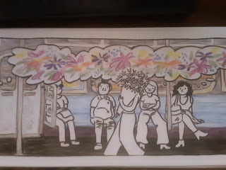
It's an entirely wordless comic, (other than announcements from the PA) but it's not without communication. Indeed, she follows each of the passengers with thought balloons that contain images. This is what carries the narrative, and they vary from people thinking about food, sex, pets, aliens, Karl Marx to everyone thinking about flowers when someone walks in with a big bouquet. Schuchat's use of color is bright and bold but still restrained, as that particular technique lends itself to a more nuanced use of palette than standard computer coloring. However, what really stands out here is Schuchat's use of line. Even with a relatively stripped-down figure drawing style, Schuchat's thick line is highly effective in not letting color overwhelm her pages, and her use of gesture and body language is top-notch.
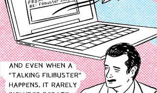
Her other entry, an accordion version of a webcomic called The Filibuster, is straight-up comics journalism and advocacy. ("Applied comics," as they would say at CCS.) It's well-researched and well-written, as she creates a compelling case for why the Congressional filibuster needs to be ended. She lands a particularly good point when she says that the spirit of the filibuster--lively debate--is all but dead, given that people no longer actually discuss issues and can actually do it online. That said, it's not especially visually compelling. I realize that Schuchat was trying to go for red and blue to represent the parties, but the light blue and purplish-red acted as distractions, especially with the zip-a-tone effect that she used. Schuchat had to use a lot of caricature and naturalistic drawing, which I don't think is a particular strength. Of course, this comic (originally published at The Guardian) had a wider audience, and her storytelling was certainly clear enough to do the job, especially with her use of infinite scroll instead of a standard grid. The art felt secondary to her writing and bordered on being illustration instead of being a comic. That said, her even-handed descriptions of hot-topic events make her well-suited for comics journalism, but a more interesting visual approach would better serve her advocacy.


No comments:
Post a Comment