The Press Gang collective in Portland is directly connected to the excellent Studygroup website that features over a dozen interesting webcomics.Masterminded by Zack Soto, they've long created comics that have a heavy and unapologetic genre slant to them. Fantasy, horror, sci-fi, and adventure are common plot referents, though each author puts their own stamp on genre and frequently blends it with any number of other concerns. It's not quite the same thing that Michael DeForge and Josh Bayer are doing in the way they're putting genre in a blender, because each of these comics can be read as a perfectly straight-ahead genre story, albeit with an aesthetic viewpoint that is unique to each artist, rather than being part of a mass-market formula.
For example, Titan #1, by Francois Vigneault, is a straight-ahead science-fiction story, though it has more in common with sociopolitical fiction than it does any other genre. It's about a corporate mining colony on Jupiter's moon Titan and a new manager who's come to deliver some very bad news to them. The problem is that the bulk of the workers are mutated humans now known as Titanians, who are about ten feet tall and massive. Printed in a single orange tone (fitting for its Jovian setting), Vigneault captures the tension of the labor-management conflict while setting up secrets to be revealed by both sides, unbeknownst to the new manager. Vigneault also adds an interesting racial component to the proceedings when a potential romance starts to germinate between the new manager and a Titanian counterpart. Vigneault's really cleaned up a lot of the rough edges in his art (I credit that in part to those excellent bird minicomics he likes to draw) and has added a layer of style that makes this a smooth but still highly personal read. The format, design and every aspect of production make this a beautiful comic to look at. Fans of "hard" sci-fi will enjoy the way that certain details regarding life on Titan play out sociologically and in terms of technology, especially in the way that technology has the potential to completely erase a way of life.
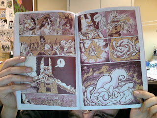
The Secret Voice V2 #1, by Zack Soto. For most of his career, Soto has done variations on bizarre superhero/fantasy comics, many of them featuring his bandaged hero Dr Galapagos. Soto has abandoned and returned to this project a few times, and each time he's brought to it a higher level of craft. His character design is an uncanny marriage of Fort Thunder-style aesthetics and superhero-style anatomy: muscular figures, heroic poses, lots of characters in motion. That aesthetic mix is not in the least ironic; instead, Soto has taken what's inspired him to create something new. The story here is very simple: Dr Galapagos has entered the bowels of the Troll Kingdom to seek their aid in a war against the Smog Emperor. For reasons beyond his control, he accidentally kills the king and his shaman and is forced to fight for his life in order to escape. What sells this comic is the way Soto creates atmosphere, thanks to the way this comic was printed (Risograph?). The dark purples, yellows and oranges create the oppressiveness of this atmosphere, highlighting and strengthening his solid drawing ability. He manages to combine the heroic romanticism present in Jack Kirby comics with a more cartoony but monstrous quality present in Fort Thunder, which is less a stylistic jolt than a reminder to the reader of how much the two really have in common. Both are about motion and movement above all else, with any stillness creating a sort of heroic pose. They're both about conflicts, grand gestures, and an explosive quality that makes every image matter. Fort Thunder tended to make the character designs themselves simpler and more abstract (like Mat Brinkman or Brian Ralph), while Soto moves that design line closer to Kirby while still setting the story in that Ralph/Brinkman sort of world. As Soto has finally seemed to settle on a visual style that suits him, I hope the story itself continues to pick up its threads and weave something dense and complex; as it is, the reader is only getting hints of a massive, epic storyline.
It Will All Hurt, by Farel Dalrymple. Dalrymple is one of the finest draftsmen in the world of comics and has been for a long time. What we haven't seen from him is much extensive personal work since early in his career. This new series is going a long way to correct that, as it appears like it will be a long, sprawling career-defining work. This first issue mostly introduces the huge cast of characters, as the reader gets to see them do their thing in a series of unconnected vignettes. Dalrymple's line is a little looser and less precise than in some of his older work, but his use of watercolors brings every page to vivid life, thanks to a slightly muted but imaginative palette. This is a kitchen sink of a comic that feels like Dalrymple simply dumped every single character idea that interested him into a single narrative that has elements of sci-fi, fantasy, and post-apocalyptic distopia. Dalrymple is great at drawing children doing unusual things as well as monsters, and both are featured prominently in this story that sets up an invincible enemy and a small but growing set of allies that oppose him. Dalrymple plays around with action, with fluid panel-to-panel transitions and with the occasional dramatic pose for effect. This one is simply a visual feast, going above and beyond the already-high standards of Press Gang. This will undoubtedly wind up being one of my favorite minis of 2013.
Subscribe to:
Post Comments (Atom)


No comments:
Post a Comment