Friday, January 2, 2026
31 Days Of CCS, #2: Daryl Seitchik & Ellie Liota
Thursday, December 5, 2024
45 Days Of CCS, #5: Daryl Seitchik
Monday, December 11, 2023
45 Days Of CCS, #11: Daryl Seitchik
Anyone who's followed my reviews over the years will know that Daryl Seitchik instantly became one of my favorite cartoonists from the very beginning of her career. Her storytelling sensibilities, her fragile line, her deadpan sense of humor, and her interest in mysticism and aesthetic wonder are all very much my sort of thing in a way few cartoonists are. (Side note: I feel so strongly about this that Daryl was one of the first artists I approached when Fieldmouse Press started soliciting books for publication, and her NOW AND OTHER DREAMS remains a proud achievement as a publisher.)
Seitchik works in a number of different styles. Her Missy comics may be my favorite, as they are thinly-veiled memoir from the point of view of a child and later a teen. Seitchik has a deep understanding of that voice, and that's carried over to some of her more recent projects. She's taken her experience as an after-school teacher for kids and spun that into some interesting comics.
Class From Hell describes a hilariously bad day. Teaching in Vermont means that kids often get their socks wet and are bundled up to go outside. The art here is scribbly, as Seitchik was clearly trying to dash these down as quickly as possible, and the immediacy of the line contributes to its frazzled energy. Seitchik's deadpan sense of humor is also on display, as they're barraged by questions. When asked when class is over, they reply, "in 25 years" with the biggest look of resignation ever on their face. Later, total chaos reigns at snack time as the kids (including one too young to be there) put their pretzels in water, yell loudly, play with Pokemon cards out of turn, refuse to draw, and start throwing tennis balls. That concludes with Seitchik having to yell at them, taking the very last of her reserves, reducing her on the page to a puddle with hair. Seitchik took a series of anecdotes and constructed several narratives around them and threw in references to her own mental health and a potential desire to have children.
Interview With A Unicorn Expert was done in Seitchik's usual style, and it also picks up a thread from teaching. This time around, she notices the ubiquity of unicorn imagery. T-shirts, hoodies, horns, you name it. Seitchik decides they want in on this secret society, and so they interview what appears to be a leading expert. The result is a series of questions with funny answers that are taken with grave seriousness. This includes Seitchik interrogating them on how they survived the asteroid that killed the dinosaurs, and the girl spins a yarn about a cave the unicorns hid out in. Once again, it's Seitchik's deadpan sense of humor and total willingness to go along with the story that makes it work. Seitchik's skill as someone who is always observing and listening is at the heart of their work as a cartoonist.
Monday, December 5, 2022
31 Days Of CCS, #5: The Ladybroad Ledger #5
The Ladybroad Ledger is a broadsheet anthology by women, femmes, and nonbinary cartoonists in Vermont. So says its back page. The original version of this folded a few years ago after four issues, but three CCS students revived it with a bunch of their fellow students and alumni, along with other local cartoonists. The editors are Violet Kitchen, Annabel Driussi, and Sofia Lesage, and it looks like Kitchen handled the editing and Driussi the design. Kitchen took the cover chores and she came up with a powerful, vivid strip filled with violent reds and oranges that exemplified her anger regarding the Supreme Court overturning Roe v. Wade and endangering a woman's right to her own body. It's an eye-catching, righteous bit of fury that demonstrates her considerable skill as a cartoonist. She's got every tool needed to become great.
One of the fun things about a broadsheet is that cartoonists get to work big. Coco Fox's strip about her struggles with gardening is a 16-panel grid that still has plenty of room to breathe because there's so much room on the page. Her loose, scribbly style and extensive use of decorative flourishes along her panel borders aid in depicting the slightly out-of-control nature of gardening and how difficult it is to control. Kristen Shull's autobio comic addresses the problem of worrying about her readers and audience reactions in general. It also has a lot of interesting visual flourishes that reflect her other cartooning interest of fantasy, and the panel design is chaotic in ways that aid its overall aims.
A lot of Daryl Seitchik's work involves wide-open spaces, and so working big in her story "How To Become A Mermaid" does a great job of using negative space and black/white contrasts. Masha Zhdanova's comic about summer and falling in love has a nice visual gestalt effect that encapsulates a brief, fleeting feeling. Sofia Lesage's comic about summer goes in a radically different direction: it's a depression journal that's an absolute howl. It's a comic about being trapped in one's own worthless, horrifying mind and body, where the possibility of communication that doesn't poison everyone around you seems impossible. Where one's creative impulses are self-muted and whatever distractions that can be generated are fleeting and foolish. She captures all of these feelings and more in a loose grid that emphasizes body language above all else.
Leda Zawacki's "29 Miles" suffers from murky grayscale reproduction, marring an otherwise spare, emotionally resonant story about a desperate young woman making a hail Mary play to get a ride. Sarah Woodard's "Open Heart" is a slightly heavy-handed but certainly pointed story about the ways in which the absurdity of racism is highlighted in a medical care facility, with people of all backgrounds providing care and treatment. Driussi's own piece spreads across two pages, depicting the raw, visceral, and erotic experience of experiencing live music. The clashing and clanging images and density of the lettering all play into creating this experience for the reader.
Sarah Oak's strip about her "Daisy Duke" character grossing out a guy who's hitting on her at work is funny, although her cartooning style is cloyingly stylized. Jen Jolls' piece about someone whining regarding a class has a funny punchline, although the cartooning is all over the place. Keilani Lime and Amy Burns' graphic medicine comic about giving blood (I think; it might be just getting a shot) is funny, reflecting how chronic illness can disrupt any experience. Franky Frances Cannon's full page strip about favorite Vermont bars is cluttered and disorganized, but the drawings are so charming and the actual reviews are so funny that it won me over. Finally, Gabrielle Tinnirello's piece on dresses beautifully uses up the space provided with a host of delicate, decorative elements in a fluid, open page layout.
There are also essays on why making bad comics is a good thing, how to become a cartoonist, an interview with Kitchen, and a long interview with musician and comics fan Neko Case. Overall, the level of cartooning is superior to the original publication, and more of the cartoonists take advantage of the format to produce work that's outside of their normal comfort zones.
Saturday, December 3, 2022
31 Days Of CCS #3: Daryl Seitchik
Wednesday, June 22, 2022
Crowdfundr for Fieldmouse Press
As you may know, one of my many hats is being a member of Fieldmouse Press, the publishing concern that puts out SOLRAD.co and just published its first book, Ariel Bordeaux's Clutter. I'm quite proud of that book, and I'm also quite proud of our upcoming Spring publishing season.
For a variety of reasons, we have shifted away from using Kickstarter for our fundraising needs and have become the inaugural launch for Crowdfundr, a new fundraising entity. We're working directly with the folks running Crowdfundr, and we are extremely pleased with this collaboration. Here's a link to our fundraiser on Crowdfundr.
We will be publishing two books and two minicomics this Spring season. The first book is Now And Other Dreams, by Daryl Seitchik. Daryl is an extremely talented young cartoonist who emerged nearly fully-formed, as readers of High-Low might remember. Nominated for an Eisner for her book Exits, Now bears some similarities to that narrative. Now is a collection of Seitchik's out-of-print dream comics and other surreal narratives. Told in her deadpan style that still allows for a number of expressive flourishes, Seitchik delves deep into her own thoughts, beliefs, trauma, and fears and comes out the other side. The collection also features two new stories. Her storytelling, line, and daring as a cartoonist feed into how she's able to create so many variations on her theme of exploring her subconscious.
The second book is Good Person Trouble, by Noëlle Kröger, They are a fantastic German cartoonist and described this book as "Bertolt Brecht meets Judith Butler." Based loosely on Brecht's The Good Person Of Szechwan, the narrative examines trans and gender issues in an ingenious manner with characters that are anthropomorphic animals. This courtroom drama with a number of dramatic twists was translated by Natalye Childress, and it's Kröger's debut in English.
The first mini is Magic Nation #1, by Ellen O'Grady. Ellen is a miraculous cartoonist who just started in the practice after years spent in other pursuits. Her sensitivity, her understanding of color, and the expressiveness of her characters are absolutely remarkable. This memoir of her childhood is meditative and evocative of the woods that meant so much to her. She's an instant memoir superstar.
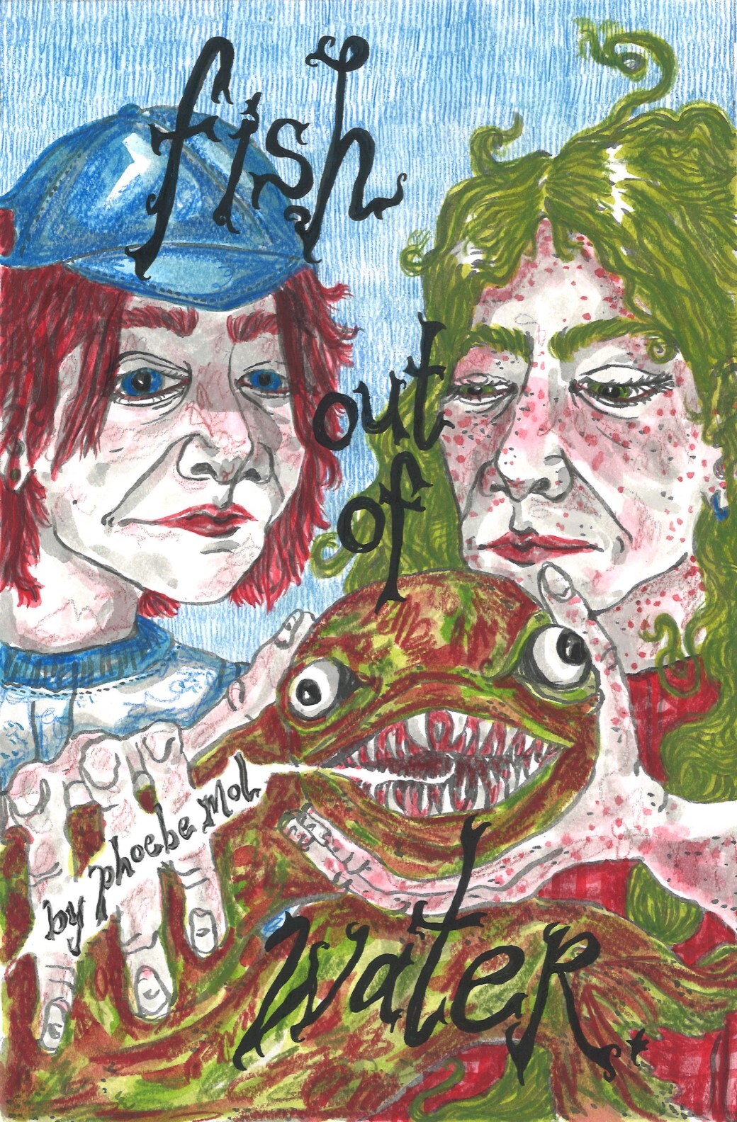
The second mini is Fish Out Of Water, by Phoebe Mol. This is yet another debuting artist, and Mol's arresting and grotesque character design and immersive storytelling style is reminiscent of artists like Juliacks. Her color sense is spectacularly vivid.
I hope that you consider funding these books and preordering them through our Crowdfundr. Thanks for your consideration!
Monday, December 13, 2021
31 Days Of CCS, #13: Daryl Seitchik
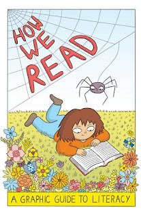
Daryl Seitchik was a great cartoonist a long time before she enrolled at CCS, and she continues to publish a varied and fascinating array of comics. She did the latest in the CCS-published "graphic guide" series, part of CCS's initiative regarding what James Sturm refers to as "applied cartooning." It's his belief that comics can be made part of nearly any profession, especially when it has educational, training, or advocacy as part of its mission. Past CCS guide series have included mental health, navigating the health care system, and voting & governance. Seitchik took on literacy in How We Read.
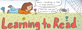
Seitchik is a sharp author. Drawn in her friendly Moon Bunnies style, the comic follows a girl who is frustrated in her attempts to read, a spider who drops in to teach her, and anthropomorphic letters that turn into sounds. Visually, it's clearly designed and friendly, with big panels and clear lettering. One would think that these would be necessities, but Seitchik is clearly trying to appeal to people who don't necessarily read comics. Starting with the miraculous process by which we turn sounds into symbols and signifiers, Seitchik takes the extra step by using her pleasing, cartoony style to break down how the brain works with regard to language. She then takes on a tour of the history of language and crucially notes that speech preceded written language by thousands of years.
However, it was that creation of written language, roughly simultaneously in different spots around the world, that proved to be the bellwether for the advancement of human civilization. Seitchik briefly elaborates on how reading helps expand our minds and helps us learn more, while carefully noting that the age and the rate at which we learn to read has nothing to do with our overall intelligence. It's just that our brains work differently. From there, Seitchick cleverly breaks down the process of how we read according to the best available science and contrasts that with ineffective methods often used in schools that focus on memorization instead of breaking words down phonetically. Seitchik also touches on issues related to diversity, subject matter, and special accommodations for those who need them. It's all told with Seitchik's typical level of restraint, brightened up by her tasteful use of color. It's also sweet and funny, making it easy medicine indeed.
Tuesday, December 3, 2019
31 Days Of CCS #3: Amelia Onorato and Daryl Seitchik
Throw in a monster who takes on the appearance of the person you desire most, and you have a formula for some solid horror soap opera. There is a scene where Obedience kisses Remember (for "practice", not knowing how much her sister desired her) that triggers a tragedy and then some bold moves on the part of the protagonists. Onorato knows how to draw a tense action scene, but the ending surprised me at first, before I thought about the humane core of her work. No one ever considers why a monster does something, and that proves to be a major plot point here. Once again, it's Onorato's attention to detail that makes the story so effective.
Daryl Seitchik may be best known for her quasi-autobiographical Missy comics, but I remember her breakthrough being a surreal mini called Sub. It was an exploration of her subconscious, partly by way of her childhood, but it established early on her interest in exploring symbolic and surreal ways of exploring ideas. That was certainly true in her sole graphic novel to date, Exits, but it's much more pronounced in her more recent work. For example, Waiting For Ariel starts off with Seitchik in an "after-life bar", waiting for someone named Ariel. Seitchik's line looks simple on the surface, but then you blink and she uses this interesting broken-line technique that fractures pages and panels like a broken mirror.
This is a story about running the gauntlet, about death in the tarot sense: transformation. Indeed, the Daryl character walks around the afterlife with an infinity sign over her head, like she was the Magician from the tarot. It's reflective of infinite possibilities, even as she clearly had unresolved ties with the material world. There are hints of unresolved relationships, unresolved gender questions, and a fundamental unwillingness to let go--to fall. A false fall finds her in her childhood room, berated by Matryoshka dolls, until she realizes that she possesses the agency to ignore them. What she has to accept and embrace is her childhood self: memories, experiences, and all. Once she comforts her childhood self (an essential element of all therapy and self-actualization is self-love, and self-love starts with going back and loving one's self as a child), she's able to finally meet Ariel. This is a supernatural lion being, showing her the ocean that represents possibility and infinite growth.
Seitchik emerged fully-formed as an artist after just a couple of minis. Her voice, her intellect and most of her technique were there from the beginning. What's different about her work now is that she's pushing the limits of that technique and expressing herself in new ways. That was true in Waiting For Ariel in terms of her daring and original use of line, and it's certainly true in the first issue of her new series Follow The Doll. This is firmly in the category of "revisionist fairy-tale" that interestingly also uses Russian religious and folk imagery. There's an ornate quality to that kind of imagery that lends itself to visual depiction, from architecture to clothing. Seitchik's use of color is spectacular and something I haven't seen from her before, but the watercolors at play here form the backbone of the story's narrative.
This issue follows a young girl at a time when her long-suffering mother has died. Her mother left her a doll that occasionally spoke to her. In the wake of her death and her father subsequently and quickly marrying someone new, the girl finds her entire view of the world in ruins, especially her belief in god. After a fantasy sequence where god (as a sort of Emperor tarot figure with a flaming sword) appears in the sky and she kills him with snowballs, the doll simply tells her, "There is no man in the sky." When the doll later throws itself on the fire, it reappears, Phoenix-like, flying across the girl's house. Her father thinks it's evil witchcraft, the work of Baba Yaga, but the girl suspects otherwise. What is the doll? The dawning of the age of reason, or the symbol of personal renewal? Is it the essence of the relationship between mother and daughter? All the girl (and the reader) can do at this point is to follow the doll.
Monday, December 24, 2018
Thirty One Days Of CCS #24: A Whole Lifetime Of Firsts
A Whole Lifetime Of Firsts. This is the second collaboration between CCS cartoonists and the White River Junction VA, featuring veteran's stories focusing in on women. The first CCS/VA collaboration was good, but this one is excellent. There's a level of depth and execution in transcribing the stories of women in the military in a variety of ways that's striking. On top of that, telling stories that haven't necessarily been part of the public discourse up til recently is also something that adds to their impact.
"Mitzi's Story" is written by co-editor J.D. Lunt (CCS president James Sturm is the other editor). She is a former NCO who wound up in places like Kosovo and Iraq. For her, even though she's a closeted lesbian, military service was her life. That was also despite a sexual assault and soldiers of lower rank frequently ignoring her orders. When she was honorably discharged because of an injury, she was ill-equipped to face civilian life despite being married. She got hooked on drugs, arrested and tried to kill herself before really deciding to embrace rehab. After a lifetime of being told she wasn't good or smart enough and enduring enough PTSD for a dozen people, her ability to endure and thrive is simply remarkable. Garcia uses a standard nine-panel grid with a visual approach that's a little ragged, yet appropriate for the subject.
"I Got Your Six" is from Daryl Seitchik & Dan Nott, and it's about an Army nurse who was in Viet Nam. There's a lot of story to tell here, and Seitchik & Nott use a twelve-panel grid to pack it all in. Despite that, they tell the story with a great deal of clarity, making frequent use of switching black & white negative space. Every panel is well-balanced in this regard, making the linework easy to grasp and contextualize. This story focuses more on her experiences in the war as a nurse and less on what happened afterwards, though she does note how much hostility she faced as a veteran of Viet Nam when she returned. What I found most fascinating is her intuitive understanding of how important psychological care was for soldiers in addressing PTSD at a time when it was not understood or used.
"Isolated Duty" is a story with the opposite scenario: a woman in the Navy in the 70s got injured and met the love of her life who was also a woman in the military. Drawn by Rachel Ford and written by Sarah Yahm and Kurt Shaffert, this is a nicely-constructed comic that at times is perhaps a bit too spare with regard to facial expressions. The theme of being taken care of and now taking care of her partner resonates, especially with the way they keep their romance alive despite her partner's increasingly diminished mental capacity. Finally, "Kathi: A Life Well Traveled" is about an Air Force nurse who was in Europe and later Viet Nam, and it's by Catherine Garbarino and Kelly L. Swann. The artists make extensive use of grayscale shading to add to the sense of this being akin to an old book of photos, filled with memories. Kathi is a relentlessly upbeat presence and was regarded as such in Viet Nam, even earning a Bronze Star for the way she enhanced morale. This is not to say that there weren't painful moments, like a truck accident that she still couldn't discuss, and a young boy in a leper colony that she wanted to adopt but couldn't, but she still mostly stayed positive. All of this was told from her perspective of being treated for cancer at eighty years old, staying positive to the end. The way each story had a different focus and featured several different armed services spoke to the variety of experiences, as well as the need for each of these women to tell their story. These are stories that needed to be told, and the artists found different ways to get there.
Sunday, December 2, 2018
Thirty One Days Of CCS #2: Daryl Seitchik, Coco Fox
Dear Missy (published by Robyn Chapman's Paper Rocket Minicomics) is a continuation of her semi-autobiographical Missy comics. The character design for Missy, and Seitchik's characters in general, is a sort of updated take on kids' comics: big heads, small bodies, and almond-shaped eyes with tiny dots. There is a sort of deliberately rigid quality to her characters, making them look like avatars as much as they are people. Seitchik uses tiny shifts in drawings to express a lot of emotion, but in eschewing a lot of gestural expression, she instead focuses on how tightly wound her main character is. This particular comic is part of Missy's journal, and she at first writes about loving writing. The child's voice she uses is heart-rendingly authentic, as she writes a poem to god about her divorcing parents. The poem has a simple, lovely meter and has the sort of misspellings one would expect from a ten year old. The line "Please don't fail me/It's OK if you do" is especially effective, because it underscores both Missy's essential sadness and her capacity for forgiveness. As opposed to the more direct diary entries that made up the previous Missy comics, this one felt like the sort of grand gesture only a child could make.
Caryatid is a more poetic entry from Seitchik. It's about caryatid columns, which were sculpted to look like women. It's a beautiful comic, written from the perspective of one of the columns, her eyes darting back and forth. Seitchik makes great use of gray scale shading here to create an illusion of light. The statue's imagination wanders from goldfish in a bowl to the fish swimming in the ocean to a rose in a sea of bottles. Here, Seitchik switches to bold red watercolors, emphasizing how the rose's initial appearance is like that of blood. The imagination of the column, as a female energy that is nonetheless constantly objectified, naturally turns to images of trying to be safe. She retreats back into sleep only when she has seen and felt that she is holding fire, imagined a head to be an egg and felt the presence of the rose above her. She was seeking totems and items of protection,
Coco Fox is a second-year student at CCS, and she uses an effectively clear drawing style that emphasizes her storytelling, use of gesture and creates an easy, natural charm in her comics. In Right To Left: A Basketball Memoir, she writes about her sixth grade basketball team. Using a 2 x 3 grid and long, looping lines for her character design, Fox injects the story with a level of detail that's unusual for this kind of reminiscence. This is a story about playing the game that's full of game-related details, as opposed to the game being the background for a more character-oriented narrative. Fox writes about her coach accidentally breaking her wrist when teaching her how to block a shot. During that sequence, Fox deliberately blurs her line to reflect that she had to use her non-dominant hand to draw and play basketball. It's written in a sixth grader's voice, which works well because it gets across her enthusiasm and her living in the moment; this approach goes a long way in charming the reader. There's even a suspenseful climax to the story, and Fox's illustrations are especially funny but well-designed during that segment.
Art Makes Me Feel features a young girl in a museum, looking at various works of art. Each drawing has a caption that starts with "This painting makes me feel like..." and goes from there. Examples include "...like I found loose hummus in my pockets" or "I'm French kissing a picture of myself. " Once again, this comic works because of the tiny, charming image of the girl. Her design is simple: a bow in her hair that seemingly levitates above her head, a dress, a pointy nose and long dark hair. The reader is drawn to her more than the works of art, and the subtle expressive differences from page to page A slightly more refined approach could make Fox an ideal candidate for doing children's comics.
Wednesday, December 6, 2017
Thirty Days of CCS #6: Daryl Seitchik
Because of that, it's interesting to see her more recent minis from her time at CCS. Lion Bride is a visceral, visually striking comic about a swim toward a waterfall. Even though the comic is in grayscale, the variations in shape and tone that Seitchik creates are enough to still draw the eye in so as to experience the texture of each drawing. Equating the roar of the waterfall with that of a lion bride and the white water taking the shape of the lion's mane. The text is spare but poetic, as she sees in the waterfall the bride tearing her veil when the water starts to spray out, described as "her raging calm". It's a meditation on cycles, on nature and even gender, as the mighty bride is laid low in her inevitable fall. The key to depicting this mixture of stillness and violence is Seitchik's visceral, immersive line.
Message From The Moon is an adaptation of a story from the Khoikoi people of southwest Africa. Here, Seitchik works off of a six panel grid template, breaking it from time to time to show a single image with four panels, for example. There's lots of zip-a-tone effects and some heavily spotted blacks. The story is about the sad moon trying to relate to the people that death is not the end, but every attempt it made to tell them directly scared them even more. So the spider took it upon itself to go from the moon to the earth on its web to tell them, but it was taking way too long. Hare appeared and offered to take the message, but he left before getting the whole thing and terrified the humans even more. The moon punished hare by blowing on him, permanently splitting his lip. Finally, spider decides to go on alone, finally making it to the surface. There, the arachnid realized that words alone would not be sufficient reassurance, so they made a web in the window of a house that needed to be rebuilt. This is a beautiful, vivid strip that flows in Seitchik's vernacular of loosened lingo, restrained cartooning and tight premise.
Norma #1 promises to be a continuing series, with a beautiful watercolor color, which is yet another new direction for her. It's the story of a cyclopean girl living in a small house near "the edge of the fire woods", who tended her garden and had her nose in a book on a constant basis. In this first chapter, her house Stephanie yells at her for not fixing her roof in a delightful series of drawings. Seitchik greatly loosened up her page composition for this comic, as panels sort of bleed into each other with decorative branches or acting as part of a cliff. The sequence where her house truly begins to have anthropomorphic qualities and gets angry is startling and funny. She leaves off on a cliffhanger, as the rain stops coming, which means that the trees will eventually be unable to stay on fire. This combination of fable and magical realism is a nice match for Seitchik's restrained style and eye for surreal imagery.
Tuesday, June 21, 2016
Foxing Reprints #1: Daryl Seitchik
Monday, October 14, 2013
Minicomics: Seitchik, Farrell, Skelly, Dinski, Taylor
Brendon and Going Rate, by Greg Farrell. There's no question that these comics are a major step forward for Ferrell. His Yo Burbalino comics had amusing moments, as it was clear that he was a good storyteller with no end of interesting anecdotes to share, but the stories felt rushed and the execution underworked. He also relied on the cheap joke and shock because they were both easy. With Brendon, a story obviously based partly on his own experiences (though it's explicitly noted as a work of fiction), Farrell retains the crude charms of his previous comics with a far greater sense of restraint and subtlety. This is a really sharp story that has a knowing sense of just how pre-teen boys relate to each other. The story revolves around a porn mag that "Greg" trades with the titular Brendon, a Hispanic kid who's become his best friend. Farrell homes in on the frequently homoerotic relationship young boys have with each other, even as there's a hyperawareness about not really being gay. That extends as far as actually performing sexual acts on each other as a sort of way of less expressing real attraction and more as a way of using their bodies. Farrell also relates tales of cruelty, betrayal and confusion, creating a book that is light on nostalgia and heavy on lives as they were lived, warts and all. Farrell keeps his line simple and utilitarian, rarely varying line weight or using many effects. Instead of using a grid, Farrell has an open page layout, which works because of the way memories and experiences bleed into each other.
While Brendon was Farrell's best effort to date, a look at his short story collection, Going Rate, reveals that this change didn't happen in a vacuum. "White Whale" is an interesting account of Farrell's obsession with one particular missing hip-hop album from his collection, and how he feel actually he after acquires it. "Jumbo Jockey" is about the B&H lunch counter in Manhattan, and Farrell does a great job capturing the essence of the place, the kind of food they serve and the sorts of people who eat there. "420" starts out as what seems to be another tedious story about someone's personal drug habits but turns into a story about personal responsibility and being a role model, all without taking on any kind of faux-moral tone. "I Am The Son Of A Small Business Owner" talks about the realities of the internet and corporations destroying small businesses and talks about the only way a small business can survive is to provide knowledgeable and personable customer service for those who happen upon their store. There are other, more-hastily drawn stories in the book, and while they're appropriately expressive, Farrell's line is too loose in those stories.
Children of Divorce and Still Life #1, by Daryl Seitchik. Seitchik is one of my favorite young cartoonists, and she flexes some different aspects of her talents in these two minis. Still Life has strips in the vein of her recent comic Sub: meditations that dip into magical realism and stream of consciousness thinking. Seitchik uses a very simple, fluid line in relaying stories about wanting to be a ghost (and how she suddenly realized that she had become one after getting high), hilariously overreacting to her toe going numb while watching a show in bed, and flashing back to remembering the sound of an ocean she heard in a beloved sea shell while using it as an ashtray while listening to music now. The way Seitchik draws herself as tiny goes beyond simply being short, as exemplified in the strip "Dinner With An Adult", where she draws herself as just a few inches tall, sitting in a gigantic chair opposite someone asking her if she's depressed and where she sees herself in ten years. These are comics about drifting, about the feeling of being betwixt and between. Fortunately for the reader, they are stylishly drawn and quite funny. The strip where the internet gives her possibilities for why her toe is numb is amusingly drawn, as she conflates "inflamed" with "enflamed" and draws herself on fire. In other strips, the way she spots blacks to create dramatic negative space is striking.
Children of Divorce is not quite as assured in terms of the drawing, but Seitchik displays some skill in the ways in which children act cruelly toward each other. The physical version of this comic is in black and white, which actually wound up flattering her character design a bit more than the way she used color online. The main character fancies herself a witch, giving out fortunes. While she's the lead, she's far from sympathetic, as she's jealous of her best friend giving attention to "Medusa", a girl with a lazy eye who is nonetheless one of the popular kids. I loved the way Seitchik drew thin, flailing limbs and skinny legs looping around. Best of all are her exaggerated faces with contortions worthy of Peter Bagge in some panels and subtle, tiny lines that nonetheless are packed with emotion in others. Seitchik will have a comic out with Oily Comics soon, and I imagine she will shine in that format, especially since she seems comfortable with her style and storytelling abilities. I'm interested in seeing what kinds of stories she'll tell from here.
Operation Margarine #2, #3, by Katie Skelly. Skelly seems really at home in this mod-inflected road story about two women whose paths cross in interesting ways. The first issue set things up for Margarine, a rich girl frequently kept in a mental institution by her mother, and Bon-Bon a tough girl on a motorcycle who simply punches out a guy who hassles her after selling her out. These issues set up what Skelly really wants to do: draw images of the open road, introduce mysterious guys with scars and stylish women with different-colored eyes to hassle them. There are motorcycle and arms dealers in the middle of the desert and a funny diner scene wherein a long-suffering waitress is made to look every bit as interesting as the leads. Skelly clearly loves combining glamor and menace, as Bon-Bon pretty much exudes that on every page. She's like a ronin on a motorcycle, waiting for something to do and someone to protect while trying to think about her past as little as possible. Margarine has been broken for so long that she's looking for someone to put her back together in an entirely different environment. Skelly really plays to her strengths as an artist here: character design, gesture and body language. She minimizes background detail in such a way that it's not lacking on the page when needed, but doesn't interfere with the two leads when she wants the reader to zero in on them. This series will be collected by AdHouse and will undoubtedly look great.
Alarm Clock, by Will Dinski. I've been reviewing Will Dinski's comics since I began High-Low over seven years ago, and he continues to produce thought-provoking, funny and occasionally disturbing work. This mini is a grab-bag of shorter work by Dinski, including an extended sketchbook section. The cover, a tribute to Gluyas Williams' work from the 1930s, leads to a hilarious punchline when one opens up the back cover as well. It's a well-designed gag that adds an enormous amount of character detail in the service of pulling the eye in one direction. Even though this is a series of shorts, Dinski manages a callback gag in the last story from the first in two stories that otherwise have nothing else to do with each other. One's a bit of hyperbole about a man who's always late and the extreme measures he takes to try to reset the clock, and the other's a droll bit of satire about a cruel but dim executive who prefers delegating unpleasant tasks to underlings. In general, each of the strips carries the titular quality of nothing happening and then alarms going off; In "Wait", a man is anxious to shake things up, but his friend tells him to sit still despite an ever-escalating series of crazy events, until the craziest event of all is an opportunity to act. "A Fine Job In The Execution" is about a watch and a conversation a man has with himself sitting alone in a room, imagining various men of authority praising his work.It's an inner dementia at work here, an alarmed mind that is stirred by a timepiece and a possible reminiscence of being a state executioner. Dinski uses a variety of color schemes here to reflect the action; the first story employs shockingly bright colors and exaggerated figures, while "Wait" employs a red and green scheme for key phases of the story, with green representing calm and red representing action. This is a fine sample of work from a smart cartoonist with an impeccable sense of design.
Stethoscope Microphone, by Whit Taylor. This is a real change of pace for Taylor, who generally tends to do autobio and semi-autobio comics. This is a comic about the rise and fall of The Doctors, the greatest funk band of all time, and Taylor takes every music trope she can think of, puts them in a blender, and sets it on Space Bass. Taylor throws in elements from Parliament-Funkadelic, Rick James, the Beatles and every other Behind the Music idea and lets the absurdity flow. Taylor works in color here, which gives her very thin line some definition and greater structure, allowing her to pull off the kind of images she needed for the story to work. Taylor isn't afraid to get very silly, making a woman adopting the persona of Betsy Ross as the main love interest of the narrator. Overall, this is a pleasant diversion that's actually quite well-researched in its own way, and fans of funk in particular will enjoys some of the references.