Showing posts with label beth hetland. Show all posts

Friday, January 12, 2024

45 Days Of CCS, #43: Rust Belt Review, Beth Hetland

The latest issue of Sean Knickerbocker's Rust Belt Review (#5) is light on CCS content but heavy on other interesting stories. Knickerbocker runs a blend of one-shot stories as well as serials, with his own "Best of 3" being the most prominent serial. It's probably my favorite story by Knickerbocker to date, as he incorporates the usual small-town losers, sleazebags, and lowlifes into a story that escalates into a genuinely thrilling murder mystery. His drawing has leveled up to match his ambition, as the yacht and other background details are drawn with a level of intense accuracy that enhances the action. This particular episode featured a yacht on fire thanks to a Molotov cocktail, a daring escape by the villains, and the start of a stressful quest. 

Audra Stang's excellent "Tunnel Vision" serial concludes in this issue, focusing on the character of Bernie, the young documentarian who followed around more familiar characters in the abandoned theme park tunnels that are an essential part of her Star Valley lore. There's an incredible page where Bernie is in the car with her hostile stepmother and then going in the other direction every other panel, talking to her mom. Stang's comics tend to fundamentally be about huge lacks in not just communication, but a willingness to listen and try to understand others. This is personified in power struggles through relationships, as those who are least willing to listen are those that hold tightest to the reins of power. This story would have benefited from (at a minimum) spot color, as the shading here crosses over into being muddy at times, but it's otherwise another great story from a cartoonist who works intentionally in a way that I really enjoy. 

Andrew Greenstone unveils some more wrinkles in his crazy story about cultists, a trivia expert who escaped a nightmarish experience, federal hearings, an attempt at normalcy, and a lot of other stuff. Balancing the craziness with an attempt at normalcy is what gives this serial some serious stakes and balances out his frequently grotesque and absurd character designs (and references to Image artists). The conclusion of Sam Grinberg's "Pancake Jake" gets funnier and more absurd with each passing page. The first part focused on the silliness of urban legends, until two friends who tried to scare their friend Sid with the legend of a breakfast monster called "Pancake Jake" discover its somehow real. This swerves into a witch who owns a diner, an abandoned tower, gentrification, magical constructs, and the healing power of IHOP. Grinberg's art is sharp and the spot blacks really pop on the page, while the character design is rubbery and playful. 

Other stories include Sienna Cittadino's story about a trans teen play soccer and the pointless, hurtful controversy this creates; it's done in a scratchy style with lots of blotchy greyscale shading that reflects the expressiveness of the characters. Alex Nall has his usual story of small-town, awful people drawn in a wacky style that seems to work at cross-purposes with the story. Pat Rooks has a full-color mini that's inset featuring a hilarious, over-the-top bit of slapstick where the futuristic workers inevitably get fucked over. Jordan Speicher-Willis has an interesting story about kids working in the library and trying to complete a quest; the character interactions are very well-observed here. Andy Wieland's story is a Rust Belt special, meaning miserable people oppressed by capitalism being miserable and then dying. John Sammis' line reminds me a bit of Tim Hensley, as he tries to think about differentiating two old Hollywood actors. Finally, Matt MacFarland contributes the first part of a serial devoted to the unfortunate genre of "dudes talking about getting laid." At least his cryptid-inspired art looks good.
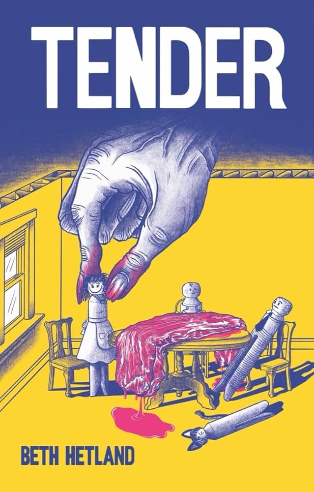

Beth Hetland's solo debut graphic novel Tender isn't what it seems at first, but the horror that's touched upon in the story's build-up informs the totally fucked-up events in the back half. The book opens with a creepy shot of the protagonist, Carolanne, softly singing to what appears to be a bundled-up baby. Hetland takes us back and forth in time and reveals that, while Carolanne is clearly a psychopath, the societal and cultural forces that shaped her and her horrific choices are also clearly to blame. 

Tender is a brutal critique of gender roles, social media, cultural pressures & expectations, and the isolation fomented by capitalism. I tend to be bored by horror that seeks to elicit shock value based on breaking taboos that were shocking fifty years ago. I'm talking about random gore, violence rooted in racism or misogyny, and other surface-level shock value tricks that embrace and reinforce cultural mores rather than challenge them. Tender is very much the opposite of this. Even as Carolanne's actions become more extreme and horrifying in her obsession with having a baby, her psychosis has a terrifying logic to it in how it reinforces not just what she has always wanted, but what she thinks is essential to being a woman. 


The narrative follows Carolanne as she seeks to get pregnant with her husband, Lee. It's all very cute and wholesome, as it then quickly cuts to her quitting her job so she can be a full-time mom. Slowly, using a dark blue wash with dense hatching and shading gradients, Hetland starts to reveal that Carolanne's approach to relationships is one where fantasy is more important than reality. She sets out to marry Lee, a co-worker, because it will help her accomplish her goal of the perfect wedding and lead her to the perfect life--all captured by Instagram posts. Hetland doesn't even have to try very hard to critique social media; indeed, social media isn't the issue so much as conflating it for reality is. In the first unsettling sequence of the book, she goes to his Facebook page, prints out a photo, cuts out his head and creates a collage where she and Lee are on their wedding day. All for a person she hadn't yet even spoken to. 

Every time she goes to a friend's engagement party, Carolanne has to practice smiling and rehearse what she's going to say. It's a mechanical response meant to mimic appropriate social behavior, which she's good at enough to garner a real group of friends. About a third of the way through, Hetland introduces a particular coping method she uses--biting off little bits of skin and eating them as a response to anxiety. Hetland periodically modulates the color scheme with purples, reds (especially for chewing on flesh or pulling skin), and yellows to indicate conflict or anxiety. Hetland also uses this creepy upward angle where we see Carolanne looming over something, usually with a blank or grim expression. 

Despite Hetland slowly unveiling not just increasingly unhinged behavior, but a genuine sense from Carolanne that she knows her behavior would frighten others, she and Lee marry, she is pregnant, and then in a devastating and terrifying scene, their baby is stillborn. This sets the events of the last third of the book into motion, as Carolanne increasingly loses touch with reality, drives away Lee, and then starts to become truly unhinged in her destructive and self-destructive behavior. She deludes herself into thinking she's pregnant, denies the death of her first child, and by the end, is in a psychotic world of her own. The visceral, awful, and genuinely unsettling scenes of her carving up her own flesh are all established and amplified by the rhythms Hetland established early in the book. 

Tender is ultimately a tragedy, where a person who simply has no conception of how to actually connect with others finds herself creating a conception of self entirely dependent on cues that are ultimately limiting, shallow, and fleeting at best. The images of self-consumption and total alienation are fitting, given that she never had a real chance of meaningfully interacting with others. Her total lack of empathy manifested in rage mostly aimed at herself, but also at the one creature she had thought of as being connected to her in her cat. It made sense in terms of the plot, but it was also the point where Hetland very deliberately wanted the reader to both cease having sympathy for Carolanne and simultaneously think about the ways in which society's guideposts brought her to that point. Having followed Hetland's career for years, Tender is a massive leveling-up visually, as she brought to bear the increasingly dense storytelling she used in Half-Asleep as well as a sophisticated and affecting color palette. This is the first major project she's written since her CCS days, and there's no question that it's a triumph. 

Monday, December 19, 2022

31 Days Of CCS, #19: Andi Santagata & Beth Hetland

Beth Hetland has been illustrating and co-writing some big projects in the past few years, but now she's gotten back to writing and drawing her own material. (The book she's working on right now is going to make people's heads explode!) Fallow Fields is a minicomic about a figure in a field, struggling with trying to make something grow. At the same time, she is beset by a torrent of platitudes, questionable statements of "support," comments that make it all about the speaker, and also genuine expressions of concern and support. All the while, the figure pulls out weeds, fervently tilling the land in an effort to clear it out--to no avail. She collapses, weeping, even as the platitudes pile up. She starts to grow and fill up the tract around her, and tiny versions of her start to clip and mow and tend to her. There is a tacit feeling of radical acceptance at the end, as the voices of others echo away. There are any number of ways to interpret this (though a few seem more likely than others), so I won't speculate as to specific meanings. This comic is really about sitting with a certain reality and coming to terms with it. The white ink on blue background adds to its sense of melancholy, There is a powerful, visceral quality to the cartooning, as Hetland's line is thick and the figure she uses is drawn as desperately strong. There is an intimacy here that I haven't seen in Hetland's past work, and she's bold in expressing vulnerability.


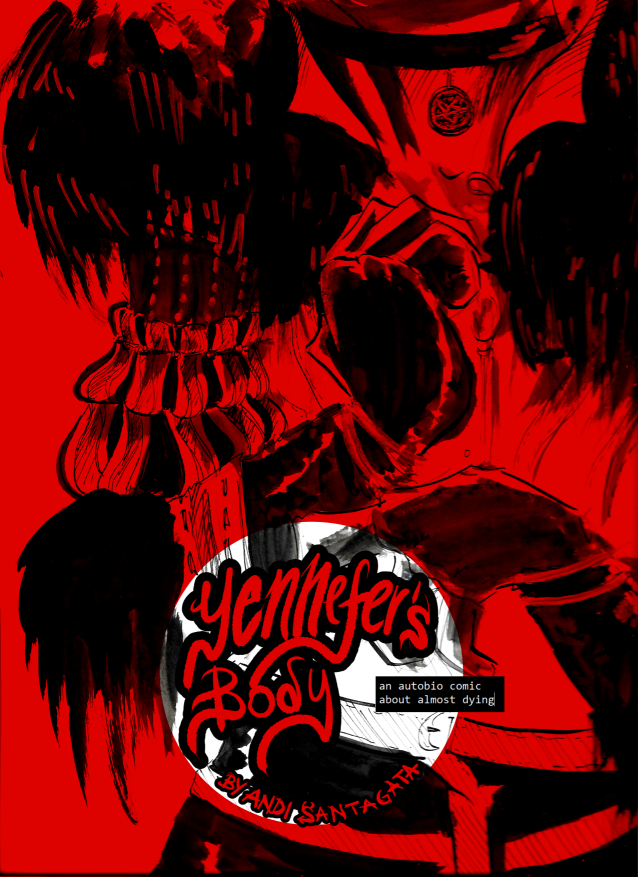
Andi Santagata is a lot of things as a cartoonist, but what I like best about his work is his sense of humor. While he mostly draws horror or horror-inspired comics, at heart, he's a humorist. This is also true of his two memoir minicomics, The Compleat Trans Man Walking and Yennefer's Body. There is a tension in his scratchy, scribbly expressive work between a brash & funny humorist and a person programmed to say as little and take up as little space as possible. Trans Man Walking is a 2016 journal of his initial transition, his battles with his mom, and adjusting to life as a man. There's also a very funny version of the CCS audition comic, involving a robot and a snowman, and Santagata turns it into a gag that's also hilariously tragic. That's true of much of this comic, though there are small moments of triumph like the delight at casually being referred to as a "fella" by a bartender. Santagata's art is so beautifully scratchy and his caricatures so exaggerated that he would have made a fine editorial cartoonist in a different era. 


If Trans Man Walking reflects the way it was assembled (haphazardly, and as part of an immediate engagement with the internet), then Yennefer's Body reflects a great amount of thematic care and planning. This is a sequel and continuation of the story from Trans Man Walking, but it more closely fits the themes related to laughing things off, especially pain, so as not to draw attention of any kind. Of course, this approach led Santagata to ignore a huge tumor that eventually caused an enormous amount of blood loss and nearly killed him. The entire comic is an attempt to come to terms with that mortality, mediated through video games and TV shows. The video game Dragon Age is the biggest touchstone, especially as its main character has to find a way to cheat death against the will of her mother. Despite his near-death, Santagata can't shake the feeling that he was still somehow making a big deal out of nothing. There is an obvious mirror here established in his previous comics, where Santagata's mother takes his transition, his tattoos, and every avenue of self-expression as a personal offense. 

This is explored further here a bit more obliquely, on blood-red pages splattered and smeared with black ink that approximates a female shape. There's a torrent of abusive, inappropriate, and narcissistic language that Santagata obviously ignored that blames him and accuses him of trying to make his mom "look bad." That's entirely in line with Santagata going an entire day as a kid with a broken arm that no one notices because he doesn't complain. (Santagata cleverly ties this in with an episode of Malcolm In The Middle where Malcolm stops complaining but then develops a stomach ulcer.) It is Yennefer, a character from the show The Witcher, who is the final touchstone, as she also has to undergo a highly painful transformation that renders her infertile. Santagata is finally given a chance to get on testosterone, something that had been unavailable to him during his transition, as a life-saving measure against the tumor and losing so much blood. The result of this also made him infertile, something he's OK with...but it's still a change. The whole thing is a pun on the feminist comedy-horror film Jennifer's Body, which is about a woman turned into a succubus who must be stopped by her best friend. That is another film about transformation, trauma, and refusing to listen to marginalized people. 

This is a horror story, and the aesthetic matches it: black pages, red ink, scratchy & monstrous figures, and the comics equivalent of jump scares. It's also funny and sweet, as the sheer obliviousness of Santagata's stand-ins, who are so thoroughly programmed to not complain and minimize everything, literally have to be taken to the edge of death and beyond to acknowledge and live in that trauma. This comic represents every angle Santagata can think of in approaching that journey into entirely-avoidable near-oblivion, and the examples he picks do something very important: they emphasize the danger instead of minimize it. These two comics are a hell of a one-two graphic medicine punch.

Thursday, December 12, 2019

31 Days Of CCS #12: Leise Hook, Ross Wood Studlar, Beth Hetland

Beth Hetland just can't stop creating things. Even when she and her writing partner Kyle O'Connell took a break after finishing their epic Half-Asleep, they crafted a super-fun project called Who's Counting? Hetland has often enjoyed formal experimentation by the way of making the actual delivery system of the comics unusual. From folding comics to color-coded narratives and much more, Hetland often seems to like to clear her creative palate by working on more craft-related projects. This "Collection of Tallies" has a single image on a page depicting something happening at a comics show or elsewhere, and a rotating series of images in a clearly divergent wheel that the reader turns by hand. It's a clever and fun twist, but there are subtle critiques as well. There's a funny page depicting a snooty artist using a number of different words to say very little, as well as Hetland's series of reactions to answering the question "What's it like to be a woman in comics?" This comic is just a bunch of these tiny illustrations and observations, with Hetland's self-caricature doing a lot of the work on each page in terms of leading the eye. There's also a sense of glee on some of these pages, as Hetland is clearly relieved to be doing funny work for a change.

Ross Wood Studlar has been quietly publishing interesting nature-related work for years, and his latest, Follow The Moon, fits nicely in that category. Studlar has also always been interested in local myths and legends regarding nature, especially those of Native American origin. This story follows a mother sea turtle telling her daughters about the first turtles and how they came to give birth on land. The story involved a turtle trying to hitch a ride with a heron and the whole experience going horribly astray, with one exception: the turtle learned how the heron followed the full moon as a guide. Studlar's art is both naturalistic and expressive, with gritty stippling grounding the details of the turtles laughing and showing other emotions. Studlar has a solid grip on how animals relate to their environments, and it shows in his drawing.

Leise Hook is a second-year student, and her comic The Moonbug Caper shows that she has a solid career in young adult and kids' comics if she wants to go down that path. She tells the story of an anthropomorphic rabbit family in a series of charming vignettes, grounding the story in the essential conflict between a younger girl named Jam and her teen sister Amma. Jam is pretending to be "Supercat," a masked superhero, while Amma is trying to summon magic using old radio equipment. Unbeknownst to them, an alien worm creature named "Secretary Moonbug" pops up and demands their help. The story is a wonderful mix of believing in the fantastic, as the rabbits help Moonbug on his mission, in part because he reveals that the stories in the book Amma loved so much were real. Hook's understanding of sibling dynamics gives the book the tension it needs to drive the rest of the plot, and the resolution of the story points to how their relationship is actually quite close. Hook's character design is irresistible, and her use of negative space, in particular, gives each character plenty of room to breathe in individual panels. She adds just enough grayscale shading to give each page enough weight. The book does seem designed for full color, and the line weights she uses would seem to support this nicely.   
                                            

Wednesday, December 5, 2018

Thirty One Days Of CCS #5: John Carvajal, Beth Hetland, Sophie Goldstein

Today's reviews feature comics drawn, but not (solely) written by, CCS cartoonists.

Anterran Day 0: 1-3, by John Carvajal and Simon Mesnard. Carvajal drew this post-apocalyptic fantasy set on an alien world where smart phone-like objects wound up causing the end of the world. With only a few survivors left on earth, there was a war between the President and his soldiers and the mutants whose addiction to the devices known as Sok'as caused them to turn. The story follows a scientist, a teen that he rescued and a mysterious woman that they save from mutants. It's a solid story with some good twists and turns, but Carjaval's grotesque, funny art is what really sells it. Big bulbous noses, beady eyes, sharp teeth and backgrounds that vary from ramshackle to high tech make this series fun to look at on every page. What really sells it are the watercolors (or watercolor effects) that Carvajal uses, especially the way he uses them to create a particular facial design for each character. The red noses and flushed cheeks stand out, making the whole project look like something that resembles E.C. Segar's Popeye more than Mad Max. 


Half Asleep Volume 8, by Beth Hetland and Kyle O'Connell. This is the final chapter of this epic story about a scientist and her daughter Ivy at odds over their exploration of dream space. The cover flap is a marvel of design, neatly summarizing and explaining a few of the comic's central ideas in a spectacular manner. In terms of the story (which is way too convoluted to go into at this point with regard to the last chapter), one of the things I liked best about it was the central ambiguity of its characters, especially Dr. Lassette, Ivy's mother. She lied and kept secrets from her daughter for years and treated her like a research subject. However, she also clearly loved her daughter and saw her potential as a dream explorer who could make a better life for everyone with her discoveries. As previous issues revealed, something went horribly wrong when Ivy was off in the dream world, and this issue revealed the reason why: the scientists found it easier to enter through nightmares than dreams. Hetland went all-out in this issue, using several different line weights and drawing styles to get across the way in which Ivy was starting to find herself seeing things from the dream world in the real world, and how objects were disappearing around her. The climactic battle with a horrifying nightmare creature sees Hetland's art at its sharpest, as the inky jet black creature really fills up every panel. This is going to be a story well worth revisiting and chewing over.


An Embarrassment of Witches, by Sophie Goldstein and Jenn Jordan. This was the team responsible for the sometimes rambling, frequently entertaining webseries Darwin Carmichael Is Going To Hell. That series saw both writer and artist trying to figure things out on the page, and it's obvious that their second project together is going to be much more self-assured. For one thing, Goldstein has become one of the best artists in comics. Her science-fiction work is brilliantly pointed and challenging, if downbeat. Jordan's tone is much more lighthearted, allowing Goldstein to stretch a different set of creative muscles. This mini is an ashcan featuring some of their work to date, with the final results set to be published by Top Shelf. Whereas Darwin Carmichael was a slice-of-life comic revolving around a set of apartment-mates and their friends, Witches has a tighter focus. It's a post-breakup comic about a recent college grad named Rory whose boyfriend tells her that he wanted to see other people right before they were going to get on an airplane together and head to Australia for several months.

All of this is the foreground information. The background is that this is a world where magic is real and part of everyday life, much like the background of Darwin Carmichael is that every religion and mythology was real and its gods and creatures lived on earth. Magic here is used in storytelling terms as a way of bringing metaphors to life in extreme ways or expressing strong emotions. It's also very much cringe comedy, as we follow Rory make a series of bad decisions, starting with lying to her controlling Mother about not going to Australia. The mini sets up that like and her decision to live in a closet in her sister's place. Goldstein has a talent for instantly communicating a character's qualities through her design. The boyfriend, Holden, has permanently arched eyebrows that are a tell of his know-it-all tendencies. Her wiry mother has a taut quality that reveals her tendency to crowd her daughter. Rory herself has somewhat blank eyes (indicating her journey ahead) but also an edgy quality that displays her thorniness. Her sister Angela is all gentle curves and straight black hair, but even that mild-mannered quality has some darkness to it. This has the potential to be a big hit, if Top Shelf markets it right.

Thursday, December 7, 2017

Thirty Days of CCS #7: Beth Hetland, Mary Shyne, Josh Lees

Half-Asleep Volume 7, by Beth Hetland & Kyle O'Connell.. This penultimate issue of Hetland and writer O'Connell's sci-fi epic/familial struggle answers some questions and sets up a potential final conflict between teen Ivy and her mother, a scientist who's been using her daughter as the guinea for her experiments. Her mother has been trying to figure out ways to reach out between the realms of consciousness and sleep, and the previous two issues, where Ivy went under in the lab's dream vault, saw her encounter all sorts of horrible and wonderful things. Ivy came back to the world of consciousness in this issue because her craft was out of energy; her mother thought that Ivy had been gone for forty years of subjective time but it had only been six--still enough time to really mess with things. It's difficult to parse this issue out in terms of plot; indeed, it will require a complete re-read when it's collected to properly evaluate it. I can say a few things about the highlight of the issue, a brutal conversation between mother and daughter.

Ivy rightly calls out her mother for her monstrous behavior in terms of how she was being exploited for her unique abilities. Her mother simply replied that she was doing her best to make sure that Ivy was capable of handling the world on her own. It's that kind of chilling logic without empathy that created their conflict in the first place, as both have spent the entire series keeping information secret from each other. Her mom reveals that she knows more than was written down and coldly notes that it will be a way for her to stay involved in her daughter's life. Meanwhile, Ivy realizes that she was the prototype for this experiment, and that her mother was preparing others to try to retrieve objects from other dream worlds. I imagine in the last issue we'll learn what her mother's true motive has been all along, but that won't sting as much as the revelations that came across in this issue. Hetland continues to use a bold line and a creative use of the grid (chopped up in three rows per page in a number of different permutations). I missed the use of color since Hetland brought us back to the waking world, and there were some pages with sloppy gray-scale that made me wish for a one or two color wash. On the other hand, I enjoyed Hetland's subtle visual pops. Ivy's inability to get real sleep starts to have a horrible effect on her, as she starts to begin hallucinating that a miniature version of herself was sitting on her shoulder. It speaks to her partnership with O'Connell that he doesn't over-write and instead clearly relies on Hetland to get across subtle pieces of information through graphics alone.


Get Over It #1, by Mary Shyne. I have Shyne's work in two separate articles because the comics are so radically different. This isn't unusual for a CCS student, as they are often encouraged to branch out and try several different genres. This comic is a beautifully-executed set-up of a clever idea that's sort of in the neighborhood of Ghostbusters. In just twelve pages, Shyne manages to create a vivid portrait of Leigh, a slightly aimless young woman who delivers food from her father's restaurant in New York City. At the same time, using a vivid color overlay, she reveals that she can see the auras of people and that they in fact are creatures that reflect the mood and emotional state of each person. Unbeknownst to us, they can also get into fights with other auras and do severe emotional damage and trauma. When she delivers something to a lab at a university, she puts on a metallic glove that informs her that she's a new employee, confirms her aura theory and tells her that her job is to contain harmful auras (which they call "miasmas"). The issue ends just as the real fight begins, and it's an excellent cliffhanger. Shyne hit on a nice concept here, and her clear but bold line combined with the spot color for the miasmas makes this a smooth, fun read. I hope she keeps going with this, because it's close to being fully formed.

Liberty High School Detective League #1, by Josh Lees. This is a straight-up kids mystery-detective comic with Bernadette "Burnside" Snyder and new kid at school Ray Griego. Lees very consciously creates a group of characters that ring true both in terms of their interests and ethnicities. Burnside is a skater who's also a member of the school's Detective League, and in this story, she's presented with the mystery of who's tagging her locker and why. The production of the book had some quirks. While the size and shape is perfect for kids (roughly the size of the platonic form of kids' comics, the Archie digest), the vibrant colors of the first few pages dull a bit into spot color and gray scale. It's fine for what it is, but the transition was a jarring one and the story doesn't quite pop as hard with the revised use of color.

The story was clever enough, but the real attraction here is the subtle use of characterization. Burnside is smart, clever and independent, carving out her own space in school and as a skater. At the same time, she's sometimes oblivious as to who's attracted to her. When the tagger is revealed to be a boy who wanted to get her attention, she has a great reaction--try to talk to someone about things they're interested in, for starters. The repudiation of borderline stalking behavior instead of valuing it as some kind of grand romantic gesture was delivered in a stark and direct fashion. Ray's Hispanic identity is important, but Lees makes sure he's not just a cliche'. The low-stakes nature of the mystery here make those characters even more important, as they are investigating something that's personal. Lees' characters are sometimes a bit on the stiff side; there are times when they look like they're posing as opposed to being in action. That felt like a creator who was paying close attention to details regarding setting and character design and needed to work more on panel to panel transitions and overall storytelling fluidity. There is certainly a great deal of potential in this series.

Thursday, December 8, 2016

Thirty-One Days of CCS #8: Beth Hetland, Josh Lees

Half Asleep Volumes 5 and 6, by Kyle O'Connell and Beth Hetland. O'Connell and Hetland reach the climax of their story about a researcher and her prodigy of a daughter that she uses as a test subject in exploring the limits of human consciousness in the form of dreams. Throughout the series, the tension between the girl (named Ivy) and her mother has played out in the form of a series of maneuvers by each to gain knowledge. Her mother holds secrets and details about the experiment that she is deliberately withholding (as revealed in issue #5) for the sake of the experiment's scientific integrity. Ivy withholds details of her dreams that her mother desperately wants. Volume 5 lays down more narrative pipe, as Ivy continues her training, her mother discusses with "Uncle" (the talking monkey retrieved from a dream) that the risks inherent in the experiment are worth going through and that telling Ivy about them would not jeopardize the experiment, but also prevent him from returning from whence he came.

When Ivy starts the experiment, something inevitably goes wrong. From her mother's perspective, the chronometer measuring Ivy's experience of subjective time inside the chamber starts rapidly cycling, until it's reached forty years before she's able to shut it down. The end of the issue shifts over to Ivy's perspective in her dream world, as the visuals switch from the black and white of reality to the swirling pastels of the dream world. The last image we see in this volume is that of an enormous, fanged serpent. Volume 6 is the big payoff issue that everything has led up to: Ivy's adventures in her dreamworld. Hetland made a few subtle changes in her line and use of color in this volume in order to allow for a more coherent reading experience. Prior to this, the dream sequences were denser and purposefully more difficult for the reader to parse. That said, there were certainly dream images that recurred throughout the series and that had a major presence in this issue. Whereas the color created a blurring effect in earlier issues, that effect is much lighter here. While Hetland totally abandoned the use of the grid in this volume, she was careful to create transitions that were still relatively easy to follow, both in terms of image-to-image and page-to-page. That flow was important in being able to understand the story as it unfolded and heighten the tension of the confrontation between Ivy and the serpent.

Hetland's dreamscape is fascinating, as it's composed of both images and words-as-images. She's in constant combat with the serpent but is aided at times by the man in the rabbit mask who helps her in her dreams. She travels to the land of Us, where she meets variations of herself and her parents. She manages to dodge the serpent again and attends to her actual mission in the dream, but an accident scuttles it at the last minute. After seemingly killing the serpent once and for all in a brutally visceral action scene, it rises again, menacing her like it did at the end of volume five. What's fascinating about this issue is the way that Hetland and O'Connell incorporate so much information from earlier issues of the series into the dream narrative, yet so much of this issue is still daring, beautiful and unsettling. The use of dream logic is impeccably presented after being hinted at for so many issues, but there are still a couple of chapters to go to resolve the story--including the cliff-hanger at the end. In terms of the writing, the clandestine nature of virtually every character comes back to haunt them in terrifying ways; after a series' worth of hints and slow pacing, having an issue devoted almost solely to jam-packed visuals made it that much more powerful.

Hetland and O'Connell's creative partnership is explored by the duo in the cleverly-designed mini Team Work Makes The Dream Work. As an artist, Hetland has always been fascinated by the possibility of creating objects that demand reader interaction as much as she does doing actual comics. This mini is a perfect example of that, as she uses pizza as a metaphor. The mini looks like a slice of pizza that then unfolds and can be read in a number of different ways. The parts in green ink are from O'Connell's point of view, the parts in red ink represent Hetland, and the parts in purple represent both of them together. The way that the comic is constructed allows the reader to flip around the pages to expand them like an entire pizza, and then a flip allows you to see the next level. It's a perfect match of form and content, as the collaboration goes far beyond simply "writer" (O'Connell) and "artist" (Hetland). They also make it clear that they are creative partners, not romantic partners and amusingly refer to Liz Lemon and Jack Donaghy from 30 Rock as a comparison. The multiple meetings, the shared tasks like proofreading, and tightening up each other's work at every level paint this as a true collaboration, one born out of mutual interests and sustained through mutual respect and productivity. I like comics about process, and this was an amusing and entertaining way to depict the complexity and rewards of collaboration.

Triple Trio #1, by Josh Lees. Lees tends to write about teen adventurers, and he has a real sense for the rhythms of those sorts of stories. Triple Trio follows the formula of something like a Cartoon Network show (complete with a commercial break!) in telling the story of three young time travelers who are tasked with observing and sometimes fixing past events. They are led by Tracey Triple, a fantastically designed character with her green eyeglass frames, ponytail, and big frame. Tracey even comments on how she was called "Tracey Triple" as a derogatory term because she was bigger than most of her classmates but now wears it as a badge of honor. The first story involves a dance marathon in the 1930s that they are supposed to observe, but inadvertently summoning a dinosaur doesn't seem to affect things too much. The second adventure sees the group accidentally sent back to the Salem witch trials and inevitably accused of witchcraft and sent to rot in jail before execution. The punchline is that witches are real and break everyone out, and the story ends on a cliffhanger. It's clear that Lees' mastery over his line is still a work in progress, but his storytelling skills and ability to depict bodies interacting with each other in space are both solid. There's influence from both Archie comics as well as manga to be found in his character designs, but the other main characters apart from Tracey feel a little underdesigned in comparison.

In his more recent ashcan Liberty High School Detective League comic, it's clear that he worked diligently on these issues, as the five characters in the first panel look more distinct from each other in that one panel than most of the characters did in the entirety of Triple Trio. The concept behind this series is a mystery-solving club at the local high school, which is a fantastic idea that combines any number of influences (Hardy Boys, Nancy Drew, Scooby Doo, Buffy The Vampire Slayer) and remixes them in an entirely fresh way. Indeed, the mechanics of how mysteries are solved was a big part of this short story, as we get a taste of the main character (Bernadette), the school and internal conflicts. Lees is writing this as a long-form project, and I think it could have a similar appeal to Drew Weing's Margo Maloo series.

Saturday, November 7, 2015

Thirty Days of CCS #7: Beth Hetland

Beth Hetland (and writing partner Kyle O'Connell) continue to add depth and mystery in the fourth issue of Half-Asleep, the story of Ivy, a genius-level teen being taught (and to some degree, exploited) by her parents, who are researchers into the relationship between dreams and reality. As this issue reveals, Ivy is being prepped to be a sort of dream explorer, with the potential results bringing revolutionary changes to the world. At the same time, her mother has been keeping her at arm's length as a parent while doing crazy things to keep her on task in particular ways. In the prior issue, Ivy was essentially compelled to move into the basement of her house and sleep on the floor. When she was reunited with her father in this issue, it wasn't exactly an emotional moment; indeed, it was more a case of mutual intellectual curiosity.

What O'Connell and Hetland make clear in the comic is that everyone has a slightly different agenda, and said agenda is slightly different from what they tell the others. Ivy's mom built a device that she claimed was designed to duplicate Ivy's thought patterns and predict her future research. As the beginning of the story revealed, what she was really after was access to Ivy's dreams, which her child kept hidden from her. Ivy follows along with regard to the expectations put upon her but with a strong amount of disdain and a degree of her own secrecy. Her father is at once the most transparent and the most mysterious, as his grip on reality and society has slipped as he's spent most of his time working with dreams, away from other people.

It's not an accident that the most human character in the book is "Uncle", a sort of ape creature that Ivy's dad brought back from a dream. He has a poetic sensibility that appeals to Ivy and brings out a sense of compassion in her that's absent from the other characters. One gets the sense that one of the reasons why she's going along with all of this is to explore her dreams in her own way, for her own reasons. While Ivy's mom does love her, that love is impinged upon by the almost desperate nature of her research, as though she's racing against time for some kind of discovery.

In service to the story, Hetland's techniques are becoming more and more clever. The dissolve at the beginning of the book to what appeared to be another one of Ivy's dreams into revealing that it was her mom trying to force her way in was jarring, especially in the almost nauseating use of color at the end. Throughout the story, the characterizations are all in the eyes--Ivy's mix of bright-eyed and side-eyed, Uncle's Little Orphan Annie-eye dots that nonetheless twitch and pulse with passion, Ivy's mom's mix of intensity and weariness, and her dad's somewhat manic and somewhat dopey wide-eyed expressiveness. Throw in techniques like using a soft pencil effect for Uncle's dreams, Ivy touching him and color exploding off of her fingers and an effective use of both tight-in and wide shots, and Hetland aids the story by allowing O'Connell to be restrained in terms of what is explained. In this, O'Connell and Hetland avoid the typical writer-artist team snare of a writer overwriting on the page and an artist being crowded out as a result.

Saturday, November 1, 2014

Thirty Days of CCS, Day 1: Beth Hetland

Beth Hetland and writer Kyle O'Connell laid down a good bit of narrative pipe in the first issue of their series Half Asleep. That issue established the strained relationship between "hypnology" professor Michelle Lassette and her eleven-year-old prodigy of a daughter Ivy. Ivy is a student at the university at which her mother teaches but proves resistant to her mother's prodding ways. In particular, because her mother's research involves the interaction between the waking world and the dreaming world, Ivy is reluctant to share her dreams. The second and third issues are a sort of chess match between the two of them to reveal hidden information. Dr Lassette wants to know about her daughter's dreams. Ivy wants to know precisely where her father is and also wants to move out of her mother's house.  Her mother counters by giving her an "internship" that puts her in the basement, even more isolated from other kids.

Things start to get seriously weird in the the third issue, when Ivy discovers a hole in her basement room and a talking, monkey-like figure who asks to be called "uncle". As the third issue ends, Ivy and Uncle go off to his lab, with him promising to tell her some secrets. What's interesting about this series is the way that Hetland and O'Connell have become such a precision team. O'Connell likes creating mysteries that sometimes get in the way of understanding the narrative (like in their Cycles), but the turbulent emotional connection between mother and child that is at the core of this series stands above the weirdness. It helps that Hetland continues to exhibit a greater mastery over her own line and that her ambitiousness in terms of page design truly pays off in these two issues. First of all, the colors she uses for Ivy's dream sequences have a pastel-soft strangeness that gives them a sense of mysterious comfort. The rabbit-masked man (presumably her father?) who appears in her dreams is taking her on a sort of elliptical, parallel plotline involving Ivy's status as a potential creator or destroyer. I especially like the mix of color and black and white when Ivy is inbetween the two states. Beyond the use of color, Hetland's detailed linework is clear, vivid and exciting. Her characters are still expressive and fluid without sacrificing clarity. The intricate mask/flap covers are another highlight of the comic.

Half Asleep is interesting because one can not only sense that both writer and artist are starting to hit their stride as both individuals and a team, but also because it's clear that they can sense it as well. The professor's lectures serve as backfill information for just how hypnology works and where it's missing out on information on how the waking world and the dreaming world interact. The professor knows that her daughter is somehow the key to this missing knowledge, putting her in a position where she must act both as loving mother and as relentless researcher trying to wring knowledge out of its test subjects. O'Connell and Hetland clearly question the ethics of the entire scenario without pushing that point too hard, and that restraint in the larger portion of the plot helps keep the dream sequences grounded. The sense of urgency the reader increasingly feels from the professor is masked the the story's leisurely pace and insistence on exploring relationships before plotlines.

Wednesday, November 20, 2013

Thirty Days of CCS #20: Beth Hetland, Colleen Frakes


Beth Hetland has slowly, subtly refined her line and storytelling through sheer hard work. The first chapter of a longer story that she's doing with writing partner Kyle O'Connell, Half Asleep, is easily the best work of her career. It's the first time that Hetland has seemed to be in control of her line on a panel-to-panel basis, particularly in the way she draws her characters. It's the second time she and O'Connell have collaborated on a major project (their first such project was Cycles), and this time around, O'Connell left a lot more room for Hetland to tell the story visually. That's generally the biggest problem with writer-artist collaborations, that the writer over-writes and doesn't trust the artist to tell the story, but it's O'Connell's sense of restraint as a writer that allows Hetland to reveal details through body language. The story involves an unusual university and a brilliant professor whose research in "Hypnology", a science that basis its neurological and engineering insights on dream symbols, makes her a campus celebrity. Conflict is set up between her and her eleven-year-old daughter, whose preciousness made her the youngest-ever undergraduate at the university. However, it also introduced tension between her hyper-focused mother and her status as a daughter. Hetland and O'Connell cover a lot of ground and background detail in the form of a campus tour given to a visiting dignitary, as the reader is slowly introduced to this world and the unusual technology that's come about as a result of the professor's research. By the end, the artists have laid down a lot of narrative pipe, and I'm eager to see how the conflict is further explored.


Colleen Frakes continues to mine her childhood spent growing up on an isolated prison island off the coast of Washington, and Ghosts & Pizza is in some ways the purest distillation of that experience so far. I noted in her earlier attempts at writing about McNeil Island that she seems to have a book's worth of stories and memories about the experience, and they seem to be seeping out, slowly but surely. This minicomic features both of her approaches to telling her story. "Ghosts" is written from a present-day perspective looking over the past, as Frakes employs a thick, brushy line on single-page panels to illustrate various buildings on the island and recall their status as either haunted or not haunted, wondering if ghosts only haunt old places. In "Pizza", Frakes uses present-tense story structure to describe she and her sister attempting to get a pizza from the mainland and the comic obstacles that get in their way. Here, Frakes uses a thinner line weight to reflect the "present-ness" of the story, as life lived in everyday moments rather than a more isolated look back at images. That's also reflected in the way she crams as many as eight panels into the small pages, once again reflecting time passing quickly. It was also a good move on Frakes' part not to worry too much about explaining the backstory of the island and how she wound up there once again; those who had read the other comics would certainly know what's going on, while the story was still perfectly intelligible for someone who hadn't. Frakes still seems to have barely scratched the surface of her experiences growing up there, and these stories seem to work best in bite-sized doses that are less reflective than they are immersive.

Wednesday, July 17, 2013

CCS-Powered Anthologies: Irene 2 and Sundays 5


Irene #2, edited by Andy Warner, dw and Dakota McFadzean. This is another strong entry from this mostly-group of grads from the Center for Cartoon Studies. I like the push-and-pull in its sensibilities with Warner (a naturalistic storyteller), McFadzean (an artist with a delicate but cartoony line) and dw (who specializes in abstractions, patterns and text appropriations), leading to a book that has a bleakly humorous streak. Take McFadzean's "Standing Water", for example. This one features a young boy making his way around his neighborhood wearing a mask, only the entire area is under water. Friends, family and pets float limply in the water, and his attempts at interacting with the world reveal a hidden well of meanings that have lost all their significance in the wake of what is essentially the end of the world. What seem to be acts of revenge or cruelty lose their meaning, leading him to a sense of sad resignation in a totally absurd situation.


Both sets of "Drawings" from dw serve to accent and set off the more conventional narratives, sounding a discordant and occasionally confrontational note in the way they use text and challenge the eye with their psychedelic patterns. After his first set of drawings come three dark stories in a row: Beth Hetland's "1838g", Warner's "Champions" and Sean K's "Ghosts". The first story is about the steady drumbeat of a nightmare that stops and starts. Is the woman in this story pregnant and afraid, imagining her baby to be a hideous parasite? Is she giving birth in the end or having an abortion? Warner's story is from the point of view of a young teen living in the rebellious glow of his older brother, following him as he storms away from his step-father and gets into a drunken snowmobile race that can only have tragic consequences. That Warner has the young narrator filled with nothing but hope makes its subtext all the more sad. "Ghosts" is shockingly straightforward: a young couple enters their house, douse themselves with gasoline and set themselves on fire. The causes of their despair are never mentioned; the drawing of a pentagram on the floor simply indicates that they had run out of options.

I was unfamiliar with Omar Khouri's work before seeing it in Irene, but his smudged, brushy story about a young man in Lebanon refusing to accept his father's legacy as a political strongman was funny and fascinating. The story is filled with scathing political satire that reflects both the sense of hope and cynicism inherent in the "Arab Spring" of the past few years, getting across the sense that the reins of power are loose enough for protest to make a difference but leaving a lingering sense of doubt that any change could be lasting or real. The back half of the comic is slightly less bleak, as Sophie Yanow's account of being escorted by a kind African cabbie in Paris consists entirely of the view from the cab, with no human figures present at all. Marc Bell's rubbery drawings and comic eye-pops make for a nice contrast to dw's drawings. Jonah McFadzean's "Monster Soup" actually works to reduce a sense of active dread with a child's logic and problem-solving. Finally, Bailey Sharp's story about being a poor cartoonist working in an art gallery and being confronted by a high-rolling elite asshole ends the book on a much-needed laugh. Her grotesque approach and willingness to take the piss out of everyone (artists, punks, the rich) leads to a number of very funny plot and character twists, and her critiques of the art world are as dead-on as her self-critiques. The book is well-edited and nicely designed, and it has the potential to be an impressive series if the editors decide to do future volumes.


Sundays #5, edited by Chuck Forsman, Sean Ford, Alex Kim, Joseph Lambert and Melissa Mendes. The Sundays anthology debuted years ago at the MOCCA festival and caused a big stir, thanks to its production values, ambitiousness and unusual format. This was especially the case because it came from a group of total unknowns, and it acted as a shot across the bow from CCS that its cartoonists were worthy of attention. The third and fourth volumes were absolutely outstanding, with the third coming in an innovative three minis in way package and the fourth simply loaded with cutting-edge cartoonists. The fifth volume, released a year ago, is filled with strong work but doesn't hold together like past volumes. Simply put, I'm not sure every participating artist had the same commitment to publish their best work here as they had in the past.

For example, editor Chuck Forsman didn't even contribute a comic--just a two page illustration. Max de Radigues seemed to have contributed a few pages from his Moose comic. The first four pieces in the book took up a lot of room but looked ill-suited for a black & white anthology. The lack of a clear link or theme also made these stories a slog; I eventually gathered that a loose theme may have been "life and death" or more specifically the line between the two. Damien Jay's "leaf writing" comic was fascinating as an experiment in immersive comics making, but once again it seemed to cry out for color to add greater clarity. Some of its pages were very difficult to read.

Things picked up in a stretch that included a grim but hopeful story by Melissa Mendes and a James Hindle story that popped off the page thanks to its cartoony clarity. Joseph Lambert stepped up with one of his best-ever short stories about a fight between two best friends. No one expresses sheer rage quite like Lambert does, and though its protagonist winds up in hell, she makes things very unpleasant for the Devil. Michael DeForge contributes just a couple of pages, but he manages to cram in a lot of story, as a hunter brings back a stray animal from the forest for his family to eat. It's just that the animal is a human child, eaten entirely with nonchalance. Alex Kim's young girl bringing animal heads to her "papa" in the forest is chilling and enigmatic; even if this is just an excerpt.

John Brodowski's "Wolf Eyes" is a typically hilarious piece that follows his exceptionally-rendered heavy metal fantasies out into the desert, as a sax player's furious solo and the cries of a wolf become one. The final image, of his sports car driving off into a sunrise that features the image of a woman's legs and ass boldly astride mountains, is typical of the wonderful ridiculousness of his comics. The highlights of the final third of the book include Warren Craghead's fascinating drawings of what seems to be a tidal pool over the span of a few hours, his drawings directing the reader's eye by numbering lines as he tries to depict simultaneity; his comics are as much about time in a single image as they are about place or object. Jeff Lok's chicken comics are typically alarming in their comedic structure, as his use of static images clashes in an interesting manner with the cartoony nature of his stories. Colleen Frakes' story about a woman getting food from the ocean was later expanded upon in her own mini, but it fits snugly here. Finally, Alexis Frederick-Frost's short about balloonists encountering a giant bird was typically elegant, horrifying, funny and delightfully-rendered. Sundays 5 is not a bad anthology. At least 2/3 of the work is good-to-excellent. It's just not quite as groundbreaking or sharp as its most recent predecessors, which to be fair is a tough standard to live up to. Given that its editors are busier than ever with their own projects, I'll be curious to see if they continue to publish the anthology.

Friday, April 12, 2013

Recent CCS Work: Sophie Goldstein, Beth Hetland, Max Mose

Let's look at some recent work by grads and students from the Center for Cartoon Studies (CCS):

Fugue #3, by Beth Hetland. This is the third and final chapter of "a family in three parts" and the ways in which creativity and performance intersect in the lives of many of them. The first chapter focused on Hetland's mother, an aspiring concert pianist who freezes up before a big show and abandons performance. The second chapter focuses on her having children and how each of them related to music. Beth and her older sister never quite had the skill, but the youngest daughter, Rachel, was every bit as talented as her mother. She unfortunately suffered the same fate: freezing up before a big show and abandoning the piano. Both comics were heartbreaking in their own way, and the third chapter is both epilogue and a chance for healing. This chapter circles around to Hetland herself and her younger sister's graduation, dancing around her recent reticence to play. One thing I love about these comics is how saturated they are in music; for this family, it is very much a second language, a way of communicating. Even non-experts like Beth can't help but know and truly appreciate so many complex pieces, something that she cleverly weaves in and out of the comic by using a sort of erasure technique on musical notes. Gershwin's "Rhapsody In Blue" is the piece most often always in the background like this, which is fitting considering its highs and lows. There are two killer pages in this comic. The first is a 3 x 3 grid where each row sees each child at the piano in the left panel, an empty piano in the middle panel and each child as an adult sitting upright doing what it is they really have grown to love as adults. It's a beautiful, succinct way of summing up the family's relationship to music and the ways in which their individual passions were nurtured and encouraged. That's recapitulated on the last page, when watching the film Little Women with her mother, and transforms the line "Now it [a piano] will make music again" into "you will make your own music." What is life but finding one's own rhythm? Hetland's character designs are simple, which helps make her occasionally complicated page designs all the more easy to immediately apprehend. Her anatomy is a bit wonky at times (a number of drawings needed to be tightened up), but never to the detriment of the story's flow. This is a fine first major solo work for a talented and emotionally perceptive artist.

Betsy and Mothership Blues, by Sophie Goldstein. Despite using sci-fi trappings, these comics by Goldstein are really about deep and abiding loneliness and alienation. Mothership Blues is about a couple of glorified space janitors aboard a sort of living slug spaceship, going about their day. One of them is in love with the captain, while another makes friends with these ghostly mold creatures. Goldstein uses a clear, bold and cartoony line to propel this story of an unrequited crush and an unfulfilled desire to create family. She even uses a seemingly throwaway plot element to good use in the book's final act, adding a sense of doomed poignancy for one of the two janitors who realizes the other is his only friend.

Betsy packs an even stronger punch. Skimping on details, Goldstein slowly reveals a young woman living in a futuristic society where she has to wear an atmosphere-tight suit just to go outside who works at something called "Future Inc." She cheerfully greats a lumpen creature (one of many) called Betsy. It's clear that this is a child and the woman is trying to train her. Goldstein's understanding of body language carries this story powerfully, Details like the way little Betsy reaches up to the woman to be picked up, the way she clings to her, the way she smiles when praised and the way she ambles along indicate an artist who has a real understanding of what children are like. These scenes of tenderness make the end of the story all the more gut-wrenching, as the real purpose of the creature-children is made clear. In just twelve pages, Goldstein gets at the heart of an ethical debate that rages today, regarding bio-engineering our children and what we would do if we knew a special-needs child was going to be the result. The story just makes that debate all the more pointed. Goldstein's work reminds me a bit of Eleanor Davis or Dash Shaw in terms of the way they use sci-fi trappings to express complex emotional truths.

Terror Terror Terror, by Max Mose. Channeling his inner Rory Hayes (not to mention Al Feldstein), Mose does off-kilter horror stories with a touch of the ridiculous.His balance of genuinely scary ideas with grotesque art and a touch of parody reminds me a great deal of Rob Jackson's genre work. The opening story features death being pissed off at a bunch of people permanently on life-preserving machines, musing that he was going to reincarnate one of them as a scorpion. Like a Lewis Trondheim story, there's a lot of ridiculous dialogue surrounding a very sound idea. The same goes for "Welcome to Castle Gorgon", a Gothic potboiler about a marriage doomed to a snake-bitten end. "The Cap of the Wolf" is a fantasy story about a top-notch archer who kills a tribe of marauding wolf-skin clad men, including its lyncanthropic leader. When he kills the leader and takes the titular wolfskin cap, he naturally goes crazy and unleashes a greater evil -- only to be exploited in an ironic fashion at the end of the story. Finally, "Space Terror Maggots" is exactly what it sounds like: a grotesque story with wooden leads and stilted dialogue (not unlike a 50s sci-fi flick) who discover a series of asteroids inhabited by brain-eating maggots. The revelation in this comic is the way Mose is using color to create a sort of queasy, over-the-top and non-intuitive series of effects that really drive the emotional core of the action.

Wednesday, July 25, 2012

The Clown Show: Cycles


Cycles, an odd book written by Kyle O'Connell and drawn by CCS alum Beth Hetland, lays out everything that is to happen in the book thanks to one of its main characters perusing his "Index of interests and technologies. That list includes things like dynamite, women, lying, hot air balloons, famous criminals, single action revolvers and bicycles. The book slowly unravels the wacky scheme hatched by a pair of oddballs in 1870 England: "Dorothy" and "The Professor". The reader is simply introduced to them as two men living together in a small apartment, as one man sleeps most of the day and another bespectacled man is always fiddling with machines.While the Professor is trying to develop a modern bicycle, Dorothy gambles at high-stakes card games, gets repeatedly arrested and attends an opera wearing only a pair of boots. At one point, the duo dress up as clowns, rob a bank, and lead a huge crowd on a merry chase through the city, culminating in setting off dynamite that blasts their money over the crowd like rain.  When Dorothy is put in jail, the professor busts him out and they escape via hot air balloon. Connections are implied throughout the methodical and episodic nature of the book, but the whys and wherefores as to their actions are not explained until the very end.

What's funny about this book is that it winds up being a mystery wrapped up in a caper story, but many of the book's events seem entirely unconnected. Indeed, the Professor and Dorothy (a funnily-drawn tall man with a droopy mustache) themselves seem to be characters whose connection is so tenuous that it seems as though they are inhabiting entirely different stories. O'Connell and Hetland are careful, however, to clue the reader in that the mousy and eccentric professor is capable of some true public lunacy, just as the outrageous Dorothy is capable of meticulous long-range planning and highly detailed & skilled work as an artist. That their scheme was an entirely benign and even beneficial one makes the convoluted events of the book even more amusing: while the duo was trying to do something beneficial for society, they couldn't help but do so by way of a series of elaborate gags. The pacing of the book is deliberate, but the way that the audience is kept in the dark, along with the bizarre pranks perpetrated by the duo, makes this a lively read.
Hetland's figures always have a softness to them that is almost cute, and the whimsical nature of her art is entirely appropriate for such a lighthearted story. I did find myself wishing for a depiction of their world that was a little more lived-in and detailed. There are a lot of pages with no backgrounds or minimal backgrounds that feel thin and even dull. Her character work alone isn't enough to make those pages interesting on their own. Color might have helped add some depth and weight to the book, but barring that, I would have liked to have experienced the city as a city, complete with its requisite grime and squalor. Indeed, given that the duo are described as grimy and threadbare, seeing a few more examples of that in their surroundings would have added an even sharper contrast to the silliness of their actions. In a book where so much of its action is clearly meant to be delivered by way of the art, that visual punch is sometimes lacking. At the same time, Hetland's use of body language and gesture, even for simply-rendered characters, gives her protagonists a marvelous life of their own. She's also skilled in terms of panel-to-panel transitions, especially in scenes where there's a lot of forward movement or chases. In particular, she clearly relishes drawing both of the protagonists, but Dorothy in particular is a marvelously realized character. This is an unconventional book with a strange structure whose payoffs aren't immediately obvious, but O'Connell and Hetland manage to pull off an affectionate tribute to the idea of creativity unbound, one where art and science intertwine with an absurdist sense of humor. If it's a little wobbly at times in terms of its details, that's mostly because the authors' ambitions outstripped their reach at times. It's a very solid first book.


Saturday, October 15, 2011

Music As Map: Beth Hetland

The first two issues of Beth Hetland's Fugue are indicative of a young artist who has taken on an ambitious, personal project as one of her first major works. Choosing to attempt to depict music on the comics page is a particularly difficult trick for a young artist, but Hetland's obvious understanding of musical composition turned this into one of the comic's main strengths. Fugue is the story of Patricia Gullo and her journey through music. Its subtitle is "a family in three parts", and that's the true focus of the book: the ways in which families support, pressure, disappoint and eventually pick each other up. While the performance of music is a key component of the story, the way music is written is even more important. A score is not the music, but rather a map or puzzle that can lead to the treasure of music once it's decoded. To go back to Dylan Horrocks' Hicksville, maps as we understand can be decoded to understand our relationship to space. Comics can be read to understand a narrative as it relates to time and space. A musical score, once played, makes the sublime audible. That is, music is not an art form that can be reduced to a privileged material structure (like a sculpture or painting) or even reproduced like a comic or book. The art form is not even the recording of the music; that is an imperfect attempt at capturing the sublime experience of hearing music in one's head as a composer does. Only the map of a piece of sheet music comes close to providing the clues that will allow a listener to pick up on this.


That's why Patricia throughout both issues is so obsessed with the composer's original intent: music isn't just about fun, self-expression and camaraderie (though these elements are important as well), it's about chasing the sublime experience. The first issue was about her having the courage to truly pursue music as her passion, to have the confidence to work hard in testing the limits of her talent. There's a great two page spread where her future boyfriend (and husband) gives her a tab of LSD and they listen to Pachelbel, an immersive experience that helps cement the idea that nothing is more important than music. Pursuing the sublime has its price, however, as she freezes up at her senior recital and is unable to perform. She's afflicted by a kind of vertigo as the fear is not of performing per se, but a fear of not doing justice to the work as it was originally scored. That fear of not being great is a paralyzing one, a fear that has nothing to do with creation or performance and has everything to do with expectation and judgment. Or as Lynda Barry puts it, the Two Questions: "Is this good?" "Does this suck?"


The second issue explores this dynamic with her three daughters. It's clear that they all have some kind of musical talent and/or interest, but it's immediately suggested by her husband that she's pushing them to do play. In other words, she wants to live vicariously through her children to finish the job of performing and grasping the sublime. But that's not what it's all about; indeed, she also simply wants to share herself with her children, to play with them as a way of expressing a mutual love for something they love dearly. Who better to play with than one's own children? And "play" is an interesting term to use, because just as playing an instrument is an expression of joy that's done with great seriousness, so is play for a young child a matter of great focus and concentration. Beyond wanting musical partners, Patricia wanted to pass on the simple joy of music to her children. It's something that keeps her in check when she was about to go too far in pressuring her children to play the way she wanted them to. The danger of inculcating a hatred of music in her children was too horrible to contemplate, and that allowed her to come to her senses before she went too far.


Still, the idea of one of her children being good enough to reach for that kind of musical mastery continued throughout the book. Her first daughter, Alison, was clearly a talented player but had no interest in learning how to read music. That was too much like work and music to her was simply a matter of pleasure. Her second daughter, Beth (presumably the author or the author's stand-in), could read and understand music (and certainly loved it), but she was much more interested in drawing than playing. It was the youngest daughter, Rachel, who shared the same gift as her mother. She was portrayed as being developmentally delayed: quiet, grim and distant, she doesn't talk until she was four (when she sneaks out of her blanket fortress to play at the piano). When everyone else noticed, she copped to learning by ear--which happened to be her first words! She grew up to have the same kind of talent as her mother, but faced the same dilemma: mastery of a certain Mozart piece was beyond her grasp, and the fear of not being able to face up to the task of performing the music in front of a group of witnesses paralyzed her just as her mother was paralyzed. She and her mother are both dreamers, something that gives both of them inspiration but also can provide the seeds of its own ruin.


I'll be curious to see how Hetland ties all of this up in a third issue, but I wanted to comment on some formal aspects of the work. First of all, Hetland repeats certain motifs throughout the comic much like a piece of music might. The most common set of "notes" she repeats is the passage of time as expressed as a child sitting at a piano bench, getting noticeably older panel-by-panel. There's also the sort of conflict and resolution you might hear in a symphony, expressed in the form of both panels and notes. Of course, the second issue resolves in much the same way as the first, providing each issue/movement with a recurring theme. The eyes of Hetland's characters are black dots, while their eyebrows are simple lines; clearly, they are meant to imitate notes on a scale. That's made clear on one page where notes and a stripped-down version of Rachel's face are presented in alternating panels. Hetland's line is simple and unfussy. The main critique I have of her work is that she's better at page design and panel composition than she is at drawing figures. Sometimes, the way figures interact with each other in space is distorted. Her anatomy (even the way she simplifies it on the page) is also wonky at times, with arms and legs bending at strange angles in otherwise normal scenes; even if this was intentional, it's a distraction to the simplicity of the story. Lastly, she relies too much on facial expression to get across body language, which has the effect of making the bodies somewhat irrelevant. It's not an accident that the pages that are talking heads and musical notes are the strongest in these comics. These drawbacks don't mar the ambition of these comics and the cleverness with which she's designed them. In her own pursuit of the sublime, Hetland has simply gone for it in a very public fashion, and I'll be excited to see how she manages to stick the landing.