Friday, March 29, 2013

Sequart Reprints: Graphic Classics

This review was originally published in 2007 at sequart.com
**************************
Producing a viable and interesting adaptation from one form of art to another is one of the most difficult and thankless tasks for an artist. A novel is not a play is not a film is not a comic--each art form has its own unique strengths and limitations, and what gives one narrative a unique flavor in one art form can be lost in translation when it's adapted to another.

In comics, there has been a long tradition of adapting works of literature into comics. From the venerable   Classics Illustrated (soon to be resurrected) to EC printing Bible stories, the primary appeal for these adaptations was providing the general public an "easier" way of reading classic stories. The problem with such translations is that they be necessity must sacrifice the richness of the prose; the better the prose, the more the comics version can suffer. A remarkable illustration that replaces a particularly eloquent bit of prose can be a powerful experience on its own, but it's not the same experience as reading that prose. On a more practical level, there simply weren't enough pages available in a standard comic book to fit in everything from a novel, so huge chunks of story and characterization were often cut. The art in these adaptations often looked hacked out, which is not surprising considering that they were produced on a tight deadline.

The Graphics Classic line has tried to circumvent these difficulties by adapting well-known works of genre fiction that lend themselves well to a propulsive comics narrative. Series editor Tom Pomplun has also gone out of his way to use short stories rather than butcher novels. The line of comics includes HG Wells, Bram Stoker, Mark Twain, Ambrose Bierce, O. Henry, Jack London, Edgar Allan Poe, Arthur Conan Doyle and others--so the stories are generally plot-driven, with larger-than-life characters, and often a bit of action. Considering that many of these stories later inspired pulp novels, which in turn inspired early comics, one can see that Pomplun has made some shrewd choices in his choice of subject matter.

Given that Pomplun has carefully chosen the subject matter and has recruited a number of comics' best artistic talents to illustrate the stories, how do these volumes hold up as comics? Let's begin with the Lovecraft volume. While there are some truly excellent artists in this volume, including Matt Howarth, Richard Corben, and Rick Geary, I'd say this volume doesn't quite succeed as a comic. That has more to do with Lovecraft than it does with the artists. Lovecraft's characters tended to be ciphers whose purpose was simply to reveal a small glimpse of the horrific world that he dreamed up. That led to another problem with translating his work into comics: his stories are full of descriptions of things seen that defy description because they're too horrible to comprehend. These things are always just hinted at , just beyond our understanding. Viewing them on a page removes the mystery that gave Lovecraft's prose power and dread. In comics form, without the weight of doom that Lovecraft brings to bear, the stories are more predictable and the visual payoffs seem trite.

The other problem is that Lovecraft's stories are often short on dialogue, leading to a number of narrative-heavy captions. In the adaptation of "Herbert West: Re-Animator", the level of text used threatens to overwhelm the comics portion of the story. Indeed, it crosses the line between comic and illustrated story. The most successful story in the book as comics is probably the first, "The Shadow Over Innsmouth". It works for three reasons: it's more character-oriented than the rest of the book, the slow transformation into horror is kept at an individual, human level rather than the apocalyptic levels implied in other Lovecraft stories, and the grotesque art by Simon Gane is a fitting match for this tale of a young man who slowly realizes his hideous destiny.

Much more successful in the transition from prose to comics is Adventure Classics. The sheer variety of material and artistic approaches actually improves the stories, some of which are so familiar that they cross over into cliche. For example, Mary Fleener's Cubismo technique is a nice match for the old Kipling poem "Gunga Din", and Hunt Emerson's exaggerated figures bring "The Shooting of Dan McGrew" to life. Emerson uses the verse as captions for each panel, but he packs the panels with so much detail and animation that they take on their own life. Along the same lines, Antonella Caputo & Nick Miller amusingly adapt Doyle's "The Crime of the Brigadier", which is part adventure story and part French-British humor. It's one of the few stories in the book that doesn't have a predictable ending. It's not really the fault of these stories that they're so formulaic; indeed, these authors created many of the formulae that are so familiar to the modern reader. Still, those stories that rely heavily on twist endings that most readers can see coming lose a lot of their impact.

The other standouts are Damon Runyon's "Two Men Named Collins" (adapted by Pomplun and drawn by Noel Tuazon) and Johnston McCulley's "The Stolen Story" (adapted by Pomplun and drawn by Chris Pelletiere). Both stories have a grimness to them that made them memorable and feature characters that linger in one's mind. The former is typical Runyon, about a hard-bitten soldier who lives a rough life, but winds up displaying surprising humanity. The latter (penned by the creator of Zorro), is about a man who so desperately wants to become a writer that he steals and rewrites the story of a drunken acquaintance of his. While the story is accepted and published, it unleashes a wild chain of events that result in the writer's doom. Both stories have a grittiness and ugliness to the art that perfectly matches the tone of the prose.

The third volume, Gothic Classics, has several stories that would go on to have a huge influence on the future of gothic fiction. "Carmilla", by J. Sheridan Le Fanu, would go on to inspire Dracula, though there's not much in here that's surprising for a modern audience. Lisa K Weber's cartoony grey-tones were an interesting match for this overheated bit of vampire fiction with lesbian overtones. Speaking of overheated, "The Mysteries of Udolpho" is sort of the world's first romance novel. Wildly popular at the time, its fainting heroines, mysterious castles, rugged heroes and sordid romantic details would become familiar to readers everywhere in story after story. Its adaptation here is perfunctory, getting across what a reader needs to know, but it's mostly of interest because of its historical importance and as a set-up for the best story in the book.

That would be Jane Austen's "Northanger Abbey", adapted by Trina Robbins and Anne Timmons. That's a team that's worked together for quite some time, and it shows. "Northanger Abbey" is a parody of "Udolpho", and the main character actually references it in hopes that her own life would resemble that gothic tale. The delicacy of Timmons' pencils are perfect for this spoof of manners, and Robbins adeptly takes us through the story's twists and turns. It's Austen's wit that towers above all, and I was surprised at how well it translated into comics form.

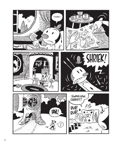
The other story of note is "At The Gate" by Myra Jo Closser. It's most notable not for the very slight story about dogs waiting outside the gates of heaven, but rather for the welcome return of Shary Fleniken. I've long admired her work, and she does a nice job in making the dogs in this story expressive.
Tom Pomplun has taken on a unique project in comics, and while it's not always successful, it definitely is a worthy attempt. If nothing else, Pomplun is keeping alive stories whose influence is taken for granted today. His willingness to use a wide variety of graphic styles makes the comics worth looking at in addition to reading, though it would be nice to see ever more idiosyncratic approaches to the material. I'd be curious to read his attempts at adapting better authors, like Twain and Bierce, to see if the impact of those stories is sustained through their transformation into comics. At some point, I'd love to see him take on authors like Vonnegut, Chesterton and Asimov. While most of the stories he's adapted have been genre stories like mystery, horror, science-fiction, detective and the like, it would be interesting to see a volume built entirely around humorous short stories. That would be an excellent way of making use of another long tradition of cartooning.

Tuesday, March 26, 2013

Sequart Reprints:: Graphic Classics Mark Twain

This review was originally published at sequart.com in 2007.
******************************

In my review of several entries from the Graphic Classics line of adaptations, I noted that some of the stories chosen seemed ill-suited for comics, and wondered what the Mark Twain collection might look like. Series editor Tom Pomplun was kind enough to send over a galley of their upcoming revised edition of Twain, and the results were impressive.

The reason why I think it worked so well was Twain's economy of style in his prose, the liveliness of the scenarios he concocted translated nicely to the language of comics, and the artists selected were astutely matched with the particular stories. Many of the stories contain some of Twain's most cynical, acidic works of satire. Even the adaptation of the little-read "Tom Sawyer Abroad", written from Huck Finn's simple-but-secretly-sophisticated point of view, contains a number of digs at religion, science, and imperialism. George Sellas' cartoony style is a nice match for what is also a rip-roaring adventure story, where Tom, Huck and Jim wind up on a mechanized hot-air balloon that sails over the Atlantic and winds up in Africa. Like any good comics story depicting action, there's a propulsive quality in both prose and art that leaves the reader breathless as they flip from page to page. The way that no-nonsense Huck acts as the foil for the slightly pompous Tom is what informs Twain's commentary and makes it crackle. The manner in which Twain is able to use Huck to get his points across while leaving him as one of the most vivid characters of all time speaks to his skill as a writer.

Twain certainly wasn't afraid to go over the top in scoring satiric points. "The Facts Concerning The Recent Carnival Of Crime In Connecticut", adapted by Antonella Caputo & Nicholas Miller, features an exaggerated rubbery art style to match the ridiculousness of the scenario. It's about a man who happens to encounter his own conscience, in the form of a dwarf. His conscience literally tortures him, until he understands that the less he allows his conscience to affect his actions and feelings, the weaker it gets. He then throttles his conscience to death--and sets about committing crime after crime! This story humorously gets across the notion of what conscience is, why we act the way we do, and is more than a little ambiguous on which side Twain falls.

By far the darkest and best story in the collection is "The Mysterious Stranger", which is one of the nastiest, most cynical stories I've ever read. It's a story of a medieval village, and a stranger who appears to three boys. His name is Satan--an angel who is the nephew of Hell's Satan. An angel does not possess "the moral sense", that which enables us to tell good from evil. As the angel proceeds to demonstrate time after time throughout the story, "good" and "evil" often depends on who's judging it, who's meting out punishment for committing evil acts and one's own attempts at justifying one's comfort. In particular, Twain has sharp words for those who declare morality to be what separates us from the animals, since men commit acts of cruelty that animals never would.

The boys ask Satan to improve people's lives, but that often winds up as him killing them so as to avoid more years of suffering on earth. Toward the end, Twain attacks the twin notions of Christianity and civilization as unequivocally good things: "We saw Christianity and Civilization march hand in hand through the ages, leaving famine and death and desolation in their wake...Who gets a profit out of it? Nobody but a parcel of usurping little monarchs who despise you--but whom you continue to fight and die for." Toward the end of the story, the boys asked Satan to make a friend of theirs, accused of thievery, happy. He responds by driving him insane. When confronted, Satan replies, "It was the truth. I said he would be happy, and he is now the one utterly happy person in this empire. No sane man can be happy. It seems to me that you are too hard to please." Twain then really unloads on religion at the very end, rejecting "a god who mouths mercy and invented hell", reducing the story and its surroundings to a dream.

Twain manages to do this while crafting an entertaining story full of twists and turns, made wickedly delightful thanks to the hand of Rick Geary, an artist who specializes in this sort of period piece. The light line and exaggerated character design are exactly what this darkly humorous story required. Even Twain's lighter-hearted stories contained a darker, cynical undercurrent as he took on hypocrisy and self-delusion. It only makes sense that a graphic adaptation of his work should also have a comic face that masks a darker heart. Every American satirist owes a debt to Twain, in terms of his boldness, clarity, wit, storytelling ability and the manner in which he managed to encapsulate both folk and sophisticated elements in his writing. Pomplun does a fine job here of finding ways to best fit his work into comics language. Given comics' long history of presenting illustrated satire, the fit only seems natural, but Pomplun clearly took pains in searching for the right artist to go with the right story. A volume solely devoted to great works of satire would probably be an enormous success in this series; I'd love to see an artist tackle Swift's "A Modest Proposal", Voltaire's Candide, Rabelais' Gargantua and Pantagruel, various works by Aristophanes along with more modern satirists.

Monday, March 25, 2013

Around the World: Loge, Machado, Pereira, Astromanta/Hetamoe

I get comics from all over the world. Let's dip into a sampling of such work.

Lies Die Kind, by Lilli Loge. Loge notes that the title's meaning in German ("Read the child") applies as much to this portrayal of trauma and lost memory as does the English meaning, though neither meaning is entirely applicable. It's about lacunae, gaps in memory that feel like holes ripped out of one's brain in much the same way that Loge hand-ripped out a hole in each one of the covers of this comic. The comic isn't so much a narrative (it's about something lost, after all) as it is a series of representations of knowing that something horrible is missing from one's memory but that it's completely lost. Loge's linework goes from exquisite and detailed to cartoony and scratchy, depending on how she chooses to represent this phenomenon. She also uses a bunch of interesting formal tricks, like a post-it note on a blank page that features a rabbit saying "Got a mind like a sieve? Better take notes!" Loge also depicts the struggle as two young women portraying different parts of the brain, with one unable to communicate to another what has been forgotten; she has forgotten that she has even forgotten anything, and getting upset about it makes the situation even worse. It's a brief, powerful and striking attempt to get at an interesting idea. Loge is an extremely clever cartoonist who puts her formal inventiveness to good use.


Megafauna/Inner Math, by Joao Machado and Andre' Pereira. This mini is a flipbook, with each artist contributing one story that meets in the middle. Megafauna represents the distant past, while Inner Math tells of the far future. Both are about evolution and freedom, and the way that the struggle for both is literally a life-or-death affair. Megafauna shows the birth of the first sentient humanoid creature in a savage environment, and how its existence activates and angers the presence of the gods in the form of a many-headed elephantine creature. Inner Math is about a distopian future where a single human is bred to combat the decay of society, navigating its structures and bringing it back in touch with nature. Here, the state (or science, or religion) plays the same role as the gods in the first story, angry about humanity's attempts to evolve and better itself. The baby born in the first story is essentially another iteration of the human designed to run the gauntlet of the repressive future. Pereira's art in Megafauna is appropriately visceral and harsh, cutting up his pages into horizontal panels interspersed with EKG readouts indicating the brain activity of the new child. Machado's lettering in his story is a bit hard to parse at times, but I liked the way he used smudges, inserted diagramatic marks on his pages and mixed freehand drawings with what look like drafted structures. Both artists use greyscale to strong effect, modulating the lightness and darkness of individual images to create ghostly appearances. This is intriguing work.


Idle Odalisque, by Astromanta and Hetamoe.This odd and lovingly-made comic is crudely-drawn in manga style. The artists (writer and artist) tell the story of a young woman going about her day as she gets ready to go to work. It's just that her job is being a streetwalker. The comic is very much in the tradition of magical realism, as her world sparkles and she winds up going home with a talking bear who prefers to talk and play scrabble than have sex. There's a matter-of-factness about this story that I enjoyed. The crudeness of the line actually made it more attractive to my eyes, since I find typical shojo-style art to be painful to look at in its slick cuteness. I'm not entirely sure where the artists are going with this; it feels like a bit of a lark. Both this mini and the preceding mini came from Portugal, by the way; click on the link to see more work on a dedicated tumblr.

Thursday, March 14, 2013

Sequart #30: Kampung Boy, Town Boy, Missouri Boy

This article was originally written for sequart.com in 2006.
***********************************
One of the really encouraging developments in recent years in the comics industry has been the increasing number of publishing houses that have started up a graphic novel imprint. This has been happening in fits and starts for some time now, but it seems like the bookstore market has reached a point where it's easier to sell things that aren't just manga or collected superhero comics. Of course, it's also helped that there seem to be smarter people running those new comics imprints, people with an eye for talent and stories that will sell in America.

One of them is Mark Siegel, who's the head of the First Second line from Roaring Brook Press, a division of Holtzbrinck Publishers. Raised on European comics, he brings that sensibility to his line of books in terms of style and appearance, though they're published in a more standard American graphic novel format rather than the European album. This gives him a bit more flexibility with the length of his stories.

As far as the content goes, Siegel is all over the map. He's publishing a number of books aimed squarely at kids, especially books by Lewis Trondheim and Joann Sfar. There are books closely examining historical events. Above all else, there is a strong international flavor in his roster. There are three Frenchmen, one Scot, one Belgian and the great Malaysian artist Lat in addition to a number of Americans.

In this article, I'm focusing in on two books that bear a lot of similarities to each other: Lat's Kampung Boy and Leland Myrick's Missouri Boy. Both are memoirs that look and feel completely different, both artistically and in terms of intent. Both are dominated by a current-day narrative perspective, but the authors employ this device for different ends. Myrick's book is complete unto itself and has a rather definitive conclusion, while this was just the first volume of many for Lat in describing his life growing up. Both are small-town boys in rural areas of their countries. Both love swimming and shenanigans with friends, and both try to gain perspective on their extended families. Beyond the surface differences of the two men, the primary difference between the two books is one of tone. There's an air of melancholy in Myrick's book that's absent in Lat's matter-of-fact but all-embracing account of his childhood.

That melancholy is expressed in the way Myrick breaks up his chapters and the sometimes overbearing language he chooses to employ. Each chapter comes from a different year in his life and essentially contains one anecdote. That sort of choppiness breaks up the smoother continuity we see in Lat's book, and it's a deliberate attempt at jarring the reader out of comfort. Myrick's anecdotes mix sweet, visceral memories with a background of discomfort. It's clear that as he grows older, he feels more and more out of place in Missouri. The later anecdotes, where he's working as an X-ray tech and details his encounters with corpses and frustrated love, feel like well-traveled ground in the world of autobiographical comics. The book loses the power it had in discussing his earlier childhood, especially the chapters where his friends go to a swimming hole and Leland wonders about the future.

The most powerful chapter is "The Resurrection", where young Leland engages in a game with friends where he hides in a pile of leaves and is supposed to jump out of it, scaring his buddies. Instead, they piss on him when he gets out. We can feel his rage and impotence. I liked the way he shows himself merging with the leaves, with some panels reminiscent of David B. His use of color intensifies his otherwise somewhat flat design choices here and throughout the book. The last chapter shows him leaving Missouri, developing the courage that he found himself losing as a young adult by learning how to ride a motorcycle and head to California. It's clear that at that time, Missouri is no longer home for him.

I think this is the central reason why I had some difficulty with this book. Myrick clearly viewed the journey from Missouri to California as the completion of a coming-of-age ritual that allowed him to fully develop as a person. The beach he encounters at the end clearly represents a new potential for freedom and the possibility of acting on his desires (creative and otherwise). This book largely seems to be an examination of those touchstones of memory that used to be important to him, but they are so heavily layered with his current perspective (represented by his somewhat stiff attempts at a poetic narrative) that it just feels like he's trying too hard. The chapters where Myrick tries to imbue each memory with Meaning through his narrative captions simply don't work as well as simpler chapters like "Old Man's Chair", where his father simply sits in a new recliner, the weight of the day ebbing from his face. It's clear that Leland hadn't thought of his father as old before this moment.

That chapter works well because Myrick trusts in the power of his images to get his point across. Ultimately, his inability to do this on a consistent basis is why Missouri Boy was not fully successful. His narrative text undermines his story at times, weighing down the images unnecessarily. The poetic language he employs simply falls flat at times, with lines like "Through a wispy umbilical of ectoplasm we didn't even know what we shared, arching between the living and the dead, connecting beginnings to ends, passing memories through the ether one belly to another" overselling a simple image of an umbilical cord shared by he and his twin brother in one panel connecting to their dead grandmother in another.

Myrick writes about alienation, but we don't have a real sense of why he felt impotent and incapable of expressing himself. The book concludes with some rather ham-fisted symbolism, as he decides to ride to California to start a new life there. He sprawls on a beach, with an ocean of possibilities before him and his old life gone. As he is traveling west, he cycles through his memories both sweet and sad, and we understand that he feels that he must shed their hold in order to become a fully-functioning person. But there's no insight as to why he couldn't do that at home, and why that symbolic and literal journey should be so transformative.

Contrast Myrick's melancholy to Lat's joyful and expressive account of his childhood. Lat's Kampung Boy is more illustrated text than traditional sequential narrative, with few word balloons or panel-to-panel transitions. Yet his holistic page design and knack for narrative flow unites the text and image on each page in a way that Myrick's book sometimes lacks. The cover copy compared Lat's work to Charles Schulz's, but Lat's work is more vibrant and kinetic. His pared-down face and figure work pops off the page, almost like a Sergio Aragonnes strip. The exaggerated teeth and facial expressions combined with his stumpy children and mops of hair draw the reader in and allow us to to empathize with young Lat. At the same time, he isn't afraid to use lush backgrounds and bold splash pages in order to emphasize his more adventurous escapades. Growing up in a rural Mayalasian kampung (village) allowed him to draw all sorts of beautiful outdoor scenery.

While the temptation to portray his childhood as exotic must have been strong, Lat goes completely in the other direction. His narrative tone is matter-of-fact and slightly wry. Though he views his upbringing with enormous affection, he's not blind to conflicts between his parents or his own fears as a child. Still, Lat clearly relishes recounting tales of the local swimming hole, learning how to fish, getting an education and otherwise becoming a good and studious Muslim. Even as Lat recounts a period of many years, the reader is made to experience them as one day slipping into another, rather than a jolt between each memory. The accumulation of small details builds up as the book goes on, giving the reader a vivid picture of life in the kampung.

A key in the rather divergent memories and accounts of the pasts of the two authors comes at the end of Kampung Boy. Lat must go off to boarding school when he becomes a young adult, and he is worried that his kampung may no longer exist in the way he remembered it. His parents were thinking of selling off their land to tin miners and move to the big city, and so the way of life he took for granted might completely change. Not being able to go home again terrified him even as he relished his opportunity for a new life. The possibility of this loss made him treasure those memories even more, but he still retained enough perspective so as not to gloss over them too much. Lat's mischievous nature and curiosity got him in trouble more often than not, but his genuine respect and love for his family & culture was just as palpable. Lat is perhaps a bit less introspective than Myrick, but in no way is he less self-aware. That's the key to the success of this work; its pleasures are small and not earth-shaking, but the author understands this and lets this be enough for him as a creator.

Lat in his own account was someone who was constantly acting. Myrick, in his story, was someone who reacted or was acted upon until the very end. As a reader, that spelled the difference between a warm reminiscence of one's origins and the navel-gazing that plagued Missouri Boy. The latter almost felt like something the author needed to get out of his system, while the former had stories and memories that simply poured out of its creator. For Myrick, growing up in a rural environment was something that he can only start to appreciate now, and only through a filter of poetic language. For Lat, this was something he could treasure all along.

*********
Town Boy by Lat, the second book in a series of autobiographical reminiscences, is a smart, knowing look at the ridiculousness of the teenaged years. Above all else, it's about the ways in which boys connect. It has a combination of wit, warmth and total mastery of the comics form that delighted me from beginning to end. These books recall his childhood growing up in Malaysia. The first book details the bucolic charms of growing up in a forest village and interacting with nature. This book is all about his adolescence in the city. It's divided into roughly two parts: the first gives us glimpses of Lat (named Mat here) as a 13-year-old, trying to fit into a new way of life; and the second is about him as a 17-year-old, now too cool for school.

The book seems to be quite episodic at first, stringing a long a series of amusing stories that appear to be unconnected. Lat later picks up threads in unexpected ways, adding emotional resonance to some stories and humorous weight to punchlines in others. While Kampung Boy put much of its focus on his family, Town Boy is about his teenaged friends. As such, the memories put down on the page are more whimsical than wistful, and one can imagine Lat laughing as he was drawing these anecdotes. The first section of the book sets up his friendship with a Chinese boy named Charlie, who loves rock 'n roll (it's the 1950s), and they form a bond through music. Kampung Boy presented a way of life very different from the typical city dweller (not to mention American), but Town Boy is filled with familiar situations and feelings.

The latter half of the book is remarkable for both warmhearted recollections and hilarious set pieces--with both going on simultaneously. Lat's narration is very dry and straightforward, letting his visuals do the work of expressing his sense of humor. The way he depicts himself and his friends as teens is a wonderful bit of ego-deflating. They all wear sunglasses; walk with a purposeful, leaning strut; and like to hang out in public places, leaning up against walls. Lat relates all sorts of tales about his eight school chums, but the best is when the prettiest girl in town asks him for advice about art. After he critiques her work, he manages to talk her into seeing a movie with him. His friends, stunned and slack-jawed at Mat's achievement, stare at them through a cafe window and then follow them at a distance as they walk to the movie theatre. All the while, their astonishment never leaves their collective faces as they follow them.

This sequence speaks to Lat's mastery and imagination as a cartoonist. He isn't afraid to vary his composition and page design dramatically and rapidly. We might see a two-page spread of a single scene with no dialogue, just a short bit of narration. We might see a standard page with a familiar grid and plenty of word baloons. We might see close-ups, pages with a single panel and lots of negative space, pages jam-packed with detail and motion, and completely silent pages. Lat never changes his linework; he evokes different feelings strictly through design and composition. His line is scribbly, frenetic and exaggerated--perfect for depicting the hustle & bustle of daily life. At the same time, he's capable of remarkable emotional subtlety with his line as he varies his page design.

In the date sequence, he manages to convey an obviously important bit of intimacy between Mat and this girl, with a wonderfully awkward conversation. Lat would draw two or three pages of this conversation in a standard grid format, flipping between the two of them. Unexpectedly, Lat would then pan back on the next page and we'd see his friends following them en masse, looking stunned, in the background. It's a tremendous running gag that gets funnier every time Lat turns his audience's attention back to the romantic date and then springs it on us again.

If Lat's books have a weakness, it's that these stories are almost too upbeat. There's no angst or tragedy; even when his best friend leaves for England, there's no tears. Of course, that can only be considered a weakness in the context of what I expect in a story about teenagers: lots of sturm und drang. It's pretty obvious that it wasn't Lat's mission to root out the negative experiences of what was clearly a pretty happy childhood. Lat was going after quotidian humor that a wide audience could appreciate and relate to, and evoked this with an astounding degree of skill. Lat's book details that need for companionship at its purest and most basic level. The joys found in this book reflect the joys he felt growing up with his friends. If there were no tears in that final scene, part of that may have been because he knew what he had shared with Charlie wasn't really ending, and part of that may have been because the nature of adolescent male friendships doesn't allow for that kind of display. Either way, Lat frantically bicycling down to see Charlie before he left showed us what this friendship meant to him, and devoting this book to that friendship makes it even clearer.

Wednesday, March 13, 2013

Plug Time: Bourdeaux, Aushenker, S.Toth, Standfest, Espey

A few requests for project publicity have come my way, so I thought I'd run a little clearing-house here.

First, cartoonist pal Michael Aushenker is working on the comics end of an overall revival of The Human Fly. Billed as "The Wildest Super-Hero Ever -- Because he's REAL!", the Human Fly was a costumed 70s daredevil who had a short-lived Marvel Comics series. There's going to be a movie based on his life as well as the comic. This is about as obscure a 70s revival I can imagine, but the premise is so agreeably strange (as was the 70s Marvel Comic, written by Bill Mantlo and drawn by Golden Age legend Lee Elias) that I can't wait to see what it looks like.

This isn't strictly comics, but I was enormously excited to have received a bag of cookies from the Golden Age Bakery in Chapel Hill, NC from a friend. It's starting to make the rounds that baker Sylvia Toth is creating cookies containing panels from public domain golden Age comics, including a batch that's nothing but Fletcher Hanks' Stardust the Super-Wizard. Toth recently quit her day job to bake cookies full time, and they are delicious and beautiful.

Ryan Standfest has just opened a Kickstarter fund for his second issue of Black Eye, his intriguing comics/essay publication dealing with satire and black humor. This issue will feature comics from Michael DeForge, S.Gross, Ben Marra, Brecht Evens and many more. The first volume was excellent and ambitious, so I'll be curious to see how Standfest refines his ideas for #2.

I haven't yet had a chance to review it in full, but the puppet show adaptation of Eamon Espey's Songs Of The Abyss looks fascinating. Espey and his wife, Lisa Krause, co-created the show. Check out details and a schedule here.

My old pal Steve Lafler has a video up about his Dog Boy series and its recent revival on the web: 

Finally, I wanted to point readers to the fine job Robyn Chapman did collecting Ariel Bourdeaux's Deep Girl series. Full disclosure: I interviewed Ariel for this book.That said, I recommend her comics unreservedly.

Friday, March 8, 2013

Learning Curve: Pope Hats #3

Ethan Rilly's first issue of Pope Hats came out in 2007. Since that time, his improvement as a storyteller has been remarkable. I thought the second issue of the series was one of the best comics of 2011. It's interesting to see how he's evolved this story of two lifelong friends: a mousy, insomniac and highly competent law clerk named Frances and a flighty, talented alcoholic actress named Vicki. Now Rilly has found a great home with Chris Pitzer's AdHouse books, a publishing house dedicated to impeccable design. Simply put, everything about his work as a cartoonist has become more restrained and subtle, allowing him to really get across big emotions and themes without resorting to storytelling histrionics. The first issue is an example of a young cartoonist who doesn't yet have the confidence in his line or figure drawing to keep things simple; Rilly relies too much on over-rendering and adding intrusive blacks to flesh out his page. Moreover, Rilly drew his characters in a fairly naturalistic style; it wasn't until he went to a more iconic style that he was able to bring their qualities to the surface in a more direct manner.

Rilly also abandoned a slightly cutesy trope of Frances being haunted by an incompetent ghost, one that accidentally killed the neighbor's cat though he was intent on frightening her. Rilly left it open to interpretation as to whether the ghost was "real" or not, but the device was dropped after the first issue. Instead, he furthers a number of storylines that he began in the second issue. There are parallel plots in the comic, as Frances finds herself inadvertently rising in status at the law firm and Vicki finds herself being flown to Hollywood for an audition. Success for both of these fuck-up friends seems like an odd phenomenon, something that's happening in spite of themselves or like something that's happening to other people. Both Frances and Vicki are "out of body" types who are all too aware of the disconnect in their lives, and both have strategies for dealing with this sensation. Vicki does it with alcohol and sex, while Frances tries to fight her crushing insomnia with work, booze and running. In neither case are they ever able to get away from themselves.

Rilly's detailed account of the machinations and politics of a law firm are riveting. A hypercompetent, efficient and hard-working clerk like Frances is a greatly desired tool in a law firm, because it means that cheap labor will be doing a lot of heavy lifting. Of course, the fact that there's a game that everyone but Frances seems to be playing in order to become successful is what makes her successful: her superiors can see that she's not playing that game, which is why she's so valuable. In a profession filled with sharks, Frances represents someone working for the sake of work, trying to find some kind of peace or purpose in the moment. The fact that she's also so tightly wound (especially regarding her emotions) allows her to blankly interact with those in authority, something that also gains their favor. The whole issue is about her continuing to draw attention from new sources, being rewarded with an office (something met with intense jealousy by others) but constantly feeling like garbage. Her refrain throughout is "Today I'm crap, but tomorrow I'll be good", magically hoping for that one good night of sleep that will transform her entire world.

On Vicki's end, every gesture she makes is a dramatic one. She throws a huge going-away party after she gets the lead role in a new TV show (about a vigilante DA, a concept worthy of Michael Kupperman), showing up late and absurdly, in a giant bird outfit. Rlily's dialogue simply sings in this comic, as she asks someone to wet her beak when she takes off the giant bird head, or when Frances struggles to explain how not everyone likes her to yet another partner in the firm who's trying to woo her to his field. It's interesting that the most emotion Frances can muster is anger at the parasites and hangers-on at the party who don't really care about her friend. She can't bring herself to cry that her childhood friend is about to leave her (indeed, Vicki seems more despondent); everything is too bottled up, including her obvious feelings for Peter, a fling of Vicki's.

His presence in the issue ties together the issue's main theme: work as a central part of our identities. Peter, a construction worker, pointedly tells Frances that his work doesn't define him. For Vicki, acting is both her passion and her meal ticket, but she has a sense that things are going to change because "I'm famous people now." As Frances' star rises at the firm, the issue zeroes in on the story of Nina, an struggling associate who is being subtly sabotaged by fellow associates and is called upon to do an impossible job in court the next day. Frances offers to tell her everything she knows about the case but is rebuffed, as Nina says "I know my place now." She fails spectacularly in court and is then called into the dreaded boardroom 25H--the only one small enough for just three people and so the room where everyone is fired. Various lawyers tell Frances of the things that keep them grounded, with some claims more dubious than others. Frances isn't quite sure what to make of her situation; she dropped out of law school and feels like a failure treading water in a nonprofessional job, but her influence becomes greater simply by not acting like a shark. As I've noted before, these are not typical themes in a slice-of-life comic. The most important relationship in the book is between Frances and Vicki as a friendship that defies logic; love relationships are very much sidelined. While quotidian details are part of the scenery, they do not dominate the comic in a way they might have in a more typical title. When you add Rilly's fully-formed, mature art style that doesn't lose an ounce of its expressiveness despite its clarity, you have a book that puts the lie to the notion that alternative comic books are dead.

Wednesday, March 6, 2013

Dispatches From Ireland

Ireland's small press scene is slowly starting to develop some exciting voices. Let's take a quick look at some work sent by prominent underground cartoonists, starting with an interesting new anthology.

Stray Lines, edited by Paddy Lynch. This is a lean, (64 pages) attractive anthology featuring five long-form  pieces by six artists. The anthology clearly goes out of its way to showcase a number of different storytelling styles. For example, Gus Hughes' "Animals Attacking Their Own Reflections" is rendered like a series of cave drawings: dark, crude and primal. The story is a bit of dark-humored nonsense, as a documentarian looking for a particular kind of tarantula is double-crossed by his native guide. Absurdly, the guide fulfills his desire to judge a dance competition, and the bite of the spider just so happens to induce dance-like spasms. The sequence where the man is dancing is topped only by a disco ball emerging out of nowhere. By contrast, Philip Barrett's "Endless Lap" is downright conventional-looking by way of comparison, as it depicts a man and a woman oddly appearing in each other's nautical dreams, trying to find their way to each other without knowing who they're looking for. It's a beautifully told story that manages to downplay its schamltz by focusing on the everyday.

Andrew & Chris Judge's "The Aviator" is about a young man growing up in America in the 1930s with a talent for drawing and painting signs.That talent led him to design and paint logos and illustrations for the front of US planes. The most famous plane from World War II also bore his art, in a sequence whose outcome was fairly obvious the moment the secretive machinations surrounding it began. The Judges get around that inevitability by starting the story toward the end and then flashing back to the illustrator's beginnings. Chris Judge, who drew the figures, seems strongly influenced by Jason Lutes' detailed and roundish character design, with a hint of Gilbert Hernandez thrown in to soften things up a bit. Lynch's "Friendly, Local" is an excellent slice-of-life story about a shiftless young man on the make with a young woman at a Chinese take-out restaurant who also has to young son and a demanding ex. It's a perfect portrait of someone who is put in a position of responsibility who is desperate to get out of it, or rather, go back in time to when he had no responsibilities as a means of comfort and retarding the march of time. Lynch's scratchy, muddy line is perfectly suited to tell this sort of story, especially the climactic moment when the young man's attempt at seducing the woman fails in an amusingly spectacular fashion. Finally, Barry Hughes' angular and cartoony "The Glass Trampoline" is yet another visual left turn, as it depicts a sort of spirit quest undertaken in order to get a bucket of chicken. Like the first story in the book, its unusual visual approach was in the service of a cheeky, absurd premise. This is certainly a solid intro to the sensibilities of the Irish comics scene: darkly humorous, soulful, and introspective.

Patrick Lynch's In The Aquarium is a meditation on madness, obsession and escape. A man in an aquarium stares at a fish that seems to be talking to him, leading him into a reverie where that conversation follows him around until he goes mad and strikes a co-worker. Then he's led into a reality where it's really him in the fish tank, drowning and on display, until the glass is smashed and his world ends. The jumbled panel arrangement reflects the chaos in the man's mind, as do the wavy and sketchy lines. It's a short, but effective glimpse at the ways in which even the worst of fantastical fates can be better than the grim reality of everyday life.

John Robbins' early comics, Negotiating The Beast and The Monkey-Head Complaint, are dark to the point of nihilism. The former is a series of one-page stories that revolve around the darker aspects of childhood, both in terms of the weird and frequently horrible things children do each other and the ways in which predators lurk. He also adapts some of the stranger and more desperate letters from a local advice column. There's a comical and cynical distance implied in these stories (like certain EC or Vertigo comics), but the problem with them is that they are incredibly overwritten. The narrative captions threaten to drown out the comics entirely, pushing the frequently arresting and spare graphics into the background. Robbins did show an interesting facility for working with negative space, especially with regard to how he used blacks and shadow. to highlight dread. The Monkey-Head Complaint sees Robbins expanding the ideas from that first comic into a single storyline about a bored couple and how they inadvertently get involved with a young man who slowly descends into homicidal madness. There are some odd storytelling choices, like the wife demanding that the husband tell his story about how he met the young man in a sort of Shakespearean cadence, but they tended to add to the slightly fantastical nature of the story. Like his earlier work, Robbins went to the EC Comics twist ending with the most horrible outcome possible, which felt a bit hackneyed. Robbins' later work is far more nuanced and restrained, but one can see how Robbins' strong visual storytelling sense was already in place in his earlier work.

Tuesday, March 5, 2013

Sequart Reprints: Percy Gloom, Bardin The Superrealist, Things Just Get Away From You

This column was originally published at sequart.com in 2007.
************

I'm reviewing Bardin the Superrealist, Percy Gloom and Things Just Get Away From You together, and not just because of their superficial similarities. Rather, all three books elicit the same feelings from me as a reader, although in significantly different ways. All three create quirky, skewed realities that force the reader to adapt to what they see on the page or get left behind. While initially disorienting, each artist skillfully draws the reader into the story's own internal logic with warmth and humor. All three artists then jolt the reader with disturbing images, ideas and emotions, each choosing to resolve their stories differently.

Let's begin with the most self-contained of the three books, Cathy Malkasian's Percy Gloom. Malkasian is a newcomer to comics, but is a veteran of animation, having directed The Rugrats and The Wild Thornberrys. Our hero is an odd little man whose most fervent dream is to work for Safely-Now, a business devoted to "cautionary writing"--the art of finding out all of the ways things can be dangerous. Percy meets all sorts of odd characters along the way to a job interview in an unusual city. He encounters singing goats, odd shops, and kids looking for a cobblestone that would destroy the city so as to prevent them from going back to school. What gives this book weight is its underlying theme: a frank and honest examination of death. This is death at an ontological level: not just dying, but the idea of non-being. Some of the characters in the book are repulsed by the idea of living and the ennui they see as surrounding it, while others are so frightened of it that they try to find ways to conquer the inevitable. That latter route leads to some dark behavior for some of the characters, threatening everyone around them.

Percy himself starts off as a nebbishy Candide sort of character, constantly beleaguered by his surroundings and bullied by more forceful personalities. However, as we get to know him, we understand the tragedies that have shaped him and learn that his own decision to choose life or death is a complicated one. It's interesting that Malkasian presents this struggle with death as an organizational and institutional one. Death is reduced to a bureaucratic struggle by Safely-Now, with the idea that it can be prevented by coming up with enough rules and warnings. One cult arises around the idea of death being preferable to life, though its leader notably doesn't practice what he preaches. Another religion arises out of the fear of death. That latter cult was in opposition to traditional ideas of accepting death as part of a tradition and custom. Percy emerges as a figure who embraces "all this pointlessness...as very entertaining", inspiring others even as he resolves his own struggles and sadness.

Malkasian tells the story with rubbery character design, grey tones and an assured pencil line. Her characters look like a cross between Bill Plympton and her Nickelodeon work, and the story's tone itself feels like that as well. There's a sense of joy and creepiness on every page, and Malkasian keeps the story lively and even suspenseful as she slowly unravels the story's themes, twists and turns. The result is a new kind of "fairy tale" with abundant charm and surprising depth.

Bardin the Superrealist is by Spanish artist Max, and it's more of a collection of interrelated stories than a single full-length narrative. The stories revolve around the title character, who has suddenly been given insights and abilities relating to the "superreal" world--a plane that's above our world. He's given these insights by the Andulsian Dog, a character evoking the famous title of the Dali/Bunuel film. There are all sorts of cheeky references to surrealism, and while there are plenty of surrealist themes (especially with regard to sexuality), this book owes a lot more to dream logic. In particular, Max skillfully portrays dream logic in the language of comics.

Bardin ponders divinity, mortality, creativity and wrestles with demons in his dreams. What makes this a great comic is its light touch and comic timing. In fact, Max eschews traditional surrealist techniques in favor of a spare cartooning style that is reminiscent of classic American cartooning. There's a little Herriman in there, maybe a little Milt Gross and other influences as well. The pace goes from frantic to languid, but the book is at its best when Bardin is interacting with his friends in a bar. From writing a manifesto for creating comics, to refereeing a poetry contest, to an explication of the patron saint of idleness, Max doesn't dip into surrealism so much as he does into well-honed gag techniques. His art here serves to set up his jokes, and it does so with great efficiency.

On the other hand, the most visually striking strips in the book deal with dreams and hallucinations. Bardin engages in extended debates with god-figures that are profane, convoluted and hilariously blasphemous. Perhaps the highest blasphemy of all is the resemblance of the god-figure to a certain iconic corporate mouse. Max goes crazy fooling around with divine schematics and icons, and these strips have a compelling internal logic that takes a few readings to adjust to.

His dream strips are really nightmare strips, playing off the Fussli painting "The Nightmare", where a ghastly monkey and horse torture a sleeper in repose. The horse and ape in Max's strips are a comical pair that trade quips with each other as they find new ways to torture Bardin, mostly revolving around implanting images of him having sex with his mother. In the book's last story, "The Sound and the Fury", Bardin gets even with his antagonists, going on a bloody & violent heroic quest in his dream, killing every opponent in his path. Finally, he meets up with a stunned horse and monkey and kills both of them as well. Consumed by bloodlust, he drives a sword into into his own sleeping form. Realizing his mistake, he slinks off the page as the book ends. It's a fitting end to a book's worth of wackiness.

Despite some occasionally heavy philosophical underpinnings and bizarre imagery, this book is really a lighthearted tribute to cartooning's golden age. The book makes no attempt to explain itself to unsuspecting readers--we're confronted with the initial premise and then the book meanders off into some very odd corners. Bardin manages to take its source material quite seriously, yet presents it in the most flippant and lighthearted of manners. It avoids pretentiousness with the playfulness of its art, but there's no doubt that Max is trying to get at something essential in his own consciousness. In this book, a punchline and a Great Truth are often the same thing.

There's a certain buoyancy to the first two comics I've reviewed. Even though both books deal with some heavy topics, there's a lightness and even optimism that shines through. This isn't the case with the third, and most beautiful, book I'm reviewing here: Walt Holcombe's Things Just Get Away From You. Holcombe's art is simply jaw-dropping, once again echoing classic comic strips of the 20th century. His art is so beautiful it almost hurts to look at. His composition and character design are his greatest strengths. His characters are expressive and fluid, drawing the reader into their world with their cartoony and exaggerated movements. Holcombe is a master at using blacks on his pages, giving them a certain weight for the reader's eye to process. On top of all that, his decorative sense fills each page with so much for a reader to see, yet never interferes with the story's flow.

Holcombe's character design ranges from friendly to sexy to funny. As a reader, I really enjoy just staring at his characters, and they draw a reader's eye and hold it to the page. The lightheartedness of his art would threaten to degenerate into froth if it wasn't for the fatalistic, downbeat nature of his stories. In essence, Holcombe writes about relationships and their inevitable downfalls. His view of humanity is cynical at best and frequently misanthropic. The possibility of finding and keeping true love, in Holcombe's strips, seems to be a near impossibility. Contrasting these themes with the sweetness of his art is an unsettling experience for a reader, especially when one reads several of his downbeat strips in a row. Unsettling, but still quite rewarding.

The two centerpieces of the collection are "King of Persia" and "Swollen Holler", both tales of love lost and found. The first story involves a man who has everything but true love. This king wears a fez, spectacles and a featherduster mustache. He's immediately funny to look at, and the woman he falls for (a commoner) is a delicately-designed creature, all curves and mysteries. After being spurned, he undertakes a quest to find an emerald in order to win her hand and save her life. That leads him on his way with a talking camel (who is in love with him and jealous of the woman) to a sky kingdom where Holcombe goes absolutely crazy with his imagery. The story mutates into a sort of 1920's era flapper and top-hat story for awhile, before the king treacherously steals the gem and reneges on several promises along the way. Finally, he wins her hand, but it's not happily ever after. Instead, he grows bored with her, ignores her and drives her to a horrible end. Unable to accept any blame, he winds up with a well-deserved fate. The tragedy of the story is the fate of his faithful camel, who only wishes to be with him forever.

The exchanges between the king and the camel as they're on their quest are painful and almost confessional in nature. They stick out in a story that has fairy tale trappings, feeling more real than most true-life stories. The main characters are narcissists, almost to the point of sociopathy, yet Holcombe forces the reader to identify and even sympathize with them--up to a point. All of the whimsy and illustrative fireworks in this story serve the dark emotional core. Unlike Bardin and Percy Gloom, where the contrasts in art and subject matter tip towards optimism and self-determination (respectively), "King of Persia" not only paints a grimmer picture for the possibility of happiness, it does so with a brush that says that most of our wounds are self-inflicted.

Slightly more upbeat is "Swollen Holler", a mini-epic about anthropomorphic insects and their dysfunctional relationships. Once again, every character here sows the seeds of their own downfall. The reason why this story is a bit more hopeful is that despite (and eventually, because) of their assorted flaws, they wind up together in the end. The heartbreaking thing about this story is that once again, the wounds are self-inflicted. One of the main characters rejects his girlfriend (a delightfully-rendered and graceful insect-girl) because he feels that he's not worthy of being loved. She flits from lover to lover, putting him on the spot by humiliating him. The scenes between them are painful, almost like reading someone's diary in how true-to-life they feel.

Monday, March 4, 2013

Weird Worlds: Biggs/Bakki, Miller, Graham/Eisenhower, Turner, Burggraf


Poor Thing #1, by Drew Miller. This is a comic from another micropublisher, Neoglyphic Media. Miller is an excellent ballpoint pen artist, using grotesquely funny figures not unlike Francesca Ghermandi or Zak Sally. Indeed, this comic feels like Sammy The Mouse's second cousin, as it follows the inhabitants of a bizarre, vaguely hellish world and zeroes in on their emotions above all of the other horrible things happening to them. The longest story, "Witchin' Hours", involves a witchdoctor named Doctor Eli and his miserable patient Eli, whose head and neck are distorted in a disgusting, lovingly-detailed manner. Miller takes special care to draw extensive facial lines, body hair, unpleasant veins and other aspects that remind the reader of just how revolting it is to be embodied, if one looks just a bit too closely. After assuring his patient that he doesn't have "heart weevils" (a truly nasty interlude involving bugs riding bugs and building a hive in one's heart), he reveals that Eli is sick with loneliness. He "cures" him by giving him a hilariously sloppy makeover (a Supertramp t-shirt means that he has "threads that say 'hey, I'm back in the game!'"), but poor Eli mistakes a dating simulator for the real thing. The main backup is a gag involving two workers, one worrying the other has a "goblin sandwich" for lunch. This gag is taken to its logical, disgusting and wonderfully-drawn extreme. Miller is a talented, confident draftsman who's clearly synthesized a number of influences and is quite comfortable drawing stories that are fairly conventional in terms of set-up, but viscerally powerful in terms of their delivery.

Scaffold, I-XXII and XXIII - XLIV, by VA Graham and  JA Eisenhower. This is a fascinating puzzle of a comic, requiring the reader to do a lot of side-scrolling as they follow small figures across and down the page of an elaborate hexagonal structure that's not unlike a beehive. As we follow figures up and down ladders, through slanting floors, across crowded rooms and into wide-open spaces, it's slowly revealed that this is a decaying society. They're living in a structure designed to keep out light, which has harmful properties for its inhabitants. Each page is designed as much as drawn, with heavy use of zip-a-tone and negative space that tells the story of what's really happening in this society apart from the plot and dialogue. The Scaffold, as the structure is known, really is its own character, one that every inhabitant must negotiate and navigate in order to take care of business in their sector of society. It's a clever commentary on the ways in which geography determine destiny and sometimes social caste. Indeed, the figures are little more than sketchily-rendered stick figures. We don't see character close-ups or really get expressions other than the basics of body language, as the Scaffold dominates everything to a suffocating degree. In the second issue, we begin to get a sense of what happens when the system begins to break down, and the vegetation that its inhabitants depend on begins to get ideas of its own. I'll be curious to see how the world continues to break down in this series and how its protagonist (a young child sent on a mission he was ill-equipped to finish) fares as things start to get worse.

Farm School, by Jason Turner. This is yet another post-apocalyptic story, but it's one where the world is not quite a total loss. There is savagery and the opportunity for "adventure", but there are also libraries, bakeries and children playing. This comic is all about restraint and in-between spaces. A stocky, powerfully built woman named Hester goes about her day, negotiating a past she doesn't wish to discuss while trying to do good deeds. Turner uses restraint to great effect in this story, revealing bits and pieces of Hester's history while strongly implying certain things about it through her actions. This is a very quiet comic, and deliberately so. Violence, adventure and action are part of Hester's past, a past she tries to disabuse a young teenaged girl about when the girl is offered a chance at adventure. At the same time, Hester was affected enough by the experience so as to be uncomfortable being a joiner in any sense, as she chooses to live alone in the forest. The only thing that seems to give her meaning, as Turner implies with his squat, sketchy drawings, is helping others. It's fitting that the final scene, where she offers to help some kids only to discover they were playing, is sort of the world's way of paying her back.


Kid Space Heater 2, by Josh Burggraf. Burggraf is a talented artist who didn't have much of a story to tell beyond the story's high concept in the first issue of this series. The story involves a young man in a squalid, futuristic city accidentally getting his hands on an intelligent weapon that bonds with him. In the second issue, Burggraf spends a lot of time setting up his characters and their relationships while tying it into a more complicated plot. It seems clear that he's taken notes from both Brandon Graham's King City as well as some of Jack Kirby's wilder 70s comics.  Burggraf perhaps lays on the socioeconomic commentary a bit thick, as the Kid's firebrand friend Celia is a sort of walking polemic-spewing device in a manner that doesn't feel earned. That said, Burggraf's dynamic layouts and slightly ragged line certainly deliver on its visceral potential, as he tops himself on page after page with crazier images. His bright and even lurid use of color is another highlight of this comic, bringing to mind a sort of Heavy Metal aesthetic.I would have liked to have seen a little more of the relationship between the protagonist and his gun (what kind of influence do they have on each other? does the gun have unknown motives?), but this is a pleasant, tightly paced adventure story with memorable visuals.

Bearlands #1, by Jeremy Biggs and Bakki. This is a Walking Dead-style zombie story, one where the zombies are less important than the breakdown of society around them. The main difference is that all of the characters are very cute anthropomorphic bears. Thanks to Thai artist Bakki, this is all much better than it sounds. The story by Biggs is strictly (and deliberately) boilerplate: a Bear With No Name is wandering the desert, looking for survivors of his clan. He's haunted by his lost love in his dreams. He encounters random zombies on the road as he roads on his motorcyle, and winds up in a city surrounded by crazy and corrupt bears, wanting to get at the honey he possesses and how they can get more. Other than the honey angle (which is a macguffin; it could stand for any food or drug), it's like any other post-apocalyptic zombie story. What sets it apart is Bakki's insanely cute visual storytelling. It's simply funny to watch the Bear kill zombies with a katana or ride a motorcycle, in part because none of this is directly played for laughs. Certainly, Biggs has this jarring juxtaposition in mind when writing the story, knowing that the style of the art would tweak the genre. However, the fact that he restrains himself and doesn't try to add any shtick, that he lets the art do the heavy lifting both in telling the story (there's not much in the way of excess verbiage) and making it funny shows that he has a keen understanding of what makes a comic effective. It's fluff, but tasty fluff.


Friday, March 1, 2013

On Exhibit: Mineshaft #28

Reading the average issue of Mineshaft is like going on a particularly well-curated art walk in a culturally refined small city. Going from one page to the next, one never knows if they're going to be encountering an interesting poem, some startling illustration work, some thought-provoking photography, an interesting comic or something else altogether. Editors Everett Rand and Gioia Palmieri continue to unearth local and forgotten culture from every end of the earth, sprinkling in the works of underground and alternative cartoonists with a variety of other material. For example, the issue leads off with photographs of both the works and the installation sites for the guerrilla photography project CorpusTrip. The reader is immediately confronted with the image of a naked, weatherbeaten woman with a cigarette defiantly dangling from her lips. It's an astounding image, one of many from this project that put atypical models in decrepit spaces, and then put the final product in even more unlikely spaces, like on the back of a a garbage truck.

Everything feels especially sharp in this issue. The poems from Adelle Stripe, J.R. Helton and Andrei Codrescu are all vividly detailed and even visceral. The charcoal drawings by Billy Childish are amazing, as their wavy lines evoke powerful feelings, especially the one depicting the death of a man in the snow. The Brad Barrett photo essay of late 60s San Diego is fascinating in the way it juxtaposes sleazy strip clubs and small shops with the elderly citizenry sitting at nearby bus stops. In terms of comics content, there are a few pages from Aleksandar Zograf and Pat Moriarty that are amusing anecdotes/rants but not what I would call major work. On the other hand, the Christoph Mueller strip "The Mighty Millborough" is a triumph of design, humor and sheer drawing ability. His work is a sort of synthesis of Chris Ware and Robert Crumb, delving deeply into the id in a crisp, orderly and clean fashion. And of course, the Robert & Aline Crumb jam at the end of the issue, which turns out to be a deleted section of the R.Crumb Handbook, is a typically funny account of the way these two talk to each other, this time in the context of Aline giving a suggested workout routine for cartoonists. Finally, David Collier advertises his folksy, meticulously-drawn stories about life in Canada with a folksy, entertaining comic. Mineshaft continues to be one of the last great bastions for sharing both high and low culture in zine form, focusing on what is local across the world. Mineshaft seeks a true cross-pollination of cultural ideas rather than a media-backed form of cultural imperialism that strangles local culture. I admire its editors for continuing to publish in the face of limited resources.