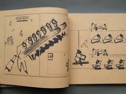
For Ibrahim R. Ineke, horror is hidden and forgotten knowledge brought to light. It's poking around in the woods and seeing things not meant to be seen. It's encountering ancient beings that look like children whose presence will bring no good. It's forbidden speech being spoken aloud, forbidden rituals made part of the everyday. It's the understanding that civilization is a facade, something that will fall away in time and be overtaken by the forest and its denizens. Ineke has been working and reworking self-published adaptations of Arthur Machen's 1904 story "The White People" over the last couple of years, culminating in a hardback publication issued by Dutch publisher Sherpa in 2015.
Ineke has long used three visual techniques. First, there's his own elegant pen-and-ink line. There's a delicacy, almost a fragility to his line that nonetheless allows for a great deal of naturalistic detail. His faces are mostly naturalistic, though they do have a slightly cartoonish quality that sometimes turn into twisted, terrifying images. His second technique is an extensive use of photocopying to repeat and distort images, often using double and even triple exposure. Along with the increasingly dark images generated by photocopying, Ineke also uses a lot of thinly-applied white-out as a mark-making technique.
In The White People, that white-on-black imagery opens the book as we see a number of figures deep in the woods notable for their lack of presence. They take up white space but have no other definition. Then comes a scene that Ineke has repeated in a number of comics: two boys playing in the woods, playing at being warriors or wizards (one even invokes Lovecraft lore and Cthulhu) and one boy running a little ahead of the other. In a slow burn of one panel stacking atop the other and the images getting bigger, we see one kid sitting in a field, his head half disappeared. Ineke flips from the bright sun illuminating a field to a dark cave (jotted with dots of white-out) with waterfalls. The child is looking at another world and is forever changed. In the book, Ineke then repeats the interaction, this time in color, and then repeats it again, this time with the implication of ritualistic kidnapping. There's a chilling image of a child turning around and their face being the image of a sinister-looking house, one where it's implied all sorts of awful things take place, followed by a full-page shot of a feral child-like thing. The book ends with two detectives looking for the missing boys, with one of them oblivious to his surroundings and the other all too aware of what the woods represent, especially with regard to "the good folk" or fairies.
An earlier minicomics version of the story with the same title included an introduction that made this connection between the city's men of power and their occult connections that involved the ritualistic abuse of children, including a reference to a sequence of symbols that appears in the stories. While this was useful, Ineke's decision to excise that bit made sense given his emphasis on imagery and suggestion over explicit explanation. Witch Route is a short mini with some forest scenes and some key (reprinted) text about testimonials regarding children who had passed through fairy territory and came back horribly changed. Again, it's an establishing text that later became assumed and tacit. White Court is a hand-bound and assembled mini that makes the connection between kids and fairies more explicit, as it starts with a stag hunt that turns on the hunter when he is surrounded, turns to a man playing a flute being seduced by a fairy, and then segues to a different version of the two kids playing at combat with each other, this time in an abandoned building and direct intervention from fairies. There's a more structured division between chapters and additional scenes, none of which are more effective than what wound up in the book.
Also worth mentioning is No Maps, which is a collaboration with Niels Post alternating spam comments from the internet with Ineke's imagery. The images range from spare to intense to horrific to amusing. Eloise is about a missing young woman and starts with violent, ritualistic image at a punk show mashed up with imagery from Catholic ceremonies. That juxtaposition, of rebellion vs tradition, is at the heart of the comic in the way that her story is one of betrayal by those she loved most. It relates to the other comics in the way she rejects the city and what she has known before and instead embraces nature and the outdoors, ending the book climbing a mountain (and perhaps not coincidentally wearing a jacket with the named of the punk group The Damned on it). Here, it's all scribbles and texture with line instead of other effects.
Finally, there's the anthology miniseries Black Books, where every issue also feels like a lab for a larger story. Each issue begins with a reference to Saturn in an astrological sense, and each story has its own twist on horror. The first issue is yet another version of the two boys playing in the woods, this time with an explicitly vicious ending. The second issue is a darkly funny retelling of the fate of Orpheus, his severed head forever alive, meeting up with a Muse who uses his head to perform cunnilingus and then kisses him--and then tosses him away. The third issue returns to the city, where secret arrangements add a sinister quality to interactions between lovers and the custody of children shared between families. The fourth issue lifts dialogue from an earlier comic and makes it an interaction between a lord and a servant, who gives him a report in comic book form that is rejected but triggers a sort of breakdown of reality. The fifth issue is about a heist gone horribly wrong when reaching the forest and includes tales of a Robin Hood-style archer causing mayhem before the reveal of a ghastly child (an image used in The White People). Finally, the sixth issue is about a merciless, pitiless witch deftly outwitting a spiritual world full of male forces.
Wednesday, May 17, 2017
Tuesday, May 16, 2017
Moreton of the Week #3: Smoo 8-10
Let's take a look at the last three issues of the self-published series where Simon Moreton got his start, Smoo.
Issue #8, in several small vignettes, talks about different ways Moreton felt the weight of anxiety and stress, and the ways in which he found himself coping. Walking around Washington, DC in the fall, the sight of a snapping turtle on a rock was somehow reassuring. Reading Moreton's work over time, he's become remarkably assured in his minimalist take, as he's not afraid to draw big, bold strokes or use a few strategically placed and confident squiggles around a simply-defined central figure. The vignettes refer to a relationship that's in the process of being redefined and reevaluated on the fly, in the middle of what is ostensibly a vacation. In classic Warren Craghead fashion, when he talks about the pieces of the relationship being taken apart, the very text that proclaims this falls apart, drifting down the page. There's a remarkable segment where he's alone in a bar, where the pages flip open and fold apart, as he feels powerless to stop what's going on in his life, like a "drunken ghost". Finally, there is quiet reconciliation and more contemplative walks, the event of music suddenly breaking out on the street the kind of marvel that reminds us of the random gifts that life can bring.
Smoo #9 introduces a lot of text on its own pages, as a kind of reflection and amplification of the images on other pages. This issue reflects on family and previous states of mind. There's a touch of a regular Moreton theme in the way that friendship endures and in many way freezes one's age with that friend back to childhood, while also being aware of being adults. It's about gatherings of friends and families at wakes. It's about understanding how and why someone isn't doing well at a given time in one's life. In "Doubt", Moreton ponders the notion that he's never really "lived a day in my life". There's a recurring theme in his comics that he feels stuck, running in place and living an inauthentic life. That's countered by the way he observes his environment and treasures his friends, because the ability to perceive and then convey beauty is a remarkable act of authenticity.
The final issue, #10, touches on a number of these themes. There's a lot of text used once again, as he thinks about places he's lived and the visceral qualities of each: sights, sounds, smells, heat, cold, etc. There's an interest in larger forces that shape his days. From lingering in the past to capturing a moment comes Moreton watching a group of birds in the fog, and then following a path with a lover to find a waterfall. This time, it's conveying that sense of aesthetic experience that is both shared and entirely personal, relaying a few moments in time in as stripped-down a manner as possible. It's his way of relaying that sensation of the sublime, when things seem to be moving in slow-motion, seem to make sense and are heart-breakingly beautiful. The issue ends after another nature excursion and then a slow moment at home, saying "We've been changing" That's neither a positive nor a negative statement, simply a fact of mutual experience. In exploring deeply personal and individual thoughts while clearly trying to put them in a larger context, Moreton has expanded his range as an artist while still working within his strengths in depicting spare and expressive visual stimuli.
Issue #8, in several small vignettes, talks about different ways Moreton felt the weight of anxiety and stress, and the ways in which he found himself coping. Walking around Washington, DC in the fall, the sight of a snapping turtle on a rock was somehow reassuring. Reading Moreton's work over time, he's become remarkably assured in his minimalist take, as he's not afraid to draw big, bold strokes or use a few strategically placed and confident squiggles around a simply-defined central figure. The vignettes refer to a relationship that's in the process of being redefined and reevaluated on the fly, in the middle of what is ostensibly a vacation. In classic Warren Craghead fashion, when he talks about the pieces of the relationship being taken apart, the very text that proclaims this falls apart, drifting down the page. There's a remarkable segment where he's alone in a bar, where the pages flip open and fold apart, as he feels powerless to stop what's going on in his life, like a "drunken ghost". Finally, there is quiet reconciliation and more contemplative walks, the event of music suddenly breaking out on the street the kind of marvel that reminds us of the random gifts that life can bring.
Smoo #9 introduces a lot of text on its own pages, as a kind of reflection and amplification of the images on other pages. This issue reflects on family and previous states of mind. There's a touch of a regular Moreton theme in the way that friendship endures and in many way freezes one's age with that friend back to childhood, while also being aware of being adults. It's about gatherings of friends and families at wakes. It's about understanding how and why someone isn't doing well at a given time in one's life. In "Doubt", Moreton ponders the notion that he's never really "lived a day in my life". There's a recurring theme in his comics that he feels stuck, running in place and living an inauthentic life. That's countered by the way he observes his environment and treasures his friends, because the ability to perceive and then convey beauty is a remarkable act of authenticity.
The final issue, #10, touches on a number of these themes. There's a lot of text used once again, as he thinks about places he's lived and the visceral qualities of each: sights, sounds, smells, heat, cold, etc. There's an interest in larger forces that shape his days. From lingering in the past to capturing a moment comes Moreton watching a group of birds in the fog, and then following a path with a lover to find a waterfall. This time, it's conveying that sense of aesthetic experience that is both shared and entirely personal, relaying a few moments in time in as stripped-down a manner as possible. It's his way of relaying that sensation of the sublime, when things seem to be moving in slow-motion, seem to make sense and are heart-breakingly beautiful. The issue ends after another nature excursion and then a slow moment at home, saying "We've been changing" That's neither a positive nor a negative statement, simply a fact of mutual experience. In exploring deeply personal and individual thoughts while clearly trying to put them in a larger context, Moreton has expanded his range as an artist while still working within his strengths in depicting spare and expressive visual stimuli.
Monday, May 15, 2017
Alex Bodea's Six Breakfasts/One Lunch
Alex Bodea's Six Breakfasts/One Lunch is a self-published, hand-constructed book that almost has the feel of a dossier or other official set of documents.. The brown paper is rough on one side, shiny on the other. As an object, it's fascinating to look at, flip through and simply feel. It's a book that takes on macro subjects like worldwide terrorism, fascist totalitarianism and the refugee crisis and looks at them in the most micro manner possible. Bodea describes the minutia of working as a volunteer in Germany at a refugee center for displaced refugees, specifically in helping serve the titular six breakfasts and one lunch during the course of a week. There is no explicit, larger commentary; instead, this is simply the observations of a person helping other people get food.
Bodea's formal choices were interesting. The figures were painted with swift, squiggly brush strokes, providing just enough structure to understand figure, foreground, background and other key items. The text (which almost looks typeset) is circled on just one or two highlighted letters and then is pointed to a panel. With this simple set of tools, Bodea uses a landscape formatting to craft a number of panels about people waiting in line, the kind of food they eat, and what clean-up is like. Most of the refugees don't speak the same language as the coordinator, making some conversations difficult. The volunteer/author is able to help with the situation of one refugee's family, which he thought was being persecuted for having children by a childless couple. The careful smudges and brushstrokes quickly become an elegant kind of shorthand language that's both word and picture in its own way. The images are small and Bodea's strategy is to whip the eye across the page quickly, especially when depicting motion.
It is the details that allow Bodea to tell a bigger story. The refugees are in Germany and hoping for a better life. They have nowhere else to go. They are depending on the kindness of the centers, eager to eat the food in front of them and comfortable enough to complain when something's missing but also paranoid as to whether as to if the sugar is poisoned. Bodea helps someone who speaks the same language as him get to a train station, where they encounter a desperate man who has lost his papers on the underground. You may as well lose your soul or your memory in a situation like this. Bodea's ability to communicate so much with a simple brushstroke speaks to the power of that image as well as finding a way to create a rhythm with it. There are small joys and small heartbreaks, often revolving around children. There is bureaucratic weirdness (the volunteers have to handle certain items, usually for liability reasons), but there's also a genuine sense of caring. In the back of the book, added as inserts, are a couple of cards that detail certain items (the book is heavily object-oriented, meaning different foods and their containers most often) and how they made Bodea feel, as well as another card that has a "list" of characters and where they were from. Above all else, the book reveals the daily life of the dispossessed (and it is hinted that many of them are Muslim), those hoping for a new and better life, and those who haven't quite reached it yet but are being materially aided and not abjected by the people in their potential new homes.
Bodea's formal choices were interesting. The figures were painted with swift, squiggly brush strokes, providing just enough structure to understand figure, foreground, background and other key items. The text (which almost looks typeset) is circled on just one or two highlighted letters and then is pointed to a panel. With this simple set of tools, Bodea uses a landscape formatting to craft a number of panels about people waiting in line, the kind of food they eat, and what clean-up is like. Most of the refugees don't speak the same language as the coordinator, making some conversations difficult. The volunteer/author is able to help with the situation of one refugee's family, which he thought was being persecuted for having children by a childless couple. The careful smudges and brushstrokes quickly become an elegant kind of shorthand language that's both word and picture in its own way. The images are small and Bodea's strategy is to whip the eye across the page quickly, especially when depicting motion.
It is the details that allow Bodea to tell a bigger story. The refugees are in Germany and hoping for a better life. They have nowhere else to go. They are depending on the kindness of the centers, eager to eat the food in front of them and comfortable enough to complain when something's missing but also paranoid as to whether as to if the sugar is poisoned. Bodea helps someone who speaks the same language as him get to a train station, where they encounter a desperate man who has lost his papers on the underground. You may as well lose your soul or your memory in a situation like this. Bodea's ability to communicate so much with a simple brushstroke speaks to the power of that image as well as finding a way to create a rhythm with it. There are small joys and small heartbreaks, often revolving around children. There is bureaucratic weirdness (the volunteers have to handle certain items, usually for liability reasons), but there's also a genuine sense of caring. In the back of the book, added as inserts, are a couple of cards that detail certain items (the book is heavily object-oriented, meaning different foods and their containers most often) and how they made Bodea feel, as well as another card that has a "list" of characters and where they were from. Above all else, the book reveals the daily life of the dispossessed (and it is hinted that many of them are Muslim), those hoping for a new and better life, and those who haven't quite reached it yet but are being materially aided and not abjected by the people in their potential new homes.
Thursday, May 11, 2017
Comics-As-Poetry #2: Linen Ovens
Linen Ovens is a 2014 anthology featuring four cartoonists who would continue to carve out interesting paths in comics-as-poetry. Keren Katz, a rising star in the comics world, led off with "A Picture Of Health", a story that features a frequent motif in her work: a narrative thickness that is immersive in the sense that it demands a reader's full attention and a willingness to adhere to the frequently playful, absurd quality of her imagery. At the same time, Katz also uses a lot of negative space in her page design, letting the reader breathe and refocus their gaze on a page-by-page basis. Using colored pencil and a distorted figure composition, Katz weaves a tale about performance, celebration and secrets, as creatures pour from a tree to provide gifts and secrets. The use of color is dazzling and is crucial to moving the eye across the page in the ways in which Katz wants. The story follows the flights of imaginative fancy that follow after attending the ballet, with text that adheres to figures and creeps around the page. The tone is one of strange delight throughout the story, which befits the images.
Molly Brooks' "Selvage" leans heavily on its two-tone effect in addressing memory and place. The dark green of the sweater that's been knitted and its inner fibers is analogous to the narrator's thoughts, plans and dreams unraveling. The flashbacks to the finished sweater and a lover now gone add poignancy to the interminable Now the narrator finds herself in, having lost both a burden and a gift. Andrea Tsurumi's comics always tend to hew closer to light absurdism. In "Hectacle", there's a nursery rhyme cadence to the disparate set of farm-related images and the text that accompanies them, especially the phrase "biscuits and breath". Alexander Rothman's "The Thing In The Wall" is illustrative of one of his main interests: the poetic qualities of brief, quotidian moments. This story is about hearing a sound when one is about to drift off to sleep, a sound that shouldn't be there. It goes beyond simple fear or annoyance and instead follows a different path, as the narrator drifts into a dream (in a beautifully bright image that's a nice contrast to the greyscale of the other pages) and considers the way time is warped by perception, sleep and seasons. He ponders the theoretical existence of the animal he thinks he hears and mourns its theoretical passing in a touching panel where he's leaning up against a wall and the ghost animal is on the other side.
This is a strong, if short, anthology. It's a good forerunner/companion piece to Rothman's Inkbrick anthology and an excellent primer for just how broad a category comics-as-poetry can be. For Katz, it's about the image in itself that creates meaning. For Tsurumi, it's formal juxtaposition. For Brooks, it's poetic and abstract language that is aided by the drawings to help communicate the emotions involved. For Rothman, the images are conventional and the text is descriptive, but their combination is indicative of a place outside time and our conventional understanding of the everyday. It's a great place to start for those new to comics-as-poetry.
Labels:
alexander rothman,
andrea tsurumi,
keren katz,
molly brooks
Wednesday, May 10, 2017
Moreton Of The Week #2: Rain and What Happened
Catching up with some more by Simon Moreton:
What Happened. A Kilgore Books release (one of my favorite small publishers around), leans heavily on Warren Craghead in terms of some of the actual drawings, but in terms of composition it's very much something else. Like Craghead, Moreton uses a lot of extremely thick lines in his drawings as a weigh of emphasizing weight, space and presence. They are deliberately non-naturalistic, as they are designed to make the reader think about that space and the drawing that's there than actually represent something. He uses zip-a-tone for similar reasons. Moreton messes around a lot with different grid designs, going from a four panel grid in the early going to an open-page layout on facing pages and back to the four-panel grid. When the storyline took on a slightly added level of complexity, Moreton quietly went with a six-panel grid that then filled up the page (he left negative space with the four panel grid). It's all part of the fluid rhythm of the comic, that sensation of rising and falling, of going from calm to excited and back to placid.
The structure of the comic revolves around a spring and summer Moreton spent as a teen. Using very few words, he gets across that amazing feeling when you're old enough to organize activities with your friends, go over to their houses on your own, etc. He also details the ways in which teens are sort of emotional ticking time bombs. There's one scene where Moreton is at a friend's house, and his friend just launches into a brutal brawl with his younger brother, leaving Moreton sitting there stunned. Another finds Simon and his friend Hadyn renting a UFO video that freaks them out; it's one of the two page, open-panel spreads, along with the fight. There are first loves, walks in the woods, trips to the beach, games of football and a glorious concluding segment where Moreton and his friend sit in a car, absorbing the words and music to a song from a tape they put in. Moreton is recording not a season, but rather a chunk of time specific to his friendship, and it ends with this segment, this song, the images and words jumbling together until the memory fades and the book ends with a number of blank panels in a row. Moreton had told the audience "what happened" and no more.
Rain and Other Stories. This is a more spontaneous effort, drawn from cues provided by Moreton's friends. The first story is "Three Transgressions", which Moreton imagined as people in fancy dress jumping fences and climbing through windows. This slightly moodier, darker work from Moreton, but it doesn't quite coalesce as well as his other work, especially since the rhythm of the piece feels off. "Fizzy Drink" goes back to his well of childhood stories, where here the hope of a new soda turns out to be disappointing. It's the opposite of a special childhood memory; it's a memory because of the way it so strong affected the sense of taste. "Rain" is the true highlight of this mini, as it combines a nice looseness in Moreton's line with strong compositions with regard to the buildings and trees (I love the way they almost jut up against the rain), The rain itself is drawn in a simple way that varies in intensity from panel to panel, as we see it batter a pedestrian until the lines get shorter and fewer and the storm goes away. Here, the length of the story really works to its advantage, as it needed to be a bit long to give the shower a real lifespan that has the correct feel, while still whipping across the page quickly enough to follow the story's main figure through the rain. The result is a beautiful, visceral story about watching and experiencing a rainstorm.
What Happened. A Kilgore Books release (one of my favorite small publishers around), leans heavily on Warren Craghead in terms of some of the actual drawings, but in terms of composition it's very much something else. Like Craghead, Moreton uses a lot of extremely thick lines in his drawings as a weigh of emphasizing weight, space and presence. They are deliberately non-naturalistic, as they are designed to make the reader think about that space and the drawing that's there than actually represent something. He uses zip-a-tone for similar reasons. Moreton messes around a lot with different grid designs, going from a four panel grid in the early going to an open-page layout on facing pages and back to the four-panel grid. When the storyline took on a slightly added level of complexity, Moreton quietly went with a six-panel grid that then filled up the page (he left negative space with the four panel grid). It's all part of the fluid rhythm of the comic, that sensation of rising and falling, of going from calm to excited and back to placid.
The structure of the comic revolves around a spring and summer Moreton spent as a teen. Using very few words, he gets across that amazing feeling when you're old enough to organize activities with your friends, go over to their houses on your own, etc. He also details the ways in which teens are sort of emotional ticking time bombs. There's one scene where Moreton is at a friend's house, and his friend just launches into a brutal brawl with his younger brother, leaving Moreton sitting there stunned. Another finds Simon and his friend Hadyn renting a UFO video that freaks them out; it's one of the two page, open-panel spreads, along with the fight. There are first loves, walks in the woods, trips to the beach, games of football and a glorious concluding segment where Moreton and his friend sit in a car, absorbing the words and music to a song from a tape they put in. Moreton is recording not a season, but rather a chunk of time specific to his friendship, and it ends with this segment, this song, the images and words jumbling together until the memory fades and the book ends with a number of blank panels in a row. Moreton had told the audience "what happened" and no more.
Rain and Other Stories. This is a more spontaneous effort, drawn from cues provided by Moreton's friends. The first story is "Three Transgressions", which Moreton imagined as people in fancy dress jumping fences and climbing through windows. This slightly moodier, darker work from Moreton, but it doesn't quite coalesce as well as his other work, especially since the rhythm of the piece feels off. "Fizzy Drink" goes back to his well of childhood stories, where here the hope of a new soda turns out to be disappointing. It's the opposite of a special childhood memory; it's a memory because of the way it so strong affected the sense of taste. "Rain" is the true highlight of this mini, as it combines a nice looseness in Moreton's line with strong compositions with regard to the buildings and trees (I love the way they almost jut up against the rain), The rain itself is drawn in a simple way that varies in intensity from panel to panel, as we see it batter a pedestrian until the lines get shorter and fewer and the storm goes away. Here, the length of the story really works to its advantage, as it needed to be a bit long to give the shower a real lifespan that has the correct feel, while still whipping across the page quickly enough to follow the story's main figure through the rain. The result is a beautiful, visceral story about watching and experiencing a rainstorm.
Tuesday, May 9, 2017
2DCloud: Sprawling Heart & Perfect Hair
Sprawling Heart, by Sab Meynert. 2dcloud has never been afraid to publish books that don't neatly fit into categories, and Meynert's book is no exception. I believe it's best described as an illustrated prayer and invocation for healing. The lush illustrations, including delicate pencil drawings, elaborate design work and vibrant use of color, give the eye something powerful to work with when paired against the relatively spare use of text. The prayer is about staying open, staying aware, looking for help and looking for connections. There's a repeating visual motif of flowering amidst an open hand, representing perhaps that it's important to understand how to be open to the things life can offer you, that one's mental state is key to accepting or not accepting what life has to offer, in all of its incarnations. The comic is all about flow, fluidity and water's paradox in being droplets and a wave all at once. That metaphor is used to explain our position relative to others: we are all water, whether we realize it or not, and we can either flow or resist--but the river will always keep moving.
Perfect Hair, by Tommi Parrish. This is an audacious debut by Parrish. It's interesting that Dash Shaw offered up a blurb, because among the many influences that Parrish cycled through in the course of this book, Shaw was the most significant. The layout, the use of diagramatic text, the use of textual onomatopoeia in place of more typical sounds effects, and simple line are all there--except when they're not. Eleanor Davis is another obvious influence, and there may be hints of Gary Panter, Chris Ware and many others. What's remarkable is the way they are able to dial in and out of a particular visual style, often in the middle of a story. In "Train Scene", Parrish begins with a naturalistic color setting at the station, then switches to a pencils-only page, and then to the big, blobby character design they use for much of the book. In other words, the "real" image, the self-image, and the way she looks at others. The result is a style for Parrish that becomes uniquely theirs, whipping the reader from narrative fragment to narrative fragment while still retaining a cohesive set of character profiles.
This book is a short, punchy series of vignettes about gender identity, sexual identity and its boundaries, isolation and alienation. In particular, it's about the feeling of being embodied and being alienated from one's body. The two leads (and as it is implied, lovers) Nicola and Cleary, each experience these feelings in their own way. Nicola is a bespectacled sex worker and artist who is at once settled in her life but also has trouble accepting the narrative put upon her as a constantly objectified sex object. There's a remarkable scene where she is hearing the narrative of a guy trying to run his patter on her. She pops off her breasts and then eventually pulls herself out of her body, leaving behind the colored form of her skin to reveal a stick figure, walking away. Later, Nicola encounters another familiar John trope: the white knight. He wants her to act like she's in love with him, and then later says he can "save" her from "all this" because he has money and wants to make her his wife for real. (Hilariously, she replies, "This what? This conversation?")
Meanwhile, Cleary (named for Beverly Cleary, perhaps?) is the cool Nicola's opposite. She goes to what appears to be a kind of fetish club and panics when a man doesn't so much frighten her with his desire, but rather puts her off as he begs her for validation of his existence. In fact, the player, the white knight and the man in the club all rely on the women in the book to validate their existences in one way or another. Cleary's reaction was to have a panic attack, but she also had learned how to control them with breathing exercises, a key point that illustrates the ways in which both Nicole and Cleary have found ways to navigate and even control their environments. When a doctor later mistakes Cleary for a boy, she doesn't mind. This touches on an earlier story where the characters aren't named and the figures look different, but it is clearly Nicola and Cleary's story and personal backstories, one of which refers to Cleary eventually coming out as trans. The way Parrish loops the reader in and out of these narratives rewards multiple readings, as the connections become clearer and the sheer craft setting up subtle signals is remarkable. Parrish's use of color is frequently sublime, evoking emotion while still staying true to the figures. This is a remarkably ambitious novella that hits every emotional beat while employing an array of narrative tricks that are more than just formal pyrotechnics.
Monday, May 8, 2017
Fantagraphics/Hic & Hoc: Vague Tales & Dad's Weekend
Vague Tales, by Eric Haven. In a lot of ways, Vague Tales, is the logical conclusion to the sort of comics Haven's been doing for a long time. The weird attachment to barbarian stories, witchcraft, monsters, superheroes and regular guys standing their living room have all formed the background of his storytelling interests for years. The level of craft he attaches to each demonstrates a familiarity and an affection for genre tropes that is undeniable, yet he comes at them in such an odd way that it's hard not to chuckle at his storytelling decisions. This is not naive storytelling that is funny in spite of what the author intends; rather, Haven's approach is clearly entirely calculated. The riffs on slice-of-life comics spinning out of control make that obvious. The reason why it works is because his use of mostly silent storytelling adds a level of dryness to the proceedings that is often lacking in overheated genre potboilers, where writers insist on purpling up the prose to within an inch of the story's life. Instead, Haven focus on what a kid would see: striking images, strung together in such a way where it's easy to understand what's happening, even if the reader has no clue as to why.
That titular vagueness helps make the stories funny. What sets apart this very slight book (just 74 pages, including the end papers) is the way Haven throws story after story at the reader and then has them bleed into each other in unexpected ways. It opens with a man standing in his living room, but the first story proper is "Psylicon", which is four pages of a crystalline man with thoughts like "ponder" and "brood" whose head explodes on the last page. It's a parody of 70s Marvel comics filled with cosmic characters who moped around the universe. "Ruin" features an emaciated ghoul of a woman (a favorite Haven trope) who flies around in a biplane, shoots down a spaceship and sucks the souls out of the pilots before they crash. "Pulsar" features a barbarian character who looks uncannily like the 1970s Captain Marvel character with his costume all but torn off, and he decapitates a monster. "Sorceress" finds the titular character going into a mountain until she encounters the head of the crystalline man.
That's the pivot point for Haven, who suddenly brings all the characters crashing together. There are fights, mysterious connections, and as is often the case in a Haven comic, the end of the world. Only it isn't--it might be just a thought in the crystal man's head, or in the imagination of the man in his living room, who is only flesh and bone, as both the cover and the last page of the story indicate. What does it mean? Well, it's vague. Every story is about pointless violence, pointless destruction and a general dealing in pointlessness. Why does anyone do anything in these stories do anything? They obviously feel compelled, which is funny considering the man in the living room seems to have no compulsions or agency of his own, other than to daydream and imagine other characters with a purpose, no matter how banal or pointlessly violent. They're vague because the limits of the man's imagination allow them no further shape. They're the images of a man-child, and it seems that Haven is satirizing that tendency toward indulging this sort of infantile fantasy as much as he is celebrating it.
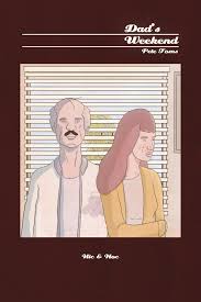
Dad's Weekend, by Pete Toms. This is a character study that is impeccably structured. It's about a conspiracy theorist and his young adult daughter, and their attempt to reconnect over a weekend. It's a funny, slow-burning, slow-building story that is also genuinely sad. The story is mostly told from the highly sardonic point of view of his daughter Whitney, and the story starts with her friends telling hilariously detached stories about their horrible futures, including one who plans to be a "failed arthouse film director", going into great detail how he will accomplish such a thing. Whitney has her own "20 year plan" of failure which is equally funny, as she and her dad exchange quips. Then the already-strange story takes a weird turn, when Manny (the dad) finds out that a friend of his is missing. This leads to a hilarious but unsettling series of events where he talks to his wife, detects something off about her and then throws a hot drink in her face.
Essentially, he was so deep in conspiracy theory decoding that he had altered his own perceptions, or rather lived in a world where what was coincidence or a trick of the ey. e became proof that his friend's wife was a lizard person. When he was found dead ("he ran himself over in a parking lot"), Manny attends the funeral and screams "This funeral is a false flag!" Eventually, he reveals the source of his paranoia: the existence of his daughter. When he saw what he perceived as the sheer terror of being alive in her eyes as an infant, it drove him from being a person who saw meaning in nothing to someone who desperately yearned to find the secret meaning of everything. It's classic conspiracy thinking, in that it's better to believe that some horrible force is in control of the world (and hence your life) than to believe that nothing and no one is control, and that everything is random and chaotic. Toms is playful at times with regard to the reality of the situation (especially in the last panel of the story), but the reality is less important than that conspiracy theorist's state of mind. The paradox is that "awareness" of the conspiracy induces a kind of debilitating madness that's exactly what They would want for you anyway. Visually, the comic has an odd flatness to it. It looks like it was drawn on a computer, and it relies on color fills quite a bit to tell the story. The strange visual tone of the comic is a perfect match for the flatness of affect of both of the main characters, who both deflect the sad reality of their situations by denying it in some way
That titular vagueness helps make the stories funny. What sets apart this very slight book (just 74 pages, including the end papers) is the way Haven throws story after story at the reader and then has them bleed into each other in unexpected ways. It opens with a man standing in his living room, but the first story proper is "Psylicon", which is four pages of a crystalline man with thoughts like "ponder" and "brood" whose head explodes on the last page. It's a parody of 70s Marvel comics filled with cosmic characters who moped around the universe. "Ruin" features an emaciated ghoul of a woman (a favorite Haven trope) who flies around in a biplane, shoots down a spaceship and sucks the souls out of the pilots before they crash. "Pulsar" features a barbarian character who looks uncannily like the 1970s Captain Marvel character with his costume all but torn off, and he decapitates a monster. "Sorceress" finds the titular character going into a mountain until she encounters the head of the crystalline man.
That's the pivot point for Haven, who suddenly brings all the characters crashing together. There are fights, mysterious connections, and as is often the case in a Haven comic, the end of the world. Only it isn't--it might be just a thought in the crystal man's head, or in the imagination of the man in his living room, who is only flesh and bone, as both the cover and the last page of the story indicate. What does it mean? Well, it's vague. Every story is about pointless violence, pointless destruction and a general dealing in pointlessness. Why does anyone do anything in these stories do anything? They obviously feel compelled, which is funny considering the man in the living room seems to have no compulsions or agency of his own, other than to daydream and imagine other characters with a purpose, no matter how banal or pointlessly violent. They're vague because the limits of the man's imagination allow them no further shape. They're the images of a man-child, and it seems that Haven is satirizing that tendency toward indulging this sort of infantile fantasy as much as he is celebrating it.
Dad's Weekend, by Pete Toms. This is a character study that is impeccably structured. It's about a conspiracy theorist and his young adult daughter, and their attempt to reconnect over a weekend. It's a funny, slow-burning, slow-building story that is also genuinely sad. The story is mostly told from the highly sardonic point of view of his daughter Whitney, and the story starts with her friends telling hilariously detached stories about their horrible futures, including one who plans to be a "failed arthouse film director", going into great detail how he will accomplish such a thing. Whitney has her own "20 year plan" of failure which is equally funny, as she and her dad exchange quips. Then the already-strange story takes a weird turn, when Manny (the dad) finds out that a friend of his is missing. This leads to a hilarious but unsettling series of events where he talks to his wife, detects something off about her and then throws a hot drink in her face.
Essentially, he was so deep in conspiracy theory decoding that he had altered his own perceptions, or rather lived in a world where what was coincidence or a trick of the ey. e became proof that his friend's wife was a lizard person. When he was found dead ("he ran himself over in a parking lot"), Manny attends the funeral and screams "This funeral is a false flag!" Eventually, he reveals the source of his paranoia: the existence of his daughter. When he saw what he perceived as the sheer terror of being alive in her eyes as an infant, it drove him from being a person who saw meaning in nothing to someone who desperately yearned to find the secret meaning of everything. It's classic conspiracy thinking, in that it's better to believe that some horrible force is in control of the world (and hence your life) than to believe that nothing and no one is control, and that everything is random and chaotic. Toms is playful at times with regard to the reality of the situation (especially in the last panel of the story), but the reality is less important than that conspiracy theorist's state of mind. The paradox is that "awareness" of the conspiracy induces a kind of debilitating madness that's exactly what They would want for you anyway. Visually, the comic has an odd flatness to it. It looks like it was drawn on a computer, and it relies on color fills quite a bit to tell the story. The strange visual tone of the comic is a perfect match for the flatness of affect of both of the main characters, who both deflect the sad reality of their situations by denying it in some way
Subscribe to:
Posts (Atom)