Monday, September 12, 2016

Fantagraphics: Conor Stechschulte, Robert Triptow


The Amateurs, by Conor Stechschulte. I reviewed the self-published version of this book already, but the updated version has a few changes that are worth mentioning. Stechschulte tossed out the original prologue involving a couple of men finding a severed head that was talking. Instead, it became two young women who found the head near the sinister river, a shift that became especially effective thanks to the addition of some new interstitial material in the form of (presumably) the same woman's library. Adding the diary sequences also helped tie in the secondary plotline of the two women who visited the butcher's shop and added more mystery and depth to the symbology of the river. Stechschulte also makes the whole thing in black and white, removing the abstract, color interstitial pieces that divided up the story and replacing them with the diary pieces. The story is still entirely ambiguous, it's just ambiguous now in a different way. The book is so disturbing for two reasons: first, because the characters in the story are constantly either forgetting what's happened or pretending to forget what's happened in the interest of preserving a veneer of sanity and reality as usual. Second, the river is a powerful force in this story, as the normally beneficial aspects of a river are not only absent, Stechschulte implies that the river is a tool of an actively malevolent force. The book is so disturbing not just because of the gore (which is still largely played for laughs), but because of the sinister, silent forces that inspired it.

Class Photo, by Robert Triptow. Triptow is a long-time underground artist and one of the former editors of the crucial Gay Comix anthology. The concept behind this, his first book, was the explication of an old high school class photograph from the 1930s, imagining the names and backstory of every single person in the photo (and several who weren't). Triptow hit upon an important narrative idea, which is that the best part of any story about high school or college is the epilogue, where we learned what happened to each character. Well, this book consists almost entirely of that, with just enough information to make the reader aware of what they were like in high school. What Triptow does in the course of this book is get set silly and then sillier as his characters endure typical high school cruelties and then go on to live atypical lives. Triptow's writing is sort of like long-form improv, as he weaves characters in and out of each other's lives, makes callbacks to earlier jokes and characters, and drops one narrative only to pick it up mid-stream later in the book. With each person in the photo providing a blank slate, he was able to create a remarkably complex (if totally nuts) series of plots and subplots.


Take Rudolph Valentino Kominsky, for instance. Ridiculed by other kids for his name, he vowed vengeance on them all and became a spy for the Nazis during World War II. His narrative drops away until we meet Fritz Beauhacker, "the only US civilian killed during World War II". Kominsky winds up shooting him. Then there are the members of the Bad Girls club, Stella Jakov and Trixie Trotlikk. A gay character doesn't notice the girl who's in love with him because he's in love with a boy who doesn't react well when a pass is made at him. Triptow makes it work in part because his knowledge of the era is exacting enough that he could make references that made sense and became a key component of his gags. At the same time, he was loose enough to let flights of fancy take him wherever they directed, be it about clairvoyants, exchange students, ultra-rich kids, thick accents and being so unmemorable that folks didn't even know she was there. There's no question that Triptow's art does a lot of the heavy narrative lifting in this book, adding a surprising amount of warmth to go along with caustic satire of New York bourgeoisie.

Triptow's art reminded me of any number of cartoonists, but Robert Crumb is the most obvious. There's also shades of Roberta Gregory, Justin Green (in a big way) and others in his cartoony but still naturalistic style. It wasn't so much that his drawings were inherently funny (like a Will Elder0, but rather that he drew funny things that disarmed readers with charm, wit and the occasional streak of cruelty. One senses that he could have made up new characters and folded them into loose narrative indefinitely, but the further the book went on, the more that Triptow started to close the ranks a bit so he could tell the final story. Triptow's hilarious mocking of hypocrisy is at the heart of the post-high school lives of these characters, as he is more than happy to make fun of familiar high school tropes and melodrama. For a quirky (almost) vanity project, it's remarkable how wide-raging and all-expansive the world Triptow created is. It's also consistently funny from beginning to end, as Triptow's exaggerated style works in concert with his instincts as a gag man. It's a testament to his skill that he was able to turn a solid high concept into reality on page after page of this ridiculous novella, as well as the fact that despite a certain expected nastiness on the page, Triptow shows a remarkable amount of empathy for his creations.

Friday, September 9, 2016

Secret Acres: MK Reed, Robert Sergel

Palefire, by MK Reed & Farel Dalrymple. Secret Acres has built their backlist on collecting minicomics into full-length books. MK Reed and Farel Dalrymple's Palefire is something more unusual, as it's a comics novella originally written and drawn by Reed and now adapted by Dalrymple. Dalrymple has collaborated with Reed on other projects and strikes me as an ideal partner because his ability to depict naturalism and body language fits nicely with Reed's dialogue-driven comics about relationship conflicts. This one's about a teen named Alison who is interested in Darren, a suspected firebug that everyone warns her about. The book follows their interactions at a party and then what happens afterward when they leave.

The strength of Reed's work has always been her ear for dialogue, but I also liked the way she gave every character a fair shake in the book. Darren was obviously a creep, but Reed made him sympathetic. Alison's unwillingness to listen to the judgment of others was her major flaw, but her willingness to give others the benefit of the doubt was her greatest strength. I especially liked the character of Tim, the self-righteously obnoxious junior EMT who rescues Alison at the end and has a huge crush on her. His bluntness and lack of tact made him seem like an almost borderline Asperger's type, only with a bit more social awareness. Still, Reed managed to make this "heroic" figure insufferable and the villainous character sympathetic without warping the story or playing favorites. Everyone in the story is flawed. Dalrymple is adept at making the worst tendencies of each character evident simply through his visual representations without doing it in an obvious way. The way Tim dresses and stands betrays his awkwardness. Darren's posture makes him look like a predator. Alison's trusting nature is revealed through the way she sat relative to Darren. Reed cleverly upset expectations that might have been created thanks to teen-story cliches, as sometimes it is best to trust the instincts and experience of others.

Space, by Robert Sergel. This is the quintessential Secret Acres publication, as they've collected various minicomics by Sergel in one smart-looking package. Considering that these quasi-autobiographical stories are all connected over time, this collection and the way it was edited and arranged made it a particularly appropriate choice for the publisher. Sergel uses a stark, clear line with lots of black and white contrasts but little in the way of greys or hatching. The naturalistic but deadpan drawings combined with the crisp and thin nature of Sergel's line made for a "cool" reading experience in the McLuhan sense. The drawings are restrained in every way, especially emotionally, as Sergel forces the reader to pay close attention to what is being said and done in order to pick up cues as to what's really going on. It's a smart decision, because the strips in this book are actually packed with emotional trauma, anger, and bitter resentment.

It's also frequently quite funny, like the strip where a guy eats lobster's brains and says "I know things". Another example is "The Talk", where the book's protagonist (as a kid) asks his father about sex. His father, watching a baseball game, doesn't even bother looking away from it as he says "It's when a man puts his penis into a woman's vagina". That's followed by the boy asking his dad to explain the infield fly rule. More typical of the tone of the book is "Thirteen Bad Experiences Involving Water", which is funny in a cringe humor sort of why, as the young man encounters a series of humiliations involving water, like being spotted peeing off the side of a boat by some girls or being ridiculed for having to wear ear plugs in the pool.

"My Famous Grey Sweatshirt" is both a chronicle of the most trivial of objects (a beloved article of clothing) but also an account of the main character's obsessiveness. "Up Up Down Down" is a chilling story about him remembering a friend dying in an accident immediately after being dressed down by our familiar protagonist for hurting him by accident. Here, Sergel demonstrates his skill in using the slightest changes in expression to convey far greater emotional meaning, aided in part by his panel-to-panel transitions and tendencies to linger on key images. "Growth" is another fascinating story about coming to grips with mental illness; in this case, it's panic disorder. He goes to a disco as part of immersion therapy to confront his fears. One technique that Sergel used in the book was to have the narration comment on the images in unexpected but sometimes clinical or detached ways. In this story, the symptoms of a panic attack are listed as he's clearly about to lose it, until a bride-to-be at her bachelorette party asks him to dance and then later asks him to spank her. It's about as much of a best-case scenario as can be imagined, until the reader learns that she was doing it as part of a "bachelorette scavenger hunt".

The final story, "It's An Awesome Thing When The Spirit Leaves The Body", was clearly the most directly autobiographical vignette in the book. It's about the protagonist and his mother deciding to track down her black-sheep uncle, who turned out to be an illustrator. It's a delightful story about forming unexpected connections, both for his great-uncle (whose gruff manner was just a cover for his generous spirit and loving nature) and for the protagonist, who was fascinated by the way his great-uncle consistently bucked his family's desires for him to conform. It's also a story about how creating those connections is a powerful comfort in times of loss. It also connects the central theme of the book: the relationship of bodies in relation to each other. He starts off with Ptolemy and ends with Galileo, noting along the way whether the sun revolves around the earth or whether the earth revolves around the sun, metaphorically speaking, is less important than the fact that the two objects have a relationship with each other. In making this comparison, Sergel both acknowledges and cleverly undermines his own position as protagonist (the center of the universe), because their relative places in the heavens, so to speak, was less important to his great uncle than the fact that he had someone there. There is no single story, only a series of orbits in space.

Thursday, September 8, 2016

Secret Acres: Reid Psaltis, Brendan Leach

The Order of Things, by Reid Psaltis. The Secret Acres publishers, Leon Avelino and Barry Matthews, have as quirky an aesthetic as any publishers I know. Their tastes are unusual but wide-ranging, making it impossible to pin down an overall Secret Acres aesthetic the way one can with say, Drawn & Quarterly or NoBrow. Take the new book from Reid Psaltis, for example. It's a non-narrative set of drawings of animals and dinosaurs that at first is painstakingly accurate in terms of the drawings and then eventually devolves into wordplay and total silliness. I can't think of a single comparison in the SA family as an access point, and that's what makes the publisher so unpredictable. There's a drawing of a Bald Eagle talon that's as good a scientific illustration as you will ever see. The stippling and overall detail is remarkable. The text describing it is a joke at the expense of the Founding Fathers. Other illustrations are gorgeous, almost impressionist water-colors of animals like the Pronghorn, and there's no amusing commentary at all.

Psaltis mixing things up keeps the reader off-balance in that regard, as one never knows what's coming next. The commentary gets stranger and funnier as the book goes on, like the remarkable drawing of the Great Horned Owl where its bones are arranged to form the shape of the animal, with only its piercing eyes appearing as per normal. The only comment is "Nightmare fuel for all species of rodents." As Psaltis leaves behind modern animals and starts to draw dinosaurs, things start to get really silly. Dilophosaurus is depicted eating "spicy, brothy, sauropad soup" (i.e., pho). Dinosaurs are dressed as X-Files characters, Star Trek characters, Game of Thrones characters, etc., with the most tenuous of puns stretched out to create gags. What's remarkable is that his skill as a cartoonist drawing funny images is just as sharp as his skill drawing scientific illustrations, and that's what makes the jokes work (because the wordplay is groaner-worthy). This is an odd duck of a book, ideal for someone less interested in comics and more interested in funny illustrations.


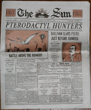
Pterodactyl Hunters In The Gilded City, by Brendan Leach. Leach first sent this, his masters thesis at the School of Visual Arts, out as a broadsheet on cheap paper, as it was meant to resemble a typical newspaper in the early 20th century. It was soon picked up by Top Shelf, went out of print, and is now being published by Secret Acres. This ambitious first work retains its status as an art object by way of cheap, mass-produced methods in the way the book was printed at a large size and the way it reproduced its original cover as the first page of the book. That fake newspaper cover is all part of its reimagining of New York City if it had been terrorized by pterodactyls.  This book is all about the end of an era and how young people coming of age during that time don’t want it to end–no matter how horrible it actually is.

The book follows two brothers, Eamon and Declan Sullivan, who both work on the pterodactyl patrol.  No explanation as to why these dinosaurs are still alive and how they came to menace the city was given, nor was one really necessary.  The only important bit of information that we were given was that the dinosaurs had been hunted almost to extinction, due in no small part to the heroic efforts of the arrogant and off-putting Eamon.  Declan, his younger brother, toiled in his shadow as a watchman, hoping that he’d somehow get a shot at glory before the monsters were all dead.
Leach turned what could have been a cheap gimmick into a genuinely affecting story.  He drew his visual inspiration from sources few young artists seem inspired by these days: David Mazzucchelli (his thesis advisor), Ben Katchor and Eddie Campbell.  From Mazzucchelli, he seemed inspired by his Rubber Blanket-era stories, especially in terms of how he used pauses and stillness to tell the story.  Leach’s scribbly line is not unlike Campbell’s, especially when he used a skeletal line to depict quick motion in a single panel.  Katchor obviously inspired Leach’s development of the alternate history of New York from a bygone era.  In addition to using the same kind of evocative gray-scaling that Katchor employs, there’s also the same level of attention to detail.
While there is a remarkable amount of detail, what makes this comic such a success is Leach’s restraint as an artist.  He’s subtle in evoking the changes that would grip a city afflicted with this particular kind of terror, like merchants hurriedly closing up shop before sundown (hunting time for the pterodactyls) and particular ethnic groups clustering to the industry that sprang up to kill the monsters.  Leach lets the reader read between the lines of what’s motivating Declan, for the most part; he has a character reveal a plot detail late in the comic that explicitly spells out his motivations, which I thought was unnecessary.
The ending of the book is spectacular, as Declan is on the verge of killing the last pterodactyl, an act that would simultaneously fulfill his life’s goal of becoming a hunter and completely nullify that goal by making his dream obsolete.  The “Gilded City” subtitle is a telling one, as the book is set a few years after the world-weary “Gilded Age” in US history, an era of tedious decadence and little heroism.  "Gilded" also gets at the "golden age" angle of the story; it's an era of horrors for the populace at large, but a golden age for heroes and heroism. Killing the pterodactyl, Declan believed, would end that age of heroism, something he had always wanted to be a part of.  Leach is careful not to glamorize this in a couple of different ways.  First, the pterodactyls are killers and especially enjoy preying on children (no doubt because they’re easy targets).  At the same time, the dinosaurs are living beings with mates and nests; killing them is not a vanquishing of evil, but rather the culmination of a kill-or-be-killed process. The reader was brought in at the end of an era, building tension between the genuine benefits that this end augured and the desperate, selfish desire of a young man who didn’t want it to end but knew it was wrong to wish so. 

Wednesday, September 7, 2016

Dasha Tolstikova's A Year Without Mom

Dasha Tolstikova's debut A Year Without Mom is an odd duck, even for a Young Adult book. It's published by a Canadian press by a Russian cartoonist who is currently living in Brooklyn. It focuses on a major life event (living apart from one's parents for an entire year as a young teenager) that has only minor consequences in the course of the book. It depicts living in Russia in a turbulent time (the attempted coup of Mikhail Gorbachev and the subsequent quashing of a military coup by Boris Yeltsin) but with only minimal relevancy to her actual day-to-day life. All of that stuff is window dressing for the book's real themes: negotiating tenuous friendships and loves as a teenager. By focusing on those specific details, Tolstikova makes the book easily relatable to anyone, while the other details provide a different take on a subject that's been addressed any number of times in YA literature, including the realm of comics.

Published by Groundwood Books, the book's biggest strength is the quality of Tolstikova's drawings. They are simple and stripped down, with highly expressive scribbles and blushes of color on faces to heighten the emotions of each character. Much of the book is really illustrated, typeset text (including the word balloons), but Tolstikova counters the sterility of that approach with the liveliness of her drawings and the unusual angles she takes on a number of pages. She uses silhouettes, extreme close-ups, two-page spreads, decorative backgrounds and all sorts of other tricks to make the pages more interesting to look at. At its heart, however, it's her character design that's the real star of the show. That's mostly thanks to her keen understanding of body language, posture and other non-verbal means of communication, even with simply-rendered faces and bodies. In fact, the lack of extraneous naturalistic detail is what accentuates the other qualities of her character design.

While there are times that details like living apart from her mom and the near-coup in Russia threaten to become major plot points (reading the book, I kept thinking something bad was going to happen to someone), the real source of conflict in the book is between young Dasha and her friends Natasha and Masha. She admires both of them because she thinks they're cooler than she is, even if they don't approve of the older boy that she has a crush on.There's a subplot where her friends start becoming cold to her and then they both seem to drop out of school, but that's later resolved and smoothed over. Then Dasha drops out of school in order to study enough to take tests to get into another school. She comes close but not close enough, but that conflict with her grandmother is also smoothed over. Everything is smoothed over until her mother returns and says she's going to take her to live in America, and the book ends with someone trying to befriend her. Again, ending without going into any details about her new life doesn't make much narrative sense, but in terms of the emotional arc of the book (making decisions and navigating relationships without the help of her mother), the ending is clearly appropriate. The shy Dasha had learned how to handle herself in her mother's absence, and that's the only story arc that matters. It's not an especially sophisticated story arc, even for a YA comic, but that's where the extraneous details and in particular Tolstikova's art made the difference and produced a book that stands out.

Tuesday, September 6, 2016

Centrala: Gosia Herba & Mikoeaj Pasinski, Malgorzata Gurowska & Joanna Ruszczyk; Lene Ask

Fertility, by Gosia Herba & Mikoeaj Pasinski. This silent comic cuts deep to the bone in its horror, making the average Josh Simmons comic look like The Care Bears in comparison. It is certainly the most disturbing piece of fiction involving rabbits since Watership Down. Herba & Pasinski start with an unnerving premise--that a certain part of a rabbit promotes fertility when ingested--and take it far, far beyond that. The scratchy line art and sickly green wash add to the atmosphere of horror, but it's the page design that takes it over the top, as Herba's tendency to cram tiny panels on some of the pages forces the reader to deal with image after image rapidly cycling by.

The story starts with four young women who have just gotten married who are already fantasizing about having babies. One pulls out a book detailing how eating a certain part of a rabbit would make them immediately fertile and so they set out some nasty-looking traps to catch, kill and dissect a rabbit. The story then shifts from their point of view to the point of view of the rabbits, who are terrified that they lost one of their own and report back to their village, where we find rabbits in little houses and sleeping in beds. Seeking vengeance, a gang of rabbits kidnaps the women naked and take them before their giant rabbit king.

Their punishment is to be buried alive up to their necks for a certain period of time. They are then raped by males rabbits in a truly unsettling series of panels. The king is outraged that this occurred when they released the women and found them to be pregnant and the offending males are called out and forced into the rabbit equivalent of a shotgun wedding with the women. Things proceed to only get worse once the women give birth, as abuse, disease and other horrors pervade both the women and rabbits alike, and the ending gives little hope that anything will change. This is a brutal and uncompromising book, and there's any number of ways to interpret it. There's a angle that gives the book a man vs nature theme, but that seems to be a facile reading. At a deeper level, the book seems to be about the exploitation and subjugation of women that's done in an exaggerated fashion but that still touches dangerously close to reality. The women in the book are both predators and victims, but the price they pay winds up being unique to the experience of women.

Locomotive/Ideolo, by Malgorzata Gurowska & Joanna Ruszczyk. This is a gorgeous-looking art object of a book that's bound accordion-style so that the pages fold out, with each set of two pages forming a single image. The back side of the book is its own entity, providing commentary on the images and adding smaller images. Created by the designer/journalist team of Gurowska & Ruszczyk, they drew influence from the Polish poet and writer Julian Tuwim. While he was best known for his children's poetry (and the book draws direct inspiration from the poem "Locomotive"), he was also outspoken about any number of issues, including fascism, capitalism, anti-Semitism, nationalism and any number of other issues related to exploitation. The book is crafted like a childrens' book in the way that the pages flip forward. Gurowska's drawings remind me a lot of John Hankiewicz or Robert Sergel in their precise crispness and the stark black & white contrasts. The use of silhouettes to depict the contents of each car looks like the sort of comics that Anders Nilsen is drawing at the moment. That starkness immediately stands out as something one would not see in a kid's book and draws the reader's eye in as we see train car after train car with different payloads.

While the first few pages reproduce the images from the poem, the authors then switch over to far more provocative images, like animals caged for testing, nuclear weapons, and people of various ethnicities packed into cars for sinister final fates. The factoids and mini-essays on the back side of the folded-out book are pointed but reserved, choosing to focus on facts related to the disappearance of the rainforest. That said, the authors pull no punches in criticizing their home country of Poland, the USA, capitalism in general, and the exploitation of animals and the environment. It's as powerful, clever and unique a vehicle I've ever seen for what is mostly a fairly straightforward polemic. Gurowska's skill as an illustrator is remarkable, as she brings a dark sense of humor to certain images, a horrific absurdity to others, and a straightforward simplicity as a baseline that is nonetheless slightly unsettling because of the almost mathematical preciseness in her drawing style.

Dear Rikard, by Lene Ask. The Norwegian artist Ask was going through the archives of the local missionary records when she came across a series of letters between a father who was a missionary in Madagascar and the son he left behind in Norway. The boy did not see his father from the age of eight to the age of eighteen, and the letters point to the ache each felt in the absence of the other. Ask imagines their lives apart from each other as they pour their hearts out in letters. The first half of the book is mostly the father writing to the son, who was, after all, only eight years old and not confident with his handwriting. The pleas from his father to write more often reflected his guilt for leaving his children behind for his calling, a job that Ask subtly critiques by illustrating his father being carried by natives into town. His father is desperate to get a sense of what life is like at home for his children, as he's confused by the fragments that his son tells him about school, his grades, etc. In the second half of the book, Ask focuses on the letters Rickard writes, where he confesses that he's gotten into fights, received poor marks, etc, all while begging his father to come home. The final letter comes years later, when Rikard is in his thirties and his father relays how proud of him he is and how much he regretted not being able to be there. Ask's densely cross-hatched, naturalistic style is remarkable for how much life she breathes into these characters. She brings both Norway and Madagascar to life, with the humidity and hurricanes of the latter and the crisp air & snow of the former. This is a vivid account of how the intimacy and bonds of family can be tested over time. It's devoid of sentiment but is remarkable in its depiction of honest despair, sadness, loneliness and heartbreak.

Monday, September 5, 2016

Centrala: Ida Neverdahl & Oystein Runde

Moscow, by Ida Neverdahl & Oystein Runde. Moscow is the kind of project that's not unusual for a European publisher but is almost unheard of in the US. Some projects from certain publishers have just been to send a cartoonist to a new city for a while and write about that. In the case of this book, initially funded by government grants from Norway (and published in English by Polish publisher Centrala), two cartoonists who work in different styles and who had never met came together to create a jam comic about their experiences. The result is a pure delight, as both Neverdahl and Runde had an unusual synergy as collaborators despite their differences in style and ages. It helped that both had a sarcastic but not cruel sense of humor that was predicated on self-effacement.

Indeed, Runde opens up the book talking to a cartoonist friend who invited him on the trip to a comics festival in Moscow, after letting him know he was their third choice. Neverdahl's young age (she was just nineteen) and talent are emphasized as a running gag. Right away, the reader gets a clear understanding of just how different their styles were in terms of subject matter and visual style, yet there were surprising similarities in terms of the cruel streak of humor that permeated both of their works. There were some long excerpts of both of their works at the beginning of the book (folded into their plane ride to Russia), with Runde's comic being a gritty, dense and dark story about a warrior trying to outwit his executioners that ends with a truly grisly scene. Neverdahl's comic about her "horrible" job cuddling cute red pandas looks a bit like Julia Wertz crossed with Joey Allison Sayers, and her wit is every bit as dark as those two cartoonists.

The melancholy Neverdahl and the ebullient Runde made a great team, as he brought her out of her funk and she him someone to bounce off of. The book goes deep into Russian politics (Vladimir Putin is a constant topic of conversation), especially when the artists decide to attend a May Day demonstration that packed in Fascists, LGBT demonstrators (an especially brave act in Putin's toxically homophobic Russia), Anti-Fascists, Leftists of various stripes and old-school Stalinists into one fairly small area. While all of these groups had differences with each other, they all hated Putin even more. Runde's observations were amusing but reality-based, while Neverdahl's thoughts drifted into absurd reveries, like imagining the OMON (the Russian SWAT team, essentially) as unicorns.

There are some genuinely funny comics about the festival they attended (many of them about people falling in love with Ida and even giving her drawings they made of her) and a hilarious, extended fantasy sequence involving Putin. What's interesting about this book is just how fluid it all is. The artists had a knack of knowing when to stop and let the other "drive" for a while, and that variety made a travelogue into something special. It helped that the artists went somewhere interesting and were bold enough to try borderline-dangerous activities, but in the end it was the imagination and enthusiasm that the artists had for this project and each other's company that made this book such a fun experience. Of the books I've seen so far from Centrala, Moscow is the one that I think would go over best with American alt-comics fans.

Friday, September 2, 2016

NoBrow: Luke Pearson

The latest edition of Luke Pearson's Hilda series, Hilda And The Stone Forest, feels like a significant turning point in the series. Each of the first four volumes has expanded the world that Hilda, her mother and her friends live in, but this fifth volume represents a recapitulation of the first four volumes and then expands on that in often harrowing fashion as Hilda and her mom find themselves trapped in a mysterious stone forest. The beginning of the book recapitulates the earlier volumes by depicting highly abridged versions of Hilda's typically rough-and-tumble, hyperkinetic adventures. That began with a long, Carl Barks-inspired sequence where Hilda was chasing after a big clot of dirt with legs that had captured a tiny elven house. Over and under fences, across tracks, through forests and finally at a farmer's house outside of the town's safety wall, the catch here is that Hilda constantly lied to her mother about where she was.

Pearson ramped that up in some remarkably designed pages. There's one page where the action starts at the top of the page in the upper left hand corner, and then the eye is sent to the panel below it, til one gets to the bottom of the page. Splitting the middle of the page into a pair of interlocking trapezoids was an ingenious way of getting the reader to follow the page's action with ease with a repeating pattern in each columns: panel one would be a lie Hilda told to her mom about where she was going, panel two was some crazy adventure and panel three was Hilda lying about where she had been--often covered in dust. While Hilda's mom was trying to keep her safe, Hilda hit a sore spot when she accused her mom of wanting Hilda around because she was lonely.

After a series of misbehavior and some magical mishaps, Hilda and her mother found themselves in a stone forest. Pearson's color schemes shifted from the vibrant, warm and welcoming hues of the city and the forest to the more pale and slightly sickly tones of the forest. There's one two page spread where the "camera" is pulled way back and we the tiny figures of Hilda and her mom walking through the forest and we get a sense of the huge scale of their environment. Each of the three panels on each page is a different color, further contributing to the alien quality of their surroundings. When they discover that they're in fact inside the mountain home of the ferocious Stone Trolls, the narrative shifts once again.

The narrative stops being one of blame and starts being one of survival and escape, as they try to figure out a way to get past the notice of the trolls and get back outside. They learn that there are a variety of trolls, some who are vicious and bullying and others who are kind and group-oriented. They eventually wind up being taken in by a troll and her baby, the latter of whom constructs crude figurines of Hilda and herself. The story seems to resolve in a predictable way: there are more chase scenes, there's a last-minute rescue and everything is cleverly arranged. Pearson never wastes a panel on an extraneous detail and always ties up every plot element, often in unusual ways. There's what appears to be a happy ending where Hilda's learned her lesson and her mother assures her that "I wouldn't change you for the world." That would have been a perfectly fine ending, only Pearson springs a doozy of a cliffhanger that's set up by the mysterious little dolls that the troll baby made. The fact that he smashed reader expectations while still delivering the goods otherwise showed that Hilda's world is getting more complex than she can understand and in this case cope with. Pearson's proven that this isn't a series of books that repeat actions from episode to episode, but rather a coherent serial that's slowly building to something more fantastic, calling back to old characters and details that may not have seemed important when they were introduced.

Of course, Pearson's art has become incredibly self-assured. It's allowed him to become visually bolder in every volume, even as the basics of his character design (especially the flawless stick-arms and stick-legs of Hilda herself and her slightly floating cap) have built a level of familiarity and comfort for the reader. By the time Hilda comes to Netflix as a series in a couple of years, Pearson will no doubt have another volume ready and a lot of material to build on for the show.