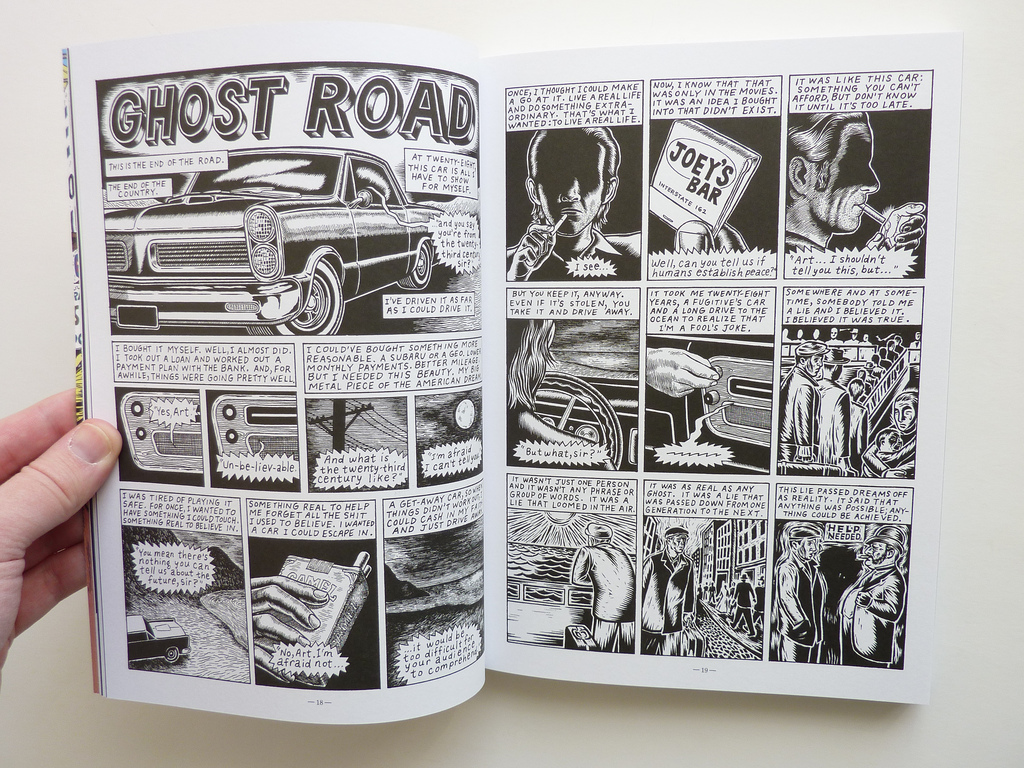
Tim Lane is one of those 20-year overnight successes in comics. He's been doing comics and illustration work for quite some time, but it's only recently that his work has become widely published. In places like Typhon and Hotwire, Lane's spare, stark pulpy stories have stood out. It's to his credit that they work even better as a collection, and Abandoned Cars feels spun from whole cloth rather than carefully stitched together from a number of disparate sources. It's an unusual work because the stories seem so familiar, which is not surprising given the broad array of influences that Lane freely admits to. At the same time, they don't seem to be particularly derivative of a single source, but are rather a fusion of inspirations from comics, film, literature and a hard-lived life. While Lane's goal was to highlight some aspects of what he refers to as "the Great American Mythological Drama" as a broad experience, the way he does it is intensely personal.
In terms of subject matter, his biggest influence is Jack Kerouac. He's drawn to the author's attempt at creating that American myth, especially in terms of wandering about the vast spaces of America. Every one of his characters is restless and unsettled. Some openly take to the road as a kind of temporary relief, while others run from their misery in more metaphorical terms. Unlike Kerouac, Lane isn't interested in building up that myth around himself; even in the autobiographical story about train-hopping titled "Spirit", he openly admits to being in the shadow of his heroes. Lane takes a big cue from Joe Sacco in this regard; not only does his art have a lot of the unfussy, naturalistic characteristics of Sacco's line, but his own self-presentation is decidedly self-deprecatory. Lane becomes one of his own characters: lonely, a little desperate, searching for something and hoping to find it on the road.
There aren't any morals or even real beginnings or endings for most of his characters' stories. There's a touch of the grotesque and the absurd in his stories that lightens and even deflates his narrative style. It's a bit reminiscent of Daniel Clowes in that respect, and I think both artists drew from a lot of the same 1950s illustration influences. Lane goes in a slightly different direction than Clowes in his use of noir stylings. The use of shadow, stark black & white imagery and close-ups recalls the work of Charles Burns, along with his character design. That said, Lane's stories aren't really like Burns' or Clowes'. The more eccentric influence of Clowes is mitigated by the spare, unadorned frankness of Ernest Hemingway.
Many of the stories center around bars and the way that they can act as refuge, crucible, storytelling center or deathtrap. In "Outing", a couple of friends narrowly dodge death in a bar filled with crazy characters, only to meet a grim end on the road. In the book's biggest standout story, "The Aries Cow", the barkeep tries to imagine the life of an old man who comes to her bar to escape his demons, only to give him a tantalizing bit of information that winds up leading him to his end. "Sanctuary" is a classic tale of a man who's done something horribly wrong and knows that he'll be punished for it, having a drink with one of the men who will be meting out that punishment, defiantly delaying his fate just a bit longer. Even Lane's version of "The Story of Stagger Lee" takes place in one of the most disreputable bars in St. Louis. Lane is clearly drawn to the bar as a place whose purpose is not just inebriation, but the possibility of human contact and communication.
If the bar represents community for Lane, the car represents not just the possibility of escape, but the illusion of solipsism. Cars are tied closely to notions of identity and triumph over one's situation. In "Cleveland", a man at the end of his rope drives to Cleveland to be present at the birth of his best friend's first child, and manages to find a spark of inspiration. "Ghost Road" is about that urge to hit the road only to find that even talking to like-minded individuals doesn't dull pain. "Doo-Wop and Planet Earth" concerns the desperate urge to connect with another as one is ready to leave town, and how that attempt is both an act of cowardice and a leap of faith.
The stationary characters in Lane's world have generally descended into madness. In the book's interstitial pieces, a shut-in is consumed by delusions of grandeur and begins having demented daydreams. In the "The Manic Depressive From Another Planet", another shut-in dares to confront the world despite his near-crippling fear. "Spirit" addresses all of the book's themes: restlessness, the attempt to create meaning out of the randomness of our lives, the way that stories and legends accrue to create our understanding of America, and the need we have to connect our own personal narratives with those overlying American legends. Lane goes a step further in building his notion of American myth with other interstitial features like paper doll cut-outs of American originals like grifters, rockabilly dancers, Chuck Berry, good cops/bad cops, etc. He opens the book with a drawing of young Marlon Brando and ends with a drawing of an older Brando, bookending two views of an actor whose own symbology declined as he aged. Abandoned Cars will appeal to anyone who's ever sought out the comfort of the road, the urge to jump a train, or who looked for answers in the company of fellow patrons at a bar.
Showing posts with label fantagraphics. Show all posts
Thursday, April 25, 2013
Monday, September 26, 2011
A Dozen Thoughts On Love & Rockets: New Stories #4
This isn't a formal review, per se, but instead a few gut-reaction thoughts on the remarkable new issue of Love & Rockets: New Stories (#4). I've never bothered to do this before in a review, but the nature of this issue demands that I note that there are spoilers below.

2. Gilbert's "And Then Reality Kicks In" is a sober, complex and layered conversation between Fritz and an old boyfriend. Like a lot of things in this issue, this story has an air of finality to it, a capstone of sorts. I haven't figured out which old lover of Fritz's this is (I need to go back and reread), but there was something satisfying about seeing her in possession of hard-won wisdom.

3. Speaking of an air of finality, Jaime's follow-up to last issue's "Browntown" and "The Love Bunglers" is what pushes this issue into the stratosphere. I literally have no idea where he goes from here with his Locas characters.


8. Considering the tragic circumstances of Calvin and Ray's own hard-luck life, I honestly thought that's where the story was going to end. Jaime's narrative equivocation about Ray's fate didn't feel manipulative to me; instead, he effectively inserts us into Maggie's perspective while giving the reader enough extra information to make the scene where she's talking to the guy in the record shop about Ray all the more heartbreaking. Jaime also inserts a bit of humor when she visits a brain-damaged Ray at his parents' house when his mother notes that all he says is "Maggie", "fuck" and "shit". Jaime is a master of body language and gesture, and the panel where Maggie curls into a ball was devastating.

9. That set up the two-pages with a nine-panel grid on each. The Maggie page is something we've seen before with her, and this page took us from her time as a baby to now. Seeing that the next page not only did the same with Ray, but when I realized as a reader that each corresponding panel on Ray's page commented on Maggie (and in most of them, because they were eyeing one another), it was a stunning gut punch. This was Jaime at his finest, "sampling" old stories, telling a story without a true narrative and using his command of gesture to recapitulate a thirty-year story.
10. The final scene with Maggie (now a mechanic once again) taking Hopey's son back to her was pitch-perfect. There's hasn't been much interaction between the two characters in a number of years, yet Jaime still has a way of conveying an astonishing amount of meaning in a very short number of panels. As always, there is both ease and tension between the two women, even as they have their own very different lives. Hopey inviting Maggie in several times and Maggie demurring was a crucial narrative point, though that's not clear until we see Ray. In other words, Ray is now Maggie's top priority.
11. Finally, the last scene with Ray was simple, powerful, emotional--again, all of that feeling felt earned, with Maggie's saying "Of course I waited for you, I love you" succinctly summing up this complex, messy, beautiful relationship. That scene was also a connector to the opening sequence of Jaime's stories in this issue, as we meet a long-time couple and see them go about their daily routine; it's decidedly unsexy and is all about devotion. The man is Yax, Maggie's new business partner, but that relationship is a referent to Maggie and Ray growing old together.
12. Again, where does Jaime go from here? Does he continue to examine Maggie & Ray's relationship as they grow older? Does he turn his eye back to Hopey as she raises a son? Is Calvin's story over? Will we see more from Penny or Izzy? Or does he turn back to depicting youth as Angel goes off to college? Perhaps at this point Maggie will be more of a background character for a few years. Perhaps he'll start over with something completely different. Certainly, his "Locas" universe feels as finished as it ever will. Whatever he decides, Jaime certainly stuck the landing on his life's work to date.

1. Gilbert's "King Vampire" is another in his line of Fritz-related grindhouse movie adaptations. It's also a brutal takedown of the current cultural obsession over vampires. Vampire fiction eroticizes the monsters at the core of their stories, equating bloodlust with simple lust and essentially glorifying rape fantasies. In one shockingly disgusting scene, the sexy vampire in the story squashes a guy's head against a wall in the most visceral manner possible so as to make it easy for his new prey to drink his blood, but also provide an object lesson. For a predator, its prey is little more than an object at hand. That scene bluntly drains all of the eroticism out of the story and rightly smashes the whole vampire erotica genre to bits.

2. Gilbert's "And Then Reality Kicks In" is a sober, complex and layered conversation between Fritz and an old boyfriend. Like a lot of things in this issue, this story has an air of finality to it, a capstone of sorts. I haven't figured out which old lover of Fritz's this is (I need to go back and reread), but there was something satisfying about seeing her in possession of hard-won wisdom.

3. Speaking of an air of finality, Jaime's follow-up to last issue's "Browntown" and "The Love Bunglers" is what pushes this issue into the stratosphere. I literally have no idea where he goes from here with his Locas characters.
4. It is cliche' to talk about one's favorite characters as though they really exist and feel like friends. It is certainly not a very sophisticated way to read a story. That said, if any cartoonist has created work that's earned this mark, it's Jaime. When Ray Dominguez was getting his head bashed in by Calvin (truly the most tragic character in Jaime's cast), my gut reaction was "No!" Ray is Jaime's Everyman character--a decent if slightly underachieving guy who never had the cool of someone like Speedy or Hopey (especially in his own eyes) and so always feels like an underdog in earning Maggie's affections.

5. The theme of the past two issues has been emotional steadfastness and patience. Characters are forced to put their cards on the table about their feelings. For some, like Ray, it was a move of maturity, of realizing what he wanted as a middle-aged man and that he had no more time to waste. For some, like Reno, it was trying to act on long-supressed crushes but not understanding the difference between fantasy and reality. For Vivian "the Frogmouth", it was an expose' of her essential vapidness, a lesson learned too late. For Maggie, it was a lesson learned almost too late that one must jump on opportunities when they arise, that putting aside one's own baggage is the key to moving on. Maggie could simply never get out of her own way. Calvin's story was one of devotion never being rewarded and becoming warped as a result. Intimacy was conflated with assault in his mind as he tried to "protect" his sister.
6. Those themes are tied up in "Return To Me", which is a sequel to both "Browntown" and "Wigwam Bam". The latter, in my opinion, was the high point of Jaime's work in Love & Rockets Volume I. The flashback stories in the past two issues have served the purpose of filling in a couple of crucial emotional blanks in Maggie's backstory. "Browntown" established how her parents' divorce cut her off emotionally from her family on a permanent basis, but also how her relationship to her best friend Letty started to fracture a bit. "Wigwam Bam" was Letty's story from Maggie's point of view, a crucial entry in that it revealed where Maggie was emotionally right before she met Hopey. Letty was of course killed in a car accident, but the heartbreaking "Return To Me" documents her friendship with Maggie from her point of view. Maggie always feared that Letty was too cool for her, but Letty never let Maggie out of her heart. This story was all the more tragic because Letty felt so awful for Maggie that her mother left her behind in Hoppers and was prepared to take her in and really nurture her. Instead, she was cruelly cut down, and Maggie never quite knew how her friend felt about her.

7. The last chapter of "The Love Bunglers" was a tour-de-force, a walk-off grand slam of a story that was thirty years in the making. I doubt there were any dry eyes on the part of long-time fans of the series while reading this, yet every single moment was completely earned organically. There was no easy sentiment on display, but rather thirty years' worth of hard-won lessons and building emotion. What was especially powerful about the last chapter is how slow and easy the pace of the prior chapters was. In retrospect, one can see how Jaime was building up to this in the earlier chapters (just as the flashback stories enhance and comment on the present-day story), but the scene where Calvin has a psychotic breakdown (after once again seeing the blue sun, a metaphor for the way Calvin sees real things that others don't and ignore) and thinks that Ray has done something bad to Maggie was heartbreaking. Ray was typical Ray in that scene--slightly exasperated, more than a little patient and trying to do the right thing--and got his head bashed in for his troubles.
8. Considering the tragic circumstances of Calvin and Ray's own hard-luck life, I honestly thought that's where the story was going to end. Jaime's narrative equivocation about Ray's fate didn't feel manipulative to me; instead, he effectively inserts us into Maggie's perspective while giving the reader enough extra information to make the scene where she's talking to the guy in the record shop about Ray all the more heartbreaking. Jaime also inserts a bit of humor when she visits a brain-damaged Ray at his parents' house when his mother notes that all he says is "Maggie", "fuck" and "shit". Jaime is a master of body language and gesture, and the panel where Maggie curls into a ball was devastating.

9. That set up the two-pages with a nine-panel grid on each. The Maggie page is something we've seen before with her, and this page took us from her time as a baby to now. Seeing that the next page not only did the same with Ray, but when I realized as a reader that each corresponding panel on Ray's page commented on Maggie (and in most of them, because they were eyeing one another), it was a stunning gut punch. This was Jaime at his finest, "sampling" old stories, telling a story without a true narrative and using his command of gesture to recapitulate a thirty-year story.
10. The final scene with Maggie (now a mechanic once again) taking Hopey's son back to her was pitch-perfect. There's hasn't been much interaction between the two characters in a number of years, yet Jaime still has a way of conveying an astonishing amount of meaning in a very short number of panels. As always, there is both ease and tension between the two women, even as they have their own very different lives. Hopey inviting Maggie in several times and Maggie demurring was a crucial narrative point, though that's not clear until we see Ray. In other words, Ray is now Maggie's top priority.
11. Finally, the last scene with Ray was simple, powerful, emotional--again, all of that feeling felt earned, with Maggie's saying "Of course I waited for you, I love you" succinctly summing up this complex, messy, beautiful relationship. That scene was also a connector to the opening sequence of Jaime's stories in this issue, as we meet a long-time couple and see them go about their daily routine; it's decidedly unsexy and is all about devotion. The man is Yax, Maggie's new business partner, but that relationship is a referent to Maggie and Ray growing old together.
12. Again, where does Jaime go from here? Does he continue to examine Maggie & Ray's relationship as they grow older? Does he turn his eye back to Hopey as she raises a son? Is Calvin's story over? Will we see more from Penny or Izzy? Or does he turn back to depicting youth as Angel goes off to college? Perhaps at this point Maggie will be more of a background character for a few years. Perhaps he'll start over with something completely different. Certainly, his "Locas" universe feels as finished as it ever will. Whatever he decides, Jaime certainly stuck the landing on his life's work to date.
Labels:
fantagraphics,
gilbert hernandez,
jaime hernandez
Tuesday, August 9, 2011
Sequart #150: Pocket Full Of Rain
This post was originally published at sequart.com in 2008.
Jason is one of my favorite cartoonists, a master of pitch, tone and composition. His comics are simultaneously hilarious and tinged with sadness, a balance achieved in part through his use of a "funny animal" motif. That anthropomorphic use of animals accomplishes three things: it creates a certain reader expectation of silliness, it allows him to subvert that expectation with the use of horror, drama or slice-of-life situations, and it allows him a free hand to inject weirdness into the proceedings without breaking the flow of the story. In Pocket Full Of Rain, we see his earliest strips, many of which were done using a more realistic style. This book is fascinating for all sorts of reasons, especially in seeing Jason as a younger cartoonist cycling through his influences, trying his hand at various genres and riffing on his personal obsessions.
What's interesting in reading this is that an observer of the artist can see that Hey...Wait, his first work in English published by Fantagraphics, is really a transition point between his earliest work and what he's doing now. Jason has since moved away from that kind of story, but it's clear that his career was leading him up to that point. The title story in this collection is his longest earliest work and bears many hallmarks of his later, more mature style. There's a doomed relationship, an air of danger settling in on it, a heavy dose of weirdness, slipping between reality and fantasy (sometimes from panel to panel) and a liberal sprinkling in of pop culture references. In many ways, it's a brilliant story, with the central love story having an aching resonance. There's an exuberance to the imagery that Jason uses, but there's also a certain stiffness to the art at times. That doesn't just come across just in terms of action, but it also brings a certain unwanted emotional slickness to the proceedings as well. The central villain is much more fearsome when he suddenly has the head of a wolf, for example, but when you compare this to future Jason stories, the decorative aspects of his art almost interfere with his emotional narrative.
It's interesting to read the many autobiographical or semiautobiographical strips in this collection. We see stories about potential romantic opportunities missed, insane landlords, growing old, losing hair, not getting into art school, etc. There's a funny early strip where Jason is talking to an anthropomorphic friend coming up with lists of annoying people who should die, which ends with Jason getting shot by a character who showed up in many of the book's other strips, shooting random people. There's an insane action story called "Invasion of the Giant Snails" which reminds me a bit of Gilbert Hernandez in its zany tone and what Jason Lutes' art would look like years later in Berlin. Jason himself notes that he was going for a David Mazzucchelli vibe. This comes in a section dedicated to influences, as we see an X-Files take-off, a Basil Wolverton pastiche, a Hugo Pratt parody and a strip about Ernest Hemingway. None of this is what I'd call top-drawer work, but it is interesting to see him work through these influences and put his own stamp on their styles.
The section that reprints some newspaper strips he wrote is fascinating because his Charles Schulz influence is in such strong evidence here. The pacing, the punchlines, the surreal subversion of expectations and more are in evidence as we meet a cast consisting of a ball-and-chain convict, a sentient cactus, and sheet-wearing ghosts. The best gag involves the convict pulling aside a curtain at a polling both, and the cactus pulling aside the curtain on the other side--wearing a wig and brandishing a knife ala Psycho. These strips are hilarious and were an obvious starting point for his simultaneously silly and deadpan style that mixed in timeless gags with pop culture obsessions. The final strips are a clear lead-in to Hey...Wait in that they mix oblique symbology, an obsession with mortality and a certain lurking dread. The main difference is that he uses a sort of warped realistic style, with oversized heads and distorted facial figures. Once again, the art slightly deflects what he is trying to convey emotionally. Switching over to simpler, more iconic figures allowed him a sort of visual versatility that allows him the freedom to instantly modulate the tone of his stories and switch gears very quickly without it jarring the reader. It's also allowed him to refine his line to an achingly beautiful extent. This book is certainly a must for any fan of Jason or someone who has an interest in artistic development and its fits and starts.
Jason is one of my favorite cartoonists, a master of pitch, tone and composition. His comics are simultaneously hilarious and tinged with sadness, a balance achieved in part through his use of a "funny animal" motif. That anthropomorphic use of animals accomplishes three things: it creates a certain reader expectation of silliness, it allows him to subvert that expectation with the use of horror, drama or slice-of-life situations, and it allows him a free hand to inject weirdness into the proceedings without breaking the flow of the story. In Pocket Full Of Rain, we see his earliest strips, many of which were done using a more realistic style. This book is fascinating for all sorts of reasons, especially in seeing Jason as a younger cartoonist cycling through his influences, trying his hand at various genres and riffing on his personal obsessions.
What's interesting in reading this is that an observer of the artist can see that Hey...Wait, his first work in English published by Fantagraphics, is really a transition point between his earliest work and what he's doing now. Jason has since moved away from that kind of story, but it's clear that his career was leading him up to that point. The title story in this collection is his longest earliest work and bears many hallmarks of his later, more mature style. There's a doomed relationship, an air of danger settling in on it, a heavy dose of weirdness, slipping between reality and fantasy (sometimes from panel to panel) and a liberal sprinkling in of pop culture references. In many ways, it's a brilliant story, with the central love story having an aching resonance. There's an exuberance to the imagery that Jason uses, but there's also a certain stiffness to the art at times. That doesn't just come across just in terms of action, but it also brings a certain unwanted emotional slickness to the proceedings as well. The central villain is much more fearsome when he suddenly has the head of a wolf, for example, but when you compare this to future Jason stories, the decorative aspects of his art almost interfere with his emotional narrative.
It's interesting to read the many autobiographical or semiautobiographical strips in this collection. We see stories about potential romantic opportunities missed, insane landlords, growing old, losing hair, not getting into art school, etc. There's a funny early strip where Jason is talking to an anthropomorphic friend coming up with lists of annoying people who should die, which ends with Jason getting shot by a character who showed up in many of the book's other strips, shooting random people. There's an insane action story called "Invasion of the Giant Snails" which reminds me a bit of Gilbert Hernandez in its zany tone and what Jason Lutes' art would look like years later in Berlin. Jason himself notes that he was going for a David Mazzucchelli vibe. This comes in a section dedicated to influences, as we see an X-Files take-off, a Basil Wolverton pastiche, a Hugo Pratt parody and a strip about Ernest Hemingway. None of this is what I'd call top-drawer work, but it is interesting to see him work through these influences and put his own stamp on their styles.
The section that reprints some newspaper strips he wrote is fascinating because his Charles Schulz influence is in such strong evidence here. The pacing, the punchlines, the surreal subversion of expectations and more are in evidence as we meet a cast consisting of a ball-and-chain convict, a sentient cactus, and sheet-wearing ghosts. The best gag involves the convict pulling aside a curtain at a polling both, and the cactus pulling aside the curtain on the other side--wearing a wig and brandishing a knife ala Psycho. These strips are hilarious and were an obvious starting point for his simultaneously silly and deadpan style that mixed in timeless gags with pop culture obsessions. The final strips are a clear lead-in to Hey...Wait in that they mix oblique symbology, an obsession with mortality and a certain lurking dread. The main difference is that he uses a sort of warped realistic style, with oversized heads and distorted facial figures. Once again, the art slightly deflects what he is trying to convey emotionally. Switching over to simpler, more iconic figures allowed him a sort of visual versatility that allows him the freedom to instantly modulate the tone of his stories and switch gears very quickly without it jarring the reader. It's also allowed him to refine his line to an achingly beautiful extent. This book is certainly a must for any fan of Jason or someone who has an interest in artistic development and its fits and starts.
Friday, August 5, 2011
The Sleeper Wakes: Mascots

Ray Fenwick is an unusual cartoonist in that his work starts with the plastic qualities of its text before anything else, including the signifying content of his words and the images & colors he chooses to place with them. In his first book, Hall of Best Knowledge, each page strictly held to this "typographical comic" formula, adding visual flourishes and details while still assembling what turned out to be a surprising narrative. His second book, Mascots (published in 2010), emphasizes the image much more than his first book, but it's less a narrative than a series of loosely-connected images that thread in and out of each other. What's interesting about this book is that while there may well be clear page-to-page connections, most of them are strictly in the mind of the artist. That's because of the methods used in constructing the book. To wit: Fenwick took the covers and back covers of cheap paperbacks and started drawing and painting on them. He usually started with text and worked some of them into images and comics. Certain images and ideas reoccur throughout the book, though none lead to any solid narrative ends.

Fenwick's use of fonts is fascinating, as he seems obsessed with their aesthetic and decorative qualities as a way of eliciting a certain kind of reaction. This book closely resembles the early work he did for Mome, where there's a certain kind of almost angry energy in the meaning of his words that's contrasted by an ornate font. The titular mascot of the book is a clown with a butterfly net, a ridiculous and impotent character who represents a sort of chase for meaning (or a narrative arc) that never quite materializes. He pops up at random intervals, acting as a sort of palate cleanser between text pieces. Fenwick slips between the absurd, the thoughtful, the existential and the sublime from page to page, keeping the reader off-balance but engaged.

The most delightfully ridiculous running set of images is that of H.P. Lovecraft's Cthulu, going on and on in a florid manner about his awesomeness, his fearsomeness, why he doesn't usually appear as a cute puffball and why his most terrifying form is making you indecisive about your hairstyle. Other pages repeat phrases (like "You were in my dream last night"), differing only in terms of word placement and color, along with a modifying word at the top. There are missives to creators, paens to chill dudes named "Brandon", faces that pulse and undulate, bizarre masks, mysterious aphorisms, inquiries into whether babies see angels and ghosts (turning into a sequence straight out of a flip-book), and a benevolent laser-light projection urging the reader to "feel the humanity". Cthulu pops up again after a series of baffling logos, forcing the reader into an "eternal no a-ha moment".

Mascots flips from image to image with a dream logic that's sometimes whimsical, sometimes creepy, sometimes weird and always vivid. It's that vividness that gives the book its energy and an almost hallucinatory quality. Readers should not expect a coherent narrative but rather simply enjoy the ride. The strict formal constraint Fenwick gave himself (painting on those book covers created a strict rectangular canvas for every image) challenged him to create variations on that formal space on every page. The result is dynamic tension between the rigidly formal and the freely expressive, silly and dense.
Sequart #123: Hall Of Best Knowledge
This post originally appeared at sequart.com in 2008.

Ray Fenwick is one of my favorite new regulars in Fantagraphics' flagship anthology Mome. His work stretches the very definition of what comics can be, because it bears only a passing resemblance on the surface to what is understood to be comics. His Hall Of Best Knowledge is a series of single-page panels, each of which is about a different topic by an unknown "author". While each panel contains decorative touches, there's very little in here in the way of pure illustration in any kind of conventional sense. Instead, the stylized extremes of Fenwick's lettering, combined with those decorative extras, combine to create a narrative flow that is entirely different from a typical prose story. The amplification of a part of comics that is usually invisible to most readers, lettering, helps create a unique reading experience.

A musical comparison might be to funk, a form that brings the usually-hidden rhythmic components of music (bass and drums in particular) and turns them into lead instruments, while the typical lead instruments become secondary and in service of the former rhythm instruments. So it is with Fenwick on the comics page, only in a more extreme manner. The prose on each page is stylized for reasons that only become clear at the very end of the story, though we do get hints dropped throughout. Each page contains a "lesson" on some topic, explained in a bombastic and florid manner by "the author". The lessons are frequently hilarious (though unintentionally so) as we are led to believe that he's a professor of some sort, dealing with a class of frequently ungrateful students. Some of his lessons get "cancelled", sometimes due to mysteriously hurt feelings.

Some of the lessons seem entirely unconnected, while others have a very clear linear connection. The effect is never disorienting thanks to the way each page acts as a complete entity of its own. We are left wondering as to what's going on while still being able to fully enjoy each page as its own discrete unit. The result is a package that is a tremendously engaging work of graphic design, calligraphy and good ol' comics lettering filtered through a dry sense of humor, an unusual set of narrative techniques and a surprisingly cohesive story in the end.

In addition to forming an ultimately pathetic (but somehow uplifting) account of "the author", Hall of Best Knowledge also acts as a scathing satire of rhetoric for its own sake. Lines like "I am, of course, a powerful golden eagle of mental fitness, able to swoop down on this unsuspecting topic and snatch it up, my powerful talons locked around its helpless form as its family squeaks below in desperation" are typical utterances from the pompous author whose lack of self-awareness contribute so much to the humor of the book. Combined with an unusual method of packaging from design ace Jacob Covey (a wrap-around ribbon has the title of the book on the cover, and strips are only printed on right-hand pages), Fantagraphics has made a bold move in publishing such an unusual work. I can't wait to see what Fenwick comes up with next.

Ray Fenwick is one of my favorite new regulars in Fantagraphics' flagship anthology Mome. His work stretches the very definition of what comics can be, because it bears only a passing resemblance on the surface to what is understood to be comics. His Hall Of Best Knowledge is a series of single-page panels, each of which is about a different topic by an unknown "author". While each panel contains decorative touches, there's very little in here in the way of pure illustration in any kind of conventional sense. Instead, the stylized extremes of Fenwick's lettering, combined with those decorative extras, combine to create a narrative flow that is entirely different from a typical prose story. The amplification of a part of comics that is usually invisible to most readers, lettering, helps create a unique reading experience.

A musical comparison might be to funk, a form that brings the usually-hidden rhythmic components of music (bass and drums in particular) and turns them into lead instruments, while the typical lead instruments become secondary and in service of the former rhythm instruments. So it is with Fenwick on the comics page, only in a more extreme manner. The prose on each page is stylized for reasons that only become clear at the very end of the story, though we do get hints dropped throughout. Each page contains a "lesson" on some topic, explained in a bombastic and florid manner by "the author". The lessons are frequently hilarious (though unintentionally so) as we are led to believe that he's a professor of some sort, dealing with a class of frequently ungrateful students. Some of his lessons get "cancelled", sometimes due to mysteriously hurt feelings.

Some of the lessons seem entirely unconnected, while others have a very clear linear connection. The effect is never disorienting thanks to the way each page acts as a complete entity of its own. We are left wondering as to what's going on while still being able to fully enjoy each page as its own discrete unit. The result is a package that is a tremendously engaging work of graphic design, calligraphy and good ol' comics lettering filtered through a dry sense of humor, an unusual set of narrative techniques and a surprisingly cohesive story in the end.

In addition to forming an ultimately pathetic (but somehow uplifting) account of "the author", Hall of Best Knowledge also acts as a scathing satire of rhetoric for its own sake. Lines like "I am, of course, a powerful golden eagle of mental fitness, able to swoop down on this unsuspecting topic and snatch it up, my powerful talons locked around its helpless form as its family squeaks below in desperation" are typical utterances from the pompous author whose lack of self-awareness contribute so much to the humor of the book. Combined with an unusual method of packaging from design ace Jacob Covey (a wrap-around ribbon has the title of the book on the cover, and strips are only printed on right-hand pages), Fantagraphics has made a bold move in publishing such an unusual work. I can't wait to see what Fenwick comes up with next.
Wednesday, July 27, 2011
You'll Never Know, Book Two: Collateral Damage

Carol Tyler's first volume of her masterful trilogy, You'll Never Know, establishes a journey that begins with a single question asked of her father as a teen-ager: "What was it like for you in World War II?" The answer to this question winds up being overwhelmingly complicated, involving her parents, her husband and her daughter in unexpected and frequently upsetting ways. When her father, a notably cold and distant (but frequently funny and always steadfast & capable) man, calls her up and starts ranting about "rivers of blood", it sets Carol on a quest to finally gain some sort of understanding and connection with him. At the same time, it leads her to an understanding of why she wound up in dysfunctional relationships with men who were emotionally withholding. The book ends with Carol hoping for a breakthrough with her father Chuck but instead gets faced with him ranting at her mother, Hannah.
The book is titled "You'll Never Know", a phrase that takes on a number of different meanings throughout the book. It's Chuck & Hannah's favorite song, for starters. It refers to the average person not knowing that Chuck was a solider who faced horror. At its core, it speaks not only to Tyler's inability to truly "know" and connect with her father, but how impossible it is to every truly know another's pain, self and emotions. The second volume is titled "Collateral Damage" and it aims to get at the damage that Chuck unknowingly causes to his wife and children.

Throughout the first volume, "A Good And Decent Man", Tyler makes a point of noting that her father lives up to that subtitle and refuses to blame him for her own mistakes with men. The second volume begins with her frantically driving to Indiana to see her parents and to make sure that her mom's OK. Unsurprisingly for a couple that made a habit of bottling up emotions (only to have them explode from time to time), both pretty much act as though nothing has happened. Carol sees a house and a couple in bad shape, with mice having eaten through their pantry. Her mother's stroke diminished her activity and mental capacity, while her father always expected this sort of work to be done by his wife. An unbelievably harsh dismissal from her father comes on the heels of the true reason why he called her and started talking about the war: his belief that the army owed him disability money. Her "failure" to prove this for him brought about all sorts of unkind cuts and brought Carol to one of several crises points in the book.

That particular crisis brings a lot of unpleasant feelings about her father to the surface. Tyler admits the resentment she feels for her father's distance, cutting comments, disinterest in taking care of her, crazy mood swings and most damning, never showing or expressing love in any tangible fashion. This is one of several emotionally brutal sections of the book, as Tyler condemns herself for her own dumb choices made once free of her parents as she became a self-fulfilling prophecy of what her father feared: a wild child. It's almost a relief for the reader when Tyler turns back to the sepia-and-olive drab tones of the "photo" scrapbook section of the book depicting his tour of duty. The high spirits and tomfoolery of the first book are replaced with hellish depictions of not just combat, but being placed in a position where his men have to destroy the lives and livelihoods of civilians.

A seemingly innocuous scene of chatter with her cheery teenage daughter is a portent of something far heavier later in the book, as Tyler recalls how she came to leave California after her husband left her for another woman. A full-page, light-hearted drawing of the pair floating outside their apartment building as they head downstairs takes on a double meaning considering that later section of the book. In a narrative sense, the interlude reminds readers that Carol at this time (in the early 2000s) is still holding out hope that her ex will return to her, as much as for the sake of her daughter as herself. It's a crucial scene for a book that, up until this point, is much more fractured and all over the place than the first volume.
The next section of the book is a long account of when Tyler stayed with her parents when his father battled cancer but somehow built a house from scratch out in the woods. It fills in some blanks in terms of their personal narrative (especially in the way it fills in the picture regarding the true state of her mother's health) but otherwise merely serves to support and amplify the points she makes earlier in the book regarding her father. The next segment of the scrapbook ends with Chuck (thinking that the war was nearly over after D-Day) being mustered into fighting the brutal Battle of the Bulge. That segment ends with Tyler getting a fateful phone call.
The last two sections of the book are a devastating one-two punch, especially to any reader with children. Much of this book falls into a holding pattern, going back and forth about Tyler's mixed feelings about a complicated man. It's an assessment of the collateral damage that she took on as a consequence of his experiences, as well as what her mother went through. Forget about getting her father to say that he loved her; Tyler would have accepted a simple "I'm sorry" for his failures as a parental figure. That said, even a complicated relationship is better than no relationship, as the chapter regarding cancer underlines.
When a parent is faced with the prospect of their child having a serious illness, it's a devastating feeling. When it's mental illness, it's an even more helpless sensation. In a section marked by red panel borders, Tyler talks about the time her daughter was first caught violating school rules and then finding drugs, alcohol and razor blades in her backpack. Much more disturbing was her daughter trying to jump out of a window, claiming "the bird man" told her she could "suck in air by jumping". Carol literally had to tackle her daughter to bring her back inside before she took her to the ER. That experience causes Carol to think of her mother's own tragedy: the death of her young daughter.

This is where Tyler reprints "The Hannah Story", which is simply one of the greatest comics short stories of all time. It's about her mother living with Chuck's family during wartime, and it was not exactly a cozy set-up. Chuck's mother was a hateful woman who had it in for Hannah and even pronounced a curse on Ann, their first child. Two years later, Ann died in a hospital after scalding herself by accident. It's the way the story is structured that makes it so brilliant, as it's staged as a conversation in a garage between Carol, Hannah and Carol's sister Virginia. A long-buried pain finally spills out as Hannah finally talks about the burden she had been trying to forget all these years. But pain can't be forgotten and emotions can only be tamped down for so long: they always emerge somehow. There's another bit of collateral damage reported here, as Chuck slaps Hannah until she stops crying about Ann. Unburdening herself of the pain allowed her to remember the brief but beautiful moments she spent with her daughter, a moment she managed to achieve when she saw Carol give birth, asking "Don't I have a right to the good parts of her life...beyond the pain I feel." The final image of the story, featuring an oriental rug with the features of all the Tyler children, is bright and hopeful, and the final line "Hannah--whose name will forever cradle her daughter's" is drawn with a heart around "ann". Tyler's light and expressive touch makes this moment powerful and resonant without being mawkish.

Thinking of the story makes Tyler realize that her daughter is still alive and in need of her. Back at the apartment building to change her clothes, she catches sight of the window she almost jumped out of and is horrified. At the end of the first volume, Tyler used Hitler as a character designed to represent the toll of war itself. At the end of this volume, Hitler returns in the person of "the bird man" (in the person of the Eagle of the Third Reich), gloating over Julia's near-death experience. If there was a sense of feeling overwhelmed at the end of the first volume, the second ends in anger. Tyler took the time to process her grief over her childhood in this book, but its real power is in how she comes to terms with that quickly when the life of her daughter is concerned. There's a certain hokeyness in the way Hitler is used here so literally, but Tyler earns that on-the-nose metaphor with the wringer she puts herself and the reader through in the course of the book. More than anything, this segment once again circles around to the book's title: she didn't know her daughter was having these suicidal/psychotic thoughts, and there was no way she could have known.

Visually, Tyler's style is unique in the comics world. Only Vanessa Davis comes close to doing the sort of thing she does in terms of using a painter's sensibility while drawing comics. The scrapbook design of the book is just one of many remarkable decorative touches she adds. Color is tremendously important both in a narrative sense (identifying key times and characters) and an emotional sense (modulating feelings felt on a page in an expressive style). The complexity of her page design (changing formats on an almost page-to-page basis) is brought to earth by the simplicity of her character design. The result is what feels like an ornate, powerful and cohesive sketchbook/journal. Even when the story goes off an a tangent, Tyler always manages to tie things back into the main narrative. Jumps forward and backward into time never obscure the main narrative through-line. Visual call-backs abound in the book, both to the first volume and to key sequences in the book. Most impressively, Tyler manages to bring a static kind of craft (a sketchbook) to life with panels that crackle with energy and movement. There are no easy outs or answers in Tyler's attempts to create, maintain and understand connections with her loved ones, so I'll be curious to see what kind of conclusions she winds up with in the last book of the trilogy.
Monday, July 25, 2011
Talking Tardi

Let's examine the recent (and welcome) spate of English translations of books by the great French artist Jacques Tardi. Thanks to translator Kim Thompson's tireless efforts and an American audience that may finally be opening up to French comics, there have been five Fantagraphics translations released to date, with two more due for imminent release and others in the pipeline. Tardi is an interesting figure because he felt comfortable writing mainstream material like detective stories, mysteries, fantasy and even science-fiction (though usually of a period nature; The Arctic Marauder, for example is a steampunk book) as well as more experimental and mature fare. No matter what the subject, his books always have a density and meatiness to them that rewards multiple readings. I'll briefly examine each book roughly in order of narrative complexity. Here's a link to my review of the other Tardi book that's been released in the last year or so by Fantagraphics, West Coast Blues.

The Arctic Marauder. This was Tardi's third graphic novel, done back in 1974. This was a bewildering read, combining elements of Jules Verne, G.K. Chesterton and a feverishly-rendered scratchboard style. In contrast to Tardi's more rubbery, visceral style, the images in The Arctic Marauder look carved out of a page. The density of the inking and hatchwork and the moodiness of the grays conjures up a forbidding, dangerous world of instant death at sea. After a while, it felt like Tardi cared less about his story than the opportunity to draw incredibly cool-looking ships, machines and battles at sea. In a book that's already pretty short (just 63 pages), The Arctic Marauder feels quite padded. The book's saving grace is that Tardi doesn't seem to take much of it that seriously. Indeed, his narration is so over-the-top that it spills over into being straight-up purple prose. The plot, such as it is, is paper-thin. What isn't immediately obvious comes out of nowhere, and the characterizations (and their reversals) are frequently baffling. That said, the ending (featuring the villains making a daring get-away in their quest to menace the world) was a bit unexpected, and the narrator's final statements add to the tongue-in-cheek nature of the story. Fans of Tardi's more mature works might be disappointed in the story but will certainly be taken aback by the sheer beauty of its images on page after page.

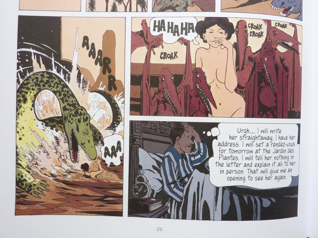
The Extraordinary Adventures of Adele Blanc-Sec, Volume 1: Pterror Over Paris and The Eiffel Tower Demon. This book, collecting the first two volumes in the series, was previously translated and published by NBM & Dark Horse in the 1980s (thanks to Tom Spurgeon for that particular tidbit). Like all of the previous attempts to translate and publish Tardi for the American market, it was met with indifference. In an interview with Spurgeon, Kim Thompson offered a few theories as to why he thought this was. Essentially, the most mainstream of French novels were too genre-oriented to draw in American art-comics audiences but were too weird for the average American mainstream comics fan. That weirdness, in my view, has to do with a visual approach that's taken for granted in Europe but is jarring for American audiences. There's a tradition of bigfoot and even slightly grotesque character design paired with rock-solid naturalism in terms of the action and backgrounds in European comics that starts with comics aimed at kids and is not unusual to see even in comics aimed at adults. Art-comics audiences might dismiss the cutesiness of the bigfoot drawing while mainstream audiences have never been kind to that sort of art crossing over into their genre stories.

The Arctic Marauder. This was Tardi's third graphic novel, done back in 1974. This was a bewildering read, combining elements of Jules Verne, G.K. Chesterton and a feverishly-rendered scratchboard style. In contrast to Tardi's more rubbery, visceral style, the images in The Arctic Marauder look carved out of a page. The density of the inking and hatchwork and the moodiness of the grays conjures up a forbidding, dangerous world of instant death at sea. After a while, it felt like Tardi cared less about his story than the opportunity to draw incredibly cool-looking ships, machines and battles at sea. In a book that's already pretty short (just 63 pages), The Arctic Marauder feels quite padded. The book's saving grace is that Tardi doesn't seem to take much of it that seriously. Indeed, his narration is so over-the-top that it spills over into being straight-up purple prose. The plot, such as it is, is paper-thin. What isn't immediately obvious comes out of nowhere, and the characterizations (and their reversals) are frequently baffling. That said, the ending (featuring the villains making a daring get-away in their quest to menace the world) was a bit unexpected, and the narrator's final statements add to the tongue-in-cheek nature of the story. Fans of Tardi's more mature works might be disappointed in the story but will certainly be taken aback by the sheer beauty of its images on page after page.

The Extraordinary Adventures of Adele Blanc-Sec, Volume 1: Pterror Over Paris and The Eiffel Tower Demon. This book, collecting the first two volumes in the series, was previously translated and published by NBM & Dark Horse in the 1980s (thanks to Tom Spurgeon for that particular tidbit). Like all of the previous attempts to translate and publish Tardi for the American market, it was met with indifference. In an interview with Spurgeon, Kim Thompson offered a few theories as to why he thought this was. Essentially, the most mainstream of French novels were too genre-oriented to draw in American art-comics audiences but were too weird for the average American mainstream comics fan. That weirdness, in my view, has to do with a visual approach that's taken for granted in Europe but is jarring for American audiences. There's a tradition of bigfoot and even slightly grotesque character design paired with rock-solid naturalism in terms of the action and backgrounds in European comics that starts with comics aimed at kids and is not unusual to see even in comics aimed at adults. Art-comics audiences might dismiss the cutesiness of the bigfoot drawing while mainstream audiences have never been kind to that sort of art crossing over into their genre stories.

What's changed is the rise of manga's popularity in the US. Cutesiness (as interpreted by an American) in serious stories is a given for many such comics. At the same time, the reputation of artists like Jack Cole (a classic bigfoot stylist) has risen in the past two decades in the art-comics crowd. The proliferation of artists fusing art-comics sensibilities with genre stories has no doubt made Tardi more palatable for American audiences, especially with Lewis Trondheim finally breaking through in the US. Tardi's cranky female adventurer Adele Blanc-Sec has starred in nine albums written & drawn by the artist, and they've been his most popular creation in France.

The books are period pieces set in early 20th century Paris, and while there's much about them that's predictable and formulaic, Tardi throws in bizarre narrative monkey wrenches at unexpected times. For example, the first story in this volume ("Pterror Over Paris") quickly establishes the book as a sci-fi mystery with conspiracy and murder thrown in as well. However, we don't meet the series' titular character until page ten and don't learn her real identity for another ten pages. Even at that, the reader is given little information as to who she is, what her motivations are or even if we should be rooting for her. This first story, concerning a pterodactyl hatched & mentally controlled by a man's mental powers and a murder subplot that attaches itself to the main narrative, is dizzying to the point of incomprehensibility at times. The reader is introduced to nearly two dozen characters in quick succession, many of whom prove to be turncoats within a page or two of their introduction. Major characters continue to be introduced up until nearly the end of the story. As an American reader, the slightly goofy & grotesque character design (lots of funny-looking facial hair and eyes, for example) make identifying the many characters a chore. That said, the pluck and cantankerousness of Adele herself make her a compelling hero.

The second story ("The Eiffel Tower Demon") is far more assured than the first. Of course, one must bear in mind that these stories were originally published in the mid-1970s and thus were some of his early work. This story was a lot clearer and sharper in terms of its narrative than the first without eschewing any twists and turns. This story of a lost Babylonian idol eventually turned into a plot to wipe out the populace of Paris using the plague, once again touching on anarchist conspiracies like Chesterton might have. Characters from the first story weave their way in and out of this one, adding additional color and complexity without cluttering up the plot. Tardi even has characters like Adele and one of her compatriots summarize the plot up to that point a few times in what seems to be a service to the reader; the dim-witted policeman who winds up saving Adele even notes that "it's all a bit confusing" when everything's explained to him! Like in his other adventure books, the protagonist manages to triumph but it's not a clear win for good over evil, as several malefactors either escape or face no repercussions whatsoever. I'll be interested to see if Tardi was able to ratchet up the level of excitement in this series another level as he got a better feel for the narrative world he created. In any event, he certainly does create a world; I've never seen an artist who could draw such solid seeming buildings, bridges, stones, etc while still never letting the reader forget they were looking at a drawing. In terms of sheer comics drawing ability, he has to be in the top ten of all time.

It Was The War Of The Trenches. Some of this book was originally serialized in the old Drawn & Quarterly anthology, but it has a far greater impact appearing in one collection. Tardi listed a number of sources that he drew from for this book about the common soldier's experience of World War I, but I thought that Erich Maria Remarque's All Quiet On The Western Front may have been the most important. That book lays out quite clearly that what I call the "Throckmorton factor" was in full effect for that war. That's a reference to the famous Bill Mauldin cartoon wherein an old, rich man sitting in a parlor says, "I say it's war Throckmorton, and I say let's fight!" It was a war manipulated by those who would not fight for reasons that no one really understood. What it came down to was a bunch of guys in a hole fighting a tedious, agonizing battle. Fighting and gaining ground was, at its essence, just another job. The problem was that this was a brand new kind of warfare, further complicated by new and deadly technology like mustard gas, flamethrowers, incendiary bombs, grenades, tanks and fighter planes. Suddenly, no one really knew how to do this job.

Tardi gets at the brutality of the battle, the absurdity at the heart of the conflict, the hyprocisy of ideas like patriotism and honor in the face of officers who were opportunists and the desperate brotherhood that formed between soldiers. He keeps the stories grounded in a series of unconnected vignettes about a variety of soldiers that flow into one another. Tardi sets the tone with an opening salvo of a story about a French soldier named Binet who thinks long and hard abou the France he's been charged to defend and how much he hates the people who live in his old building. He bemoans the idea that an accident of geography has set him on this course, cursing every moment he's there until he dies alone when investigating the fate of another soldier. It's an incredibly nihilistic story that is astonishingly beautiful to look at; Tardi's inventive page composition features a wordless center panel that's set off the from the rest of the page that draws the eye in and summarizes the action on the page.

That story sets the tone for the rest of the book. In the trenches, concepts like good and evil are outmoded since neither is punished nor rewarded. Instead, there is only life, death and the random chance that determines which you get. Tardi spins tales of a soldier who is captured by a German when he gets separated from his company, only to be executed as a traitor when he's discovered again. Another story features men trying to give themselves gangrene in order to get off of the front, with highly mixed results. Throughout, the viciousness and hyprocrisy of the officers and the brutality of the military police are excoriated by Tardi in a style reminiscent of a far more vicious Bill Mauldin. Only the last chapter of the book, which tallies up the numbers of the dead and the money spent on the war, is too on-the-nose. Keeping the book at a human level is what makes it so effective. The true revelation of the book, as noted in the first story and throughout, is that most of the soldiers were barely adults. They were forced to grow up quickly, but Tardi never lets the reader forget that these tales of grizzled soldiers are really just boy's stories taken to their logical, horrible extreme. World War I left a wound that never quite healed right, a conflict so barbaric that new international laws had to be created to prevent its excesses from occurring again. In page after relentless page, Tardi aims to make the reader never forget what can happen when the jingoistic fantasies of the powerful consume the lives of the powerless. As proof of Tardi finally conquering America, It Was The War Of The Trenches just won two Eisner awards at the 2011 Comicon: for best reprint of international material and best reality-based work.

You Are There. This was is by far my favorite of Tardi's books that have been translated to date. Written by Jean-Claude Forest, this psychedelic social satire is given its power thanks to Tardi's line that embodies farce, horror, dementia and eroticism in turns. The book's protagonist is quixotic figure named Arthur There who lives on top of the walls that encircle every house in a small French village called Mornemont (alias "The Land Within" and literally "dreary mountain"). Though his family historically owns the properties there, they were swindled out of everything years earlier. The only victory There won was to have the walls built and have the people of Mornemont pay a toll every time they wanted to leave home, though he notes at the beginning of the book that his lawyers were working hard to win him back everything.

The resolution of that story alone would have made this book oddly charming, as the hatted, thin and angular There is a magnificent triumph of character design. With his long, thin face, he almost resembles Stan Laurel. However, You Are There contains enough plot details for five books and character arcs for another five. Arthur winds up as the unwitting pawn of France's prime minister, who is in danger of being voted out of office and desperately tries to find a way to come back into power after this happens. Arthur has regular conversations and debates with the captain of a grocery barge who happens to be the only merchant who will sell to him. Most importantly, there is Julie, the daughter of one of the Mornemont families. She's in turns bawdy, foul-mouthed, charismatic, and sexually transgressive. She's presented as both childlike and wise beyond her years, understanding and anticipating complex events before they even occur. Her connection to the prime minister (as a child, she was a lover to him but fascinated him most with her piss play) and Arthur make her the books' pivotal character in many ways.

This is satire in the Rabelaisian or Swiftian sense: hyperbolic but earthy. The pretentious are ever reminded of their status as human beings obsessed with sex and bodily functions. The seemingly ignorant have lessons to impart on their hypocritical betters. Poor Arthur is somewhere in-between: as the book unfolds, we discover that he's not just eccentric but entirely unhinged and delusional. At the same time, he's a victim of the manipulations of others, though not without pity and mercy of his own (as his friendship with a Mickey Mouse-reading boy attests). While crazy, he's still a sympathetic character. The same can certainly be said of Julie, who is also unstable and damaged in some respects, yet has achieved a freedom of movement, access and belief through this process. She fears no one and loves Arthur, perhaps because he is a true innocent.
The political machinations in the other half of the book in retrospect are hilariously oily, with the Prime Minister hatching a plan that's sort of the reverse of The Mouse That Roared: after he is defeated, he plans to retreat to what will be regarded as the sovereign state of Mornemont. A variety of ministers, writers, back-stabbers, libertines and secret agents swirl around all of this activity, all of which winds up backfiring in an amusing but still tragic way. It's all nonsense, really, compared to the ways in which the desperately damaged Julie and Arthur are trying to make sense of their lives.

In the end, Julie and Arthur experience interesting turnarounds as characters. The restless Julie decides to return home in an effort to rescue and care for the lost and innocent. The xenophobic and routine-driven Arthur is unleashed on "the machine" that hurt so many for no reason at all, frantically rowing a dinghy to Paris and carried away on the waves of fantasy and destiny. It may well be a doomed enterprise, yet Arthur always did manage to triumph against the odds. In a political landscape where delusion is the currency of the land, who can say what would happen when Arthur made the scene? The last image of the book, with Arthur rowing, inspired by the image of his old grocer/captain friend, is one of many hallucinations that are given a deliberate firmness by Tardi. Just as he imagines the young boy to be surrounded by waves of books, or the townspeople to have giant clippers arrayed to trap him on the wall, so too he imagines this scenario. Of course, the book posits that truth is far stranger and more demented that fantasy or delusion, as the townspeople dressed up in costumes coming to lynch him, the decadent nature of the political world or the grocer's own bookshelves will attest. Even if Tardi didn't write this comic, I'd still say it's his greatest work. He creates a world that is fever-dream vivid and populates it with characters one imagines you can see, hear and smell. His character design makes this world simultaneously sad and hilarious in a way that the written word alone could never capture. You Are There is relentlessly powerful, silly, tragic and beautiful in the ways it captures both the betrayal of and irrepressibility of fantasy.
Wednesday, June 22, 2011
Sequart #141: Willie and Joe: The World War II Years
This review was originally published at sequart.com in 2008.
****************************

Bill Mauldin was the right man with the right attitude at the right place at the right time. The fact that a cartoonist of his skill was able to craft barbed, pointed cartoons that criticized officers in wartime that were printed in military newspapers is almost impossible to imagine today. While he certainly had his share of detractors (including General George S. Patton), his cartoons were insanely popular among the grunts--the army infantrymen. His ability to understand their lives and frustrations and produce humor from it was tolerated because many members of the top brass thought it was actually a morale booster, helping the dogfaces blow off steam as they faced horrible conditions. Mauldin was an infantryman himself who was part of the army press corps. He didn't see active combat, but he did travel to every front with the infantry and even received a purple heart after being hit by shrapnel. He was obsessed with accuracy and verisimilitude, feeling that he'd be letting down his fellow soldiers if he got any details wrong.

The amazing thing about his strips is how quickly this crucible of a comics laboratory turned him from a raw artist to an absolute master within the span of three years. He was just a kid when he entered the army, just starting to learn his craft; yet by the end he became one of the most accomplished and famous cartoonists in the world. Willie & Joe: The World War II Years, the 600+ page retrospective of cartoons from the beginning of his career through the end of World War II is a remarkable record of not just the development of an artist and his craft, but how a war was fought. It is as thorough and painstaking a document about a cartoonist and their career as I've ever seen. Editor and Mauldin biographer Todd DePastino provides a wealth of historical context without overwhelming the cartoons themselves, and as a bonus presents a trove of variant strips, unpublished cartoons and other Mauldin material. Most of the strips in this book have never been reprinted. The design of the collection is icing on the cake, done in camo-green with a heavy cardboard slipcase. The type for the notes is done in what looks like a Pica font, the sort that would have been used on a manual typewriter in the 1940's to write military documents. It's an added flourish that helps tie the project together, as though it were a military dossier of some kind.

Most of the first volume finds Mauldin developing as an artist. His career began in earnest in 1940 when he was just 19 years old, and much of his pre-war work was visually clever but crude. He relied a lot on certain ethnic stereotypes, especially Native Americans. His earliest military strip, "Star-Spangled Banter", was crafted for a limited audience and hence had the feel of an inside joke at times. Mauldin honed his craft with these strips, concentrating on composing a strip that needed a minimum of text to get across its gag. Mauldin made some missteps along the way, changing the format of his cartoon to landscape and jamming in up to five different "around-the-scene" gags. There was humor in these strips, but little resonance beyond that gag. Still, reading this first volume provides context and informs what was to follow.

When Mauldin shipped out with his company to the Italian front and his strip began to run in army newspaper Stars and Stripes, his strip (now retitled "Up Front") became legendary. Mauldin abandoned his cluttered compositional style and went back to a single panel gag per page. Writing from the front, his normally tart observations on army life crossed over into being acidic. With the government waging a propaganda war at home in its depiction of its apple-cheeked soldiers, Mauldin provided a voice for the real experiences of the soldiers at the front and in the trenches. He centered his strips around the unshaven, disheveled and cynical privates Willie and Joe. Mauldin emphasized that they were good soldiers who did the dirty work and didn't have time for protocol and other niceties that officers like Patton demanded.

With the influence of a Native American soldier in his company, Mauldin also abandoned the crude stereotypes from his early strips (as noted by DePastino). His gags grew more sophisticated and pointed even as they dealt with the quotidian concerns of GIs. The strips told the story of the European theater, from the fighting on the front to the occupation to mustering out. Mauldin had his finger on the pulse of the frustrations of the soldiers, be it over-eager MPs keeping them out of occupied towns, officers demanding comforts he didn't feel that they earned, the difficulty in actually getting home when victory in Europe was declared and the sheer tedium of daily life in a hole in the ground. Mauldin was quite restrained in the use of stereotypical imagery or propaganda regarding the enemy, concentrating instead on the job the soldiers were there to do.

The most remarkable thing about Mauldin is the sheer amount of labor he put into each strip. He knew he had an audience who wouldn't accept a cartoon that didn't look authentic, and so he slaved over those details. Beyond his simple attention to detail and craftsmanship, his composition was superb. The way he drew in the eye to instantly tell a story was a testament to his ability. At the same time, he never oversold his gag, trusting his audience to absorb his visual clues. That sense of craft carried over to his later career as a political cartoonist, as he tried to eschew lazy labeling. This collection of Mauldin's World War II strips is an invaluable resource for anyone interested in the history of gag cartooning, political cartooning or World War II in general and provide the luxurious and expansive treatment that his work has always deserved.
****************************

Bill Mauldin was the right man with the right attitude at the right place at the right time. The fact that a cartoonist of his skill was able to craft barbed, pointed cartoons that criticized officers in wartime that were printed in military newspapers is almost impossible to imagine today. While he certainly had his share of detractors (including General George S. Patton), his cartoons were insanely popular among the grunts--the army infantrymen. His ability to understand their lives and frustrations and produce humor from it was tolerated because many members of the top brass thought it was actually a morale booster, helping the dogfaces blow off steam as they faced horrible conditions. Mauldin was an infantryman himself who was part of the army press corps. He didn't see active combat, but he did travel to every front with the infantry and even received a purple heart after being hit by shrapnel. He was obsessed with accuracy and verisimilitude, feeling that he'd be letting down his fellow soldiers if he got any details wrong.

The amazing thing about his strips is how quickly this crucible of a comics laboratory turned him from a raw artist to an absolute master within the span of three years. He was just a kid when he entered the army, just starting to learn his craft; yet by the end he became one of the most accomplished and famous cartoonists in the world. Willie & Joe: The World War II Years, the 600+ page retrospective of cartoons from the beginning of his career through the end of World War II is a remarkable record of not just the development of an artist and his craft, but how a war was fought. It is as thorough and painstaking a document about a cartoonist and their career as I've ever seen. Editor and Mauldin biographer Todd DePastino provides a wealth of historical context without overwhelming the cartoons themselves, and as a bonus presents a trove of variant strips, unpublished cartoons and other Mauldin material. Most of the strips in this book have never been reprinted. The design of the collection is icing on the cake, done in camo-green with a heavy cardboard slipcase. The type for the notes is done in what looks like a Pica font, the sort that would have been used on a manual typewriter in the 1940's to write military documents. It's an added flourish that helps tie the project together, as though it were a military dossier of some kind.

Most of the first volume finds Mauldin developing as an artist. His career began in earnest in 1940 when he was just 19 years old, and much of his pre-war work was visually clever but crude. He relied a lot on certain ethnic stereotypes, especially Native Americans. His earliest military strip, "Star-Spangled Banter", was crafted for a limited audience and hence had the feel of an inside joke at times. Mauldin honed his craft with these strips, concentrating on composing a strip that needed a minimum of text to get across its gag. Mauldin made some missteps along the way, changing the format of his cartoon to landscape and jamming in up to five different "around-the-scene" gags. There was humor in these strips, but little resonance beyond that gag. Still, reading this first volume provides context and informs what was to follow.

When Mauldin shipped out with his company to the Italian front and his strip began to run in army newspaper Stars and Stripes, his strip (now retitled "Up Front") became legendary. Mauldin abandoned his cluttered compositional style and went back to a single panel gag per page. Writing from the front, his normally tart observations on army life crossed over into being acidic. With the government waging a propaganda war at home in its depiction of its apple-cheeked soldiers, Mauldin provided a voice for the real experiences of the soldiers at the front and in the trenches. He centered his strips around the unshaven, disheveled and cynical privates Willie and Joe. Mauldin emphasized that they were good soldiers who did the dirty work and didn't have time for protocol and other niceties that officers like Patton demanded.

With the influence of a Native American soldier in his company, Mauldin also abandoned the crude stereotypes from his early strips (as noted by DePastino). His gags grew more sophisticated and pointed even as they dealt with the quotidian concerns of GIs. The strips told the story of the European theater, from the fighting on the front to the occupation to mustering out. Mauldin had his finger on the pulse of the frustrations of the soldiers, be it over-eager MPs keeping them out of occupied towns, officers demanding comforts he didn't feel that they earned, the difficulty in actually getting home when victory in Europe was declared and the sheer tedium of daily life in a hole in the ground. Mauldin was quite restrained in the use of stereotypical imagery or propaganda regarding the enemy, concentrating instead on the job the soldiers were there to do.

The most remarkable thing about Mauldin is the sheer amount of labor he put into each strip. He knew he had an audience who wouldn't accept a cartoon that didn't look authentic, and so he slaved over those details. Beyond his simple attention to detail and craftsmanship, his composition was superb. The way he drew in the eye to instantly tell a story was a testament to his ability. At the same time, he never oversold his gag, trusting his audience to absorb his visual clues. That sense of craft carried over to his later career as a political cartoonist, as he tried to eschew lazy labeling. This collection of Mauldin's World War II strips is an invaluable resource for anyone interested in the history of gag cartooning, political cartooning or World War II in general and provide the luxurious and expansive treatment that his work has always deserved.
Thursday, May 5, 2011
New Post: Tomb of Horrors: Dungeon Quest, Volume 2

Joe Daly's comics are an unequivocal delight. The second volume of his role playing/video game send-up and tribute, Dungeon Quest, is a visual feast from beginning to end. Of course, this feast may be mere junk food, but his sheer commitment to the adventurous reality that his characters encounter makes the reader care about the most ridiculous of scenarios. This volume is actually far more straightforward as an adventure story than the first volume. It's much less meta, for one thing; a new reader would have no clue that the story began when main hero Millennium Boy blows off his homework in search of adventure in his suburb. By the time we reach the forest depicted in volume 2, it's as though he and his party have entered a completely different world.

Dungeon Quest is visually exciting for two reasons. First, Daly lavishes a tremendous amount of attention and detail on action, backgrounds and setting. The forest is densely hatched and cross-hatched, the vegetation is given loving detail, the monsters are vividly drawn and in constant motion. Second, the characters themselves are drawn in a cartoony style that draws the eye to them immediately. Their faces in particular couldn't be any simpler: dots for eyes, a line for a mouth, and a squiggle for a nose. That simplicity leaves lots of white space in the area of the characters' faces, naturally drawing in the eye to focus in on them. That one technique makes every fight easy to follow, no matter how dense the action.

While there's less of the languid, stoner sort of humor in this volume, that's not to say that there's not a lot of laughs to be found. Daly likes to employ a matter of fact and visceral crudeness in his stories, from a message capsule flying out of one character's anus during a fight to basic bathroom humor presaging a clash with giant spiders. In-between combat, Daly has his characters engage in information-processing in the form of stoner/slacker humor. The party gets stoned one night while contemplating their adventures, hoping that they will get even better weed and more elaborate pipes in the future. After another fight, one character gets high on cocaine and starts bullying another party member, until Millennium Boy talks him down. The dialogue is incongruous with the deadly seriousness of the fights themselves yet fits in nicely with the world Daly has created. At heart, every adventurer in a RPG is a bored person who's looking to explore their world.

World-building and exploration of a space is at the core of Dungeon Quest. In an excellent and revealing interview with Tom Spurgeon, Daly reveals the debt he owes to Fort Thunder cartoonists like Mat Brinkman and Brian Ralph. Books like Climbing Out and Teratoid Heights feature simple characters with simple motivations who explore spaces and deal with the creatures they find. By fusing this idea more deliberately with the video game aesthetic that's also a driving force behind this comic, Daly creates an experience that mimics the experience of driving a character or characters through their world, down to the acquisition and cataloging of objects as well as "leveling up" after a major fight. While the characters are experiencing the rush of exploring ancient ruins and completing quests, there's also the sense that they are experiencing and commenting on this experience the way a video game player might. While the encounters and fights are serious, Daly infuses the whole comic with a sense of absurdism, from the nature of one of their quests (to assemble an Atlantean resonator guitar), to the silly name of the objects they pick up. That interview notes that Daly wants each volume to have its own distinct feel, with some being devoted to fights and others indulging in more humor (and one would guess, meta-humor). It's clear that this volume is one that was all about fights, and there are indications that the next volume will be more talky. While there are a number of alt-comics fantasy series being published these days (with Trondheim & Sfar's Dungeon the best), Daly's fusion of underground comics sensibilities with the blunt directness of the video game playing experience is unique and leaves the reader wanting more.
Subscribe to:
Posts (Atom)