Tuesday, April 23, 2013

Sequart Reprints: Chewing Gum In Church

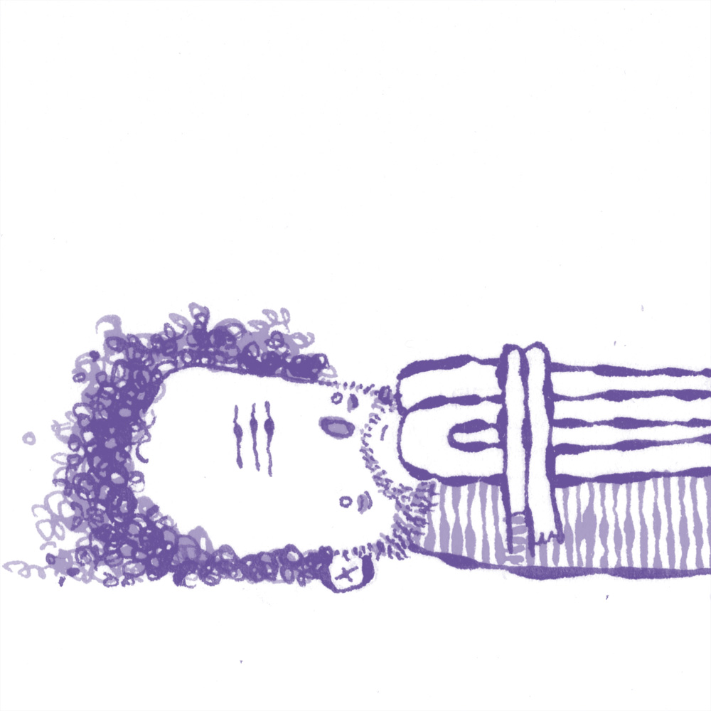
I'll confess that I've never been the biggest fan of Steve "Ribs" Weissman. Having read his Kid Firechief stories and assorted strips here and there, I'd always thought his stuff was cloyingly cute. The smartass element of his work was obvious, but it was in a weird no-man's land for me: not charming enough to work as kids' comic but not enough bite or brains to draw me in as an adult. I went into reading his new collection of strips with an open mind but low expectations.

Imagine my surprise when I found myself won over by Chewing Gum In Church, a collection of connecting gags featuring Weissman's little monsters. To put it in high concept terms, the strips feel like Peanuts meets The Addams Family. We follow the day-to-day exploits of Lit'l Bloody (a vampire), Pull-Apart Boy (a Frankenstein monster), X-Ray Spence, Kid Medusa, Dead Boy (a zombie) and Chubby Cheeks (an obnoxious fat kid). There's a gruesome, visceral quality to the strips since these kids are literally monsters, but Weissman's cute figures and thick black line balance the proceedings. What really stands out are Weissman's cruel punchlines and his intensely strange & non-intuitive use of color. Weissman goes from garish two-color strips to more standard four-color comics, with the two-color strips usually nastier. Weissman also has a lot of 4-panel (or more strips on a page), and then also stretches out several stories to a panel a page. This variation allows him to keep the reader off-guard, not knowing exactly where some stories begin and end; it creates a narrative to go along with the gags. Still and all, the gag's the thing here. The best features Chubby & Pull-Apart Boy enjoying a pie, with the latter coming up with an idea to sell them in a yard. Of course, their sign, "Guys With Pies", draws a slightly different (and more perverted) clientele than than they expected!

Like in Peanuts, the kids in the strip are wise beyond their years and can be quite cruel. The meanest of them all is Chubby, who at one point rips off Pull-Apart Boy's arm and starts beating him with it, saying "I'm doing you a favor." There's also a self-awareness at work here, as one character starts riffing on how the strip should be interpreted as a commentary on "middle-class youth" which immediately get turned into a gag. While there's obviously a lot of room for metaphor with his characters and their surroundings, Weissman is firmly rooted in the present, material and (often) the gross-out.

My favorite character is the poor put-upon Kid Medusa, shunned by all and just looking for somewhere to fit in. She envies the ants' sense of purpose and meaning and destroys their hill. She begs the queen of the ants to accept her, and not hearing anything (they are ants, after all), jumps up and down on them in frustration. Medusa then tries to join up with the bees, mistaking their swarming her with acceptance. Finally, she mistook a black widow in her mailbox as a message from her missing father, resulting in a fatal bite and a series of joyful hallucinations. Her story is the book in microcosm: somehow demented and sweet at the same time.

Monday, April 22, 2013

The Moment: Sumo

What makes Thien Pham's book Sumo (First Second) so effective is that its story is very slight and its characters barely fleshed out, but it doesn't overstay its welcome by padding itself. In its 95 pages, what Pham is really after is illustrating the implications of a single phrase: "Every moment is the moment of truth." Along the way, Pham strips his story of nearly every extraneous detail and narrative prop. Scott, a former college football player who travels to Japan to become a sumo wrestler after the love of his life leaves him, finds himself at a crossroads in his career as a wrestler. Flashing back and forth and time with the clever use of a simple color scheme, we quickly learn that Scott has faced many crossroads and has managed to come through every time. The book ends without a definitive answer regarding Scott's last bout, but that answer was unnecessary thanks to the way Pham cleverly collapsed and sped up the flashbacks at a dizzying rate at the end of the book.

Pham is in complete command of the structure of the page and the book, effortlessly guiding the reader back and forth while using his appealingly blocky, spare style. His use of color makes all the difference as a storyteller, instantly providing the reader with an understanding of how and why the setting has changed thanks to a flashback, something that's reinforced by the symbols around his page numbers. The symbol with the sumo wrestling mat represents the present, the symbol with the water tower represents his past in California, and the symbol with the fish represents the near past when he meets a girl in Japan and develops a profound connection with her. Pham implies the nature of that connection was actually deeper than the one he had with his American girlfriend, in part because of the way his new relationship was one where he not only felt accepted for who he was, but that he had something to offer her beyond surface qualities.

Pham manages to inject moments of humor into what is otherwise a very still and somber narrative when we flash back to Scott's going away party. His friends are funny and vary in their acceptance of his decision, but only out of concern for him.When Scott declares there's nothing for him in America, he lists what each of his friends have going for them, noting that his lush friend "has his beer". It's a sly line, delivered sincerely. The only false note in the comic was a scene where Scott's ex-girlfriend comes to him before he leaves and begs him to stay. He declines, saying that he can't live in the past. It's a scene that really doesn't make much sense and feels more like fantasy fulfillment than anything else. Scott already knows he can't live in the past, so that piece of imparted information doesn't add much to the narrative. Other than that one sour note, Pham's narrative is a smooth glide through to the end, when the images of a plane landing, a fish grasped for and a wrestler thrusting out his arms all converge in beautiful, understated fashion with color and line working harmoniously to instantly transmit simply-rendered information. .

Friday, April 19, 2013

Two From Toon Books: Renee' French and Philippe Coudray

Francoise Mouly's Toon Books is now partnered with Candlewick Press, a respected children's book publisher. Little has changed about them, other than formally codifying the age levels of the books in an easy to understand way. Level one is for emerging readers, level two is for ages 6-7 and level three is for ages 7-8. As such, level one books have fewer words and just one to two panels per page. Level two books are a bit more complex. The same design team and overall quality remain the same; these are simply attractive books to look at and hold, no matter one's age.

Renee French is no stranger to doing children's lit (she has a couple of great ones under he pen name Rainy Dohaney), but this is the first time she's done comics for kids. Her book Barry's Best Buddy is a masterclass on how to effectively cartoon using constraints. The story is very simple: a bird-like creature named Barry is awakened by his friend Polarhog to go on a surprise walk. Along the way, the reluctant Barry is dragged along to such activities as trying on hats at a hat store and eating blue ice cream at an ice cream stand. French embraces the panel constraint and goes even bigger in some cases, with two pages containing a single panel's worth of action. Her figures are still recognizably her, as Barry's one-eyed appearance (we only ever see one eye) and Polarhog's slightly amorphous body are a bit on the unsettling side while still being recognizably cute. French goes all-in with the big panels as she has the pair of friends ambling in slightly dull fashion from left to right. At the same time, she introduces a parade of ants moving across the panel from right to left, carrying increasing strange objects to an unknown destination. The ants are only acknowledged once, at the very beginning of the story, and are otherwise ignored even though they are in the foreground of every page. It's an ingenious storytelling device, pushing kids to read a comics page in several different ways without telling them to do so. The final payoff is not completely unexpected but it's still quite pleasant as it rewards the eye for paying attention to what the ants are doing. French's ability to write a book that is simultaneously off-kilter and straightforward in any number of ways (especially in portraying friendship) make her a perfect candidate to as many of these Toon Books as she cares to do.

Philippe Coudray's first Benjamin Bear book, Fuzzy Thinking, caused a minor sensation because of its nature as a series of one-page gags for kids. The fact that the gags were uniformly clever and excellent is what made the book so popular for adults as well. His new book, Bright Ideas!, is more of the same kind of cartooning. Every page has a story that ends with a single gag. The first panel always establishes the premise of the strip ("the first one to the top of the tree wins!", "it's my ball!", "I'm too hot!", etc). In best improv fashion, the action takes a "yes, and" turn, encounters some kind of opposition and then winds up in a punchline that directly comments on the premise in an unexpected manner. Sometimes he does this with no dialogue at all, using a simple visual to establish the premise. Again, this is a comic that forces the reader to read each panel carefully and make cognitive leaps in order to understand the punchline. For the purposes of both entertainment and education, these books do a spectacular job of exercising new ways of looking at pictures that are far more interactive and complex than a typical illustrated children's book.

Thursday, April 18, 2013

Sequart Reprints: The Baby-Sitters Club

I first encountered Raina Telgemeier's work in the form of a Meathaus-related comic called Getting The Sex Out Of The Way. In a book filled with unusual stylizations, her art stood out thanks to her clean line and cartoony figures. Later, I picked up one of her minicomics up without knowing who it was, and was again drawn in by her art, her ear for dialogue, and a certain grimness that offsets her cheerful style. There's something addictive about looking at her figures; they remind me a little of John Stanley's. Telgemeier's specialty seems to be comics involving teens and children, and her skill in getting across how they act and talk is considerable. I'd recommend checking out her autobiographical "dental drama" series: Smile. [This was subsequently published by Scholastic and was a best-seller. --RC] Telgemeier's work was noticed in a Friends of Lulu anthology by an editor at Scholastic, aka the people who publish Harry Potter books in America. Offering her a gig, Telgemeier suggested adopting the Baby-Sitters Club novels that she loved growing up. As a critic and reader, I can state unequivocably that I am not the intended audience for these books. That said, I was interested in how they scanned, how they looked and wanted to speculate on their impact.

It would seem that Telgemeier was the perfect choice for creating comics aimed at girls. Her cartoony, iconic style is warm and inviting for the eye. Her page composition is simple and uncluttered, yet she adds occasional decorative touches, especially for her chapter headers. The result is a nice bit of light entertainment, where one really feels compelled to turn the pages. In fact, the lightness of Telgemeier's style is a perfect complement to the often heavy-handed, After-School Special nature of the plots and characters. A moodier, more realsitic style would have made reading these books unbearable, but Telgemeier has a knack for keeping things light even when the book gets bogged down in issue-oriented teen drama, like divorce, parents' expectations, health issues, etc.

The first book, Kristy's Great Idea, details how four friends came together to form a baby-sitters club as a way of organizing their lives. Along the way, each character deals with their own conflicts, and conflicts with each other, before the group settles their problems at the end of the book. The second book, The Truth About Stacey, details their struggle with a rival set of baby-sitters and one character's struggle with diabetes. The characters are fairly easy to pick apart in terms of character traits: there's the tomboy, the mouse, the artistic one and the fashionista from New York with a secret.

The whole baby-sitting plot is obviously not in my frame of reference, but after talking to a number of women who grew up in the 80's, all of them noted how important these books were to them--especially because they were baby-sitters. Beyond that, the idea of a group of friends who were responsible and treated with respect by adults had to be enormously appealing. The stories were escapist, but the didactic element of the books was undoubtedly a plus for girls who wanted to see somewhat complicated feelings and situations resolved by girls who were likeable but not perfect--just like them, one presumes. The fact that friendships are shown as important but fragile, subject to hurt feelings and misunderstandings, is probably the most sophisticated element of the books.

Visually, it's clear that Telgemeier had a lot of difficult decisions to make in converting the books to comics form. With page after page of talking heads and lots of dialogue to transcribe, along with four or more characters to cram into a panel, Telgemeier often had to sacrifice backgrounds for the sake of clarity--especially since her audience was not necessarily one that could easily decode a complicated comics page. While this does aid clarity and story flow, it doesn't offer a more sophisticated reader a lot to look at in some of the panels. This is one reason why these comics cried out for color, although I'm sure that was a decision that wasn't in Telgemeier's hands. As much as I enjoy looking at Telgemeier's flowing lines, it seems as though she could have been greatly aided in getting across a lot of information with a nicely muted, pastel palette. Of course, all of that would have been irrelevant if Telgemeier's understanding of the body language and gestures of youngsters wasn't so assured. In particular, her ability to get across feelings through facial expressions with such a simple set of lines is at the heart of why these books work so well.

All told, the Baby-Sitters Club comics fill a void for tween girls. While many girls love to read manga, there's a dearth of material out there for them that reflects familiar interests, conflicts and situations. These comics fill that gap with an artist who understands the appeal of the original source material and succeeds in getting this across in a highly visually appealing package with a breezy narrative flow.

Wednesday, April 17, 2013

Small Comics by Andrew Fulton

UK cartoonist Andrew Fulton sent me a big batch of his "smaller comics": hand-crafted minicomics that indulge the artist's scatological side and show off his excellent chops. With his scratchy and delicate line, he reminds me a lot of Joseph Lambert, especially since both often like to draw silly and/or childish things. Telep is a lesser, earlier work about a woman's frustration with a dropped call. The storytelling isn't entirely coherent in this one. Pee Merm, on the other hand, is about a drunk's pool of piss transforming into a magical pool featuring the titular creature, only to have her be far nastier than she initially seemed. It's an excellent joke that he executes in a spot-on fashion, keeping things cartoony and simple. Super is about an encounter between a pervy customer and a supermarket check-out girl that turns into a very amusing and surprising game of riding a cart down a hill, with both parties winding up in compromising positions--but not unwillingly so.

Fulton's comics are invariably about being lonely and isolated and taking extraordinary means to try to relieve this state. Ben Lives In A Cabin Up A Mountain is about a big guy living in that titular cabin who shits off the edge of a mountain every night. The punchline is that he's created his own sort of shit sculpture that resembles a human--company at least, as he leaps off the mountain! Along the same lines is Can You Still Get Pregnant If The Dude Just Cries The Whole Time, which is about a hairy, tubby guy who blows up condoms, draws on them so they look like women, and then jumps up and down on them with a great deal of glee. Like all of Fulton's comics, it would be repulsive if it weren't drawn in such a cute manner.

Fulton's more recent work is a bit more introspective, while still very much in the same vein. Mad Bonaz 4 Lyfe is about two men who were lovers who are trying to break up. One makes an effort to masturbate to the thought of women while the other tries to have sex with an actual woman...but it's not quite the same. Connected by orgasm, the two simply cannot be apart, which makes for a surprisingly tender conclusion in a comic dedicated to a couple of Fulton's friends. Finally, Good abandons sex and scatology and instead focuses on a father and his children. Only this father is nearly fetal and feral, presumably after trying to look after two rambunctious boys. The way the boys draw their father back in and the way he comes back in feels both real and exaggerated, the way that parenthood itself often feels. Fulton's drawing has become much more assured as he really took time to draw dozens of tiny, scraggly lines of hair on the man's head, giving him a properly disheveled appearance to go with his long, angular limbs and torso.  These minis clearly seem to be Fulton having a bit of fun and knocking out quick, silly ideas, but it's clear that he's talented and has deeper ideas lurking under this veneer of silliness. 

Tuesday, April 16, 2013

Sequart Reprints: Little Vampire, Kaput & Zosky

First Second continues to build on their impressive stockpile of comics aimed at kids with collections of Lewis Trondheim's Kaput & Zosky and Joann Sfar's Little Vampire. Both of these comics have appeared in English in other formats, at least in pieces. Some Kaput & Zosky shorts were translated in the much-missed Trondheim spotlight series The Nimrod that Fantagraphics used to publish. A couple of the Little Vampire stories were published by Simon & Schuster five years ago, but the series ended there. First Second, with their solid design, aggressive and smart marketing and understanding of how to reach their desired audience, picked up the banner for Sfar and Trondheim.

Little Vampire is the prequel of sorts for Vampire Loves, another charmingly ambling set of stories featuring the friendly vampire. Little Vampire lives in a haunted castle with all sorts of monsters and ghosts. His desire to go to school leads to an amusing sequence where his mother and father (who turns out to be the Flying Dutchman) arrange for the whole menagerie to attend a school at night. He does the homework for a human boy, and the two wind up as fast friends. Sfar manages to make the monsters and ghosts simultaneously friendly and gruesome. Maintaining that balance is his best trick--the supernatural in all its occasionally frightening forms is on every page, yet the boldness of Little Vampire and the boy Michael offer a reassuring presence for even the youngest of readers.

The stories are Sfar at his best. The first story is about friendship, the second is about standing up to bullies, and the third is about animal cruelty. Sfar manages to get across lessons in the least didactic manner possible, thanks to his lively line, attention to the forward propulsion of the story's action, and vivid colors. At the same time, he's not afraid to go off on tangents and character soliloquies, trusting his audience enough to know that they'll realize that he'll snap back into the main narrative shortly. The second story, "Little Vampire Does Kung-Fu", takes a pretty simple idea (Michael must deal with a bully) and takes it into some very odd directions.

Michael and LV step into a painting in the haunted castle, where a rabbi points him in a direction where he can learn kung-fu. In a hilarious sequence, Michael goes through a clever series of vignettes to achieve his quest--only to find that the castle monsters have eaten his tormentor. Realizing that that would never do, he and Little Vampire have to consult a group of sorcerers to bring him back to life, but not before nearly sparking a wizard war. Finally, the bully was brought back to life a little too effectively--he became a monstrous giant who nearly squashed our heroes before they got a little help from LV's father. This story encapsulates what Sfar does so well here--he creates a narrative that doesn't talk down to children, but rather respects their intelligence and thirst for the unusual, the bizarre and even the scatological, all while crafting characters that are enormously sympathetic, distinctive and affectionate. Above all else, these stories are funny--the drawings are funny to look at, and his dialogue is filled with punchlines, plays on words and even amusing non sequiturs.

On the other hand, Lewis Trondheim's Kaput & Zosky is done in the tradition of the Warner Brothers or Terrytoons--stylish, hilarious and glorious cartoonish violence for its own sake. These stories are about two inept intergalactic conquerors whom, despite their taste for mayhem, find themselves foiled on every planet they visit. These stories were mostly drawn by Eric Cartier in a style very similar to Trondheim's, and they were later adapted for an animated series that was once aired on Nicktoons. This collection also contains a number of "The Cosmonaut" strips, written and drawn by Trondheim. In gag stories like this, Trondheim is at his best because his plots unfold like puzzles, slowly unveiling the story's clever solution (and resolution) in hilarious fashion.

For example, a planet where every being obeys them not only frustrates their desire to conquer bloodily, it winds up driving them off the planet when Kaput's suggestions of things he doesn't want to happen come to pass. On one planet, when Kaput wins on a slot machine and doesn't want the money (preferring money stolen), the money keeps doubling and doubling until he owns the entire planet--and then walks away because he doesn't want to rule a world without "kicking butt". They conquer another world by getting elected in a democratic process and are forced to flee when they're expected to live up to their promises ("...the ugly shall be beautiful!"). The duo are fleeced by a traveling arms merchant who sells weapons and something to overcome them to both our protagonists and the planet they're trying to conquer. When Kaput manages to solve the problem of the annoying salesman in a very direct fashion, it leads to the natives learning from his example and driving them off.

Like all of his comics aimed at kids, Trondheim really makes them for his own enjoyment first and foremost. As a result, any adult can read and enjoy them for the liveliness of the art, the clever storytelling, and the way he manages to slip between sophisticated and crude humor so effortlessly. The "Cosmonaut" interstitial pages fit in perfectly with this style of humor, and are perhaps even more vicious and scatological than the Kaput & Zosky strips. This book is not quite as appealing as the stories from Dungeon , mostly because these are deliberately one-note characters designed to fit a certain kind of story design. These stories are pure parody, sending up sci-fi's hoary cliches while still managing to utilize clever premises. Kaput & Zosky isn't the first book I'd recommend for someone looking to explore Trondheim's work, but it still serves as an example of his long winning streak in comics--I don't think I've ever read a Trondheim story that wasn't at least clever, well-crafted and enjoyable to read at worst, and transcendentally brilliant at best.

Monday, April 15, 2013

Personal Stories: MariNaomi, Rob Kirby, Virginia Paine


What's New Pussycat?, by MariNaomi. With small, spare drawings done on big pages, MariNaomi gives this story time to breathe, build and develop a certain uncomfortable rhythm. It's about her history with a particular dorky guy who awkwardly flirted with her over a period of years as they encountered each other at various work spaces. Each little vignette is separated by raindrops, with the rain getting heavier until the final vignette, when we learn the guy has met a tragic end. There's no real moral here, nor is this an excuse for the author to beat herself up for not seeing how deeply depressed the guy (Herbert) was. It's simply a solemn, respectful and honest appraisal of his behavior (he made her uncomfortable with mildly sexist remarks and actions), her behavior (she felt she overreacted when she finally rebuked him, years later) and the ways in which depression can lead us to dark territories. The images are spare, stark and beautiful, with some of her best-ever drawing. In particular, her figure drawing is simple but highly expressive, capturing MariNaomi's naivete as a younger woman and Herbert's complex mixture of despair, wit and desperation to connect. The author's epilogue provided interesting background information but wasn't really necessary for understanding or relating to the story.


Rob Kirby's Snack Pak #1, by Rob Kirby. Kirby is just a solid cartoonist overall with a light, fanciful touch. This grab-bag comic contains gags, diary strips, drawings and vignettes. Kirby leads a relatively quiet, successful and contented life, with most of his anxiety being directed at his career as a cartoonist. His self-caricature is one of the most charming in comics, complete with a slightly-upturned pickle nose. Kirby enjoys playing up his more embarrassing moments for laughs, like the time he felt sick and fainted on a plane or puked on a Mexican vacation. His daily strips can take on a slightly poetic tone, as he does his best work when commenting on how he interacts with his environment outside and how it makes him feel physically. He also has an ear for an anecdote, especially when he starts talking about the always-reliable comics convention stories. Then there are times when he's just plain funny, like his "Middle Age" strip about having a six-pack, drinking six packs and then having a bun in the oven and "junk in mah trunk" set to a funky beat heard only in his own mind. It's a great bit of exaggerated cartooning and a nice joke at a his own expense. Kirby's the kind of artist who can do just about any type of storytelling, and minis like this are clearly a way for him to stay nimble and loose while he's between longer projects, with results that are delightful for the reader.


MilkyBoots #14, by Virginia Paine. This comic represents a big step forward for Paine as both a writer and cartoonist. Though mostly a series of vignettes, drawings, profiles and other small pieces, it's all surrounding Paine's feelings regarding a rough break-up. What's remarkable about this comic is the way that Paine eschews that path of simple lamentation and instead tries to gain insight into her own emotional and existential points of view. It really looks like Paine put a great deal of effort into both the quality of her drawings and the design of the piece; it seems clear that she did a lot of drawing from life. Many of the vignettes experiment with all sorts of different layouts, with her use of negative space adding a lot of clarity and power to her individual images. Paine also spends time to establish her daily routines and support system in the form of her friends who sit out on the porch with her, all while examining deeper questions about herself: her sexual identity, her identity regarding relationships (polyamorous vs monogamous) and how to handle emotionally needy friends. It's a beautiful, powerful and altogether cohesive mini that's greater than the sum of its parts.