Rebekka Dunlap's Dream Tube is Youth in Decline's third book (Rav by Mickey Zacchilli and Snackies by Nick Sumida were the first two). The three stories in this collection explore the tropes of fantasy, dreams and science-fiction with an eye that's at various points both whimsical and horrible. With figures that are stylized and distorted in a manner that's not unlike that of Dash Shaw, Dunlap's stories always involve coupling at their cores, and the ways in which couples fall apart or get torn apart. "Brooklyn Witch Treats" is the funniest story, as it doesn't follow a single character as it does a scene, transposing Brooklyn hipsters into a supernatural setting in a remarkably effortless fashion. Casting a spell in a bathroom is akin to doing lines of coke (only the witch was in the wrong bathroom). Various monsters and magical creatures dance in the club, while a hooded man winds up sleeping with the witch, who devours him when she asks him if he wants to see her void. The second half of the story concerns a voyeuristic creature with an eye for a head (an appropriate fetish) who watches eye-BDSM porn ("Bad eyes don't get solution!") and has a crush on a beautiful witch from afar. It's implied that his insinuating gaze disrupts her own attempts at "broadcasting", a wide form of expression. This is less a narrative than a loosely-connected series of events that creates a tone and illustrates a particular aesthetic.
"Cities And Spaces And" is about a couple living in a remote location and a dream she had. In the dream, they were living in a city, they didn't know each other, and the city was under attack. Essentially, she created a romance for them that didn't exist in their daily lives, one that included danger, daring, new sights, togetherness but also a certain amount of distance in terms of intimacy. Dunlap's stylizations are especially vivid here, emphasizing angles and grids set against inexplicable shapes. It's wish fulfillment and a reaction against their present living arrangement, where even the man's hair is rigidly stylized.
"Colony" is about paranoia and the problematic nature of colonization, as a scientist is increasingly concerned with the ethical implications about the presence of her team, especially as initially innocent exploration turned into something far different. It's also about friendship and betrayal, with imagery and ideas not unlike 2001: A Space Odyssey, as the lead character tries to anticipate and outsmart the forced arrayed against her. It's also a story about guilt, as her friend who came with her on the interstellar journey wound up being a sort of sacrifice as he merged with the alien forces. Dunlap is remarkably skilled as both illustrator and cartoonist, and I think the similarity to Shaw's work may come in a mutual interest in manga. What's especially interesting about Dunlap's work is that she wrote three stories with very different concerns and tones using roughly the same visual techniques, but the way she arranged images and wrote each story led to wildly different tones. To be sure, there are funny asides and eye pops in each story, but the first story's anarchy, the second story's intimacy and the third story's paranoia led to wildly different reading experiences.
Showing posts with label ryan sands. Show all posts
Friday, May 27, 2016
Monday, May 23, 2016
Youth In Decline Week: Frontier 1-3
Of the newer alt-comics publishers, Youth In Decline's Ryan Sands reminds me the most of the late Dylan Williams of Sparkplug Comics. First, he has a particular aesthetic that guides his publishing choices above all other considerations. Second, he always has an eye on up-and-coming talent. Third, he not only is open to diversity in whom he publishes, it's clear that he seeks it out. In the first twelve issues of YID's anthology talent showcase, Frontier, Sands has published the work of eight women. Four issues have featured Americans, four issues have featured Canadians, and the rest have come from all over Europe. Some of the artists have submitted a single story for this mini-comic size publication (about 6.5 x 8"), while others have submitted several shorter stories. Some artists eschewed narratives altogether, preferring illustrations that have a sort of fractured narrative quality. All of them are in Sands' aesthetic wheelhouse, which can be described as an overlapping appreciation for what some might consider banal or limited genres like horror or erotica. Really, what Sands is most interested in is narratives and imagery about transformation, ritual, and identity. The approach each artist might use was less important than a certain bold willingness to take difficult and sometimes problematic ideas as far as they will go.
In Frontier #1 (2013), Russian artist Uno Moralez is featured. His character designs range from cartoony to naturalistic as they depict David Lynch-inspired torch singers, religious iconography as part of a visceral battle between good and evil, and scenes of voyeurism met with sheer, unrelenting horror. There's not a cohesive narrative connection between all of the images, but they have a thematic similarity in that Moralez is showing us a fallen world that's still met with pockets of desperate belief. For every moment of hope, there's an image of corruption, dissolution, and abject terror. What seems beautiful and desirable is destructive, and what is pure is eventually destroyed. The image of a boy with a telescope seeing a horrendous female demon with an almost prehensile tongue is especially terrifying, as she simply appears in front of him and chases him. We don't see her catch him, but we do see his head tilt at a sickening angle, with a demented grin spreading across is face. Many of the illustrations have a pixelated quality, as though Moralez wants the reader to understand the artificial nature of what they're seeing. That connection between image and reality is driven home at the end with a photo of Laura Dern ugly-crying in a scene from David Lynch's Wild At Heart, which is a film about a quest that slowly breaks down.
Frontier #2 (2013) features Hellen Jo in a comic filled with images of girl gangs in a sort of mythical California. Again, there's no particular story here other than imagining what might have led to the moments captured in time that Jo depicts, like one image of a group called the Bang Gang where one girl is putting on lipstick in a public bathroom while another is washing blood out of her mouth. Jo indicates in an afterword that these are fantasy figures based on girls she saw, feared and respected growing up, desiring the power and freedom they wielded. Jo's skill as an illustrator is remarkable, as she tells a lot of story with body language and the placement of figures in space. The details of what the girls are doing is less important than their poses and how they're doing it. Jo favors lavender and blue as her go-to colors for many of the illustrations, soft colors that both belies the toughness of the girls and underscores the fact that they are still young girls. Two girls who call themselves the Shit Twins stand against a wall with blank expressions, blue hair and fairly typical clothes--but one of them is wearing an eyepatch. There's another two page spread where a member of the Scalps is getting her hair buzzed while eating a lollipop and another is looking at art on a wall. Every illustration shares that weird tension between adulthood and childhood, one that Jo is careful not to sexualize in an exploitative manner. Indeed, the girls here are defiant and clearly do not give a fuck about anyone else's view of them. They have transformed from whatever they were before into something different, powerful and self-determining.
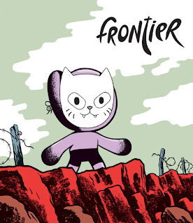
Frontier #3 (2014) includes three stories published in English for the first time by German artist Sascha Hommer. In an afterword, he says that his biggest influences are Chris Ware and Yuichi Yokoyama, and that's made clear by his simplified use of character design as well as an interest in oblique imagery. He uses a lot of zip-a-tone effects in "Drifter", which is essentially a shaggy-dog story about an escaped convict on what appears to be an alien planet. The story starts off with a jailer bitching about the convict's complaints about his room, and the story tensely follows his journey after escaping, only to reveal that he got what he really wanted in the end. In a story where every page was a nine-panel grid, Hommer always used the middle panel in the page not necessarily as a climax point, but as a tension point: his pursuers blown up, moving forward in a ridiculous disguise in a diner, wondering if the police would catch him, etc. "Transit" is about aliens investigating a small town in Austria for their mysterious purposes ("transit"--colonization?). Instead of simply following around a figure, the story has an almost clinical air about it, as we see computer screen images the aliens are following. The figures we do meet have a lumpy, almost bigfoot quality to them. "The Black Lord" is about a board game's main piece that we see over a long period of time, using that familiar Richard McGuire time-splintering effect that Ware has long favored. The ultimate fate of the figure is reflective of the game's theme of conquest and randomness. The latter two stories are all about transformation, while the first story is about the illusion of change.
In Frontier #1 (2013), Russian artist Uno Moralez is featured. His character designs range from cartoony to naturalistic as they depict David Lynch-inspired torch singers, religious iconography as part of a visceral battle between good and evil, and scenes of voyeurism met with sheer, unrelenting horror. There's not a cohesive narrative connection between all of the images, but they have a thematic similarity in that Moralez is showing us a fallen world that's still met with pockets of desperate belief. For every moment of hope, there's an image of corruption, dissolution, and abject terror. What seems beautiful and desirable is destructive, and what is pure is eventually destroyed. The image of a boy with a telescope seeing a horrendous female demon with an almost prehensile tongue is especially terrifying, as she simply appears in front of him and chases him. We don't see her catch him, but we do see his head tilt at a sickening angle, with a demented grin spreading across is face. Many of the illustrations have a pixelated quality, as though Moralez wants the reader to understand the artificial nature of what they're seeing. That connection between image and reality is driven home at the end with a photo of Laura Dern ugly-crying in a scene from David Lynch's Wild At Heart, which is a film about a quest that slowly breaks down.
Frontier #2 (2013) features Hellen Jo in a comic filled with images of girl gangs in a sort of mythical California. Again, there's no particular story here other than imagining what might have led to the moments captured in time that Jo depicts, like one image of a group called the Bang Gang where one girl is putting on lipstick in a public bathroom while another is washing blood out of her mouth. Jo indicates in an afterword that these are fantasy figures based on girls she saw, feared and respected growing up, desiring the power and freedom they wielded. Jo's skill as an illustrator is remarkable, as she tells a lot of story with body language and the placement of figures in space. The details of what the girls are doing is less important than their poses and how they're doing it. Jo favors lavender and blue as her go-to colors for many of the illustrations, soft colors that both belies the toughness of the girls and underscores the fact that they are still young girls. Two girls who call themselves the Shit Twins stand against a wall with blank expressions, blue hair and fairly typical clothes--but one of them is wearing an eyepatch. There's another two page spread where a member of the Scalps is getting her hair buzzed while eating a lollipop and another is looking at art on a wall. Every illustration shares that weird tension between adulthood and childhood, one that Jo is careful not to sexualize in an exploitative manner. Indeed, the girls here are defiant and clearly do not give a fuck about anyone else's view of them. They have transformed from whatever they were before into something different, powerful and self-determining.
Frontier #3 (2014) includes three stories published in English for the first time by German artist Sascha Hommer. In an afterword, he says that his biggest influences are Chris Ware and Yuichi Yokoyama, and that's made clear by his simplified use of character design as well as an interest in oblique imagery. He uses a lot of zip-a-tone effects in "Drifter", which is essentially a shaggy-dog story about an escaped convict on what appears to be an alien planet. The story starts off with a jailer bitching about the convict's complaints about his room, and the story tensely follows his journey after escaping, only to reveal that he got what he really wanted in the end. In a story where every page was a nine-panel grid, Hommer always used the middle panel in the page not necessarily as a climax point, but as a tension point: his pursuers blown up, moving forward in a ridiculous disguise in a diner, wondering if the police would catch him, etc. "Transit" is about aliens investigating a small town in Austria for their mysterious purposes ("transit"--colonization?). Instead of simply following around a figure, the story has an almost clinical air about it, as we see computer screen images the aliens are following. The figures we do meet have a lumpy, almost bigfoot quality to them. "The Black Lord" is about a board game's main piece that we see over a long period of time, using that familiar Richard McGuire time-splintering effect that Ware has long favored. The ultimate fate of the figure is reflective of the game's theme of conquest and randomness. The latter two stories are all about transformation, while the first story is about the illusion of change.
Labels:
hellen jo,
ryan sands,
sascha hommer,
uno moralez
Subscribe to:
Posts (Atom)


