Showing posts with label kus. Show all posts
Wednesday, November 8, 2017
Minis: N. Van Sciver, E.Luce/M.Wobensmith
His Last Comic, by Noah Van Sciver. This is Mini-Kus! #60, and it's a jokey story from Van Sciver that he ran on his Facebook page. Van Sciver excels at drawing schlubs and losers, and this is a sort of second cousin to Dan Clowes' old Dan Pussey stories. It's about a worker drone who's been self-publishing his shitty superhero comics to no acclaim for years, and he wonders if he should just give up on his dreams of being famous and getting to go out with this particular woman at his job. In a plot twist that hinges on EC Comics' Old Witch selling him a magical potion which will solve all of his problems. When he pours the potion into the ink that's used to print his comic, he finds that no one can resist the actual object...but no one cares about the story. This is a hilarious send-up of comics as a speculator's item, wherein their perceived "value" was more important than their feelings about the story and art. The main character is an exaggerated loser with no redeeming qualities (even Van Sciver's sad-sack narcissist character Fante Bukowski was likable in some ways), existing to serve a gag and to get his just desserts with an EC-style twist ending. For such a goof of a story, Van Sciver can't help but make beautiful pages that actually add pathos to the narrative. The above image of the artist walking in the snow is gorgeously rendered, giving the reader a sense of the fully-developed world that the artist lives in but can't quite see because his imagination is occupied by adolescent nonsense.
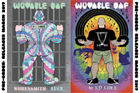
Wuvable Oaf #5, by Ed Luce & Matt Wobensmith. Three years in the making, this 40 page comic book-formatted effort sees Luce going in some different directions, even as he continues to be a genre and boundary-smashing artist. It's not just that this is a gay romance comic; it's a gay romance comic that's about death metal, pro wrestling and features a number of characters who are "bears", or large, hairy men. There's also a strong magical realist component to the comic which resembles Jaime Hernandez's work a bit, only in a different context. Oh, and kitties.
The first few issues of the series focused on the titular Oaf, a former professional wrestler, who developed a huge crush on Eiffel, the diminutive lead singer of death metal band Ejaculoid. The last issue featured their (despite all sorts of weirdness) adorable first date, and the back-up story beginning in this issue deals with the ramifications of Oaf and Eiffel being in a couple while Ejaculoid is on tour. There's a reason why the story is titled "Yokoaf Onoaf", which is one of my all-time favorite story puns. Luce is a skilled illustrator and cartoonist, and there's an astonishing two page spread filled with literally flowery detail when Oaf walks into the hotel holding the gig and finds it filled with flowers and ferns. It's precisely the opposite of the sort of grit and grime usually seen in this comic and it's a marvelous comedic turn. After singing "Fatty Daddy Baby Batter" (an ode to sexy, chubby dads), we are introduced to Marx, who apparently commands black, magical mind-control tentacles but is mostly looking to get laid on Ejaculoid's tour as its manager. (He hooks up with Simon Hanselmann's Megg character here, for instance.) It's silly, it's weird, and it's funny, even as Luce cooks up some band melodrama for further episodes.
On the other hand, the other side of the comic (it's a flip book) follows Smusherrrr, the "artist" who once was obsessed with Oaf to the point of stalking and is now obsessed with Oaf's friend Bufu. This section was written by Wobensmith, and Smusherrrr is presented as a character who is desperately in search of an identity, and often tries to find that identity in his obsessions with others. There's a hilariously creepy scene where Bufu, who is African-American, is "accidentally" run into by Smusherrrr and his grocery cart, which contains nothing but chocolate items. After an over-the-top and uncomfortable scene where Smush essentially begs Bufu to be his, there's a hilarious drug sequence (inspired by smoking hair of various people and animals) where he confronts aspects of himself that he was unwilling to come to terms with. This leads up to his attending a support group for fake people; in other words, people who appropriate or fetishize other cultures and races. The best character there is Killrrrrr, who is drawn like a grown-up Charlie Brown (including using the same lettering style as Schulz!) wearing a Dodgers jersey and a do-rag whose biggest ambition is to break into "the inner circle of Hollywood gangster character actor extras." Satirizing racial and ethnic stereotypes & appropriation is a tricky matter, but Luce does a lot to make it work with his exaggerated, cartoony drawings. He's an exceptional caricaturist (it's perhaps his greatest skill) and putting in jokes like adding in the Tupac hologram (from Coachella 2012) as a literally fake racial persona went a long way in making the situation funny, rather than relying on drawing a lot of stereotypes. I'm not sure what the ultimate point of this storyline will be (an epiphany for Smusherrrr? a tour of racist appropriations throughout history? leaving Smusherrrr as a clueless, narcissistic parasite?), but Luce has thus far heightened the humor and defused what could have been a number of problematic elements.
Tuesday, July 11, 2017
Mini-Kus! of the Week #13: M.Ahokoivu, E.Valve, M.Sienczyk
Mini-Kus #10: Otso, by Mari Ahokoivu. This story of a bear astronaut takes a highly surprising turn early on. Ahokoivu mixes a friendly, simple line with a green color pencil wash as to astronaut is told to enter "hypersleep" in order to reach his destination in the stars. That's a clever take on hibernation, of course, but what actually happens is a mix of the strange and horrifying. In hyperspace, his ship is overtaken by a trio of bloodthirsty aliens, who attack him for unknown reasons in a series of visceral, orange-stained pages that are surprisingly disturbing. As always, simplicity and suggestion are far more frightening than complexity of image and gore. The final twist is that the aliens seemed to be there to help the bear fulfill his mission of being out in the stars, just in a way that was simultaneously terrible, beautiful and poetic. This is another one of those issues of mini-Kus! where the length of the story is perfect for the subject matter, as well as the size of the pages. The reader is given a glimpse into the mysteries of the universe, and all we're allowed to see is what's on these very small, mini-comics sized pages.
Mini-Kus #11: All You Need Is Love, by Emmi Valve. This is a charming, visually interesting autobio comic that explores relationships and love outside of romance. Valve uses a thick, chunky line for her hand-drawn panels that reflect the rough, spontaneous nature of her drawing. At the same time, within each panel her line is thin enough to detail delicate aspects of her environment as well as provide cross-hatching. Hers is a heavy world, weighed down by depression and expectation. Like many in that state, basic self-care seems entirely impossible. Fortunately, her platonic friend Joakim stops by to give her encouragement, help and a push in the right direction. They bond over the Beatles, coffee and a trivia quiz, as Joakim essentially engages her in opposite action: healthy activities that make her feel better but are the opposite of what her malaise wants her to do. The watercolors in the piece become subtly bright as the story goes on, reflecting the fact that this isn't a cure, but rather a reprieve. The way Valve focuses on specifics in the story is the key to its success; she doesn't try to make any larger points about love, work or success because doing so would rob the story of its personal power.
Mini-Kus #12: Historyjki, by Maciej Sienczyk. This mini is like reading an especially strange series of vignettes from Ripley's Believe It Or Not. There's the same straight face in presenting the absurd, the same stiff line, and the same total commitment in telling the story. There's a story of a tribe on a small island, a frightening old man with oversized testicles, and a tribe that travels in a formation the shape of the old man. There's a piece about a song made up during sweeping the floor that becomes an epic about a woman whose bra is stolen off of her when she dies, and how horrible this is. There's a robber foiled by touching a piece of food in a man's mouth shaped like the robber surrendering, tall tales surrounding bread and frightening bread fauns that walk around at night, and the boy who could only survive if kept in boiling water. The latter had to wear a suit like an iron lung/pot-bellied stove but managed to have a wife and children! These stories are remarkably dense but short, packing a treasure trove of false facts in just three or four pages each. The colors are deliberately flat, refusing to betray any sense of sensationalism in these otherwise whacked-out stories, as Sienczyk sticks to his shtick relentlessly.
Labels:
emmi valve,
kus,
maciej siencyzk,
mari ahokoivu
Thursday, January 19, 2017
Slipping Through The Shadows With Roman Muradov
Roman Muradov is one of the few cartoonists I can think of who is somehow an appropriate fit for NoBrow, Uncivilized Books, Kus! and Retrofit. Take Jacob Bladders And The State Of The Art (Uncivilized), for example. The mystery angle, satirical elements and stark black & white drawings are all perfect fits for the highbrow/lowbrow mix that Uncivilized is known for. (In A Sense) Lost & Found (NoBrow) is far more clearly laid out and an easier read in general, and its use of color and its lush design puts it firmly in that NoBrow aesthetic. The End Of A Fence is a smaller-sized art object in vivid color, making it a nice fit in the Kus! family. They're all unmistakably Muradov in terms of the whimsical, angular drawings; a continuous use of shadow; and a bone-dry sense of humor that occasionally veers into too-clever preciousness.
Jacob Bladders is a sort of noir parody set in a ruthless 1940s publishing world where illustrators can get roughed up to get at their work. Even if it's the mediocre work of the titular cartoonist, whose drawing of "career ladders" for the New York Daily News provides steady filler. In many ways, this entire book is a shaggy dog joke, as it imagines Twitter existing in a slightly different form in that era (called Tweeter), with certain elite tweeterers being named as Twitterateurs, leading to the punchline of a book heavily influenced by the aesthetic of painter Paul Klee. The book claims that his ink-and-watercolor piece The Twittering Machine (below) was a satire of Tweeter, providing a groaner of an end for that shaggy dog joke. While Muradov's figures sometimes resemble that of Klee's fellow Der Blaue Reiter member Wassily Kandinsky, the famous Klee smudges are omnipresent in this comic, often deliberately obscuring dialogue and even action. This is a book about conspiracies at a high level, thuggishness and brute force at a low level, and art theory at an abstract and concrete level, with the drawings in an Expressionist style and the narrative being all about the value and meaning of art, especially with regard to how it interacts with commerce. This is decidedly the densest of Muradov's comics, and there are points when visual and narrative thickness becomes nearly incoherent, but Muradov is always able to bring it clearly back around to the narrative just in time.
The End Of A Fence has a pretty simple high concept: a world where one can be redirected to a different area where one can meet one's perfect match. The book starts with a break-up and a woman with a perfectly coiffed bun hairstyle going elsewhere. In this book, the characters are smooth and essentially piles of geometric figures carefully arranged to create what looks like people. The story is fairly predictable, as the protagonist learns that it's the differences that make relationships interesting, and too much agreement is not only boring, but can lead to conflict on its own. This was what I meant by Muradov's comics being a bit on the precious side, because if it wasn't for the remarkable use of color, this would be a fairly generic story. Indeed, Muradov's juxtaposition of colors makes the characters shimmer and shine on the page. The way Muradov dips colors into pitch black and out again is a particular visual highlight, as is his unusual lettering and neologisms that develop out of text that's slightly altered and bent. In Muradov's comics, reality has a slightly elastic quality, and the dance of color forms across the page is what makes this comic fun to look at; the actual text is of far lesser importance.
(In A Sense) Lost & Found felt like a kind of middle ground, wherein Muradov used a traditional comics grid (9 panels) and a russet-brown/deep purple color wash to tell this story of lurking in the city's shadows. Muradov is fond of doing homages to other artists and writers, and the introductory line of this comic ("F. Premise awoke one morning from troubled dreams to find that her innocence had gone missing...") seems to be a direct reference to Franz Kafka's classic The Metamorphosis, wherein "As Gregor Samsa awoke one morning from uneasy dreams he found himself transformed in his bed into a monstrous vermin." In the case of Ms. Premise, that transformation was similar to poor Gregor's in that she instantly became an outcast; her father told her to not ever leave the house now that it was gone. Exactly what "innocence" meant in the context of the story is left deliberately vague; it could be an awareness of how the world works (especially with regard to how women are treated), it could be one's virginity, but it's definitely something specific to being a woman.
She launches a quest to track it down, leading her to a fatalistically depressed bookseller who saves her from an angry mob. From there, she follows a clue to an underground series of merchants where she learns that her innocence had been taken to a certain address. She's forced to put on a pair of baggy pants to disguise her gender before she goes out, however. Eventually, she discovers her innocence has been mass-produced to make neckerchiefs, at which point she realizes she doesn't need it anymore. After that final, life-changing encounter, she negotiates her environment that shifts from the nightmare world of Pablo Picasso's Guernica to The Dance, by Henri Matisse. In other words, from the brutality of a judgmental world to a way of reclaiming her innocence on her own terms. Unlike Gregor Samsa, F. Premise lives through the nightmare and comes out the other side, thanks entirely to her own newfound understanding of her self and the power that not caring about social mores gives one. At the very end, she is literally writing her own story as she repeats the first line of the book's narrative, an indicator that her identity is something that can never be taken away from her, but it can be given away. The result of her quest was discovering that she had indeed never really lost it in the first place, but rather it had transformed into something she, and only she, had control over. Once again, the use of the grid and the mixture of total storytelling clarity mixed in with shadows, darkness and visual chaos made for a perfect blend in representing someone who started to see the familiar world as something new and confusing.
Subscribe to:
Posts (Atom)


