Wednesday, June 3, 2015
Autobio: Jep, Hayden, Nichols, Bean/Viola
Jep Comix 4, by Jep. The cartoonist draws slice-of-life autobio vignettes featuring a stripped-down self-caricature and frequent anthropomorphic versions of friends. These are comics featuring small but pointed moments, like a memory from high school spent playing a video game, avoiding his father. Another interesting bit was one where the cartoonist has a number of awkward interactions with a man from across the street who weirdly hits on him after he tells him he's getting married. Even a talking head strip featuring him talking to his sister about flooding basements and Moses parting the Red Sea is interesting because of his thick, simple line that's not unlike a Sam Brown figure. These comics are modest, charming and utterly lacking in pretension.
Rushes, by Jennifer Hayden. This is a collection of good ol' four-panel diary comics. They remind me a bit of Jesse Reklaw's strips in that the reader is more or less dropped in media res into Hayden's life and expected to figure things out as she goes along and that it's a process strip. That is, it's Hayden recording her progress finishing a long book about her experience with breast cancer (The Story Of My Tits, out in September from IDW/Top Shelf), as well as a document of everyday family life. This particular volume is also an account of the preparations for as well as an actual trip to London and Paris, so that gives the reader a bit of value-added above simply watching Hayden draw comics or talk on the phone for several panels. Hayden's voice is distinct and powerful, and it's well-matched to her stripped-down but still dense style of cartooning. Her use of negative space in particular is impressive in depicting a busy, cluttered and full life with comics, her family, playing music and a clear identity as the family organizer. Allowing the reader to fill in some lines allows her comics some space to breathe, letting the eye pass quicker from panel to panel without getting bogged down in each panel's details. The personal details are mostly of a quotidian nature, with occasional reminders about her surviving cancer; in these strips, Hayden is more interested in getting down the basics than reflecting too long on what it all means. That immediacy is what makes the strip-to-strip flow so effective.
Heart Farts, by Cara Bean and Rebecca & Jason Viola. This is a two-woman anthology featuring Bean and R.Viola (comics drawn by her husband Jason). The strips are pleasant and lightweight, featuring topics like dreams about Tom Brady and the satisfaction received in creating bento boxes for others' lunches. One of the bigger treats here is a chance to see more of Bean's classroom comics and her bean-shaped self-caricature; one of the strips is about being a teacher and trying to get her students to love what she's teaching as much as she does, getting away from the feeling that she's torturing them. The Violas' bento box strip is about how having an opportunity to make something unique and nourishing for someone else is in itself a nourishing activity. Bean's classroom strip addressed the idea of "flow": how purposeful, creative activity creates positive energy not only for oneself, but for one's associates as well. While Viola's comic doesn't address this explicitly, there's no question that her comic is a demonstration of this idea in action. That synergy of ideas makes the mini greater than the sum of its parts, as it features slightly diverging points of view on the same set of ideas. The versatility of Jason Viola meant that Rebecca could write about anything and the result would inevitably look great.
Flocks 4, by L.Nichols.This is the most powerful chapter yet in Nichols' account of growing up queer and Christian. In this issue, Nichols lays out why simply excoriating her parents and others in their rural Louisiana community for condemning homosexuality isn't so simple. Their parents, teachers and people in their church, who made Nichols' life hellish in some respects, were the same people who encouraged them to excel in school. Being an intellectual of size in school made Nichols an easy target, and that support from adults turned out to be a crucial factor in becoming a success and realizing their dream of attending MIT. In one sense, Flocks is a document about pain: the pain of not fitting in, the pain of knowing that those people you love might not love you for what you truly are.
In another sense, Flocks is about pressure and balance, cleverly represented through mathematical notations. It's about the pressures that all of the various groups of whom we are a member put on us, for good ("you can do it!") and ill ("nerd!", "queer!", etc) and how to balance the negative pressures with the positive support. Nichols describes how they "fit in enough not to be rejected" and "fit in enough to gain support when needed" in hopes that "everything would get better one day". However, this wasn't simply a matter of things getting better by means of escape. Rather, things got better in part because of Nichols' amazing ability to take what nourished them and discard the rest. Even now, the even-handedness regarding faith, family and Nichols' upbringing is remarkable, considering how easy it would to be bitter. As per usual, Nichols' self-caricature as a sort of rag doll remains one of my favorites in autobio comics; it's a figure that's both capable of absorbing a tremendous amount of abuse as well as a tremendous amount of love, often from the same person. Though each issue stood on its own well, the cumulative effect really pays off in this issue in particular, since Nichols so wisely lays out that relationships are far more complicated than they seem on the surface and that the same person can give out support in one way and unwittingly undermine you in another.
Friday, July 19, 2013
Minis: Roberts, Viola, May, Fitzpatrick
Powdered Milk #9-10, by Keiler Roberts. Issue #9 of these strips taken from her website focuses in on more anecdotes about her young daughter during her toddler years. As her husband notes, toddlers are walking joke and anecdote generators, and so in one strip he literally tells Keiler that what their daughter just said will be her next strip. Her mentioning him saying this adds another meta level to the strip, something she's done a few times. The last couple of pages feature Keiler and a friend sitting naked in a hot tub at a day spa, with the talk turning to the attractiveness of each other's breasts and her friend's desire to get her entire body rubbed down. Roberts really captures both the sense of ease with which they talk and acknowledges the awkwardness inherent in their conversation. Issue #10 is all about a film she remembers seeing as a child about a man who didn't know how to read and her present-day extrapolation as to how the story might have continued. When she learns that it was a book, not a film, and that she had misstated some of its elements, she rewrote her extrapolation based on that new evidence. This is a hilarious examination of the perils of memory, especially when one tries to create a narrative based on those memories. Roberts is a witty and pithy cartoonist, and she seems to really be hitting her stride as a memorist who mines humor from her dark and light moments alike.
Men's Feelings, by Ted May.May has a knack for delivering sublimely formatted comics and minis. Men's Feelings, a "tears and toilets" comic to use his description, is no exception. Published by Revival House, May is at his best here in depicting the lives of men of varying ages, sending up both their own feelings and how other people view them. For example, "Earthlings" is a hilarious story wherein a number of younger people congregate outside the window of a middle-aged man's house, displaying this football-watching average schlub as though he were in a zoo.May is a master at delivering a lot of information with very little text, and this story is a good example of that. "New Life" is one of those toilet stories, as a guy sits in a coffee shop on top of the world one moment and then on top of a toilet as he has painful diarrhea that seems to last forever, driving him to tears. Another highlight is "Milestones", featuring two guys griping about marriage, children and religion as they stand against a wall at a wedding. When they scatter when they see the priest approaching, it highlights just how toothless their rants really were. "Dimensions" is so knowing regarding the banality of interoffice chatter that it hurts, and I loved the way May inserted the possibility of stopping and literally smelling nature as an almost mystical and incomprehensible act. May is great at depicting schlubs, losers and burnouts, as the band of weirdos in the poker story "Winning" puts on full display. The funniest story is "Token", about a balding man who is constantly choking on all kinds of food until a magician intercedes and the man chokes out a casino token. How magical this man actually is is a central part of the joke. May is an assured storyteller and underrated as a humorist because his stories always have a certain flatness to them that forces the reader to really engage them to see what's really going on, and this mini is a fine example of that humor at work.
Jerry's Journal #2 and Me, by Neil Fitzpatrick.I've critiqued Fitpatrick's comics in the past for being too twee. His musings seemed shallow, as he was more interested in a quip than a genuine moment of understanding. With Jerry's Journal #2 and Me, Fitzpatrick took a hard turn into expressing some hard emotional truths as he tried to make sense of an unraveling relationship that nearly wrecked him. Jerry's Journal is full of rage and bile, a righteous feeling of being burned and the desire to somehow get back. Me abandons the pretense of the Jerry character, laying Fitzpatrick and his feelings totally bare. While he never gets at the specifics of the nature of the betrayal that ended his relationship, it's clear that he felt side-swiped and that her attempts at apology seemed halfhearted at best. Fitzpatrick goes through a lot of grieving in the pages of this comic, alternating between expressing anger and trying to forge a new life and identity for himself. Of course, stating that he's in a new life and actually living it are two different things, as he lapses back into anger and finally a sense of acceptance by the end. It's a pretty bold experiment to expose his emotions so openly (something he also acknowledges in one of the strips), but it seemed key that this needed to be sent out into the world. These comics are a breakthrough for Fitzpatrick, one that I hope keeps up without the pain and rage that fueled them.
Fear of Flowers, by Jason Viola. Viola is generally a gag man, but this trio of stories about cryptic plant behavior is contemplative and philosophical. It also doesn't hurt that his renderings of flowers are beautiful without overwhelming the eye or obscuring his narrative ends. The first story, considering sunflowers mysteriously all turning in one direction when they mature, gets at this sense of the enigmatic quality of nature being overwhelming in the way he renders an entire lea's worth of sunflowers. The second story, about a rare flower called a kadupul, discusses the plant's rare and nocturnal blooming pattern, as though it waited until everything around it was absolutely still before flowering and wilting before anyone could see it. Again, the fact that this is unexplained makes it all the more intriguing. Finally, when considering the orchid, Viola holds forth on the topic of mortality and how we never know when we will die. This final mystery in our lives is what largely motivates are actions, whether we acknowledge this or choose to distract ourselves from this fact. Viola then informs the reader that under the right conditions, the orchid can effectively be immortal. It's a clever final bombshell in a mini that's about nature defying our conventions and expectations, one that's well-matched with its drawings.
Wednesday, January 23, 2013
Minicomics round-up: Viola, Echavarria, Fitzpatrick, Shapiro, Cullum
Rabbit Shadows, by Jason Viola. I've always preferred Viola's side projects to his gag-oriented Herman the Manatee webcomic, and this silent comic is no exception. It's about an anthropomorphic rabbit leading a humdrum, lonely life who is somehow able to freeze and isolate his shadow, which he uses to become a famous artist. When his one gimmick is rejected by the public for being passe' and he's accused of being washed up, he retreats in despair to the forest, where he accidentally finds new inspiration. This is perhaps a statement about working on the same strip for a long time and finding one's inspiration drying up, as well as the sheer joy of being in that moment where creativity starts to flow again. In that moment in the forest, Viola suggests, is the purest form of being an artist: creating for its own sake, without consideration of audience, fame or money. Viola's drawing is lovely here, as it's a bit fuzzier and denser than his webcomics, giving it a warmer overall atmosphere.
Jerry's Journal, by Neil Fitzpatrick. This is a single-page gag version of Fitzpatrick's quasi-philosophical musings, done off-the-cuff in his sketchbook. This is a format that flatters Fitzpatrick's art and writing. His line at this stage of his career is fully formed, and he does a nice job using thick but simple black lines to quickly set up his cartoon bird for a series of gags. This comic is mostly about loneliness, the sort of cutesy navel-gazing that James Kochalka might have done if he hadn't had a girlfriend/wife. Fortunately, Fitzpatrick doesn't seem to mind mocking his own character's self-absorption, as in one funny strip when Jerry starts droning about how he's "into stickers right now" and the giant words "NO ONE CARES" appear in the sky. The one page format allows Fitzpatrick to quickly move on from the gags that don't land without miring the reader in a nonsensical narrative that's going nowhere. At the same time, there's just enough continuity between strips to make the whole thing cohesive, if very slight.
How Do I Know Who I Am If I Forget?, by Luis Echavarria.I reviewed a bunch of Echavarria's earlier comics in a High-Low piece.This comic is a big leap forward in terms of writing, characterization, depth, subtlety and overall skill. Echavarria dials way back on the gimmicks that marked his earlier work, presenting the reader with a simple, beautiful silkscreen cover of a young woman as a cutaway drawing of her insides. It's a funny, creepy story about an introverted teenage girl named Camila who is trying to connect to the world in her own bizarre way. The comic starts innocently enough, as the slightly OCD Camila fastidiously tends to her aquarium and all its inhabitants, spending hours staring at them. Echavarria slowly reveals increasingly strange details about her, like staring at her own excrement, "just like a crime scene investigator would examine a piece of evidence". Her boyfriend breaks up with her after she suggests they try drinking each other's blood. (That scene was cleverly staged against the couple watching the film Eternal Sunshine of the Spotless Mind, which is all about memory and identity.) Finally, when one of her "eel-shaped fishes" dies, she swallows it whole. Shortly thereafter, she winds up in the emergency room, where all is revealed as to her bizarre behavior, which has an internal logic all its own. Echavarria does a fine job of mixing the mundane with the strange, as Camila is very much an innocent scientist looking for the best way to establish her own identity while connecting to the world. The alienating way she goes about this gives the comic its narrative charge, especially since she's not deliberately trying to freak anyone out; her methods simply seem to be logical for her socially tone-deaf mind. This is a great character study by an artist who's hitting his stride, and the lush, naturalistic style he employs adds a lot to the proceedings. Some of the pages look a little rougher than others (especially in the beginning), but he pulls it all together quickly to create a horror book without any supernatural content or violence.
Hotel Le Jolie, by Jared Cullum.This is a sweet, low-key comic that takes its time in unraveling the ways in which a man and woman missed out on a number of opportunities to connect as children. Cullum somewhat heavy-handedly has the woman as a girl give him a love note, asking for a drawing. He responds by giving her the drawing in public next to her friends, who ridicule him--and she feels forced to go along with it. Years later, peer pressure causes the boy to do the same. Now at a conference and finding her at the front desk, he once again has a choice to make. I liked the structure of the comic and the character details, even if it all seemed a little familiar. Cullum is a decent enough craftsman working in a naturalist style, but there are lots of tell-tale tics that betray a lack of experience: over-rendering in some panels, under-rendering in others, a shaky understanding of how bodies interact in space. Cullum has a lot of potential, especially thanks to his command over dialogue and solid storytelling skills. This is simply a case of an artist needing to get back out there and continue to draw more comics in order to get a better feel for their own style.
"Popular", Crushable: Mary Tyler Moore and Crushable: Neil Young, by Janice Shapiro.I've greatly enjoyed the various episodes of Shapiro's autobio-by-anecdote "Crushable" minicomics. A smart way to do autobio is to parcel it out or mediate it through something other than the author; in this case, it's a list of the pop culture figures Shapiro had a crush on. The Mary Tyler Moore comic is hilarious because Moore represented this idealized figure of perfection, one that she dreamed of emulating until the cool girls came around and pressured her into drinking, doing drugs, etc. Seeing teenaged Shapiro literally wearing a Moore-style turtleneck and scarf and then seeing them disappear in a cloud of smoke was funny and effective. The Neil Young comic is even more deranged, because it involves a complex plot to become Neil Young's girlfriend by way of her best friend becoming Jackson Browne's girlfriend (note: both were fifteen years old at the time) after seeing the latter in concert. The epilogue to the story is even more embarrassing, detailing the fleeting moment Shapiro actually did get to meet Neil Young years later and what a disaster that was. "Popular" is about the way popularity as a teen shifted from being nice and clean-cut in the early 60s to detached and slovenly in the early 70s. In her typically self-deprecatory style, Shapiro notes that she had the slovenly and nice parts down pat, but couldn't make the transition into being a good 70s cool girl because of her innate dorkiness. Shapiro's line is crude, but she's undaunted in the way she attacks the page, even if drawing certain figures and things is out of her reach as a draftsman. She makes it work because of her scribbly style and distinct voice as a writer. Indeed, her scrawl is a confident extension of her own handwriting. I'd love to see her continue to refine this.
Wednesday, August 22, 2012
Minicomics Round-Up: Fisher, Young, Gullett, Viola
3-D Pete's Star Babe Invasion Comics #3, by Mike Fisher. This fanzine devoted to b-movies and the women who starred in them doesn't overstate the value of it subject matter nor is its devotion ironic. Fisher simply likes the sheer entertainment value of vintage b-movies and the beautiful women who starred in them, and writes clever and crisply drawn comics that celebrate this fact. "Queen of Outer Space is King of the B-Movies" is a tremendous appreciation of the awful titular film, as Fisher shares weird factoids about the movie (including Zsa Zsa Gabor's role in the film as a rebel). He correctly calls out the male roles in the film as being painfully stereotypical, but it's his sharp use of a boldly-defined line and evocative figures that make reading his comics a real pleasure. Fisher's own thoughts on fandom are equally cheerful, as the actor Marc Singer made him feel warm and welcome at a convention, even if Fisher's encounter with him was a bit weird. Anyone interested in the subject matter will delight in Fisher's observations and drawings.
Blacked Out #1, by Max Young. Young is the king of high-concept minicomics ideas. His last comic, Jetpack Shark, has an appeal that is self-explanatory. This comic is about a slightly douchey college kid prone to blackout drinking binges who learns that drinking alcohol gives him superpowers. Recruited by a grizzled man at a bar whose alcohol-based powers give him the ability to control smoke, the issue ends with the kid ready to be trained in how to use his powers in order to fight some unnamed menace. Young's art is fairly naturalistic with the odd tic of elongating his heads into "long faces", but it's clean and packed with details. The idea of a society of super-powered drunks is a very funny one, and Young milks the concept for all its worth. The comic is funny despite the fact that virtually every character is fratty and obnoxious, but then that's exactly the sort of culture that's going to produce young, super-powered drunks. I'll be curious to see how far he's going to take this story.
Air Ghost Illustrated #1 by Jim Gullett. This is a continuation of the Gary Panter-influenced story that appeared in a recent issue of the anthology Candy or Medicine.Gullett's lightning-bolt headed, big-toothed character post-apocalpytic bounty hunter Ziff feels like a more stylized version of Panter's Jimbo character, though Gullett's overall visual approach is much cleaner and more straightforward than Panter's. In other words, Gullett may have taken inspiration from a certain kind of comics storytelling, but he fuses it with more conventional kind of genre narrative. Still, this book is interesting because of the intensity and detail of Gullett's drawings, which overpower the reader without sacrificing readability or flow. The story, such as it is, emphasizes action and conflict: the bounty hunter gets captured by a vengeance-seeking lizard man and gets back at him using a vital piece of technology. There's no question that this is a great-looking minicomic that, like the other comics examined in this column, are not ground-breaking or innovative but rather represent successful and skilled iterations of older formulas.
Tuesday, December 20, 2011
Minicomics and Genre: Doug Michel, Jason Viola, Tim Rocks, Mike Fisher

Monkey Force One #7 & #8, by Doug Michel. This comic is part epic adventure and part spoof, as Michel blends the X-Men, James Bond, sci-fi, scatological kids' humor, Scott Pilgrim and coming-of-age stories into one dizzying package. It helps that Michel keeps his line simple, varying his line weights to make his characters pop off the page but keeping everything else fairly clear. That's helpful for the reader, because Michel is a "kitchen sink plus" kind of artist, cramming his panels with details, figures, weapons, posters and other chicken fat. There are occasions when Michel indulges in a more detailed extreme close-up of a particular piece of action the way a video game might cut away to that sort of animation. The weird tension in these issues is between the shared indy rock band past of several characters and how their lives are intersecting in the middle of a zombie invasion of St. Louis. I found those conflicts more interesting than the zombie fights, which are all pretty standard issue. Indeed, Michel's main weakness as an artist is depicting action; the stiffness of his line that's appropriate for scenes depicting conversation makes his fight scenes less interesting to look at. That's especially true for fistfights, where Michel seems to have a shaky grasp on how bodies relate to each other in space and how to hook the reader into immediately turning their attention to the next panel. Michel is at his best when he's poking fun at the genre conventions he genuinely enjoys, like when a rapper comes across Zombie Tupac and Zombie Biggie Smalls and demands to get a picture with them for his next album. It's that breeziness that gives these comics their energy and appeal.

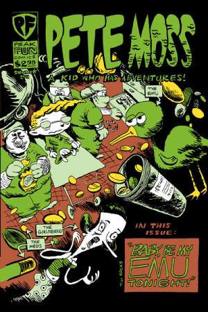
Pete Moss: A Kid Who Has Adventures, by Tim Rocks. This is a hyperexaggerated screwball comic somewhat in the vein of Peter Bagge, in terms of the frenetic quality of its storytelling. It's about a kid who mistakenly receives news that he's a terminal case, who then proceeds to try to get laid before he dies while tricking a variation on the Make-A-Wish foundation. Rocks gets across most of his humor with funny and/or grotesque drawings and over-the-top satire. The drawing is much more interesting than the writing, which aims for shocking and falls well short of shock or even pointed commentary. On the other hand, Rocks is unrelenting in the avalanche of gross and funny images he throws at the reader, making this comic interesting to flip through if not especially memorable otherwise.

Jay's Brain, by Jason Viola. Viola is best known for his webcomic gag strip Herman The Manatee, but I've often enjoyed his side projects more. This is a series of gags about Viola and his anthropomorphic brain, and what's most interesting about it is the obvious discomfort the artist feels from drawing these strips. For an artist who does pretty silly gags (even the ones that touch on despair still feel like shtick), Viola is surprisingly personal and even confessional in these strips that touch on panic attacks, saying horrible things to those he loves, a lack of inspiration and other issues not unfamiliar to readers of autobio comics. The difference is that his brain character turns every strip into a punchline, no matter how awful or uncomfortable the premise. Viola turns his social anxiety into some pretty fertile ground for humor (the page of tweets from his brain is especially amusing--it tells Viola things like "You shouldn't have said that" while wondering "Why don't they put flavor crystals in EVERYTHING?"), making this his single strongest work to date.

3-D Pete's Star Babe Invasion Comics, by Mike Fisher. This comic/zine is exactly what it claims to be--a celebration and examination of sexy women in science fiction films. What makes it enjoyable is the light tone Fisher employs throughout, deemphasizing prurience and playing up humor. It helps that he has rock-solid fundamentals as a cartoonist, capturing the naturalistic essence of a figure without losing the cartoony quality of his compositions. Speaking through his mouthpiece character 3-D Pete, Fisher discusses Jane Fonda in Barbarella and which Star Trek guest actress was most appealing, as well as silly strips where Pete encounters less-than-sharp aliens and tries to get on a space ark. The interview with a model from a sci-fi themed beer commercial is entirely gratuitous; it doesn't really add much to the comic other than letting us know that he managed to interview a model. While the comic is entirely disposable, Fisher's line is wonderfully fluid and expressive. A full length genre story from Fisher would be quite pleasant to read.
Wednesday, June 8, 2011
Gag Comic Round-Up Nowacki, Viola, Reed,, Latta, Aushenker

Moe, by Piotr Nowacki. Nowacki, a Polish artist, uses a delightfully simple and blobby line in depicting his anthropomorphic protagonist and the mysterious blotch who both aids and hinders him. This is a silent comic with an open four panel-per-page layout that emphasizes each character's body language above all else. Nowacki values exaggeration of action as the hero is punched in the face by the blob (after being offered a bone), winds up in jail, gets busted out by the blob, smokes a joint with a Rasta angel blob in a cloud, and finally rescues a beautiful woman underwater. The mischievous blob reminds me a bit of Al Capp's Shmoo character, only it's black with white eyes. Nowacki's work is incredibly self-assured in its simplicity and expressiveness; there are no wasted lines. The gags are reminiscient of the sort of thing Lewis Trondheim does so well in his silent humor comics: set up a character, provide an antagonist, then subvert reader expectations. Nowacki's imagination isn't quite as wild as Trondheim's, but Moe's ambitions are modest and this mini is a rewarding read.

Some Stories #1, by Desmond Reed. Reed is another artist who uses a simple line in order to tell his shaggy dog twist gags. Sort of like the O.Henry of minicomics gag work, Reed uses his exposition to set up an unexpected punchline. I wish Reed would vary the thickness of his line from time to time in order to make his pages more interesting to look at (as well as giving him more storytelling options); his art is merely functional, though it is effective. This latest effort, published in a larger size than his earlier micro-minis, is a mixed bag. "4 O'Clock" is too much of a shaggy dog story, dragging out the fate of a lab guinea pig who is killed by accident and is trying to sort out his afterlife. The eventual resolution of this story felt predictable in a way his prior comics hadn't. On the other hand, "Todd" represented a step up for Reed. As we meet two fish who are madly in love, we continuously flash back in time three seconds at a time, a clever way of detailing their extremely short attention spans and memories. It's a sort of underwater version of Memento, where Reed adds layer on top of layer until he reaches the final payoff. Unlike the first story, every single page is funny on its own, working first as a kind of non sequitur and then finally cohering in the end.

Herman The Manatee Volume 4, by Jason Viola. Viola's meandering strip about a manatee and his "lousy friends" hits a nice groove in this collection. Viola has an appealing line and great character design sense, but the quality of his work has varied as he's tried to figure out just what he wants to do with his strip. He quickly ran out of variations of his initial premise (the titular character getting hit in the head by passing boats), but attempts at piecing together extended storylines fell flat. His characters are simply too silly to support such attempts. In this volume, Viola strikes a balance with the Candide-like Herman, depressed (to the point of absurdity) Lester and vicious narwhal Knuckles playing off each other. Instead of trying to attach these characters to a plot (even a plot that was a parody), Viola instead simply structures gags around each character's quirks and how they interact. The result is a consistently amusing set of strips, drawn in a clean and assured style with a minimum of fuss.
Those Unstoppable Rogues Party Hard!, by Michael Aushenker. Of all the humorists discussed in this article, Aushenker's work is certainly the weirdest. Even in this series of strips about a turtle named Brett and a chicken named Clucky, it's hard to pin down Aushenker's style. There's a kitchen sink quality to it that I admire, as he throws in wordplay, absurdity, puns, double-entendres, purely visual gags, meta-humor, and character-based jokes. It's a loud, sprawling series of strips that features my favorite character designs of Aushenker's; there's an almost geometric appeal to Clucky (all triangles) and Brett (all curves). That balance makes this strip work better than his Greenblatt the Great! strips simply because I like looking at these characters more. There's also no real attempt to bring in other characters as concept gag generators, which sometimes proves to be a distraction in Aushenker's other comics. Brett and Clucky are at the center of every storyline and other characters serve purely to react against them, and then leave. Most of these strips are pretty old (dating from the early 90s) and there are some pages that have a bit of clutter that interfere with the overall storytelling. However, there's mostly a happy lack of fussiness to these strips. Aushenker has such a heavy line that keeping things relatively simple on the page winds up being the best approach. That simplicity allows Aushenker to create a strip that's simultaneously dumb and smart.

Rashy Rabbit Droppin' Anchor, by Josh Latta. Latta returns with another Gilbert Shelton-style adventure of a slacker rabbit done in a rubbery, lively anthropomorphic style. Latta has all but abandoned any sense of verisimilitude in his comics, as Rashy winds up at sea after his girlfriend dumps him and meets a group of sexy mermaids. While the comic is well-paced and balances its chaotic and ridiculous elements with straightforward storytelling, it's far sillier than Latta's earlier comics. Latta is better at mining humor out of awkwardness and sleaze than he is out of pure absurdity, and as a result this story winds up being fairly forgettable. The characters, divorced from prior continuity, all feel fairly stock and paper-thin. The sea captain Rashy ventures off with (and with whom he discovers he has a surprising connection) is ridiculously cartoonish. As a result, this issue isn't silly or absurd enough to be memorable in a Michael Kupperman sort of way nor is it tethered enough to actual character relationships to keep the reader focused on the page. That said, it certainly looks like Latta had a great deal of fun drawing this issue, especially the mermaid sequences. If Latta does decide to commit to more of a fantasy element in his stories, I hope he takes his concepts further.
Wednesday, October 28, 2009
Minicomics Round-Up: Krall, Turnbull, Viola, Ineke, Runkle, Jordan & Harada

RUNX TALES #2, by Matt Runkle. Runkle has a crude but expressive line, but these comics popped off the page because of his terrific design sense. In this large format comic (8.5 x 11), the standouts were "Nora Stories" and, oddly enough, a long essay on ranch dressing. With the former, Runkle's character design was key, especially with regard to the huge eyeglasses of the title character (they fairly overwhelmed her face) and the sleazy vagrant named Crow who somehow kept popping up in her life. Nora's exasperated but resigned body language was nicely related by Runkle, particularly in the way she looked exactly like a weirdo magnet--the sort of person freaks gravitate toward because they know they'll be tolerated. Runkle's comics essay on the virtues of ranch dressing leaned heavily on his use of white-on-black images and a clever use of fonts. Runkle was more than a little tongue-in-cheek in this essay, especially when he compared the dressing to semen and noted that many of the folks he waited on reacted to it much like a desired money-shot.

Runkle's own personal observations also had some amusing moments. "Wrestling With The Truth" was about his high school experiences as a wrestler, while dealing with the awkwardness of being gay in rural America. While that was the backdrop of the story, the meat of it dealt with what happened when he was thrown to the mat in practice and hit his head hard. He saw a vision where for a second, "it all made sense": a middle-aged woman, a ladder and other vague details. Runkle contrasting this to San Francisco goddess worship was hilarious, noting that this goddess was very much of her surroundings: "farm-hardened, sensible and the type that would hate new-agers". His story about a recently deceased friend of his was touching, funny and compelling, detailing the ways in which this trans friend embraced living. Runkle is a great cartoonist despite being a mediocre draftsman who plays to his strengths, understands how to compose a page, and focuses on his line expressing his sense of humor and point of view. The result is one of the more entertaining one-man anthologies I've read in quite some time.

HERMAN THE MANATEE, #1 & 2 by Jason Viola. At first glance, I thought this might be a series of cute strips about a manatee and worried that it might be a bit saccharine. Then I read the first strip and realized that it was about a manatee who was hit by a speedboat in strip after strip. It was the equivalent of reading a collection of PEANUTS wherein every strip featured Lucy pulling the football away from Charlie Brown. Varying the set-up to a situation with the same punchline every time is not easy, but Viola went through a lot of variations: flashing back to childhood, being deceived by god, playing Marco Polo, doing a Gorey pastiche, etc. By volume 2 of this mini, Viola started an extended narrative about the perils of having a protected pond, including being forced to pose for humiliating photos with tourists and being exploited for money. Viola is a good gagsmith with an appealing line who gets a lot of mileage out of being extremely cruel to his characters for no particular reason. Herman isn't punished because he deserves it; it's simply his fate to have his head hit by boats. While I can understand the difficulty of coming up with variations on a particular formula, I did think that Viola started to drift away from what made his strip successful when he went on to do the longer storyline. His attempts at satire were clumsy, but more problematic was that he was trying to turn Herman into a real protagonist. Sure, he still turned out to be a failure, but it still felt like an uneasy match of ambition and character. Herman is perhaps less like Charlie Brown (a sad-sack who is multidimensional) and more like Wile E Coyote, and the extended storyline felt like Viola was plopping him down into a story that didn't suit the character.
THE SLEEP OF KINGS, by Ibrahim Ineke. Ineke is a Dutch artist with a fine arts background who has recently started to move into comics work. His specialty is horror, but less an American sense of horror and more of a Japanese one. That is, the ideas presented and hinted at by the story are more awful than the standard American presentation of gore. There's also a bit of Lovecraft to be found here, in that evidence of something ancient & horrible is discovered with disastrous results. The story finds two boys playing sword and sorcery games in the woods. When one boy disappears for a bit, his friend finds him with his back to him, unresponsive--and surrounded by buzzing insects. What I liked about this story is that its horror takes place in broad daylight, with light and shadow cleverly deployed when an eclipse occurs. Ineke only hints at what's happening here: stones in a circle with some sort of mystic runes, and some type of demonic possession. All the reader needs to know is that both boys meet a terrible end in a story that moves leisurely but doesn't outstay its welcome.
Ineke's figures, especially in close-up, have a scribbly & energetic quality to them that made them come alive. Indeed, there's a spontaneity to his line that made reading this sort of story more entertaining than usual, given that I'm used to a certain slickness with American horror comics. There were some panels where he seemed to be losing a bit of control with regard to characters in motion (not surprising for someone from a fine arts background); panel-to-panel transitions as well as characters in relation to each other are things that I imagine he'll continue to improve on as he continues to draw comics. He's certainly an interesting artist, and I'll be curious to see how he would tackle a longer-form work.

PRIZE #2, by Hawk Krall. I first became aware of Krall's work in the pages of Danny Hellman's anthology TYPHON, with his "Summer of Seven-Eleven" story being a standout. PRIZE is a collection of shorter strips in three different categories: stories about working the graveyard shift at a 7-11, stories about living in squalid conditions with his art school roommates ("Living In Filth"), and tales from the kitchens of a big city ("Dirty Dish"). Krall's work is very much in the tradition of underground comics, with a particular focus on grotesque character design. Krall is a great yarn-spinner, especially when he zeroes in on the most sordid details. He plays up the absurdity of living with filthy roommates in a run-down apartment, of the frequently disgusting truth of working conditions in a kitchen, and the sort of people he encountered working in a convenience store. His ability to capture the characters he met and crystalize them in short order made strip after strip a hilarious experience.

Of the three different features, I thought "Dirty Dish" was the funniest and most original. They're presented as single-page strips, and it's a format that flatters Krall's style. Krall doesn't vary his line or panel composition much from strip to strip. With his longer stories, the reader is hammered in panel after panel by Krall's grotesque imagery, and the effect can be suffocating at times. "Dirty Dish" not only opens up the page a bit, it finds Krall concentrating on a single image or idea and playing that out. The strip also provides the reader a peek into the world of professional kitchens. Krall portrays it as an unrelenting series of hostile encounters, where the workers struggle to hold on to their sanity. He also made it seem like fun, at least in the sense that huddling in a foxhole develops camaraderie. Even in strips that seemed a bit cluttered, Krall's ability to escalate situations is the hallmark of his very sharp sense of comic timing.

INVASIVE EXOTICS #2, by Jack Turnbull. Turnbull's APOLLO ASTRO series of minicomics that he published before he went to art school positioned him high on my list of interesting young artists. His new series is a radical departure from those comics that clearly displayed his influences (Clowes, Ware & Tomine in particular) but still showed that his voice was one that needed to be heard. INVASIVE EXOTICS is a mash-up of a startling array of genres, including sci-fi, conspiracy fiction, psychedelic social satire, slice-of-life, and crime fiction. While not a direct influence, Matthew Thurber's 1-800-MICE is the closest point of comparison I can think of, though Turnbull's comic is not as tightly plotted or outrageous in its conceits.

Most stories involving satires of corporate America tend to fall flat, but Turnbull mutated an obvious visceral dislike of Coldstone Creamery (the one where the servers are forced to sing whenever they get a tip) into an over-the-top conspiracy story. I've always liked Turnbull's elongated character design, and the slightly bigfoot nature of his character design serves the story well. The villainous "Slimecold" CEO resembled a warped Bozo the Clown, with pointy hair that he used as corporate iconography. His scheme was to force out the residents of Brooklyn using a mutated form of killer ant that would cause them to flee, create gentrification and then provide the sort of Brooklyn where he could open up many more stores. He's opposed by a small cadre of eco-terrorist types, with the character of Jane Easewell being Turnbull's all-purpose satire of scientist-as-action hero. The first issue sees her go on a one-woman commando raid at a Slimecold lab in a sequence that's deadpan in its depiction but completely ridiculous. At the same time, there's a pastiche of slice-of-life romance going on in the backdrop that gets dramatically halted when the ant rampage story slams into it.

This comic is jam-packed with ideas, characters and crazy page layouts. At times I think it's too all over the place, as Turnbull seemed to want to draw every single idea he had had for the past several years in one series. The action scenes, while funny, didn't really work on their own visually because there's a lack of fluidity in the way he depicted motion. His figure-to-figure interactions also felt a bit stiff. The comics simply seemed rushed at times, with a slew of spelling errors and some cramped panels. That said, there was a lot to like in INVASIVE EXOTICS. Panels where you see ants who have been put to sleep with tiny little "zzz"s next to their head displayed just how loony Turnbull was getting here, while still positing the insects as a very real threat. Turnbull created caricatures that, while exaggerations, still have a lot of uncomfortable truths to them. This comic simply needs to be refined, edited and cleaned up; the energy, ideas and images are all there.

MOULGER BAG DIGEST #2, by Rusty Jordan & Brent Harada. This is a comic very much in the Fort Thunder tradition, with a big dose of Gary Panter. There is a kind of narrative at play here, on pages dominated by psychedelic character design that's mashed up much like a collage. The narrative involves ambling movements followed by utter stillness and a sense of characters constantly changing and pulsing into one another. What's surprising about this comic is the way my eye was able to latch on to the figures on the pages. Even the most jam-packed pages had a few images that seemed to pop out at the reader. I'm not sure what to make of this succession of images that combined figure and structure, other than I liked looking at it. It certainly felt like an object that was meant to be looked at more than read, especially given the oblique nature of its narrative.
Friday, June 19, 2009
More Mini-Comics: Sobel, Viola, Bougie & Frank, Apt 307, & the MCC

SUNWARD, by Jason Viola. This is a curious little mini about a group of three friends, one of whom has become unstuck from gravity and threatens to fly off the face of the earth (and inevitably, as his friends note, into the sun). The way that the cartoony characters are introduced, the reader almost has a sense that these are established dramatic personae whom we should know all about. Viola plays it straight the whole issue, now matter how absurd the set-up gets or crazy the ideas become in trying to solve the bedraggled hero's dilemma. The most interesting thing about the comic is the way that whom the protagonist actually is shifts from page to page. Is it Dave, who's in danger of flying off? Is it the pensive Felonious Monk? Is it the rambling Sebastian?
I enjoyed the weirdness of the premise so much that I was a bit disappointed when there was a kind of explanation as to what happened to Dave that wound up being the on-the-nose receptacle of the mini's main theme. That theme was the need to define a direction to one's life before it slips completely out of control--especially when one is experiencing near-total freedom. The figure work is fairly simple and ranges from expressive to slightly stiff and clunky. Viola seemed to really enjoy drawing short-haired and chunky Sebastian; at the very least, he comes alive a bit more than the book's other characters. Viola does well with keeping things deadpan, and as a result, there's plenty of sly humor in this comic. It just could have done with either more or less control over its line: more would have given the book a greater sense of restraint, heightening the tension of the situation; less would have been a nice chaotic counterpoint to the artist's dry humor.
THE RED STILETTO, by Marc Sobel. This is the first mini written and drawn by my former Sequart.com stablemate Sobel. Sobel is best known for his ultra-exhaustive, issue-by-issue take on LOVE & ROCKETS, an effort that I hope is one day published in a more permanent form. Sobel brutally critiqued his own art on this mini at the link above, and he's pretty much spot on. The problem for me was not that he used too much photo reference (including some direct traces). The problem was that he didn't go far enough in one direction or another. That is, it would have been preferable to see a shaky but spontaneous & expressive line or go the other way and play up the story as though it was a series of photographs, emphasizing the still & stiff nature of the images. That would have been perfectly appropriate for this story, which was about images & memories, both lost and found. Instead, we got something in-between whose linework was indeed stiff and awkward.
That said, this was a cleverly designed and composed comic, especially for such an early effort. There's no question that Sobel is a fine writer, and he really went to town adding layer upon layer of metafictive aspects in this story. THE RED STILETTO is a story about one man's memories of his best friend growing up. This friend lost contact with him many years prior but had moved to get back in touch with him for reasons that were initially unclear. Much of the issue's narrative involved a reminiscence juxtaposed against the actions of the friend, some of which confirmed his beliefs and others of which belied them. The climax of the comic was a text short story that led the friend to want to reconnect, a story written by her father who had killed himself. The story was about missing motivation and ideas that haunt creators, and it seemed both autobiographical and prescient in unusual ways. The shock ending of that story and the shock ending of the mini itself mirrored each other, creating spectacularly violent endings for mysteries that could never really be resolved. It's obvious that Sobel already has a firm grasp on visual storytelling, and that it will simply be a matter of repetition and refinement. I'm eager to see what he publishes next.

MAXIMUM SUPEREXCITEMENT #2, by Robin Bougie & Maxine Frank. This is a sharply drawn bit of filth and fluff. Bougie is best known for his Cinema Sewer magazine, celebrating the sleaziest examples of grindhouse films and culture. He's also a fine cartoonist who isn't afraid to go to some pretty extreme places with regard to sex, violence, gore and gross-outs. This comic is a collaboration with Frank, one where the two artists traded off panels and sometimes collaborated within the same panel. The results are amazingly seamless, which no doubt reflects their similar sensibilities. The story is a mishmash of postapocalyptic shenanigans, rapacious sex slaves, maggot-inducing viruses and the destruction of all human knowledge. There's gunplay, S&M, worms exploding out of assorted body parts and an (anti-) heroine dressed smartly in an old WAC uniform. This is gleeful gross-out, not really meant to shock or disturb, but rather to point out "Hey, isn't this exploding head awesome?" This comic is a fun drawing exercise by the artists--no more, no less. Its potential audience would seem to be a rather self-selecting one.
APARTMENT 307, by Josh Blair, Pete Borrebach & Nick Marino, and Noah Van Sciver. This little mini-anthology hit upon a coincidence of circumstance shared by the three artists: they all lived in apartment 307 in each of the different cities they inhabited. Both Blair and Van Sciver complain about going up three flights of stairs. I liked Blair's visual treatment of this, using numbers and crossed lines to break up what is otherwise a mundane story. He's obviously not a very confident draftsman at this point, but he worked his way around that cleverly. Van Sciver engaged in a bit of navel-gazing here as he reflected on the ways in which his social anxiety has made him want to retreat to his room (and his stuff) more and more. Van Sciver's self-caricature is fascinatingly ugly, a point that he not only plays up in this story, but spreads to his art in general. There's a sloppy ugliness to his line that's starting to grow on me. I don't think he's really found his voice yet as an artist, but it's clear he's determined to do so. The Borrebach/Marino piece breaks up the introspection with a tale of why it's really best not to get involved in other people's business in Miami. It's a funny concept, but Marino's art manages to be both crude and drab.

MINIMALIST COMICS COLLECTIVE, by Agnes Anger, C. Che' Salazar and Abel Jimenez. This is the sort of comic that will draw a strong reaction from its audience, be it positive or negative. It's a conceptual exercise in comics narrative storytelling, with each of the three involved artists using a different technique. Jimenez crafts comics using only the most basic of geometric shapes as his characters, and they spout dialogue as though they were drawn in a perfectly naturalistic style. His are actually the most conventional comics in this anthology. Salazar uses text and panel-to-panel transitions to tell stories, a slightly more abstracted approach but still fairly straightforward. For Salazar, the iconography of the text becomes the image; words bend, dip and wrap around each other in a way that gives the reader information at both levels. Anger repurposes photographs to act either as word balloons or actual captions. Jimenez's comics are sort of like Matt Feazell's stick-figure comics taken to their logical end.
It's important to note that the stories in this comic aren't abstract. Indeed, with the exception of Anger's image-only comics, the storytelling is rather easy to follow. The grid on each page is standard, the Jimenez's drawings are obviously made with a simple computer program, and the lettering is also done by computer. The whole thing should be entirely dull to look at, and yet I found to be a compelling read. That was especially true in the stories where the three artists collaborated and combined their techniques. "A Typical Comics Story" combines Salazar's "expressive text" to create the characters and Anger's appropriated (but public domain) photographic images to create word ballons: text and image are cleverly inverted to tell a story that itself is a commentary on genre stories.
I think this comic succeeds because the artists made a deliberate conceptual choice to work using these techniques. It owes as much to dada artist Marcel Duchamp as it does any cartoonist. Anger in particular appropriates images with a particular (often charged) meaning and recontextualizes them in a manner similar to Duchamp and his ready-mades. In "Blink And You'll Miss It", horrific images literally blur into each other when the page is held up to the light; the formal properties of both page and image are integral to seeing these images in a new way.
Jimenez is much more playful, as in "Great Panels in Comic Book History", where he reduces motion and emotion from famous comics and breaks them down to circles and rectangles. The cascading rectangles depicting R.Crumb's "Keep on Truckin'" is particularly clever, evoking a different Duchamp work: "Nude Descending A Staircase".
Duchamp's work crossed a number of media, making it hard to ultimately classify as a particular sort of art or literature. His art was both funny and whip-smart, thinking through concepts and laying them bare in ways other artists never considered. It should be noted, however, that once he told a "joke", he rarely lingered on the same sort of material for long. Along those same lines, I'll be curious how long the thinkers from the MCC will be content to work using these same techniques. One can only tell the same joke so many times, even when it's deadly serious, before the punchline gets stale. That said, this comic was an enormously clever dissection of the relationship between the formal qualities of comics art and craft. Those who conflate the craft of drawing with the art of creating comics will no doubt be enraged by this comic, but its sheer audacity as both an act of provocation and meditation made me chuckle throughout. Hopefully we'll soon get to see what the MCC has in mind for a second transmission.