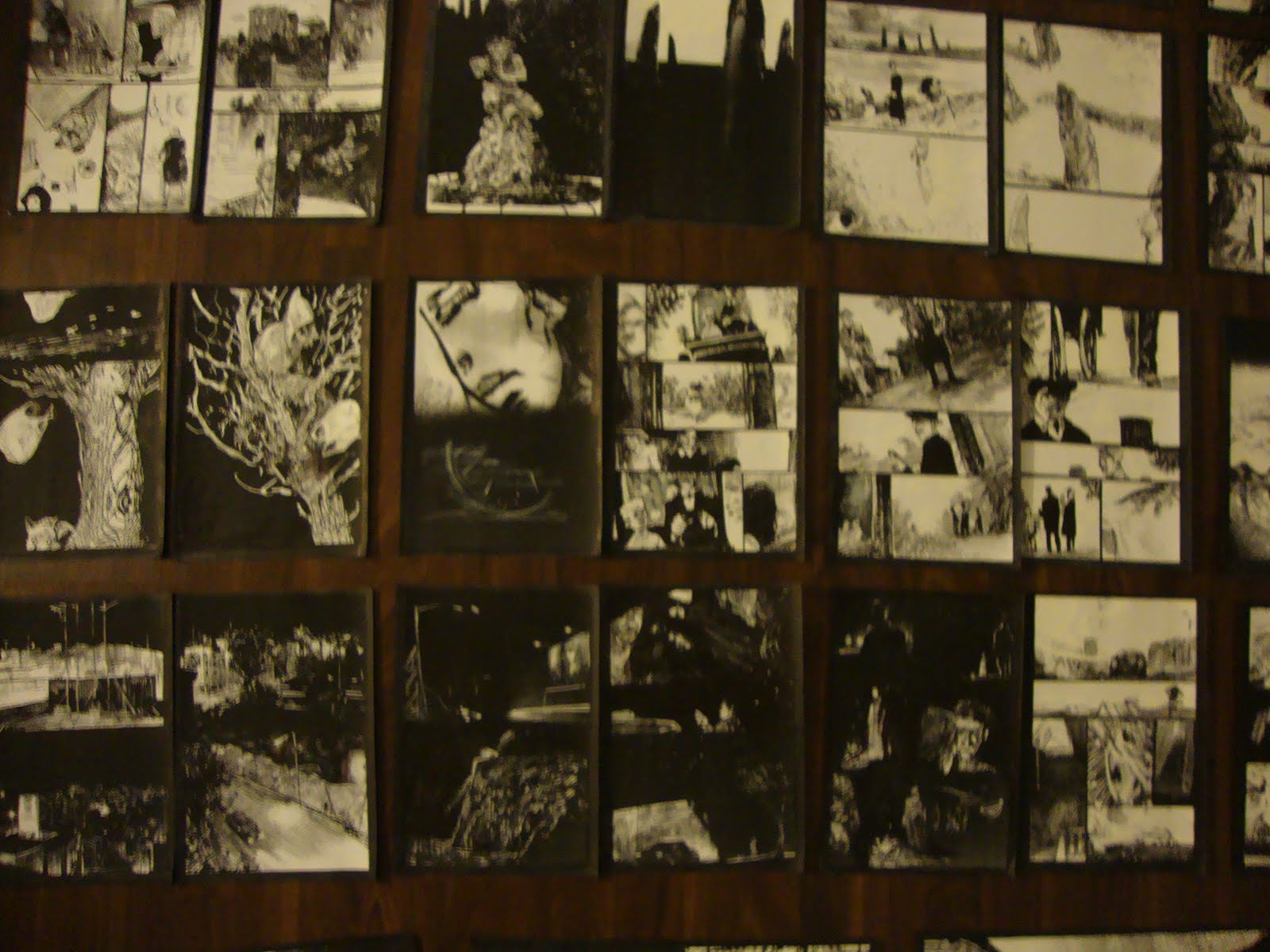
For Ibrahim R. Ineke, horror is hidden and forgotten knowledge brought to light. It's poking around in the woods and seeing things not meant to be seen. It's encountering ancient beings that look like children whose presence will bring no good. It's forbidden speech being spoken aloud, forbidden rituals made part of the everyday. It's the understanding that civilization is a facade, something that will fall away in time and be overtaken by the forest and its denizens. Ineke has been working and reworking self-published adaptations of Arthur Machen's 1904 story "The White People" over the last couple of years, culminating in a hardback publication issued by Dutch publisher Sherpa in 2015.
Ineke has long used three visual techniques. First, there's his own elegant pen-and-ink line. There's a delicacy, almost a fragility to his line that nonetheless allows for a great deal of naturalistic detail. His faces are mostly naturalistic, though they do have a slightly cartoonish quality that sometimes turn into twisted, terrifying images. His second technique is an extensive use of photocopying to repeat and distort images, often using double and even triple exposure. Along with the increasingly dark images generated by photocopying, Ineke also uses a lot of thinly-applied white-out as a mark-making technique.
In The White People, that white-on-black imagery opens the book as we see a number of figures deep in the woods notable for their lack of presence. They take up white space but have no other definition. Then comes a scene that Ineke has repeated in a number of comics: two boys playing in the woods, playing at being warriors or wizards (one even invokes Lovecraft lore and Cthulhu) and one boy running a little ahead of the other. In a slow burn of one panel stacking atop the other and the images getting bigger, we see one kid sitting in a field, his head half disappeared. Ineke flips from the bright sun illuminating a field to a dark cave (jotted with dots of white-out) with waterfalls. The child is looking at another world and is forever changed. In the book, Ineke then repeats the interaction, this time in color, and then repeats it again, this time with the implication of ritualistic kidnapping. There's a chilling image of a child turning around and their face being the image of a sinister-looking house, one where it's implied all sorts of awful things take place, followed by a full-page shot of a feral child-like thing. The book ends with two detectives looking for the missing boys, with one of them oblivious to his surroundings and the other all too aware of what the woods represent, especially with regard to "the good folk" or fairies.
An earlier minicomics version of the story with the same title included an introduction that made this connection between the city's men of power and their occult connections that involved the ritualistic abuse of children, including a reference to a sequence of symbols that appears in the stories. While this was useful, Ineke's decision to excise that bit made sense given his emphasis on imagery and suggestion over explicit explanation. Witch Route is a short mini with some forest scenes and some key (reprinted) text about testimonials regarding children who had passed through fairy territory and came back horribly changed. Again, it's an establishing text that later became assumed and tacit. White Court is a hand-bound and assembled mini that makes the connection between kids and fairies more explicit, as it starts with a stag hunt that turns on the hunter when he is surrounded, turns to a man playing a flute being seduced by a fairy, and then segues to a different version of the two kids playing at combat with each other, this time in an abandoned building and direct intervention from fairies. There's a more structured division between chapters and additional scenes, none of which are more effective than what wound up in the book.
Also worth mentioning is No Maps, which is a collaboration with Niels Post alternating spam comments from the internet with Ineke's imagery. The images range from spare to intense to horrific to amusing. Eloise is about a missing young woman and starts with violent, ritualistic image at a punk show mashed up with imagery from Catholic ceremonies. That juxtaposition, of rebellion vs tradition, is at the heart of the comic in the way that her story is one of betrayal by those she loved most. It relates to the other comics in the way she rejects the city and what she has known before and instead embraces nature and the outdoors, ending the book climbing a mountain (and perhaps not coincidentally wearing a jacket with the named of the punk group The Damned on it). Here, it's all scribbles and texture with line instead of other effects.
Finally, there's the anthology miniseries Black Books, where every issue also feels like a lab for a larger story. Each issue begins with a reference to Saturn in an astrological sense, and each story has its own twist on horror. The first issue is yet another version of the two boys playing in the woods, this time with an explicitly vicious ending. The second issue is a darkly funny retelling of the fate of Orpheus, his severed head forever alive, meeting up with a Muse who uses his head to perform cunnilingus and then kisses him--and then tosses him away. The third issue returns to the city, where secret arrangements add a sinister quality to interactions between lovers and the custody of children shared between families. The fourth issue lifts dialogue from an earlier comic and makes it an interaction between a lord and a servant, who gives him a report in comic book form that is rejected but triggers a sort of breakdown of reality. The fifth issue is about a heist gone horribly wrong when reaching the forest and includes tales of a Robin Hood-style archer causing mayhem before the reveal of a ghastly child (an image used in The White People). Finally, the sixth issue is about a merciless, pitiless witch deftly outwitting a spiritual world full of male forces.
Showing posts with label ibrahim ineke. Show all posts
Wednesday, May 17, 2017
Friday, August 12, 2011
Into The Void: Julia Gfrorer, Ibrahim Ineke, Sean Andress
Let's look at three minicomics that focus on different aspects of darkness, horror and fear.
Moral Geometry #2, by Sean Andress. Of the three artists discussed here, Andress' comic is the most conventional. This is a straight-up horror comic with a silent, dream logic narrative. Andress' line is thick and rubbery with dense hatching; the result is a page that looks like partly like it's melting and partly like its decaying. Andress goes for grotesque overload, overpowering the reader with intense but clear images that nonetheless have a fairly simple through line and a dark sense of humor. The action follows a sort of bizarre performance as a man with a crown looks down a hall to find a demonic creature tossing an object that's part head and part balloon at a blindfolded creature with a spike sticking out of its mouth; the effect is that it's some sort of strange party game. The more interesting story finds a family of lumpen figures sitting down at a table for dinner. The putative father figure pierces a roast, which squirts blood into the mouths of everyone at the table. Things go horribly awry as a particularly disgusting birth occurs, the new creature threatens the house we see at the beginning of the book and the man with the crown laughs in fun. This is less a coherent narrative than a series of loosely connected images, and Andress revels in the excess of his images in panel after panel. Despite the violence and gore, this comic really is pinned to a humorous sort of logic, which puts it a step above a splatterfest that is simply trying for shock.
Various comics by Ibrahim Ineke. The Netherlands-based artist specializes in an oblique depiction of fear. Using a ballpoint pen, white-out and a photocopier, Ineke creates whirling environments of black and white shadows enveloping his characters, and as a result, the reader. "Empty Quarter" finds a man walking a lonely city street receiving a piece of paper that falls from above. Opening it up, it seems to lead him to a seemingly empty but creepy building. After fleeing the building, he falls, the piece of paper flying out of his hand. As a clever, gimmick, Ineke inserted a blank but stained and folded piece of paper into the back of the comic, as though it fluttered out of the comic. Like all of his comics, it's marked by extremely dense hatching marked with streaks of white. "In Prism" is a story whose title winds up being a dark play on words, as a hotel manager investigates an Alistair Crowley-type mystic and whether or not he and his order are abusing his young niece, who is "a medium". Unlike most of this stories, this one mostly concerns its figures rather than its environment, and the result is a scratchy, expressionistic approach. This is his most conventional story to date, though its end has quite a visual kick to it. Finally, there's the untitled, magazine-size comic that features a boy and girl and unnamed horror. The boy happens to see a corpse with no face when on a business trip with his father and uses this image to terrify and coerce the girl. The story has a hallucinatory quality, as the faceless corpse (all the more terrifying because he has a few teeth left in his jaw) suddenly appears in a sequence where reality seems quite fluid, resulting in the children losing their faces and then page after page of people at the ocean, waves crashing and dragging a woman down. The book segues into a sequence where a woman is in a curiosity shop buys an item that draws unwelcome company. Once again, Ineke shifts between the power of the intense, individual image and the need to relate a narrative. This is certainly his most ambitious comic, given its length, recurring images and stunning use of his tools to create a dense environment of light and darkness that demands its readers to engage it fully, peeking into the darkest cracks to suss out meaning.
Too Dark To See, by Julia Gfrorer. Of all the work discussed in this column, Gfrorer's comic is by far the most disturbing. Using a clear, light line, lots of open space and a minimal use of blacks, Grfrorer nonetheless crafts a story that's terrifying because of its implications. Grfrorer's themes frequently revolve around the supernatural, sex, death and lies. This story is a bizarre mash-up of a typical slice-of-life relationship story and a horrifying supernatural story of sexual violation, lies and distance. The story is simple: a 20-something couple is lying in bed asleep when a female shadow creature seduces the man by first going down on him and then saying that she'll go away if he'll have sex with her, saying "I just need your cum". While his girlfriend never finds out about this encounter, it casts a long figurative shadow over their relationship as he immediately becomes more distant and she immediately becomes more paranoid. When she finds "something black" on her genitals, she accuses him of cheating, but the implication of what she might be afflicted is especially chilling. The ending is ambiguous, as there is a segue between the aftermath of the couple arguing and the shadow creature and her lover coalescing and mocking the couple for naming their imminent baby with a "hipster grandpa name". The implication, of course, is that the male shadow had sex with the woman and impregnated her. This is a truly grim story, and perhaps its bleakest aspect is how easily the shadows were able to get exactly what they wanted from the couple, even as the first page of the book showed how much in love they supposedly were. Gfrorer has carved out a unique place in comics with her subject matter and every new comic she releases is worthy of close attention.
Moral Geometry #2, by Sean Andress. Of the three artists discussed here, Andress' comic is the most conventional. This is a straight-up horror comic with a silent, dream logic narrative. Andress' line is thick and rubbery with dense hatching; the result is a page that looks like partly like it's melting and partly like its decaying. Andress goes for grotesque overload, overpowering the reader with intense but clear images that nonetheless have a fairly simple through line and a dark sense of humor. The action follows a sort of bizarre performance as a man with a crown looks down a hall to find a demonic creature tossing an object that's part head and part balloon at a blindfolded creature with a spike sticking out of its mouth; the effect is that it's some sort of strange party game. The more interesting story finds a family of lumpen figures sitting down at a table for dinner. The putative father figure pierces a roast, which squirts blood into the mouths of everyone at the table. Things go horribly awry as a particularly disgusting birth occurs, the new creature threatens the house we see at the beginning of the book and the man with the crown laughs in fun. This is less a coherent narrative than a series of loosely connected images, and Andress revels in the excess of his images in panel after panel. Despite the violence and gore, this comic really is pinned to a humorous sort of logic, which puts it a step above a splatterfest that is simply trying for shock.
Various comics by Ibrahim Ineke. The Netherlands-based artist specializes in an oblique depiction of fear. Using a ballpoint pen, white-out and a photocopier, Ineke creates whirling environments of black and white shadows enveloping his characters, and as a result, the reader. "Empty Quarter" finds a man walking a lonely city street receiving a piece of paper that falls from above. Opening it up, it seems to lead him to a seemingly empty but creepy building. After fleeing the building, he falls, the piece of paper flying out of his hand. As a clever, gimmick, Ineke inserted a blank but stained and folded piece of paper into the back of the comic, as though it fluttered out of the comic. Like all of his comics, it's marked by extremely dense hatching marked with streaks of white. "In Prism" is a story whose title winds up being a dark play on words, as a hotel manager investigates an Alistair Crowley-type mystic and whether or not he and his order are abusing his young niece, who is "a medium". Unlike most of this stories, this one mostly concerns its figures rather than its environment, and the result is a scratchy, expressionistic approach. This is his most conventional story to date, though its end has quite a visual kick to it. Finally, there's the untitled, magazine-size comic that features a boy and girl and unnamed horror. The boy happens to see a corpse with no face when on a business trip with his father and uses this image to terrify and coerce the girl. The story has a hallucinatory quality, as the faceless corpse (all the more terrifying because he has a few teeth left in his jaw) suddenly appears in a sequence where reality seems quite fluid, resulting in the children losing their faces and then page after page of people at the ocean, waves crashing and dragging a woman down. The book segues into a sequence where a woman is in a curiosity shop buys an item that draws unwelcome company. Once again, Ineke shifts between the power of the intense, individual image and the need to relate a narrative. This is certainly his most ambitious comic, given its length, recurring images and stunning use of his tools to create a dense environment of light and darkness that demands its readers to engage it fully, peeking into the darkest cracks to suss out meaning.
Too Dark To See, by Julia Gfrorer. Of all the work discussed in this column, Gfrorer's comic is by far the most disturbing. Using a clear, light line, lots of open space and a minimal use of blacks, Grfrorer nonetheless crafts a story that's terrifying because of its implications. Grfrorer's themes frequently revolve around the supernatural, sex, death and lies. This story is a bizarre mash-up of a typical slice-of-life relationship story and a horrifying supernatural story of sexual violation, lies and distance. The story is simple: a 20-something couple is lying in bed asleep when a female shadow creature seduces the man by first going down on him and then saying that she'll go away if he'll have sex with her, saying "I just need your cum". While his girlfriend never finds out about this encounter, it casts a long figurative shadow over their relationship as he immediately becomes more distant and she immediately becomes more paranoid. When she finds "something black" on her genitals, she accuses him of cheating, but the implication of what she might be afflicted is especially chilling. The ending is ambiguous, as there is a segue between the aftermath of the couple arguing and the shadow creature and her lover coalescing and mocking the couple for naming their imminent baby with a "hipster grandpa name". The implication, of course, is that the male shadow had sex with the woman and impregnated her. This is a truly grim story, and perhaps its bleakest aspect is how easily the shadows were able to get exactly what they wanted from the couple, even as the first page of the book showed how much in love they supposedly were. Gfrorer has carved out a unique place in comics with her subject matter and every new comic she releases is worthy of close attention.
Wednesday, October 28, 2009
Minicomics Round-Up: Krall, Turnbull, Viola, Ineke, Runkle, Jordan & Harada
Time for another look at a variety of minicomics that have been sent my way. Reviewed are RUNX TALES #2 by Matt Runkle; HERMAN THE MANATEE #1 & 2 by Jason Viola; THE SLEEP OF KINGS by Ibrahim Ineke; PRIZE #2 by Hawk Krall; INVASIVE EXOTICS #2 by Jack Turnbull; and MOULGER BAG DIGEST #2 by Rusty Jordan & Brent Harada.

RUNX TALES #2, by Matt Runkle. Runkle has a crude but expressive line, but these comics popped off the page because of his terrific design sense. In this large format comic (8.5 x 11), the standouts were "Nora Stories" and, oddly enough, a long essay on ranch dressing. With the former, Runkle's character design was key, especially with regard to the huge eyeglasses of the title character (they fairly overwhelmed her face) and the sleazy vagrant named Crow who somehow kept popping up in her life. Nora's exasperated but resigned body language was nicely related by Runkle, particularly in the way she looked exactly like a weirdo magnet--the sort of person freaks gravitate toward because they know they'll be tolerated. Runkle's comics essay on the virtues of ranch dressing leaned heavily on his use of white-on-black images and a clever use of fonts. Runkle was more than a little tongue-in-cheek in this essay, especially when he compared the dressing to semen and noted that many of the folks he waited on reacted to it much like a desired money-shot.

Runkle's own personal observations also had some amusing moments. "Wrestling With The Truth" was about his high school experiences as a wrestler, while dealing with the awkwardness of being gay in rural America. While that was the backdrop of the story, the meat of it dealt with what happened when he was thrown to the mat in practice and hit his head hard. He saw a vision where for a second, "it all made sense": a middle-aged woman, a ladder and other vague details. Runkle contrasting this to San Francisco goddess worship was hilarious, noting that this goddess was very much of her surroundings: "farm-hardened, sensible and the type that would hate new-agers". His story about a recently deceased friend of his was touching, funny and compelling, detailing the ways in which this trans friend embraced living. Runkle is a great cartoonist despite being a mediocre draftsman who plays to his strengths, understands how to compose a page, and focuses on his line expressing his sense of humor and point of view. The result is one of the more entertaining one-man anthologies I've read in quite some time.

HERMAN THE MANATEE, #1 & 2 by Jason Viola. At first glance, I thought this might be a series of cute strips about a manatee and worried that it might be a bit saccharine. Then I read the first strip and realized that it was about a manatee who was hit by a speedboat in strip after strip. It was the equivalent of reading a collection of PEANUTS wherein every strip featured Lucy pulling the football away from Charlie Brown. Varying the set-up to a situation with the same punchline every time is not easy, but Viola went through a lot of variations: flashing back to childhood, being deceived by god, playing Marco Polo, doing a Gorey pastiche, etc. By volume 2 of this mini, Viola started an extended narrative about the perils of having a protected pond, including being forced to pose for humiliating photos with tourists and being exploited for money. Viola is a good gagsmith with an appealing line who gets a lot of mileage out of being extremely cruel to his characters for no particular reason. Herman isn't punished because he deserves it; it's simply his fate to have his head hit by boats. While I can understand the difficulty of coming up with variations on a particular formula, I did think that Viola started to drift away from what made his strip successful when he went on to do the longer storyline. His attempts at satire were clumsy, but more problematic was that he was trying to turn Herman into a real protagonist. Sure, he still turned out to be a failure, but it still felt like an uneasy match of ambition and character. Herman is perhaps less like Charlie Brown (a sad-sack who is multidimensional) and more like Wile E Coyote, and the extended storyline felt like Viola was plopping him down into a story that didn't suit the character.

THE SLEEP OF KINGS, by Ibrahim Ineke. Ineke is a Dutch artist with a fine arts background who has recently started to move into comics work. His specialty is horror, but less an American sense of horror and more of a Japanese one. That is, the ideas presented and hinted at by the story are more awful than the standard American presentation of gore. There's also a bit of Lovecraft to be found here, in that evidence of something ancient & horrible is discovered with disastrous results. The story finds two boys playing sword and sorcery games in the woods. When one boy disappears for a bit, his friend finds him with his back to him, unresponsive--and surrounded by buzzing insects. What I liked about this story is that its horror takes place in broad daylight, with light and shadow cleverly deployed when an eclipse occurs. Ineke only hints at what's happening here: stones in a circle with some sort of mystic runes, and some type of demonic possession. All the reader needs to know is that both boys meet a terrible end in a story that moves leisurely but doesn't outstay its welcome.
Ineke's figures, especially in close-up, have a scribbly & energetic quality to them that made them come alive. Indeed, there's a spontaneity to his line that made reading this sort of story more entertaining than usual, given that I'm used to a certain slickness with American horror comics. There were some panels where he seemed to be losing a bit of control with regard to characters in motion (not surprising for someone from a fine arts background); panel-to-panel transitions as well as characters in relation to each other are things that I imagine he'll continue to improve on as he continues to draw comics. He's certainly an interesting artist, and I'll be curious to see how he would tackle a longer-form work.

PRIZE #2, by Hawk Krall. I first became aware of Krall's work in the pages of Danny Hellman's anthology TYPHON, with his "Summer of Seven-Eleven" story being a standout. PRIZE is a collection of shorter strips in three different categories: stories about working the graveyard shift at a 7-11, stories about living in squalid conditions with his art school roommates ("Living In Filth"), and tales from the kitchens of a big city ("Dirty Dish"). Krall's work is very much in the tradition of underground comics, with a particular focus on grotesque character design. Krall is a great yarn-spinner, especially when he zeroes in on the most sordid details. He plays up the absurdity of living with filthy roommates in a run-down apartment, of the frequently disgusting truth of working conditions in a kitchen, and the sort of people he encountered working in a convenience store. His ability to capture the characters he met and crystalize them in short order made strip after strip a hilarious experience.

Of the three different features, I thought "Dirty Dish" was the funniest and most original. They're presented as single-page strips, and it's a format that flatters Krall's style. Krall doesn't vary his line or panel composition much from strip to strip. With his longer stories, the reader is hammered in panel after panel by Krall's grotesque imagery, and the effect can be suffocating at times. "Dirty Dish" not only opens up the page a bit, it finds Krall concentrating on a single image or idea and playing that out. The strip also provides the reader a peek into the world of professional kitchens. Krall portrays it as an unrelenting series of hostile encounters, where the workers struggle to hold on to their sanity. He also made it seem like fun, at least in the sense that huddling in a foxhole develops camaraderie. Even in strips that seemed a bit cluttered, Krall's ability to escalate situations is the hallmark of his very sharp sense of comic timing.

INVASIVE EXOTICS #2, by Jack Turnbull. Turnbull's APOLLO ASTRO series of minicomics that he published before he went to art school positioned him high on my list of interesting young artists. His new series is a radical departure from those comics that clearly displayed his influences (Clowes, Ware & Tomine in particular) but still showed that his voice was one that needed to be heard. INVASIVE EXOTICS is a mash-up of a startling array of genres, including sci-fi, conspiracy fiction, psychedelic social satire, slice-of-life, and crime fiction. While not a direct influence, Matthew Thurber's 1-800-MICE is the closest point of comparison I can think of, though Turnbull's comic is not as tightly plotted or outrageous in its conceits.

Most stories involving satires of corporate America tend to fall flat, but Turnbull mutated an obvious visceral dislike of Coldstone Creamery (the one where the servers are forced to sing whenever they get a tip) into an over-the-top conspiracy story. I've always liked Turnbull's elongated character design, and the slightly bigfoot nature of his character design serves the story well. The villainous "Slimecold" CEO resembled a warped Bozo the Clown, with pointy hair that he used as corporate iconography. His scheme was to force out the residents of Brooklyn using a mutated form of killer ant that would cause them to flee, create gentrification and then provide the sort of Brooklyn where he could open up many more stores. He's opposed by a small cadre of eco-terrorist types, with the character of Jane Easewell being Turnbull's all-purpose satire of scientist-as-action hero. The first issue sees her go on a one-woman commando raid at a Slimecold lab in a sequence that's deadpan in its depiction but completely ridiculous. At the same time, there's a pastiche of slice-of-life romance going on in the backdrop that gets dramatically halted when the ant rampage story slams into it.

This comic is jam-packed with ideas, characters and crazy page layouts. At times I think it's too all over the place, as Turnbull seemed to want to draw every single idea he had had for the past several years in one series. The action scenes, while funny, didn't really work on their own visually because there's a lack of fluidity in the way he depicted motion. His figure-to-figure interactions also felt a bit stiff. The comics simply seemed rushed at times, with a slew of spelling errors and some cramped panels. That said, there was a lot to like in INVASIVE EXOTICS. Panels where you see ants who have been put to sleep with tiny little "zzz"s next to their head displayed just how loony Turnbull was getting here, while still positing the insects as a very real threat. Turnbull created caricatures that, while exaggerations, still have a lot of uncomfortable truths to them. This comic simply needs to be refined, edited and cleaned up; the energy, ideas and images are all there.

MOULGER BAG DIGEST #2, by Rusty Jordan & Brent Harada. This is a comic very much in the Fort Thunder tradition, with a big dose of Gary Panter. There is a kind of narrative at play here, on pages dominated by psychedelic character design that's mashed up much like a collage. The narrative involves ambling movements followed by utter stillness and a sense of characters constantly changing and pulsing into one another. What's surprising about this comic is the way my eye was able to latch on to the figures on the pages. Even the most jam-packed pages had a few images that seemed to pop out at the reader. I'm not sure what to make of this succession of images that combined figure and structure, other than I liked looking at it. It certainly felt like an object that was meant to be looked at more than read, especially given the oblique nature of its narrative.

RUNX TALES #2, by Matt Runkle. Runkle has a crude but expressive line, but these comics popped off the page because of his terrific design sense. In this large format comic (8.5 x 11), the standouts were "Nora Stories" and, oddly enough, a long essay on ranch dressing. With the former, Runkle's character design was key, especially with regard to the huge eyeglasses of the title character (they fairly overwhelmed her face) and the sleazy vagrant named Crow who somehow kept popping up in her life. Nora's exasperated but resigned body language was nicely related by Runkle, particularly in the way she looked exactly like a weirdo magnet--the sort of person freaks gravitate toward because they know they'll be tolerated. Runkle's comics essay on the virtues of ranch dressing leaned heavily on his use of white-on-black images and a clever use of fonts. Runkle was more than a little tongue-in-cheek in this essay, especially when he compared the dressing to semen and noted that many of the folks he waited on reacted to it much like a desired money-shot.

Runkle's own personal observations also had some amusing moments. "Wrestling With The Truth" was about his high school experiences as a wrestler, while dealing with the awkwardness of being gay in rural America. While that was the backdrop of the story, the meat of it dealt with what happened when he was thrown to the mat in practice and hit his head hard. He saw a vision where for a second, "it all made sense": a middle-aged woman, a ladder and other vague details. Runkle contrasting this to San Francisco goddess worship was hilarious, noting that this goddess was very much of her surroundings: "farm-hardened, sensible and the type that would hate new-agers". His story about a recently deceased friend of his was touching, funny and compelling, detailing the ways in which this trans friend embraced living. Runkle is a great cartoonist despite being a mediocre draftsman who plays to his strengths, understands how to compose a page, and focuses on his line expressing his sense of humor and point of view. The result is one of the more entertaining one-man anthologies I've read in quite some time.

HERMAN THE MANATEE, #1 & 2 by Jason Viola. At first glance, I thought this might be a series of cute strips about a manatee and worried that it might be a bit saccharine. Then I read the first strip and realized that it was about a manatee who was hit by a speedboat in strip after strip. It was the equivalent of reading a collection of PEANUTS wherein every strip featured Lucy pulling the football away from Charlie Brown. Varying the set-up to a situation with the same punchline every time is not easy, but Viola went through a lot of variations: flashing back to childhood, being deceived by god, playing Marco Polo, doing a Gorey pastiche, etc. By volume 2 of this mini, Viola started an extended narrative about the perils of having a protected pond, including being forced to pose for humiliating photos with tourists and being exploited for money. Viola is a good gagsmith with an appealing line who gets a lot of mileage out of being extremely cruel to his characters for no particular reason. Herman isn't punished because he deserves it; it's simply his fate to have his head hit by boats. While I can understand the difficulty of coming up with variations on a particular formula, I did think that Viola started to drift away from what made his strip successful when he went on to do the longer storyline. His attempts at satire were clumsy, but more problematic was that he was trying to turn Herman into a real protagonist. Sure, he still turned out to be a failure, but it still felt like an uneasy match of ambition and character. Herman is perhaps less like Charlie Brown (a sad-sack who is multidimensional) and more like Wile E Coyote, and the extended storyline felt like Viola was plopping him down into a story that didn't suit the character.
THE SLEEP OF KINGS, by Ibrahim Ineke. Ineke is a Dutch artist with a fine arts background who has recently started to move into comics work. His specialty is horror, but less an American sense of horror and more of a Japanese one. That is, the ideas presented and hinted at by the story are more awful than the standard American presentation of gore. There's also a bit of Lovecraft to be found here, in that evidence of something ancient & horrible is discovered with disastrous results. The story finds two boys playing sword and sorcery games in the woods. When one boy disappears for a bit, his friend finds him with his back to him, unresponsive--and surrounded by buzzing insects. What I liked about this story is that its horror takes place in broad daylight, with light and shadow cleverly deployed when an eclipse occurs. Ineke only hints at what's happening here: stones in a circle with some sort of mystic runes, and some type of demonic possession. All the reader needs to know is that both boys meet a terrible end in a story that moves leisurely but doesn't outstay its welcome.
Ineke's figures, especially in close-up, have a scribbly & energetic quality to them that made them come alive. Indeed, there's a spontaneity to his line that made reading this sort of story more entertaining than usual, given that I'm used to a certain slickness with American horror comics. There were some panels where he seemed to be losing a bit of control with regard to characters in motion (not surprising for someone from a fine arts background); panel-to-panel transitions as well as characters in relation to each other are things that I imagine he'll continue to improve on as he continues to draw comics. He's certainly an interesting artist, and I'll be curious to see how he would tackle a longer-form work.

PRIZE #2, by Hawk Krall. I first became aware of Krall's work in the pages of Danny Hellman's anthology TYPHON, with his "Summer of Seven-Eleven" story being a standout. PRIZE is a collection of shorter strips in three different categories: stories about working the graveyard shift at a 7-11, stories about living in squalid conditions with his art school roommates ("Living In Filth"), and tales from the kitchens of a big city ("Dirty Dish"). Krall's work is very much in the tradition of underground comics, with a particular focus on grotesque character design. Krall is a great yarn-spinner, especially when he zeroes in on the most sordid details. He plays up the absurdity of living with filthy roommates in a run-down apartment, of the frequently disgusting truth of working conditions in a kitchen, and the sort of people he encountered working in a convenience store. His ability to capture the characters he met and crystalize them in short order made strip after strip a hilarious experience.

Of the three different features, I thought "Dirty Dish" was the funniest and most original. They're presented as single-page strips, and it's a format that flatters Krall's style. Krall doesn't vary his line or panel composition much from strip to strip. With his longer stories, the reader is hammered in panel after panel by Krall's grotesque imagery, and the effect can be suffocating at times. "Dirty Dish" not only opens up the page a bit, it finds Krall concentrating on a single image or idea and playing that out. The strip also provides the reader a peek into the world of professional kitchens. Krall portrays it as an unrelenting series of hostile encounters, where the workers struggle to hold on to their sanity. He also made it seem like fun, at least in the sense that huddling in a foxhole develops camaraderie. Even in strips that seemed a bit cluttered, Krall's ability to escalate situations is the hallmark of his very sharp sense of comic timing.

INVASIVE EXOTICS #2, by Jack Turnbull. Turnbull's APOLLO ASTRO series of minicomics that he published before he went to art school positioned him high on my list of interesting young artists. His new series is a radical departure from those comics that clearly displayed his influences (Clowes, Ware & Tomine in particular) but still showed that his voice was one that needed to be heard. INVASIVE EXOTICS is a mash-up of a startling array of genres, including sci-fi, conspiracy fiction, psychedelic social satire, slice-of-life, and crime fiction. While not a direct influence, Matthew Thurber's 1-800-MICE is the closest point of comparison I can think of, though Turnbull's comic is not as tightly plotted or outrageous in its conceits.

Most stories involving satires of corporate America tend to fall flat, but Turnbull mutated an obvious visceral dislike of Coldstone Creamery (the one where the servers are forced to sing whenever they get a tip) into an over-the-top conspiracy story. I've always liked Turnbull's elongated character design, and the slightly bigfoot nature of his character design serves the story well. The villainous "Slimecold" CEO resembled a warped Bozo the Clown, with pointy hair that he used as corporate iconography. His scheme was to force out the residents of Brooklyn using a mutated form of killer ant that would cause them to flee, create gentrification and then provide the sort of Brooklyn where he could open up many more stores. He's opposed by a small cadre of eco-terrorist types, with the character of Jane Easewell being Turnbull's all-purpose satire of scientist-as-action hero. The first issue sees her go on a one-woman commando raid at a Slimecold lab in a sequence that's deadpan in its depiction but completely ridiculous. At the same time, there's a pastiche of slice-of-life romance going on in the backdrop that gets dramatically halted when the ant rampage story slams into it.

This comic is jam-packed with ideas, characters and crazy page layouts. At times I think it's too all over the place, as Turnbull seemed to want to draw every single idea he had had for the past several years in one series. The action scenes, while funny, didn't really work on their own visually because there's a lack of fluidity in the way he depicted motion. His figure-to-figure interactions also felt a bit stiff. The comics simply seemed rushed at times, with a slew of spelling errors and some cramped panels. That said, there was a lot to like in INVASIVE EXOTICS. Panels where you see ants who have been put to sleep with tiny little "zzz"s next to their head displayed just how loony Turnbull was getting here, while still positing the insects as a very real threat. Turnbull created caricatures that, while exaggerations, still have a lot of uncomfortable truths to them. This comic simply needs to be refined, edited and cleaned up; the energy, ideas and images are all there.

MOULGER BAG DIGEST #2, by Rusty Jordan & Brent Harada. This is a comic very much in the Fort Thunder tradition, with a big dose of Gary Panter. There is a kind of narrative at play here, on pages dominated by psychedelic character design that's mashed up much like a collage. The narrative involves ambling movements followed by utter stillness and a sense of characters constantly changing and pulsing into one another. What's surprising about this comic is the way my eye was able to latch on to the figures on the pages. Even the most jam-packed pages had a few images that seemed to pop out at the reader. I'm not sure what to make of this succession of images that combined figure and structure, other than I liked looking at it. It certainly felt like an object that was meant to be looked at more than read, especially given the oblique nature of its narrative.
Subscribe to:
Posts (Atom)