Monday, February 11, 2013
Back to Black: Jam In The Band 3
There's a sense in which Robin Enrico wrote himself into a corner at the conclusion of Jam In The Band V2.The first volume depicted an all-woman indy rock band in mid-rise, flashing back to their roots and forward to their decline. It's an upbeat, visually exciting comic that combines stripped-down cartooning and a certain video game aesthetic. The second volume depicts the depressing crash of the band, a break-up that occurs in a tour of Germany in front of hostile fans and in unpleasant working & living conditions. Bianca, the despotic leader of the band whose drive put the band together and pointed them to success, was no longer delivering on her promises. That prompted Tiara, the sweet-seeming drummer, to stand up for herself and punch her out. Corbin, the alcoholic skirt-chasing bass player, also walked out. Enrico wrote in the notes to these comics that he had trouble returning to the story, doing an entire second miniseries (the fun Life of Vice) but then nearly quit comics altogether. It's understandable; he wrote a story that ended; and coming up with what occurs after that ending is tricky from a conceptual and narrative standpoint.
Bianca being his stand-in, it's no wonder the story progresses as it does in the first two minicomic issues of the third volume of Jam In The Band. Enrico goes to some pretty dark places in this volume, including a repeating motif of Bianca tying her belt to her door and suffocating herself with it--not enough to kill herself, but enough to alter herself. It's telling that Enrico draws her as her Rock Star alter ego that she has dialogues with earlier in the series; she has now become a Rock Star, only now she's in the washed-up stage of rock stardom. Bianca dominates the first two issues of this volume mostly be her absence; she barely says a word as she constantly tinkers with her music, draining the patience of the few people who will still talk to her. The comic is also interesting because it examines the life of artists who have to figure out what to do with their lives after their first big project ends. Do you get married? Get a job? Drop out altogether? How do you balance the immense satisfaction of playing live shows with the reality of turning thirty and trying to figure out how you can do art and live a relatively comfortable life? Of course, all of these questions pertain to making comics as well and all of them undoubtedly had a place in Enrico's thinking during his time away from making art.
These issues catch up with Tiara (now close to thinking about marriage), Corbin (now in an "Electro Booty Jamz" band called Rayd Tittiez) and assorted side characters like the ebullient Becky Vice and outsider artist Jennet. The relationship between Jennet and Corbin is fascinating; Corbin's in love with her and Jennet is willing to allow an emotional relationship between the two of them, but nothing more. There's a level of complexity in that relationship that Enrico pulls off nicely, adding a layer of depth to Corbin that she badly needed. Indeed, Enrico does a nice job of fleshing out his characters the more time he spends with them, turning potentially one-note (but fun) characters like Becky Vice into vivid, believable (if slightly crazy) people. Enrico has also progressed as a draftsman, adding a level of precision to his simply-drawn characters that makes them pop off the page. He still has his trademark party-clutter pages, but even these are easier to follow as his page design sense has sharpened. The flashbacks and flashforwards and "interview" pages continue to be go-to narrative devices for Enrico as a way to break up the story into vignettes, though they are in less evidence in this volume out of necessity. Enrico definitely answers one of the big questions of this project: can you balance ambition in one's art with having a personal life? That's a pretty definitive yes as far as most of the character go. The larger question is, can an artist obsessed with success ever be satisfied? That's a question that I imagine we'll see answered in the remaining issues of this excellent series that captures a particular time and place with a great deal of verisimilitude.
Saturday, February 9, 2013
Call For Entries: Dadsvile Anthology
I'll run this as is; I think it's an intriguing anthology concept:
DADSVILLE
COMICS ANTHOLOGY
Call
for Entries
WHAT
IS DADSVILLE?
Dadsville
is a comic anthology organized around the common thread of fatherhood as
interpreted by a collaboration of artists and writers united in a commitment to
create original comics that don’t suck.
Welcome
to Dadsville, where you’ll delve deep into the paternal past and meet the
quirky fathers of the artist-contributors. Whether they’re dishing out the
wisdom of the ages or scratching themselves in front of the TV, each will give
you a unique insight into what it means to be called “Dear Old Dad.” In the
tradition
of Meathaus, Mome, and Kramers Ergot, Dadsville will hold appeal for readers
who enjoy whimsy, deep thought, empathy, and nonsense.
DEADLINE,
ELIGIBILITY and SPECS.
All entries for consideration must be recieved by July 1, 2013. All submissions must be
black & white, conforming
to size of 6.625 x 10.25 inches trim, scanned at 600 dpi. Each artist may submit 1 to 4
pages max.
Submissions should be based on the theme of fatherhood but need not be
autobiographical in nature. Authors and artists of original works may
collaborate if desired. Title panels should be included within first page.
Submissions from any country are wecome, English language only. Please submit
work in pdf
form to dane@danelachiusa.com. Subject heading: Dadsville. Please include your name,
email address, and a brief bio within the email. Final art in jpeg form will be
requested if work makes final list.
HOW
DOES IT WORK?
Dadsville
editors are responsible for collecting, reviewing, and selecting semi-finalists
from all comics received by July 1, 2013. An established comics
author
will act as guest editor, to be announced in July. He or she is responsible for
choosing among the semi-finalists the works for inclusion in the book.
If your
work is on the final list, you will be contacted by us in August for
permission.
Dadsville
Editors: Dane LaChiusa, Tom Christmann, Carol Holsinger. Cover Art © Fabio Lyra, Brazil •
http://lyra.50webs.com
For
questions contact: dane@danelachiusa.com. View recent submissions at:
behance.net/dadsville
Friday, February 8, 2013
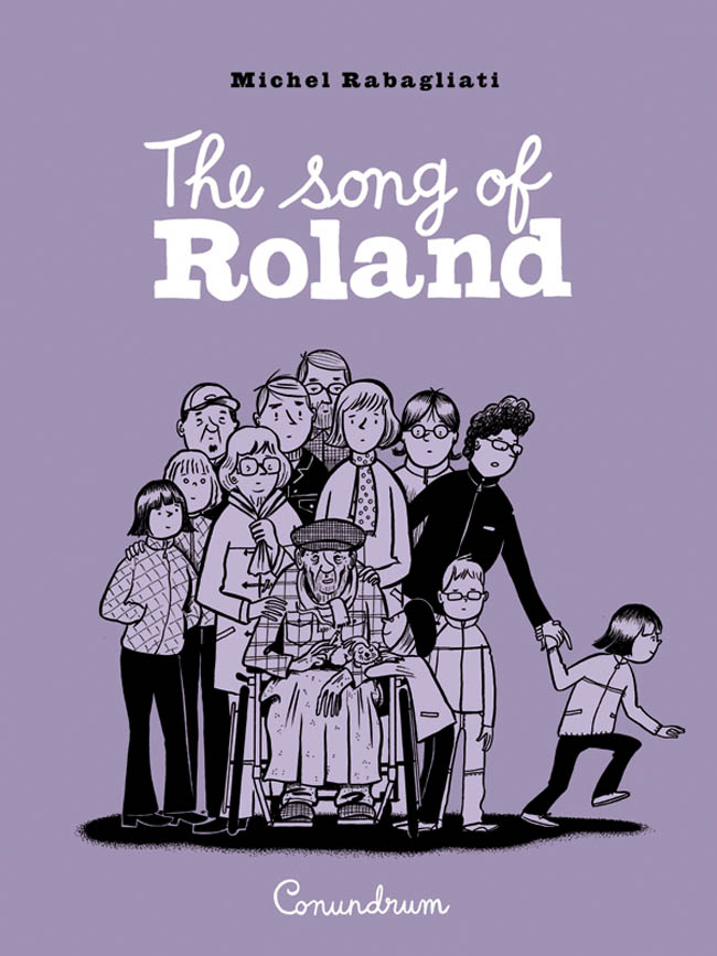
On Making An Exit: The Song of Roland
Michel Rabagliati's The Song of Roland (titled Paul in Quebec in its original French release) is the first of his books to be translated into English by a publisher other than Drawn & Quarterly. Indeed, it was released by the formidable Conundrum Press, a publisher that's now publishing some cartoonists formerly published by D&Q as well as a host of other Canadian cartoonists. I've said it before elsewhere, but Canada has an incredibly deep, diverse and ever-expanding range of cartooning talent, and it deserves to have a number of different publishers active to curate, nurture and publicize its talent. Rabagliati's slice-of-life Paul series of books offer a gentle, humane, funny and ultimately very real account of how lives are lived. His last book, Paul Goes Fishing, was about life and death, creativity and parenting. Rabagliati's books are always about the intersection between memory and how we process our current emotions, and The Song of Roland is no exception.
What's different about this volume is that Paul is really just a supporting character. The book is really about the family of Paul's partner Lucie and her father in particular. Rabagliati sets the scene in the early part of the book, as her parents always made their country cabin a place of vacation for their children and grandchildren, relishing a busy and loud house. The tracks of memories are laid down in this section of the book as Lucie and her sisters recall funny and sometimes vaguely traumatic memories of coming out there. In a book that's about the death of a beloved family member, Rabagliati is careful to vividly create a set of characters before assigning them roles in a tragedy and also inserts a number of moments of both tranquility and levity into the proceedings. We get to inhabit the lives of the people in this book, to get a sense of their eccentricities and how they interact with each other, before tragedy strikes.
Rabagliati does clue the reader in right away that Lucie's father Roland has cancer, though at the time we meet him he's still robust and gruff. As the book proceeds, Paul and the reader get to know him better: he was raised in an orphanage and had a hardscrabble life, until he worked his way up through various companies to become a vice-president. While Roland never quite escaped that feeling of being a defensive, gruff orphan, he made sure to become the sort of father and grandfather that he never had. He is paid back, at the end of his life, in the love he felt from his family. The final third of the book, when Roland is in a hospice facility, neatly encompasses the various stages of accepting death. There's a beautiful stillness to this section that contrasts nicely to the louder, more rambunctious storytelling earlier in the book. Roland is initially rude to the staff when he enters the facility but soon understands both his fate and the role of the people taking care of him. His children and surprising friends show up to see him, many stunned by the sight of a once-vital man wasting away. Through the whole experience, Paul and Roland grow closer and closer after years of slight distance between the two men. The one mawkish note Rabagliati does inject into the proceedings was Roland telling Paul to call him by his first name after years of insisting he call him by his surname. The minute Rabagliati introduced the latter bit of information, it was obvious how this would play out.
On the other hand, what I didn't see coming was a scene on a park bench involving Roland's three daughters getting high as a kind of pressure valve and laughing uproariously at all sorts of nonsense. During a long and austere set of sequences, some drug & scat humor was just what the doctor ordered, as the scene breaks an almost unbearable and inevitable tension in the narrative. It's also a palate cleanser for the real end of the story when Roland dies. The epilogue is a mix of the same sort of heartfelt emotion and quotidian comedic fare that makes up the rest of the book, as the priest at Roland's funeral mispronounces his name, one of his daughters gives a stirring speech, and his granddaughter sees his spirit moving on. That scene could have been cloying, but it felt earned after the way that Rabagliati so gracefully depicts the passing of a forceful personality--especially since there's a funny callback to be found. All told, The Song of Roland isn't quite as complex or powerful as Paul Goes Fishing, but it's a strong effort that addresses downbeat themes with grace, wit and genuine warmth.
What's different about this volume is that Paul is really just a supporting character. The book is really about the family of Paul's partner Lucie and her father in particular. Rabagliati sets the scene in the early part of the book, as her parents always made their country cabin a place of vacation for their children and grandchildren, relishing a busy and loud house. The tracks of memories are laid down in this section of the book as Lucie and her sisters recall funny and sometimes vaguely traumatic memories of coming out there. In a book that's about the death of a beloved family member, Rabagliati is careful to vividly create a set of characters before assigning them roles in a tragedy and also inserts a number of moments of both tranquility and levity into the proceedings. We get to inhabit the lives of the people in this book, to get a sense of their eccentricities and how they interact with each other, before tragedy strikes.
Rabagliati does clue the reader in right away that Lucie's father Roland has cancer, though at the time we meet him he's still robust and gruff. As the book proceeds, Paul and the reader get to know him better: he was raised in an orphanage and had a hardscrabble life, until he worked his way up through various companies to become a vice-president. While Roland never quite escaped that feeling of being a defensive, gruff orphan, he made sure to become the sort of father and grandfather that he never had. He is paid back, at the end of his life, in the love he felt from his family. The final third of the book, when Roland is in a hospice facility, neatly encompasses the various stages of accepting death. There's a beautiful stillness to this section that contrasts nicely to the louder, more rambunctious storytelling earlier in the book. Roland is initially rude to the staff when he enters the facility but soon understands both his fate and the role of the people taking care of him. His children and surprising friends show up to see him, many stunned by the sight of a once-vital man wasting away. Through the whole experience, Paul and Roland grow closer and closer after years of slight distance between the two men. The one mawkish note Rabagliati does inject into the proceedings was Roland telling Paul to call him by his first name after years of insisting he call him by his surname. The minute Rabagliati introduced the latter bit of information, it was obvious how this would play out.
On the other hand, what I didn't see coming was a scene on a park bench involving Roland's three daughters getting high as a kind of pressure valve and laughing uproariously at all sorts of nonsense. During a long and austere set of sequences, some drug & scat humor was just what the doctor ordered, as the scene breaks an almost unbearable and inevitable tension in the narrative. It's also a palate cleanser for the real end of the story when Roland dies. The epilogue is a mix of the same sort of heartfelt emotion and quotidian comedic fare that makes up the rest of the book, as the priest at Roland's funeral mispronounces his name, one of his daughters gives a stirring speech, and his granddaughter sees his spirit moving on. That scene could have been cloying, but it felt earned after the way that Rabagliati so gracefully depicts the passing of a forceful personality--especially since there's a funny callback to be found. All told, The Song of Roland isn't quite as complex or powerful as Paul Goes Fishing, but it's a strong effort that addresses downbeat themes with grace, wit and genuine warmth.
Thursday, February 7, 2013
Sequart Reprints: Russell Patterson & Dupuy/Berberian
Fantagraphics has been releasing lush art books detailing the lives and work of artists whose work bears significant historical significance. Russell Patterson was one of the most important illustrators of all time, who also happened to do a lot of cartoons & comics as well. Tophats and Flappers, a book devoted to his art, is astonishing because the illustrations, despite defining and giving an iconography to the 1920's and 1930's, look thoroughly modern. Dutch publishers Oog & Blik have released an English translation of The Complete Universe of Dupuy & Berberian, an astonishingly gorgeous, full-color collection of paintings, sketches, illustrations and other ephemera by this French duo best known in America for the Monseiur Jean stories published by Drawn & Quarterly. While they're from a different era, this tome (complete with commentary by the artists) is a smooth pairing with the book on Patterson.
Patterson came from a time when illustrators were celebrities and made vast sums of money. After years of struggle, he found success during the Roaring 20's. His illustrations defined a certain look and feel of the era; in fact, the widespread use of the term "flapper" is often attributed to his work. As his career went on, he did more girlie-mag type art that still maintained his sophisticated style even as the content became racier.
Reading the book, I was struck by how the accumulated illustrations so sharply depict a sense of time and place. Patterson's mix of slashing angles for his figures & exaggerated ovals for faces lend a certain frenetic energy to his illustrations. In fact, many of his non-comics illustrations are far livelier than many of the actual cartoons & comics included in this volume. If the 1920's were immortalized (and not in an especially flattering manner) by F.Scott Fitzgerald in novel form, it's Patterson who brings these images to life. The difference is that Patterson the man became part of the decadence of the era, and so presents an entirely unironic take on what he saw.
It goes without saying that for fans of Dupuy-Berberian, The Complete Universe is a must-have. At the same time, this book is $55 and so would not be recommended for those with only a passing interest, other than as an object of great beauty. This is a book of art and illustrations, and as such, there's virtually no actual comics content here, other than a passing appearance or two by Jean or other familiar characters. There's an easy, almost lyrical quality to the way the images pass by on the pages, aided by the artists' brief & witty commentary. What's striking about this duo is that their powers of observation are matched by their powers of imagination. Their ability to imagine Paris in the 20's and bring it to vivid life is as remarkable as their capacity to visit any city and depict its warmth, life and energy.
Like Patterson, D&B have a special touch for drawing women. Their women tend to be long and angular, with a certain mysterious quality that makes them so appealing. Most of the works in this book were commissioned illustrations. In the introduction to the book, the duo recounts their influences and speak glowingly of classic illustration. For them, there's no boundary between art and commercial art. Thus, they approach any commercial job they acquired with the same seriousness and aesthetic approach as they would their comics. They had a way of making commercial art personal, a manner eventually aided by the fame they achieved through their comics work.
Dupuy & Berberian took on all sorts of work: calendars, greeting cards for their publishing houses, artwork for liner notes and album covers, advertising (including an extensive & amusing series for a winery), book covers and more. The most extensive material here are magazine illustrations; their ability to evoke a concept, place and mood make them perfect for such assignments. There are also pages of unpublished sketches, paintings and drawings. Combined with their sketches of cities like New York, Lisbon, Barcelona & Tangier that were later published as stand-alone sketchbooks, what one takes away from this volume is simply how much they love to draw. The book spares no expense in properly showing off the art; not only are the production values high, there are several gorgeous multipage gatefolds, one of which depicts a vivid scene of a band playing in a New York cafe. Despite their many and varied professional assignments, the duo's passion for drawing seems insatiable. Extensive samples of their art (including some images seen in the book) may be found at http://www.duber.net.
Labels:
charles berberian,
phillip dupuy,
russell patterson
Wednesday, February 6, 2013
Catching Up With Koyama
Let's catch up with some slender new releases from one of my favorite publishers, Koyama Press.
The Big Team Society League Book Of Answers, by John Martz, Aaron Costain, Zach Worton and Steve Wolfhard (aka Team Society League). This is 44 pages worth of a relentless assault of filthy, hilarious scatological jokes. While the inside covers detail the names of the many, simply-drawn characters that appear in this dialogue-free book, that's a fake-out. The characters are ciphers in the tradition of Lewis Trondheim's Mister I and Mister O. That Trondheim influence can be felt strongly in the way the artists go to work at sublimely-crafted fart jokes like some master artisans of flatulence. The reason why this comic works so well is that the artists don't end their gags with a fart joke--they begin their gags with something gross and then go to great lengths to not only top that grossness, they wrap it around a nicely-crafted joke. While the drawing is kept simple, it's actually quite skilled. There's one joke where the main character cuts out his own bowels, stuffs a pizza inside so as to make him a pizza-like character for a kids' birthday party, and then starts bleeding as he stumbles out in front of a group of terrified kids. There's a recurring character who's an anthropomorphic hot dog whose "meat" keeps coming undone and falling on people. There's one strip that subverts every other--a character sucks down gallons worth of gasoline, lights a match, smokes a cigarette, and then walks away with nothing bad happening to him even as the reader is eager to see how it end. Stabbings, incineration, various things being shoved in and emerging out of asses, and general mayhem rule the day in these comics, and there's a sense of glee on these pages as the four jamming artists try to one-up each other. It's a genuine treat.
Eat More Bikes, by Nathan Bulmer. This is another slender book of gags, this time more of the absurd and conceptual variety. Bulmer's line is lean and scratchy; he gives it some solidity by using grey-scaling. I've long enjoyed Bulmer's weekly strip over at tcj.com (in Tucker Stone's column), and his work actually gets funnier as you read more strips and come to understand his comedic rhythm. Like the Team Society League, he starts off with an inherently funny premise (Sheriff Duck, muscles in the shape of the Empire State Building, Children's Song Conspiracy Theories, etc) and then quickly escalates the humor in that situation (the best was having a mini King Kong climb the bicep tower and get shot down). Bulmer's other approach is to start with an utterly mundane premise (a party on a roof, a male stripper, an interview), quickly subvert reader expectations (often with violence) and then cap it with a perfect punchline. What's amazing is that Bulmer drew this entire 36 page comic in just a month--he's a relentless joke machine with a solid sense of craft.
Sunday In The Park With Boys, by Jane Mai. This is a harrowing, unsparing account of one young woman's experience with anxiety, depression and sheer existential terror. Mai's rendering style ranges from a simplistic, cartoony line (almost like a manga character, complete with a sailor suit) to an intense, almost unbearable naturalism that oozes pain. If there's a credo to this comic, it's "I wish you could understand". Mai tries to get across what it's like to feel the way that she does on a regular basis. She often sees the world as inhabited by horrifying, multisegmented insectoid creatures. She frequently feels them on her own head, suffocating her, isolating her, causing her to become more and more desperate. The phrase she uses, "I wish I wasn't such an asshole" is the cry of depressives everywhere who feel like they don't deserve to be loved. The most devastating part of the book, and really the part that recapitulates Mai's many attempts at understanding herself, comes when she tries to describe how she feels when she's depressed. She says it's like being in water, "complacent and happy" but "boring". Then you start to drown "and it gets harder to bounce back and stay afloat each time"; for a young person starting to get older, this is precisely what happens. What's interesting about this comic is Mai's use of whimsical storytelling devices that try to give her pep talks: her dog, a mermaid, a mirror, an eyepatch. It's like the entire book is really a dialogue between her depressive self and what is known in therapy as one's "wise mind"--the rational part of one's brain that knows how to help, if only the depressive self would listen. Mai's wise mind is just especially cleverly rendered in so many different ways, even as the specter of the all-controlling insect is such a dominant presence. The book ends on a hopeful note that is as much self-suggestion as it is an honest conclusion for this stunning piece of someone trying to get better in public through art. She and Lance Ward are my new favorite autobio cartoonists for the way they mix humor and unsparing self-examination.
The Big Team Society League Book Of Answers, by John Martz, Aaron Costain, Zach Worton and Steve Wolfhard (aka Team Society League). This is 44 pages worth of a relentless assault of filthy, hilarious scatological jokes. While the inside covers detail the names of the many, simply-drawn characters that appear in this dialogue-free book, that's a fake-out. The characters are ciphers in the tradition of Lewis Trondheim's Mister I and Mister O. That Trondheim influence can be felt strongly in the way the artists go to work at sublimely-crafted fart jokes like some master artisans of flatulence. The reason why this comic works so well is that the artists don't end their gags with a fart joke--they begin their gags with something gross and then go to great lengths to not only top that grossness, they wrap it around a nicely-crafted joke. While the drawing is kept simple, it's actually quite skilled. There's one joke where the main character cuts out his own bowels, stuffs a pizza inside so as to make him a pizza-like character for a kids' birthday party, and then starts bleeding as he stumbles out in front of a group of terrified kids. There's a recurring character who's an anthropomorphic hot dog whose "meat" keeps coming undone and falling on people. There's one strip that subverts every other--a character sucks down gallons worth of gasoline, lights a match, smokes a cigarette, and then walks away with nothing bad happening to him even as the reader is eager to see how it end. Stabbings, incineration, various things being shoved in and emerging out of asses, and general mayhem rule the day in these comics, and there's a sense of glee on these pages as the four jamming artists try to one-up each other. It's a genuine treat.
Eat More Bikes, by Nathan Bulmer. This is another slender book of gags, this time more of the absurd and conceptual variety. Bulmer's line is lean and scratchy; he gives it some solidity by using grey-scaling. I've long enjoyed Bulmer's weekly strip over at tcj.com (in Tucker Stone's column), and his work actually gets funnier as you read more strips and come to understand his comedic rhythm. Like the Team Society League, he starts off with an inherently funny premise (Sheriff Duck, muscles in the shape of the Empire State Building, Children's Song Conspiracy Theories, etc) and then quickly escalates the humor in that situation (the best was having a mini King Kong climb the bicep tower and get shot down). Bulmer's other approach is to start with an utterly mundane premise (a party on a roof, a male stripper, an interview), quickly subvert reader expectations (often with violence) and then cap it with a perfect punchline. What's amazing is that Bulmer drew this entire 36 page comic in just a month--he's a relentless joke machine with a solid sense of craft.
Sunday In The Park With Boys, by Jane Mai. This is a harrowing, unsparing account of one young woman's experience with anxiety, depression and sheer existential terror. Mai's rendering style ranges from a simplistic, cartoony line (almost like a manga character, complete with a sailor suit) to an intense, almost unbearable naturalism that oozes pain. If there's a credo to this comic, it's "I wish you could understand". Mai tries to get across what it's like to feel the way that she does on a regular basis. She often sees the world as inhabited by horrifying, multisegmented insectoid creatures. She frequently feels them on her own head, suffocating her, isolating her, causing her to become more and more desperate. The phrase she uses, "I wish I wasn't such an asshole" is the cry of depressives everywhere who feel like they don't deserve to be loved. The most devastating part of the book, and really the part that recapitulates Mai's many attempts at understanding herself, comes when she tries to describe how she feels when she's depressed. She says it's like being in water, "complacent and happy" but "boring". Then you start to drown "and it gets harder to bounce back and stay afloat each time"; for a young person starting to get older, this is precisely what happens. What's interesting about this comic is Mai's use of whimsical storytelling devices that try to give her pep talks: her dog, a mermaid, a mirror, an eyepatch. It's like the entire book is really a dialogue between her depressive self and what is known in therapy as one's "wise mind"--the rational part of one's brain that knows how to help, if only the depressive self would listen. Mai's wise mind is just especially cleverly rendered in so many different ways, even as the specter of the all-controlling insect is such a dominant presence. The book ends on a hopeful note that is as much self-suggestion as it is an honest conclusion for this stunning piece of someone trying to get better in public through art. She and Lance Ward are my new favorite autobio cartoonists for the way they mix humor and unsparing self-examination.
Labels:
aaron costain,
annie koyama,
jane mai,
john martz,
nate bulmer,
steve wolfhard,
zach worton
Tuesday, February 5, 2013
Sequart Reprints: Windy Corner 1
This review was originally published in 2007 for sequart.com
*********************
Reading Windy Corner Magazine #1 was a special pleasure, because I've always found Austin English's taste to be impeccable as a critic and now as an editor. It was a bonus to see so much of his new work as an artist as well. What makes this publication distinctive is its focus on artists and their experiences as artists--how they feel about drawing as much as technical or biographical information. To that end, English has an interview with Andrice Arp, Steve Lafler writes about an anecdote from his art school days, Paula Salemme contributes a few pages from her sketchbook and Richard Hahn has a comic about his thoughts on Saul Steinberg.
I often speak of artists who discuss the pleasurable sensation of drawing, and English is a prime example of this. His draftsmanship has always been primitive, even childlike, but he makes this style work for him with sophisticated composition and a huge bag of storytelling tricks. He has two different storylines in this issue: "Life of Francis", about a girl growing up in the midwest, and "My Earliest Memory Comics", which are self-explanatory. The two different stories feel connected thematically, as Francis grows up poor but becomes an artist. Along the way, she discovers her father's infidelity to her mother, an event fraught with profound significance. We later see him out of the picture as we delve into another memory, and that's what this multipart story is: a series of memories, presented as vignettes. There's one telling page where Francis is drawing and telling her infant brother about the experience. "It's so hard to draw but also so much fun. I can't draw the way I want...but I like the way it feels, the way my arm feels". Drawing as a sensual experience is exactly what English is all about, and when someone asks to buy one of Francis' drawings, we see a twinkle in her eye that suggests a lifetime of balancing the pleasure of drawing with its mercenary and popular aspects.
This story directly segues into English's memory stories, where we see him tagging along with his mother (an artist) at a gallery opening. It's not made explicit, but it's strongly implied that Francis was in fact his mother (or at least the inspiration for same), and Austin is seeing the world of art through her eyes now. English is especially dynamic in telling his story here, with breathless stream-of-consciousness narration applied to each individual panel, forcing the reader through his memories as fast as one can speed through the word balloon. The narration is not exactly done the way a child would describe it; instead, English is clearly trying to reach back to that memory and describe it as an adult, but filtered through the emotions he remembers of that event.
His second memory story, "North Beach", sees him spending time with his father. It's clear that their relationship is very different than with Austin and his mother. There's obviously still a great deal of affection but perhaps not the same kind of closeness, and his memory of going to Chinese New Year with his father ("he knew what a little kid would like he knew this was something I would like") was simultaneously delightful and tinged with danger.
The last story, "Red Balloon", was the sort of small event that can stick in a child's memory for a long time--just a little anecdote about seeing a film in a library with his mother that for some reason lingered on. It's not surprising to see English plunder his memory for materials in these stories, because he always seems obsessed with connecting the emotions one feels as a child with how one engages the world as an adult. It's a theme that rang true in Christina and Charles and certainly is at play here. This is not to say that his comics are simplistic or juvenile--quite the contrary, there's an enormous complexity to his work, as English understands that actually capturing these emotions and experiences is extremely difficult. There's a disconnect between experiencing an event, having a memory of that event, and creating a narrative related to that event--they are all discrete activities that are often conflated as one and the same thing. English seems to understand this and uses a strategy that makes each of these three components as transparent as possible for both himself and the reader. This can be somewhat disconcerting for those who aren't used to seeing the mechanics of autobiographical storytelling laid bare, but the result is a story that is rich with depth and meaning.
The sketchbook paintings of New York's Lower East Side fit smoothly with English's comics. The vivid, almost garish colors of the buildings are almost characters unto themselves. English is generous in the full-color images he reproduces for the Arp interview. As noted earlier, the questions are very much of the sort an artist might wonder about another artist: does she see writing and drawing as the same thing? Is drawing pleasurable? Can you recall your first memory of drawing? How do you modify your drawings to make it understandable for an audience? What's your drawing set-up like, and how much do you draw in a day? What is the benefit of spending time with other artists? English drew out Arp nicely, and the interview was clearly interesting to him because her approach was very different from his. This is where English's status as artist/critic comes into play: though he has a specific approach to his art, he's fascinated by how and why others work. The combination of his understanding the artistic process with a genuine intellectual curiousity is why I've always been interested in both his art and critiques.
Anyone who's ever read any of Steve Lafler's prose knows that he's hilarious. His story of his Advanced Drawing professor in art school torturing the students with seemingly-impossible assignments was a nice counterpoint to the more sober entries in the book. At the same time, Lafler was trying to prove a point about learning not just how to draw but how to see the world in a different way. It was as critically relevant as anything else in this issue, just done from Lafler's off-beat perspective. I hope that Lafler will continue to contribute to Windy Corner, especially now that he's moved to Mexico.
Finally, Richard Hahn (an enormously underrated artist) contributed a startling comics essay of sorts. It's much looser than his normally tight, angular work, giving the sometimes=mysterious images room to breathe and play with each other. The comic seemed to be both a further continuation of the empty city-scapes Hahn is known for exploring along with a commentary on Saul Steinberg's New Yorker cartoons.
Sparkplug Comic Books fills an interesting niche in the world of comics. The work that Dylan Williams publishes is hard to reduce down to a particular type or genre, yet at the same time as a whole is very different from any other publishing concern. It makes sense that he's publishing a comics magazine that's dedicated to featuring artists who get overlooked and discussing ideas not explored in other publications. Each new book by Sparkplug reveals a comic that you didn't know that you needed to read until someone handed it to you. Williams has an ambitious 2007 publishing schedule, which is only great news for the world of comics.
*********************
Reading Windy Corner Magazine #1 was a special pleasure, because I've always found Austin English's taste to be impeccable as a critic and now as an editor. It was a bonus to see so much of his new work as an artist as well. What makes this publication distinctive is its focus on artists and their experiences as artists--how they feel about drawing as much as technical or biographical information. To that end, English has an interview with Andrice Arp, Steve Lafler writes about an anecdote from his art school days, Paula Salemme contributes a few pages from her sketchbook and Richard Hahn has a comic about his thoughts on Saul Steinberg.
I often speak of artists who discuss the pleasurable sensation of drawing, and English is a prime example of this. His draftsmanship has always been primitive, even childlike, but he makes this style work for him with sophisticated composition and a huge bag of storytelling tricks. He has two different storylines in this issue: "Life of Francis", about a girl growing up in the midwest, and "My Earliest Memory Comics", which are self-explanatory. The two different stories feel connected thematically, as Francis grows up poor but becomes an artist. Along the way, she discovers her father's infidelity to her mother, an event fraught with profound significance. We later see him out of the picture as we delve into another memory, and that's what this multipart story is: a series of memories, presented as vignettes. There's one telling page where Francis is drawing and telling her infant brother about the experience. "It's so hard to draw but also so much fun. I can't draw the way I want...but I like the way it feels, the way my arm feels". Drawing as a sensual experience is exactly what English is all about, and when someone asks to buy one of Francis' drawings, we see a twinkle in her eye that suggests a lifetime of balancing the pleasure of drawing with its mercenary and popular aspects.
This story directly segues into English's memory stories, where we see him tagging along with his mother (an artist) at a gallery opening. It's not made explicit, but it's strongly implied that Francis was in fact his mother (or at least the inspiration for same), and Austin is seeing the world of art through her eyes now. English is especially dynamic in telling his story here, with breathless stream-of-consciousness narration applied to each individual panel, forcing the reader through his memories as fast as one can speed through the word balloon. The narration is not exactly done the way a child would describe it; instead, English is clearly trying to reach back to that memory and describe it as an adult, but filtered through the emotions he remembers of that event.
His second memory story, "North Beach", sees him spending time with his father. It's clear that their relationship is very different than with Austin and his mother. There's obviously still a great deal of affection but perhaps not the same kind of closeness, and his memory of going to Chinese New Year with his father ("he knew what a little kid would like he knew this was something I would like") was simultaneously delightful and tinged with danger.
The last story, "Red Balloon", was the sort of small event that can stick in a child's memory for a long time--just a little anecdote about seeing a film in a library with his mother that for some reason lingered on. It's not surprising to see English plunder his memory for materials in these stories, because he always seems obsessed with connecting the emotions one feels as a child with how one engages the world as an adult. It's a theme that rang true in Christina and Charles and certainly is at play here. This is not to say that his comics are simplistic or juvenile--quite the contrary, there's an enormous complexity to his work, as English understands that actually capturing these emotions and experiences is extremely difficult. There's a disconnect between experiencing an event, having a memory of that event, and creating a narrative related to that event--they are all discrete activities that are often conflated as one and the same thing. English seems to understand this and uses a strategy that makes each of these three components as transparent as possible for both himself and the reader. This can be somewhat disconcerting for those who aren't used to seeing the mechanics of autobiographical storytelling laid bare, but the result is a story that is rich with depth and meaning.
The sketchbook paintings of New York's Lower East Side fit smoothly with English's comics. The vivid, almost garish colors of the buildings are almost characters unto themselves. English is generous in the full-color images he reproduces for the Arp interview. As noted earlier, the questions are very much of the sort an artist might wonder about another artist: does she see writing and drawing as the same thing? Is drawing pleasurable? Can you recall your first memory of drawing? How do you modify your drawings to make it understandable for an audience? What's your drawing set-up like, and how much do you draw in a day? What is the benefit of spending time with other artists? English drew out Arp nicely, and the interview was clearly interesting to him because her approach was very different from his. This is where English's status as artist/critic comes into play: though he has a specific approach to his art, he's fascinated by how and why others work. The combination of his understanding the artistic process with a genuine intellectual curiousity is why I've always been interested in both his art and critiques.
Anyone who's ever read any of Steve Lafler's prose knows that he's hilarious. His story of his Advanced Drawing professor in art school torturing the students with seemingly-impossible assignments was a nice counterpoint to the more sober entries in the book. At the same time, Lafler was trying to prove a point about learning not just how to draw but how to see the world in a different way. It was as critically relevant as anything else in this issue, just done from Lafler's off-beat perspective. I hope that Lafler will continue to contribute to Windy Corner, especially now that he's moved to Mexico.
Finally, Richard Hahn (an enormously underrated artist) contributed a startling comics essay of sorts. It's much looser than his normally tight, angular work, giving the sometimes=mysterious images room to breathe and play with each other. The comic seemed to be both a further continuation of the empty city-scapes Hahn is known for exploring along with a commentary on Saul Steinberg's New Yorker cartoons.
Sparkplug Comic Books fills an interesting niche in the world of comics. The work that Dylan Williams publishes is hard to reduce down to a particular type or genre, yet at the same time as a whole is very different from any other publishing concern. It makes sense that he's publishing a comics magazine that's dedicated to featuring artists who get overlooked and discussing ideas not explored in other publications. Each new book by Sparkplug reveals a comic that you didn't know that you needed to read until someone handed it to you. Williams has an ambitious 2007 publishing schedule, which is only great news for the world of comics.
Monday, February 4, 2013
Catching Up With 2D Cloud
One of my favorite micropublishers is Minneapolis' 2D Cloud, spearheaded by Raighne Hogan and Justin Skarhus. Let's take a look at their recent output.
Startled Maggie, by Meghan Hogan. This is a memory comic devoted to the artist's first memories, supplemented by the memories of her parents and others. It's charming in the way that anything a little kid does is charming, even when it's really obnoxious or disgusting. Hogan employs a scratchy, scribbly line that's expressive and unfussy, carrying the reader through gently captioned memories, milestones and adventures. The way Hogan draws her parents as having blank eyes behind their eyeglasses is almost as perfect as the way she draws herself: a crazy-haired curmudgeon with either a glint of mischief or a permanent scowl on her face. The panel captioned "Maggie gives orders now" features a scowling child yelling "OFF PHONE!". The other thing this comic captures so well is the seriousness of play. For a young child, play is an activity that requires intense concentration whose purpose is a kind of making or remaking of reality. Toward the end of the comic, as Maggie enters her toddler years, that scowl is replaced by a relentless sense of wonder, leading to amusing flights of fancy and endless questioning. It's an entirely accurate view of early childhood with an emphasis on the lighter side of a child's struggle to gain agency and control over her world.
Ablatio Penis, by Will Dinski. The stars and stripes and red, white and blue color scheme of the cover initially conceal the title of this comic, which is fitting considering it's all about what is concealed and why. Dinski, a long-time favorite of mine, loves to misdirect and redirect a reader's attention in interesting ways in his narratives, which is especially fitting here considering that the story is about an election. Taking no particular sides, Dinski details the machinations between charismatic Republicatn Andre St. Louis and dishwater dull democrat Susan Wallace. What's interesting about the two is that while both harbor deep secrets that could lose them the election, neither acts on that knowledge when grudge-holders pass it on to their campaigns. The secret that is revealed by an ex-girlfriend (despite his womanizing tendencies, he is a virgin) does indeed cost him the election, though the reason she does it is political, not personal (though as Dinski suggests, is there a difference?). Of course, his real secret, as suggested by the title (which means "detached penis") is never openly revealed, though it is strongly hinted at late in the book. A botched circumcision is what causes him to keep the many women attracted to him at arm's length, a secret known by only a few. In some ways, the end of the book is a shaggy dog joke, but Dinski constantly subverts expectations as to motives and gives new meaning to earlier scenes in the book when all is revealed. As always, Dinski's pacing and character design are both slightly eccentric, focusing on exaggerated, cartoony details as well as jamming a lot of panels on a single page while still leaving enough room for those individual panels to breathe. Telling the final third of the story through the eyes of a random person sitting in a diner was an especially inspired move, creating a narrative that's even more subjective and removed from the truth. "We can only know what we're shown" is the quote that concludes the book, and it sums up the ways in which St Louis lost and what secrets he was able to keep--and the price he paid. It also sums up how Wallace manages to win despite her own sordid history and robotic personal affect: what she didn't show got her elected moreso than what she did show. The difference between being and seeming has been a running theme throughout Dinski's career, and he adds an interesting layer of complexity to the subject in this book.
RDCD Fist #1.5, by Justin Skarhus. This wordless comic feels sort of a like a Rosenkrantz and Guildenstern Are Dead version of the first issue of Skarhus' comic about exploring a space and the visceral and surreal nature of violence. A ghostly, spectral character emerges from a warped television image until it coalesces into a director's chair, prints out scripts and gives them to the waiting "actors" from RDCD Fist #1, eventually swirling to form the word "action" above its head. Skarhus is an interesting thinker, and I like the way he juxtaposes simplistic scenes of violence that are the core of most genre comics with a sort of phenomenology of the entire experience of exploring the space, experiencing the fight and watching the fight all at once, both as a "real" event and as a contrived ritual done for putative entertainment. That he manages to do this despite limited drawing ability makes it all the more impressive.
High Score, edited by Raighne Hogan. This is an anthology that's part of a Kickstarter incentive for a book by Rusel DeMaria of the same title, done in full color. It's about a variety of cultural experienced related to video games. Hannah Blumenreich writes of being a girl who wanted to play a video game at daycare but found herself shunned by boys. When she finally gets a chance to play, the boys are less than cooperative in showing her how to play. Her character design is especially effective here, emphasizing the hyperbolic qualities of children. Peter Wartman's comic about his German cousin wanting to play a "Medal of Honor" game in order to "kill German people" gets at the heart of the power of video games and why it's sometimes important to take a step back. Eric Schuster's 8-bit style history of the disastrous ET Atari game is hilarious and dovetails nicely with Saman Bernel-Benrud picking the story up when thousands of copies of the game were supposedly buried in a landfill in New Mexico. He imagines a scenario where the ET-shaped spirit of the game rises out of the landfill, shedding a tear at seeing kids play other games. Toby Jones contributes a typically amusing list of how his sedentary hobbies might look as video games, in contrast to the more active creator of key Wii games doing the same with his active hobbies. Finally, Hogan himself shows off his dazzling talent as a colorist with a variety of pages involving monsters and children. Overall, the anthology is best suited for gamers, which makes sense considering its original publishing history. It certainly bears the mark of a typically well-designed and eye-catching work from Hogan.
Startled Maggie, by Meghan Hogan. This is a memory comic devoted to the artist's first memories, supplemented by the memories of her parents and others. It's charming in the way that anything a little kid does is charming, even when it's really obnoxious or disgusting. Hogan employs a scratchy, scribbly line that's expressive and unfussy, carrying the reader through gently captioned memories, milestones and adventures. The way Hogan draws her parents as having blank eyes behind their eyeglasses is almost as perfect as the way she draws herself: a crazy-haired curmudgeon with either a glint of mischief or a permanent scowl on her face. The panel captioned "Maggie gives orders now" features a scowling child yelling "OFF PHONE!". The other thing this comic captures so well is the seriousness of play. For a young child, play is an activity that requires intense concentration whose purpose is a kind of making or remaking of reality. Toward the end of the comic, as Maggie enters her toddler years, that scowl is replaced by a relentless sense of wonder, leading to amusing flights of fancy and endless questioning. It's an entirely accurate view of early childhood with an emphasis on the lighter side of a child's struggle to gain agency and control over her world.
Ablatio Penis, by Will Dinski. The stars and stripes and red, white and blue color scheme of the cover initially conceal the title of this comic, which is fitting considering it's all about what is concealed and why. Dinski, a long-time favorite of mine, loves to misdirect and redirect a reader's attention in interesting ways in his narratives, which is especially fitting here considering that the story is about an election. Taking no particular sides, Dinski details the machinations between charismatic Republicatn Andre St. Louis and dishwater dull democrat Susan Wallace. What's interesting about the two is that while both harbor deep secrets that could lose them the election, neither acts on that knowledge when grudge-holders pass it on to their campaigns. The secret that is revealed by an ex-girlfriend (despite his womanizing tendencies, he is a virgin) does indeed cost him the election, though the reason she does it is political, not personal (though as Dinski suggests, is there a difference?). Of course, his real secret, as suggested by the title (which means "detached penis") is never openly revealed, though it is strongly hinted at late in the book. A botched circumcision is what causes him to keep the many women attracted to him at arm's length, a secret known by only a few. In some ways, the end of the book is a shaggy dog joke, but Dinski constantly subverts expectations as to motives and gives new meaning to earlier scenes in the book when all is revealed. As always, Dinski's pacing and character design are both slightly eccentric, focusing on exaggerated, cartoony details as well as jamming a lot of panels on a single page while still leaving enough room for those individual panels to breathe. Telling the final third of the story through the eyes of a random person sitting in a diner was an especially inspired move, creating a narrative that's even more subjective and removed from the truth. "We can only know what we're shown" is the quote that concludes the book, and it sums up the ways in which St Louis lost and what secrets he was able to keep--and the price he paid. It also sums up how Wallace manages to win despite her own sordid history and robotic personal affect: what she didn't show got her elected moreso than what she did show. The difference between being and seeming has been a running theme throughout Dinski's career, and he adds an interesting layer of complexity to the subject in this book.
RDCD Fist #1.5, by Justin Skarhus. This wordless comic feels sort of a like a Rosenkrantz and Guildenstern Are Dead version of the first issue of Skarhus' comic about exploring a space and the visceral and surreal nature of violence. A ghostly, spectral character emerges from a warped television image until it coalesces into a director's chair, prints out scripts and gives them to the waiting "actors" from RDCD Fist #1, eventually swirling to form the word "action" above its head. Skarhus is an interesting thinker, and I like the way he juxtaposes simplistic scenes of violence that are the core of most genre comics with a sort of phenomenology of the entire experience of exploring the space, experiencing the fight and watching the fight all at once, both as a "real" event and as a contrived ritual done for putative entertainment. That he manages to do this despite limited drawing ability makes it all the more impressive.
High Score, edited by Raighne Hogan. This is an anthology that's part of a Kickstarter incentive for a book by Rusel DeMaria of the same title, done in full color. It's about a variety of cultural experienced related to video games. Hannah Blumenreich writes of being a girl who wanted to play a video game at daycare but found herself shunned by boys. When she finally gets a chance to play, the boys are less than cooperative in showing her how to play. Her character design is especially effective here, emphasizing the hyperbolic qualities of children. Peter Wartman's comic about his German cousin wanting to play a "Medal of Honor" game in order to "kill German people" gets at the heart of the power of video games and why it's sometimes important to take a step back. Eric Schuster's 8-bit style history of the disastrous ET Atari game is hilarious and dovetails nicely with Saman Bernel-Benrud picking the story up when thousands of copies of the game were supposedly buried in a landfill in New Mexico. He imagines a scenario where the ET-shaped spirit of the game rises out of the landfill, shedding a tear at seeing kids play other games. Toby Jones contributes a typically amusing list of how his sedentary hobbies might look as video games, in contrast to the more active creator of key Wii games doing the same with his active hobbies. Finally, Hogan himself shows off his dazzling talent as a colorist with a variety of pages involving monsters and children. Overall, the anthology is best suited for gamers, which makes sense considering its original publishing history. It certainly bears the mark of a typically well-designed and eye-catching work from Hogan.
Labels:
2D cloud,
justin skarhus,
meghan hogan,
toby jones,
will dinski
Subscribe to:
Posts (Atom)