The Comix Reader is the brainchild of British cartoonist, Richard Cowdry. He edits and contributes material to each issue. Its format is that of a classic comics broadsheet; each issue is 24 pages and in full color. His stated purpose in publishing it was to revive the anything goes, "fun" and "free-spirited" nature of the underground press of the 60s and 70s. That's a line I've heard quite often from slightly older cartoonists in the US who decry literary comics and cartoonists and prefer their comics to be as id-soaked, vulgar and free-wheeling as possible. Naturally, there's room for all sorts of comics, but those that invoke the underground frequently have a chip on their shoulder while staking out their territory.
Fortunately, Cowdry abandons this rhetoric after the first issue and simply went about the business of recruiting a wide variety of artists to regularly contribute to the
Reader. Having read the first five issues, it establishes a nice rhythm to see some artists return in issue after issue, while having more samples of work made me appreciate other artists more. Cowdry has made a sustained effort to recruit a number of female cartoonists and obviously has no editorial mandates as to what he wants each cartoonist to do. The result is a melange of gag strips, local/topical humor, autobio comics, whimsical fantasy strips, low-res drawings and highly detailed renderings. The
Reader has gotten stronger from issue to issue, and that's a testament to each cartoonist obviously trying to contribute their best material and up their game in each subsequent installment. Rather than review particular issues, I thought I'd highlight some of the cartoonists who caught my eye. While this is a long list, there's still about a dozen other cartoonists published in the
Reader who didn't draw my attention one way or another.
Richard Cowdry: Cowdry himself is an excellent and vicious satirist. Some of the strips here were reprinted in his Downtown collection, which I reviewed
here.
Saban "Shabs" Sazin: The cartoony style of this artist emphasizes bold, sweeping expressions by his characters. Sazin smartly and amusingly addresses working-class woes as well as the experience of being an immigrant in the U.K. His thick line looks especially great soaking up color on a big page.
Lord Hurk: Hurk most closely resembles the underground cartoonists to which Cowdry refers than anyone else in the Reader. His comics are in turn bizarre, hilarious and imaginative as he imagines the adventures of the Lonely Bomb, Diamond Chops and misshapen superhero The Magnificent Orb. Hurk's chops are unassailable and his work looks especially effective in color. While he taps into that anarchic underground sensibility in terms of his ideas and wild visuals, he avoids scatology for scatology's sake; every gross gag is in service of the story or satire. His figures are grotesque, funny and distorted, but his work doesn't rest on grossing out the reader.
Kat Kon: Kon tends to work really big--like just four panels per huge page. That's because she likes to blow up faces and really zero in their weirder qualities. In issue #2, she works a bit smaller, but still with that thick line that emphasizes character expression and lots of spotting blacks. Issue #3 has one image where a woman has a shirt that says "I refuse to smile for no reason" and loads of dead bodies around her; it's a darkly amusing take on a persistent feminist issue that pervades any number of culture. The fifth issue reinforces this with her take on being a barista and the kinds of comments she gets. Kon isn't much one for metacommentary, letting her figures and images speak for themselves. The format certainly flatters her art and adds greatly to its punch.
Alex Potts: His comics took time to really grow on me, as he tends to use a 5 x 7 grid in each issue. That grid minimizes his art while pushing the reader through quickly, but his low-key narratives regarding the character Philip have a surprisingly dark tone to them. Potts reminds me a bit of Chris Ware in the way he uses small panels to his advantage and lets the reader figure out the implications of the character's story for themselves.
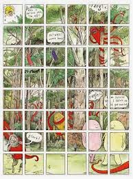
Steve Tillotson: Of all the artists in the Reader, Tillotson is the one who took the greatest advantage of the formal possibilities of working big. His trademark is using a grid that simultaneously depicts a single image and that breaks it up to allow individual actions by the characters. His rendering is superb, as he draws both cute & simple characters as well as lush backgrounds. I'm not sure I'd be up to seeing a book's worth of his strips, but that's what makes him perfect for an anthology.
Ellen Lindner: A long-time favorite of mine, Lindner uses her Reader space for autobio (which has always been funny and sharply observed) and splashes it with huge swaths of vivid color. Oranges, yellows, greens, pinks and purples all tend to dominate her comics here, grabbing the reader's eye while she relates witty and thoughtful anecdotes.
Sina Shamsavari: His autobio centers around relationships and loneliness as a gay man in London. His line varies from a bold, naturalistic style to a more fragile, angular look that incorporates splashes of color. I love the way he varies approaches from issue to issue. In some, he does a single narrative and in others, four 2 x 3 panel mini-narratives. All of them focus on the pros and cons of being alone, of being an outsider even in gay culture. The comics are philosophical and thoughtful rather than whiny, but one can still feel Shamsavari's(variously also known as Sina Evil and Sina Sparrow) the depths of his sadness. That's mitigated by the ways in which he finds to express himself. The sophistication of his autobio is a perfect balance for the sillier stuff in the
Reader.
Paul O'Connell: O'Connell's biography of model and singer Sabrina in #1 was a strong piece, using photo-reference to create a narrative while giving it a "pop art" effect through the nonintuitive application of color. Less successful was a "clowns in hell" experiment with Addy Evenson; this page was dissonant to the point of incoherency.
Julia Homersham: Homersham appeared in the first two issues with a number of goofy gags that riff on inanimate objects like food or animals behaving as humans. The first issue features single-panel gags, while the second issue is all strips of various lengths. Homersham is heavy on both verbal and visual puns, and there are some groaners in there. In the context of the reader, her work acts as a nice palate cleanser for heavier work. Her "History of English Puddings" page is not strictly comics, but the nomenclature and explanation of many of these bizarre dishes is both bewildering and amusing.
Tobias Tak: Tak is a great draftsman who pulls out all the stops with his use of color. The actual content of his comics is usually self-consciously twee, which makes reading them a slog. They're like reading a Richard Sala comic without any of the bite or the brains and tend to act as a roadblock while reading the anthology. It's labored whimsy.
Gareth Brookes: His page about birds singing to humanity about its arrogance was one of the most overtly-precious, tedious and annoying lectures I've ever seen in comics. The birds are nicely-illustrated, but they're only illustrations and lie inert on the page.
Tim & Alex Levin: Their "Jones" gag strips, in issue after issue, are sloppy without any charm. The jokes themselves are easy pop cultural targets, dumb scatological humor, or bits of randomness that don't go anywhere.
Peter Lally: His take-off on the artist Banksy was silly, poorly-drawn and had an obvious punchline. Much better was "Taxi", a fascinating slice-of-life story (drawn white-on-black backgrounds) that reveals a lot about working-class taxi drivers and an older generation in general. The style Lally used was bold and eye-catching, instantly drawing me in.
Bernadette Bentley: Bentley writes, smart, funny and sharply-observed autobio comics. Her strip about being a guard in a museum and desperately trying to find things to do to stave off boredom is clever for her use of strike-outs in her text to couch meanings. The story about her mother trying to use art to draw out mentally handicapped people that was subsequently shot down by superiors was heart-breaking.
Barnath Richards: He did just one page for the Reader, but it's a doozy: a beautifully drawn and colored one-pager about remembering a TV show from his youth about a robot. In just three panels, he captures the vividness of this memory without wallowing too much in the nostalgia of the moment.
Hannah Eaton: Her densely rendered story about her grandfather hauling corpses for a living was funny and evocative of a different and often stranger era.
Jimi Gherkin: Gherkin's comics are mostly silly, but I thought his affectionate tribute to Harvey Pekar and R.Crumb in "The Jimi Gherkin Name Story" was effective both as homage and as a way of exploring his own past.
Elliot Baggott: Baggott is another artist who dove into the opportunity given to him by having such a big page with enormous relish. His first strip, a single illustration that follows a fox down a building and through a city, is a marvel of clear formal cleverness. His silent strip in #3, done in the style of stained glass, is a gag about how movable type transformed the world, complete with a plop take at the end. If his first strip was remarkable for its use of negative space, the second one is fascinating due to how the reader is dropped into a landscape entirely suffused with color. "Boss Talk" in #5 is a more conventional strip that's a takedown of thinly veiled sexism.
Bird: Bird's mediation on why we worship what we worship and the sheer weirdness of being alive in #3 was funny and thoughtful, and his thin line combined with a restrained use of color made it a highlight. Jokes about allergies and "Happy Days" in #4 could have been hacky, but they were so well-constructed that the set-ups were just as amusing as the punchlines; the character construction was completely different than his work in #3 but their rounded, roly-poly quality was entirely appropriate for this sort of joke.
Maartje Schalkx: Schalkx's strips are models of economy and efficiency, as they mostly depict just her head, and remove most of her facial features at that. There's one strip in particular where we see just her head on a pillow and her eyes open, staring at a man sleeping next to her with his eyes closed. She flips back and forth in sequence on a panel-free page, sparking a silent reverie about perhaps why she's there and who she happens to be sleeping next to. Another issue simply featured her head bouncing down the page, while another issue features her head interacting with other heads at an LGBT disco, where she's trying hard to pick someone up. That strip also features soft pastels in the background, adding to the ethereal feel of that particular scenario. Schalkx uses the entire page in smart ways that made seeing her work a pleasure in every issue.
Craig Burston: I'm not generally a fan of 8-bit style drawings, but Burston's "Low-Res Des" strips are funny because they make the formal qualities of the work part of the narrative. The strip about the fly (in an homage to the film
The Fly) was especially amusing.
Ralph Kidson: Kidson's first strip was called "Big Balls Crow", which is about all you need to know about it. The rest of his work in the Reader is silly without otherwise being distinctive.
Sean Duffield: I found little to interest me in Duffield's work; when it wasn't mining scatological humor for its own sake, it seemed overly provincial. It was too locked into local, political and popular references to resonate with me, though perhaps that wouldn't be true of someone living in Britain.
Noelle Barby: Her autobio strip about encountering the forces of sexual debauchery (at last!) in high school was hilarious, as were the depictions of her particular sexual misadventures. Seeing Lust narrate her disappointing future sexual adventures in high school was also amusing, though Barby did at least hold out hope for herself for "life after high school".
James Parsons: Parson's first strip that sees football hooligans wearing the red cross on their faces was mostly clever because of the red crosses on the ambulances that arrive after the inevitable dust-up. His strip in #5 about developing a crush on the actress Sarah Douglas, who played the villainous Ursa in Superman II. It's the rare strip that's both intensely personal and dedicated to one's id but also finds ways to ridicule his own obsessions. The drawings themselves are hilarious--especially the cartoony ones of his penis.
Sally-Anne Hickman: Hickman's "SallyShinyStars" comic strip was a highlight of #5, detailing in grotesque and colorful fashion certain anecdotes about working in a market and the sort of customers she encountered. Her self-caricature is especially amusing.




 Posts
Posts


