It's been a while since I've written about John Hankiewicz, who I consider to be one of the greatest cartoonists in the world. He came out with a book (Education) and a short mini within the last couple of years which I haven't reviewed yet, so I did want to get to his latest release as soon as I could. That comic is N for Nadelman, which is a meditation of sorts on the sculptor, artist and collector Elie Nadelman. He was active in the burgeoning avant garde scene in the early 20th century as a sculptor and later put together (with his heiress wife Viola Flannery) a huge collection that focused on folk art. His own work was forgotten during his lifetime, and there's one detail in particular that Hankiewicz zeroes in on: he put all of his pre-1935 work up in his attic to slowly rot away.
Hankiewicz (along with Warren Craghead) is the premier practitioner of comics-as-poetry. His approach has always been to use the familiar framework of comics in an oblique manner, creating rhymes through repeating certain panels and lines of dialogue. It is a narrative, but it's an oblique narrative whose meanings must be teased out and contemplated closely. In this comic, Hankiewicz defaults to a six-panel grid, 2 x 3, and he collapses them from time to time to emphasize certain images. He also uses his super-dense cross-hatching technique here to help create the atmosphere not just of darkness, but of being lost in the dark. The story begins with the image of a duck juxtaposed against the darkness as a woman approaches a house during a thunderstorm. She has a small pin in the shape of a duck in her hand, and these are key figures because they are representative of the kind of folk art that Nadelman collected and created himself.
The comic is set in 1944, two years before Nadelman's death. The woman spells out some details: she works for an art gallery and they borrowed a pie plate with two carved owl heads as handles from his collection for a folk art show. Her narrative captions only loosely match the accompanying image, as though she was thinking about these memories from the future and she was dictating a parallel narrative. She notes that his house was mostly bare from losing a lot of money in the stock market crash, and that only plays into Hankiewicz's hands. The house is bizarre as a result: dark and empty of almost everything except sculptures.
Throughout the comic, Nadelman is never literally seen. Instead, his works and objects stand in for him, a kind of visual metanym for the reserved, defeated but proud artist. Along with that visual bit of reality shifting, the narrative itself shifts in terms of causality, confusing even the narrator as Nadelman himself is confused. Was she there to bring back the pie plate or to take it? She wanted him to tell him a fable associated with the owls while simultaneously flashing forward and back in time and experiencing déjà vu. Nadelman in this book is about precision of language even as his form changes from one of his famous busts to his Dancer piece to his Tango piece. There's a joy of movement in these pieces that translates into cartooning, animating the page more than the other drawings.
All along, she's wondering where she had seen him before, even as the tale of two owls staring at each other in desolation played out on the page. She and Nadelaman were those two owls, talking themselves into being other than they were in the desolation of life. However, she couldn't quite let go of that nagging sense that she knew him. Know him she did, because as she saw him literally as an impression of his works, she had "seen" him through one of his works that she saw in the city. In a sense, all that was left of him was his art--at least in her eyes. His world was dark and fading from existence, yet he would live on.
Accompanying this comic is Notes for N, featuring "unwanted text" and "sketches from the beach". The text was excised from the comic and paired with sketches (some of them in Nadelman's style) that he made at the beach. The juxtaposition of art and image here in a setting that is not-art because it was only a precursor to something larger is fascinating. Like with any ready-made and repurposed use of art, the juxtaposition changed the meaning of both word and image. sketch of a bird is captioned "The rain has stopped, so I ask that you leave". It's fascinating, because the images that Hankiewicz drew are folk art images: just people and animals at the beach. Some of the images were then repurposed for drawings of sculptures, but it's all part of the overall project: reconciling fine art, folk art and the role of the artist in treading these two worlds.
Showing posts with label john hankiewicz. Show all posts
Thursday, January 17, 2019
Tuesday, July 9, 2013
Sequart Reprints: Peter Conrad, Superior Showcase
I happen to love comics anthologies, in all their beautiful sloppiness. I love panning for gold in them, hoping to get at least one great story even in an anthology that's otherwise a waste of time. I enjoy seeing authors stretched to put something together for a themed anthology, to be put out of their comfort zone either by the length of the story or its theme. In the history of comics, there have been so many significant talents that were discovered in anthologies, so much important history made. I especially enjoy reading minicomics anthologies, as so many artists get their first significant exposure (such as it is) in these venues.
One advantage of self-published, self-constructed minicomics is that the formal and design possibilities are almost limitless. They can become as much art object as a vehicle for delivering narratives. Peter Conrad has done a lot of exploring with both form and design for his comics. His best known was a comic he affixed to a Rubik's Cube, where every twist and turn created different stories. It wasn't just an ingenious idea, it actually made for some good comics, because he took the time to break down every panel and how it might connect to every other panel.
Along these lines, Conrad conceived of an anthology where every artist had to draw their story using their non-dominant hand. I was intrigued by such a severe formal constraint, and it was Conrad's aim to get each artist out of their comfort zone. What was interesting is that a number of similar themes popped up from story to story, including twins, mirrors, and other states of not quite being oneself. Conrad's formal constraint wound up producing a set of stories that fit well together, but was not burdened by the sort of repetitiveness that a thematic constraint often brings.
Highlights from On The Other Hand include Josh Neufeld's "Josh And I", Diana Tamblyn's "Cat Scratch Fever", John Hankiewicz's "Left Side/Right Lung", K. Thor Jensen's "Business Plans", Luciano Cruzado's "Secrets" and most especially Renee French's "Tooth Fairy". Neufeld's story is told from the perspective of his mirror twin, wondering about the odd person he sees in the mirror every day. Using his other hand loosened up his normally fine line considerably, adding a nervous energy that seemed to suit the personality of his mirror self. Tamblyn wrote about a cat whose "bad" paw caused it to get into all sorts of mischief. It seemed a sly way of talking about how difficult it was to work with her "bad" hand. The subject matter of Hankiewicz's story fit right into the rest of his typically cryptic tales, but still meshed nicely with the overall theme. There's his typical sense of foreboding here, about a man who can't sleep on his left side without his right lung causing him agony. Hankiewicz is another artist who normally employs a tight and spare line, which belies the tension beneath. Here, the nervousness and claustrophobia is all on the surface with an almost rubbery quality.
Jensen's story is a bit of autobiography: an embarrassing, drunken night. It's funny and the crudeness of his drawing looks perfect in this context. Cruzado's entry is perhaps the most beautiful-looking piece, suggesting that he may be ambidextrous. Regardless, it's a creepy yet touching account of a young boy finding a roomful of secrets and dreams, where he learns the most important secret of his young life. Finally, there's the insanity that is Renee French. Blessed with some of the best chops in the business, her disturbing-yet-charming style remains intact with her off hand. The story tells us what the Tooth Fairy really looks like, and it's not pretty.
Many of On The Other Hand's stories stayed with me for awhile, which is unusual for an anthology. I think part of that was due to the strength of the writing. While most of the stories clearly showed how much the author struggled to even get them on the page, it was ultimately their themes and execution that made this a memorable experience.
Turning to a thematic constraint, Superior Showcase #1 ($3.95, AdHouse Books) spun out of Chris Pitzer's beautiful Project: Superior anthology. That one was pretty simple: artists told stories about superheroes they way they wanted to. Whether it was superheroes as romance, straight-ahead stories, slice-of-life or humor, the results were at worst amusing and at best quite charming. Showcase is a "regular" comic book that continues the theme, and the three artists featured turn in very different pieces. The ultra-versatile Nick Bertozzi gives us "Super-Mart". In TOP TEN, Alan Moore gave us a city where everyone has superpowers and wears a costume, so that those two things no longer serve to differentiate members of the populace. "Super-Mart" works on a similar level, only with the more mundane setting of a convenience store. Mike Dawson shows us the fate of "Ace-Face", a retired superhero turned college professor. When he decides to stop a brutal vigilante, the real world catches up to him. Finally, Dean Trippe (with John Campbell) brings us a tale of "Butterfly", the son of a Superman-like character. He meets up with a disaffected Robin-like sidekick named Birdie, and they encounter Hipster Ghosts on Halloween.
The stories vary in tone, with Dawson's becoming unexpectedly grim. Trippe's is sweet and frothy, while Bertozzi's is absurd with a healthy helping of smart-ass. The book is aided by a gorgeous Hope Larson cover and publisher Chris Pitzer's impeccable design sense. I like superheroes and enjoy seeing artists put them to uses beyond simple action. What I've enjoyed about Pitzer's vehicles is their sense of fun. Superhero comics are really not very good at dealing with "serious" subjects; the inherent ridiculousness of the genre tends to make attempts at seriousness collapse. This is not to say that one can't do character work in a superhero setting, just that the artist has to have a grasp on the absurdity of that sort of world.
Finally comes, a miniscomics version of Conrad's webstrip Paper Dummy, which Conrad describes as a cross between a blog and a comic strip. What this winds up meaning is that formally, every entry is a comic strip. It's just that Conrad doesn't feel constrained to stick to a particular genre. Some days, it's gags. Other days, it's slice-of-life stories. And on other days, it's just little observations: things he's noticed in nature, or odd things that he's heard. The punchline here is that I'm reviewing a minicomics version of an online comic strip, which of course provides certain constraints of its own: the size of the paper, the order in which I am to read the strips, etc. While there are some web cartoonists who are uninterested in being published in "real" books, there are plenty who happily view the web as a great place to get the kind of daily / weekly / monthly exposure they might get from more traditional (but hard to obtain) means of serialization. After reaching a certain critical mass, they can simply use a service like lulu.com to whip up print-on-demand collections. For artists with more clout, they can cut a deal with either an established comics publisher or even a "real" book publisher; there seem to be more and more of these kinds of deals every day.
Of course, that's a whole 'nother story. Conrad's own contribution has lots of great gags. I especially liked the story about his parents moving to California and him getting them a TiVo and subscription to Wired so as to fit in; staying awake on the road by watching movies in other cars; and a dog reading a book called "Where The Ball Went" in bed. My favorite gag was "That Tingle Means It's Working", depicting a man with his hair on fire. The strips definitely have that sketchbook feel, looking quickly drawn. That aids in their immediacy, but their visual component is not all that compelling. I like a loose style that contains a certain energy, but I also appreciate the craft that goes into honing a line to perfection. The beauty of the online sketchbook is that an artist can do both: draw something every day to keep their skills in practice and get the instant gratification of having the world as an audience; and working on that long-range, slow project that can take years to finish.
One advantage of self-published, self-constructed minicomics is that the formal and design possibilities are almost limitless. They can become as much art object as a vehicle for delivering narratives. Peter Conrad has done a lot of exploring with both form and design for his comics. His best known was a comic he affixed to a Rubik's Cube, where every twist and turn created different stories. It wasn't just an ingenious idea, it actually made for some good comics, because he took the time to break down every panel and how it might connect to every other panel.
Along these lines, Conrad conceived of an anthology where every artist had to draw their story using their non-dominant hand. I was intrigued by such a severe formal constraint, and it was Conrad's aim to get each artist out of their comfort zone. What was interesting is that a number of similar themes popped up from story to story, including twins, mirrors, and other states of not quite being oneself. Conrad's formal constraint wound up producing a set of stories that fit well together, but was not burdened by the sort of repetitiveness that a thematic constraint often brings.
Highlights from On The Other Hand include Josh Neufeld's "Josh And I", Diana Tamblyn's "Cat Scratch Fever", John Hankiewicz's "Left Side/Right Lung", K. Thor Jensen's "Business Plans", Luciano Cruzado's "Secrets" and most especially Renee French's "Tooth Fairy". Neufeld's story is told from the perspective of his mirror twin, wondering about the odd person he sees in the mirror every day. Using his other hand loosened up his normally fine line considerably, adding a nervous energy that seemed to suit the personality of his mirror self. Tamblyn wrote about a cat whose "bad" paw caused it to get into all sorts of mischief. It seemed a sly way of talking about how difficult it was to work with her "bad" hand. The subject matter of Hankiewicz's story fit right into the rest of his typically cryptic tales, but still meshed nicely with the overall theme. There's his typical sense of foreboding here, about a man who can't sleep on his left side without his right lung causing him agony. Hankiewicz is another artist who normally employs a tight and spare line, which belies the tension beneath. Here, the nervousness and claustrophobia is all on the surface with an almost rubbery quality.
Jensen's story is a bit of autobiography: an embarrassing, drunken night. It's funny and the crudeness of his drawing looks perfect in this context. Cruzado's entry is perhaps the most beautiful-looking piece, suggesting that he may be ambidextrous. Regardless, it's a creepy yet touching account of a young boy finding a roomful of secrets and dreams, where he learns the most important secret of his young life. Finally, there's the insanity that is Renee French. Blessed with some of the best chops in the business, her disturbing-yet-charming style remains intact with her off hand. The story tells us what the Tooth Fairy really looks like, and it's not pretty.
Many of On The Other Hand's stories stayed with me for awhile, which is unusual for an anthology. I think part of that was due to the strength of the writing. While most of the stories clearly showed how much the author struggled to even get them on the page, it was ultimately their themes and execution that made this a memorable experience.
Turning to a thematic constraint, Superior Showcase #1 ($3.95, AdHouse Books) spun out of Chris Pitzer's beautiful Project: Superior anthology. That one was pretty simple: artists told stories about superheroes they way they wanted to. Whether it was superheroes as romance, straight-ahead stories, slice-of-life or humor, the results were at worst amusing and at best quite charming. Showcase is a "regular" comic book that continues the theme, and the three artists featured turn in very different pieces. The ultra-versatile Nick Bertozzi gives us "Super-Mart". In TOP TEN, Alan Moore gave us a city where everyone has superpowers and wears a costume, so that those two things no longer serve to differentiate members of the populace. "Super-Mart" works on a similar level, only with the more mundane setting of a convenience store. Mike Dawson shows us the fate of "Ace-Face", a retired superhero turned college professor. When he decides to stop a brutal vigilante, the real world catches up to him. Finally, Dean Trippe (with John Campbell) brings us a tale of "Butterfly", the son of a Superman-like character. He meets up with a disaffected Robin-like sidekick named Birdie, and they encounter Hipster Ghosts on Halloween.
The stories vary in tone, with Dawson's becoming unexpectedly grim. Trippe's is sweet and frothy, while Bertozzi's is absurd with a healthy helping of smart-ass. The book is aided by a gorgeous Hope Larson cover and publisher Chris Pitzer's impeccable design sense. I like superheroes and enjoy seeing artists put them to uses beyond simple action. What I've enjoyed about Pitzer's vehicles is their sense of fun. Superhero comics are really not very good at dealing with "serious" subjects; the inherent ridiculousness of the genre tends to make attempts at seriousness collapse. This is not to say that one can't do character work in a superhero setting, just that the artist has to have a grasp on the absurdity of that sort of world.
Finally comes, a miniscomics version of Conrad's webstrip Paper Dummy, which Conrad describes as a cross between a blog and a comic strip. What this winds up meaning is that formally, every entry is a comic strip. It's just that Conrad doesn't feel constrained to stick to a particular genre. Some days, it's gags. Other days, it's slice-of-life stories. And on other days, it's just little observations: things he's noticed in nature, or odd things that he's heard. The punchline here is that I'm reviewing a minicomics version of an online comic strip, which of course provides certain constraints of its own: the size of the paper, the order in which I am to read the strips, etc. While there are some web cartoonists who are uninterested in being published in "real" books, there are plenty who happily view the web as a great place to get the kind of daily / weekly / monthly exposure they might get from more traditional (but hard to obtain) means of serialization. After reaching a certain critical mass, they can simply use a service like lulu.com to whip up print-on-demand collections. For artists with more clout, they can cut a deal with either an established comics publisher or even a "real" book publisher; there seem to be more and more of these kinds of deals every day.
Of course, that's a whole 'nother story. Conrad's own contribution has lots of great gags. I especially liked the story about his parents moving to California and him getting them a TiVo and subscription to Wired so as to fit in; staying awake on the road by watching movies in other cars; and a dog reading a book called "Where The Ball Went" in bed. My favorite gag was "That Tingle Means It's Working", depicting a man with his hair on fire. The strips definitely have that sketchbook feel, looking quickly drawn. That aids in their immediacy, but their visual component is not all that compelling. I like a loose style that contains a certain energy, but I also appreciate the craft that goes into honing a line to perfection. The beauty of the online sketchbook is that an artist can do both: draw something every day to keep their skills in practice and get the instant gratification of having the world as an audience; and working on that long-range, slow project that can take years to finish.
Monday, May 13, 2013
Rhythm & Rhyme: Asthma, The Blot and Comics-As-Poetry
In the early stages of any media, the influence of a preceding art form is readily apparent. Early films were shot without much camera movement and editing and looked much like staged plays, for example — a self-imposed limitation that was shattered by cinematic visionaries. Similarly, the earliest published American comics in the 19th century on through the popularization of the medium in American comic strips in the 20th century took their cues from the popular media of the time, which was driven by linear narrative rather than experimentation with form: whether a single panel, a comic strip or a comic book, comics presented a clear and usually literal delineation of an idea. Whether that idea was a story, a gag or a political idea, this fusion of word and image has had its own set of self-imposed limitations. As comics evolved and developed their own avant-garde movement, artists such as Tom Neely and John Hankiewicz, have embraced a different form of expression in the comics medium: the use of comics-as-poetry.
First, a word of clarification: There is a difference between what I refer to comics-as-poetry and illustrated poems. There have been some recent works where cartoonists tackle previously published works by poets in an attempt to provide an appropriate visual. In this instance, the poem and the image are separate entities that may comment on each other but do not create a gestalt. There has always been a tension between illustration and cartooning, and this is a perfect example of where the line is drawn between the two forms.
Reading comics-as-poetry
Poetry exploits language, abstracting beyond its initial meaning for aesthetic and other purposes, while at the same time remaining more condensed and less straightforward than most prose. As such, poetry requires an active reader who must interact with the text rather than be led along to an inevitable end. The slippery, elusive nature of poetry gives the reader the responsibility to engage every word and the power to wrestle meaning from the text. Meanings can be teased out through initial surface impressions, emotional impressions, phenomenological study and an analysis of the poem’s symbology based on the first three steps.
Just as a reader must employ different reading techniques with poetry and prose, comics-as-poetry must be read the same way, with attention to the visual cues that interact with text or act on their own adding an additional layer of complexity. Poetry provides a narrative as much as any other art form does, and likewise, the comics analyzed below are examples of comics-as-poetry that offer a very rich, complex and mysterious kind of narrative that, like poetry, requires the engagement of the reader.
What separates what I call comics-as-poetry from more conventional comics? That difference is overdetermined in many respects. There is often a denseness in each panel and page that requires unpacking, a higher level of commitment to closely reading each word and image and how specifically they interact. More conventional narratives can of course make use of symbol and metaphor but rarely at the level of abstraction and fluidity that characterizes comics-as-poetry. Unlike a standard comic, there can be an emphasis on the image qua image, as the artist lingers on the plastic qualities of an image and asks that the reader do so as well. In this sense, the imagery in comics-as-poetry simply isn’t a shorthand way of delivering easily digested narrative clues but, at the same time, is not merely decorative or illustrative. Poetic language is often highly symbolic, dense and abstract, taking readers out of their comfort zone. In much the same way, comics-as-poetry not only uses compact, frequently cryptic imagery in order to force the reader to engage it outside of the framework of an expected narrative, it also adds an additional layer of complexity when the reader is also asked to grapple with the tension between word and image.
It is important to note that formalist experimentation for its own sake, à la http://www.tomhart.net/oubapo/, is not what I would consider to be comics-as-poetry. Such experimentation is valuable in understanding the forms, limits and possibilities available in constructing comics, but they don’t relate to the aims of comics-as-poetry. There is no emotional or symbolic meaning to be taken from those comics, and this is something at the heart of comics-as-poetry; an exploration and demarcation of the contents of our inner worlds: be it emotions, ideas, dreams or symbols.
John Hankiewicz and Asthma
John Hankiewicz has long created strips with an enigmatic, elusive quality that fully employ the language of comics, with conventional page and panel designs recognizable to any reader of the form. Though on the surface level his iconic imagery seems familiar, his comics do not have a traditional, linear, plot-driven narrative, but rather an emotional and cryptographic one in which meaning is more challenging to tease out. Best known for his depiction of mundane objects, such as chairs, as a sort of visual rhyming device, Hankiewicz’s comics force the reader to immerse himself/herself in the imagery and yield to the emotion generated by the flow of images. He discussed his creative method at a recent gallery talk at the Minneapolis College of Art and Design as well as at SPX 2006, noting that he “rhymes” an image with the one that precedes it. Hankiewicz’s panels depict emotions in the same manner that abstract expressionist paintings were meant to provoke an emotional reaction: without the benefit of recognizable iconographic reference points.
Asthma (Sparkplug Comic Books, 2006), a collection of Hankiewicz’s stories, reveals a number of repeating motifs and variations on themes. His most heavily cross-hatched and realistically rendered strips tend to be the most static of his comics. The more cartoony or iconic figures in his strips tend to have the most movement, both within each panel and in terms of panel-to-panel transitions. Hankiewicz often subverts the reader’s expectations of what is to appear in a comic strip, making full use of familiar tropes of the form to create meaning.
In line with traditional comic-strip form, “Amateur Comics” (above), a series of silent one-page strips, is prefaced by a provocative question – “How Did You Happen to Stop?” — and an almost corny title such as “Balmy Comics” (a clever subversion of the standard purpose of such titles to draw a reader’s eye) to accompany its imagery. Hankiewicz creates a rhythm with the alternating images of a man in the first panel and a chair in the next, sometimes with an object contrasting with images of the man. This repeats three more times, acting as a sort of “verse” for each strip. The common objects that we see (chairs, bowls, bottles, radios) are stripped of their everyday meaning and context here. The man is either stock-still or frantically, almost spasmodically, moving out of a sense of desperation or boredom rather than purpose. In the middle of the story, lightning (a heavily used motif of Hankiewicz’s) pops out of a speaker; it is unclear if this represents sound, electricity, energy or simply movement. The lightning changes the action and rhythm of the strip, providing a variation on the previous “verse,” as the man appears in panels where he’s not “supposed” to be. Perhaps this is how Hankiewicz plays with the idea of reader expectations in terms of continuity of images: in the last strip, with the question “When Might You Actually Learn? (Fresh Comics)”, the man is completely absent, as Hankiewicz draws panels devoid of the man — with the exception of his shoes, which appear in the penultimate panel.
The tension between text and image, especially with regard to the titles of his strips, is as important to experiencing and understanding his strips as the images themselves. The text does not serve to “explain” the image; instead, its purpose in this strip seems to shift from strip to strip. At times, the questions asked and the titles of the strips seem to act as an admonition to the man in the strip, to the readers themselves and perhaps even to the artist. The fact that the word “comics” is in the title of this suite of strips is no accident; this is a deliberate experiment on and with the form, and Hankiewicz demands that the reader keep up. At the same time, Hankiewicz never indulges in mere formalist trickery for its own sake; rather, there is always an emotional content to even the most cryptic of his strips.
“Amateur Comics” illustrates Hankiewicz’s most deliberate use of the rhythms of poetry to create feeling and meaning. The rigid panel set-up and dense rendering make it difficult for the eye to latch on to each panel as if it were a standard narrative comic. One is forced to slow down and give oneself over to the strip’s own rhythms, which become increasingly oppressive as it proceeds. The use of repetition and slight variation immerses the reader in this world, where one wonders why this man is in the house and what he is feeling. We sense boredom, desperation, an urge to connect or create, and a general sense of trying to find his purpose. When he finally breaks the tension and leaves (or disappears?), we get a resolution of sorts, with the text offering a clue that he has moved on and the shoes perhaps indicating that he’s barefoot and hence less constrained. What he has moved on to or moved away from is open to interpretation. One could say that the man has moved away from repetition and paralysis. Another way to view the strip is as a metaphor for the creative process, where the man found a way to break out of routines that inhibited his ability to innovate. Taking that a step further, the strip itself is a means of addressing and breaking out of narrative traps and structures: for the man, for Hankiewicz himself and for the readers who grapple with the piece.
In “Martha Gregory,” Hankiewicz moves in a completely different direction from “Amateur Comics.” This story, using a six-panel grid on every page, is a series of realistically rendered talking heads. Each sub-story is ironically titled; for example, in “Martha Gregory, Intrepid Scholar,” the title character struggles with her own thoughts as she defends her graduate thesis. In each strip, we learn more about Martha, a poet, and her difficulty articulating her desires to the outside world. Halfway through the comic, its perspective flips to an elderly male sculptor while still retaining the title “Martha Gregory.” Both characters wrestle with creation, communication and how these two possibilities interrelate.
The transition from female to male character may be an implication that Martha disappears into a fantasy of this male sculptor, possibly as a poetic narrative. We never learn the man’s name, for example, and the fact that each episode still bears her name supports this possibility — especially since the structure and nature of his struggle is very similar to Martha’s. The main difference is that in some respects he is an idealized version: a romantic who has a love affair by mail, an accomplished artist, and a man who has confronted death and overcome it. Martha notes in her last strip that she would like to simply disappear. Once again, the reader is forced to grapple with the huge amount of emotional information provided by way of text this time, with the images only giving context and a sense of rhythm.
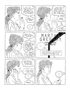
A running sub-theme in Hankiewicz’s work is the possibility of creation and communication. In “Martha Gregory,” the emotions running through the story are conveyed by the stream-of-consciousness thought balloons. The six-panel grid grounds her thoughts temporally, adding story beats to her mental wanderings. Through the realistic depiction of the figures, Hankiewicz discourages easy reader identification with the characters. Instead, the reader is immediately thrust into the “otherness” of Martha, forced to grapple with her thoughts, fears and hopes. Martha’s feelings are often contradictory, balancing the hopeful energy of creation with the desperation inherent in her inability to fruitfully communicate her desires. It is that tension that perhaps triggers the change midway through the story, where the male artist has a somatic cause for his initial inability to communicate and yet overcomes it to spark a personal and creative set of connections.
Hankiewicz’s most enigmatic use of symbology comes in “Jazz,” a series of four-panel strips that are perhaps the most fully realized of his comics and a fine example of comics-as-poetry. These strips are about opposites and are expressed using the full range of the comics language. This range of visual approaches inherent in comics gives each strip its power, meaning and ability to express the tension between opposites. Some of the strips are titled “Asthma,” implying constriction and desperation. Some are titled “Jazz,” implying free-flowing, unrestricted and improvisational movement. Various other titles (“Soup,” “Nap,” “Prayer,” “Laundry”) depict varying levels of stasis and motion, energy and entropy. His visual approach, informed by George Herriman’s Krazy Kat and other classic strips, veers into strictly realistic depiction of a man and woman. ”Jazz” also embodies a frequent motif in Hankiewicz’s work, the sudden transformation of realistically depicted hands into cartoon hands. That transformation has a price, as that hand is shown as being injured by a flash of the lightning so often seen in his strips. At the same time, this transformation of hands can be likened to the kind of word-play seen in poetry. ”Jazz” is a symbolic narrative, an exploration of active and passive states of transformation, and an exploration of the relationship between word and image that is intrinsic to poetry.
In his work, Hankiewicz explores ways in which the mundane becomes alien and threatening, how communication can be a form of aggression, the madness that isolation can induce, and the possibility that we are essentially doomed to be isolated from both the world and each other. At the same time, this quest for connection is our only chance at creating meaning and purpose, impossible as it may seem. Hankiewicz’s comics are the most compelling of those that attempt to illustrate the complexity and frustration that this process can elicit. Indeed, for the reader seeking to explore comics-as-poetry, the work of Hankiewicz is essential because it so effectively subverts reader expectations and challenges them to wrestle with the form and meaning of his comics, effectively providing a bracing crash course.
Tom Neely and The Blot
Like Hankiewicz, Tom Neely’s The Blot (self-published) uses familiar, old-time cartoon imagery and then subverts its use in a visceral, violent manner. Informed and influenced by Floyd Gottfredson’s old Mickey Mouse comics, among other artists of the era, Neely introduces the reader to the sort of rubbery, cartoony figure that is aesthetically conventional in such a story. When the nameless protagonist is confronted with an apparently ravenous blot of ink that often fills up an entire page, it becomes the ultimate apocalypse for a cartoon character: the obliteration of identity and form on the page.
However, the blot is composed of ink, the raw stuff of cartoon creation, full of possibility. As the protagonist proceeds, the blot alternatively (and sometimes simultaneously) represents creation, destruction, seduction, sexuality, brutality, oblivion and, above all else, knowledge. When the protagonist is spotted by a woman in a cafe who instantly understands his dilemma, she awakens this knowledge of his potential as master of his own fate and world. It is not unlike Eve offering Adam the fruit from the tree of knowledge. The blot acts as the stuff of being and identity.
The protagonist’s immediate reaction to his newfound power over his reality is to immediately recreate a conventional existence for the woman with whom he is now in love. However, it is clear that she is attracted to possibility, power and motion above all else. She despises the static life that the protagonist offers her, so she betrays him for a monstrous, all-black wolf-creature. It is not a coincidence that she is attracted to a creature consisting entirely of ink, the stuff of creation, a creature that fully embraces the possibilities of its power and the potential for violence that this entails. Confronting the protagonist, she compels him to commit horrific acts of violence upon himself. The violence is brutal and visceral but simultaneously cartoonish and uncomfortably realistic, as though Mickey Mouse had been savagely battered, beaten and splintered. She then tenderly kisses the protagonist and tells him everything is going to be all right, and he is then healed by the blot, having had an epiphany.
Neely’s use of vibrant color on the last few pages of the story indicates, perhaps, that the protagonist has a more full understanding of his potential. Formally, The Blot is a manifestation of the creative urge. The artist is creator and destroyer of his character’s lives and narratives, and Neely here imbues his hero with the same power. That power is both liberating and frightening, and Neely expresses it with images that are both familiar and mysterious. He takes advantage of the reader’s comfort and knowledge of cartoon images and then re-imagines them, instilling in them the possibilities of life, death, sex and purpose.
The Blot functions as comics-as-poetry in the way that it subverts a reader’s familiarity with its imagery, turning it on its head. The reader must grapple with Neely’s use of abstract (but still formally contextualized) ink blots as a device designed to elicit emotion. While Neely provides various visual and textual cues that offer hints as to what feelings he’s trying to portray, it’s up to the reader to interpret them. Neely’s use of nostalgic cartoon imagery for his figure work is quite deliberate and jarring, forcing the reader to understand these seemingly familiar characters in a new emotional context. The use of cartoon masks to “cover up” emotion, the oppressiveness of a seemingly endless sea of blank-faced characters trying to smother the protagonist, and the way that lines appear and disappear (literally rewriting reality for the characters) are examples of how typical comics tropes are subverted and repurposed to elicit terror and wonder for both the characters and the readers.
That meta-awareness of the reader being constantly reminded by Neely that he is working with ink on paper serves as both a narrative abstraction and emotional intensification for the reader, who is drawn into the lives of the characters through the simplicity of their iconic representation. While there is a narrative of sorts in The Blot, it is a narrative of ideas and emotions more than a conventional one. Neely achieves a level of immediacy on each page, creating a powerful emotional shorthand designed to get across the intensity of feeling, be it dread, joy, fear, desperation or longing. His iconic imagery acts as dense bundles of emotional information that, when unpacked by the reader, provide a powerful experience and insight into the creative process.
Conclusion
Both John Hankiewicz in Asthma and Tom Neely in The Blot are interested in the possibility of communication and purpose beyond the traditional narrative in comics art. Neely’s approach is more direct and visceral, but no less capable of absorbing multiple interpretations. As a reader and critic, one must be capable of addressing these works differently than most comics. A conventional analysis of plot and character simply does not apply here, nor do standard analyses of the use of visuals. Only a close examination of how words and images actually interact and the ability to let them wash over one to feel their impact can tease out meaning or meanings. Like all the best poetry, what a reader gets out of comics-as-poetry is entirely dependent on how willing they are to truly engage the material and articulate the feelings it evokes.
(This article was originally published at tcj.com in 2009.)
First, a word of clarification: There is a difference between what I refer to comics-as-poetry and illustrated poems. There have been some recent works where cartoonists tackle previously published works by poets in an attempt to provide an appropriate visual. In this instance, the poem and the image are separate entities that may comment on each other but do not create a gestalt. There has always been a tension between illustration and cartooning, and this is a perfect example of where the line is drawn between the two forms.
Reading comics-as-poetry
Poetry exploits language, abstracting beyond its initial meaning for aesthetic and other purposes, while at the same time remaining more condensed and less straightforward than most prose. As such, poetry requires an active reader who must interact with the text rather than be led along to an inevitable end. The slippery, elusive nature of poetry gives the reader the responsibility to engage every word and the power to wrestle meaning from the text. Meanings can be teased out through initial surface impressions, emotional impressions, phenomenological study and an analysis of the poem’s symbology based on the first three steps.
Just as a reader must employ different reading techniques with poetry and prose, comics-as-poetry must be read the same way, with attention to the visual cues that interact with text or act on their own adding an additional layer of complexity. Poetry provides a narrative as much as any other art form does, and likewise, the comics analyzed below are examples of comics-as-poetry that offer a very rich, complex and mysterious kind of narrative that, like poetry, requires the engagement of the reader.
What separates what I call comics-as-poetry from more conventional comics? That difference is overdetermined in many respects. There is often a denseness in each panel and page that requires unpacking, a higher level of commitment to closely reading each word and image and how specifically they interact. More conventional narratives can of course make use of symbol and metaphor but rarely at the level of abstraction and fluidity that characterizes comics-as-poetry. Unlike a standard comic, there can be an emphasis on the image qua image, as the artist lingers on the plastic qualities of an image and asks that the reader do so as well. In this sense, the imagery in comics-as-poetry simply isn’t a shorthand way of delivering easily digested narrative clues but, at the same time, is not merely decorative or illustrative. Poetic language is often highly symbolic, dense and abstract, taking readers out of their comfort zone. In much the same way, comics-as-poetry not only uses compact, frequently cryptic imagery in order to force the reader to engage it outside of the framework of an expected narrative, it also adds an additional layer of complexity when the reader is also asked to grapple with the tension between word and image.
It is important to note that formalist experimentation for its own sake, à la http://www.tomhart.net/oubapo/, is not what I would consider to be comics-as-poetry. Such experimentation is valuable in understanding the forms, limits and possibilities available in constructing comics, but they don’t relate to the aims of comics-as-poetry. There is no emotional or symbolic meaning to be taken from those comics, and this is something at the heart of comics-as-poetry; an exploration and demarcation of the contents of our inner worlds: be it emotions, ideas, dreams or symbols.
John Hankiewicz and Asthma
John Hankiewicz has long created strips with an enigmatic, elusive quality that fully employ the language of comics, with conventional page and panel designs recognizable to any reader of the form. Though on the surface level his iconic imagery seems familiar, his comics do not have a traditional, linear, plot-driven narrative, but rather an emotional and cryptographic one in which meaning is more challenging to tease out. Best known for his depiction of mundane objects, such as chairs, as a sort of visual rhyming device, Hankiewicz’s comics force the reader to immerse himself/herself in the imagery and yield to the emotion generated by the flow of images. He discussed his creative method at a recent gallery talk at the Minneapolis College of Art and Design as well as at SPX 2006, noting that he “rhymes” an image with the one that precedes it. Hankiewicz’s panels depict emotions in the same manner that abstract expressionist paintings were meant to provoke an emotional reaction: without the benefit of recognizable iconographic reference points.
Asthma (Sparkplug Comic Books, 2006), a collection of Hankiewicz’s stories, reveals a number of repeating motifs and variations on themes. His most heavily cross-hatched and realistically rendered strips tend to be the most static of his comics. The more cartoony or iconic figures in his strips tend to have the most movement, both within each panel and in terms of panel-to-panel transitions. Hankiewicz often subverts the reader’s expectations of what is to appear in a comic strip, making full use of familiar tropes of the form to create meaning.
In line with traditional comic-strip form, “Amateur Comics” (above), a series of silent one-page strips, is prefaced by a provocative question – “How Did You Happen to Stop?” — and an almost corny title such as “Balmy Comics” (a clever subversion of the standard purpose of such titles to draw a reader’s eye) to accompany its imagery. Hankiewicz creates a rhythm with the alternating images of a man in the first panel and a chair in the next, sometimes with an object contrasting with images of the man. This repeats three more times, acting as a sort of “verse” for each strip. The common objects that we see (chairs, bowls, bottles, radios) are stripped of their everyday meaning and context here. The man is either stock-still or frantically, almost spasmodically, moving out of a sense of desperation or boredom rather than purpose. In the middle of the story, lightning (a heavily used motif of Hankiewicz’s) pops out of a speaker; it is unclear if this represents sound, electricity, energy or simply movement. The lightning changes the action and rhythm of the strip, providing a variation on the previous “verse,” as the man appears in panels where he’s not “supposed” to be. Perhaps this is how Hankiewicz plays with the idea of reader expectations in terms of continuity of images: in the last strip, with the question “When Might You Actually Learn? (Fresh Comics)”, the man is completely absent, as Hankiewicz draws panels devoid of the man — with the exception of his shoes, which appear in the penultimate panel.
The tension between text and image, especially with regard to the titles of his strips, is as important to experiencing and understanding his strips as the images themselves. The text does not serve to “explain” the image; instead, its purpose in this strip seems to shift from strip to strip. At times, the questions asked and the titles of the strips seem to act as an admonition to the man in the strip, to the readers themselves and perhaps even to the artist. The fact that the word “comics” is in the title of this suite of strips is no accident; this is a deliberate experiment on and with the form, and Hankiewicz demands that the reader keep up. At the same time, Hankiewicz never indulges in mere formalist trickery for its own sake; rather, there is always an emotional content to even the most cryptic of his strips.
“Amateur Comics” illustrates Hankiewicz’s most deliberate use of the rhythms of poetry to create feeling and meaning. The rigid panel set-up and dense rendering make it difficult for the eye to latch on to each panel as if it were a standard narrative comic. One is forced to slow down and give oneself over to the strip’s own rhythms, which become increasingly oppressive as it proceeds. The use of repetition and slight variation immerses the reader in this world, where one wonders why this man is in the house and what he is feeling. We sense boredom, desperation, an urge to connect or create, and a general sense of trying to find his purpose. When he finally breaks the tension and leaves (or disappears?), we get a resolution of sorts, with the text offering a clue that he has moved on and the shoes perhaps indicating that he’s barefoot and hence less constrained. What he has moved on to or moved away from is open to interpretation. One could say that the man has moved away from repetition and paralysis. Another way to view the strip is as a metaphor for the creative process, where the man found a way to break out of routines that inhibited his ability to innovate. Taking that a step further, the strip itself is a means of addressing and breaking out of narrative traps and structures: for the man, for Hankiewicz himself and for the readers who grapple with the piece.
In “Martha Gregory,” Hankiewicz moves in a completely different direction from “Amateur Comics.” This story, using a six-panel grid on every page, is a series of realistically rendered talking heads. Each sub-story is ironically titled; for example, in “Martha Gregory, Intrepid Scholar,” the title character struggles with her own thoughts as she defends her graduate thesis. In each strip, we learn more about Martha, a poet, and her difficulty articulating her desires to the outside world. Halfway through the comic, its perspective flips to an elderly male sculptor while still retaining the title “Martha Gregory.” Both characters wrestle with creation, communication and how these two possibilities interrelate.
The transition from female to male character may be an implication that Martha disappears into a fantasy of this male sculptor, possibly as a poetic narrative. We never learn the man’s name, for example, and the fact that each episode still bears her name supports this possibility — especially since the structure and nature of his struggle is very similar to Martha’s. The main difference is that in some respects he is an idealized version: a romantic who has a love affair by mail, an accomplished artist, and a man who has confronted death and overcome it. Martha notes in her last strip that she would like to simply disappear. Once again, the reader is forced to grapple with the huge amount of emotional information provided by way of text this time, with the images only giving context and a sense of rhythm.
A running sub-theme in Hankiewicz’s work is the possibility of creation and communication. In “Martha Gregory,” the emotions running through the story are conveyed by the stream-of-consciousness thought balloons. The six-panel grid grounds her thoughts temporally, adding story beats to her mental wanderings. Through the realistic depiction of the figures, Hankiewicz discourages easy reader identification with the characters. Instead, the reader is immediately thrust into the “otherness” of Martha, forced to grapple with her thoughts, fears and hopes. Martha’s feelings are often contradictory, balancing the hopeful energy of creation with the desperation inherent in her inability to fruitfully communicate her desires. It is that tension that perhaps triggers the change midway through the story, where the male artist has a somatic cause for his initial inability to communicate and yet overcomes it to spark a personal and creative set of connections.
Hankiewicz’s most enigmatic use of symbology comes in “Jazz,” a series of four-panel strips that are perhaps the most fully realized of his comics and a fine example of comics-as-poetry. These strips are about opposites and are expressed using the full range of the comics language. This range of visual approaches inherent in comics gives each strip its power, meaning and ability to express the tension between opposites. Some of the strips are titled “Asthma,” implying constriction and desperation. Some are titled “Jazz,” implying free-flowing, unrestricted and improvisational movement. Various other titles (“Soup,” “Nap,” “Prayer,” “Laundry”) depict varying levels of stasis and motion, energy and entropy. His visual approach, informed by George Herriman’s Krazy Kat and other classic strips, veers into strictly realistic depiction of a man and woman. ”Jazz” also embodies a frequent motif in Hankiewicz’s work, the sudden transformation of realistically depicted hands into cartoon hands. That transformation has a price, as that hand is shown as being injured by a flash of the lightning so often seen in his strips. At the same time, this transformation of hands can be likened to the kind of word-play seen in poetry. ”Jazz” is a symbolic narrative, an exploration of active and passive states of transformation, and an exploration of the relationship between word and image that is intrinsic to poetry.
In his work, Hankiewicz explores ways in which the mundane becomes alien and threatening, how communication can be a form of aggression, the madness that isolation can induce, and the possibility that we are essentially doomed to be isolated from both the world and each other. At the same time, this quest for connection is our only chance at creating meaning and purpose, impossible as it may seem. Hankiewicz’s comics are the most compelling of those that attempt to illustrate the complexity and frustration that this process can elicit. Indeed, for the reader seeking to explore comics-as-poetry, the work of Hankiewicz is essential because it so effectively subverts reader expectations and challenges them to wrestle with the form and meaning of his comics, effectively providing a bracing crash course.
Tom Neely and The Blot
Like Hankiewicz, Tom Neely’s The Blot (self-published) uses familiar, old-time cartoon imagery and then subverts its use in a visceral, violent manner. Informed and influenced by Floyd Gottfredson’s old Mickey Mouse comics, among other artists of the era, Neely introduces the reader to the sort of rubbery, cartoony figure that is aesthetically conventional in such a story. When the nameless protagonist is confronted with an apparently ravenous blot of ink that often fills up an entire page, it becomes the ultimate apocalypse for a cartoon character: the obliteration of identity and form on the page.
However, the blot is composed of ink, the raw stuff of cartoon creation, full of possibility. As the protagonist proceeds, the blot alternatively (and sometimes simultaneously) represents creation, destruction, seduction, sexuality, brutality, oblivion and, above all else, knowledge. When the protagonist is spotted by a woman in a cafe who instantly understands his dilemma, she awakens this knowledge of his potential as master of his own fate and world. It is not unlike Eve offering Adam the fruit from the tree of knowledge. The blot acts as the stuff of being and identity.
The protagonist’s immediate reaction to his newfound power over his reality is to immediately recreate a conventional existence for the woman with whom he is now in love. However, it is clear that she is attracted to possibility, power and motion above all else. She despises the static life that the protagonist offers her, so she betrays him for a monstrous, all-black wolf-creature. It is not a coincidence that she is attracted to a creature consisting entirely of ink, the stuff of creation, a creature that fully embraces the possibilities of its power and the potential for violence that this entails. Confronting the protagonist, she compels him to commit horrific acts of violence upon himself. The violence is brutal and visceral but simultaneously cartoonish and uncomfortably realistic, as though Mickey Mouse had been savagely battered, beaten and splintered. She then tenderly kisses the protagonist and tells him everything is going to be all right, and he is then healed by the blot, having had an epiphany.
Neely’s use of vibrant color on the last few pages of the story indicates, perhaps, that the protagonist has a more full understanding of his potential. Formally, The Blot is a manifestation of the creative urge. The artist is creator and destroyer of his character’s lives and narratives, and Neely here imbues his hero with the same power. That power is both liberating and frightening, and Neely expresses it with images that are both familiar and mysterious. He takes advantage of the reader’s comfort and knowledge of cartoon images and then re-imagines them, instilling in them the possibilities of life, death, sex and purpose.
The Blot functions as comics-as-poetry in the way that it subverts a reader’s familiarity with its imagery, turning it on its head. The reader must grapple with Neely’s use of abstract (but still formally contextualized) ink blots as a device designed to elicit emotion. While Neely provides various visual and textual cues that offer hints as to what feelings he’s trying to portray, it’s up to the reader to interpret them. Neely’s use of nostalgic cartoon imagery for his figure work is quite deliberate and jarring, forcing the reader to understand these seemingly familiar characters in a new emotional context. The use of cartoon masks to “cover up” emotion, the oppressiveness of a seemingly endless sea of blank-faced characters trying to smother the protagonist, and the way that lines appear and disappear (literally rewriting reality for the characters) are examples of how typical comics tropes are subverted and repurposed to elicit terror and wonder for both the characters and the readers.
That meta-awareness of the reader being constantly reminded by Neely that he is working with ink on paper serves as both a narrative abstraction and emotional intensification for the reader, who is drawn into the lives of the characters through the simplicity of their iconic representation. While there is a narrative of sorts in The Blot, it is a narrative of ideas and emotions more than a conventional one. Neely achieves a level of immediacy on each page, creating a powerful emotional shorthand designed to get across the intensity of feeling, be it dread, joy, fear, desperation or longing. His iconic imagery acts as dense bundles of emotional information that, when unpacked by the reader, provide a powerful experience and insight into the creative process.
Conclusion
Both John Hankiewicz in Asthma and Tom Neely in The Blot are interested in the possibility of communication and purpose beyond the traditional narrative in comics art. Neely’s approach is more direct and visceral, but no less capable of absorbing multiple interpretations. As a reader and critic, one must be capable of addressing these works differently than most comics. A conventional analysis of plot and character simply does not apply here, nor do standard analyses of the use of visuals. Only a close examination of how words and images actually interact and the ability to let them wash over one to feel their impact can tease out meaning or meanings. Like all the best poetry, what a reader gets out of comics-as-poetry is entirely dependent on how willing they are to truly engage the material and articulate the feelings it evokes.
(This article was originally published at tcj.com in 2009.)
Sunday, December 13, 2009
Rhythm & Rhyme: Asthma, The Blot & Comics-as-Poetry
Over at the Comics Journal, I've published an essay I'm particularly proud of. It's on what I'm calling Comics-As-Poetry, and I explore this idea in the work of two artists whose work I admire greatly: John Hankiewicz's ASTHMA and Tom Neely's THE BLOT.
Here's a link to part one, part two and part three
Labels:
comics journal,
john hankiewicz,
sparkplug,
tom neely
Subscribe to:
Posts (Atom)


