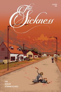
The first issue of The Sickness, published by Uncivilized Books, looks and feels more like a 90s black & white Image comic than the kind of thing Uncivilized would normally do. At least at first. However, Tom Kaczynski's bunch has been slowly moving into serialized work for a while now, with Craig Thompson's Ginseng Roots, Noah Van Sciver's Maple Terrace, Tom K's own Cartoon Dialectics, and more. However, The Sickness most closely resembles a standard-size comic book, rather than a minicomic. Rather than the work of an auteur, it's done by the team of Jenna Cha, Lonnie Nadler, and letterer Hassan Otsmane-Elhaou. Cha is the artist and co-writer, with Nadler. It feels and looks like a lot of other horror books published in that era and the early aughts; everything about it is a throwback, including having multiple covers for the first issue. Knowing Tom K, this isn't a choice made for collectors, but more of an aesthetic one.
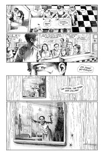
The Sickness follows a kid named Danny in 1945 Stillwater, MN, and then shifts a decade later to Lakewood, CO. In Stillwater, we're introduced to a teen named Danny, who's become increasingly alienated from the rest of his friends. He's seeing things, horrible things, and being around anyone just makes it worse. Cha teases us just a bit with a final panel reveal of a monstrous-looking woman and a mysterious man in the background. In Lakewood, there's a long reveal of a woman listening to records in a living room, talking to a cop, as it's slowly revealed that the woman's sister has murdered her husband, two children, and their dog. Her son survives the attack and is questioned by a psychiatrist, as he tells him that his mom kept seeing holes, said their faces had been warped, and there was someone else in the house. Going back to Danny in the future, he's seeing all of the things that were described by the killer, including a grotesquely warped version of his mother and a mysterious man in the background.
The whole effect is quite clever, even if the extensive monologue by the psychiatrist and the dense dialogue in general suffocates the narrative a bit. The three part structure of show, don't show, then show again builds tension and slowly gives the reader a set of clues that are built upon without revealing the entire hand. Much of the horror is implied and teased, making the actual monstrous moments all the more effective. The idea of otherwise completely normal people snapping because of some pernicious outside influence is a terrifying idea, especially since the nature of this "sickness" is unclear. Given the slow pace of the issue, I'm guessing that this will go at least seven or eight issues, and that the psychiatrist will be a prominent character. The art is dense and naturalistic, with a lot of smartly-added greyscale shading to go along with hatching and crosshatching. That level of realistic detail makes the monstrous elements more effective, because it feels real to the reader. Limiting the number of those scenes is important precisely because its connection to what seems to be everyday reality is a big key to the comic's success so far.


No comments:
Post a Comment