Sunday, January 14, 2024

45 Days Of CCS, #45: Aaron Cockle

Let's jump back into the world of Aaron Cockle and Andalusian Dog. Cockle's been hard at work pumping out issues of his enigmatic pastiche of and ode to the work of sci-fi author Philip K. Dick, producing six issues in the last couple of years and a related zine, Solar Lottery. The essence of these heavily text-driven zines with sparse and frequently oblique illustrations has revolved around the concept of a VR game called Andalusian Dog. It essentially transforms your own reality into a Grand Theft Auto overlay, with various instructions and missions to perform in real life. 


Cockle took this idea and meshed it with the concepts behind several Dick novels (including VALIS, The Three Stigmata Of Palmer Eldritch, Clans Of The Alphane Moon, The Penultimate Truth, Ubik, and others) and fuses it with modern technology to spin an oblique narrative and metanarrative. It revolves around alien intelligences, sex cults, drugs, office drudgery, and the total destabilization of society. Frequently quoting from Dick directly, Cockle focuses on the fear, paranoia, and inherently destructive and isolating qualities of late capitalism and how technology can be used as another tool of dehumanization that is an essential element of this nihilistic death cult. 


Like Dick, Cockle sees the future, and it is grim. From self-replicating androids designed to replace humans to horrifying drugs that permanently alter one's sense of reality, there's no escape once you've been caught up in this conspiratorial web. At the same time, there's a sense that it's the only game in town. It's the only way to remain relevant. We are willing consumers of our own annihilation. Cockle implies that there is resistance here and there, but even this resistance has its own agenda. The individual has no chance because they have been reduced to mere individuality. Once again, much of this work stretches the very definition of comics or sequential art; it's closer to comics-as-poetry than anything else in terms of how there is something important about the illustrations and collages he uses with regard to how they interact with the text, but that relationship isn't necessarily easy to understand or parse. It's as though Cockle is working on a deeply subconscious level, hoping to trigger connections and even memories (ala VALIS) in an effort to wake us up. 

Saturday, January 13, 2024

45 Days Of CCS, #44: Natalie Norris

Natalie Norris has been producing memoir about trauma since before she started at CCS. Even in her earliest assignments at the school, she turned standard first-year assignments like adapting a fable from Aesop or doing a comic in the style of Ed Emberley into frank, bold, and highly vulnerable narratives about her traumatic experiences. It's no surprise that her first long-form memoir, Dear Mini, should not only expand on her struggles, but it's also the one where she reveals, in an achingly intimate manner, her most formative traumatic experience. 


Norris uses a very clever narrative technique in making this an epistolary memoir for a number of reasons. The most obvious one is that it allows her to comment on events from the past from the perspective of the future, which is what differentiates it from the most obvious comparable book, Ulli Lust's This Is The Last Day Of The Rest Of Your Life. That's another memoir about a teenage girl out of her depth in Europe who is raped, but Lust chooses to convey that experience in the present tense for a different kind of impact. Norris not only adds commentary from the future in the form of huge, floating decorative lettering, but her dreamy open-page layout style gives the entire memoir a magical storybook feel until things start to go very wrong. 


Secondly, by addressing it to her Austrian friend Mini, whom she feels inadvertently betrayed her, she puts the narrative power in her own hands rather than grant it to her nameless rapist. This is an unflinching account of being sexually assaulted and its aftermath and reverberations across the years, but more importantly, it's an attempt to connect and truly reach out to someone who meant a lot to her. This narrative is Norris's own, and she's sharing it with Mini.


Norris noted in the afterword of this first volume that she had reams of diaries and photos that documented her time in Europe, but for the most part, she chose to rely on her memory. This made for a much more emotionally rich narrative, as it followed the path of memories that she allowed herself to unlock by drawing them rather than compelling her to commit to a more "true" account of those events. Of course, even a diary or journal from that time, while more immediate, isn't necessarily more accurate. Indeed, as Norris points out, she deliberately downplayed most of the key moments of trauma in those journals.


The plot summary for part one of Dear Mini goes like this: Natalie is 17 years old and suffers from chronic pain and depression, among other issues. Natalie was quite used to the attention given to her by older men, which was a form of flattery she sometimes chased but was also frequently repulsed by it. Her mother suggested that she try a language immersion summer program in France as a way of trying to push her away from getting drunk and high with local older guys. Upon arriving, she met an Austrian girl named Mini, and they became thick as thieves, constantly pushing against the rules in order to go out dancing and drinking as well as meeting guys. Norris was young enough to conflate desire with love in an environment where sex, generally speaking, was treated as far more casual than in American culture. 

This invoked the key line of the book: as she found herself treated with contempt by the boys who used her sexually, she convinced herself that "this was just what happened to girls like me." That her desire made her worthless and unworthy of expressing her own agency. That lesser forms of horrible treatment by men were somehow OK because they were "nicer" to her than out-and-out assailants. The flip side of constantly wanting to be drunk or high as a way of numbing these feelings had the double whammy of not only being ultimately ineffective, it also made her far more vulnerable. Eventually, after the program, Natalie spent time in Italy and then made a side trip to see Mini in Vienna.

That's where the bulk of the narrative really picks up and slows down, as Norris goes day by day in great detail with regard to this fateful visit. She alludes to the event, the birthday party of one of Mini's friends, multiple times (even referring to it as an execution), yet her depiction of the rape itself is far more harrowing, direct, and graphic than I could have imagined, even given how frank she was about everything else. It reads as though Norris was disgorging a malignant tumor in the most painful way possible; an excruciating experience in every way as a reader and one would imagine, as an artist, yet one where at least the malignancy was out in the open. As awful as this depiction of this all was, the events afterward (where she internalizes everything and hides it from Mini and then winds up fooling around with another guy just to not be alone with her thoughts) are terrible in their own way. All of this is made even more devastating in Norris' bright, colorful, and dreamy style. 

Norris alludes to having discussed this with Mini over the years, with Mini not understanding Norris' anger to not only being abandoned at this party but virtually being pushed into the clutches of her rapist. The nature of this disconnect is something that I imagine will be discussed in part two. While I can understand the split, it feels like doing this in a single volume would have done more justice to the narrative as a whole. There are some other problems with the book that reveal Norris as a relatively inexperienced cartoonist, but this is stuff that should have been corrected by an editor. Basic design issues like word balloon flow, word balloon blocking, large lettering being split by a figure and making it hard to read, and even a typo are all distractions. Norris' character design for figures other than herself seems a bit undercooked at times, which is not unusual for young artists having to introduce multiple characters in a longer narrative. 

Those are mostly nitpicks. What Norris does here is unlock a tremendously powerful narrative about the ways in which memory can be warped and poisoned as it is obliterated by shame, trauma, and misogyny. Her use of color, her understanding of how using decorative drawings can influence the narrative, and her strong & distinctive authorial voice all drive this memoir to an unflinching place that eventually grants herself and women who have similar stories a sense of grace and absolution that no one else has given them.


Friday, January 12, 2024

45 Days Of CCS, #43: Rust Belt Review, Beth Hetland

The latest issue of Sean Knickerbocker's Rust Belt Review (#5) is light on CCS content but heavy on other interesting stories. Knickerbocker runs a blend of one-shot stories as well as serials, with his own "Best of 3" being the most prominent serial. It's probably my favorite story by Knickerbocker to date, as he incorporates the usual small-town losers, sleazebags, and lowlifes into a story that escalates into a genuinely thrilling murder mystery. His drawing has leveled up to match his ambition, as the yacht and other background details are drawn with a level of intense accuracy that enhances the action. This particular episode featured a yacht on fire thanks to a Molotov cocktail, a daring escape by the villains, and the start of a stressful quest. 

Audra Stang's excellent "Tunnel Vision" serial concludes in this issue, focusing on the character of Bernie, the young documentarian who followed around more familiar characters in the abandoned theme park tunnels that are an essential part of her Star Valley lore. There's an incredible page where Bernie is in the car with her hostile stepmother and then going in the other direction every other panel, talking to her mom. Stang's comics tend to fundamentally be about huge lacks in not just communication, but a willingness to listen and try to understand others. This is personified in power struggles through relationships, as those who are least willing to listen are those that hold tightest to the reins of power. This story would have benefited from (at a minimum) spot color, as the shading here crosses over into being muddy at times, but it's otherwise another great story from a cartoonist who works intentionally in a way that I really enjoy. 

Andrew Greenstone unveils some more wrinkles in his crazy story about cultists, a trivia expert who escaped a nightmarish experience, federal hearings, an attempt at normalcy, and a lot of other stuff. Balancing the craziness with an attempt at normalcy is what gives this serial some serious stakes and balances out his frequently grotesque and absurd character designs (and references to Image artists). The conclusion of Sam Grinberg's "Pancake Jake" gets funnier and more absurd with each passing page. The first part focused on the silliness of urban legends, until two friends who tried to scare their friend Sid with the legend of a breakfast monster called "Pancake Jake" discover its somehow real. This swerves into a witch who owns a diner, an abandoned tower, gentrification, magical constructs, and the healing power of IHOP. Grinberg's art is sharp and the spot blacks really pop on the page, while the character design is rubbery and playful. 

Other stories include Sienna Cittadino's story about a trans teen play soccer and the pointless, hurtful controversy this creates; it's done in a scratchy style with lots of blotchy greyscale shading that reflects the expressiveness of the characters. Alex Nall has his usual story of small-town, awful people drawn in a wacky style that seems to work at cross-purposes with the story. Pat Rooks has a full-color mini that's inset featuring a hilarious, over-the-top bit of slapstick where the futuristic workers inevitably get fucked over. Jordan Speicher-Willis has an interesting story about kids working in the library and trying to complete a quest; the character interactions are very well-observed here. Andy Wieland's story is a Rust Belt special, meaning miserable people oppressed by capitalism being miserable and then dying. John Sammis' line reminds me a bit of Tim Hensley, as he tries to think about differentiating two old Hollywood actors. Finally, Matt MacFarland contributes the first part of a serial devoted to the unfortunate genre of "dudes talking about getting laid." At least his cryptid-inspired art looks good.


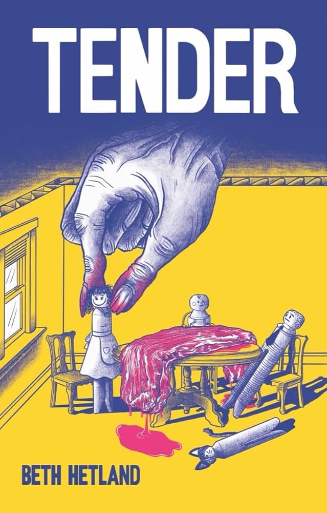
Beth Hetland's solo debut graphic novel Tender isn't what it seems at first, but the horror that's touched upon in the story's build-up informs the totally fucked-up events in the back half. The book opens with a creepy shot of the protagonist, Carolanne, softly singing to what appears to be a bundled-up baby. Hetland takes us back and forth in time and reveals that, while Carolanne is clearly a psychopath, the societal and cultural forces that shaped her and her horrific choices are also clearly to blame. 

Tender is a brutal critique of gender roles, social media, cultural pressures & expectations, and the isolation fomented by capitalism. I tend to be bored by horror that seeks to elicit shock value based on breaking taboos that were shocking fifty years ago. I'm talking about random gore, violence rooted in racism or misogyny, and other surface-level shock value tricks that embrace and reinforce cultural mores rather than challenge them. Tender is very much the opposite of this. Even as Carolanne's actions become more extreme and horrifying in her obsession with having a baby, her psychosis has a terrifying logic to it in how it reinforces not just what she has always wanted, but what she thinks is essential to being a woman. 


The narrative follows Carolanne as she seeks to get pregnant with her husband, Lee. It's all very cute and wholesome, as it then quickly cuts to her quitting her job so she can be a full-time mom. Slowly, using a dark blue wash with dense hatching and shading gradients, Hetland starts to reveal that Carolanne's approach to relationships is one where fantasy is more important than reality. She sets out to marry Lee, a co-worker, because it will help her accomplish her goal of the perfect wedding and lead her to the perfect life--all captured by Instagram posts. Hetland doesn't even have to try very hard to critique social media; indeed, social media isn't the issue so much as conflating it for reality is. In the first unsettling sequence of the book, she goes to his Facebook page, prints out a photo, cuts out his head and creates a collage where she and Lee are on their wedding day. All for a person she hadn't yet even spoken to. 

Every time she goes to a friend's engagement party, Carolanne has to practice smiling and rehearse what she's going to say. It's a mechanical response meant to mimic appropriate social behavior, which she's good at enough to garner a real group of friends. About a third of the way through, Hetland introduces a particular coping method she uses--biting off little bits of skin and eating them as a response to anxiety. Hetland periodically modulates the color scheme with purples, reds (especially for chewing on flesh or pulling skin), and yellows to indicate conflict or anxiety. Hetland also uses this creepy upward angle where we see Carolanne looming over something, usually with a blank or grim expression. 

Despite Hetland slowly unveiling not just increasingly unhinged behavior, but a genuine sense from Carolanne that she knows her behavior would frighten others, she and Lee marry, she is pregnant, and then in a devastating and terrifying scene, their baby is stillborn. This sets the events of the last third of the book into motion, as Carolanne increasingly loses touch with reality, drives away Lee, and then starts to become truly unhinged in her destructive and self-destructive behavior. She deludes herself into thinking she's pregnant, denies the death of her first child, and by the end, is in a psychotic world of her own. The visceral, awful, and genuinely unsettling scenes of her carving up her own flesh are all established and amplified by the rhythms Hetland established early in the book. 

Tender is ultimately a tragedy, where a person who simply has no conception of how to actually connect with others finds herself creating a conception of self entirely dependent on cues that are ultimately limiting, shallow, and fleeting at best. The images of self-consumption and total alienation are fitting, given that she never had a real chance of meaningfully interacting with others. Her total lack of empathy manifested in rage mostly aimed at herself, but also at the one creature she had thought of as being connected to her in her cat. It made sense in terms of the plot, but it was also the point where Hetland very deliberately wanted the reader to both cease having sympathy for Carolanne and simultaneously think about the ways in which society's guideposts brought her to that point. Having followed Hetland's career for years, Tender is a massive leveling-up visually, as she brought to bear the increasingly dense storytelling she used in Half-Asleep as well as a sophisticated and affecting color palette. This is the first major project she's written since her CCS days, and there's no question that it's a triumph. 

Thursday, January 11, 2024

45 Days Of CCS, #42: Issy Manley, Anna Sellheim

Issy Manley's No One Wants To Work Anymore is a series of comics essays addressing labor and one's role in global capitalism from a personal perspective. Their tone widely varies, given the venues these stories originally appeared. Manley is at her best when she's able to truly craft a narrative that focuses on character over information. For example, "To All The Bosses I've Begged For A Job" and "Not Working" cover a lot of the same territory, but the former is funny and biting while the latter feels didactic and is way too text-heavy. 


The opening story, "How Things Are Done," smoothly highlights Manley's skill as a cartoonist and smartly employs her experience of losing her job as a server at the start of COVID. Starting with the personal and then applying it to a wider swath of society is a clever way of helping a reader understand a complex issue, especially if it's one where they might have preconceived notions. Like many who work or worked in the service industry, the exploitative nature of the business, especially in the US, was something that was understood as just the way things functioned as a natural part of the system. The willingness to put such workers at high risk with no additional reward during the pandemic was a splash of cold water that massively put the lie not only to exploitation by big chain restaurants but also (and often especially) locally-owned businesses. Manley's clear line and thoughtful use of spot color help lead the eye around the page and emphasize important details.


"To All The Bosses..." is the real standout of the collection, in large part due to its structure and sardonic sense of humor. Manley confronts head-on the demeaning quality of looking for a job that's looking for you to want to do it for any other reason than making money. The more dehumanizing the actual job or business (like anything in baking, consulting, or investment), the more they play up their "values" and demand that employees play along. Manley uses an array of clever visual tricks to keep the reader engaged with both her own narrative (badly needing a job) and the critique of what jobs are. The only slightly dissonant tone was the digression into imagining a job that's just and fulfilling in a corporate structure. I understand the yearning and even admire her hoping this is possible, but critiques that introduce fantasy utopian scenarios without a bridge to how they might be possible tend to fall flat. 

Much better in that regard is the titular essay, "No One Wants To Work Anymore." It's another COVID-era essay that this time turns the narratives of others she interviewed into anecdotes, where each person is drawn as an anthropomorphic flower. The story addresses the heart of the labor conflict in the US: the clash between the so-called "Protestant Work Ethic" with the concept of a life devoted to something other than just labor. This was brought into sharp relief during the pandemic when the government provided small amounts of money to every citizen, suspended student loan repayments, and forestalled rent. For low-income workers, this offered up a level of freedom that was unprecedented for them, and the narratives showed how much happiness this brought. While some stayed inside and read for pleasure, others took the time to volunteer or otherwise stay active. Moreover, when the quarantines ended and businesses started to open up, it led to many not wanting the same old shitty jobs anymore. Manley hits on this collective wake-up call for one part of the population and a gross sense of entitlement for those who expected the others to simply fall back in line. Here, Manley's digression into anti-work fantasies and a different world makes a lot more sense. Manley definitely has that Dan Nott style of using a gentle visual style to approach difficult problems, and I'd be curious to see her really sink her teeth into something long-form.


Anna Sellheim didn't have a traditional comics entry this year. Instead, she presented a couple of zines she made for the Refugee Youth Project After School & Summer School Programming from Baltimore City Community College. Sellheim's Promo Zine is exactly what it sounds like: a comic describing her experience as an art/comics teacher for young refugees from a variety of countries. Sellheim's anecdotes are funny, blunt, and optimistic without overstating things. Her own past dealing with not just trauma, but somatic trauma responses deeply informs how she interacts with the students, even if their trauma experiences are completely different. Sellheim also gets into how the cultural shock for refugees coming to the US is much deeper than it might seem at first while also providing the basics of how the program works. It's an ideal promotional tool for the RYP as it's from an insider who genuinely believes in the beneficial qualities of the program. RYP Zine consists mostly of art from Sellheim's students, as well as poetry and other writing. Sellheim lets the contributors' work speak for itself while adding some highly supportive notes in the bio section. This is applied cartooning at its best, as it encourages each student to develop and express their own voice as they work to adjust to American culture. 

Wednesday, January 10, 2024

45 Days Of CCS, #41: Meandering Realms

Filipa Estrela has long been a leading proponent of constructed comics made from unconventional materials. Meandering Realms is an anthology that she edited full of such comics. Be it woodcuts, clay figures, cut paper, pyrography on wood, or mixed media, this anthology is a fascinating read for fans of extreme formal experimentation in comics. The anthology has a mix of CCS artists and others; some are well-established in terms of cartooning while others primarily ply their trade in other media. 


Starting with the CCS artists, Issy Manley's pandemic story about taking walks for pleasure was done in cut paper and embroidery. It is a perfect union of form and content, with countless clever formal touches that are all in service to the narrative. Manley's page composition, done mostly in an open-page layout, is beautiful and contains surprising elements. The use of embroidery to depict center lines on roads was an inspired element, especially when they loop around. It all gives context to this meditation on walking when others would prefer to drive. 


Bread Tarleton's facepaint comic literally uses their face for a comic in panel after panel, with paint creating images and lettering. The story is totally absurd, yet Tarleton makes it work so effectively. The story is engaging enough that the gimmick never grows old. 


Allison Bannister's retelling of a Greek myth with a feminist edge was done in layered woodcuts, and this was an incredibly effective way of portraying this kind of story. Stacking and layering the images gave them weight and depth, as though one was looking at a fresco. The sepia tones feel like the reader is looking at something ancient. Bannister's drawing and decorative touches only further this effect, especially the detail on the tree that is so central to the end of this myth about unasked for romantic attention that drives the protagonist to transform into a tree out of defiance. 


Sage Clemmons does a highly expressive story using clay figures and mixed media. It's a story about how a beloved childhood family game was phased out because of the protagonist's brother's sensitivity regarding his teeth, and it evolves into how not understanding others can lead to fractures. 


Estrela contributed two comics. The first was about an elder seed who chose to stay underground, despite being cajoled by the roots around it. It was pyrography on wood, and the burnt tones mimicked sepia hues. The shading gradations being made by altering the intensity of the flame was absolutely ingenious. Once again, while the form was important, it was entirely in the service of content. Her other story was done with needlefelt and wool, and it was about an explorer giving a mushroom sentience and what the mushroom chooses to do afterward. The muted, fuzzy colors create an atmosphere completely different from her first story. 


Of the non-CCS cartoonists, Bryn Ziegler's re-telling of the story of Orpheus (done with paint markers on acetate) is the most successful. The sharpness of the colors go hand-in-hand with the dramatic content, creating an achingly beautiful set of images. Kriota Willberg's story, done with embroidery on painted fabric, is right in her wheelhouse. It's about an account of a medical procedure after an attempted murder in the 16th century. Willberg nails the medieval tapestry look. Roshan Ganu's "Chappal Diary" combines a leather sandal and photography; this one is more a novelty than a coherent narrative. D.T. Burns also uses cut paper, and while it's less sophisticated than some of the other stories, there's a solid gag at the end. Keren Katz's use of cut paper and wire sculpture to depict a scene at an art museum is not only beautifully constructed, it's also a compelling character study. The other pieces tended to be either too wordy or lacking in substance beyond formal play. Overall, the misses were just as important as the hits. This is one of the rare anthologies where the formal constraints are just as important as the narrative content, and the pieces that nailed both made for boldly distinctive and innovative comics. 

Tuesday, January 9, 2024

45 Days Of CCS, #40: Josh Rosen

Josh Rosen follows up on illustrating a work of graphic history with another one, this time focusing on the home front of World War II in the US. Working with writer Kate Hannigan, World War II: Fight On The Home Front (a part of the History Comics series from First Second) is a pretty typical middle-grade book. Hannigan does her best to get at some of the racial and gender inequality in the US and how the demands of the war temporarily changed things, but the book still dipped into a bit of that "V for Victory" spirit that was so prominent in media and culture at that time in the US. 


Rosen's character design is the star of the show, from the four kids who are the narrators of the story to funny caricatures of world leaders to more naturalistic drawings of important figures from history. The fascinating thing about the book is how it details the way in which the US went about engaging in total war, nationalizing many of its industries to go into manufacturing goods for its war effort. The propaganda machine was a big part of this (and Hannigan actually did use that term once in the book), trying to convince the populace that doing things like rationing resources, going on extended scrap hunts for metal and rubber, and even establishing "victory gardens" in every corner of the city to help bolster food on the home front were worth the sacrifice. 

Propaganda or not, and despite an extended anti-war movement (with various motives, including a pro-German Bund movement), it was still astonishing to see a country founded on rugged individualism buy into a collective good as widely as the US did at that time. Of course, this was during the FDR administration, where the collapse of the US economy allowed for widespread socialist programs that had a profound and wide positive impact. This collective action against a decidedly malignant foe in Nazi Germany kept the populace at home engaged, as everyone was made to feel they were doing their part. What's interesting is how this engaged marginalized groups. That included women, who had limited employment and educational opportunities. It included Black people, who forced their way into jobs and then better-paying jobs because bodies were needed. It didn't include Japanese-Americans, as Hannigan does make extensive mention of the internment camps. 


Hannigan's strategy of telling the story through some neighborhood kids only works because Rosen was so good at using them to directly comment on the narrative itself. Their snarkiness toward the "victory" propaganda was funny, even as the kids still were active in many ways. However, they also reflected the difficulties of rationing, especially when things like sugar and dairy rationing meant that ice cream stopped being a part of daily life. Hannigan notes that surplus of goods following the war, with plenty of sourced anecdotes and statistics (like gallons of ice cream eaten!). All told, this is a solid primer brought to life by Rosen's expressive and varied characters. The color scheme was pretty much the First Second house style, meaning it wasn't especially interesting nor intrusive; it did the job and thankfully didn't interfere with Rosen's line art.

Monday, January 8, 2024

45 Days Of CCS, #39: What The Gnomes Know

What The Gnomes Know is an anthology centered around artists from CCS and the Columbus scene. There's a good mixture of both, and there are a number of artist-writer combos that are somewhat unusual for an alt-comics anthology, but it works to good effect here. What's interesting is that a couple of the collaborations are between partners. It was organized and selected by CCS grads Rainer Kannenstine and Ben Wright-Heuman, both of whom have a lot of different projects they've been involved in, both solo and in terms of collaborative efforts. It was edited and designed by Columbus mainstay Kelci Crawford. 


Writer Ian M. Klesch collaborated with Wright-Heuman on a post-apocalyptic story following an elder gnome navigating a ruined city, looking for parts. This is an elegantly-constructed story using a recording of the gnome's dead son to push the narrative, as we learn just what caused the apocalypse in the first place. Wright-Heuman's art is moody and stylish, but it pushes the frantic action of the second half of the story clearly. It's a great use of world-building to set up a character-driven narrative with a satisfying resolution that still leaves the reader wanting more. 

Catalina Rufin's "Gnome Pizza" was cleverly assigned right after that story, and it's the contrast that make both stories stand out. Using a delicate line and extensive use of watercolors, Rufin establishes an interesting narrative when a woman moves into an apartment that was originally gnome territory, and then turns the plot on its head by turning what could have been a conflict into an appeal for connection from a desperately lonely person. 


Writer C.M. Clemence and artist Kelly Swann offer up what seems to be a typical D&D-inspired quest by two gnomes seeking out their friend. They acquire allies along the way until the rescue, but the swerve at the end that reveals what's really happening is clever. Swann's art shot straight from her scratchy pencils is the highlight here. Eddie J. O'Neill and Kaz G.M. Lukacs collaborated on a story of a group of gnomes adopting a misfit kobold that's cute, but whose use of color feels garish throughout. Angela Boyle took a lot of risks with "Gnoir With A Silent G," a parody of detective tropes featuring a gnome. The big risk was making this illustrated text with a stylized font. There were just enough illustrations (and enough sequential art) to make this work, especially since the art belied the hard-boiled cliches of the lead character. Boyle's drawings are also lovely, with an effective combination of grit and delicate color. 


Alex Washburn's story about humans who can transform into gnomes was a mix of what felt like a personal story of frustration around identity and a ripping fantasy story involving the danger of possibly being turned into stone. Washburn's use of color was way over the top and would have looked better muted, but his expressive characters drawn in a thick line match up with their emotional natures. The collaboration between Erienne McCray and Kannenstine leans into the density of its colors in a deeply expressionistic manner, especially since so much of the story revolves around dark magic. However, it's still essentially a story about a mother and daughter's connection, and that's what ultimately gives the story its real impact in the end. 

The non-CCS stories included a clever entry from Jess Tweed about two friends dealing with dark magic in order to save someone else, and the clever way a seemingly iron-clad contract was dealt with. There's also a text piece written by Jack Wallace with moody illustrations by J.M. Hunter that's nearly unreadable because of its use of stylized text. The illustrations became almost incidental. Overall, it's a fairly strong anthology that could have toned down some of its use of color and has a wide variety of genre types despite revolving around a highly particular genre theme 


Sunday, January 7, 2024

45 Days Of CCS, #38: April Malig

April Malig is an avid zine-maker whose work varies from hyper-specific narrative comics, to journals revolving around drawing, food & travel; and abstract experiments with color and form. In I Am Trying To Enjoy My Life, Malig shows off one of the favorite things about her as an artist. She's completely unapologetic about every aspect of herself and her art, especially as it impacts her mental health. There's a sense of her having running out of fucks left to give a long time ago, and so she talks about and does things that make her happy: eat, draw, go outside from time to time, travel, and see friends. This zine captures her personality perfectly, and the little decorative details (the drawing on graph paper, the mix of hand lettering and type) only accentuate the pleasure of reading this. The abstract swooshes of color on every other page feel in tune with Malig's descriptions of what each individual day was like. 


The 2022 Sketchbook Drawings zine is another great example of Malig's abstract waves of color, this time gridded out on a monthly calendar on every page. This allows the reader to enjoy each image individually, experience them sequentially, and then perceive each page as a gestalt of bright colors. Malig adds commentary about why drawing every day can be joyful so long as you are in the moment of making marks or creating color. She also added a bunch of Washi tape images to add further detail and complexity to each page, making each its own unique viewing experience. 


The comic I was most interested in here was the third issue of Rotten Roses, Malig's sequential comic about a group of friends obsessed with a particular boys love manga & anime that Malig made up. This includes a dedication to not just the show, but to fanfic writers and artists equally obsessed with the show. Malig captures this subgenre of fans who are so inspired by original source material (and perhaps hyperfixated) that they want to put their own spin on it. There's a hilarious segment where one of the members of the friends group writes a fanfic manifesto that admonishes those who write fanfic that openly ignores what she considers to be canon aspects of characters. It makes sense, because while putting your personal favorites in space or doing a Digimon crossover might make sense, ignoring the fact that one of them hates sweets is going over the line. Malig's character design nicely balances lots of looping lines and a tasteful use of color. The guest artists providing examples of art for imaginary manga or anime shows is another nice touch, as Malig takes great pains to provide verisimilitude for something that does not exist. Malig concludes the issue as the friends start to drift apart; they find other fandoms, stories dry up for this fandom, or real life intrudes. It's a natural part of both friendships (especially those that start off in an extremely intense way) and fandoms, and Malig has captured something special in this series. Even if you have no idea what she's referring to at times, the fandom acts as a gimmick that reveals the enthusiasm and infectious need to discuss the thing they're fixated on with other people 

Saturday, January 6, 2024

45 Days Of CCS, #37: Filipa Estrela and Allison Bannister

Filipa Estrela is one of the more fascinating graduates of CCS due to their interest in what they refer to as "unconventional material comics" or "crafted comics." These are comics made in whole or part with materials other than traditional pen or pencil. This includes photos, mixed media, felting, clay, woodcuts, etc, as they outline in their very useful mini Building Realms. This is a companion piece to Meandering Realms, the anthology they edited (and which I will be reviewing in a few more days), as well as a guide. Estrela lists some of their preferred supplies, how to plan and set intentions for such a comic, post-production tips, and much more--all with delightful crafted creations in the background. Estrela's specialty is felt and thread, and you could see them playing around with this here. 


Estrela is also quite adept at more traditional cartooning and risograph printing. Dream Of A Brighter Tomorrow, like much of Estrela's work, is aspirational. Using bold and cute figures along with bright and vivid colors, Estrela makes a claim and a wish for a better world, one where needs are attended to, radical acceptance is the norm, and collaborations are the standard. It's a lovely sentiment, and Estrela's imaginative character design brings a playfulness to the comic that prevents it from simply being a polemic. 


Little Friend, Big Feelings is the sort of delicate Risographed comic that is directly in Estrela's wheelhouse. Using bright pinks and darker blues and a cute character design style, Estrela talks about the "little one" that accompanies us all (a little fuzzy creature) that reflects our emotions, be they joy, grief, rage, fear, or even boredom. Whatever the feelings, the little one is grateful to feel them, no matter what. This is a beautiful sentiment and one that's a consistent theme throughout all of Estrela's work: feeling our feelings in a direct manner is essential to our health. 


Allison Bannister is currently working on a long-form comic called At The Inn, and she sent me the first 12 pages (the prelude and first chapter). This is an excellent example of world-building meeting character-driven narratives right in the middle, as she creates a rich environment and several memorable characters in the span of just a few pages. This is a fantasy narrative about an inn owned by a woman named Minerva who comes across a young wizard who steals food. Recognizing a proud but scared runaway when she sees one, she offers the adept (named Andreja) a job and passage to the city. While the dialogue in some of the talking heads scenes gets a bit thick, Bannister balances that with several pages that have minimal text. With a mixture of body language and knowing hints in the dialogue, Bannister imparts a great deal of information to the reader about these characters without being overly direct; the plot details are less important than the characters and what we see as their basic motivations to start with. Bannister's use of color is also tasteful and intentional, adding even more information to the narrative while also establishing beautiful, lush backgrounds. 

Friday, January 5, 2024

45 Days Of CCS, #36: Mac Maclean

Mac Maclean's comics tend to be about body image and grief, and there are a lot of intersections. They are also fundamentally about queerness. Ode To A Body is a brief mini accompanied by illustrations of their body in close-up that abstracts the images. It's a smart approach because the narrative is about learning to accept one's body as it is--every fold, every muscle, every crack. It's not explicitly stated in this mini, but being trans undoubtedly makes this self-acceptance even more difficult. 


Dice-O-Mancy is an ingenious comics idea generator. Using dice to determine genre, conflict type, theme, character types, events, and random elements is a perfect way for artists struggling with structure or focusing in on ideas to break out of their rut. Maclean has a strong understanding of genre story structure, which is funny because virtually none of their own comics tend to fall into this category. They're careful to include slice-of-life and potentially deep themes that allow for the use of metaphorical images while never losing hold of motivation and conflict. I would recommend using this in a second for any artist struggling to get going and would especially recommend it over the more familiar turf of a diary comic. 


Six Years was Maclean's entry in the ShortBox Comics Fair, and it's a companion piece to their many previous comics about their deceased father. Maclean cleverly structures this update in such a way that no prior knowledge of their past comics is needed. It opens with Maclean in a diner, sitting in a booth and talking to someone who is kept out of sight. It becomes immediately obvious that this is a one-sided conversation, as Maclean says things like "I bet you'd like D&D." The expected reveal comes halfway through, as Maclean wonders if their father (a preacher) ever suffered from anxiety and control issues, and if so, if his belief in god helped. The shifting use of colors used as a wash seems to reflect a shifting emotional tone in different parts of the story, as Maclean shares news of their current life, their partner, and their career before they fervently wished he was still there. It's a touching, vulnerable moment that's both an attempt at connection and an expression of grief that this was no longer possible. Maclean's cartoony, chunky self-caricature (their hair is drawn in a wild, wavy, and unruly style) carries what is essentially a talking head comic with a variety of gestures and expressions. 


Thursday, January 4, 2024

45 Days Of CCS, #35: Zaria Cannon

Zaria Cannon is a second-year student who's mostly working in genre-related fiction, albeit stories that have a personal and human touch. Ignited, for example, is about a couple of kids at a superhero high school who don't have powers and are often bullied by others. Zanyah is excitable and extroverted, while the green-haired Maverick is shy and anxious. Much of this comic, done in a style that wouldn't look out of place in a weekly manga magazine, is about their debate as to the nature of powers and what they might do with them. It's a powerful philosophical question that speaks to how one's ethical behavior might change given access to powers that allow one to ignore the status quo. In dramatic fashion, Cannon answers this question at the very end, as one of the characters has to make a life-or-death choice that changes everything. One thing Cannon needs to work on is the relationship between bodies in space and body language in general; there was some stiffness in the character poses. 


The Boy Who Cried Werewolf is a clever horror comic about a boy who hates the family dog because of the attention he gets from his parents over him. Cannon cleverly flips their relationship in an interesting way to cast doubt on the boy's character, but then swerves again at the end to reveal something far more sinister happening with the dog. Combining cute character design with horror tropes was actually quite effective, especially when Cannon wanted to take the reader down a certain set of expectations. 


Countless Dreams is a 4-page dream comic that nonetheless packs a lot of punch. It starts with Cannon as an adult working in a convenience store with Sonic the Hedgehog as a co-worker. Running out of an ingredient, Cannon travels through the past and their mind to re-emerge as a child to find her father fishing. He's been dead for a while, but the dream allows her a few moments with him, and the comic in general was dedicated to his memory. It's a sweet comic that nonetheless has a coherent narrative and uses a variety of styles to convey the dream logic that runs through the story. 

Wednesday, January 3, 2024

45 Days Of CCS, #34: Iris Gudeon

Iris Gudeon's comics are delicate, deeply warm and sincere, and clever. One Horse Farm is the humor entry here, as it's a POV story where the reader is being offered a job at a farm that strangely seems to have one of many different kinds of animals. The eventual punchline is given to the reader in a manner that's deliberately awkward. Gudeon is so good at color that its absence here lessens the impact of the story, but it seems to be something of a lark anyway. 


Candy Is Changing is a beautiful, poetic comic about a piece of candy in a wrapper and the changes she must face. Here, we can see Gudeon's talent using color, adding both a sense of brightness and intensity. The comic can be seen as a metaphor for any number of things, but I especially like the wrapper initially being something that provides safety and solidity but eventually becomes constricting until it is shed. Gudeon really gets at the heart of an existential crisis of belief in that it's not only an individual change that is perceived, but one where the entire world ceases to make sense. Of course, the two are inextricably linked, but it's impossible to understand that in the moment. Gudeon uses cute character design to get at much deeper ideas. 


Cat 14 is a beautiful blend of different coloring strategies. It looks like there's crayon, colored pencil, and maybe even some watercolors in there. The different textures of the color add to the gentle richness of the storytelling. There's a Little Prince vibe to this story, as explorers Ellsworth and Danley walk around a very small planet. However, this isn't a story about loneliness but rather curiosity, intimacy, and affection. As the duo walks around a swamp looking for another example of a cat-plant species, they gently poke fun at each other, make schemes, get lost, and otherwise meander around pleasantly. Amusingly, the various cats featured in the comic are based on Gudeon's CCS classmates. There are times when Gudeon's line disappears a little in terms of keeping the characters a solid presence on the page, but this is mostly just a delight. 


Tuesday, January 2, 2024

45 Days Of CCS, #33: Laura Meilman

Laura Meilman is a talented cartoonist with a particular knack for color and a delightfully scribbly line. Her proficiency with colored pencils and playful sense of humor make reading her frequently silly comics a pleasure. However, Meilman's actual narrative storytelling style shown in these comics leans less toward strong character-based content and more on anecdotal storytelling. That limits her ability to put together coherent stories and sometimes leaves the reader with a meandering series of sequences that too often overly rely on text. 

Starting with the shorter comics, Laura's Writing A Graphic Memoir is a micro-mini that's essentially an extended advertisement for her Patreon. Even the brief clips from this do little to establish an actual story; instead, there are references to anecdotes within a story. Aquar-aoke is a cute anecdote about working in an aquarium and singing to the electric eel. With just six pages of story, it's a perfect length for this brief, funny story that has a solid punchline. 


Salvage is a dream comic. Dream comics are tricky under the best of circumstances, as they require post-dream interpretation to make them into something resembling a narrative. Meilman here strings together a number of images flowing into each other with a few key words, and the boldness of her color brings to mind how vivid some dreams can be. The comic didn't really need any further explanation, but Meilman included a long text page decoding dream symbols. This didn't work at all with what preceded it; instead of the flow of a story, the reader was asked to go back and do homework in a way that didn't flow at all. 


The longest story here is titled The Pot Brownie Story: The Comic. This is a story about telling a story, which unfortunately transforms an amusing narrative into an anecdote about telling a story. What's worse is that the superfluous introduction to the actual anecdote tells the reader how funny and popular this story is--it is literally telling, not showing. The story itself, wherein a drunken Meilman consumed a pot brownie that made her uncomfortably high, leading to a trip to the ER, is funny enough on its own without the extra asides about particular parts of the story being especially funny to people in the medical industry. It's a shame, because there is an actual funny story in her that's well-drawn, but Meilman just added on too many unnecessary details. That said, her self-caricature is killer, her page composition is frequently innovative and makes story elements pop, and her bold lettering adds a great deal to the story's impact. Meilman's talent is undeniable; she just needs to rein it in a little. 

Monday, January 1, 2024

45 Days Of CCS, #32: Edea Giang, F.G. Meanie

It's difficult to get a handle on what kind of cartoonist first-year CCS cartoonist F.G. Meanie is at this point from the two comics they submitted for review. What is clear is that Meanie is a talented writer and thinker about the comics page. In Wobbegong, which seems to be the Ed Emberley assignment, this comic printed on purple paper is about a figure (drawn in stick-figure silhouette) about to be executed for treason/heresy who escapes and goes on a long rampage in their escape. The ending reveals that their heresy may not yield the result they had hoped and makes great use of vast amounts of negative space. Meanie definitely knows what they're doing on the page in terms of composition. 


Turtles South Of Vegas was drawn digitally, and it takes place in a car. There are four stacked horizontal panels on each page, and the figures are just barely sketched out in green and red, respectively. The two men here are Mafia hitmen, and one named Carlo gets in the car and is greeted warmly by his old friend Cazzo. Their job is to bury the body of someone who pissed off their boss. Meanie lays the dialogue on a bit thick, although it's understandable since the story depends on it more than the art, which is more of a visual placeholder and rhythm-setter. Once again, there's a nice twist in the story that feels satisfying. This comic is an interesting visual experiment, but this level of abstraction isn't sustainable for a cartoonist largely writing genre stories. I'm interested in what Meanie's actual drawing and cartooning style turns out to be. 


Edea Giang's three minis are all short, but she gets across a lot about what she's about in a brief number of pages. Giang's relationship with science, nature, and biology seem to be the backbone of her comics about transformation and alienation. The unfolding micro-mini Lanternfly, Lanternfly reminds me a lot of John Porcellino's Mosquito Abatement Man stories, as it starts out with the narrator talking about killing these insects that are dangerous to crops and unfolds into a visceral sense of genuine empathy. The mixture of drawing and diagrams is especially clever. 

Decompression Sickness is a narrative that begins with an underwater creature and the extreme & specific depth it thrives in on top of the page and the near-embryonic form of the narrator at the bottom of the page. As the story proceeds, we move further up from the bottom of the ocean and the narrator takes on an ever-more humanoid form until they move past the ocean, above sea level, and even into orbit. It's a fiendishly clever convergence of science and personal narrative with an eye-catching use of color. Finally, Enigma Taxa is about Barnacle seeking aid from bivalves and crustaceans, both of which reject her, because she's being hunted by Finch and is beset by a parasite. Every crazy thing Finch says about Barnacle, including the legend that they spawn geese, is not only historically accurate but also occurs in the story. Giang's ability to turn science into visceral, jaw-dropping action is a gift. There's a lot of cleanup regarding lettering and other compositional issues, of course, but Giang is ready for much more ambitious narratives.